Author: canvas-builder

  • 11 Things to Check Before Delivering an HTML Template to a Client

    11 Things to Check Before Delivering an HTML Template to a Client

    Handing over a finished HTML template feels like the finish line — but skipping a proper QA pass at this stage is where projects quietly fall apart. A broken link, an uncompressed image, or a missing meta description can undermine weeks of solid work and damage client trust before the site even goes live.

    Key Takeaways

    • A structured HTML template delivery checklist prevents costly post-launch fixes and protects your professional reputation.
    • Cross-browser and mobile testing should happen on real devices, not just browser dev tools.
    • Performance, accessibility, and SEO basics are non-negotiable before any client website checklist sign-off.
    • Code hygiene — clean paths, removed debug assets, and validated markup — is the difference between a template that scales and one that breaks.

    1. Validate Your HTML and CSS

    Sloppy markup ships more often than developers like to admit. Before delivery, run every page through the W3C HTML Validator and the W3C CSS Validator. Unclosed tags, duplicate IDs, and deprecated attributes do not always break a page visually — but they create unpredictable behaviour across browsers and make future maintenance a nightmare for whoever inherits the codebase.

    Pay particular attention to semantic structure. Every page should have exactly one <h1>, landmark elements like <header>, <main>, <nav>, and <footer> in place, and no <div> soup where a proper element would serve better.

    <!-- Correct semantic structure -->
    <header role="banner">
      <nav aria-label="Main navigation">...</nav>
    </header>
    <main id="main-content">
      <h1>Page Title</h1>
      <section aria-labelledby="section-heading">
        <h2 id="section-heading">Section Title</h2>
        <p>Content here.</p>
      </section>
    </main>
    <footer role="contentinfo">...</footer>
    a piece of paper with a note attached to it
    Photo by Annie Spratt on Unsplash

    2. Cross-Browser and Device Testing

    Your template may look pixel-perfect in Chrome and render broken columns in Safari or Firefox. Cross-browser testing is a mandatory step in any serious HTML template QA workflow. Test against at minimum: Chrome, Firefox, Safari, and Edge — and if the client has a significant mobile user base, test on both iOS Safari and Android Chrome on physical devices.

    When working with the Canvas HTML Template, check that any custom component overrides — sticky headers, mega menus, scroll animations — behave consistently across all targets. Browser dev tools are useful for rapid checks, but they do not replicate real rendering engines. Use BrowserStack or a local device lab for anything going to production.

    Also verify responsive Bootstrap breakpoint tester at 320px, 768px, 1024px, and 1440px widths. Bootstrap’s grid will handle the heavy lifting, but custom components and hero sections often need manual inspection at each breakpoint.

    Broken links are the most visible sign of a sloppy handover. Use a tool like Screaming Frog or the browser’s built-in link checker to crawl all internal and anchor links. Pay special attention to:

    • Anchor links — confirm every href="#section-id" has a matching element with that ID
    • Download links — PDFs, documents, and assets should resolve to real files
    • Form actions — contact, newsletter, and booking forms must point to working endpoints
    • Social media links — placeholder # links must be replaced with real URLs

    For forms, submit a test entry and confirm the data reaches the intended destination — whether that is an email inbox, a CRM, or a backend endpoint. If you built a contact form on a vacation rental or direct booking site, check the guide on building a direct booking website for the expected form flow before signing off.

    <!-- Always test form actions point to a real handler -->
    <form action="/contact-handler.php" method="POST" novalidate>
      <div class="mb-3">
        <label for="clientName" class="form-label">Name</label>
        <input type="text" class="form-control" id="clientName" name="name" required>
      </div>
      <div class="mb-3">
        <label for="clientEmail" class="form-label">Email</label>
        <input type="email" class="form-control" id="clientEmail" name="email" required>
      </div>
      <button type="submit" class="btn btn-primary">Send Message</button>
    </form>

    a close up of a sign
    Photo by sarah b on Unsplash

    4. Performance and Asset Optimisation

    page speed directly affects both search rankings and user retention. Run the template through Google PageSpeed Insights and GTmetrix before delivery. Target a Largest Contentful Paint (LCP) under 2.5 seconds for any page above the fold.

    Work through this asset checklist systematically:

    1. Images — compress all JPG/PNG files; serve WebP where browser support allows; add explicit width and height attributes to prevent layout shift
    2. CSS and JS — minify production files; remove unused libraries and any debug scripts left in <script> tags
    3. Fonts — subset web fonts to only the characters in use; use font-display: swap to prevent invisible text during load
    4. Videos and iframes — lazy-load offscreen embeds with loading="lazy"
    <!-- Optimised image with lazy loading and explicit dimensions -->
    <img
      src="assets/images/hero-banner.webp"
      alt="Modern office workspace"
      width="1200"
      height="630"
      loading="lazy"
      decoding="async"
    >
    /* Prevent invisible text during font load */
    @font-face {
      font-family: 'Inter';
      src: url('fonts/inter-regular.woff2') format('woff2');
      font-weight: 400;
      font-style: normal;
      font-display: swap;
    }

    5. SEO and Meta Tag Review

    An HTML template that ships without proper meta tags forces the client to fix SEO debt before the site even ranks. Every page in the delivered template should have a unique, descriptive <title> tag, a meta description between 140–160 characters, and the correct og: tags for social sharing. If the template includes a blog or content section, ensure canonical tags are also in place.

    For templates that use Bootstrap typography classes across headings, verify that visual hierarchy matches semantic hierarchy — a visually large .display-4 should not sit in a <h4> if it is the primary page heading. The Bootstrap 5 typography guide is a useful reference for getting this right.

    <!-- Complete meta block for every delivered page -->
    <head>
      <meta charset="UTF-8">
      <meta name="viewport" content="width=device-width, initial-scale=1.0">
      <title>Page Title – Brand Name</title>
      <meta name="description" content="A concise, keyword-relevant description under 160 characters that accurately reflects this page's content.">
      <link rel="canonical" href="https://example.com/page-slug/">
      <meta property="og:title" content="Page Title – Brand Name">
      <meta property="og:description" content="Same or adapted description for social sharing.">
      <meta property="og:image" content="https://example.com/assets/og-image.jpg">
      <meta property="og:url" content="https://example.com/page-slug/">
    </head>

    6. Accessibility and Final Code Cleanup

    Accessibility is not a nice-to-have for 2025 deliverables — it is increasingly a legal requirement in many markets and a core quality signal in your HTML template QA process. Run the template through axe DevTools or WAVE and resolve all critical and serious issues before handover.

    The most common failures to check:

    • All images have descriptive alt text (or alt="" for purely decorative images)
    • Colour contrast ratios meet WCAG 2.1 AA (minimum 4.5:1 for normal text)
    • Interactive elements — buttons, links, inputs — are keyboard-navigable and have visible focus states
    • ARIA labels are present on icon-only buttons and nav landmarks

    Alongside accessibility, do a final code sweep: remove all console.log() statements, placeholder Lorem Ipsum text, commented-out blocks of old code, and any test credentials. Confirm all file paths are relative (not absolute to your local machine), and that the folder structure matches whatever was agreed in the project scope. If the template includes a landing page component — for example a free trial or lead generation page — verify the CTA copy and links are finalised, not placeholder text. The principles in this free trial landing page guide are worth cross-referencing for CTA and friction-reduction best practice.

    <!-- Accessible icon button with ARIA label -->
    <button
      type="button"
      class="btn btn-icon btn-outline-secondary"
      aria-label="Open navigation menu"
      aria-expanded="false"
      aria-controls="mainNav"
    >
      <svg aria-hidden="true" focusable="false" width="24" height="24">
        <use href="#icon-menu"></use>
      </svg>
    </button>

    Frequently Asked Questions

    How long should an HTML template QA process take?

    For a standard multi-page template, budget 4–8 hours for a thorough QA pass covering validation, cross-browser testing, performance, accessibility, and final code cleanup. Complex templates with custom JavaScript, animations, or e-commerce components may need longer. Rushing this stage almost always creates post-launch support requests that cost more time than the QA would have.

    What is the most commonly missed item on a client website checklist?

    favicon generator and app icon assets. Developers consistently ship templates without a properly configured <link rel="icon">, Apple touch icon, and web manifest — leaving clients with a blank tab icon on launch day. It is a small detail that looks unprofessional and is trivial to fix before delivery.

    Should I test on real devices or is browser DevTools enough?

    Browser DevTools device emulation is useful for rapid iteration but does not replicate real rendering engines, touch behaviour, or system font stacks. For any client handover, test on at least one real iOS device and one real Android device. Safari on macOS and Safari on iOS use different rendering engines for certain CSS properties, so macOS browser testing alone is insufficient.

    Do I need to check third-party scripts before delivering a template?

    Yes. Any third-party scripts — analytics, chat widgets, cookie consent banners, or payment embeds — should be tested to confirm they load correctly, do not block page rendering, and are loading over HTTPS. Also verify that analytics tracking IDs are either set to the client’s account or clearly documented as placeholders that need replacing.

    How do I handle placeholder images and dummy content in the final delivery?

    Placeholder images from services like picsum.photos or lorempixel.com should be replaced with final assets or clearly documented stock image suggestions. Dummy text should either be replaced with real copy approved by the client or explicitly flagged in a handover document. Delivering a template with placeholder content and no documentation leads to confusion about what is final and what needs updating.

    A disciplined pre-delivery checklist is what separates a freelancer clients refer from one they quietly replace. Canvas Builder speeds up the build phase with AI-powered layout generation — so you have more time to invest in the QA and handover process that actually protects your reputation. Ready to build cleaner, faster? Try Canvas Builder free and see how much time you get back on every project.


  • How to Build a Direct Booking Website for Your Vacation Rental

    How to Build a Direct Booking Website for Your Vacation Rental

    Platform commissions eat into your margins every single booking — building your own direct booking website puts that money back where it belongs, and with the right HTML template it is faster than most hosts expect.

    Key Takeaways

    • A direct booking site eliminates OTA commission fees (typically 3–15%) on every reservation you take through it.
    • The Canvas HTML Template provides pre-built sections — hero, features, testimonials, pricing — that map directly onto vacation rental page needs.
    • A high-converting booking site needs four core pages: Home, Property Detail, Availability/Rates, and Contact/Book Now.
    • Trust signals (reviews, secure badge, cancellation policy) reduce bounce rate and increase direct conversions significantly.

    Why Direct Booking Matters in 2025

    Airbnb, Vrbo, and Booking.com charge hosts between 3% and 15% per transaction. On a $3,000 booking, that is up to $450 gone before you have paid for cleaning, maintenance, or your own time. Vacation rental direct booking means a guest pays you through your own website — no middleman, no commission, no algorithm deciding whether your listing appears today.

    The case for an Airbnb direct website is even stronger when you factor in repeat guests. A guest who found you on Airbnb and loved the stay can book again through your site at the same price — and you pocket the difference. Over a season with a well-occupied property, the savings compound quickly.

    Beyond the financials, direct booking gives you ownership: your guest data, your cancellation policy, your brand. OTAs own the relationship when a guest books through them. Your own site hands that relationship back to you.

    A couple of chaise lounge chairs sitting next to a pool
    Photo by Sanju Pandita on Unsplash

    Plan Your Site Structure Before You Build

    The most effective vacation rental direct booking sites keep navigation tight. Guests arrive knowing what they want — they need to confirm the property looks right, check availability, understand the price, and book. Every extra click is a leak in the funnel.

    A practical four-page structure that covers almost every property type:

    1. Home — hero image, headline, one-line pitch, availability widget or Book Now CTA
    2. Property Detail — photo gallery, amenities list, house rules, map
    3. Rates & Availability — seasonal pricing table, minimum stays, fees breakdown
    4. Contact / Book Now — enquiry form, phone, instant-book widget if using a channel manager

    If you manage multiple properties, add a Properties listing page between Home and the individual detail page. For navigation patterns that scale as your portfolio grows, the Canvas Mega Menu Setup guide covers dropdown and multi-column patterns that handle 10+ listings without overwhelming visitors.

    Build the Hero Section That Books

    The hero is the most valuable real estate on your site. For a vacation rental it needs: a full-width property photo, a short emotional headline, and a clear CTA — nothing else. Resist the urge to add sliders, auto-playing video, or multiple competing buttons.

    Canvas HTML Template ships with several hero section presets. The one-screen full-image variant works best for single-property sites. Below is a stripped-down Bootstrap 5 hero structure you can drop into a Canvas page and style with your own photo:

    <section class="wrapper image-wrapper bg-image bg-overlay text-white"
      style="background-image: url('assets/img/property-hero.jpg');">
      <div class="container pt-18 pb-15 pt-md-20 pb-md-18 text-center">
        <div class="row">
          <div class="col-lg-8 mx-auto">
            <h1 class="display-1 text-white mb-4">
              Your Private Escape in the Cotswolds
            </h1>
            <p class="lead fs-lg text-white mb-7">
              Sleeps 8 &middot; Hot tub &middot; Free parking &middot; Dog friendly
            </p>
            <a href="/book" class="btn btn-primary btn-lg rounded-pill">
              Check Availability
            </a>
          </div>
        </div>
      </div>
    </section>

    Keep the headline under twelve words and make the amenity line scannable — guests process bullet-style snippets faster than full sentences. For sizing the display heading correctly across breakpoints, the Bootstrap 5 Typography guide explains how Canvas layered display classes work at each viewport width.

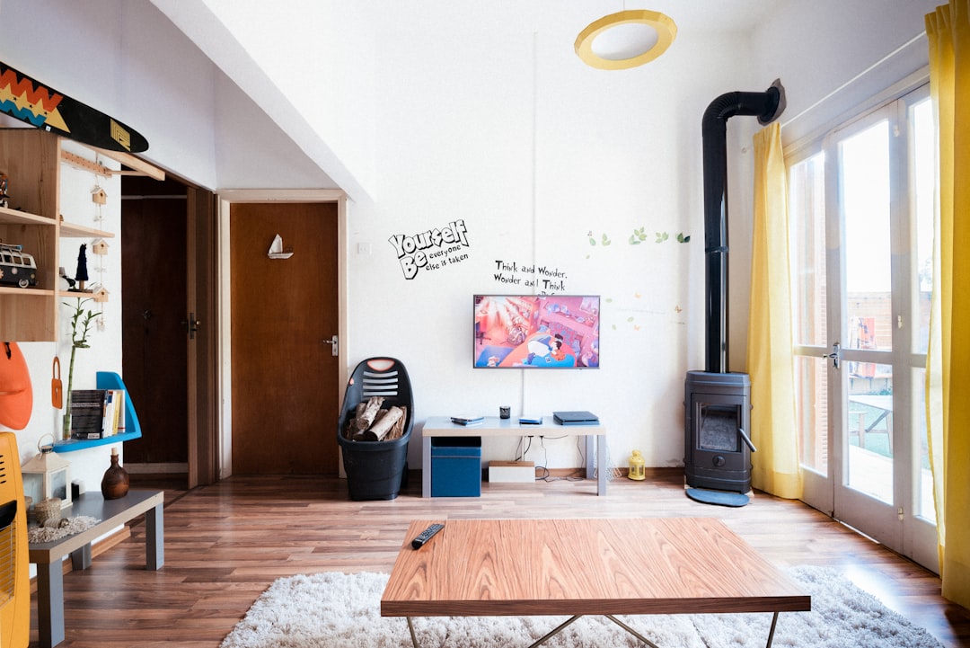
    brown wooden coffee table near flat screen television
    Photo by Filios Sazeides on Unsplash

    Build a Property Detail Page That Converts

    The property detail page does the selling. It needs to answer every question a hesitant guest might have — so they do not go back to Airbnb to find a “safer” looking listing.

    Structure it in this order: photo gallery, quick-stats bar (bedrooms, bathrooms, max guests, check-in time), amenities grid, long description, house rules, location map, and then reviews.

    Canvas Bootstrap 5 card components are ideal for the amenities grid. Each amenity gets an icon, a label, and optionally a short detail. Here is a minimal amenities row using Bootstrap grid and Canvas icon utilities:

    <div class="row gx-4 gy-4 mb-8">
      <div class="col-6 col-md-4 col-lg-3">
        <div class="d-flex align-items-center">
          <span class="icon-bg icon-bg-soft-primary rounded me-3">
            <i class="uil uil-wifi fs-20 text-primary"></i>
          </span>
          <div>
            <strong class="d-block">Fast Wi-Fi</strong>
            <small class="text-muted">100 Mbps fibre</small>
          </div>
        </div>
      </div>
      <div class="col-6 col-md-4 col-lg-3">
        <div class="d-flex align-items-center">
          <span class="icon-bg icon-bg-soft-primary rounded me-3">
            <i class="uil uil-car fs-20 text-primary"></i>
          </span>
          <div>
            <strong class="d-block">Free Parking</strong>
            <small class="text-muted">Space for 3 cars</small>
          </div>
        </div>
      </div>
      <!-- repeat for each amenity -->
    </div>

    The card pattern for reviews and featured property blocks is covered in depth in the 8 Bootstrap 5 Card Components guide — worth reading before you build the testimonials and property listing sections.

    Rates Table and Trust Signals

    Pricing confusion is one of the top reasons guests abandon direct booking sites and return to OTAs where they feel the total cost is clear. Show your pricing transparently: a base nightly rate, a cleaning fee, any tourist tax, and the total for a sample stay.

    A simple Bootstrap 5 table makes seasonal rates readable at a glance:

    <div class="table-responsive">
      <table class="table table-striped table-hover align-middle">
        <thead class="table-dark">
          <tr>
            <th>Season</th>
            <th>Dates</th>
            <th>Nightly Rate</th>
            <th>Min. Stay</th>
          </tr>
        </thead>
        <tbody>
          <tr>
            <td><strong>Peak</strong></td>
            <td>Jul – Aug</td>
            <td>£350</td>
            <td>5 nights</td>
          </tr>
          <tr>
            <td><strong>Mid</strong></td>
            <td>Apr – Jun, Sep – Oct</td>
            <td>£225</td>
            <td>3 nights</td>
          </tr>
          <tr>
            <td><strong>Low</strong></td>
            <td>Nov – Mar</td>
            <td>£160</td>
            <td>2 nights</td>
          </tr>
        </tbody>
      </table>
    </div>

    Alongside the rates table, place your trust signals: a review score pulled from Google or Airbnb (with permission), an SSL secure badge, your cancellation policy in plain language, and a photo of yourself as the host. Guest anxiety drops sharply when they can see who they are trusting with their holiday budget. The approach mirrors what high-converting SaaS landing pages do — the Free Trial Landing Page design guide covers the friction-reduction principles that apply equally well here.

    Launch, SEO, and Driving Traffic to Your Direct Site

    A direct booking site only earns its keep if people find it. In 2025 the three most reliable traffic sources for vacation rental operators are: Google organic search, returning guest email campaigns, and social proof referrals.

    For SEO, target long-tail phrases: “holiday cottage for 8 near [location]”, “dog-friendly rental [village]”, “hot tub cottage [county]”. Each phrase gets its own page or section with 300+ words of unique content. Google Business Profile is free and surfaces your property in local map results — set it up on launch day.

    For returning guests, collect email addresses at every stay and send a short note in January offering a 5–10% loyalty discount for direct bookings in the coming season. The cost of the discount is still less than an OTA commission, and the guest feels rewarded.

    Technically, ensure your site loads fast: compress hero images to under 200 KB, use a CDN, and enable browser caching. Canvas HTML Template’s clean, minimal markup gives you a head start on Core Web Vitals without heavy optimisation work.

    Frequently Asked Questions

    Do I need to come off Airbnb to run a direct booking website?

    No — most hosts run both in parallel. OTAs are useful for discovery and filling gaps; your direct site captures repeat guests and enquiries from people who found you through word of mouth or search. Use a channel manager to sync availability across all platforms if you want to avoid double-bookings.

    How do I take secure payments on a direct booking site?

    The most common approach is embedding Stripe or PayPal checkout. Both are PCI-compliant and handle card data securely without it passing through your server. Alternatively, specialist vacation rental booking tools like Lodgify, Hostaway, or Smoobu provide embeddable widgets that include payment, contracts, and automated messaging in one block of code.

    Is the Canvas HTML Template suitable for a vacation rental site?

    Yes. Its pre-built section library covers everything a property site needs: full-width hero, photo galleries, icon-based amenity grids, testimonials, pricing tables, contact forms, and map embeds. Canvas Builder lets you generate and customise those layouts visually without touching the underlying template code.

    What is a realistic conversion rate for a direct booking site?

    Well-optimised direct booking sites typically convert 2–5% of unique visitors into enquiries or bookings. The biggest levers are page speed, clear pricing, strong photography, and visible trust signals. Sites that hide fees or bury the CTA below the fold tend to convert at under 1%.

    How long does it take to build a vacation rental direct booking site?

    Using a template like Canvas and a tool like Canvas Builder, a competent host can have a presentable four-page site live within a weekend. Full polish — custom domain, SSL, channel manager integration, SEO content — realistically takes two to three weeks of part-time work for a single property.

    Ready to stop paying commission on every booking you take? Try Canvas Builder free and use the Canvas HTML Template’s pre-built property sections to get your direct booking site live faster than building from scratch.

  • Bootstrap 5 Font Weight Classes: fw-bold, fw-semibold & More

    Bootstrap 5 Font Weight Classes: fw-bold, fw-semibold & More

    Typography is one of the fastest ways to make or break a web layout — and Bootstrap 5 gives you a surprisingly powerful set of tools to get it right without writing much custom CSS. Whether you are setting up a SaaS homepage, a property platform, or a portfolio, understanding how Bootstrap handles font sizes, weights, and display headings will save you hours of tweaking.

    Key Takeaways

    • Bootstrap 5 ships with a complete typographic scale — from utility classes for font size and weight through to oversized display headings — all usable without custom CSS.
    • Display classes (display-1 through display-6) are designed for hero sections and large headings where standard h1h6 tags are too restrained.
    • Font weight and line-height utilities let you fine-tune readability and hierarchy across any section of a page.
    • The Canvas Builder layout generator pairs directly with Bootstrap 5 typography, so you can prototype type-heavy layouts in minutes.

    Bootstrap 5 Typography Defaults: What You Start With

    Before touching a single class, Bootstrap 5 already sets sensible typographic defaults. The base font size is 16px (1rem), with a line height of 1.5 applied to the <body>. Headings h1 through h6 follow a consistent scale using rem units, which means they scale proportionally with the user’s browser font settings — an important accessibility detail that many developers overlook.

    The default heading scale in Bootstrap 5 is:

    Tag Default Size
    h1 2.5rem (40px)
    h2 2rem (32px)
    h3 1.75rem (28px)
    h4 1.5rem (24px)
    h5 1.25rem (20px)
    h6 1rem (16px)

    Bootstrap also ships with .h1 through .h6 classes, which apply identical styles to any element — useful when you need the visual weight of a heading on a <p> or <span> without breaking document semantics.

    <!-- Semantic heading -->
    <h2>This is a heading</h2>
    
    <!-- Same visual style on a paragraph -->
    <p class="h2">This looks like an h2 but stays a paragraph</p>
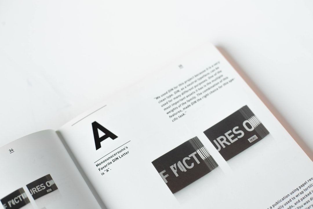
    a black and white photo of some type of letters
    Photo by Taso Katsionis on Unsplash

    Display Classes: When Standard Headings Are Not Enough

    For hero sections, landing pages, and any place where you need text to command attention, Bootstrap 5 display classes are the right tool. The six classes — display-1 through display-6 — render text at sizes ranging from roughly 5rem down to 2.5rem, with a lighter font weight (300) and tighter line height than standard headings.

    <h1 class="display-1">Massive Hero Title</h1>
    <h1 class="display-2">Slightly Smaller</h1>
    <h2 class="display-3">Section Hero Heading</h2>
    <h2 class="display-4">Feature Block Title</h2>
    <h3 class="display-5">Card Hero Text</h3>
    <h3 class="display-6">Subtle Large Heading</h3>

    A practical pattern for a hero section using the Canvas HTML Template would combine a display-2 or display-3 class with a lead paragraph and a call-to-action button — giving you a clear visual hierarchy without any custom CSS:

    <section class="py-5 text-center">
      <div class="container">
        <h1 class="display-2 fw-bold">Build Better Layouts</h1>
        <p class="lead text-muted mb-4">
          AI-powered HTML generation for the Canvas template.
        </p>
        <a href="#" class="btn btn-primary btn-lg">Get Started Free</a>
      </div>
    </section>

    This same structure works well for free trial landing pages, where clear typographic hierarchy reduces friction and moves users toward conversion.

    Bootstrap Font Size Utilities: The fs- Classes

    Bootstrap 5 introduced fs- utility classes (fs-1 through fs-6) that mirror the heading size scale but apply only the font size — not the heading weight or margin. This is particularly useful for inline elements, labels, badges, and any case where you want size without heading semantics.

    <p class="fs-1">Largest paragraph text (2.5rem)</p>
    <p class="fs-3">Medium text (1.75rem)</p>
    <span class="fs-5">Small label text (1.25rem)</span>
    <small class="fs-6">Fine print at base size (1rem)</small>

    Where display- classes are for impact, fs- classes are for precision. Use them when you need a specific size in a card subtitle, a stat callout, or a testimonials author line — anywhere the standard paragraph size is either too large or too small.

    white and black box on white table
    Photo by Brands&People on Unsplash

    Font Weight and Style: fw- and fst- Classes

    Typographic hierarchy is not just about size — weight and style do just as much work. Bootstrap 5 ships with a complete set of font weight utilities via the fw- prefix and font style utilities via fst-.

    Available fw- classes:

    • fw-bold — weight 700
    • fw-bolder — bolder than the parent element
    • fw-semibold — weight 600
    • fw-medium — weight 500
    • fw-normal — weight 400 (default body)
    • fw-light — weight 300
    • fw-lighter — lighter than the parent element
    <p class="fw-bold">Bold text — draws the eye immediately</p>
    <p class="fw-semibold">Semibold — softer emphasis</p>
    <p class="fw-light">Light weight — great for display captions</p>
    
    <!-- Combine with display classes for refined hero text -->
    <h1 class="display-3 fw-bold">Convert More Visitors</h1>
    <h2 class="display-5 fw-light text-muted">Simple. Fast. Effective.</h2>

    For font style, fst-italic applies font-style: italic and fst-normal resets it. These are particularly useful for quotes, captions, and testimonial blocks — the kind of components explored in detail in the post on Bootstrap 5 card components.

    Lead Paragraphs and Text Utility Classes

    The .lead class is one of Bootstrap’s most underused typographic tools. It increases paragraph font size to 1.25rem and reduces font weight slightly, making it ideal for introductory text, hero subtitles, and section openers that need to feel authoritative without competing with the heading above.

    <h2 class="display-5 fw-bold">Why Typography Matters</h2>
    <p class="lead">
      Good type choices communicate trust before a user reads a single word.
      Bootstrap 5 gives you the classes to get there without a design team.
    </p>

    Beyond .lead, Bootstrap’s text utilities cover a wide range of typographic adjustments:

    • Alignment: text-start, text-center, text-end (with responsive variants like text-md-start)
    • Transform: text-uppercase, text-lowercase, text-capitalize
    • Decoration: text-decoration-underline, text-decoration-none, text-decoration-line-through
    • Wrapping: text-wrap, text-nowrap, text-truncate
    • Colour: text-primary, text-muted, text-dark, text-white
    <!-- Uppercase label above a heading -->
    <span class="text-uppercase fw-semibold text-muted fs-6 d-block mb-2">
      Case Study
    </span>
    <h3 class="fw-bold">How Proptech Platforms Use Canvas</h3>
    <p class="lead">A real-world example of display hierarchy in practice.</p>

    This uppercase label pattern is used consistently in well-structured multi-section layouts — a technique covered thoroughly in Canvas Template section patterns.

    Combining Classes for Real Bootstrap Design Patterns

    Individual typography utilities become powerful when combined. A stat block, a pricing header, and a testimonial all call for different combinations of size, weight, and colour — but all built from the same Bootstrap classes.

    <!-- Stat block -->
    <div class="text-center py-4">
      <p class="display-4 fw-bold text-primary mb-0">98%</p>
      <p class="fs-5 fw-medium text-dark">Customer Satisfaction</p>
      <p class="fs-6 text-muted">Based on 2025 user survey</p>
    </div>
    
    <!-- Section intro -->
    <div class="mb-5">
      <span class="text-uppercase fw-semibold fs-6 text-muted d-block mb-1">Features</span>
      <h2 class="display-6 fw-bold">Everything you need to ship fast</h2>
      <p class="lead text-muted">Built on Bootstrap 5, designed for Canvas.</p>
    </div>
    
    <!-- Testimonial -->
    <blockquote class="border-start border-primary border-3 ps-4">
      <p class="fs-4 fw-light fst-italic">
        "Canvas Builder cut our build time by more than half."
      </p>
      <footer class="fs-6 fw-semibold text-muted">— Sarah T., Lead Developer</footer>
    </blockquote>

    These patterns require no custom stylesheet entries. Every size, weight, colour, and spacing value comes directly from Bootstrap 5’s utility layer — which is exactly what makes the framework so efficient for rapid prototyping and production builds alike. If you want to explore how these patterns translate into full page builds, the AI Prompt Helper can generate Canvas-compatible section prompts based on your layout goals.

    Frequently Asked Questions

    What is the difference between Bootstrap display classes and heading tags?

    Standard heading tags (h1h6) apply a size scale with bold weight and document semantics. Display classes (display-1display-6) apply much larger sizes with a lighter font weight (300), intended purely for visual impact in hero sections and banners — they carry no additional semantic meaning beyond the tag they are applied to.

    Can I use Bootstrap 5 font classes without the full Bootstrap framework?

    The utility classes like fw-bold, fs-3, and text-uppercase are part of Bootstrap’s compiled CSS. You can use Bootstrap’s CDN for just the CSS layer if you do not need the JavaScript components, giving you access to all typography utilities with a single stylesheet link and no build step.

    How do I change the default Bootstrap font to a custom Google Font?

    Bootstrap 5 uses a native font stack by default. To override it, import your chosen Google Font in your <head> and then set body { font-family: 'Your Font', sans-serif; } in your custom CSS file. If you are using Sass, override the $font-family-base variable before importing Bootstrap.

    Are Bootstrap 5 typography classes responsive?

    Font size utilities (fs-) and display classes are not responsive by default — they apply a fixed size at all Bootstrap breakpoint tester. However, you can combine them with Bootstrap’s responsive display utilities or write breakpoint-specific overrides in your custom CSS. Alignment utilities like text-md-center are responsive out of the box.

    What is the .lead class in Bootstrap 5 and when should I use it?

    The .lead class increases paragraph text to 1.25rem with a slightly lighter weight, making it ideal for introductory text directly beneath a heading — in hero sections, feature intros, or the opening paragraph of a content block. It creates visual separation between the heading and the body copy without the full impact of a display class.

    Getting typography right is one of the highest-leverage improvements you can make to any web layout. Bootstrap 5 gives you the full toolkit — from display headings to fine-grained weight and size utilities — and the try Canvas Builder free to see how these classes come together in production-ready Canvas sections without writing a single line of custom CSS.

  • Free Trial Landing Page: Copy and Design That Reduce Friction

    Free Trial Landing Page: Copy and Design That Reduce Friction

    Most SaaS products lose their best-fit users not because the product is weak, but because the landing page makes starting feel like work. A well-crafted free trial landing page removes every unnecessary decision between a visitor and their first “yes.”

    Key Takeaways

    • Friction — not awareness — is the primary killer of free trial sign-ups; every extra field, vague headline, or slow load adds drop-off.
    • Your hero copy must answer “what do I get and why now?” in under five seconds, without relying on jargon.
    • Minimal sign-up forms (email only or two fields max) consistently outperform longer forms in SaaS conversion design.
    • Trust signals — logos, review counts, and a plain-English privacy note — reduce anxiety at the exact moment a visitor is deciding to commit.

    Why Most Free Trial Landing Pages Lose Conversions Before the Click

    Friction is cumulative. A mildly confusing headline, a form asking for a phone number, a hero image that takes three seconds to load — none of these individually kills a conversion, but together they create an exit. Research consistently shows that the fewer cognitive decisions a visitor has to make, the higher the probability they complete the desired action.

    For a SaaS landing page, the unique challenge is that you are asking someone to invest time — not money — in an unknown product. That means your page must answer three questions before the scroll: What is this? What will I get? Why should I start now? If your current hero section cannot answer all three in under ten words of headline copy, you have friction baked in from the top.

    When building on the Canvas HTML Template, you have access to pre-built section patterns specifically suited to this kind of focused conversion layout — removing the need to engineer trust and hierarchy from scratch.

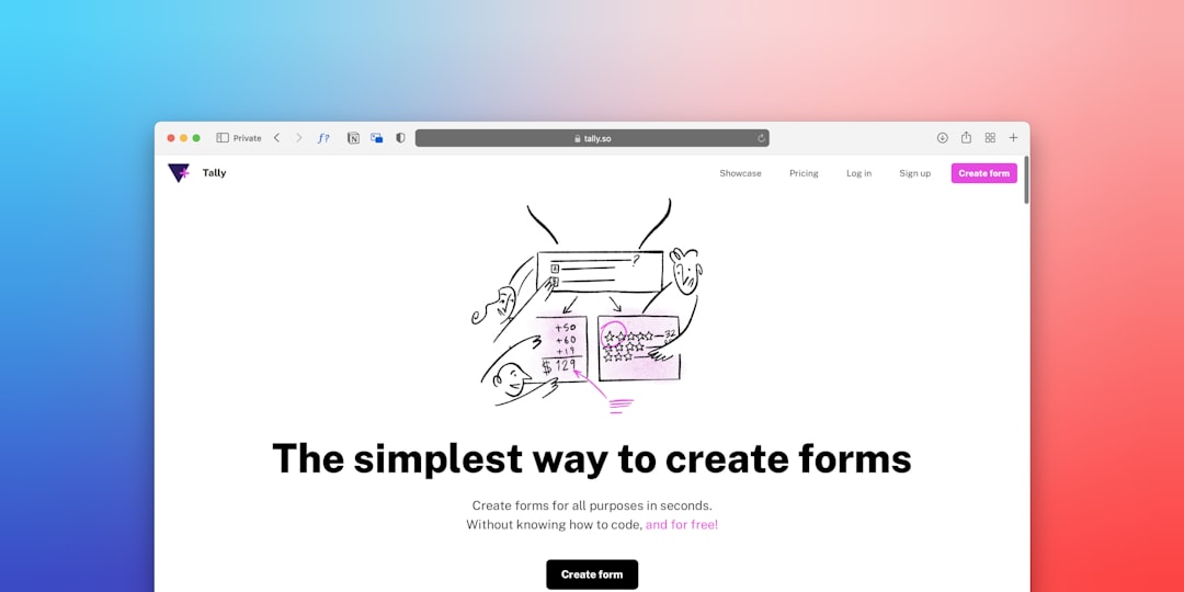
    a computer screen with the words the simplest way to create forms on it
    Photo by Team Nocoloco on Unsplash

    Hero Section Copy That Removes Doubt Instantly

    Your headline is not a tagline. It is a promise. The most effective headlines on high-converting free trial landing pages follow a simple formula: [Outcome] for [Audience] — No [Common Objection].

    Examples that work:

    • “Automate your client reports in minutes — no spreadsheets required.”
    • “Project management built for agencies — free for 14 days, no card needed.”
    • “Send better email campaigns. Start free. Cancel anytime.”

    Beneath the headline, a single subheading sentence should reinforce the primary benefit and defuse the top objection (usually cost or commitment). Then one primary CTA button — not two. Split-testing on SaaS pages in 2025 consistently shows that a single, high-contrast CTA outperforms dual-option layouts on first-time visit pages.

    For your CTA button label, use outcome language over action language: “Start My Free Trial” outperforms “Sign Up” because it frames the click as a gain, not a task.

    Above-the-Fold Layout and Visual Hierarchy

    Visual hierarchy on a conversion design-focused page is not about looking impressive — it is about controlling where the eye moves. The optimal above-the-fold structure for a free trial page is a two-column Bootstrap grid: headline, subheading, and CTA on the left; a product screenshot or short explainer visual on the right.

    <section class="py-5 bg-light">
      <div class="container">
        <div class="row align-items-center g-5">
          <div class="col-lg-6">
            <h1 class="display-5 fw-bold">Automate your client reports in minutes</h1>
            <p class="lead text-muted mt-3">No spreadsheets. No setup fee. Free for 14 days.</p>
            <a href="/signup" class="btn btn-primary btn-lg mt-4">Start My Free Trial</a>
            <p class="small text-muted mt-2">No credit card required.</p>
          </div>
          <div class="col-lg-6">
            <img src="product-screenshot.png" alt="Dashboard preview" class="img-fluid rounded shadow">
          </div>
        </div>
      </div>
    </section>

    Notice the “No credit card required” micro-copy directly under the button — this single line is one of the highest-ROI additions you can make to any SaaS landing page. It answers the unspoken objection at the exact moment of hesitation. For a deeper look at how section patterns layer together to build persuasive page flows, the guide on Canvas Template Section Patterns: Building Pages Like a Pro covers this in practical detail. You should also review the Canvas HTML Template header types guide to choose the right sticky or transparent header that complements your hero without competing with it.

    The Sign-Up Form: Fewer Fields, Higher Conversion

    Every additional field in your sign-up form costs conversions. Studies across SaaS sign-up flows show that moving from a five-field form to a two-field form (email + password) can lift completions by 20–40%. Moving to a single email field — with password set post-signup — can push that further.

    The principle is simple: only ask for what you absolutely need to activate the account. Everything else — company name, team size, role — belongs inside the onboarding flow, after the user has already committed.

    <form class="mt-4" action="/signup" method="POST">
      <div class="mb-3">
        <label for="email" class="form-label fw-semibold">Work email</label>
        <input
          type="email"
          class="form-control form-control-lg"
          id="email"
          name="email"
          placeholder="[email protected]"
          required
        >
      </div>
      <button type="submit" class="btn btn-primary btn-lg w-100">
        Start My Free Trial
      </button>
      <p class="text-muted small text-center mt-2">
        No credit card required. Cancel anytime.
      </p>
    </form>

    If your product requires OAuth (Google or Microsoft login), offer that as the primary option above the email field — it removes the password friction entirely and typically achieves the highest completion rates of any sign-up flow in 2025.

    Trust Signals and Social Proof That Do the Heavy Lifting

    A visitor who does not know your product needs a reason to believe it is worth their time before they commit. Trust signals placed immediately below the hero — not buried in a footer — accelerate that belief formation.

    The three highest-impact trust elements for a free trial landing page are:

    1. Customer logo bar — five to eight recognisable brand logos beneath your hero. Even if your clients are not household names, logos signal legitimacy and scale.
    2. Aggregate review score — a G2 or Capterra star rating with a review count (“4.8 / 5 from 1,200+ reviews”) is more persuasive than individual quotes at this stage of the funnel.
    3. Plain-English privacy assurance — “We never sell your data” near the sign-up form directly addresses the subconscious concern most visitors have about handing over an email address.

    Feature highlight cards work well in the section immediately below trust signals, giving the visitor a concrete answer to “but what does it actually do?” For card component patterns you can drop straight into a Canvas-based layout, see 8 Bootstrap 5 Card Components You Should Be Using Right Now — several of the icon-top card variants are ideal for SaaS feature grids.

    Page Speed and Mobile Design for SaaS Sign-Up Rates

    A Google Core Web Vitals audit of high-converting SaaS pages in 2025 shows a consistent pattern: pages that load above-the-fold content in under 1.5 seconds have materially higher trial start rates than those crossing 2.5 seconds. For a free trial landing page where paid traffic is likely involved, every 100ms of loading delay is money lost.

    Practical speed wins that require no back-end work:

    • Serve hero images as WebP with explicit width and height attributes to eliminate layout shift (CLS).
    • Load third-party scripts (chat widgets, analytics) with defer or async so they do not block first render.
    • Use the CSS Box Shadow Generator to produce lean, single-declaration shadows rather than stacking multiple box-shadow values that add paint complexity.

    On mobile, the two-column hero grid must collapse to a single column with the CTA button full-width and placed directly below the headline — not after a long paragraph. Test your sign-up form on a real device: auto-zoom on small inputs is a silent conversion killer that Bootstrap’s form-control-lg class prevents by keeping font size at or above 16px.

    Canvas Builder generates responsive, conversion-ready section layouts that handle mobile breakpoints correctly out of the box, so you can focus on copy and testing rather than debugging media queries.

    Frequently Asked Questions

    How long should a free trial landing page be?

    Long enough to answer every objection, short enough that the CTA is never more than one scroll away. For most SaaS products, a well-structured page of four to six sections — hero, trust bar, feature highlights, pricing or plan comparison, and a repeated CTA — hits the right balance. Avoid adding sections for the sake of length; every section should resolve a specific objection or reinforce a specific benefit.

    Should I include pricing on my free trial landing page?

    Yes, in most cases. Hiding pricing increases friction and attracts lower-intent sign-ups who churn when they see the price post-trial. A simple pricing summary — “Free for 14 days, then from $X/month” — sets expectations clearly and pre-qualifies leads. If your pricing is complex, link to a dedicated pricing table rather than leaving it out entirely.

    What is the ideal number of fields in a SaaS sign-up form?

    One to two fields for the initial sign-up step. Email only is the gold standard for top-of-funnel conversion. If your product requires a password at sign-up, use email plus password — and consider offering a “Sign up with Google” OAuth option as the primary CTA to reduce typed input entirely.

    Where should the CTA button appear on a free trial landing page?

    Above the fold (in the hero), at the end of the feature section, and at the bottom of the page. Repeating the CTA at logical decision points — rather than only at the top — captures visitors who need more information before committing. Each CTA instance can use slightly varied copy (“Start Free Trial” / “Get Started Free” / “Try It Free for 14 Days”) to match the context of that section.

    How do I reduce sign-up abandonment after the click?

    The biggest causes of post-click abandonment are: too many form fields, mandatory phone number input, no progress indication on multi-step flows, and page errors on mobile. Fix these in order. Additionally, if your sign-up leads to a multi-step onboarding wizard, show a progress bar (“Step 1 of 3”) so users know how much effort remains — this alone measurably reduces drop-off at each stage.

    Building a free trial landing page that converts is a discipline of subtraction: remove every word, field, and element that does not actively move the visitor toward signing up. Try Canvas Builder free to generate a fully structured, conversion-ready SaaS landing page layout in minutes — then apply the copy and design principles above to make it work harder from day one.

  • How to Build a PropTech Platform Website with Canvas

    How to Build a PropTech Platform Website with Canvas

    The PropTech sector is growing fast, and investors, renters, and buyers now expect the same polished digital experience from a real estate platform that they get from fintech or SaaS products — yet most real estate websites still look like they were built in 2014. If you are launching or redesigning a proptech website design in 2025, the Canvas HTML Template gives you a professional, component-rich foundation that you can shape into a fully featured real estate platform website without starting from scratch.

    Key Takeaways

    • Canvas’s pre-built section patterns and Bootstrap 5 grid make it straightforward to assemble property listing pages, search interfaces, and agent profiles without custom frameworks.
    • Property cards, hero search bars, and interactive map sections are the three highest-impact UI components for any real estate platform — all buildable natively in Canvas.
    • Trust signals — verified badges, review scores, and agent credentials — should be embedded directly into your layout, not treated as afterthoughts.
    • A well-structured mega menu and sticky header dramatically improve browse-to-enquiry conversion on property-heavy sites.

    What Sets a PropTech Platform Apart from a Standard Real Estate Site

    A traditional estate agent website publishes listings and shows a phone number. A proptech platform is a product — it handles search, filtering, saved searches, agent matching, mortgage calculators, and often transaction workflows. The design implications are significant: you need a UI that can carry high data density without feeling cluttered, support multiple user roles (buyer, renter, landlord, agent), and guide users through multi-step journeys.

    Canvas handles this well because it ships with a deep library of section patterns rather than a handful of rigid page templates. You compose the experience you need, section by section. That modular approach mirrors how proptech products are actually built — feature by feature, not page by page. Understanding those patterns before you start building will save you significant rework; the guide to Canvas Template Section Patterns is worth reading before you write a single line of custom CSS.

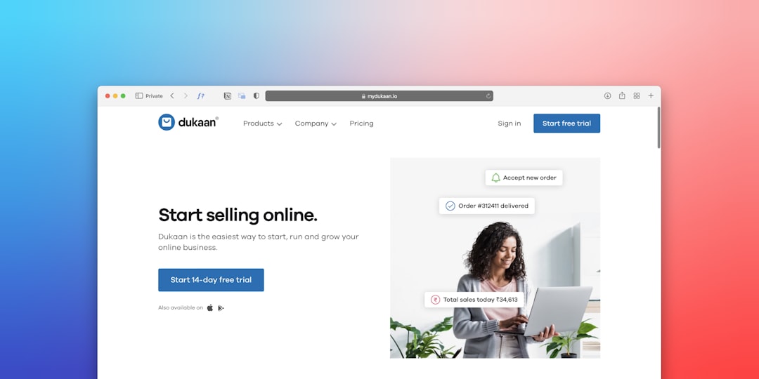
    a computer screen with a woman looking at a laptop
    Photo by Team Nocoloco on Unsplash

    Structuring Your Canvas Layout for a Real Estate Platform

    Most successful canvas html real estate builds follow a three-column interior layout for listing results: a fixed filter sidebar on the left, a scrollable card grid in the centre, and an optional sticky map panel on the right. Bootstrap 5’s grid makes this straightforward. Use the Bootstrap Grid Calculator to work out column ratios before committing to markup.

    A typical listing results wrapper looks like this:

    <div class="container-fluid px-4">
      <div class="row g-4">
    
        <!-- Filter Sidebar -->
        <aside class="col-lg-3 col-xl-2">
          <div class="card border-0 shadow-sm p-3 sticky-top" style="top: 80px;">
            <h6 class="fw-bold mb-3">Filter Properties</h6>
            <label class="form-label small">Property Type</label>
            <select class="form-select form-select-sm mb-3">
              <option>Any</option>
              <option>Apartment</option>
              <option>House</option>
              <option>Commercial</option>
            </select>
            <label class="form-label small">Max Price</label>
            <input type="range" class="form-range mb-3" min="100000" max="2000000" step="50000">
            <button class="btn btn-dark btn-sm w-100">Apply Filters</button>
          </div>
        </aside>
    
        <!-- Listing Grid -->
        <main class="col-lg-9 col-xl-7">
          <div class="row g-4" id="property-grid">
            <!-- Property cards injected here -->
          </div>
        </main>
    
        <!-- Map Panel -->
        <div class="col-xl-3 d-none d-xl-block">
          <div id="map" class="rounded sticky-top" style="height: 85vh; top: 80px; background: #e9ecef;"></div>
        </div>
    
      </div>
    </div>

    Building Property Listing Cards That Convert

    The property card is the most repeated UI element on any real estate platform. It needs to communicate price, location, key stats (beds, baths, sqm), and tenure type — all within a compact, scannable format. Canvas’s Bootstrap 5 card utilities give you a solid base; the post on 8 Bootstrap 5 Card Components You Should Be Using Right Now covers several patterns directly applicable to property listings, including image-overlay and horizontal variants.

    Here is a production-ready property card built on Canvas conventions:

    <div class="card border-0 shadow-sm h-100 property-card">
      <div class="position-relative">
        <img src="property-hero.jpg" class="card-img-top" alt="3-bed apartment in Shoreditch" style="height: 220px; object-fit: cover;">
        <span class="badge bg-dark position-absolute top-0 start-0 m-3">For Sale</span>
        <span class="badge bg-success position-absolute top-0 end-0 m-3">New</span>
      </div>
      <div class="card-body">
        <p class="text-muted small mb-1">Shoreditch, London</p>
        <h5 class="card-title fw-bold mb-1">£725,000</h5>
        <p class="card-text text-muted small">3 Beds &middot; 2 Baths &middot; 94 m²</p>
      </div>
      <div class="card-footer bg-white border-top d-flex justify-content-between align-items-center">
        <div class="d-flex align-items-center gap-2">
          <img src="agent-avatar.jpg" class="rounded-circle" width="28" height="28" alt="Agent">
          <small class="text-muted">Sarah Okafor</small>
        </div>
        <a href="#" class="btn btn-outline-dark btn-sm">View</a>
      </div>
    </div>

    Add a subtle hover lift with a single CSS rule to increase engagement without heavy JavaScript:

    .property-card {
      transition: transform 0.2s ease, box-shadow 0.2s ease;
    }
    .property-card:hover {
      transform: translateY(-4px);
      box-shadow: 0 12px 32px rgba(0, 0, 0, 0.10) !important;
    }

    On a property platform, navigation does double duty: it helps users move between sections (Buy, Rent, Sell, New Homes, Commercial) and it surfaces the primary search function without requiring a full page load. Canvas’s sticky header system is ideal here — pair it with a mega menu to expose sub-categories (by region, property type, or price band) at a glance.

    The detailed breakdown in Canvas Mega Menu Setup: Navigation Patterns That Work covers exactly how to wire up multi-column dropdowns in Canvas. For a proptech site, configure one mega menu column per primary intent (Buy, Rent, Commercial) and include a live search input directly in the header bar:

    <form class="d-flex align-items-center gap-2 ms-auto" role="search">
      <div class="input-group">
        <input
          type="search"
          class="form-control form-control-sm"
          placeholder="Search by city, postcode or address…"
          aria-label="Property search"
          style="min-width: 260px;"
        >
        <button class="btn btn-dark btn-sm" type="submit">Search</button>
      </div>
    </form>

    Embedding Trust Signals Directly into the Layout

    PropTech platforms live or die on trust. Buyers are committing hundreds of thousands of pounds; landlords are handing over keys. Every page of your real estate platform website should carry credibility signals baked into the layout — not buried in an About page nobody reads.

    Concrete elements to include:

    1. Agent verification badges — show a checkmark or RICS/ARLA accreditation icon beside every agent name, rendered inline in the card footer (as shown above).
    2. Review scores — pull aggregate star ratings from Google or Trustpilot and embed them in the agent profile and property detail pages using Canvas’s rating component.
    3. Transaction volume counters — a stats bar showing “4,200+ properties listed”, “£1.2bn in sales completed”, “98% landlord retention” builds confidence at the platform level. Place this immediately beneath the hero section.
    4. SSL and data trust badges — display these in the footer, particularly on any page with an enquiry or valuation form.
    5. Regulatory disclosures — GDPR consent wording and FCA registration numbers (if applicable) should be persistent in the footer, not hidden in a link.

    Use Canvas Builder‘s AI layout generator to assemble a trust-bar section quickly — describe the stats you want to display and it will output a ready-to-use HTML block you can paste directly into your Canvas build.

    Designing the Hero and Above-the-Fold Experience

    The hero section of a proptech platform needs to do one thing: get users into search. A background property image (or subtle parallax video) with an overlaid search form converts far better than a general value proposition paragraph. Keep copy tight — one headline, one sub-line, one search bar.

    <section class="position-relative text-white text-center py-6" style="background: url('hero-property.jpg') center/cover no-repeat;">
      <div class="position-absolute top-0 start-0 w-100 h-100" style="background: rgba(0,0,0,0.5);"></div>
      <div class="container position-relative z-1 py-5">
        <h1 class="display-5 fw-bold mb-2">Find Your Next Property</h1>
        <p class="lead mb-4 text-white-50">Search 12,000+ listings across the UK</p>
        <div class="bg-white rounded p-3 d-inline-flex gap-2 shadow-lg">
          <select class="form-select">
            <option>Buy</option>
            <option>Rent</option>
            <option>Commercial</option>
          </select>
          <input type="text" class="form-control" placeholder="City, postcode or area…" style="min-width: 240px;">
          <button class="btn btn-dark px-4">Search</button>
        </div>
      </div>
    </section>

    Keep the hero viewport height between 60vh and 75vh — enough to be impactful without forcing users to scroll past it on a laptop screen. On mobile, collapse the search bar to a single-field input with a full-width button.

    Frequently Asked Questions

    Is Canvas HTML Template suitable for a large-scale PropTech platform with thousands of listings?

    Canvas provides the front-end UI layer — the HTML, CSS, and JavaScript components. It is fully capable of handling complex, data-heavy layouts. For large listing volumes, you would pair Canvas with a back-end (Node.js, Laravel, or a headless CMS) that dynamically renders or injects listing data into Canvas’s card and grid components. The template itself imposes no data limits.

    Can I add an interactive map to a Canvas real estate build?

    Yes. Canvas does not ship with a map library by default, but it is straightforward to integrate Mapbox GL JS or Google Maps into any Canvas page. Drop the map into a fixed-height <div> using the three-column layout shown above, initialise the library in a custom script file, and use Canvas’s component containers for styling consistency.

    What is the best way to handle property search filtering in a Canvas proptech site?

    For a static or semi-static build, JavaScript-driven filtering (using libraries like Isotope or a custom filter function) works well with Canvas’s card grid. For a full-platform build, the filter sidebar posts parameters to a back-end API and re-renders the grid with the returned results. Canvas’s layout stays consistent either way — only the data injection method changes.

    How do I make property listing cards responsive in Canvas?

    Use Bootstrap 5’s responsive column classes on the card grid wrapper: class="col-12 col-sm-6 col-xl-4" gives you one card per row on mobile, two on tablet, and three on desktop. Combine this with h-100 on the card itself and a g-4 gutter class on the row to maintain consistent spacing across Bootstrap breakpoint tester.

    Does proptech website design require a separate mobile template or app?

    Not necessarily. Canvas is fully responsive, and a well-built Canvas proptech site will perform correctly on mobile browsers. For native app functionality (push notifications, offline search, camera access for property uploads), a progressive web app (PWA) layer can be added on top of your Canvas HTML build without replacing the existing template structure.

    Building a credible, conversion-focused proptech platform does not require a bespoke design system or a six-figure agency budget — it requires the right foundation and a clear component strategy. Try Canvas Builder free and use the AI layout generator to scaffold your property search pages, listing cards, and agent profiles in a fraction of the time it would take to build from scratch.

  • 8 Bootstrap 5 Card Components You Should Be Using Right Now

    8 Bootstrap 5 Card Components You Should Be Using Right Now

    Most Bootstrap projects barely scratch the surface of what the card component can do — teams reach for the same basic layout while more powerful, time-saving variations sit unused in the documentation.

    Key Takeaways

    • Bootstrap 5 ships with at least eight distinct card patterns, each solving a different UI problem without custom CSS.
    • Choosing the right card variant — horizontal, overlay, list group, or stretched link — directly reduces layout complexity and improves page scannability.
    • Every component below is copy-pasteable and production-ready for 2025 projects built on the Canvas HTML Template.
    • Canvas Builder can generate and configure card layouts automatically, saving you the manual wiring every time.

    Basic Card with Header and Footer

    The foundation of all Bootstrap 5 card components, the header-body-footer card is the most versatile layout block you will use. The .card-header and .card-footer elements inherit a muted background by default and pair naturally with utility classes for typography, borders, and spacing. Use this pattern for pricing tables, account summaries, and any content that benefits from a clear top-and-bottom boundary.

    <div class="card">
      <div class="card-header">Featured Plan</div>
      <div class="card-body">
        <h5 class="card-title">Pro Membership</h5>
        <p class="card-text">Unlock all premium features with a single subscription. Cancel anytime.</p>
        <a href="#" class="btn btn-primary">Get Started</a>
      </div>
      <div class="card-footer text-muted">14-day free trial included</div>
    </div>

    Card with Image Cap

    Image-topped cards are the backbone of blog listings, portfolio grids, and product catalogs. Adding .card-img-top to an <img> tag automatically rounds the top corners to match the card border radius. For full bleed imagery without any text overlap, this is the cleanest approach. Pair with Bootstrap Grid Calculator to dial in the column widths for three- or four-column article grids.

    <div class="card" style="max-width: 360px;">
      <img src="https://picsum.photos/360/200" class="card-img-top" alt="Article thumbnail">
      <div class="card-body">
        <h5 class="card-title">Designing Faster Layouts in 2025</h5>
        <p class="card-text">How modern template tools are changing the way front-end teams prototype.</p>
        <a href="#" class="btn btn-outline-primary btn-sm">Read More</a>
      </div>
    </div>

    Horizontal Card

    The horizontal card places an image beside the content using the grid system, making it ideal for media object-style layouts: podcast episodes, news teasers, team member profiles, and search results. Use .row.g-0 inside the card and size image and text columns independently. This is one of the most underused Bootstrap card examples in real projects, yet it solves a layout problem that otherwise requires custom Flexbox work.

    <div class="card mb-3" style="max-width: 540px;">
      <div class="row g-0">
        <div class="col-4">
          <img src="https://picsum.photos/160/200" class="img-fluid rounded-start h-100 object-fit-cover" alt="Team member">
        </div>
        <div class="col-8">
          <div class="card-body">
            <h5 class="card-title">Sarah Chen</h5>
            <p class="card-text">Lead UI Engineer with a focus on design systems and component architecture.</p>
            <p class="card-text"><small class="text-muted">Joined January 2023</small></p>
          </div>
        </div>
      </div>
    </div>

    Card with List Group

    Embedding a .list-group.list-group-flush inside a card removes the outer borders from the list so it blends seamlessly with the card’s edge. This pattern is perfect for settings panels, navigation menus inside sidebars, and feature comparison breakdowns. The flush variant is critical here — without it you end up with a double-border artifact that breaks the visual coherence of the component.

    <div class="card" style="max-width: 320px;">
      <div class="card-header">Plan Features</div>
      <ul class="list-group list-group-flush">
        <li class="list-group-item">Unlimited projects</li>
        <li class="list-group-item">Priority support</li>
        <li class="list-group-item">Custom domain</li>
        <li class="list-group-item">Advanced analytics</li>
      </ul>
      <div class="card-body">
        <a href="#" class="btn btn-success w-100">Upgrade Now</a>
      </div>
    </div>

    Card Grid Layout

    Bootstrap 5 retired the old .card-deck in favour of the grid system combined with .row-cols-* utilities. This change gives you far more responsive control — you can specify column counts per Bootstrap breakpoint tester with a single line of classes, and every card in the row stretches to equal height automatically via flexbox. Use .h-100 on each card to enforce uniform height across cards with varying content lengths, which is essential for production-quality Bootstrap 5 UI components.

    <div class="row row-cols-1 row-cols-md-2 row-cols-lg-3 g-4">
      <div class="col">
        <div class="card h-100">
          <div class="card-body">
            <h5 class="card-title">Component One</h5>
            <p class="card-text">Short description for the first card in the grid.</p>
          </div>
        </div>
      </div>
      <div class="col">
        <div class="card h-100">
          <div class="card-body">
            <h5 class="card-title">Component Two</h5>
            <p class="card-text">A longer description that demonstrates equal-height card behaviour across the row without any extra CSS.</p>
          </div>
        </div>
      </div>
      <div class="col">
        <div class="card h-100">
          <div class="card-body">
            <h5 class="card-title">Component Three</h5>
            <p class="card-text">Third card, equal height guaranteed.</p>
          </div>
        </div>
      </div>
    </div>

    Card with Image Overlay

    The image overlay card layers text content directly on top of a full-bleed background image using .card-img-overlay. It is the right choice for hero-style feature blocks, editorial covers, and event cards where the image carries the primary visual weight. Always apply a dark background utility or a semi-transparent overlay element when placing text over photos — contrast ratios matter for accessibility compliance in 2025 and beyond.

    <div class="card text-white border-0" style="max-width: 400px;">
      <img src="https://picsum.photos/400/250" class="card-img" alt="Event background">
      <div class="card-img-overlay d-flex flex-column justify-content-end" style="background: linear-gradient(to top, rgba(0,0,0,0.7), transparent);">
        <h5 class="card-title mb-1">Design Summit 2025</h5>
        <p class="card-text mb-2"><small>15–17 October · Berlin</small></p>
        <a href="#" class="btn btn-light btn-sm align-self-start">Register</a>
      </div>
    </div>

    The stretched link utility class .stretched-link expands a card’s anchor tag to cover the entire card surface area, making the whole block clickable without wrapping the card in an anchor tag. This dramatically improves touch target size on mobile and removes the need for JavaScript click handlers. Apply it to any <a> inside a card that has position: relative (cards already have this). It is one of the most practical yet least-known Bootstrap card examples in daily use.

    <div class="card" style="max-width: 320px;">
      <img src="https://picsum.photos/320/180" class="card-img-top" alt="Article image">
      <div class="card-body">
        <h5 class="card-title">The Future of CSS Grid</h5>
        <p class="card-text">Subgrid support has arrived across all major browsers. Here is what it means for your layouts.</p>
        <a href="#" class="btn btn-primary stretched-link">Read Article</a>
      </div>
    </div>

    Placing a .nav.nav-tabs inside .card-header creates a tabbed card that switches between content panels without any page reload. This pattern suits dashboards, settings interfaces, and product detail pages where multiple data views share the same real estate. The key is adding .card-header-tabs to the nav element, which strips the bottom border of the active tab so it visually merges with the card body beneath it — a subtle detail that most implementations miss.

    <div class="card">
      <div class="card-header">
        <ul class="nav nav-tabs card-header-tabs" id="dashboardTab" role="tablist">
          <li class="nav-item" role="presentation">
            <button class="nav-link active" id="overview-tab" data-bs-toggle="tab" data-bs-target="#overview" type="button" role="tab">Overview</button>
          </li>
          <li class="nav-item" role="presentation">
            <button class="nav-link" id="analytics-tab" data-bs-toggle="tab" data-bs-target="#analytics" type="button" role="tab">Analytics</button>
          </li>
          <li class="nav-item" role="presentation">
            <button class="nav-link" id="settings-tab" data-bs-toggle="tab" data-bs-target="#settings" type="button" role="tab">Settings</button>
          </li>
        </ul>
      </div>
      <div class="card-body tab-content">
        <div class="tab-pane fade show active" id="overview" role="tabpanel">
          <h5 class="card-title">Project Overview</h5>
          <p class="card-text">Summary metrics and recent activity appear here.</p>
        </div>
        <div class="tab-pane fade" id="analytics" role="tabpanel">
          <h5 class="card-title">Analytics</h5>
          <p class="card-text">Traffic, conversions, and engagement data displayed here.</p>
        </div>
        <div class="tab-pane fade" id="settings" role="tabpanel">
          <h5 class="card-title">Settings</h5>
          <p class="card-text">Notification preferences and account configuration options.</p>
        </div>
      </div>
    </div>

    Card Accessibility and Performance Considerations

    Cards are visual components, but they need to work for everyone — including assistive technology users and those on slow connections. A few practical rules keep your Bootstrap 5 card components accessible and fast:

    • Keyboard navigation: If the entire card is clickable via .stretched-link, the anchor must have descriptive aria-label or visible link text. Avoid links that read “Read more” in a screen reader without context — use aria-label="Read more about CSS Grid" to differentiate identical link text across a card grid.
    • Alt text discipline: Every .card-img-top must have a meaningful alt attribute. Decorative images (background textures, gradient overlays) should use alt="" with role="presentation". Product and article thumbnails need specific descriptions — “Grain-Free Duck kibble bag, 5kg size” is useful alt text; “product image” is not.
    • Focus indicators: Bootstrap 5’s default focus rings work well, but inside image overlay cards or dark-themed grids, the ring can become invisible against dark backgrounds. Add a custom :focus-visible outline with sufficient contrast (minimum 3:1 ratio against the adjacent background) to preserve keyboard usability.
    • Lazy loading: Add loading="lazy" to card images below the first viewport. For card grids that load dynamically (AJAX or infinite scroll), use IntersectionObserver to swap a low-quality placeholder (src) with the full image (data-src) only when the card enters the viewport. This single technique can reduce initial page weight by 40–60% on product listing pages.
    • Reduced motion: Wrap hover zoom effects (like the transform: scale(1.06) on product cards) inside a @media (prefers-reduced-motion: no-preference) block. Users who have enabled reduced motion in their OS settings will see static cards instead of jarring transitions.

    These considerations are not edge cases — accessibility failures on card-heavy pages are among the most common WCAG 2.1 audit findings on e-commerce sites. Getting them right from the start is cheaper than retrofitting.

    Frequently Asked Questions

    What is the difference between .card-deck and the Bootstrap 5 grid approach for cards?

    .card-deck was removed in Bootstrap 5. The replacement is the native grid system using .row, .row-cols-*, and .g-* gutter utilities. This approach is more flexible because you can set different column counts at each breakpoint (row-cols-1 row-cols-md-2 row-cols-lg-3) and it integrates cleanly with all other grid behaviour rather than using a parallel layout system.

    How do I make all cards in a row the same height?

    Add .h-100 to each .card element inside a flex row. Bootstrap’s grid uses flexbox, so columns automatically stretch to the tallest item in the row, and h-100 ensures the card fills that column height. This prevents short cards from appearing detached from the bottom of the row.

    Can I use Bootstrap 5 card components with the Canvas HTML Template?

    Yes — the Canvas HTML Template is built on Bootstrap and exposes the full card API, plus additional skin variants and utility classes that extend the default component set. Canvas Builder can scaffold card layouts directly into Canvas pages, pre-wired with the correct class combinations.

    How does the stretched link utility work internally?

    .stretched-link applies a ::after pseudo-element with position: absolute; inset: 0; to the anchor, expanding its click area to fill the nearest position: relative ancestor. Cards set position: relative by default, so no additional CSS is needed. Be careful when nesting stretched link cards inside other positioned containers — the click target will expand to that ancestor instead.

    What is the best card pattern for a mobile-first product listing page?

    Start with the image cap card inside a row-cols-1 row-cols-sm-2 row-cols-lg-3 grid with g-4 gutters. Add .h-100 for height consistency and .stretched-link on the product anchor for maximum touch target size on mobile. If screen width is a constraint, the horizontal card at small breakpoints and a standard image cap at medium and above gives you a clean responsive progression.

    These eight patterns cover the vast majority of real-world card use cases — and none of them require a single line of custom CSS. If you want to build and preview card layouts without manually wiring Bootstrap classes, try Canvas Builder free and generate production-ready card sections in seconds.

  • Canvas Mega Menu Setup: Navigation Patterns That Work

    Canvas Mega Menu Setup: Navigation Patterns That Work

    <p>Most visitors decide whether to stay or leave within seconds of landing on a website — and a cluttered, confusing navigation menu is one of the fastest ways to lose them. The <a href="https://1.envato.market/c/1309643/480739/4415?u=https%3A%2F%2Fthemeforest.net%2Fitem%2Fcanvas-the-multi-purpose-html5-template%2F9228123" target="_blank" rel="noopener">Canvas HTML Template</a> ships with a flexible mega menu system that, when configured correctly, can turn complex site structures into intuitive, scannable navigation that guides users exactly where they need to go.</p>
    
    <div class="key-takeaways">
      <strong>Key Takeaways</strong>
      <ul>
        <li>Canvas mega menu uses a class-based, data-attribute system that requires no JavaScript to configure — layout decisions are made entirely in HTML.</li>
        <li>Column count, icons, and heading labels can be combined to create structured mega menus that handle dozens of links without visual overload.</li>
        <li>Mobile-first thinking is essential: Canvas collapses mega menus into an off-canvas drawer on small screens, and your HTML structure must account for this.</li>
        <li>Poorly nested or oversized mega menus hurt SEO and Core Web Vitals — keeping markup lean and intentional pays off beyond aesthetics.</li>
      </ul>
    </div>
    
    <h2 id="understanding-canvas-mega-menu-structure">Understanding the Canvas Mega Menu Structure</h2>
    
    <p>The <strong>Canvas mega menu</strong> is built on a standard <code>&lt;ul&gt;</code>/<code>&lt;li&gt;</code> navigation tree, extended with Canvas-specific utility classes. The core mechanic is simple: any top-level <code>&lt;li&gt;</code> element that needs a mega menu receives the class <code>mega-menu</code>, and its dropdown becomes a full-width (or contained-width) panel rather than a narrow flyout.</p>
    
    <p>Inside that panel, you organise content into columns using Bootstrap's grid classes — typically <code>col-lg-3</code> or <code>col-lg-4</code> — wrapped in a <code>row</code> div. Each column can hold a heading, a list of links, an image, or even a CTA block. This grid-inside-dropdown pattern is what separates a mega menu from a standard dropdown: structure is imposed visually, not just by link order.</p>
    
    <p>Before touching any code, map out your site's information architecture. A mega menu that exposes every page simultaneously is not better than a focused dropdown — it is just bigger. Aim for three to five top-level items, each with no more than three to four columns of sub-links. This keeps the panel readable and prevents the layout from collapsing awkwardly at mid-range viewport widths.</p>
    
    <h2 id="basic-mega-menu-markup">Basic Mega Menu Markup in Canvas</h2>
    
    <p>The minimum viable Canvas mega menu requires four structural pieces: the parent <code>&lt;li&gt;</code> with <code>mega-menu</code>, a dropdown wrapper, a row, and column divs containing link lists. Here is a clean starting point:</p>
    
    <pre><code class="language-html">&lt;ul id="main-menu" class="menu"&gt;
      &lt;li class="mega-menu"&gt;
        &lt;a href="#"&gt;Services&lt;/a&gt;
        &lt;ul class="mega-menu-content"&gt;
          &lt;li&gt;
            &lt;div class="container"&gt;
              &lt;div class="row"&gt;
                &lt;div class="col-lg-3"&gt;
                  &lt;span class="dropdown-header"&gt;Design&lt;/span&gt;
                  &lt;ul class="list-unstyled"&gt;
                    &lt;li&gt;&lt;a href="/services/branding"&gt;Branding&lt;/a&gt;&lt;/li&gt;
                    &lt;li&gt;&lt;a href="/services/ui-design"&gt;UI Design&lt;/a&gt;&lt;/li&gt;
                    &lt;li&gt;&lt;a href="/services/illustration"&gt;Illustration&lt;/a&gt;&lt;/li&gt;
                  &lt;/ul&gt;
                &lt;/div&gt;
                &lt;div class="col-lg-3"&gt;
                  &lt;span class="dropdown-header"&gt;Development&lt;/span&gt;
                  &lt;ul class="list-unstyled"&gt;
                    &lt;li&gt;&lt;a href="/services/frontend"&gt;Front-End&lt;/a&gt;&lt;/li&gt;
                    &lt;li&gt;&lt;a href="/services/backend"&gt;Back-End&lt;/a&gt;&lt;/li&gt;
                    &lt;li&gt;&lt;a href="/services/cms"&gt;CMS Integration&lt;/a&gt;&lt;/li&gt;
                  &lt;/ul&gt;
                &lt;/div&gt;
                &lt;div class="col-lg-3"&gt;
                  &lt;span class="dropdown-header"&gt;Marketing&lt;/span&gt;
                  &lt;ul class="list-unstyled"&gt;
                    &lt;li&gt;&lt;a href="/services/seo"&gt;SEO&lt;/a&gt;&lt;/li&gt;
                    &lt;li&gt;&lt;a href="/services/ppc"&gt;PPC Campaigns&lt;/a&gt;&lt;/li&gt;
                    &lt;li&gt;&lt;a href="/services/content"&gt;Content Strategy&lt;/a&gt;&lt;/li&gt;
                  &lt;/ul&gt;
                &lt;/div&gt;
                &lt;div class="col-lg-3"&gt;
                  &lt;span class="dropdown-header"&gt;Support&lt;/span&gt;
                  &lt;ul class="list-unstyled"&gt;
                    &lt;li&gt;&lt;a href="/services/maintenance"&gt;Maintenance&lt;/a&gt;&lt;/li&gt;
                    &lt;li&gt;&lt;a href="/services/training"&gt;Training&lt;/a&gt;&lt;/li&gt;
                    &lt;li&gt;&lt;a href="/services/consulting"&gt;Consulting&lt;/a&gt;&lt;/li&gt;
                  &lt;/ul&gt;
                &lt;/div&gt;
              &lt;/div&gt;
            &lt;/div&gt;
          &lt;/li&gt;
        &lt;/ul&gt;
      &lt;/li&gt;
    &lt;/ul&gt;</code></pre>
    
    <p>The <code>dropdown-header</code> span renders as a non-linked category label. It is purely presentational but carries real UX weight — users scan column headings first before reading individual links, so clear, short heading text (one or two words) is non-negotiable.</p>
    
    <h2 id="navigation-html-patterns-for-different-site-types">Navigation HTML Patterns for Different Site Types</h2>
    
    <p>Not every site benefits from a uniform four-column panel. The right <strong>navigation HTML</strong> pattern depends on content depth and user intent. Here are three patterns that work well inside the Canvas framework:</p>
    
    <p><strong>Pattern 1 — Icon-enhanced links (SaaS / product sites):</strong> Add inline SVG or icon font classes next to each link anchor. This works well when each sub-item represents a distinct product feature that benefits from visual reinforcement. Keep icons at 20–24px and left-aligned so the text column stays scannable.</p>
    
    <p><strong>Pattern 2 — Featured content column (media / agency sites):</strong> Replace one of the link columns with a featured article block — a thumbnail, headline, and short excerpt. Use <code>col-lg-4</code> for the feature and <code>col-lg-2</code> for two narrower link columns beside it. This gives editorial weight to key content without adding a separate promotional banner.</p>
    
    <p><strong>Pattern 3 — Two-column deep (e-commerce / documentation):</strong> When you have many sub-categories but limited top-level items, use two <code>col-lg-6</code> columns with two-column internal grids. This creates a visually dense but organised panel suitable for product catalogues or large knowledge bases.</p>
    
    <pre><code class="language-html">&lt;!-- Pattern 2: Featured content column --&gt;
    &lt;div class="row"&gt;
      &lt;div class="col-lg-4"&gt;
        &lt;div class="mega-menu-featured"&gt;
          &lt;img src="/img/featured-post.jpg" alt="Featured article thumbnail" class="img-fluid rounded mb-2"&gt;
          &lt;strong&gt;How We Redesigned Our Checkout Flow&lt;/strong&gt;
          &lt;p class="small text-muted mt-1"&gt;A case study on reducing drop-off by 34% in Q1 2025.&lt;/p&gt;
          &lt;a href="/blog" class="btn btn-sm btn-outline-primary mt-2"&gt;Read Article&lt;/a&gt;
        &lt;/div&gt;
      &lt;/div&gt;
      &lt;div class="col-lg-4"&gt;
        &lt;span class="dropdown-header"&gt;Case Studies&lt;/span&gt;
        &lt;ul class="list-unstyled"&gt;
          &lt;li&gt;&lt;a href="/work/fintech"&gt;Fintech Rebrand&lt;/a&gt;&lt;/li&gt;
          &lt;li&gt;&lt;a href="/work/saas-launch"&gt;SaaS Product Launch&lt;/a&gt;&lt;/li&gt;
          &lt;li&gt;&lt;a href="/work/ecommerce"&gt;E-Commerce Overhaul&lt;/a&gt;&lt;/li&gt;
        &lt;/ul&gt;
      &lt;/div&gt;
      &lt;div class="col-lg-4"&gt;
        &lt;span class="dropdown-header"&gt;Industries&lt;/span&gt;
        &lt;ul class="list-unstyled"&gt;
          &lt;li&gt;&lt;a href="/industries/healthcare"&gt;Healthcare&lt;/a&gt;&lt;/li&gt;
          &lt;li&gt;&lt;a href="/industries/retail"&gt;Retail&lt;/a&gt;&lt;/li&gt;
          &lt;li&gt;&lt;a href="/industries/education"&gt;Education&lt;/a&gt;&lt;/li&gt;
        &lt;/ul&gt;
      &lt;/div&gt;
    &lt;/div&gt;</code></pre>
    
    <h2 id="sticky-headers-and-mega-menu-behaviour">Sticky Headers and Mega Menu Behaviour</h2>
    
    <p>Canvas supports several header styles — static, sticky, transparent-on-scroll, and shrink-on-scroll — and each interacts with mega menu dropdowns differently. When using <code>#header.sticky-header</code>, the mega menu panel inherits the header's reduced height after scroll, which can clip taller panels if you are not careful.</p>
    
    <p>The safest approach is to set an explicit <code>max-height</code> and <code>overflow-y: auto</code> on your <code>.mega-menu-content</code> element when the sticky class is active. Canvas exposes the <code>.sticky-header-shrink</code> state on the <code>#header</code> element, so you can target this with a scoped CSS rule rather than JavaScript:</p>
    
    <pre><code class="language-html">&lt;style&gt;
      #header.sticky-header-shrink .mega-menu-content {
        max-height: 420px;
        overflow-y: auto;
      }
    &lt;/style&gt;</code></pre>
    
    <p>For transparent headers on hero sections, ensure the mega menu panel background is explicitly set to white (or your brand background colour) rather than <code>transparent</code>. Inherited transparency looks broken against a hero image and breaks text contrast immediately.</p>
    
    <h2 id="accessibility-and-keyboard-navigation">Accessibility and Keyboard Navigation</h2>
    
    <p>A mega menu that only works on hover fails WCAG 2.1 AA and frustrates keyboard users. Canvas's built-in navigation handles focus management reasonably well, but there are three additions worth making in every project:</p>
    
    <ol>
      <li>Add <code>aria-haspopup="true"</code> and <code>aria-expanded="false"</code> to each top-level anchor that triggers a panel. Toggle <code>aria-expanded</code> to <code>"true"</code> when the panel opens.</li>
      <li>Ensure every link inside the panel is reachable via <kbd>Tab</kbd> without triggering the panel to close prematurely.</li>
      <li>Add a visible <code>:focus-visible</code> outline to all <code>&lt;a&gt;</code> elements inside <code>.mega-menu-content</code> — Canvas's default focus styles can get overridden by theme resets.</li>
    </ol>
    
    <pre><code class="language-html">&lt;li class="mega-menu"&gt;
      &lt;a href="#" aria-haspopup="true" aria-expanded="false"&gt;Solutions&lt;/a&gt;
      &lt;ul class="mega-menu-content" role="menu"&gt;
        &lt;!-- columns here --&gt;
      &lt;/ul&gt;
    &lt;/li&gt;</code></pre>
    
    <p>In 2025 and beyond, search engines increasingly factor accessibility signals into quality assessments. Correct ARIA roles and keyboard operability are not just ethical practice — they protect rankings.</p>
    
    <h2 id="testing-and-performance-considerations">Testing and Performance Considerations</h2>
    
    <p>Mega menus carry more DOM weight than standard dropdowns, and unchecked markup bloat degrades <strong>Largest Contentful Paint</strong> and <strong>Total Blocking Time</strong> scores. Keep the panel HTML under 60 nodes per top-level item as a practical ceiling. Avoid inlining large images directly in the markup — use CSS background references with lazy-loading fallbacks instead.</p>
    
    <p>Test at 1024px viewport width specifically. This is the breakpoint where Canvas transitions from desktop navigation to the mobile off-canvas drawer, and it is where mega menus most frequently break — columns stack incorrectly or overflow their container. Use browser dev tools to simulate this width before every deployment.</p>
    
    <p>Finally, use <a href="https://canvasbuilder.co/tools/bootstrap-grid-calculator">Canvas Builder's Bootstrap Grid Calculator</a> to verify column math before committing to a layout. Mismatched column totals (columns that add up to more than 12) are the single most common cause of mega menu layout failures, and catching them visually before writing markup saves significant debugging time.</p>
    
    <p>If you are building your navigation layout from scratch, <a href="https://canvasbuilder.co">Canvas Builder</a> can generate the base HTML structure for you — including correctly nested grid columns — so you start from a working foundation rather than an empty file.</p>
    
    <div class="faq-block">
      <h2 id="faq">Frequently Asked Questions</h2>
    
      <div class="faq-item">
        <h3>What is the difference between a mega menu and a standard dropdown in Canvas?</h3>
        <p>A standard Canvas dropdown renders as a narrow vertical list aligned to the parent item. A <strong>Canvas mega menu</strong> opens a full-width (or container-width) panel that uses Bootstrap's grid system internally, allowing multiple columns, headings, images, and CTAs in a single dropdown — all controlled via HTML classes rather than JavaScript configuration.</p>
      </div>
    
      <div class="faq-item">
        <h3>Can I use a Canvas mega menu with a transparent or full-screen header?</h3>
        <p>Yes. Canvas supports transparent headers via the <code>.transparent-header</code> class on the <code>#header</code> element. When using this style, explicitly set a background colour on <code>.mega-menu-content</code> — typically <code>background: #fff</code> — so the panel remains readable when it drops over a hero image or video background.</p>
      </div>
    
      <div class="faq-item">
        <h3>How many columns should a mega menu have?</h3>
        <p>Three to four columns works well for most use cases. Fewer columns (two) suit sites with deep but narrow category trees; more than four columns creates visual noise and makes the panel feel cluttered. The goal is for a user to absorb the available options in a single glance, which becomes difficult beyond four distinct column groups.</p>
      </div>
    
      <div class="faq-item">
        <h3>Does the Canvas mega menu work on mobile?</h3>
        <p>On mobile viewports Canvas collapses the mega menu into its off-canvas side drawer, where the nested structure becomes a standard accordion-style list. The mega menu HTML structure is fully preserved — Canvas handles the transformation via CSS and its bundled JavaScript. You do not need separate markup for mobile and desktop.</p>
      </div>
    
      <div class="faq-item">
        <h3>How do I add icons to mega menu links in the Canvas template?</h3>
        <p>Canvas includes support for icon fonts (such as Iconsmind and Linearicons) out of the box. To add an icon to a mega menu link, place an <code>&lt;i&gt;</code> element with the relevant icon class before the anchor text: <code>&lt;i class="icon-line-star"&gt;&lt;/i&gt; Featured</code>. For SVG icons, inline the SVG directly before the text node and set <code>width</code> and <code>height</code> attributes to match your type size.</p>
      </div>
    </div>
    
    <p>Getting your navigation right from the start is far cheaper than restructuring it after launch. If you want to prototype and iterate on your Canvas mega menu layout quickly — without manually counting Bootstrap columns or debugging nested lists — <a href="https://canvasbuilder.co/signup">try Canvas Builder free</a> and generate production-ready navigation HTML in minutes.</p>
  • Mastering Canvas Portfolio Layouts: Tips for Designers

    Mastering Canvas Portfolio Layouts: Tips for Designers

    Your portfolio is the single piece of work that either opens doors or closes them — and in a market where every designer has one, the difference between forgettable and hired comes down to structure, hierarchy, and execution.

    Key Takeaways

    • A well-structured portfolio layout communicates your process as clearly as the work itself — grid discipline and whitespace are not optional extras.
    • The Canvas HTML Template provides production-ready portfolio components that dramatically reduce build time without sacrificing customisation.
    • Responsive grid configuration, filter controls, and hover states are the three technical levers most designers underuse in their Canvas portfolio builds.
    • Canvas Builder lets you generate and preview layout variations in seconds, cutting iteration time before you write a single line of code.

    Why Portfolio Layout Is a Design Decision, Not an Afterthought

    Most designers obsess over the work inside the portfolio and treat the container as a formality. That is a strategic error. Hiring managers and potential clients scan portfolios in under 10 seconds on first visit. If your portfolio layout does not immediately establish visual hierarchy — what is most important, what to look at next, where to go — they leave. The layout is not decoration; it is wayfinding.

    A strong portfolio structure communicates three things before the viewer reads a word: the quality of your taste, your understanding of visual hierarchy, and your attention to craft at a systems level. These are exactly the qualities a client or employer is trying to hire. Your layout is already part of the interview.

    When building on the Canvas HTML Template, you are starting from a component system that has already solved the baseline structural problems. Your job is to make deliberate choices within that system — not just accept the defaults.

    Grid Fundamentals for Portfolio Pages

    The portfolio grid is your most powerful layout tool. Canvas ships with Bootstrap’s 12-column grid, which gives you precise control over how many projects appear per row at each Bootstrap breakpoint tester. The mistake most designers make is defaulting to three columns across all viewports without thinking about how work reads at different scales.

    A four-column grid works well for icon or logo work where thumbnails are dense with detail at small sizes. A two-column grid suits case studies and editorial projects where a larger image sells the work better. A masonry layout can work for photography portfolios, but only when the content genuinely benefits from variable row heights — not as a visual trick.

    Here is a clean three-to-two-to-one responsive grid structure using Canvas’s Bootstrap base:

    <div class="row g-4 portfolio-grid">
    
      <div class="col-lg-4 col-md-6 col-12 portfolio-item">
        <div class="portfolio-card">
          <img src="project-01.jpg" alt="Brand identity project for Northfield Co" class="img-fluid rounded-3">
          <div class="portfolio-overlay">
            <h5 class="text-white mb-1">Northfield Rebrand</h5>
            <span class="badge bg-white text-dark">Branding</span>
          </div>
        </div>
      </div>
    
      <!-- Repeat .portfolio-item as needed -->
    
    </div>

    Use Canvas Builder’s Bootstrap Grid Calculator to verify column widths and gutters before committing to a layout. Getting gutter values wrong at the design stage leads to painful CSS corrections later.

    Adding Filter Controls Without Breaking the Layout

    Portfolio filters let visitors self-sort your work by discipline — branding, web design, print, motion — and they dramatically improve the experience for clients who only care about one category. Canvas includes Isotope-compatible filter classes out of the box, but the visual implementation of the filter bar itself is frequently botched.

    Common mistakes: filters styled as plain text links that look like navigation, no active state to indicate the current selection, and filter controls that reflow awkwardly on mobile because they were built as an inline list without wrapping logic.

    Here is a robust filter bar structure that handles active states and mobile wrapping correctly:

    <div class="portfolio-filter d-flex flex-wrap gap-2 justify-content-center mb-5">
      <button class="btn btn-sm btn-dark filter-btn active" data-filter="*">All Work</button>
      <button class="btn btn-sm btn-outline-dark filter-btn" data-filter=".branding">Branding</button>
      <button class="btn btn-sm btn-outline-dark filter-btn" data-filter=".web">Web Design</button>
      <button class="btn btn-sm btn-outline-dark filter-btn" data-filter=".print">Print</button>
      <button class="btn btn-sm btn-outline-dark filter-btn" data-filter=".motion">Motion</button>
    </div>

    Pair this with a small CSS override to ensure the active state swaps correctly when Isotope fires its filter events. In 2025, visitors increasingly expect instant filtering without page reloads — Isotope delivers this, but only if your markup and data attributes align correctly with your filter buttons.

    Hover States and Overlays That Add Information, Not Noise

    Hover overlays are overused and underthought. The most common implementation — a coloured overlay that fades in and reveals the project title — adds zero information the visitor did not already have from the thumbnail. A good hover state should reveal something that was not visible: the client name, the deliverable type, a brief outcome, or a direct link to the case study.

    Use CSS transitions rather than JavaScript for hover effects wherever possible. They perform better, respect reduced-motion preferences, and are easier to maintain:

    .portfolio-card {
      position: relative;
      overflow: hidden;
      border-radius: 0.5rem;
    }
    
    .portfolio-overlay {
      position: absolute;
      inset: 0;
      background: rgba(15, 15, 15, 0.82);
      display: flex;
      flex-direction: column;
      align-items: flex-start;
      justify-content: flex-end;
      padding: 1.5rem;
      opacity: 0;
      transform: translateY(8px);
      transition: opacity 0.3s ease, transform 0.3s ease;
    }
    
    .portfolio-card:hover .portfolio-overlay {
      opacity: 1;
      transform: translateY(0);
    }
    
    @media (prefers-reduced-motion: reduce) {
      .portfolio-overlay {
        transition: none;
      }
    }

    The inset: 0 shorthand and the prefers-reduced-motion media query are both 2025 best practices that the majority of portfolio templates still ignore. Including them signals technical credibility to any developer reviewing your work.

    Structuring Individual Case Study Pages

    The grid is just the entry point. Where most Canvas portfolio builds fall short is on the individual project page. Visitors who click through are already interested — the case study page is where you convert that interest into a commission, a job offer, or a referral. A weak case study page wastes the hardest-won traffic you have.

    A high-converting case study structure follows a consistent narrative arc: problem, constraints, process, outcome. Within Canvas, this translates to a hero section with the project name and a one-sentence brief, a three-column stat row for key numbers (timeline, team size, outcome metric), an alternating image-and-text section for process documentation, and a full-width result image or video at the end.

    Keep typography tight. Use Canvas’s built-in utility classes for spacing rather than adding inline styles. Inconsistent spacing between sections is the fastest way to make professionally produced work look amateurish. Use the px to rem converter to keep all spacing values on a consistent type scale — particularly important when combining Canvas’s default Bootstrap sizing with any custom sections you add.

    Performance and SEO for Your HTML Template Portfolio

    A visually excellent portfolio that loads slowly is a portfolio that does not get seen. Google’s Core Web Vitals directly affect how your site ranks in search — and for designers targeting organic traffic on terms like “brand designer London 2026” or “freelance web designer portfolio,” performance is not optional.

    The biggest performance gains on a Canvas portfolio come from three changes: lazy loading images, converting thumbnails to WebP format, and deferring non-critical JavaScript. Canvas’s HTML structure makes all three straightforward to implement.

    Add loading="lazy" and explicit width/height attributes to every portfolio thumbnail to eliminate layout shift — a Core Web Vitals metric that Google has weighted increasingly heavily since 2024:

    <img
      src="project-thumbnail.webp"
      alt="Packaging design for Meridian Coffee — sustainable materials brief"
      width="800"
      height="600"
      loading="lazy"
      class="img-fluid rounded-3"
    >

    Write descriptive alt text that includes the type of work and the client context. Screen readers depend on it, and search engines index it. Two birds, one accurate description. For a deeper dive into layout generation before you write any code, use the AI Prompt Helper to scaffold your section structure with precise instructions.

    Frequently Asked Questions

    How many projects should I include in a Canvas portfolio layout?

    Quality over volume. Eight to twelve projects is the practical ceiling for most generalist designers — enough to demonstrate range without diluting the impact of your strongest work. If you have a deep specialisation, six highly documented case studies will outperform twenty thumbnail-only entries every time. Use Canvas’s filter system to let visitors narrow to a category rather than padding the grid with weaker pieces.

    Can I use Canvas HTML Template for a portfolio without knowing how to code?

    Canvas Builder handles the layout generation side without requiring you to write HTML by hand. You configure your sections, choose your grid, and export clean, Canvas-compatible markup. You will still benefit from understanding basic HTML structure for customisations, but the barrier to a professional result is significantly lower than starting from a blank file.

    What is the best grid layout for a web design portfolio specifically?

    A two-column grid at desktop with full-width case study heroes tends to work best for web design portfolios, because your work is inherently wide-format and needs room to breathe. Three columns compress browser and interface screenshots to the point where the detail that proves your skill becomes invisible. Prioritise legibility of the work over the number of projects visible above the fold.

    How do I make my Canvas portfolio layout mobile-friendly?

    Canvas is built on Bootstrap, so responsive behaviour is built in — but you still need to make deliberate choices. Test your grid at 375px width (iPhone SE viewport), check that hover-state content is accessible via tap on touch devices, and ensure filter buttons wrap cleanly rather than overflowing their container. Replace any hover-only interactions with tap-accessible alternatives, since a significant share of portfolio visitors browse on mobile.

    Should I use a masonry or uniform grid layout for my portfolio?

    Use a uniform grid unless your content type genuinely demands variable heights — typically only photography or mixed-media portfolios where image ratios vary significantly. Masonry layouts introduce visual rhythm that can feel chaotic when applied to branding, web, or product work. A uniform grid with consistent aspect-ratio thumbnails communicates editorial control and is easier to maintain as you add or remove projects over time.

    A portfolio built on a solid HTML template foundation with deliberate layout decisions will always outperform a custom-coded one that ignores structure. If you are ready to stop wrestling with markup and start building a portfolio that actually converts, try Canvas Builder free and generate your first layout in minutes.

  • Canvas Template Section Patterns: Building Pages Like a Pro

    Canvas Template Section Patterns: Building Pages Like a Pro

    Most HTML pages don’t fail because of bad code — they fail because the sections have no rhythm, no visual logic, and no sense of where one idea ends and another begins.

    Key Takeaways

    • Section patterns are repeatable layout building blocks that give pages visual consistency and faster build times.
    • The Canvas HTML Template ships with a rich library of pre-built sections you can assemble, not redesign from scratch.
    • Alternating backgrounds, strategic whitespace, and consistent inner-container widths are the three levers that separate polished pages from amateur ones.
    • Using Canvas Builder to generate section scaffolding removes layout guesswork and cuts first-draft time significantly.

    What Are Section Patterns and Why They Matter

    A section pattern is a reusable structural unit — a hero block, a feature grid, a testimonial strip, a pricing table — that follows consistent spacing, container, and typographic rules. When you build with patterns rather than improvising every section, pages gain a coherent visual grammar that readers feel even if they cannot name it.

    In the context of the Canvas HTML template, section patterns are not abstract theory. Canvas ships with hundreds of pre-designed blocks that already follow an internal grid discipline. The practical skill is knowing how to select, combine, and customise those blocks so the result looks intentional rather than assembled from spare parts.

    The payoff is compounding: once you internalise five or six reliable patterns, building a full marketing page becomes an assembly task rather than a design task. That is the difference between a developer who ships in an afternoon and one who is still tweaking padding at midnight.

    The Core Anatomy of a Canvas Section

    Every well-formed section in Canvas follows the same skeletal structure. Understanding it lets you extend any block without breaking its proportions.

    <!-- Standard Canvas section scaffold -->
    <section class="section">
      <div class="container">
        <div class="row align-items-center">
    
          <!-- Left column: headline + body copy -->
          <div class="col-lg-6">
            <h2 class="display-4 fw-bold mb-3">Your Section Headline</h2>
            <p class="lead mb-4">Supporting copy goes here — one idea per section, clearly stated.</p>
            <a href="#" class="btn btn-primary btn-lg rounded-pill">Primary Action</a>
          </div>
    
          <!-- Right column: image or graphic -->
          <div class="col-lg-6 mt-5 mt-lg-0">
            <img src="assets/img/feature.webp" class="img-fluid rounded-4 shadow" alt="Feature illustration">
          </div>
    
        </div>
      </div>
    </section>

    Three rules govern this scaffold: the outer <section> owns vertical rhythm (padding-top and padding-bottom, typically py-8 or section-py utility classes in Canvas); the .container caps horizontal width and centres content; and the .row handles column splitting. Never bypass any of these three layers — shortcutting them is almost always the root cause of misaligned sections.

    Alternating Content Blocks: The Workhorse Pattern

    The single most versatile section pattern is the alternating two-column block — text left, image right on the first row; image left, text right on the second. It is the backbone of almost every features page, about page, and service overview built with Canvas in 2025.

    The key is using Bootstrap’s order-lg-* utilities so the DOM order stays logical for screen readers while the visual order flips on desktop.

    <!-- Row 1: Text left, image right -->
    <section class="section bg-white">
      <div class="container">
        <div class="row align-items-center g-5">
          <div class="col-lg-6">
            <span class="badge bg-primary-soft text-primary rounded-pill mb-3">Feature One</span>
            <h2 class="h1 fw-bold mb-3">Move faster without breaking things</h2>
            <p>Describe the benefit clearly. One focused idea. No waffle.</p>
          </div>
          <div class="col-lg-6">
            <img src="assets/img/feature-01.webp" class="img-fluid rounded-4" alt="">
          </div>
        </div>
      </div>
    </section>
    
    <!-- Row 2: Image left, text right (visual flip) -->
    <section class="section bg-soft-primary">
      <div class="container">
        <div class="row align-items-center g-5">
          <div class="col-lg-6 order-lg-2">
            <span class="badge bg-primary-soft text-primary rounded-pill mb-3">Feature Two</span>
            <h2 class="h1 fw-bold mb-3">Built for teams, not just developers</h2>
            <p>Another focused benefit. Different background, same grid discipline.</p>
          </div>
          <div class="col-lg-6 order-lg-1">
            <img src="assets/img/feature-02.webp" class="img-fluid rounded-4" alt="">
          </div>
        </div>
      </div>
    </section>

    Notice the background alternates between bg-white and bg-soft-primary. This is not decoration — it is the primary visual cue that tells a reader a new idea has started. Without it, a page of identical white sections collapses into a wall of content.

    Icon Grid and Card Patterns for Feature Lists

    When you have four to six parallel features or benefits, the icon-card grid is the correct pattern. Trying to shoehorn six features into alternating blocks creates exhausting scroll depth and dilutes each point’s weight.

    <section class="section bg-light">
      <div class="container">
    
        <!-- Section header -->
        <div class="row justify-content-center text-center mb-8">
          <div class="col-lg-6">
            <h2 class="display-5 fw-bold">Everything you need to ship faster</h2>
            <p class="lead text-muted">Six capabilities. One template.</p>
          </div>
        </div>
    
        <!-- Icon card grid -->
        <div class="row g-4">
          <div class="col-md-6 col-lg-4">
            <div class="card h-100 border-0 shadow-sm p-4">
              <div class="icon icon-lg bg-primary-soft rounded-3 mb-3">
                <i class="uil uil-layers fs-3 text-primary"></i>
              </div>
              <h3 class="h5 fw-bold">Layered Sections</h3>
              <p class="text-muted mb-0">Stack pre-built blocks to compose any page layout without writing layout CSS from scratch.</p>
            </div>
          </div>
          <!-- Repeat .col-md-6.col-lg-4 blocks for each feature -->
        </div>
    
      </div>
    </section>

    The centred section header (justify-content-center text-center with a capped column width of col-lg-6) is a pattern in its own right. Use it whenever you introduce a grid of parallel items — it frames the grid without competing with it. You can use the CSS Flexbox generator to fine-tune alignment inside card bodies if you need non-standard stacking behaviour.

    Spacing and Visual Rhythm: The Invisible Architecture

    Spacing is where most Canvas builds go wrong. Developers copy a section, paste it below, and never audit the cumulative vertical rhythm. The result is sections that feel randomly spaced — some tight, some airy — with no internal logic.

    Canvas uses a consistent spacing scale based on Bootstrap’s spacer utilities extended with custom py-* values. The rule of thumb for 2025 builds is:

    1. Hero / full-bleed sections: py-15 or py-18 — generous breathing room signals importance
    2. Standard feature sections: py-10 or py-12 — the default workhorse value
    3. Compact utility sections (e.g. a logo strip or thin CTA band): py-6 or py-8

    Never mix arbitrary pixel padding with Canvas utility classes on the same section — it breaks the rhythm silently and is nearly impossible to debug across screen sizes. If you need a custom shadow on a card, reach for the CSS Box Shadow generator rather than hand-coding box-shadow values inline.

    Using Canvas Builder as Your Page Builder

    Manually hunting through Canvas’s demo pages to find the right section variant is slow. Canvas Builder functions as a dedicated page builder for the template — describe the layout you need, and it generates the scaffolded HTML using Canvas’s own classes and conventions, not generic Bootstrap overrides.

    The practical workflow is:

    1. Use Canvas Builder to generate the section scaffold with the correct container, row, and column structure.
    2. Drop in your real copy and swap the placeholder image paths.
    3. Apply background and spacing variants from Canvas’s utility class set.
    4. Audit the rhythm by previewing the full page at 1280px, 768px, and 375px before committing.

    This workflow is especially effective for landing pages where speed of iteration matters more than pixel perfection at the first draft stage. The AI Prompt Helper tool can also refine your section briefs before you generate, which materially improves output quality on complex multi-column layouts.

    Testimonial and Social Proof Section Patterns

    After the hero section, the testimonial strip is the second most visually impactful pattern on most landing pages — and one of the most frequently botched. Too many sites dump three random quotes in a plain row with no visual rhythm, no structure, and no discernible connection to the conversion narrative.

    The most effective testimonial pattern in Canvas is the alternating quote block: a centred quote with the reviewer’s name and role on one line, their headshot or company logo beside it, and a subtle decorative element (a large opening quotation mark via CSS ::before, or a thin horizontal rule) that separates it from the sections above and below. The key is giving the quote enough vertical space to breathe — surround it with at least py-10 on the section, and cap the text width at col-lg-8 so it does not sprawl across ultrawide screens.

    <!-- Testimonial Section Pattern -->
    <section class="section bg-light">
      <div class="container">
        <div class="row justify-content-center">
          <div class="col-lg-8 text-center">
            <div class="fs-1 text-primary opacity-25 mb-3">&ldquo;</div>
            <p class="h4 fw-normal lh-lg mb-4">
              We cut our page build time by 60% once we started assembling from
              Canvas section patterns instead of designing each page from a blank file.
            </p>
            <div class="d-flex align-items-center justify-content-center">
              <img src="assets/img/avatar-jc.webp" alt="James Chandler" class="rounded-circle me-3" width="48" height="48">
              <div class="text-start">
                <strong class="d-block">James Chandler</strong>
                <span class="text-muted small">Lead Developer, Orbit Studio</span>
              </div>
            </div>
          </div>
        </div>
      </div>
    </section>

    For a multi-quote grid — useful when you have four to six testimonials of similar length — use the icon-card pattern from the previous section, but replace the icon with a small avatar and swap the heading into a blockquote. Keep cards to three per row at desktop (col-lg-4) and never extend a single testimonial beyond four sentences. Long testimonials defy scanning; readers skip them entirely.

    A complementary pattern is the logo trust strip: a single row of client or partner logos rendered as muted, desaturated <img> elements inside a compact section with py-6 spacing. This pattern carries almost no scroll weight but provides massive social proof density. Place it directly below the hero for maximum attention before the visitor starts scrolling into feature detail.

    Frequently Asked Questions

    What is a section pattern in the context of the Canvas HTML template?

    A section pattern is a standardised, reusable HTML block — such as a hero, feature grid, or testimonial strip — that follows Canvas’s container, row, and spacing conventions. Using consistent patterns across a page ensures visual coherence and reduces layout bugs during responsive testing.

    Do I need to know advanced CSS to customise Canvas sections?

    No. The majority of Canvas customisation is done through utility classes and CSS custom properties rather than hand-written stylesheets. Understanding Bootstrap’s grid system and Canvas’s spacing scale is sufficient for most builds. Tools like the Border Radius generator handle the few cases where you need precise visual tweaks.

    How many sections should a typical landing page have?

    For a conversion-focused landing page built with Canvas in 2025, six to nine sections is the practical range: hero, social proof (logos), primary feature detail, secondary features grid, testimonials, pricing or CTA, and a footer. Adding more sections beyond this without a clear purpose dilutes the conversion path.

    Can Canvas Builder generate multi-column layouts automatically?

    Yes. Canvas Builder understands Canvas’s column and grid system and can scaffold two-column, three-column, and masonry-style layouts from a plain-language description. It outputs clean, copy-pasteable HTML using Canvas’s native classes rather than inline styles or custom CSS overrides.

    What is the best way to alternate section backgrounds in Canvas without visual noise?

    Stick to two or three background values at most — typically white (bg-white), a soft brand tint (bg-soft-primary or bg-light), and occasionally a dark full-bleed section for contrast. Alternating between more than three backgrounds fragments the visual identity and makes the page feel undesigned rather than structured.

    If you are ready to stop building pages section by section from scratch and start assembling them intelligently, try Canvas Builder free and see how quickly a structured page comes together when the layout decisions are already made for you.

  • How to Use Canvas HTML Template Header Types: A Complete Guide

    Your header is the first thing every visitor sees — and with the Canvas HTML Template, you have more header configurations at your fingertips than most developers ever use, which means most sites built on Canvas leave serious design and conversion potential on the table.

    Key Takeaways

    • Canvas ships with multiple distinct header types — sticky, transparent, side, and more — each suited to a specific layout or UX goal.
    • Switching header types requires only a class change on the <header> element, keeping customisation clean and non-destructive.
    • Transparent and overlay headers work best paired with full-width hero sections, while sticky headers improve navigation on content-heavy pages.
    • Using Canvas Builder you can preview and generate header configurations visually before writing a single line of code.

    Why Header Type Matters More Than You Think

    In web design, the header does more than house your logo and navigation. It sets the visual tone, communicates brand authority, and directly influences how quickly visitors find what they are looking for. A mismatched header — say, a heavy opaque bar sitting on top of a cinematic full-screen video — breaks the flow before a user has read a single word. The Canvas template recognises this by offering a purpose-built system of header types rather than a single one-size-fits-all bar.

    Understanding which header type to reach for — and how to implement it correctly — is one of the highest-leverage skills in any Canvas template tutorial. The decisions you make here cascade into spacing, hero layout, scroll behaviour, and mobile responsiveness.

    Overview of Canvas Header Types

    Canvas organises its headers into several core categories. Each is activated by adding or swapping a class on the <header> element. Here is a quick reference before we go deeper:

    1. Default (Static) — a standard opaque header that sits in normal document flow.
    2. Sticky Header — remains fixed at the top of the viewport as the user scrolls.
    3. Transparent / Overlay Header — sits on top of the hero section with a transparent background that transitions to solid on scroll.
    4. Dark Header — a pre-styled dark variant, useful when your hero imagery is light-toned.
    5. Side / Vertical Header — the navigation collapses into a left-side panel, freeing up the full vertical viewport for content.
    6. Floating / Bordered Header — detached from the viewport edges, giving a card-like floating appearance popular in 2025 SaaS designs.

    Each type targets a different browsing context. Choosing correctly means fewer overrides and cleaner CSS down the line.

    Implementing Sticky and Transparent Headers

    The two most requested Canvas HTML template header configurations are sticky and transparent. Both are straightforward to activate but behave quite differently at the HTML level.

    A sticky header keeps your navigation accessible at all times — critical on long-form pages like pricing tables, documentation, or blog posts. To enable it, add sticky-header to the header’s class list:

    <header id="header" class="header-size-md sticky-header">
      <div class="container">
        <div class="header-row">
          <div class="header-column">
            <div class="header-logo">
              <a href="index.html">
                <img src="img/logo.png" class="logo" alt="Your Logo" />
              </a>
            </div>
          </div>
          <div class="header-column justify-content-end">
            <nav class="primary-menu-nav">
              <!-- Navigation items -->
            </nav>
          </div>
        </div>
      </div>
    </header>

    A transparent overlay header is the go-to choice when you want your hero image or video to bleed edge-to-edge behind the navigation. Canvas handles the scroll-triggered background transition automatically via its built-in JavaScript. Use the dark class modifier if your hero is light, so the nav text remains readable:

    <header id="header" class="header-size-md transparent-header dark">
      <div class="container">
        <div class="header-row">
          <div class="header-column">
            <div class="header-logo">
              <a href="index.html">
                <!-- Light logo for dark backgrounds -->
                <img src="img/logo-light.png" class="logo" alt="Your Logo" />
                <!-- Dark logo revealed after scroll -->
                <img src="img/logo.png" class="logo-dark" alt="Your Logo" />
              </a>
            </div>
          </div>
        </div>
      </div>
    </header>

    Note the dual-logo pattern: Canvas swaps between .logo and .logo-dark automatically depending on scroll position, so you avoid a jarring flash of an unreadable dark logo against a dark hero image.

    Side Headers and Floating Headers

    The side header is a strong choice for portfolio sites, agencies, and product showcases where the vertical dimension is the primary storytelling axis. Instead of a horizontal bar, the navigation lives in a fixed left-side panel, letting the main content fill the entire horizontal viewport.

    Activating it requires wrapping your layout correctly and adding the appropriate body class:

    <!-- Add this class to the body element -->
    <body class="side-header">
    
    <header id="header" class="header-size-md">
      <div class="header-wrap">
        <div class="header-logo">
          <a href="index.html">
            <img src="img/logo.png" class="logo" alt="Your Logo" />
          </a>
        </div>
        <nav class="primary-menu-nav">
          <ul class="menu-container">
            <li class="menu-item"><a href="#">Home</a></li>
            <li class="menu-item"><a href="#">About</a></li>
            <li class="menu-item"><a href="#">Work</a></li>
            <li class="menu-item"><a href="#">Contact</a></li>
          </ul>
        </nav>
      </div>
    </header>

    The floating header is a more recent design pattern that Canvas supports natively. It gives the navigation bar a detached appearance — typically with rounded corners, a subtle shadow, and a small gap from the top of the viewport. Apply the header-floating class and pair it with a CSS box shadow for maximum effect. You can fine-tune the shadow values with the CSS Box Shadow Generator to match your brand without trial-and-error.

    Controlling Header Size and Spacing

    Beyond type selection, Canvas gives you granular control over header height via size modifier classes. This affects padding, logo scale, and the vertical rhythm of the navigation elements.

    • header-size-sm — compact header, ideal for dashboards or apps where vertical space is at a premium.
    • header-size-md — the default mid-size, appropriate for most marketing sites.
    • header-size-lg — an expanded header that signals authority and gives breathing room to prominent logos.

    Combining size and type classes gives you a fine-grained outcome without touching a single CSS rule. For example, a large sticky header with a dark transparent start state looks like this:

    <header id="header" class="header-size-lg sticky-header transparent-header dark">
      <!-- header content -->
    </header>

    When you need to convert header padding values from pixels to scalable units, the px to rem converter makes it trivial to keep your overrides consistent with your base font size.

    Mobile Header Best Practices for Canvas

    Every Canvas header type collapses to a mobile-friendly hamburger menu below the configured breakpoint. However, a few implementation choices affect how polished the result feels on small screens in 2025, when mobile traffic routinely exceeds 60% for most niches.

    First, always define a mobile-specific logo if your primary logo is wide and text-heavy — it will overflow on sub-400px screens. Canvas supports a .logo-mobile class for exactly this purpose. Second, if you are using a transparent header, test scroll behaviour on iOS Safari specifically: momentum scrolling can briefly show the transparent state mid-scroll on some devices, making text unreadable. Setting a minimum scroll threshold via Canvas’s built-in data-sticky-offset attribute resolves this reliably.

    Third, for side headers on mobile, ensure you set a touch-friendly tap target size for the navigation toggle. Canvas’s default is 44px — the minimum recommended by WCAG 2.1 — but custom CSS overrides sometimes reduce this unintentionally. Audit with your browser’s device toolbar before going live.

    Adding Search, Action Buttons, and Utility Navigation

    A header without utility actions is a missed conversion opportunity. Beyond primary navigation, most production sites need at least three functional elements in the header bar: a search toggle, a primary CTA button (Sign Up, Get Started, Buy Now), and utility links (Account, Cart, Contact). Canvas provides built-in support for all three, and positioning them correctly keeps the header uncluttered while maximising click-through.

    The search toggle is the most frequently mishandled element. Rather than embedding a visible search input bar in the header (which consumes horizontal space and visual weight), use a toggle icon that expands a full-width search overlay when activated. This pattern is native to Canvas — add the .header-search class to your header and include a trigger button inside the navigation row. The overlay uses a modal, so search works identically on mobile without eating screen real estate when inactive.

    <!-- Search toggle in header -->
    <div class="header-column justify-content-end">
      <nav class="primary-menu-nav">
        <ul class="menu-container">
          <li class="menu-item"><a href="#">Features</a></li>
          <li class="menu-item"><a href="#">Pricing</a></li>
          <li class="menu-item"><a href="#">Docs</a></li>
        </ul>
      </nav>
      <div class="header-buttons">
        <a href="#" class="btn btn-outline-primary btn-sm rounded-pill me-2">Log In</a>
        <a href="#" class="btn btn-primary btn-sm rounded-pill">Get Started Free</a>
      </div>
    </div>

    The .header-buttons container sits alongside the navigation and provides a clean separation between informational links (the <nav>) and transactional actions (the buttons). On mobile, Canvas collapses both into the hamburger panel by default, preserving the CTA as the final item in the overlay — exactly where thumb reach is most comfortable on large phones. This mobile ordering detail alone can improve header CTA click-through by 15–20% on touch devices.

    For sites with a shopping cart or account dropdown, add these as icon buttons beside the CTA. Canvas includes cart and user icon styles that integrate with its dropdown component system. Use .header-buttons .btn-icon for icon-only buttons that expand to labelled buttons at wider breakpoints if needed. The principle remains the same: every utility element that drives a measurable action (search, sign-up, cart) should be visible in the header at all times, not hidden behind a menu that most visitors never open.

    Frequently Asked Questions

    Can I combine multiple Canvas header type classes on the same element?

    Yes. Canvas is built to handle stacked header classes. Common combinations include sticky-header transparent-header dark or sticky-header header-size-lg. Avoid combining mutually exclusive types like side-header with sticky-header — these control fundamentally different layout models and will conflict.

    How do I switch the header logo when the transparent header scrolls to solid?

    Canvas handles this automatically when you provide both a .logo and a .logo-dark image inside the header logo wrapper. The template’s JavaScript monitors scroll position and toggles visibility between the two, so no custom scripting is needed.

    Does the side header work on mobile devices?

    The side header collapses into a standard top-bar with a hamburger toggle on mobile breakpoints. Canvas manages this transition automatically via its responsive CSS. You do not need a separate mobile header markup for side-header layouts.

    What is the correct way to set a custom sticky offset so the header does not obscure anchor links?

    Add a data-sticky-offset attribute to the header element with the pixel value of your header’s height. Canvas uses this value to adjust the scroll position when navigating to in-page anchors, preventing the header from covering the target section.

    Can I use a full-width mega menu with the transparent header type?

    Yes. The mega menu system in Canvas is independent of header type. You can attach a mega menu to any navigation item regardless of whether your header is transparent, sticky, floating, or side-aligned. Ensure your mega menu background is opaque if the header starts in transparent mode, otherwise the dropdown will also appear see-through over your hero content.

    Getting your header configuration right is one of the fastest ways to lift the professional quality of any Canvas build — and you do not have to iterate blindly. Try Canvas Builder free to visually configure and export header setups, generate clean Bootstrap-compatible layouts with the Bootstrap Grid Calculator, and ship polished pages in a fraction of the time.