Blog

  • Digital Nomad Community Website Design Best Practices

    Digital Nomad Community Website Design Best Practices

    Building a website for a digital nomad community is one of the more demanding design briefs in 2025: your audience spans time zones, devices, and connection speeds, and they expect a platform that feels as fluid as their lifestyle. Get the design wrong and you lose trust before a single membership is activated.

    Know Your Nomad Audience Before You Design Anything

    Digital nomads are not a single demographic. Freelancers billing hourly in Bali have different browsing habits from startup founders hopping between Berlin co-working spaces. Before choosing a colour palette or hero layout, map out three or four real user types: the solo freelancer, the remote-employed worker, the long-term slow traveller, and the community organiser. Each visits your site with different intent, and your navigation and content hierarchy must serve all of them without friction.

    Conduct a quick content audit of the top nomad communities (Nomad List, Remote Year alumni spaces, Hacker Paradise) and notice what they surface first: city guides, member counts, upcoming meetups, and job boards. These are the content types your architecture must accommodate. If you are designing a new platform rather than an established one, prioritise two or three of these core modules for your MVP rather than attempting all of them at launch.

    Man working on laptops at a desk.
    Photo by Compagnons on Unsplash

    Mobile-First Layout Structure for Nomad Sites

    A nomad checking your community forum from a Thai airport lounge on a 4G connection is not an edge case; it is your median user. Every layout decision should be validated at 375px before you worry about desktop. Bootstrap 5 (which Canvas bundles natively, so never load a separate Bootstrap CDN) gives you a twelve-column grid that degrades gracefully, but you still need to make deliberate column choices per breakpoint.

    For a community dashboard layout, a two-column card grid on desktop collapses to a single-column feed on mobile. Here is a working Bootstrap 5 snippet you can drop directly into a Canvas section:

    <section class="py-5">
      <div class="container">
        <div class="row g-4">
          <div class="col-12 col-md-6 col-lg-4">
            <div class="card h-100 border-0 shadow-sm">
              <div class="card-body">
                <h5 class="card-title">Chiang Mai Hub</h5>
                <p class="card-text text-muted">142 members active this month</p>
                <a href="#" class="btn btn-sm btn-outline-primary">View Hub</a>
              </div>
            </div>
          </div>
          <div class="col-12 col-md-6 col-lg-4">
            <div class="card h-100 border-0 shadow-sm">
              <div class="card-body">
                <h5 class="card-title">Lisbon Hub</h5>
                <p class="card-text text-muted">98 members active this month</p>
                <a href="#" class="btn btn-sm btn-outline-primary">View Hub</a>
              </div>
            </div>
          </div>
          <div class="col-12 col-md-6 col-lg-4">
            <div class="card h-100 border-0 shadow-sm">
              <div class="card-body">
                <h5 class="card-title">Medellin Hub</h5>
                <p class="card-text text-muted">67 members active this month</p>
                <a href="#" class="btn btn-sm btn-outline-primary">View Hub</a>
              </div>
            </div>
          </div>
        </div>
      </div>
    </section>

    If you want finer control over spacing on smaller screens, the Bootstrap Grid Calculator helps you verify gutter and column widths before you commit to a layout. You can also use the px to rem converter to keep your padding values consistent across breakpoints.

    Typography and Colour That Reflect Nomad Culture

    Nomad communities occupy an interesting design space: they need to feel adventurous and global without tipping into travel-blog cliche. Avoid the predictable combination of an oversized map background with white sans-serif text. Instead, use typography as your primary cultural signal. A humanist sans-serif for headings (Inter, DM Sans, or Plus Jakarta Sans) paired with a slightly warmer body font reads as modern and approachable, which maps well to community trust. For a deep breakdown of which pairings work in 2026, see Best Google Font Pairings for Web Design (2026).

    For colour, a palette built around a single accent hue (deep teal, warm amber, or terracotta) with neutral greys reads as contemporary and does not date quickly. In Canvas, you set this accent once using the CSS variable –cnvs-themecolor, and it propagates across buttons, links, and interactive elements automatically:

    :root {
      --cnvs-themecolor: #0f7173;        / deep teal accent /
      --cnvs-themecolor-rgb: 15, 113, 115;
      --cnvs-primary-font: 'DM Sans', sans-serif;
      --cnvs-secondary-font: 'Lora', serif;
    }

    Keep background contrast ratios above 4.5:1 for body text. Nomads often browse in bright outdoor environments where low-contrast designs become completely unreadable.

    Hero Section Design for Community Landing Pages

    The hero section of a nomad community site has to do heavy lifting: it must convey the community’s identity, signal the membership value, and push toward a clear call to action, all within the first five seconds. Social proof numbers (active members, cities represented, meetups hosted) embedded directly in the hero outperform generic taglines by a significant margin in conversion testing.

    For practical hero design patterns that translate across community and membership sites, How to Design Hero Sections That Grab Attention Instantly covers the structural decisions that matter most. The core principle for nomad sites specifically: lead with belonging, not features. “Join 4,200 remote workers building their best lives abroad” converts better than a list of platform features above the fold.

    UI Patterns for Core Community Features

    A nomad community site typically needs at least four functional modules: a member directory, a city or destination guide, a jobs or gigs board, and an events or meetup listing. Each has different information density requirements, and trying to design them all with the same card template produces a flat, undifferentiated experience.

    Use these design rules per module:

    • Member directory: Avatar, name, current location flag, and two or three skill tags. Keep cards compact so members can scan twenty profiles per screen on desktop. Add a sticky filter sidebar that collapses to a top filter bar on mobile.
    • City guides: Feature image dominant, with a cost-of-living badge and internet speed indicator as inline metadata. These are high-engagement pages; invest in the visual quality of location photography.
    • Jobs board: Text-heavy by nature. Use clear typographic hierarchy: company name in bold, role title as the primary heading, location tags and salary range as secondary metadata in a muted colour. Avoid card shadows here; a flat list with hover row highlights performs better for scan-heavy content.
    • Events and meetups: Date and city must be the most prominent elements. A simple countdown or “X days away” label drives urgency. Group events by upcoming month rather than a flat chronological list.

    For comparison, the structural thinking behind Creator Economy Website Design: What Works in 2026 is closely related: both community and creator platforms need to balance user-generated content with brand-controlled design systems.

    Performance and Trust Signals That Retain Nomad Members

    Site performance is a trust signal for nomads in a way it simply is not for a local restaurant website. If your community platform loads slowly on a mediocre hostel WiFi connection, members will not return. Optimise aggressively: compress all images to WebP, defer non-critical JavaScript, and keep your Canvas JS limited to js/plugins.min.js and js/functions.bundle.js without stacking additional unminified libraries.

    Trust signals beyond performance include: verified member badges, transparent community guidelines linked in the footer, a public member count that updates in real time, and genuine testimonials with full names and profile photos rather than anonymous quotes. Nomad communities live or die on reputation and word-of-mouth, so every trust element compounds over time.

    On the visual side, use subtle box shadows on interactive cards to create depth without adding visual noise, and keep your border radius consistent across UI components using a defined token. A border radius generator helps you lock in values like 8px for cards and 4px for buttons before you start templating.

    Frequently Asked Questions

    What is the most important design priority for a digital nomad community website?

    Mobile-first performance is the single most important priority. Nomads are high-frequency mobile users often on unstable connections. A site that loads fast and is fully usable on a 375px screen will retain more members than a visually elaborate desktop experience that performs poorly on mobile.

    Should a nomad community site use dark mode?

    Offering a dark mode toggle is a meaningful UX improvement for a nomad audience that works irregular hours across time zones. Implement it using CSS custom properties so your Canvas theme colour variables adapt cleanly. However, design and QA your light mode first; dark mode is an enhancement, not a replacement.

    How do I handle multilingual content on a nomad community site?

    If your community is genuinely international, plan for at minimum English plus two or three high-demand languages (Spanish and Portuguese cover a large nomad population). Use lang attributes on your HTML elements, left-align all body text (avoid justified text which breaks badly with languages that have long compound words), and ensure your font choices include broad Unicode coverage.

    Can the Canvas HTML Template handle a community site with member profiles and forums?

    Canvas provides the front-end HTML and CSS layer: it is not a back-end platform. You would pair it with a back-end framework (Laravel, Node, or a headless CMS with an API) to handle authentication, member data, and forum threads. Canvas gives you a polished, production-ready UI foundation that integrates cleanly with any back end via its modular HTML structure.

    How many features should a nomad community site launch with?

    Three to four core modules is a realistic MVP scope: a member directory, a city guide or destination database, a jobs or gigs board, and an events listing. Launching with too many half-built features damages trust more than launching with fewer polished ones. Add modules incrementally as your community grows and its specific needs become clearer.

    If you’re working with the Canvas HTML Template and want to generate production-ready layouts faster, try Canvas Builder free and see how much time you save on every project.

  • 8 Design Elements Every Luxury Property Website Needs

    8 Design Elements Every Luxury Property Website Needs

    High-net-worth buyers make snap judgements about a property before they ever speak to an agent, and those judgements are formed entirely by what they see on screen. A luxury property website that looks generic, loads slowly, or buries its best photography will lose qualified buyers in seconds, regardless of how spectacular the listing actually is.

    Key Takeaways

    • Luxury property websites require a distinct visual language: restrained colour palettes, editorial typography, and cinematic imagery that signals prestige immediately.
    • Performance and mobile responsiveness are non-negotiable, because affluent buyers frequently browse on high-resolution devices and expect flawless presentation.
    • The right Bootstrap 5 framework, such as the Canvas HTML Template, gives developers a structurally sound base that can be styled to match high-end brand standards without rebuilding from scratch.
    • Every element from hero sections to contact forms should reinforce one message: this brand is authoritative, discreet, and worth the price.

    A Cinematic Hero Section That Commands Attention

    The hero section is where the first impression lives. For luxury real estate, that means full-viewport imagery or video, no clutter, and a headline that is confident rather than salesy. The goal is to evoke a feeling before a buyer reads a single specification.

    Full-width video backgrounds of a property at golden hour, paired with a single italic serif headline and a minimal CTA, outperform traditional property-photo carousels in time-on-site metrics. Keep overlay opacity light enough to preserve the visual richness of the asset beneath it. For a deeper look at what makes hero sections perform, read How to Design Hero Sections That Grab Attention Instantly.

    In Canvas, the hero section structure using Bootstrap 5 looks like this:

    <section class="section mb-0 py-0" style="background: url('assets/images/property-hero.jpg') center/cover no-repeat; min-height: 100vh;">
      <div class="container h-100 d-flex align-items-center">
        <div class="row">
          <div class="col-lg-7">
            <span class="text-white ls-2 fw-light d-block mb-3" style="font-family: var(--cnvs-secondary-font); font-size: 0.85rem; letter-spacing: 0.25em; text-transform: uppercase;">Exclusive Collection</span>
            <h2 class="display-3 text-white fw-light mb-4" style="font-family: var(--cnvs-secondary-font);">Residences Defined by Rarity</h2>
            <a href="#featured" class="button button-border border-light text-white ls-1">View Properties</a>
          </div>
        </div>
      </div>
    </section>
    man's photo-printed paper
    Photo by Water Journal on Unsplash

    Editorial Typography That Signals Prestige

    Typography in luxury design is not decorative. It communicates brand authority at a glance. The combination that consistently works in prestige real estate is a refined serif for headlines paired with a geometric or humanist sans-serif for body copy. Think of how architectural magazines use type: generous white space, restrained weights, deliberate hierarchy.

    In Canvas, you control typeface choices through the –cnvs-primary-font and –cnvs-secondary-font CSS variables. Setting these site-wide means every component inherits the brand identity automatically, with no per-element overrides needed.

    :root {
      --cnvs-primary-font: 'Cormorant Garamond', Georgia, serif;
      --cnvs-secondary-font: 'Jost', 'Helvetica Neue', sans-serif;
      --cnvs-themecolor: #9a7d5a; / warm gold accent /
      --cnvs-themecolor-rgb: 154, 125, 90;
    }

    Cormorant Garamond at light weight for display headings and Jost for navigation and body copy is a pairing that reads as contemporary luxury. For a full breakdown of font pairings that suit prestige brands in 2026, see Best Google Font Pairings for Web Design (2026).

    A Restrained Colour Palette With a Single Accent

    Luxury websites use colour with discipline. The palette is typically near-white or warm off-white backgrounds, deep charcoal or muted navy for text, and one carefully chosen accent, usually a gold, bronze, or dusty sage, applied sparingly to CTAs, underlines, and hover states.

    Avoid bright primary colours, gradient backgrounds, and anything that could appear on a budget real estate portal. The accent colour, set through –cnvs-themecolor, should appear only at decision points: buttons, active navigation items, and icon highlights. Overusing it destroys the hierarchy.

    A disciplined CSS variable setup for a luxury palette:

    :root {
      --cnvs-themecolor: #b09060;
      --cnvs-themecolor-rgb: 176, 144, 96;
      --cnvs-header-bg: #ffffff;
      --cnvs-header-sticky-bg: rgba(255, 255, 255, 0.97);
      --cnvs-primary-menu-color: #2a2a2a;
      --cnvs-primary-menu-hover-color: #b09060;
    }
    
    body {
      background-color: #faf9f7;
      color: #2a2a2a;
    }
    white and green concrete building under blue sky during daytime
    Photo by set.sj on Unsplash

    A Property Showcase Layout Built for High-Resolution Imagery

    Listing grids on luxury property websites should feel like gallery previews, not search results. Each card needs space to breathe: generous padding, large imagery, subtle hover transitions, and minimal text overlay. Avoid crowding price, beds, and baths into a cramped footer strip. Instead, reveal details progressively on hover or on a dedicated property page.

    Using Bootstrap 5 columns inside Canvas, a clean luxury listing grid looks like this:

    <div class="row g-5">
      <div class="col-lg-6">
        <div class="property-card position-relative overflow-hidden">
          <img src="assets/images/listing-01.jpg" alt="Mayfair Penthouse" class="w-100" style="aspect-ratio: 4/3; object-fit: cover; transition: transform 0.6s ease;"
            onmouseover="this.style.transform='scale(1.04)'" onmouseout="this.style.transform='scale(1)'">
          <div class="pt-4">
            <span class="d-block text-uppercase ls-3 mb-1" style="font-size: 0.7rem; color: var(--cnvs-themecolor); letter-spacing: 0.2em;">Mayfair, London</span>
            <h3 class="h5 fw-light mb-1" style="font-family: var(--cnvs-primary-font);">The Grosvenor Penthouse</h3>
            <p class="text-muted mb-0" style="font-size: 0.85rem;">4 Beds &middot; 3 Baths &middot; 3,200 sq ft</p>
          </div>
        </div>
      </div>
      <div class="col-lg-6">
        <!-- Additional listing card -->
      </div>
    </div>

    For the correct Bootstrap grid setup, the Bootstrap Grid Calculator can help you plan column ratios and gutters before writing a line of code.

    Trust and Credibility Signals That Justify Premium Pricing

    Affluent buyers are cautious buyers. Before they contact an agent, they want evidence of track record, market knowledge, and discretion. Credibility signals on a luxury property website must feel earned, not manufactured.

    The most effective trust elements for prestige real estate sites include:

    • Press and award logos from recognised publications (Financial Times, Architectural Digest, property industry bodies), displayed in a monochrome strip to avoid visual noise.
    • Testimonials with full names, not initials, formatted as editorial pull quotes rather than star-rating widgets.
    • Transaction volume statistics such as “GBP 2.4bn in completed sales since 2010,” presented in large, clean numerals with a brief descriptor.
    • Agent profiles with professional portrait photography, credentials, and market specialisations, not a generic team grid.
    • A discreet off-market section accessible only after registration, which signals exclusivity and encourages lead capture.

    Avoid third-party review widgets that look like consumer e-commerce. The visual language should stay consistent with the editorial tone of the rest of the site.

    Lead Capture and Enquiry Forms That Respect the Buyer

    Contact forms on luxury property websites should be brief, unintimidating, and framed as a private conversation rather than a data collection exercise. A form that asks for name, email, phone, and a free-text enquiry field is sufficient. Multi-step forms with progress indicators can work well for qualifying buyers without feeling bureaucratic.

    The section background, button styling, and form layout should stay consistent with your established palette. The CTA button should use –cnvs-themecolor as the background and never use stock phrases like “Submit” or “Send.” Use “Request a Private Viewing” or “Begin Your Enquiry” instead.

    <section class="section bg-transparent">
      <div class="container">
        <div class="row justify-content-center">
          <div class="col-lg-6 text-center mb-5">
            <span class="d-block text-uppercase ls-3 mb-2" style="font-size: 0.75rem; color: var(--cnvs-themecolor); letter-spacing: 0.2em;">Private Enquiries</span>
            <h2 class="h3 fw-light" style="font-family: var(--cnvs-primary-font);">Speak With an Advisor</h2>
          </div>
        </div>
        <div class="row justify-content-center">
          <div class="col-lg-5">
            <form>
              <div class="mb-4">
                <input type="text" class="form-control form-control-lg border-0 border-bottom rounded-0 px-0" placeholder="Your Name" style="background: transparent; border-color: #ccc !important;">
              </div>
              <div class="mb-4">
                <input type="email" class="form-control form-control-lg border-0 border-bottom rounded-0 px-0" placeholder="Email Address" style="background: transparent; border-color: #ccc !important;">
              </div>
              <div class="mb-5">
                <textarea class="form-control border-0 border-bottom rounded-0 px-0" rows="3" placeholder="Your Enquiry" style="background: transparent; border-color: #ccc !important; resize: none;"></textarea>
              </div>
              <button type="submit" class="btn w-100 py-3 text-white" style="background-color: var(--cnvs-themecolor); letter-spacing: 0.15em; font-size: 0.8rem; text-transform: uppercase;">Request a Private Viewing</button>
            </form>
          </div>
        </div>
      </div>
    </section>

    For broader principles on converting high-intent visitors with well-designed forms and CTAs, the post on Lead Generation Landing Pages: 7 Principles That Maximise Opt-Ins covers the psychology behind form friction in detail.

    Frequently Asked Questions

    What makes a property website look truly luxurious rather than just expensive?

    True luxury design is characterised by restraint, not extravagance. White space, a controlled two-font system, a single accent colour, and cinematic photography do more for perceived prestige than elaborate animations or ornate graphic elements. Every decision should reduce cognitive load, not increase it.

    Should a luxury property website show prices publicly?

    This depends on market norms and brand strategy. Many ultra-prime agencies use “Price on Application” or “Available on Request” as a deliberate signal of exclusivity. If prices are shown, they should be formatted cleanly with no cluttered surrounding data, and always displayed in context (per annum, per week, or purchase price) to avoid ambiguity.

    How important is page speed for a luxury property website?

    Critically important. High-net-worth buyers frequently browse on premium devices with high expectations for performance. A slow-loading hero video or unoptimised gallery will be interpreted as a lack of professionalism. Compress images with modern formats such as WebP, lazy-load off-screen content, and keep third-party scripts to a minimum.

    Is the Canvas HTML Template suitable for building a luxury property website?

    Yes. Canvas is built on Bootstrap 5, which provides a responsive, structured grid system that is well-suited to property layouts. Its CSS variables, particularly –cnvs-themecolor, –cnvs-primary-font, and –cnvs-secondary-font, allow precise brand customisation without fighting the framework. The template also includes a wide range of pre-built section types that can be styled to luxury standards.

    How many listings should appear on the homepage of a luxury property website?

    Feature between two and six listings on the homepage, curated as a “collection” rather than a searchable index. The goal is to showcase the quality of inventory, not the quantity. A prominent “View All Properties” link routes buyers to a full, filterable listings page where volume is appropriate.

    If you’re working with the Canvas HTML Template and want to generate production-ready layouts faster, try Canvas Builder free and see how much time you save on every project.
  • Hotel and Hospitality Website: Design That Drives Bookings

    Hotel and Hospitality Website: Design That Drives Bookings

    Most hotel websites lose bookings before a visitor even reaches the reservation form, not because of price, but because the design fails to build trust fast enough. In a sector where a guest is deciding whether to hand over hundreds of pounds based on a few web pages, every layout decision carries real commercial weight.

    Key Takeaways

    • Hotel web design must establish trust visually within the first three seconds, before any copy is read.
    • A well-structured hero section, clear room hierarchy, and frictionless booking flow are the three highest-impact design decisions for conversion.
    • The Canvas HTML Template paired with Bootstrap 5 gives you a production-ready foundation without starting from scratch.
    • Typography, colour variables, and mobile responsiveness are not aesthetic choices in hospitality web design, they are conversion factors.

    What Makes Hospitality Web Design Different from Other Industries

    Hospitality websites sell an experience before it happens. Unlike a SaaS product page or an e-commerce store, a hotel website must create an emotional response, remove doubt, and push the visitor toward a booking decision, all at the same time. That creates a specific design challenge: you need to be aspirational and functional in equal measure.

    The three signals guests use to evaluate a hotel website unconsciously are visual quality, social proof density, and booking ease. If any of these fail, the visitor bounces to OTA platforms like Booking.com, where you lose the margin on every room sold. A strong direct-booking website is therefore not a branding exercise, it is a revenue protection strategy.

    If you are coming from a vacation rental background, the principles in How to Build a Direct Booking Website for Your Vacation Rental are directly transferable to boutique hotel projects, especially around trust signals and booking widget placement.

    tabletop lamp beside laptop on desk beside window
    Photo by Tim Trad on Unsplash

    Hero Section Design: Selling the Stay Before the Scroll

    The hero section of a hotel website does more heavy lifting than any other element on the page. It needs to communicate property quality, location, and atmosphere in a single visual impression. A full-viewport image or video background is standard for good reason: it removes abstraction and puts the guest inside the property immediately.

    Key decisions for your hotel hero section:

    • Image selection: Use the most emotionally resonant shot, typically the main pool, lobby, or signature suite, not the exterior unless it is architecturally striking.
    • Overlay and contrast: A semi-transparent dark overlay (around 40-55% opacity) keeps text legible without killing the image impact.
    • Headline brevity: Five words or fewer. “Where the Sea Meets Silence” outperforms “Welcome to Our Beautiful Beachfront Hotel”.
    • CTA placement: A single high-contrast booking button in the hero, not a menu of options.

    Here is a working Canvas-compatible hero section using Bootstrap 5 grid and Canvas CSS variables:

    <section class="section-hero vh-100 d-flex align-items-center" style="background: url('images/hotel-hero.jpg') center/cover no-repeat;">
      <div class="overlay" style="position:absolute;inset:0;background:rgba(0,0,0,0.45);"></div>
      <div class="container position-relative text-white text-center">
        <h1 class="display-4 fw-bold mb-3">Where the Sea Meets Silence</h1>
        <p class="lead mb-4">Boutique luxury on the Amalfi Coast. 12 rooms. Zero compromises.</p>
        <a href="#booking" class="btn btn-lg px-5 py-3" style="background-color: var(--cnvs-themecolor); color: #fff; border-radius: 4px;">Check Availability</a>
      </div>
    </section>

    For a deeper treatment of hero design principles, the guide on designing hero sections that grab attention instantly covers contrast ratios, CTA copy psychology, and layout hierarchy in detail.

    Room and Amenity Layout Patterns That Convert

    Once a visitor scrolls past the hero, they are evaluating rooms. The layout pattern you choose here directly affects whether they continue to the booking step. Three patterns work consistently in hospitality web design in 2026:

    1. Card grid with persistent CTA: Each room type gets a card with an image, room name, key features (bed size, view, capacity), price anchor, and a “Book This Room” button. Bootstrap’s col-md-4 grid gives you a clean three-column layout on desktop.
    2. Full-width alternating rows: Image left, details right, then flip for the next room. Works well for properties with fewer than five room types where you want each to feel premium.
    3. Tabbed room browser: Tabs for room categories (Standard, Deluxe, Suite) keep the page length manageable for larger properties.

    For the card grid, Canvas and Bootstrap 5 make this straightforward:

    <section id="rooms" class="py-6">
      <div class="container">
        <div class="row g-4">
          <div class="col-md-4">
            <div class="card border-0 shadow-sm h-100">
              <img src="images/room-deluxe.jpg" class="card-img-top" alt="Deluxe Sea View Room">
              <div class="card-body">
                <h3 class="h5 fw-bold">Deluxe Sea View</h3>
                <p class="text-muted small">King bed · 32m² · Private balcony</p>
                <p class="fw-bold" style="color: var(--cnvs-themecolor);">From £220 / night</p>
                <a href="#booking" class="btn btn-sm w-100" style="background-color: var(--cnvs-themecolor); color: #fff;">Book Now</a>
              </div>
            </div>
          </div>
        </div>
      </div>
    </section>
    a computer screen with a drawing of two people talking to each other
    Photo by Team Nocoloco on Unsplash

    Typography and Colour: Matching the Brand Tier

    Font choice signals price tier immediately. Budget properties can use clean geometric sans-serifs. Mid-range boutique hotels benefit from pairing a serif display font with a readable sans-serif for body copy. Luxury properties should lean into editorial typefaces with generous line height and letter spacing.

    In Canvas, you set your font stack via CSS variables:

    :root {
      --cnvs-primary-font: 'Cormorant Garamond', Georgia, serif;
      --cnvs-secondary-font: 'DM Sans', Helvetica, sans-serif;
      --cnvs-themecolor: #8b6f47;
      --cnvs-themecolor-rgb: 139, 111, 71;
    }

    The warm brown #8b6f47 works well for boutique and heritage properties. Coastal properties often use deep navy or teal. Always test your theme colour against white text at a contrast ratio above 4.5:1 to meet WCAG AA accessibility standards.

    For curated Google Font pairing recommendations that work specifically for hospitality and lifestyle brands, the Best Google Font Pairings for Web Design (2026) guide covers options across price tier and aesthetic.

    Trust Signals and Social Proof: Removing the Last Objection

    Guests do not book hotels they do not trust. In 2025 and 2026, trust signals on hotel websites follow a reliable hierarchy of effectiveness:

    1. Real guest reviews with dates, pulled from Google or TripAdvisor via embed or API, not manually curated testimonials without attribution.
    2. Award badges and press mentions, positioned near the fold, not buried in the footer.
    3. High-resolution photography, preferably from a professional shoot rather than phone images, because visual quality is a proxy for overall quality.
    4. Booking volume indicators (“14 people viewed this property today”) if your booking engine supports them.
    5. Clear cancellation policy visible on the booking step, not hidden in terms and conditions.

    A reviews strip using Bootstrap flexbox keeps social proof visible without dominating the layout. You can use the CSS Flexbox Generator to prototype the alignment before coding it by hand.

    Building a Hotel Website with Canvas HTML Template and Canvas Builder

    Starting a hotel website from blank HTML means weeks of layout work before you can show a client anything meaningful. The Canvas HTML Template provides a structured, Bootstrap 5-based foundation with pre-built section patterns, navigation styles, and responsive components that map directly to hospitality use cases: full-screen heroes, card grids, testimonial sliders, and sticky headers with your logo sized via --cnvs-logo-height.

    Canvas Builder accelerates this further by letting you describe your hotel concept in plain language and generating a production-ready HTML layout using the correct Canvas structure. A prompt like “boutique coastal hotel, luxury tier, 8 room types, direct booking focus, warm sand and navy palette” produces a scaffold you can hand to a developer or customise yourself, without touching layout code from scratch.

    The output uses Canvas’s correct JS files (js/plugins.min.js and js/functions.bundle.js), the right CSS references (style.css and css/font-icons.css), and Canvas CSS variables throughout, so you are never fighting the template’s architecture.

    For a detailed walkthrough of this workflow from prompt to deployed layout, see From Prompt to Production: A Real Canvas Builder Workflow.

    Frequently Asked Questions

    What is the most important page on a hotel website for conversions?

    The rooms or accommodation page consistently drives the highest booking intent. Visitors use it to verify that the property meets their expectations before committing. Prioritise clear photography, honest descriptions, and a persistent booking CTA on this page above all others.

    Should I use a booking widget or a custom booking form on my hotel website?

    For most independent hotels, a third-party booking engine (such as Cloudbeds, Little Hotelier, or Checkfront) embedded via widget is the right choice. It handles availability, payment, and confirmation logic that would take months to build custom. Design the widget container to match your site’s colour scheme using --cnvs-themecolor if the engine allows CSS customisation.

    How do I make my hotel website load fast without reducing image quality?

    Serve images in WebP format at the correct display dimensions. For a full-viewport hero at 1920px wide, you do not need a raw 6000px export. Use loading="lazy" on below-the-fold images, and preload the hero image in your <head> with a <link rel="preload"> tag. Canvas’s bundled JS already defers non-critical scripts, so avoid loading additional libraries unnecessarily.

    Is the Canvas HTML Template suitable for a hotel website project in 2026?

    Yes, particularly for boutique and independent properties. Canvas is built on Bootstrap 5, includes a wide range of pre-built layout components relevant to hospitality (hero sections, galleries, testimonial blocks, pricing tables), and its CSS variable system makes brand customisation straightforward. The main limitation is that it is a static HTML template, so dynamic availability and booking functionality requires a third-party widget or back-end integration.

    How many pages does a hotel website typically need?

    A functional hotel website requires at minimum: Home, Rooms and Suites, Dining (if applicable), Facilities and Amenities, Location and Getting Here, Gallery, and a Contact or Book Direct page. Larger properties often add separate pages for weddings, events, and spa services. Keep navigation to the top six or seven items maximum to avoid decision paralysis.

    If you’re working with the Canvas HTML Template and want to generate production-ready layouts faster, try Canvas Builder free and see how much time you save on every project.
  • How to Design Hero Sections That Grab Attention Instantly

    How to Design Hero Sections That Grab Attention Instantly

    Your hero section has roughly three seconds to earn the visitor’s attention before they decide to scroll or leave. That makes it the single highest-stakes real estate on any webpage, yet most designers fill it with vague copy, stock photography, and a button that says “Learn More.”

    Key Takeaways

    • A high-performing hero section combines a clear value proposition, a single dominant call to action, and a visual hierarchy that guides the eye without confusion.
    • Typography scale, contrast ratios, and whitespace do more conversion work than decorative imagery in most hero designs.
    • Bootstrap 5 utility classes and Canvas CSS variables let you build production-ready hero sections without writing complex custom CSS from scratch.
    • Small structural decisions, such as CTA button placement and headline length, measurably affect bounce rate and conversion.

    What Actually Makes a Hero Section Work

    A hero section works when it resolves the visitor’s immediate question: “Am I in the right place?” Answering that question requires three elements working together: a specific headline that names the outcome, supporting copy that qualifies who this is for, and a primary CTA that removes ambiguity about the next step. Everything else, background image, animation, icon set, is secondary.

    Research on eye-tracking consistently shows an F-pattern or Z-pattern reading flow above the fold. Designing against those patterns means visitors process your message in the wrong order. Place your headline in the top-left or center, your supporting sentence directly beneath it, and your CTA button immediately below that. Do not make the eye hunt.

    Visual hierarchy matters as much as copy. A headline set at 56px or larger on desktop, a subheadline at 20-22px, and a button with at least 8px vertical padding creates a clear reading sequence. If you are unsure which font combinations reinforce that hierarchy without clashing, the guide on best Google font pairings for web design covers which typeface combinations actually hold up at display sizes.

    person drawing woman character
    Photo by BalΓ‘zs KΓ©tyi on Unsplash

    The Core HTML Structure for a Hero Section

    Whether you are building from scratch or adapting an existing Canvas HTML Template, the structural markup for an effective hero follows the same pattern. Here is a working Bootstrap 5 hero section you can drop directly into any project:

    <section class="section bg-dark text-white py-6">
      <div class="container">
        <div class="row align-items-center min-vh-75">
          <div class="col-lg-7">
            <p class="text-uppercase ls-2 mb-2 opacity-75">Launching 2026</p>
            <h1 class="display-4 fw-bold lh-sm mb-3">
              Build Landing Pages That Convert, Not Just Look Good
            </h1>
            <p class="lead mb-4 opacity-90">
              Generate production-ready Bootstrap 5 layouts in minutes with
              AI-powered block generation built for the Canvas HTML Template.
            </p>
            <div class="d-flex flex-wrap gap-3">
              <a href="/signup" class="btn btn-primary btn-lg px-4">Start Free Trial</a>
              <a href="#how-it-works" class="btn btn-outline-light btn-lg px-4">See How It Works</a>
            </div>
          </div>
          <div class="col-lg-5 mt-5 mt-lg-0">
            <img src="hero-visual.png" alt="Dashboard preview" class="img-fluid rounded-3 shadow-lg">
          </div>
        </div>
      </div>
    </section>

    Notice the structure: eyebrow label, headline, subheadline, dual CTA. The primary button uses a filled style; the secondary uses an outline. This pattern reduces decision paralysis while still offering an alternative path for visitors who need more information before committing.

    Using Canvas CSS Variables for Hero Customisation

    If you are building on the Canvas HTML Template, you have access to a set of CSS custom properties that give you consistent theming without overriding core styles. Customising a hero background and typography through these variables keeps your build upgrade-safe:

    :root {
      --cnvs-themecolor: #4f46e5;
      --cnvs-themecolor-rgb: 79, 70, 229;
      --cnvs-primary-font: 'Inter', sans-serif;
      --cnvs-secondary-font: 'Playfair Display', serif;
      --cnvs-header-bg: rgba(0, 0, 0, 0.85);
      --cnvs-header-sticky-bg: #0d0d0d;
    }
    
    .hero-section {
      background-color: rgba(var(--cnvs-themecolor-rgb), 0.08);
      border-bottom: 2px solid var(--cnvs-themecolor);
      padding: 100px 0;
    }
    
    .hero-section h1 {
      font-family: var(--cnvs-secondary-font);
      color: #ffffff;
      font-size: clamp(2.25rem, 5vw, 3.5rem);
      line-height: 1.15;
    }

    Using clamp() for your headline font size means the hero scales fluidly across viewports without brittle breakpoint overrides. Pair this with a px to rem converter to keep your type scale consistent across the full layout.

    Computer screen displaying lines of code
    Photo by Jakub Ε»erdzicki on Unsplash

    Visual Hierarchy, Contrast, and Whitespace

    A common mistake is treating the hero as a branding exercise rather than a conversion component. Designers add gradient overlays, animated particles, and multi-line taglines that compete for attention instead of directing it. Here is what the evidence actually supports:

    • Headline contrast ratio should be at least 4.5:1 against its background (WCAG AA). Low contrast is the fastest way to lose readers with any level of visual impairment.
    • Whitespace around the CTA increases click rates. A button crowded by text and icons requires more cognitive effort to identify as the primary action.
    • Image placement on the right (desktop) is the most common high-converting layout because it leaves the left side, where Western readers start, clear for text.
    • Single CTA beats dual CTA in most A/B tests unless you have a meaningful secondary audience (e.g., “Start Free” vs “Book a Demo” for a SaaS product with two buyer types).

    Whitespace is not empty space; it is breathing room that prioritises what matters. The principles in the post on whitespace in web design apply directly to hero design, especially the argument for removing elements rather than adding them when conversion stalls.

    The Most Common Hero Section Mistakes (and How to Fix Them)

    After reviewing hundreds of templates and live sites, the same errors appear repeatedly. These are the ones that cause the most measurable conversion damage:

    1. Headline that describes the product, not the outcome. “AI-Powered Analytics Platform” tells the visitor what you built. “Know exactly where you’re losing revenue” tells them what they get. Rewrite every headline as a customer outcome.
    2. CTA label that says “Submit” or “Learn More.” Vague verbs reduce clicks. Use outcome-oriented labels: “Get My Free Report,” “Start Building Today,” “See Pricing.”
    3. Hero image that adds no information. A generic smiling team photo communicates nothing specific. A product screenshot, interface preview, or before/after comparison communicates value directly.
    4. No mobile-specific layout consideration. A 60/40 split column layout that looks great on desktop often stacks badly on mobile. Test your hero at 375px width before shipping.
    5. Auto-playing video backgrounds. These hurt performance (Core Web Vitals), distract from the headline, and can reduce conversions on slow connections. Use a static poster image with an optional play trigger instead.

    For the CTA element specifically, the research behind call-to-action button design goes deeper into colour, sizing, and label psychology if you want to optimise beyond layout.

    Generating Hero Sections Faster with Canvas Builder

    Designing a hero from scratch takes time even when you know exactly what you want. Canvas Builder reduces that time significantly by letting you describe your layout in plain language and generating the corresponding Canvas HTML Template block, including correct Bootstrap 5 markup, Canvas CSS variable hooks, and responsive column structure, ready to paste into your project.

    A prompt like “Create a dark hero section for a SaaS product with a left-aligned headline, two-button CTA group, and a right-side product screenshot” produces a complete, production-ready block rather than a starting-point wireframe. The output already uses the correct Canvas section type (block_section), correct JS references (js/plugins.min.js and js/functions.bundle.js), and correct CSS file references (style.css and css/font-icons.css), so you are not debugging asset paths before you can test the design.

    If you want to understand how that workflow connects across a full page build, the post on prompt-to-production Canvas Builder workflow walks through a real example from brief to deployed layout.

    Frequently Asked Questions

    What is the ideal height for a hero section?

    There is no single correct height. The goal is to display the headline, subheadline, and primary CTA above the fold on the most common viewport sizes (typically 768px to 900px tall on desktop). Using min-height: 80vh with flexbox centering is a reliable approach that scales across screen sizes without fixing a pixel value that breaks on ultrawide or small displays.

    Should a hero section use a video background or a static image?

    Static images almost always outperform video backgrounds on conversion metrics because they load faster and do not distract from the headline. Video backgrounds can work for brand-led campaigns where atmosphere matters more than direct response. If you use video, always provide a static poster image fallback, disable autoplay on mobile, and ensure the video file is under 2MB to protect Core Web Vitals scores.

    How long should a hero headline be?

    Aim for six to twelve words at display size. Shorter headlines force specificity and scan faster. If your value proposition genuinely needs more explanation, move the detail into the subheadline (one to two sentences maximum) rather than expanding the headline. Headlines longer than fifteen words at large font sizes create awkward line breaks on tablet and mobile viewports.

    How do I make a hero section responsive in Bootstrap 5?

    Use Bootstrap 5 column classes with responsive breakpoints: col-12 col-lg-7 for the text column and col-12 col-lg-5 for the image column. Stack vertically on mobile by default and switch to a side-by-side layout at the lg breakpoint (992px). Add mt-5 mt-lg-0 to the image column to control vertical spacing when stacked. Test at 375px, 768px, and 1280px as your three key checkpoints.

    What Canvas section type should I use for a hero block?

    For a standalone reusable hero component, use the blocksection type. If the hero is part of a complete single-page site, it lives within the singlepage layout type, positioned after the header and before the first content section. Never mix section types within the same layout file, as this breaks Canvas’s initialisation sequence for scroll animations and sticky header behaviour.

    If you’re working with the Canvas HTML Template and want to generate production-ready layouts faster, try Canvas Builder free and see how much time you save on every project.

  • Best Google Font Pairings for Web Design (2026)

    Best Google Font Pairings for Web Design (2026)

    Typography is one of the fastest decisions that shapes how professional a website feels, yet most developers grab the first Google Font pairing that looks roughly acceptable and ship it. In 2026, with AI-generated sites flooding every niche, deliberate font choices are one of the clearest signals that separates polished work from generic output.

    Key Takeaways

    • The strongest Google Font pairings use contrast in weight or style (serif with sans-serif, geometric with humanist) rather than similarity.
    • Loading speed matters: limiting your Google Fonts import to two families with 2-3 weights each keeps page load under control without sacrificing flexibility.
    • Pairing choices should match the emotional register of the industry (editorial, corporate, friendly, bold) not just visual aesthetics.
    • Canvas HTML Template users can set typography globally using the –cnvs-primary-font and –cnvs-secondary-font CSS variables, eliminating the need to override individual selectors.

    Why Font Pairings Still Matter in 2026

    Variable fonts and AI-assisted design tools have made it easier than ever to drop in typography, but that ease has also produced a homogenous look across thousands of sites. The problem is not access to fonts. It is the deliberate decision-making behind which two fonts belong together and why.

    A well-chosen pairing does three things simultaneously: it creates visual hierarchy so readers know what to read first, it reinforces brand personality without a single word of copy, and it keeps cognitive load low by giving the eye a clear system to follow. A poor pairing does the opposite. Two fonts that are too similar create visual noise. Two fonts that clash in tone feel untrustworthy.

    For projects built with the Canvas HTML Template, global typography is controlled through two CSS variables. Set them once in a custom stylesheet and every heading, paragraph, and UI label inherits correctly without hunting through nested selectors.

    :root {
      --cnvs-primary-font: 'Playfair Display', Georgia, serif;
      --cnvs-secondary-font: 'Inter', system-ui, sans-serif;
    }
    

    The Five Best Google Font Pairings for 2026

    Each pairing below is chosen for a specific design context. Use the context description to match a pairing to the project in front of you, not just to your personal preference.

    1. Playfair Display + Inter

    Best for: editorial blogs, luxury brands, portfolio sites, vacation rentals, and hospitality businesses.

    Playfair Display is a high-contrast transitional serif with strong optical weight at large sizes. Inter is a neutral, highly legible grotesque designed for screens. The contrast between them is significant enough to create instant hierarchy. The combination reads as confident and refined without feeling stuffy.

    2. Manrope + Lora

    Best for: health platforms, wellness brands, mental health services, and coaching sites.

    Manrope is a geometric sans-serif with rounded terminals that gives headings an approachable, modern feel. Lora, a serif with brushed curves, adds warmth to body text. This pairing avoids the clinical sharpness of many tech-facing fonts, which matters enormously for trust-sensitive categories. This kind of typographic empathy is a core consideration in mental health platform website design.

    3. Space Grotesk + DM Sans

    Best for: SaaS products, AI tools, developer tools, fintech, and startup landing pages.

    Space Grotesk has distinctive quirky details (notched stems, uneven weight distribution) that give headings personality without veering into novelty territory. DM Sans is clean and efficient for body copy. Both are technically sans-serif but different enough in character to create clear hierarchy. This pairing communicates technical competence while staying readable.

    4. Cormorant Garamond + Nunito Sans

    Best for: fashion, beauty, salon websites, event brands, and boutique e-commerce.

    Cormorant Garamond is exceptionally elegant at display sizes with very fine hairline strokes. Nunito Sans keeps body text grounded and readable. The risk with Cormorant is legibility at small sizes; never use it below 20px and never rely on it for body paragraphs. Pair it with the generous x-height of Nunito Sans and the contrast is immediately arresting.

    5. Outfit + Source Serif 4

    Best for: creator economy sites, newsletters, bootcamps, course platforms, and community brands.

    Outfit is a geometric sans-serif released in 2021 that has matured into one of the most versatile heading fonts available. Source Serif 4 is an optical size-aware serif from Adobe that holds up exceptionally well in body copy even at small sizes. Together they produce a modern editorial feel that suits long-form content environments. For projects in this space, the typographic principles align with what converts in creator economy website design.

    Loading Google Fonts Without Killing Page Speed

    Google Fonts served naively (the default embed link with no customisation) will request every weight variation available. A single import of Inter with five weights adds 300-400KB to a cold page load. The correct approach is to request only the weights you will actually use, use font-display: swap, and preconnect to the Google Fonts domain before the stylesheet request.

    <link rel="preconnect" href="https://fonts.googleapis.com">
    <link rel="preconnect" href="https://fonts.gstatic.com" crossorigin>
    <link href="https://fonts.googleapis.com/css2?family=Playfair+Display:wght@600;700&family=Inter:wght@400;500&display=swap" rel="stylesheet">
    

    This request loads Playfair Display in two weights (600 and 700) and Inter in two weights (400 and 500). That covers 99% of use cases: a bold display heading, a semibold subheading, regular body, and medium UI labels. Nothing more is needed in most projects.

    For Canvas-based projects, place this snippet inside <head> before the style.css reference. Canvas bundles Bootstrap 5 internally, so you never need to load the Bootstrap CDN separately.

    Applying a Font Pairing in the Canvas Template

    Once you have loaded the fonts via the Google Fonts link, override the Canvas CSS variables in a custom stylesheet. This propagates the change across every element that inherits from those variables without touching the template’s core files.

    / custom-typography.css β€” loaded after style.css /
    :root {
      --cnvs-primary-font: 'Space Grotesk', system-ui, sans-serif;
      --cnvs-secondary-font: 'DM Sans', system-ui, sans-serif;
    }
    
    h1, h2, h3, h4, h5, h6 {
      font-family: var(--cnvs-primary-font);
      font-weight: 600;
      letter-spacing: -0.02em;
    }
    
    body, p, li, td {
      font-family: var(--cnvs-secondary-font);
      font-weight: 400;
      line-height: 1.7;
    }
    

    The letter-spacing reduction on headings (-0.02em) is a small but meaningful detail. Geometric sans-serifs like Space Grotesk are designed with generous default tracking intended for small sizes. At large display sizes, tightening tracking by 1-2% is standard practice and matches what you see on the leading SaaS product sites today.

    If you are assembling layouts quickly and want font pairing decisions already baked into AI-generated section prompts, Canvas Builder generates Canvas-compatible HTML with typography variables pre-applied based on the layout type you request.

    Three Pairing Conventions Worth Breaking

    Most font pairing guides repeat the same rules without question. Here are three worth interrogating in 2026:

    1. “Always pair a serif with a sans-serif.” This is safe but not a law. Space Grotesk paired with Outfit (both sans-serif, different personalities) creates strong hierarchy and looks distinctly contemporary. The rule to follow is contrast in optical weight, not necessarily in classification.
    2. “Limit yourself to two fonts.” True in most cases, but for editorial and content-heavy sites a third font for pull quotes or callouts (set in a very large size with 300 weight) adds visual texture without confusion. The constraint is intentionality: every font must have a defined role.
    3. “Match fonts from the same designer or foundry.” This leads to overly harmonious pairings that blur into one. Some of the most effective pairings on the web today (Cormorant Garamond + Nunito Sans, Outfit + Source Serif 4) come from entirely different design traditions. The contrast is the feature, not a bug.

    Typography Works With Whitespace, Not Against It

    Font selection is only half the equation. A well-chosen pairing will underperform if it is placed inside a layout with insufficient breathing room. Line height, paragraph spacing, and margin between heading and body text are all part of the typographic system. Tighter spacing suits dense data interfaces. Looser spacing suits editorial and high-ticket service sites where reading comfort is a trust signal.

    The relationship between type size, line length, and whitespace is something worth studying in depth before finalising any design system. The principles that apply here overlap directly with broader layout decisions covered in whitespace in web design.

    A practical baseline: set body font size at 16-18px, line height at 1.65-1.75, and maximum paragraph width at 68-72 characters (roughly 640-680px at 18px). These numbers are not arbitrary. They reflect decades of readability research applied to screen contexts.

    Frequently Asked Questions

    How many Google Fonts should I load on a single page?

    Two font families with two to three weights each is the practical maximum for most projects. Beyond that, the cumulative HTTP requests and file sizes begin to noticeably affect page load scores, particularly on mobile connections. If your design genuinely needs a third font, consider loading it only on the specific page or section where it appears.

    Do Google Fonts affect Core Web Vitals scores?

    Yes, if loaded incorrectly. The most common issue is Cumulative Layout Shift (CLS) caused by the browser rendering fallback fonts and then re-rendering when the web font loads. Using font-display: swap in the Google Fonts URL parameter (add &display=swap) and preconnecting to the Google Fonts domain reduces both CLS and Largest Contentful Paint impact significantly.

    Can I self-host Google Fonts in a Canvas project?

    Yes, and for performance-critical projects it is often the better choice. Download the font files via a tool like google-webfonts-helper, add the WOFF2 files to your project’s fonts directory, and declare them with @font-face in your custom stylesheet. Reference them in –cnvs-primary-font and –cnvs-secondary-font as normal. Self-hosting eliminates the third-party DNS lookup and gives you full control over caching headers.

    Which Google Font pairing works best for a SaaS or AI product site?

    Space Grotesk paired with DM Sans consistently performs well in this category. Space Grotesk’s distinctive letterforms give brand differentiation at heading sizes while DM Sans keeps UI copy clean and scannable. For conversion-focused SaaS layouts, legibility in small UI text (labels, tooltips, table headers) matters as much as display heading impact.

    Is it better to use system fonts instead of Google Fonts in 2026?

    System font stacks (system-ui, -apple-system, BlinkMacSystemFont) are faster because there is zero network request. They are a strong choice for web applications where interface speed is paramount and brand distinctiveness in typography is a secondary concern. For marketing sites, landing pages, and brand-forward properties, a carefully loaded Google Font pairing still delivers meaningful differentiation that system fonts cannot replicate.

    If you’re working with the Canvas HTML Template and want to generate production-ready layouts faster, try Canvas Builder free and see how much time you save on every project.
  • From Prompt to Production: A Real Canvas Builder Workflow

    From Prompt to Production: A Real Canvas Builder Workflow

    Most web designers spend more time wrestling with template structure than actually building pages β€” and that bottleneck is exactly what a well-defined AI workflow is designed to eliminate. This post walks through a real, step-by-step Canvas Builder workflow, from writing your first prompt to deploying production-ready HTML with the Canvas HTML Template.

    Key Takeaways

    • A structured prompt produces layout-ready HTML in Canvas-compatible markup β€” vague prompts produce generic code that requires heavy rework.
    • Canvas Builder outputs Bootstrap 5 grid HTML that slots directly into Canvas sections, so you never need to load an third-party Bootstrap CDN.
    • The correct Canvas CSS variables (–cnvs-themecolor, –cnvs-primary-font, –cnvs-logo-height) must be used in any custom styling β€” not Bootstrap equivalents.
    • Reviewing generated output against Canvas’s section types (singlepage, blocksection, fullpagelayout) before adding to your project prevents structural conflicts.

    Why Your Workflow Determines Output Quality

    An AI HTML generator is only as useful as the instructions you give it. Designers who treat AI tools like a vending machine β€” drop in a keyword, collect a page β€” routinely get output they cannot use. Designers who treat it like a junior developer they need to brief properly get production-ready components in minutes.

    The difference is almost always prompt specificity. Telling Canvas Builder “make me a hero section” leaves too many decisions to chance. Telling it “generate a Canvas block_section hero with a full-width Bootstrap 5 row, a left-aligned h1, a 48px subtitle, a primary CTA button using –cnvs-themecolor, and a right-column product image” produces something you can paste directly into your project. If you want to sharpen your prompting further, the post on writing AI prompts for web design covers the principles in depth.

    a man standing in front of a white board with sticky notes on it
    Photo by Walls.io on Unsplash

    Step 1: Define the Section Type and Goal Before You Prompt

    Canvas organises output into three section types. Choosing the right one before you prompt prevents wasted generation cycles:

    • single_page β€” a complete one-page layout including header, hero, content sections, and footer. Use this for landing pages or microsites built from scratch.
    • block_section β€” a single reusable component (hero, pricing table, testimonials, contact form). Use this when adding to an existing Canvas project.
    • fullpagelayout β€” a multi-page niche demo structure. Use this for client projects that need a complete site architecture generated upfront.

    For most day-to-day work, block_section is your starting point. It keeps generated HTML modular and easy to slot into any existing Canvas page without disrupting your header or footer structure.

    Step 2: Write a Structured Prompt

    A reliable prompt for Canvas Builder follows this format: section type + layout description + content elements + styling constraints. Here is a real example that produces clean, usable output:

    Generate a Canvas block_section for a SaaS pricing page.
    Layout: Bootstrap 5, three-column row (col-lg-4 each), centered header above.
    Content: Plan name (h3), monthly price (large display text), 5 feature list items (ul), CTA button per card.
    Styling: Use --cnvs-themecolor for the featured card border and button background. 
    Cards should use Bootstrap's shadow-sm utility and 2rem border-radius.

    That level of detail eliminates ambiguity. The generator knows the Bootstrap column structure, the Canvas variable to apply, and the visual hierarchy you expect. Compare this to what makes AI SaaS pages convert β€” the same structural thinking that drives conversion also drives prompt quality.

    woman in black long sleeve shirt using black laptop computer
    Photo by Maxim Tolchinskiy on Unsplash

    Step 3: Review and Adapt the Generated Output

    Once Canvas Builder returns your HTML, review it against four criteria before adding it to your project:

    1. Bootstrap 5 grid integrity β€” confirm the row/column structure is intact and no extra wrapper divs have been inserted that break the grid at mobile breakpoints. Use the Bootstrap Grid Calculator to verify column math if you have a complex multi-column layout.
    2. Canvas variable usage β€” check that any colour references use –cnvs-themecolor or –cnvs-themecolor-rgb, not –bs-primary or hardcoded hex values. Hardcoded values break theme switching.
    3. JS dependency β€” Canvas requires js/plugins.min.js and js/functions.bundle.js. If your generated section uses any Canvas interactive components (sliders, accordions, counters), confirm these files are already loaded in your base layout.
    4. CSS file scope β€” Canvas relies on style.css and css/font-icons.css. Any section-level custom styles should be added as overrides in a separate stylesheet, not embedded in style.css directly.

    A typical generated pricing section, after review, looks like this before integration:

    Simple, Transparent Pricing

    No contracts. Cancel any time.

    Starter

    $29/mo

    • 5 Projects
    • 10 GB Storage
    • Email Support
    • Basic Analytics
    • API Access
    Get Started

    Pro Popular

    $79/mo

    • Unlimited Projects
    • 100 GB Storage
    • Priority Support
    • Advanced Analytics
    • Full API Access
    Get Started

    Enterprise

    $199/mo

    • Unlimited Projects
    • 1 TB Storage
    • Dedicated Support
    • Custom Analytics
    • SLA Guarantee
    Contact Sales

    Step 4: Apply Canvas Theme Variables for Consistent Styling

    One of the most common mistakes when integrating AI-generated HTML into Canvas is using Bootstrap’s own colour variables instead of Canvas’s. This breaks consistency the moment someone changes the theme colour in the Canvas settings panel.

    The correct Canvas variables for the sections you are most likely to customise are:

    • –cnvs-themecolor β€” primary brand colour, used for buttons, borders, highlights
    • –cnvs-themecolor-rgb β€” RGB version, used for rgba() transparency effects
    • –cnvs-primary-font and –cnvs-secondary-font β€” font stack overrides
    • –cnvs-header-bg and –cnvs-header-sticky-bg β€” header background control
    • –cnvs-logo-height and –cnvs-logo-height-sticky β€” logo sizing (never target #logo img directly)

    A quick override block to drop into your custom stylesheet after generation:

    :root {
      --cnvs-themecolor: #4f46e5;
      --cnvs-themecolor-rgb: 79, 70, 229;
      --cnvs-primary-font: 'Inter', sans-serif;
      --cnvs-logo-height: 36px;
      --cnvs-logo-height-sticky: 28px;
    }

    With these set at the root level, every Canvas component β€” including anything you generate via Canvas Builder β€” inherits the correct values automatically. This approach is what separates a maintainable Canvas project from one that requires manual colour updates across dozens of files.

    Step 5: Integrate and Test Before Deployment

    Before pushing to production, run through a short validation checklist. This applies whether you are building a simple landing page or a complex niche site β€” similar to the process described in the landing page builders vs custom HTML comparison, where the maintenance burden of custom HTML is only justified if the integration is clean from the start.

    • Load the page in a browser with the Canvas JS files present and confirm no console errors from missing plugins.
    • Test at 320px, 768px, and 1440px viewport widths β€” Bootstrap 5’s grid handles most cases, but check for padding collapses on small screens.
    • Verify that –cnvs-themecolor renders correctly in the featured card and button, confirming the variable is being picked up from your root override.
    • Check that font-icons.css is loaded if your generated section uses any Canvas icon classes.
    • Validate the HTML at validator.w3.org to catch any unclosed tags introduced during generation or manual edits.

    Frequently Asked Questions

    Does Canvas Builder output code that works with Canvas HTML Template out of the box?

    Yes. Canvas Builder generates Bootstrap 5 HTML that matches Canvas’s section structure and uses the correct Canvas CSS variables. You may need to adjust content and apply your own –cnvs-themecolor value, but the structural HTML is designed to integrate without conflict.

    Should I load Bootstrap from a CDN when using Canvas Builder output?

    No. The Canvas HTML Template bundles Bootstrap 5 internally. Loading Bootstrap from a CDN on top of Canvas will create duplicate class definitions and cause styling conflicts. Canvas Builder’s output assumes Bootstrap is already present via Canvas’s own files.

    What is the difference between a blocksection and a singlepage output in Canvas Builder?

    A blocksection is a single reusable component β€” a hero, pricing table, or testimonial row β€” designed to be dropped into an existing Canvas page. A singlepage output is a complete one-page layout with header, hero, content sections, and footer, suitable for microsites built from scratch.

    How do I make generated sections match my existing Canvas theme colour?

    Set –cnvs-themecolor in your root CSS override to your brand colour. Any Canvas Builder generated section that correctly references this variable will inherit your colour automatically, without needing to edit individual components.

    Can I use Canvas Builder for multi-page client projects, or only single landing pages?

    Canvas Builder supports fullpagelayout generation for multi-page niche demos, making it practical for full client projects. For complex sites, generate sections individually as block_sections to keep the output modular and easier to maintain across page types.

    If you’re working with the Canvas HTML Template and want to generate production-ready layouts faster, try Canvas Builder free and see how much time you save on every project.
  • Creator Economy Website Design: What Works in 2026

    Creator Economy Website Design: What Works in 2026

    The creator economy is no longer a side-hustle phenomenon. In 2026, independent writers, educators, podcasters, and community builders are running six- and seven-figure businesses from a single website, and the gap between a site that converts and one that just exists comes down to a handful of design decisions.

    Key Takeaways

    • Creator websites in 2026 must serve three jobs at once: build trust, grow an email list, and sell a product or membership, all from the same page structure.
    • Newsletter sign-up placement, social proof framing, and offer clarity are the three highest-impact design variables for creator sites right now.
    • Bootstrap 5, as bundled with the Canvas HTML Template, gives creators a fast, maintainable foundation without the bloat of WordPress page builders.
    • Whitespace, a single accent colour, and one primary CTA per section consistently outperform busy, multi-offer layouts in creator site A/B tests.

    What Creator Sites Actually Need in 2026

    The template that worked in 2021 (a Linktree page plus a Substack link) no longer cuts it. Audiences are more selective, ad costs are higher, and the creators winning market share own their audience through email rather than renting attention on platforms. That means your website has to do real conversion work.

    A high-performing creator economy website in 2026 typically handles three distinct jobs inside one layout:

    1. Trust establishment – credentials, testimonials, recognisable brand media logos, and a clear voice that matches the creator’s content
    2. List building – a newsletter opt-in that appears above the fold, mid-page, and as an exit-intent or scroll-triggered unit
    3. Offer conversion – a paid product, membership tier, or course positioned after trust is established, never before it

    Getting the order wrong is the most common mistake. Creators who lead with pricing before social proof see opt-in rates drop by 40 to 60 percent compared to those who build credibility first. Structure follows psychology here.

    black and white laptop computer
    Photo by Obi on Unsplash

    Hero Section Design for Creator Websites

    The hero section of a creator site is doing a different job to a SaaS landing page. Where a SaaS hero sells a product, a creator hero sells a person and a promise. The reader is asking: “Is this person worth my attention, and will following them make my life better?”

    The most effective hero structure in 2026 uses a tight three-part formula: a direct identity statement, a specific outcome promise, and an email capture field. Here is a working Canvas-compatible example using Bootstrap 5 utility classes and Canvas CSS variables:

    <section class="section py-6 bg-transparent">
      <div class="container">
        <div class="row align-items-center g-5">
          <div class="col-lg-7">
            <span class="badge bg-color-3 text-white mb-3 fw-semibold ls-1">Free Weekly Newsletter</span>
            <h1 class="display-4 fw-bold lh-sm mb-3" style="color: var(--cnvs-themecolor);">
              Grow a business doing work you actually enjoy.
            </h1>
            <p class="lead text-muted mb-4">
              Every Thursday: one practical strategy, one tool, one creator case study.
              Read by 14,000 independent builders.
            </p>
            <form class="d-flex gap-2 flex-wrap">
              <input type="email" class="form-control form-control-lg w-auto flex-grow-1"
                placeholder="[email protected]" required>
              <button type="submit" class="btn btn-lg"
                style="background-color: var(--cnvs-themecolor); color: #fff;">
                Subscribe Free
              </button>
            </form>
            <p class="text-muted small mt-2">No spam. Unsubscribe in one click.</p>
          </div>
          <div class="col-lg-5 text-center">
            <img src="images/creator-headshot.jpg" alt="Creator headshot"
              class="rounded-circle img-fluid" style="max-width: 320px;">
          </div>
        </div>
      </div>
    </section>

    Note the subscriber count in the subheadline. Social proof embedded in the hero, not below it, lifts conversions meaningfully. Even a modest real number (1,200 readers) outperforms leaving the field empty.

    Newsletter Website Design Specifics for 2026

    Newsletter-first creators have a unique design challenge: the product is invisible until someone subscribes. That makes the website essentially a long-form opt-in page with supporting content around it. The principles from lead generation landing page design apply directly here.

    The sections that convert consistently for newsletter websites are:

    • Sample issue preview – show a cropped or lightly blurred recent issue to make the product tangible
    • Subscriber testimonials – three to five short quotes, not star ratings, because creator audiences respond to peer voices
    • Frequency and format declaration – tell visitors exactly how often they will hear from you and what each issue contains
    • Second opt-in block mid-page – repeat the email form after the social proof section, not just at the top

    One structural choice that consistently underperforms on newsletter sites is a navigation menu with more than four items. Every additional link in the nav reduces the probability that a visitor takes the single action you want. On a newsletter landing page, consider collapsing secondary links into a minimal footer and keeping the header to logo plus one CTA button only.

    Abstract blue and white wavy lines background
    Photo by Rohit Choudhari on Unsplash

    Structuring the Offer and Product Sections

    Once a creator moves beyond free content into paid products (courses, communities, templates, consulting), the product section needs a different visual weight to the newsletter section. A pricing or product card should feel like a step up, not an interruption.

    The practical approach in Canvas is to use a contrasting section background to signal the shift from “free value” to “paid offer.” Here is a simple section divider pattern using a Canvas-compatible dark background variable:

    .section-offer {
      background-color: #0d0d0d;
      color: #f5f5f5;
      padding: 80px 0;
    }
    
    .section-offer .card {
      background-color: #1a1a1a;
      border: 1px solid rgba(255, 255, 255, 0.1);
      border-radius: 12px;
    }
    
    .section-offer .btn-primary-offer {
      background-color: var(--cnvs-themecolor);
      border: none;
      color: #fff;
      padding: 14px 32px;
      font-size: 1rem;
      font-weight: 600;
      border-radius: 6px;
      transition: opacity 0.2s ease;
    }
    
    .section-offer .btn-primary-offer:hover {
      opacity: 0.88;
    }

    Keep the offer section to one primary product per page view. As noted in the research behind long-form sales page structure, adding a second offer to a page without a clear primary/secondary hierarchy reliably reduces total conversions on both products.

    Typography and Brand Voice as Design Elements

    In the creator economy, the person IS the brand. Typography choices carry more weight here than on a corporate site because readers associate the font and spacing with the creator’s voice before they even read a word.

    In 2026, the dominant aesthetic on high-converting creator sites leans toward large serif headlines paired with a clean sans-serif body font. The combination reads as authoritative but approachable. Canvas makes this straightforward to implement via its CSS variables:

    :root {
      --cnvs-primary-font: 'Inter', sans-serif;
      --cnvs-secondary-font: 'Playfair Display', serif;
      --cnvs-themecolor: #2563eb;
      --cnvs-themecolor-rgb: 37, 99, 235;
    }
    
    h1, h2, h3 {
      font-family: var(--cnvs-secondary-font);
      font-weight: 700;
    }
    
    body, p, li {
      font-family: var(--cnvs-primary-font);
      line-height: 1.75;
    }

    Load both fonts via a single <link> in the document head, and never load Bootstrap from CDN separately since Canvas bundles Bootstrap 5 already. Font size hierarchy matters: a 16px body, 24px H3, 36px H2, and 52px to 64px H1 gives creator sites the generous, editorial feel that audiences associate with quality independent publishing.

    Building a Creator Site with the Canvas HTML Template

    The Canvas HTML Template suits the creator economy build better than most alternatives because it ships with the section variety needed to cover all three creator site jobs (trust, list, offer) without requiring a CMS or plugin ecosystem. You get a real codebase you own, not a subscription to a builder that locks your content inside its export format.

    If you are evaluating whether the full version of Canvas is the right investment for a creator project, the feature comparison in Canvas HTML Template Lite vs Full Version covers the practical differences. For a creator site, the full version’s extended block library typically pays for itself in hours saved on the newsletter and testimonial sections alone.

    Canvas Builder accelerates the process further by letting you describe the creator site layout you need in plain language and generating a production-ready Canvas-compatible HTML structure. For a newsletter website, that means a complete above-the-fold hero with opt-in form, a sample issue section, and a testimonial row, ready to customise without starting from a blank file.

    Frequently Asked Questions

    What pages does a creator economy website need at minimum?

    At minimum, a creator site needs a homepage that functions as a newsletter landing page, an About page that establishes credibility and backstory, and a dedicated product or work-with-me page. Many high-converting creator sites also add an archive or “Start Here” page that routes new visitors to the best existing content, reducing the decision fatigue that causes first-time visitors to bounce.

    Should a creator website be built on WordPress or custom HTML?

    It depends on your technical comfort and how often you will update content. WordPress is a reasonable choice if you publish frequently and want a visual editor. Custom HTML with a template like Canvas is better if you want a faster, more maintainable site without plugin overhead, and if most of your content lives in a newsletter platform like Beehiiv or ConvertKit rather than on the site itself.

    How many CTAs should a creator homepage have?

    One primary CTA, repeated at most three times across the page (hero, mid-page, and footer). The CTA should be your newsletter opt-in if list building is the priority, or a direct link to your main paid product if your audience is already warm. Mixing the two CTAs without a clear hierarchy is the most common conversion killer on creator homepages.

    What subscriber count is worth showing as social proof?

    Any real number above zero is worth showing, as long as it is accurate. Even 500 subscribers displayed as “500 readers” outperforms showing nothing. The framing matters: “Join 500 founders who read X every week” is more persuasive than just displaying a raw number. Avoid rounding up aggressively because creator audiences are more likely than most to verify public metrics.

    How do I set my brand accent colour in the Canvas HTML Template?

    Set your accent colour by updating the --cnvs-themecolor CSS variable in a custom stylesheet or inside a <style> block in your document head. For example: :root { --cnvs-themecolor: #2563eb; --cnvs-themecolor-rgb: 37, 99, 235; }. This cascades through Canvas’s button, link, and highlight styles automatically, so you do not need to override individual component colours manually.

    If you’re working with the Canvas HTML Template and want to generate production-ready layouts faster, try Canvas Builder free and see how much time you save on every project.
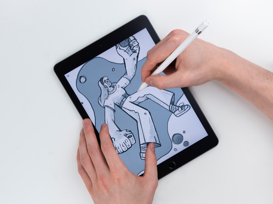
  • Canvas HTML Template Lite vs Full Version: Feature Breakdown

    Canvas HTML Template Lite vs Full Version: Feature Breakdown

    Choosing between a lite and full version of a premium HTML template is one of those decisions that looks simple until you’re halfway through a client project and realise you’re missing a component you need. If you’re evaluating the Canvas HTML Template, here is a direct, no-filler comparison of what each version actually gives you and which one makes sense for your workload in 2026.

    Key Takeaways

    • The Canvas Lite version is a stripped-back starter package suitable for simple, single-purpose projects, while the full version ships with the complete demo library, all UI blocks, and the full plugin set.
    • The full Canvas template includes all section types: singlepage, blocksection, and fullpagelayout niche demos, giving agencies the breadth to serve multiple client types from one purchase.
    • Both versions share the same Bootstrap 5 core, the same Canvas CSS variables, and the same JS bundle, so custom code written for one version is portable to the other.
    • For production client work, the full version pays for itself quickly; Lite is only genuinely cost-effective for single, lightweight personal projects.

    What Canvas Lite Actually Includes

    Canvas Lite is the entry-level distribution of the template. It is intended as a proof-of-concept or personal-project starter, not a commercial-grade toolkit. In practical terms, Lite gives you the core framework: Bootstrap 5 bundled, the style.css base stylesheet, css/font-icons.css, and the two JS files that power Canvas interactivity, js/plugins.min.js and js/functions.bundle.js.

    What Lite omits is significant. You get a limited selection of pre-built HTML pages, typically a small subset of the homepage variants and a handful of inner pages. The full demo library, which runs to hundreds of niche layouts across industries, is absent. Most third-party plugin integrations are either reduced or not configured. If you’re building something straightforward, like a personal portfolio or a minimal landing page, Lite can serve as a workable starting point. If you’re building for clients across different verticals, you’ll hit its ceiling fast.

    white printer paper on white table
    Photo by Daria Nepriakhina πŸ‡ΊπŸ‡¦ on Unsplash

    What the Full Version Adds

    The full Canvas template is a substantially different product in scope. The most obvious addition is the complete demo library: hundreds of pre-built HTML files spanning categories like SaaS, e-commerce, food and restaurant, health, education, agencies, and more. Each demo is a fullpagelayout niche build, meaning it ships as a coherent multi-page set with consistent typography, colour application, and component structure.

    Beyond raw page count, the full version gives you the complete block section library. Every block_section component, hero variants, pricing tables, testimonial sliders, feature grids, FAQ layouts, and so on, is included. This matters practically because building a layout from blocks is far faster than coding components from scratch. If you’re putting together something like a lead generation landing page, you’re pulling from a large component library rather than building each section by hand.

    The full version also ships with all configured plugin integrations: GSAP animations, Swiper sliders, Isotope filtering, and more. These are pre-wired into the Canvas JS bundle and do not require separate CDN loading.

    CSS Variables and Customisation Depth

    Both versions share the same Canvas CSS variable architecture, but the full version gives you more working examples of how those variables behave across different component contexts. The core variables you’ll work with in either version include:

    • –cnvs-themecolor: the primary brand colour, used across buttons, links, and accents
    • –cnvs-themecolor-rgb: the RGB decomposition used for alpha-channel colour mixing
    • –cnvs-primary-font and –cnvs-secondary-font: typography control
    • –cnvs-logo-height and –cnvs-logo-height-sticky: logo sizing in default and sticky header states
    • –cnvs-header-bg and –cnvs-header-sticky-bg: header background colour in each scroll state
    • –cnvs-primary-menu-color and –cnvs-primary-menu-hover-color: navigation link colours

    Here is a practical example of a Canvas theme override you would place in a custom CSS file, applicable to both versions:

    :root {
      --cnvs-themecolor: #e63946;
      --cnvs-themecolor-rgb: 230, 57, 70;
      --cnvs-primary-font: 'Inter', sans-serif;
      --cnvs-logo-height: 48px;
      --cnvs-logo-height-sticky: 36px;
      --cnvs-header-bg: #ffffff;
      --cnvs-header-sticky-bg: rgba(255, 255, 255, 0.95);
      --cnvs-primary-menu-color: #1a1a2e;
      --cnvs-primary-menu-hover-color: #e63946;
    }

    This block alone controls the majority of a brand’s visual identity. The full version lets you validate these changes instantly across dozens of demo pages, which significantly accelerates QA during a client handoff.

    text
    Photo by FORTYTWO on Unsplash

    Demo Library and Niche Coverage

    For agencies and freelancers who work across multiple industries, the full version’s demo library is where the purchase justifies itself quickly. The library covers verticals including SaaS products, professional services, food and hospitality, fitness and wellness, creative portfolios, and e-commerce. Each fullpagelayout demo is built with production-quality HTML structure, not placeholder shells.

    If your workflow includes pitching to clients with a working prototype, having the right niche demo available matters. A client in the food service space responds differently to a blank template than to a configured restaurant or meal kit layout. The post on landing page builders vs custom HTML covers why this kind of pre-structured starting point often beats drag-and-drop builder tools for developers who need output control.

    Lite does not give you this range. You start with a generic structure and build everything yourself. That is fine for a personal project, but it adds hours to any client engagement.

    Who Should Choose Which Version

    The decision is less about budget and more about project scope and frequency. Here is a direct breakdown:

    Scenario Recommended Version
    Personal portfolio or one-off landing page Lite
    Freelancer serving 2 or more client industries Full
    Agency with recurring HTML project delivery Full
    Developer learning Canvas structure for the first time Lite (then upgrade)
    Building a niche product like a SaaS or e-commerce site Full

    If you’re building something like an AI SaaS website where the layout needs to communicate credibility and conversion at launch, starting from a full demo with all component blocks is a meaningful advantage over starting from scratch.

    Using Canvas Builder with Both Versions

    Canvas Builder works with both the Lite and full versions of the Canvas template. The AI-powered layout generator outputs production-ready HTML structured to match Canvas’s class conventions, variable architecture, and JS initialisation patterns. This means you can use Canvas Builder to accelerate your build regardless of which version you purchased.

    The practical advantage of pairing Canvas Builder with the full version is that the generated layouts can reference and extend the broader component library. With Lite, you’re generating layouts into a smaller base, which still works but gives you fewer pre-existing patterns to connect with. If you’re unsure how to prompt the AI effectively for a specific layout need, the guide on writing AI prompts for web design covers the approach in detail.

    Frequently Asked Questions

    Is Canvas Lite free or does it cost money?

    Canvas Lite is typically available at a reduced price compared to the full version and is sometimes offered as a free or minimal-cost starter. Check the current ThemeForest listing for exact pricing, as it varies by promotional period. The full version is a one-time purchase on ThemeForest that includes lifetime updates for the version purchased.

    Can I upgrade from Lite to the full version later?

    Yes, but you purchase the full version as a separate product rather than paying a difference. The good news is that any custom CSS or JS code you wrote for Lite is fully portable because both versions share the same Canvas variable system and JS bundle paths.

    Does the full Canvas template include Bootstrap 5, or do I load it separately?

    Bootstrap 5 is bundled inside Canvas and is loaded through the Canvas asset files. You should never load Bootstrap via a separate CDN link, as this will cause style and component conflicts. The Canvas bundle already includes everything Bootstrap 5 provides.

    What JS files does Canvas require to function?

    Canvas requires two JS files: js/plugins.min.js and js/functions.bundle.js. These are included in both Lite and full versions. Do not reference alternate JS paths or CDN-hosted versions, as Canvas components are initialised through these specific bundles.

    How many niche demo layouts does the full Canvas template include?

    The full Canvas template ships with hundreds of pre-built HTML pages across dozens of industry verticals. The exact count grows with each update, so the current ThemeForest listing reflects the most accurate number. As of 2026, it remains one of the most comprehensive HTML template libraries on the marketplace.

    If you’re working with the Canvas HTML Template and want to generate production-ready layouts faster, try Canvas Builder free and see how much time you save on every project.

  • AI SaaS Website Examples: What Makes Them Convert

    AI SaaS Website Examples: What Makes Them Convert

    Most AI SaaS homepages look impressive and convert poorly β€” a stunning hero, a vague value proposition, and a free trial button that nobody clicks. The difference between AI SaaS websites that generate pipeline and those that simply generate compliments comes down to a small set of structural and copy decisions that are entirely replicable.

    Key Takeaways

    • The highest-converting AI SaaS landing pages lead with a specific, measurable outcome β€” not a feature list or a technology pitch.
    • Social proof placement, hero copy specificity, and CTA friction are the three variables with the biggest measurable impact on AI website conversion rates.
    • Bootstrap 5 layouts built on the Canvas HTML Template can replicate the structural patterns used by top-performing AI SaaS sites without custom development overhead.
    • Conversion lifts on AI landing pages rarely come from visual redesigns β€” they come from removing ambiguity about who the product is for and what happens next.

    What Actually Drives Conversion on AI SaaS Websites

    The most instructive thing you can do before designing an AI SaaS landing page is study pages that are measurably converting, not just ones that win design awards. Sites like Jasper, Otter.ai, Copy.ai, and Notion AI share a pattern that is easy to miss because it looks simple: the hero section answers three questions in under five seconds. What does this do? Who is it for? What do I do right now?

    Generic AI positioning (“the future of work, powered by AI”) fails because it answers none of these. Specific positioning (“write first drafts 3x faster, built for content teams”) answers all three. This is not a copywriting tip β€” it is a structural constraint. Every section of the page either reinforces or undermines the answer to those three questions.

    For teams building with Bootstrap 5, that constraint translates directly into layout decisions: the hero row must not compete with navigation for visual attention, the primary CTA must be visible without scrolling on all viewport sizes, and supporting copy must follow the headline, never precede it.

    A security and privacy dashboard with its status.
    Photo by Zulfugar Karimov on Unsplash

    Hero Section Anatomy That AI SaaS Sites Get Right

    The highest-performing AI SaaS heroes in 2026 consistently follow a column structure: outcome-led headline on the left or centre, a supporting subheadline that names the user and the mechanism, a CTA button with zero ambiguity about what happens on click, and a trust signal (logo bar or testimonial snippet) immediately below the fold.

    Here is a production-ready Bootstrap 5 hero structure you can drop into a Canvas single_page layout:

    <section id="hero" class="py-6 bg-light">
      <div class="container">
        <div class="row align-items-center justify-content-center text-center">
          <div class="col-lg-8">
            <p class="text-uppercase fw-semibold ls-2 mb-3" style="color: var(--cnvs-themecolor);">AI Writing Assistant</p>
            <h1 class="display-4 fw-bold mb-4">Write Better Content in Half the Time</h1>
            <p class="lead text-muted mb-5">Built for marketing teams who need first drafts, not more meetings. Connect your brand voice and go live in minutes.</p>
            <div class="d-flex flex-wrap justify-content-center gap-3">
              <a href="/signup" class="btn btn-lg px-5 py-3 fw-semibold" style="background-color: var(--cnvs-themecolor); color: #fff;">Start Free β€” No Credit Card</a>
              <a href="#demo" class="btn btn-outline-secondary btn-lg px-5 py-3">Watch 2-min Demo</a>
            </div>
            <p class="small text-muted mt-3">Trusted by 4,200+ content teams at Shopify, HubSpot, and Canva</p>
          </div>
        </div>
      </div>
    </section>

    Notice that var(–cnvs-themecolor) is used for brand colour, not --bs-primary. Canvas overrides Bootstrap’s colour system with its own variable layer β€” mixing the two creates inconsistencies that are difficult to debug. The CTA label “Start Free β€” No Credit Card” removes the two most common objections in a single phrase, which is standard practice on pages like Loom and Otter.ai.

    For more detail on structuring CTAs that reduce friction, the post on call-to-action button design covers the science behind button copy, colour contrast, and placement.

    Social Proof Placement and the Trust Sequence

    AI SaaS sites face a specific credibility problem that e-commerce and professional services sites do not: visitors are being asked to trust an automated system with business-critical output. The trust sequence matters more than on almost any other product category.

    The pattern used by the best-converting AI SaaS pages is: logo bar immediately after the hero, case study metric mid-page, and a testimonial carousel anchored above the final CTA. This is not arbitrary β€” it mirrors the psychological sequence of awareness, interest, and decision that a real sales conversation follows.

    A simple, scannable metric row built with Bootstrap 5 grid:

    <section class="py-5 border-top border-bottom">
      <div class="container">
        <div class="row text-center gy-4">
          <div class="col-6 col-md-3">
            <h3 class="display-5 fw-bold" style="color: var(--cnvs-themecolor);">3x</h3>
            <p class="small text-muted mb-0">Faster first drafts</p>
          </div>
          <div class="col-6 col-md-3">
            <h3 class="display-5 fw-bold" style="color: var(--cnvs-themecolor);">4,200+</h3>
            <p class="small text-muted mb-0">Active teams</p>
          </div>
          <div class="col-6 col-md-3">
            <h3 class="display-5 fw-bold" style="color: var(--cnvs-themecolor);">98%</h3>
            <p class="small text-muted mb-0">Customer satisfaction</p>
          </div>
          <div class="col-6 col-md-3">
            <h3 class="display-5 fw-bold" style="color: var(--cnvs-themecolor);">14 min</h3>
            <p class="small text-muted mb-0">Average setup time</p>
          </div>
        </div>
      </div>
    </section>

    Specificity converts. “14 min average setup time” is more credible than “get started in minutes” because it is falsifiable β€” it implies someone measured it.

    Ai brain inside a lightbulb illustrates an idea.
    Photo by Omar:. Lopez-Rincon on Unsplash

    Pricing Section Patterns That Reduce Drop-Off

    AI SaaS pricing pages have a unique challenge: usage-based pricing models are hard to communicate without triggering anxiety. The sites that handle this best anchor one plan visually, call out the most popular tier explicitly, and reduce the number of feature comparison rows to seven or fewer.

    If you are building a comparison table, keep it scannable. Resist the temptation to list every feature β€” visitors read the first three rows and then scan for price. Use a highlighted column with a Canvas theme-colour border to direct attention to the recommended plan:

    .pricing-featured {
      border: 2px solid var(--cnvs-themecolor);
      border-radius: 0.75rem;
      position: relative;
    }
    
    .pricing-badge {
      position: absolute;
      top: -14px;
      left: 50%;
      transform: translateX(-50%);
      background-color: var(--cnvs-themecolor);
      color: #fff;
      font-size: 0.75rem;
      font-weight: 600;
      padding: 4px 14px;
      border-radius: 100px;
      white-space: nowrap;
    }

    This approach is equally applicable when building custom HTML landing pages versus using a drag-and-drop builder β€” the structural logic stays the same, only the implementation differs.

    Whitespace, Hierarchy, and Why Busy AI Pages Lose

    A common failure mode on AI SaaS sites is information density. Founders want to explain how the model works, list every integration, and show the product UI all within the first viewport. This competes with the conversion goal instead of supporting it.

    The pages that convert use whitespace as a layout tool, not a gap to fill. Each section has one job: the hero converts attention into interest, the social proof section converts interest into credibility, the features section converts credibility into desire, and the CTA section converts desire into action. When a section tries to do two jobs, it usually does neither well.

    This is not abstract design theory. For a practical framework on applying whitespace in ways that measurably reduce bounce, see the post on whitespace in web design. The principles map directly to AI SaaS layouts.

    In Canvas, controlling section spacing consistently uses the built-in padding utility classes (py-5, py-6) rather than inline margins. This keeps the layout responsive without per-breakpoint overrides.

    Building AI SaaS Layouts Faster with Canvas Builder

    The structural patterns described above are well-understood by 2026 standards. The bottleneck is execution speed. A typical AI SaaS landing page requires a hero, a logo bar, a metrics row, a features section, a pricing table, a testimonial section, and a footer β€” at minimum seven distinct layout components, each with mobile-responsive variants.

    Building these from scratch on the Canvas HTML Template is achievable, but it requires assembling the right component combinations from Canvas’s extensive library, setting the correct CSS variable values for brand colours and typography, and validating responsiveness across breakpoints.

    Canvas Builder generates these section combinations from a prompt, pre-wired with the correct Canvas variable names (including –cnvs-themecolor, –cnvs-primary-font, and –cnvs-header-bg), so the output drops directly into a Canvas project without variable mismatches or JS path errors. If you want to experiment with prompt structures that produce tighter layout briefs, the guide on writing AI prompts for web design is worth reading before you start.

    For an AI SaaS page specifically, a prompt that specifies the target persona, the primary conversion action, and the number of pricing tiers produces a layout that requires far less manual restructuring than a generic “SaaS landing page” prompt.

    Frequently Asked Questions

    What is the most important element on an AI SaaS landing page?

    The hero headline is the single highest-leverage element. It determines whether a visitor reads further or bounces. The headline needs to state a specific, measurable outcome for a named type of user β€” not a category description of the product. Everything else on the page either supports or undermines the promise made in the first five words.

    How many CTAs should an AI SaaS landing page have?

    One primary CTA repeated at logical decision points β€” typically after the hero, after the features section, and again above the footer. A secondary CTA (such as “Watch Demo”) is acceptable in the hero alongside the primary, but it should be visually subordinate. Adding more than two CTA types causes decision paralysis and measurably reduces click-through on the primary action.

    Should AI SaaS sites show pricing on the landing page?

    Generally yes, for self-serve products targeting SMBs and individual users. Hiding pricing increases bounce rates among high-intent visitors who want to self-qualify before booking a call. For enterprise-focused products with deal sizes above four figures, a “Contact Sales” path alongside a starting price or “from $X/month” anchor is the standard pattern used by Salesforce, Gong, and similar enterprise SaaS sites.

    How does the Canvas HTML Template handle AI SaaS page layouts?

    Canvas is built on Bootstrap 5 and ships with a comprehensive set of pre-built sections covering heroes, feature grids, pricing tables, testimonial carousels, and CTA blocks. Brand colours are controlled via –cnvs-themecolor and related CSS variables, which means global theming requires editing a single variable rather than hunting through stylesheets. Canvas JS is loaded via js/plugins.min.js and js/functions.bundle.js β€” no additional Bootstrap CDN scripts should be added, as Bootstrap 5 is already bundled.

    What conversion rate should a well-optimised AI SaaS landing page target?

    Industry benchmarks for B2B SaaS free-trial signups typically sit between 2% and 5% on paid traffic. Top-performing pages in competitive AI categories (writing, analytics, customer support) can reach 8-12% when the traffic source is highly qualified and the page-to-ad message match is tight. If your page is converting below 2%, the problem is almost always the hero copy or a mismatch between ad audience and landing page persona β€” not the visual design.

    If you’re working with the Canvas HTML Template and want to generate production-ready layouts faster, try Canvas Builder free and see how much time you save on every project.

  • Writing AI Prompts for Web Design: Tips to Get Better Layouts Faster

    Writing AI Prompts for Web Design: Tips to Get Better Layouts Faster

    Most AI-generated web layouts disappoint not because the AI is bad at HTML, but because the prompt that drove it was too vague to produce anything useful. The gap between “make me a landing page” and a production-ready section with correct Bootstrap 5 classes, Canvas variables, and real content is entirely closed by how precisely you write your instructions.

    Why Vague Prompts Fail Every Time

    When you ask an AI to “generate a hero section,” it makes a dozen silent assumptions: which framework, which breakpoints, which heading hierarchy, which image ratio, which button style. Each assumption is a coin flip. The result is technically valid HTML that fits nothing in your actual project.

    The root problem is that AI tools optimise for completion, not fit. They will always return something, and that something will look plausible. The only way to steer output toward genuinely usable code is to eliminate those silent assumptions by stating your constraints explicitly.

    In the context of Canvas and Bootstrap 5 projects, this matters even more. Canvas has its own CSS variable layer on top of Bootstrap. If you ask a generic AI tool for a “Bootstrap hero,” it may reference --bs-primary or reach for a Bootstrap CDN link, both of which conflict with Canvas’s bundled setup. Your prompt needs to specify the environment, not just the output shape.

    a cell phone with an advertisement on the back of it
    Photo by Mockup Free on Unsplash

    Anatomy of a Strong AI Prompt for Web Design

    A reliable AI prompt for a web layout has five components, each one narrowing the solution space:

    1. Context: What template, framework, or system the code must work inside (e.g. Canvas HTML Template, Bootstrap 5 bundled, no third-party CDN)
    2. Section type: Whether you need a hero, features grid, testimonials block, pricing table, or footer
    3. Grid specification: Column count, breakpoints, and nesting (e.g. “a 3-column Bootstrap grid that stacks to 1 column on mobile”)
    4. Content placeholders: Real or representative text, image dimensions, icon style (e.g. “3 feature cards, each with a 48×48 SVG icon, an H3 heading of 5-7 words, and 2 sentences of body text”)
    5. Style constraints: Canvas CSS variables to apply, spacing classes, and any component-specific requirements

    Here is an example of a weak prompt versus a strong one for the same section:

    Weak: “Write a features section with Bootstrap.”

    Strong: “Write a Canvas HTML Template features section using Bootstrap 5 (bundled, no CDN). Use a .container with a 3-column .row using col-lg-4 col-md-6. Each column is a card with class card h-100 p-4 border-0 shadow-sm. Include a 48×48 inline SVG placeholder icon, an H3 heading, and a short paragraph. Apply –cnvs-themecolor to the icon fill. No JavaScript required.”

    The second prompt eliminates guesswork about framework version, layout, spacing, and theming in one pass.

    Canvas-Specific Variables and Classes to Include in Your Prompts

    One of the fastest ways to improve AI output quality for Canvas projects is to paste the correct variable names directly into your prompt. When the AI sees real token names, it uses them rather than inventing alternatives.

    The most useful Canvas CSS variables to reference in prompts are:

    • –cnvs-themecolor for primary brand colour fills, borders, and accents
    • –cnvs-themecolor-rgb for rgba() transparency effects on backgrounds and overlays
    • –cnvs-primary-font and –cnvs-secondary-font for typography overrides
    • –cnvs-header-bg and –cnvs-header-sticky-bg when prompting header variants
    • –cnvs-logo-height and –cnvs-logo-height-sticky for logo sizing (never target #logo img directly)

    A practical prompt fragment might read: “Style the section background using rgba(var(--cnvs-themecolor-rgb), 0.08) to create a tinted panel without overriding the theme colour.” That single instruction produces correctly scoped CSS the AI would never guess on its own.

    Here is a working example of a Canvas-compatible feature card that you could ask an AI to extend or replicate across a full section:

    <div class="col-lg-4 col-md-6 mb-4">
      <div class="card h-100 p-4 border-0 shadow-sm">
        <div class="mb-3">
          <svg width="48" height="48" viewBox="0 0 48 48" fill="none"
               xmlns="http://www.w3.org/2000/svg">
            <circle cx="24" cy="24" r="24"
                    fill="rgba(var(--cnvs-themecolor-rgb), 0.12)"/>
            <path d="M16 24l6 6 10-12"
                  stroke="var(--cnvs-themecolor)"
                  stroke-width="2.5"
                  stroke-linecap="round"
                  stroke-linejoin="round"/>
          </svg>
        </div>
        <h3 class="h5 fw-semibold mb-2">Feature Heading Here</h3>
        <p class="text-muted mb-0">
          A concise two-sentence description of this feature
          and its primary benefit to the user.
        </p>
      </div>
    </div>

    When you include a snippet like this as a “template card” in your prompt, you are giving the AI a concrete pattern to replicate rather than asking it to invent one. Output quality improves dramatically because the structural and styling decisions are already made.

    Computer screen displaying code and text
    Photo by Bernd πŸ“· Dittrich on Unsplash

    Layering Prompts for Complex Layouts

    Complex layouts, like a full landing page for a lead generation campaign or a multi-section product page, should never be requested in one prompt. Instead, use a layered approach across three passes:

    1. Pass 1 – Structure: Ask for the HTML skeleton only, with correct section tags, container/row/col classes, and ID attributes. No inline styles, no content.
    2. Pass 2 – Content: Ask the AI to populate each section with realistic placeholder text, image dimensions, and icon references, referencing the skeleton from Pass 1.
    3. Pass 3 – Style: Ask for a targeted CSS block that applies Canvas variables, custom spacing, and any component-specific overrides. Specify that Bootstrap’s bundled JS (js/functions.bundle.js and js/plugins.min.js) handles interactivity, so no extra script tags are needed.

    This workflow mirrors how an experienced developer actually builds layouts, and it keeps each AI response focused enough to be reviewable in under two minutes. It also makes iteration faster: if the content in Pass 2 is wrong, you fix one pass, not a monolithic blob of mixed HTML and CSS.

    For teams building niche demo pages, such as a newsletter landing page or a service-specific microsite, the layered approach also makes it easier to hand off sections to other team members without context loss.

    Common Prompt Mistakes and How to Fix Them

    Even experienced developers make predictable mistakes when prompting AI for layout code. The most costly ones in 2025 are:

    • Asking for “Bootstrap” without specifying Bootstrap 5: You will often get Bootstrap 4 class names like ml-auto instead of ms-auto, which break silently in Canvas.
    • Not specifying Canvas JS files: The AI may add a CDN script tag for Bootstrap JS. Canvas bundles its JS in js/plugins.min.js and js/functions.bundle.js. Adding a second Bootstrap JS bundle causes conflicts.
    • Omitting responsive behaviour: Always state the breakpoint behaviour explicitly (e.g. “col-lg-3 col-md-6 col-12”) or the AI defaults to desktop-only layouts.
    • Requesting colour values instead of variables: Hardcoding #e84040 instead of var(--cnvs-themecolor) means every global theme change breaks the component.
    • No section context: Saying “write a card” without specifying whether it sits inside a dark background section, a white panel, or a tinted wrapper means the AI cannot make appropriate contrast decisions.

    Fixing these is mostly a matter of building a reusable prompt template you paste at the start of every session. Keep one in a notes app or doc, update it when you discover a new Canvas variable or class pattern, and paste it before every design request.

    Using Canvas Builder to Close the Prompt Gap

    Writing precise prompts is a learnable skill, but it takes time, and even a good prompt still requires you to review, test, and adjust the output manually. Canvas Builder is designed to remove the middle steps: it understands the Canvas template’s structure natively, so it generates layouts using the correct CSS variables, Bootstrap 5 classes, and Canvas JS file references from the start.

    Instead of crafting a 200-word prompt and reviewing whether the AI remembered to use --cnvs-themecolor instead of --bs-primary, you describe the section’s purpose and Canvas Builder handles the environment constraints automatically. For agencies and freelancers managing multiple Canvas-based projects, that consistency across deliverables is worth more than the time saving alone.

    If you are comparing approaches, the detailed breakdown in Landing Page Builders vs Custom HTML is worth reading before committing to a workflow for 2025 and 2026 projects.

    Frequently Asked Questions

    What is the most important thing to include in an AI prompt for web design?

    The framework version and environment context matter most. Specify Bootstrap 5 (bundled), the template system (Canvas HTML Template), and the exact CSS variables you expect the AI to use. Without this, the AI defaults to generic assumptions that produce code requiring extensive fixes.

    Can AI tools generate Canvas-compatible HTML accurately without manual correction?

    General-purpose AI tools can get close if your prompt is detailed enough, but they do not inherently know Canvas’s variable names, JS file paths, or section types. Accuracy improves when you provide a prompt template containing the correct variable names and a reference snippet. Tools purpose-built for Canvas, like Canvas Builder, eliminate this gap entirely.

    How do I stop AI from adding Bootstrap CDN links when using Canvas?

    Explicitly state in your prompt: “Canvas HTML Template bundles Bootstrap 5 internally. Do not add any Bootstrap CDN links or script tags. The only JS files are js/plugins.min.js and js/functions.bundle.js.” Stating the constraint directly is the only reliable way to prevent the AI from adding conflicting dependencies.

    Is layering prompts (structure, content, style) always better than a single prompt?

    For sections with more than two components or any layout requiring responsive behaviour at three breakpoints, yes. Single prompts for complex layouts produce mixed outputs that are harder to review and debug. For simple elements like a single CTA button or a one-column text block, a single focused prompt is usually sufficient.

    What Canvas CSS variable controls the primary brand colour?

    The correct variable is –cnvs-themecolor. For transparency effects, use –cnvs-themecolor-rgb inside an rgba() function. Never reference –bs-primary or –color-primary in Canvas projects, as those variables are not part of Canvas’s theming system and will not respond to global theme changes.

    If you’re working with the Canvas HTML Template and want to generate production-ready layouts faster, try Canvas Builder free and see how much time you save on every project.