
Tag: Bootstrap 5 flexbox utilities

  • Bootstrap 5 Utility Classes: Every Designer Should Know These

    Bootstrap 5 Utility Classes: Every Designer Should Know These

    Most designers spend hours writing custom CSS for spacing, alignment, and visibility — when Bootstrap 5 already ships every one of those tools as a single class. If you are building on a Canvas HTML Template or any Bootstrap-based project, knowing these utility classes cold will cut your development time dramatically.

    Key Takeaways

    • Bootstrap 5 utility classes cover spacing, flexbox, typography, colours, display, and sizing — all without writing a single line of custom CSS.
    • Responsive prefixes (sm, md, lg, xl, xxl) make every utility class adapt to any screen width with minimal markup.
    • Understanding which utilities to stack and when dramatically speeds up layout prototyping inside the Canvas HTML Template.
    • Misusing utilities — such as fighting Bootstrap spacing with overriding CSS — creates technical debt that slows down future edits.

    What Are Bootstrap 5 Utility Classes

    Bootstrap 5 utility classes are single-purpose, atomic CSS classes that apply one specific style rule. Instead of writing .my-card { margin-bottom: 2rem; } in a stylesheet, you add mb-4 directly to the element. The result is faster markup, fewer stylesheet conflicts, and a predictable visual system that any team member can read at a glance.

    Bootstrap 5 ships with utilities covering: spacing (margin and padding), typography, colours, flexbox, display, sizing, borders, shadows, and overflow. In a Canvas project this is especially valuable because Bootstrap 5 is bundled into the template — you never load Bootstrap from a CDN separately. Every utility is already available the moment you open the file.

    For a deeper grounding in the full Bootstrap 5 system, the Bootstrap 5 Complete Guide for Web Designers covers the grid, components, and underlying logic that makes utilities work so well.
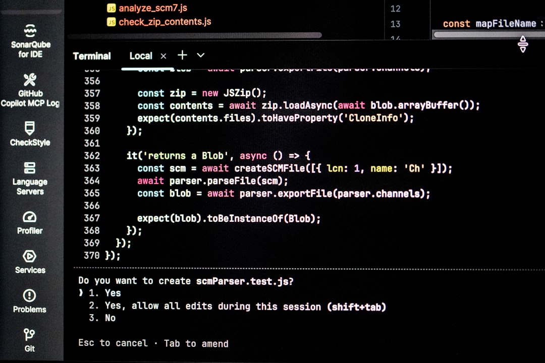
    Computer screen displaying lines of code
    Photo by Bernd 📷 Dittrich on Unsplash

    Spacing Utilities: Margin and Padding Done Right

    Spacing utilities follow a consistent naming pattern: {property}{sides}-{size}. The property is either m (margin) or p (padding). The sides are t (top), b (bottom), s (start/left), e (end/right), x (horizontal), y (vertical), or blank for all sides. Sizes run from 0 to 5, with 5 equalling 3rem by default.

    <section class="py-6 px-3 px-md-5">
      <div class="container">
        <h2 class="mb-3">Section Heading</h2>
        <p class="mb-0">No bottom margin on the last paragraph.</p>
      </div>
    </section>

    Notice the responsive prefix on px-md-5 — the horizontal padding only increases to 5 on medium screens and above. This pattern eliminates the need for media query blocks in your CSS file. Canvas extends Bootstrap spacing to include size 6 and 7, giving you more range without overriding variables.

    Display and Flexbox Utilities: Controlling Layout Without CSS

    Display utilities (d-none, d-block, d-flex, d-inline-flex, d-grid) are among the most frequently used in any Bootstrap template. Combine them with responsive prefixes to show or hide elements at specific breakpoints — a pattern used constantly in navigation, hero sections, and card layouts.

    <div class="d-flex align-items-center justify-content-between gap-3">
      <img src="logo.svg" alt="Logo" class="flex-shrink-0">
      <nav class="d-none d-md-flex gap-4">
        <a href="#">Home</a>
        <a href="#">About</a>
        <a href="#">Contact</a>
      </nav>
    </div>

    The gap-3 class applies a consistent gap between flex children without touching padding or margin on the children themselves — a significant improvement Bootstrap 5 introduced over version 4. The post Bootstrap 5 Flexbox: Aligning and Spacing Elements With Ease covers the full range of flex utilities in detail, including alignment combinations that solve the most common layout problems.

    text
    Photo by Ferenc Almasi on Unsplash

    Typography and Colour Utilities: Consistent Text Styling at Scale

    Bootstrap 5 typography utilities let you control font size, weight, alignment, line height, and text transform without a single custom rule. The display classes (display-1 through display-6) are ideal for hero headings. Font weight utilities run from fw-light to fw-bold and fw-bolder. Text alignment classes (text-start, text-center, text-end) all accept responsive prefixes.

    <div class="text-center text-md-start">
      <h1 class="display-4 fw-bold mb-2">Launch Faster</h1>
      <p class="fs-5 text-muted mb-4">Build production-ready layouts without writing custom CSS.</p>
      <a href="#" class="btn btn-dark btn-lg">Get Started</a>
    </div>

    Colour utilities work on text (text-primary, text-muted, text-dark) and backgrounds (bg-primary, bg-light, bg-dark). In Canvas, these map through –cnvs-themecolor and the Bootstrap 5 colour system simultaneously — so customising the theme colour variable updates both Bootstrap component colours and Canvas-specific elements in one change. This is covered in depth in the post about Bootstrap 5 Typography: Font Sizes, Weights, and Display Classes.

    Border, Shadow, and Sizing Utilities: Polish Without the CSS Overhead

    Three categories of utility class that designers often overlook are borders, shadows, and sizing. These cover the finishing details that separate a rough prototype from a polished layout.

    Border utilities include border, border-0, border-top, border-bottom, rounded, rounded-circle, rounded-pill, and radius size variants from rounded-0 to rounded-5. If you need precise corner control beyond Bootstrap’s defaults, the CSS Border Radius Generator produces the exact value to drop into a custom variable or inline style.

    Shadow utilities (shadow-none, shadow-sm, shadow, shadow-lg) apply box shadows in a single class. For custom shadow values beyond Bootstrap’s three defaults, the CSS Box Shadow Generator lets you dial in depth and spread visually before copying the CSS.

    Sizing utilities set width and height as percentages of the parent: w-25, w-50, w-75, w-100, h-100, mw-100, min-vw-100. These are invaluable for responsive images, full-height containers, and equal-height card columns.

    <div class="row g-4">
      <div class="col-12 col-md-6">
        <div class="border rounded-4 shadow-sm p-4 h-100">
          <h3 class="fw-semibold mb-2">Feature One</h3>
          <p class="text-muted mb-0">Consistent height without any custom flexbox CSS.</p>
        </div>
      </div>
      <div class="col-12 col-md-6">
        <div class="border rounded-4 shadow-sm p-4 h-100">
          <h3 class="fw-semibold mb-2">Feature Two</h3>
          <p class="text-muted mb-0">h-100 keeps both cards the same height automatically.</p>
        </div>
      </div>
    </div>

    Combining Utilities: Real-World Patterns Designers Reuse

    The real productivity gain comes from stacking utilities in predictable combinations. These patterns appear repeatedly across landing pages, SaaS dashboards, and portfolio sites — knowing them by name means you can build a section in minutes rather than writing and debugging CSS rules.

    Here are the most reused combinations in 2025 Canvas and Bootstrap projects:

    1. Full-width dark hero: bg-dark text-white py-6 text-center on a section element with display-3 fw-bold on the heading.
    2. Centred content column: col-12 col-md-8 col-lg-6 mx-auto text-center inside a container row — no custom centering CSS needed.
    3. Icon + text row: d-flex align-items-start gap-3 on the wrapper, flex-shrink-0 on the icon, and mb-0 on the last paragraph in the text block.
    4. Sticky-top navbar: sticky-top bg-white shadow-sm py-3 on the nav element — three classes replace a typical block of custom header CSS.
    5. Pill badge: badge rounded-pill bg-primary text-uppercase fw-semibold on a span — used in pricing tables and feature highlights.

    When building a SaaS landing page, these combinations accelerate the entire above-the-fold section. For context on how utility-first layouts translate into conversion-focused design, see the guide on SaaS Landing Page Design: The Blueprint That Converts Trials to Customers.

    Frequently Asked Questions

    Do Bootstrap 5 utility classes work inside the Canvas HTML Template without any extra setup?

    Yes. Canvas bundles Bootstrap 5 directly — every utility class is available immediately. You do not need to load Bootstrap from a CDN or install any additional packages. Simply add the utility classes to your HTML markup and they apply instantly.

    Can I use Bootstrap utility classes alongside custom Canvas CSS variables?

    Absolutely. Bootstrap utilities and Canvas CSS variables operate at different levels. You would use a utility like py-5 for spacing and then set –cnvs-themecolor in your stylesheet to control the brand colour that feeds into background and text colour utilities. They complement each other without conflict.

    What is the difference between Bootstrap 4 and Bootstrap 5 spacing utilities?

    Bootstrap 5 replaced the directional classes ml- and mr- with logical properties ms- (margin-start) and me- (margin-end). It also added the gap- utility for flex and grid containers, which was not available in Bootstrap 4. If you are migrating an older template, updating these class names is the most common source of spacing bugs.

    Are Bootstrap 5 utility classes responsive by default?

    Most utilities accept responsive breakpoint prefixes (sm, md, lg, xl, xxl). For example, d-none d-md-block hides an element on mobile and shows it from medium screens up. Display, flexbox, spacing, text alignment, and float utilities all support responsive variants. A small number — such as shadow and border — do not have responsive variants by default in Bootstrap 5.

    Should I use Bootstrap utility classes or write custom CSS for complex layouts?

    Use utility classes for spacing, alignment, colour, typography, and simple display logic. Write custom CSS — ideally using Canvas variables — when you need values outside Bootstrap’s scale, complex animations, pseudo-element styling, or component-specific overrides that would require many stacked utilities to express. The rule of thumb: if a combination of three or more utilities is reused more than twice, extract it into a named CSS class instead.

    If you’re working with the Canvas HTML Template and want to generate production-ready layouts faster, try Canvas Builder free and see how much time you save on every project.

  • Bootstrap 5 Flexbox: Aligning and Spacing Elements With Ease

    Bootstrap 5 Flexbox: Aligning and Spacing Elements With Ease

    Flexbox transformed the way developers approach layout — and Bootstrap 5 puts its full power behind a set of utility classes that let you align, distribute, and space elements without writing a single line of custom CSS. If you’ve ever wrestled with vertical centring or fought with justify-content in raw CSS, this guide will show you how Bootstrap 5 makes those problems routine to solve.

    Key Takeaways

    • Bootstrap 5 flexbox utilities replace the need for most custom alignment CSS, keeping your stylesheets lean and your markup predictable.
    • Classes like justify-content- and align-items- map directly to CSS flexbox properties and support responsive breakpoint prefixes.
    • Gap utilities (gap-*) provide a cleaner alternative to margin hacks when spacing flex children.
    • Combining flex utilities with Bootstrap’s grid system gives you precise, responsive control over almost any layout pattern.

    What Is Bootstrap 5 Flexbox and Why It Matters

    Bootstrap 5 ships with a comprehensive set of flexbox utility classes built directly on the CSS Flexible Box Layout specification. Unlike Bootstrap 3’s float-based grid, Bootstrap 5’s entire grid system runs on flexbox under the hood — which means you already have a flex container the moment you use .row.

    The utility classes extend this further, letting you apply flexbox behaviour to any element beyond the grid. They follow a consistent naming pattern that mirrors native CSS: d-flex creates a flex container, and every subsequent utility controls how its children behave. If you want a broader foundation before diving into flex specifics, the Bootstrap 5 Complete Guide for Web Designers covers the full picture from grid to components.

    In 2025 and beyond, fast, maintainable layout code is a competitive advantage — and Bootstrap 5 flexbox utilities deliver exactly that.

    a row of grey boxes
    Photo by Jaime Nugent on Unsplash

    Creating a Flex Container With d-flex

    The starting point for any flexbox layout in Bootstrap 5 is d-flex. Apply it to a parent element and all direct children immediately become flex items. You can also use d-inline-flex when you need the container itself to behave as an inline element.

    <div class="d-flex">
      <div class="p-3 bg-light border">Item 1</div>
      <div class="p-3 bg-light border">Item 2</div>
      <div class="p-3 bg-light border">Item 3</div>
    </div>

    By default, flex items line up in a row and stretch to match the tallest sibling. From here, every other utility class refines the behaviour of these items. Breakpoint prefixes work exactly as you would expect: d-md-flex activates flex layout only at medium viewports and above, keeping stacked mobile layouts intact.

    Controlling Horizontal Alignment With justify-content

    The justify-content-* classes control how flex items are distributed along the main axis (horizontal by default). Bootstrap 5 provides six variants that map directly to CSS values:

    • justify-content-start — items packed to the left (default)
    • justify-content-end — items packed to the right
    • justify-content-center — items centred horizontally
    • justify-content-between — equal space between items, none on the edges
    • justify-content-around — equal space around each item
    • justify-content-evenly — equal space between all items including edges

    A classic use case is a navigation bar where the logo sits on the left and action buttons on the right. justify-content-between handles this in one class:

    <nav class="d-flex justify-content-between align-items-center p-3 bg-dark">
      <a href="#" class="text-white fw-bold">BrandName</a>
      <div class="d-flex gap-3">
        <a href="#" class="text-white">Features</a>
        <a href="#" class="text-white">Pricing</a>
        <a href="#" class="btn btn-primary btn-sm">Sign Up</a>
      </div>
    </nav>

    All classes support responsive prefixes — justify-content-lg-between applies only from large viewports up, letting you stack items on mobile without overrides.

    person holding black leather lace up boots
    Photo by LOGAN WEAVER | @LGNWVR on Unsplash

    Vertical Alignment With align-items and align-self

    The align-items-* classes control alignment on the cross axis (vertical when items flow in a row). This is where Bootstrap 5 flexbox finally makes vertical centring trivial:

    • align-items-start — items align to the top
    • align-items-center — items centre vertically
    • align-items-end — items align to the bottom
    • align-items-baseline — items align on their text baseline
    • align-items-stretch — items stretch to fill the container height (default)

    When you need to override the parent’s alignment for a single child, align-self-* applies the same values to the individual item. This is useful when one card in a row needs to hug the bottom while others stay centred.

    Combining d-flex, justify-content-center, and align-items-center on a container with a defined height produces a perfectly centred element — a pattern that used to require multiple hacks in pre-flexbox CSS:

    <div class="d-flex justify-content-center align-items-center" style="min-height: 300px; background: #f8f9fa;">
      <div class="text-center">
        <h2>Perfectly Centred</h2>
        <p class="text-muted">Horizontal and vertical, zero custom CSS.</p>
      </div>
    </div>

    Spacing Flex Children With gap Utilities

    Before Bootstrap 5.1, developers relied on margin utilities like me-3 on each flex child to create spacing. The problem: the last child always needed a margin override, and responsive adjustments multiplied the classes quickly.

    gap- utilities solve this cleanly. Applied to the flex container, they add consistent spacing between all children without affecting the outer edges — exactly how CSS gap works natively. Bootstrap maps gap-0 through gap-5 to its spacing scale, and you can also use row-gap- and column-gap-* to control axes independently.

    <div class="d-flex flex-wrap gap-3">
      <div class="p-3 bg-primary text-white rounded">Card A</div>
      <div class="p-3 bg-primary text-white rounded">Card B</div>
      <div class="p-3 bg-primary text-white rounded">Card C</div>
      <div class="p-3 bg-primary text-white rounded">Card D</div>
    </div>

    For more on Bootstrap 5 layout utilities beyond flexbox — including spacing, sizing, and display helpers — the post on 7 Bootstrap 5 Utilities That Will Transform Your Layout Design is worth reading alongside this one.

    If you need to calculate exact pixel-to-rem conversions for custom gap values that extend Bootstrap’s scale, the px to rem converter saves time when writing override CSS.

    Flex Direction, Wrap, and Order

    Not every layout flows left to right. Bootstrap 5 includes flex-row, flex-row-reverse, flex-column, and flex-column-reverse to control the direction items flow. flex-column is particularly useful for sidebar navigation lists, step-by-step processes, or stacked form layouts.

    When items overflow their container, flex-wrap allows them to wrap onto new lines — essential for responsive card grids that don’t use the full Bootstrap grid system. Pair it with gap-* for clean, self-managing layouts:

    <div class="d-flex flex-wrap gap-4 justify-content-start">
      <div class="p-4 bg-light border rounded" style="min-width: 200px;">Feature 1</div>
      <div class="p-4 bg-light border rounded" style="min-width: 200px;">Feature 2</div>
      <div class="p-4 bg-light border rounded" style="min-width: 200px;">Feature 3</div>
      <div class="p-4 bg-light border rounded" style="min-width: 200px;">Feature 4</div>
      <div class="p-4 bg-light border rounded" style="min-width: 200px;">Feature 5</div>
    </div>

    The order-* utilities (order-0 through order-5, plus order-first and order-last) let you reorder items visually without changing the DOM — useful for mobile-first reordering where a hero CTA might need to appear above the headline image on small screens but after it on desktop. These work alongside Bootstrap’s grid utilities to give you granular control, as covered in detail in the Bootstrap 5 Complete Guide for Web Designers.

    Frequently Asked Questions

    What is the difference between d-flex and the Bootstrap grid row class?

    The .row class already applies display: flex internally, but it is designed to work with .col-* children and includes negative margins for gutters. d-flex is a general-purpose utility you apply to any element when you want flexbox behaviour without the grid’s column system — for example, aligning a nav, a button group, or a card header.

    Can I use Bootstrap 5 flexbox utilities responsively?

    Yes. Every flexbox utility supports Bootstrap 5’s breakpoint prefixes: sm, md, lg, xl, and xxl. For example, flex-column flex-md-row stacks items vertically on mobile and switches to a horizontal row from medium viewports upward — no media queries required in your CSS.

    How do gap utilities differ from using margin utilities on flex children?

    gap- adds spacing between items only — it does not add space on the outer edges of the container. Margin utilities like me-3 add space to every item including the last, requiring you to either remove the final margin or use :last-child overrides. gap- is simpler, cleaner, and the recommended approach in Bootstrap 5.1 and later.

    Does the Canvas HTML Template support Bootstrap 5 flexbox utilities out of the box?

    Yes. The Canvas HTML Template is built on Bootstrap 5, so all flexbox utility classes — including d-flex, justify-content-, align-items-, and gap-* — are available in every Canvas layout without loading any additional library.

    When should I use flexbox utilities versus the Bootstrap grid?

    Use the grid (row/col) when you need column-based layouts with gutters, responsive column widths, and multi-row alignment. Use flexbox utilities when you need fine-grained control over alignment, spacing, or direction within a single row of elements — like navigation bars, button groups, icon-text pairs, or card footers. The two systems complement each other and are commonly used together in the same layout.

    If you’re working with the Canvas HTML Template and want to generate production-ready layouts faster, try Canvas Builder free and see how much time you save on every project.