Author: canvas-builder

  • Open Graph Tags: The Complete Guide to Social Media Previews

    Open Graph Tags: The Complete Guide to Social Media Previews

    Every time someone shares a link on LinkedIn, Twitter, Facebook, or Slack, the platform reaches into your page’s <head> and pulls out a title, description, and image to display as a rich preview card. If you haven’t told it what to use, it guesses — and it usually guesses wrong. Open Graph tag generators are the handful of meta tags that put you back in control of that first impression.

    Key Takeaways

    • Open Graph tags are HTML meta tags placed in your page’s <head> that control how your content appears when shared on social media platforms.
    • The four required tags are og:title, og:type, og:image, and og:url — everything else is optional but strongly recommended.
    • Your og:image should be at least 1200×630 pixels to render correctly across Facebook, LinkedIn, and most messaging apps.
    • Twitter/X uses its own twitter:card meta tags, which complement — but do not replace — Open Graph tags.

    What Are Open Graph Tags and Why Do They Matter

    Open Graph (OG) is a protocol originally developed by Facebook in 2010 to standardise how web pages describe themselves to social platforms. The protocol works through <meta> tags added to your HTML document’s <head> section, using a property attribute prefixed with og:. When a crawler from Facebook, LinkedIn, Slack, Discord, WhatsApp, or iMessage visits your URL, it reads these tags and uses them to construct a preview card.

    Without OG tags, platforms fall back on whatever they can scrape — often the first paragraph of body text, a random image from the page, or the raw URL itself. The result is an unprofessional preview that reduces click-through rates and undermines the credibility of every page you publish. For any project built on the Canvas HTML Template, adding OG tags is a zero-effort, high-return step that should be part of every deployment checklist.

    The Four Required Open Graph Tags

    The Open Graph protocol defines four tags as mandatory. Without all four, some platforms will refuse to render a preview card entirely.

    1. og:title — The title of your page as it should appear in the preview. This can differ from your HTML <title> tag; keep it under 60 characters to avoid truncation.
    2. og:type — The type of content: website for most pages, article for blog posts, product for e-commerce items.
    3. og:image — An absolute URL to the image that will appear in the preview card. This is the single most important tag for visual impact.
    4. og:url — The canonical URL of the page. This prevents duplicate preview cards when the same content is accessible via multiple URLs.
    <head>
      <meta charset="UTF-8">
      <title>SaaS Platform for Growing Teams | Acme</title>
    
      <!-- Required Open Graph tags -->
      <meta property="og:title" content="SaaS Platform for Growing Teams">
      <meta property="og:type" content="website">
      <meta property="og:image" content="https://www.example.com/assets/images/og-homepage.jpg">
      <meta property="og:url" content="https://www.example.com/">
    </head>

    Beyond the four required tags, a small set of optional properties significantly improves how your previews render and how platforms index your content.

    • og:description — A 1–2 sentence summary shown beneath the title. Keep it under 155 characters. Write it like ad copy: the person reading it has not visited your site yet.
    • og:site_name — Your brand name, displayed separately from the page title on many platforms (e.g. “Acme” appears below the title on Facebook).
    • og:image:width and og:image:height — Explicitly declaring image dimensions lets crawlers skip a separate HTTP request to determine the image size, speeding up preview generation.
    • og:locale — Declares the language and territory of your content, e.g. enGB or enUS. Useful for multi-region sites.
    <!-- Recommended Open Graph tags -->
    <meta property="og:title" content="SaaS Platform for Growing Teams">
    <meta property="og:type" content="website">
    <meta property="og:url" content="https://www.example.com/">
    <meta property="og:image" content="https://www.example.com/assets/images/og-homepage.jpg">
    <meta property="og:image:width" content="1200">
    <meta property="og:image:height" content="630">
    <meta property="og:description" content="Acme helps growing teams automate workflows and close more deals — without the enterprise price tag.">
    <meta property="og:site_name" content="Acme">
    <meta property="og:locale" content="en_US">

    Twitter Card Tags: The Companion Protocol

    Twitter/X does read og:title, og:description, and og:image as fallbacks, but its own twitter: namespace gives you explicit control over how previews render on the platform. The most important tag is twitter:card, which accepts four values: summary, summarylargeimage, app, or player. For almost every website, summarylargeimage is the correct choice — it renders a full-width image above the title and description.

    <!-- Twitter Card tags -->
    <meta name="twitter:card" content="summarylargeimage">
    <meta name="twitter:site" content="@AcmeHQ">
    <meta name="twitter:title" content="SaaS Platform for Growing Teams">
    <meta name="twitter:description" content="Automate workflows and close more deals — without the enterprise price tag.">
    <meta name="twitter:image" content="https://www.example.com/assets/images/og-homepage.jpg">
    <meta name="twitter:image:alt" content="Screenshot of the Acme dashboard showing pipeline and task views">

    Notice that twitter: tags use name= rather than property=. This is a common mistake that causes Twitter to silently ignore the tags. Always double-check this distinction when reviewing your markup. For a landing page built to drive signups — like the patterns covered in SaaS Website Design: Building a B2B Homepage That Converts — getting the Twitter card right is especially valuable because your sales team will be sharing those links constantly.

    Open Graph Image Best Practices

    The og:image is responsible for the vast majority of the click-through lift you will get from optimising your Open Graph tags. Getting it right involves more than just picking a nice photo.

    • Dimensions: The recommended size is 1200×630 pixels at a 1.91:1 aspect ratio. Facebook and LinkedIn both crop square images, so avoid using portrait-orientation assets as your OG image.
    • File size: Keep images under 8 MB (Facebook’s hard limit), but aim for under 300 KB in practice. Platforms cache your image, but slow initial fetches can cause previews to fail entirely the first time a URL is shared.
    • Text overlays: If you add text to the image, keep it in the central 80% of the canvas — edges are sometimes cropped on mobile previews.
    • Absolute URLs only: The og:image value must begin with https://. Relative paths like /images/og.jpg are silently ignored by most crawlers.
    • Unique images per page: Avoid using the same generic brand image on every page. A blog post, a pricing page, and a product page should each have a distinct OG image that reflects the content.
    • Cache invalidation: Social platforms cache OG images aggressively. If you update an image, use Facebook’s Sharing Debugger and LinkedIn’s Post Inspector to force a re-scrape.

    If you are building event pages or registration flows — for example, the kind of high-conversion design discussed in Webinar Registration Pages: Design Elements That Fill Seats — a branded OG image with the event name and date dramatically increases the perceived legitimacy of links shared in email campaigns and community groups.

    Testing and Validating Your Open Graph Implementation

    Writing the tags is only half the work. Before publishing, verify that crawlers can read them correctly. Each major platform provides its own inspection tool.

    • Facebook Sharing Debugger (developers.facebook.com/tools/debug) — shows exactly what Facebook will display and flags warnings such as missing tags or images that are too small.
    • LinkedIn Post Inspector (www.linkedin.com/post-inspector) — useful because LinkedIn sometimes applies stricter caching than Facebook; use the “Inspect” button to force a refresh.
    • Twitter Card Validator — now part of the developer portal after the 2023 platform changes; still functional for verifying twitter:card output.
    • OpenGraph.xyz — a third-party preview tool that shows how your tags render across multiple platforms simultaneously without requiring you to log into each.

    A common issue is that platforms cannot reach your og:image URL because it sits behind authentication, a firewall, or a robots.txt rule that blocks crawlers. Always test with a publicly accessible URL. For sites generated with Canvas Builder, your HTML is served as static files, which means OG image URLs are straightforward — no authentication barriers to worry about.

    Frequently Asked Questions

    Do Open Graph tags affect SEO rankings?

    Open Graph tags do not directly influence Google’s ranking algorithm, but they have an indirect effect. Better social previews increase click-through rates on shared links, which drives traffic signals. They also reduce bounce rates from social referrals because visitors arrive with accurate expectations about the content. Every page on a professionally built site — including those covered in guides like How to Build a Complete Business Website with Canvas HTML Template — should include a full set of OG tags as standard practice.

    What happens if I leave out the og:image tag?

    If no og:image is present, most platforms will attempt to find a suitable image by scanning the page’s visible <img> elements. This is unreliable — the chosen image may be a logo, an icon, or a decorative background element. In some cases, the preview will render with no image at all, which significantly reduces engagement on shared links.

    Can I use different titles and descriptions for OG versus my HTML title and meta description?

    Yes, and in many cases you should. Your HTML <title> is optimised for search engine results pages, where it competes alongside ten other blue links. Your og:title appears in a social context where it competes with the content in someone’s feed. These are different copy problems. A title that works for SEO may be too dry for social sharing, and vice versa.

    How often do social platforms re-scrape Open Graph tags?

    Platforms cache OG data aggressively. Facebook typically re-scrapes a URL every 30 days or when someone uses the Sharing Debugger to trigger a manual refresh. LinkedIn caches for 7 days. If you update your OG tags or replace an image, use the platform’s respective inspection tool to invalidate the cache immediately, otherwise the old preview will continue appearing for weeks.

    Do Open Graph tags work on single-page applications (SPAs)?

    This is a known challenge with SPAs built in React, Vue, or similar frameworks. Social crawlers generally do not execute JavaScript, so if your OG tags are injected into the DOM by client-side code, crawlers will not see them. Solutions include server-side rendering (SSR), static site generation (SSG), or a prerendering service. If you are building static HTML pages — as with Canvas-based projects — this problem does not apply, since the tags are present in the raw HTML file.

    If you’re working with the Canvas HTML Template and want to generate production-ready layouts faster, try Canvas Builder free and see how much time you save on every project.

  • Canvas Builder vs Competitors: Why It Wins for HTML Templates

    Canvas Builder vs Competitors: Why It Wins for HTML Templates

    Most AI tools that claim to generate HTML give you something generic — unstyled divs, inline styles, and Bootstrap CDN links that clash with your existing setup. If you’re building on the Canvas HTML Template, that generic output creates more cleanup work than it saves — which is exactly the problem Canvas Builder was built to solve.

    Key Takeaways

    • Generic AI HTML generators produce output that conflicts with Canvas’s variable names, JS files, and Bootstrap 5 integration — requiring significant manual correction.
    • Canvas Builder generates layout code that uses correct Canvas CSS variables like –cnvs-themecolor and the proper JS files (js/plugins.min.js and js/functions.bundle.js).
    • Competitor tools lack awareness of Canvas section types — singlepage, blocksection, and fullpagelayout — making their output structurally incompatible without heavy rework.
    • For teams shipping Canvas projects at scale in 2025 and beyond, a purpose-built AI tool eliminates an entire category of debugging that general-purpose tools create.

    What General AI Tools Get Wrong About HTML Generation

    Tools like general-purpose AI coding assistants — and even dedicated HTML generators — share a common flaw: they generate to a lowest common denominator. When you ask for a hero section or a pricing block, they produce something that works in isolation but ignores the template context you’re actually working in.

    The most common failures when using general AI tools with Canvas include:

    • Loading a Bootstrap CDN link separately, which conflicts with the Bootstrap 5 bundle already included in Canvas
    • Referencing –bs-primary or –color-primary instead of Canvas’s actual variable –cnvs-themecolor
    • Pointing to incorrect JS paths instead of js/plugins.min.js and js/functions.bundle.js
    • Targeting #logo img with custom CSS when Canvas controls logo sizing through –cnvs-logo-height and –cnvs-logo-height-sticky
    • Generating layout structures that don’t map to Canvas’s section type conventions

    Each of these mistakes looks minor on its own. Together they produce a layout that either breaks visually or requires 30 minutes of debugging before it resembles a usable Canvas page. If you’re regularly building with Canvas — whether for SaaS homepages or PropTech platforms — that overhead compounds fast.

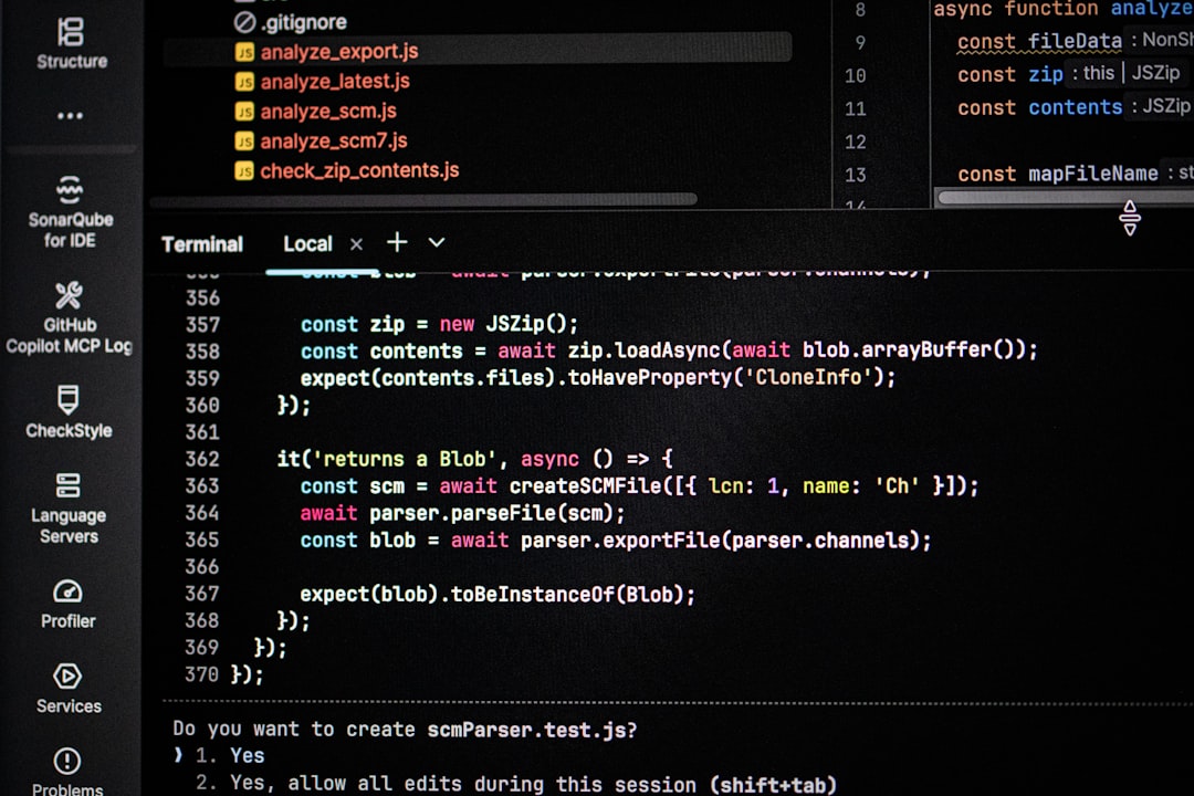
    Computer screen displaying code and terminal output
    Photo by Bernd 📷 Dittrich on Unsplash

    Canvas Builder’s Variable Accuracy: A Real-World Difference

    The clearest demonstration of how Canvas Builder differs from competitors is in the CSS it produces. Consider a simple theme colour override. A generic AI tool will give you something like this:

    :root {
      --bs-primary: #e74c3c;
      --color-primary: #e74c3c;
    }
    

    Neither variable does anything in a Canvas project. The correct approach — which Canvas Builder applies automatically — uses Canvas’s own custom property:

    :root {
      --cnvs-themecolor: #e74c3c;
      --cnvs-themecolor-rgb: 231, 76, 60;
    }
    

    The same accuracy applies to typography and header styling. Canvas Builder will output variables like –cnvs-primary-font, –cnvs-secondary-font, –cnvs-header-bg, and –cnvs-primary-menu-color where appropriate — not improvised alternatives that require manual replacement before the page renders correctly.

    Section Type Awareness No Competitor Offers

    Canvas’s architecture distinguishes between three layout types: singlepage (a complete page with header, hero, content sections, and footer), blocksection (a single reusable component intended to be dropped into an existing layout), and fullpagelayout (a multi-page niche demo structure). This distinction matters enormously when generating code.

    A general AI tool has no concept of these types. It will generate a full page scaffold when you only needed a block, or produce a fragment when you needed a complete page — and you won’t know which until you try to integrate it. Canvas Builder’s generation is structured around these types from the start, so a block_section output arrives ready to paste into your layout without wrapping it in redundant containers or stripping out duplicate headers.

    Here is an example of a correctly structured Canvas block section for a features row — the kind of clean, paste-ready output Canvas Builder produces:

    <section id="features" class="section">
      <div class="content-wrap">
        <div class="container">
          <div class="row col-mb-50">
            <div class="col-md-4">
              <div class="feature-box fbox-center fbox-light fbox-effect">
                <div class="fbox-icon">
                  <i class="bi-lightning-charge"></i>
                </div>
                <div class="fbox-content">
                  <h3>Fast Delivery</h3>
                  <p>Deploy layouts in minutes, not hours.</p>
                </div>
              </div>
            </div>
            <div class="col-md-4">
              <div class="feature-box fbox-center fbox-light fbox-effect">
                <div class="fbox-icon">
                  <i class="bi-code-slash"></i>
                </div>
                <div class="fbox-content">
                  <h3>Clean Code</h3>
                  <p>Production-ready output, every time.</p>
                </div>
              </div>
            </div>
            <div class="col-md-4">
              <div class="feature-box fbox-center fbox-light fbox-effect">
                <div class="fbox-icon">
                  <i class="bi-grid"></i>
                </div>
                <div class="fbox-content">
                  <h3>Canvas Native</h3>
                  <p>Built for Canvas — not a generic template.</p>
                </div>
              </div>
            </div>
          </div>
        </div>
      </div>
    </section>
    
    text
    Photo by Ferenc Almasi on Unsplash

    Correct Bootstrap 5 Handling Without Duplication

    Canvas bundles Bootstrap 5 internally. Loading it again from a CDN — something almost every competitor tool does by default — introduces version conflicts and style overrides that are notoriously difficult to trace. The symptom is usually subtle: a button that looks slightly wrong, a grid column that breaks at an unexpected Bootstrap breakpoint tester, a modal that fires incorrectly.

    Canvas Builder never outputs a Bootstrap CDN link. It respects the fact that Bootstrap 5 is already present in the template, and generates grid and component markup that relies on that existing inclusion. If you’re building a niche site that uses Canvas’s full Bootstrap grid system, this single distinction saves significant debugging time.

    It also means the generated JS references are always correct. Canvas Builder outputs:

    <script src="js/plugins.min.js"></script>
    <script src="js/functions.bundle.js"></script>
    

    Not a collection of CDN-sourced jQuery plugins, not a reference to bootstrap.bundle.min.js from an third-party URL, and not paths that assume a different folder structure than Canvas uses.

    Speed Advantage for Multi-Niche and Client Projects

    The practical speed difference between Canvas Builder and a general AI HTML generator becomes most visible when you’re building multiple layouts across different industries. A general tool requires the same manual correction pass on every single output — fix the variables, remove the duplicate Bootstrap link, restructure the section, correct the JS paths. Canvas Builder eliminates that correction pass entirely.

    For agencies or freelancers delivering Canvas projects across verticals — whether that’s an EdTech enrollment site or a SaaS demo — the compounded time saving across five or ten projects per month is substantial. Competitor tools charge for generation volume while requiring you to fix their output; Canvas Builder charges for generation that works.

    The AI Prompt Helper tool also accelerates the process by helping you write precise generation prompts — so the output you get on the first pass is closer to what you actually need.

    Honest Limitations to Consider

    Canvas Builder is purpose-built — and that specificity is a feature, not a constraint, if you’re working with Canvas. But it is worth stating clearly: if you are not working with the Canvas HTML Template, Canvas Builder is not the right tool. General-purpose AI HTML generators have their place for teams working across multiple different templates or building from scratch without a template foundation.

    Within the Canvas ecosystem, however, the comparison is not close. No general-purpose tool has knowledge of Canvas’s CSS variables generator naming conventions, its section type architecture, its bundled Bootstrap 5 integration, or its specific JS file structure. Those are not details a generic tool can approximate — they require dedicated implementation, which is what Canvas Builder provides.

    Frequently Asked Questions

    Can I use a general AI coding assistant to generate Canvas HTML layouts?

    You can, but the output will reliably contain errors specific to Canvas — incorrect CSS variable names, duplicate Bootstrap links, wrong JS paths, and structurally incompatible section markup. You will spend more time correcting the output than you saved generating it.

    What CSS variables does Canvas use that other tools get wrong?

    The primary ones are –cnvs-themecolor and –cnvs-themecolor-rgb for colour, –cnvs-primary-font and –cnvs-secondary-font for typography, and –cnvs-logo-height and –cnvs-logo-height-sticky for logo sizing. Generic tools typically substitute Bootstrap or custom variable names that have no effect in a Canvas project.

    Does Canvas Builder work for all Canvas section types?

    Yes. Canvas Builder generates output appropriate to the section type you need — singlepage, blocksection, or fullpagelayout — so the output integrates into your Canvas project without structural rework.

    Why is loading Bootstrap CDN separately a problem in Canvas?

    Canvas already bundles Bootstrap 5 internally. Adding a CDN reference loads Bootstrap twice, which causes version conflicts, style overrides, and unpredictable component behaviour. Canvas Builder never outputs a Bootstrap CDN link.

    Is Canvas Builder suitable for agencies building multiple client sites on Canvas?

    Yes — the per-project time saving is most significant for teams shipping Canvas layouts repeatedly. Eliminating the manual correction pass on every generated output, across multiple projects per month, represents a meaningful reduction in delivery time and debugging overhead.

    If you’re working with the Canvas HTML Template and want to generate production-ready layouts faster, try Canvas Builder free and see how much time you save on every project.

    Where the Alternatives Win

    General-purpose AI coding tools are the better choice when you are not building on the Canvas HTML Template at all — their output is framework-agnostic and works cleanly with custom setups, other commercial themes, or projects that manage their own Bootstrap CDN inclusion. If your team needs to generate HTML across multiple unrelated template systems, locking into a purpose-built tool like Canvas Builder adds workflow friction rather than removing it. For one-off or exploratory prototypes outside the Canvas ecosystem, the overhead of context-specific variable accuracy simply does not apply.

    The Verdict: Who Should Choose What

    Canvas Builder is the right choice for developers and agencies who regularly ship production projects on the Canvas HTML Template and cannot afford time lost to debugging mismatched CSS variables, duplicate Bootstrap loading, or structurally incorrect section output. If your work is Canvas-specific and at any meaningful scale, the purpose-built accuracy described in this article compounds into real hours saved. If you are working outside the Canvas template — or only need HTML generation occasionally across varied stacks — a general-purpose AI coding assistant will serve you better without the specialisation you do not need.

  • Webinar Registration Pages: Design Elements That Fill Seats

    Webinar Registration Pages: Design Elements That Fill Seats

    Most webinar registration pages lose attendees before the form is even seen — not because the topic lacks appeal, but because the page fails to communicate value fast enough. Getting the design right means understanding exactly which elements build urgency, reduce friction, and push visitors to commit their time.

    Key Takeaways

    • A clear, benefit-led headline above the fold is the single highest-impact element on any webinar registration page.
    • Social proof, speaker credibility, and a visible countdown timer consistently lift registration rates by reducing hesitation.
    • Keeping your registration form to three fields or fewer is the most effective way to reduce drop-off before submission.
    • Using a dedicated landing page template built on Bootstrap 5 — rather than a generic page layout — gives you structural control over every conversion element from the start.

    What Belongs Above the Fold

    Visitors decide within seconds whether a webinar is worth their time. Every element above the fold must earn its place. The headline should name a specific outcome — not the webinar format, not the host company, but the result the attendee will leave with. “How to Cut Your Agency’s Reporting Time by 40%” converts better than “Join Our Marketing Webinar” every time.

    Below the headline, include three supporting elements in a tight layout: a short subheadline that qualifies the audience (“For SaaS founders scaling past $1M ARR”), the date and time with timezone, and your registration call-to-action button. Do not hide the form below a long scroll. On desktop, place the form in a right-column card alongside the headline. On mobile, stack it immediately beneath the hero text.

    If you are building on the Canvas HTML Template, the two-column section structure handles this split naturally using Bootstrap 5’s grid. A col-lg-6 split keeps the hero copy and form card balanced without custom CSS overrides.

    <section class="py-5">
      <div class="container">
        <div class="row align-items-center g-5">
          <div class="col-lg-6">
            <span class="badge bg-warning text-dark mb-3">Live Webinar — 14 May 2025</span>
            <h2 class="display-5 fw-bold mb-3">How to Cut Agency Reporting Time by 40%</h2>
            <p class="lead text-muted">A 60-minute live session for marketing agency owners ready to reclaim billable hours.</p>
            <ul class="list-unstyled mt-4">
              <li class="mb-2"><strong>Date:</strong> Wednesday 14 May 2025</li>
              <li class="mb-2"><strong>Time:</strong> 11:00 AM EST / 4:00 PM GMT</li>
              <li class="mb-2"><strong>Duration:</strong> 60 minutes + live Q&A</li>
            </ul>
          </div>
          <div class="col-lg-6">
            <div class="card shadow-sm border-0 p-4">
              <h3 class="h5 mb-4">Reserve Your Free Seat</h3>
              <form>
                <div class="mb-3">
                  <input type="text" class="form-control" placeholder="Full Name" required>
                </div>
                <div class="mb-3">
                  <input type="email" class="form-control" placeholder="Work Email" required>
                </div>
                <div class="mb-3">
                  <input type="text" class="form-control" placeholder="Company Name">
                </div>
                <button type="submit" class="btn btn-primary w-100">Secure My Spot</button>
              </form>
            </div>
          </div>
        </div>
      </div>
    </section>
    
    a website page with a star theme
    Photo by Team Nocoloco on Unsplash

    Building Speaker Credibility Quickly

    People register for people as much as for topics. A speaker bio section placed immediately below the hero establishes authority and reduces the “who is this?” hesitation that kills conversions. Avoid long biographical paragraphs. Instead, use a headshot, name, title, and three bullet-pointed credentials that are directly relevant to the webinar subject.

    If there are multiple speakers, use a card grid rather than a stacked layout — it is faster to scan and visually signals a higher-value event. For posts covering conversion-focused page architecture in more depth, the guide on 10 Canvas HTML Template Sections Every Landing Page Needs covers how to sequence credibility blocks for maximum effect.

    Using Urgency Without Manipulation

    Urgency is the most misused element on registration pages. Fake countdown timers and fabricated seat limits destroy trust the moment a visitor returns to find the “only 12 seats left” counter reset. Legitimate urgency comes from real constraints: a live Q&A that cannot be replayed, a genuinely limited cohort, or a deadline-linked bonus for early registrants.

    A countdown timer to the webinar start date is both honest and effective. Use a lightweight JavaScript snippet tied to the actual event date rather than a rolling 48-hour timer that resets per session. Place it prominently near the registration form, not buried in the footer.

    <div class="text-center py-4 bg-light rounded mb-4">
      <p class="small text-muted mb-1 text-uppercase fw-semibold">Webinar Starts In</p>
      <div id="countdown" class="d-flex justify-content-center gap-3 fs-4 fw-bold">
        <span id="days">00</span><span>d</span>
        <span id="hours">00</span><span>h</span>
        <span id="minutes">00</span><span>m</span>
        <span id="seconds">00</span><span>s</span>
      </div>
    </div>
    
    <script>
      const eventDate = new Date("2025-05-14T16:00:00Z").getTime();
      const timer = setInterval(function() {
        const now = new Date().getTime();
        const distance = eventDate - now;
        if (distance < 0) { clearInterval(timer); return; }
        document.getElementById("days").textContent = String(Math.floor(distance / 86400000)).padStart(2,"0");
        document.getElementById("hours").textContent = String(Math.floor((distance % 86400000) / 3600000)).padStart(2,"0");
        document.getElementById("minutes").textContent = String(Math.floor((distance % 3600000) / 60000)).padStart(2,"0");
        document.getElementById("seconds").textContent = String(Math.floor((distance % 60000) / 1000)).padStart(2,"0");
      }, 1000);
    </script>
    
    turned-on monitor
    Photo by Stephen Phillips – Hostreviews.co.uk on Unsplash

    Social Proof That Actually Works on Registration Pages

    Generic testimonials (“Great webinar!”) do almost nothing. Specific social proof tied to outcomes converts. Aim for one of three formats: a registrant count (“2,340 people have already registered”), a past-attendee quote that names a concrete result, or recognisable company logos of past participants where permission exists.

    If this is a first-time event with no existing attendees to quote, use speaker-adjacent proof instead — publications the speaker has appeared in, podcast episodes, or organisations they have trained. Displayed as a simple “As seen in” logo strip, this transfers credibility without requiring fabricated testimonials.

    For landing pages where social proof architecture and enrollment psychology overlap — particularly in education contexts — the post on EdTech Website Design: Driving Enrollment with Better UX covers comparable conversion patterns worth reviewing.

    Registration Form Design: Fewer Fields, More Signups

    Every additional field on a HTML registration page reduces completion rates. For a free webinar, three fields is the maximum before drop-off accelerates: name, email, and one qualifying field (role, company, or how they heard about the event). Remove phone number fields entirely from free registrations — the friction-to-value ratio is never justified at this stage of commitment.

    The submit button label matters more than most designers assume. “Register Now” is passive. “Secure My Free Seat”, “Save My Spot”, or “Join the Live Session” use specificity and mild possession language that lifts click-through. Style the button with strong visual contrast against the card background and ensure it spans the full width of the form on mobile.

    Apply Canvas’s theme colour variable directly to custom button styles so your brand colour carries through without hard-coded hex values:

    .btn-webinar-primary {
      background-color: var(--cnvs-themecolor);
      border-color: var(--cnvs-themecolor);
      color: #fff;
      width: 100%;
      padding: 0.75rem 1.5rem;
      font-weight: 600;
      border-radius: 6px;
      transition: opacity 0.2s ease;
    }
    
    .btn-webinar-primary:hover {
      opacity: 0.88;
      color: #fff;
    }
    

    The Post-Registration Page Is Part of the Conversion

    The confirmation page is where most webinar funnels drop the ball. A blank “You’re registered” message wastes the highest-intent moment in the entire funnel. Use the confirmation page to do four things: confirm the registration visually with the date and time repeated, deliver the calendar invite link immediately, introduce one secondary action (follow on LinkedIn, join a community, download a pre-read), and set an expectation for the reminder email sequence.

    A well-constructed landing page template handles this as a separate thank-you.html file with its own meta redirect prevention so the page is not re-submittable. On Canvas, this is a straightforward block_section page with a centred confirmation card, an icon, and a clearly labelled “Add to Calendar” button pointing to a pre-generated ICS file or a Google Calendar link with the event details encoded in the URL.

    For teams building multiple campaign pages quickly, Canvas Builder generates production-ready layout structures for registration and confirmation pages without requiring manual assembly of every section from scratch.

    Frequently Asked Questions

    How many form fields should a webinar registration page have?

    Three fields is the practical maximum for a free webinar: name, email, and one qualifying question. Every additional field reduces completion rates measurably. For paid or high-ticket webinars where lead qualification matters more, four to five fields can be justified, but always test against a shorter version first.

    Should the registration form be above the fold or further down the page?

    For desktop, place the form in a right-side card alongside your hero headline so it is visible without scrolling. On mobile, stack it immediately after the headline and date. Requiring visitors to scroll past speaker bios and social proof before reaching the form increases drop-off significantly on shorter-intent traffic.

    What is the best way to structure a webinar registration page in HTML?

    Use a two-column Bootstrap 5 grid for the hero section — headline and details on the left, form card on the right. Follow this with a speaker credentials section, a social proof strip, an agenda or “what you’ll learn” block, and a second CTA before the footer. Keep the page single-column on mobile with the form appearing early in the scroll order.

    Do countdown timers actually increase webinar registrations?

    Yes, when they are tied to the genuine event date rather than a rolling artificial deadline. A real countdown to the live session start time creates authentic urgency and reminds visitors that the event is time-bound. Fake timers that reset per visit erode trust and can actively reduce conversion rates once visitors notice.

    Can I use the Canvas HTML Template to build a webinar registration page?

    Canvas HTML Template is well-suited for webinar registration pages. Its Bootstrap 5 grid handles the two-column hero layout cleanly, its card components work for the registration form, and CSS variables generator like –cnvs-themecolor make brand-consistent button and accent styling straightforward. Use a blocksection or singlepage format depending on whether you need a standalone page or a full site with a dedicated registration section.

    If you’re working with the Canvas HTML Template and want to generate production-ready layouts faster, try Canvas Builder free and see how much time you save on every project.
  • Restaurant Website Design with Bootstrap 5 — Full Tutorial

    Restaurant Website Design with Bootstrap 5 — Full Tutorial

    Key Takeaways

    • Bootstrap 5’s grid system and utility classes give you a fast, mobile-first foundation for a professional restaurant website without writing excessive custom CSS.
    • The Canvas HTML Template extends Bootstrap 5 with prebuilt sections, components, and CSS variables that dramatically accelerate restaurant site builds.
    • Key restaurant website sections — hero, menu, gallery, reservations, and location — each have distinct layout and UX requirements that Bootstrap handles cleanly when structured correctly.
    • Using CSS custom properties alongside Canvas variables keeps your brand colours and typography consistent across every section without repetitive overrides.

    Why Bootstrap 5 Is a Strong Choice for Restaurant Websites

    Restaurant websites have a specific set of requirements: they need to load fast on mobile (most bookings happen on phones), display food photography beautifully, and make core actions — viewing the menu, making a reservation, finding the address — effortless. Bootstrap 5 addresses all three through its mobile-first grid, responsive image utilities, and flexible component library.

    The removal of jQuery in Bootstrap 5 also means leaner JavaScript, which contributes directly to faster page loads — a ranking factor that matters when local diners are searching for somewhere to eat tonight. Paired with the Canvas HTML Template and Canvas Builder, you can generate production-ready layout scaffolding in minutes rather than hours.

    If you are deciding between a single-page and multi-page structure for your restaurant site, the post on Canvas One Page Demo vs Multi-Page: When to Use Each Format covers the trade-offs in useful detail.

    Project Structure and Canvas Setup

    Start with Canvas’s standard file structure. Your root directory should include style.css, css/font-icons.css, js/plugins.min.js, and js/functions.bundle.js. Never load Bootstrap from a CDN separately — Canvas bundles Bootstrap 5 internally, so a separate CDN import will cause conflicts.

    A clean base HTML shell for a restaurant page looks like this:

    <!DOCTYPE html>
    <html lang="en">
    <head>
      <meta charset="UTF-8">
      <meta name="viewport" content="width=device-width, initial-scale=1">
      <title>Ember & Oak — Modern Grill</title>
      <link rel="stylesheet" href="css/font-icons.css">
      <link rel="stylesheet" href="style.css">
      <style>
        :root {
          --cnvs-themecolor: #c0392b;
          --cnvs-primary-font: 'Playfair Display', serif;
          --cnvs-secondary-font: 'Inter', sans-serif;
          --cnvs-logo-height: 52px;
          --cnvs-logo-height-sticky: 40px;
        }
      </style>
    </head>
    <body>
      <!-- header, sections, footer go here -->
      <script src="js/plugins.min.js"></script>
      <script src="js/functions.bundle.js"></script>
    </body>
    </html>

    Notice that –cnvs-themecolor sets the brand accent (a deep restaurant red in this case), and logo sizing is handled entirely through –cnvs-logo-height and –cnvs-logo-height-sticky — not by targeting #logo img directly.

    Hero Section: Full-Bleed Food Photography

    The hero is the most conversion-critical section on a restaurant site. A full-bleed background image with an overlay, a short headline, and two clear CTAs (View Menu, Book a Table) is the proven pattern. Bootstrap’s position utilities and Canvas’s section classes make this straightforward:

    <section class="section py-0 min-vh-75 d-flex align-items-center"
             style="background: url('images/hero-grill.jpg') center/cover no-repeat;">
      <div class="overlay" style="background: rgba(0,0,0,0.52);"></div>
      <div class="container position-relative text-white text-center">
        <h1 class="display-3 fw-bold mb-3">Fire-Kissed Flavour,<br>Every Evening</h1>
        <p class="lead mb-5">Open Tuesday to Sunday, 5 pm — 11 pm</p>
        <a href="#menu" class="btn btn-lg me-3"
           style="background-color: var(--cnvs-themecolor); border:none; color:#fff;">
          View Menu
        </a>
        <a href="#reservations" class="btn btn-lg btn-outline-light">
          Book a Table
        </a>
      </div>
    </section>

    The min-vh-75 class ensures the hero occupies at least 75% of the viewport on every screen size. Using var(--cnvs-themecolor) on the primary button keeps the brand colour consistent without hardcoding a hex value in multiple places.

    Restaurant menus on the web fail most often because of poor information hierarchy. A two-column card grid on desktop that collapses to a single column on mobile is the correct starting point. Bootstrap’s col-md-6 and col-lg-4 modifiers handle this without a single media query in your custom CSS.

    <section id="menu" class="section">
      <div class="container">
        <div class="row justify-content-center mb-5">
          <div class="col-lg-6 text-center">
            <h2 class="mb-2">Our Menu</h2>
            <p class="text-muted">Seasonal ingredients, prepared simply and well.</p>
          </div>
        </div>
        <div class="row g-4">
          <div class="col-md-6 col-lg-4">
            <div class="card border-0 shadow-sm h-100">
              <img src="images/ribeye.jpg" class="card-img-top" alt="Dry-Aged Ribeye">
              <div class="card-body">
                <div class="d-flex justify-content-between align-items-start">
                  <h5 class="card-title mb-1">Dry-Aged Ribeye</h5>
                  <span class="fw-bold" style="color: var(--cnvs-themecolor);">$48</span>
                </div>
                <p class="card-text text-muted small">
                  28-day aged, served with truffle butter and roasted heritage carrots.
                </p>
              </div>
            </div>
          </div>
          <!-- Repeat .col-md-6.col-lg-4 blocks for additional dishes -->
        </div>
      </div>
    </section>

    The g-4 gutter class on the row provides consistent spacing between cards. Using Bootstrap’s shadow-sm and border-0 keeps cards clean without heavy styling. For more complex image-heavy layouts, the CSS Box Shadow Generator lets you dial in the exact shadow depth before committing it to your stylesheet.

    Reservations and Contact: Converting Intent into Bookings

    A reservation form needs to be short, clear, and reassuring. Date, time, party size, name, and phone number are the only fields that matter at this stage. Everything else creates friction. Use Bootstrap’s form-control and form-select classes for consistent styling, and wrap the form in a row with a location/map column beside it on larger screens:

    <section id="reservations" class="section bg-light">
      <div class="container">
        <div class="row g-5 align-items-center">
          <div class="col-lg-6">
            <h2 class="mb-4">Reserve Your Table</h2>
            <form>
              <div class="row g-3">
                <div class="col-sm-6">
                  <label class="form-label">Full Name</label>
                  <input type="text" class="form-control" placeholder="Jane Smith">
                </div>
                <div class="col-sm-6">
                  <label class="form-label">Phone</label>
                  <input type="tel" class="form-control" placeholder="+1 555 000 0000">
                </div>
                <div class="col-sm-6">
                  <label class="form-label">Date</label>
                  <input type="date" class="form-control">
                </div>
                <div class="col-sm-6">
                  <label class="form-label">Guests</label>
                  <select class="form-select">
                    <option>1</option>
                    <option>2</option>
                    <option>3–4</option>
                    <option>5+</option>
                  </select>
                </div>
                <div class="col-12">
                  <button type="submit" class="btn w-100 py-3 fw-semibold text-white"
                          style="background-color: var(--cnvs-themecolor);">
                    Confirm Reservation
                  </button>
                </div>
              </div>
            </form>
          </div>
          <div class="col-lg-6">
            <iframe
              src="https://www.google.com/maps/embed?pb=!1m18!..."
              width="100%" height="380"
              style="border:0; border-radius: 12px;"
              allowfullscreen loading="lazy">
            </iframe>
          </div>
        </div>
      </div>
    </section>

    The two-column layout — form on the left, embedded map on the right — is a high-performing pattern for local businesses because it satisfies both conversion intent and location discovery in one section. For similar food-sector project approaches, the post on How to Design a Meal Kit Subscription Website with Canvas shows how these section patterns adapt across food industry niches.

    Performance and SEO: Finishing Touches That Matter in 2025

    A technically sound restaurant site needs a few non-negotiable finishing touches before launch:

    1. Lazy-load all food images using loading="lazy" on every <img> tag below the fold. This alone can cut initial page load time significantly on image-heavy menu sections.
    2. Add structured data (JSON-LD) with @type: Restaurant so Google can display opening hours, cuisine type, and star ratings directly in search results.
    3. Use descriptive alt text on every food image — “dry-aged ribeye with truffle butter” outperforms “dish1.jpg” for both accessibility and image search.
    4. Compress images to WebP format. A hero image at 2500px wide should weigh under 200 KB in WebP with quality set to 80.
    5. Set a canonical URL if your menu is accessible from multiple paths, to avoid duplicate content penalties.

    The Food Tech Website Design Trends and Best Practices for 2026 post covers how performance expectations for food-sector sites continue to rise alongside mobile usage, which makes these optimisations non-optional for competitive local search.

    Frequently Asked Questions

    Do I need to know Bootstrap 5 in depth to build a restaurant site with Canvas?

    No. Canvas abstracts most of Bootstrap 5’s complexity into prebuilt section types and Canvas-specific utility classes. A working knowledge of Bootstrap’s grid system — rows, columns, and responsive Bootstrap breakpoint tester modifiers — is sufficient for most restaurant site builds.

    Which Canvas section type is best for a restaurant website?

    A singlepage section type works well for most restaurant sites — it keeps the header, hero, menu, reservations, and footer in a single scrollable experience that converts well on mobile. If the restaurant has multiple locations or a large menu, a fullpage_layout with internal navigation may be more appropriate.

    How do I change the theme colour across the entire site without editing every element?

    Set –cnvs-themecolor once in the :root block of your stylesheet. Every Canvas component and any custom elements that reference var(--cnvs-themecolor) will update automatically. This is far more maintainable than hardcoding a hex value repeatedly.

    Can I add an online ordering system or booking widget to a Bootstrap 5 restaurant site?

    Yes. Third-party booking platforms like OpenTable or Resy provide embeddable iframes or JavaScript widgets that integrate cleanly into any Bootstrap 5 layout. Place the widget code inside a standard Bootstrap container and grid column to ensure it remains responsive.

    What is the recommended image format for restaurant food photography on a Canvas site?

    WebP is the recommended format in 2025 for its combination of quality and file size. Use a <picture> element with a WebP source and a JPEG fallback for older browsers. Hero images should be compressed to under 200 KB and all below-fold images should carry the loading="lazy" attribute.

    If you’re working with the Canvas HTML Template and want to generate production-ready layouts faster, try Canvas Builder free and see how much time you save on every project.
  • App Download Landing Page: Getting Users to Tap Install

    App Download Landing Page: Getting Users to Tap Install

    An app download landing page has one job: get the visitor to tap or click install before they scroll away, get distracted, or talk themselves out of it. Most pages fail that job because they borrow the structure of a marketing brochure instead of designing around the moment of decision.

    Key Takeaways

    • A high-converting app download landing page leads with a single, device-specific call to action above the fold — everything else is supporting evidence.
    • Social proof, app store ratings, and screenshot carousels reduce friction and build the confidence users need before they commit to an install.
    • The Canvas HTML Template gives you a production-ready foundation for mobile app landing pages without building component by component from scratch.
    • Page speed and mobile responsiveness are not optional — app users are already on their phones, and a slow or broken page will cost you the install.

    What Belongs Above the Fold

    The first screenful of your app landing page determines whether the visitor stays or bounces. For an app download landing page, the above-the-fold area needs to answer three questions instantly: what does this app do, who is it for, and where can I get it?

    That means your hero section needs a concise headline (not a tagline — a plain-language description of the core benefit), a supporting subheading that adds one layer of context, a rendered phone mockup or short looping video, and your App Store and Google Play badge links. Nothing else belongs here. Navigation menus, feature grids, and testimonials carousels all belong below the fold where they serve as supporting evidence after the visitor has decided they are interested.

    Using Canvas, a Bootstrap 5 hero section with stacked CTA badges looks like this:

    <section id="hero" class="py-6 bg-light">
      <div class="container">
        <div class="row align-items-center">
          <div class="col-lg-6">
            <h2 class="display-4 fw-bold mb-3">Track Every Run. Own Every Goal.</h2>
            <p class="lead mb-4">Pace Pro gives runners real-time coaching, personalised training plans, and race-day insights — all in one app.</p>
            <div class="d-flex flex-wrap gap-3">
              <a href="#ios-link" class="button button-rounded button-large">
                <i class="fa-brands fa-apple me-2"></i>App Store
              </a>
              <a href="#android-link" class="button button-rounded button-large button-border">
                <i class="fa-brands fa-google-play me-2"></i>Google Play
              </a>
            </div>
          </div>
          <div class="col-lg-6 text-center mt-5 mt-lg-0">
            <img src="images/app-mockup.png" alt="Pace Pro app screenshot" class="img-fluid">
          </div>
        </div>
      </div>
    </section>
    the best way to build web apps without code
    Photo by Team Nocoloco on Unsplash

    Presenting Features Without Overwhelming Visitors

    Feature sections are where most app landing page designs go wrong. Developers list every capability the app has. Users only care about the three or four things that are relevant to the problem they are trying to solve. The rule for 2025 and beyond is simple: lead with outcomes, not features.

    Instead of “Advanced route mapping algorithm,” write “Never get lost on a trail again.” Instead of “Biometric data integration,” write “See your heart rate, pace, and elevation in one glance.” Each feature point should map to a specific frustration or desire your target user already has.

    Structurally, a three-column icon grid using Bootstrap 5 works well here. Keep each item to one icon, one short headline, and two sentences maximum:

    <section id="features" class="py-6">
      <div class="container">
        <div class="row g-4 text-center">
          <div class="col-md-4">
            <div class="feature-box">
              <i class="bi bi-lightning-charge fs-1 text-primary mb-3 d-block"></i>
              <h3 class="h5 fw-semibold">Real-Time Coaching</h3>
              <p class="text-muted">Audio cues and pace alerts keep you on target without ever glancing at your screen.</p>
            </div>
          </div>
          <div class="col-md-4">
            <div class="feature-box">
              <i class="bi bi-calendar-check fs-1 text-primary mb-3 d-block"></i>
              <h3 class="h5 fw-semibold">Personalised Plans</h3>
              <p class="text-muted">Training schedules built around your goal race, current fitness level, and available days.</p>
            </div>
          </div>
          <div class="col-md-4">
            <div class="feature-box">
              <i class="bi bi-bar-chart-line fs-1 text-primary mb-3 d-block"></i>
              <h3 class="h5 fw-semibold">Race-Day Insights</h3>
              <p class="text-muted">Post-run breakdowns that tell you exactly where you gained or lost time.</p>
            </div>
          </div>
        </div>
      </div>
    </section>

    If your app has more than six key features, consider a tabbed layout or a scrolling alternating-row section rather than expanding the grid. The 10 Canvas HTML Template sections every landing page needs post covers alternating feature rows in more detail.

    App screenshots are your most persuasive selling tool because they show, rather than tell. A well-structured screenshot Bootstrap carousel lets visitors mentally place themselves inside the app before they download it. The goal is to reduce the uncertainty that stops someone tapping install.

    Canvas includes multiple slider and carousel components. For a mobile app HTML template context, a horizontal scrolling screenshot strip inside phone frame mockups works better than a full-width hero slider. Keep autoplay off or set a slow interval — forcing users through slides at pace feels patronising. For guidance on choosing the right carousel style for your layout, the Canvas Slider and Carousel Components guide is worth reading before you decide.

    One practical tip: order your screenshots by the user journey, not by what looks impressive in isolation. Show the onboarding screen, then the core dashboard, then a results or achievement screen. That narrative arc mirrors the experience the visitor is about to have, which makes the decision to install feel less like a leap of faith.

    a hand holding a game controller
    Photo by Egor Komarov on Unsplash

    Social Proof: Ratings, Reviews, and Download Numbers

    Social proof on an app landing page works differently from an agency portfolio or SaaS homepage. Visitors are not evaluating your company — they are assessing whether this specific app is worth the storage space and the learning curve. That means your social proof needs to be app-centric and specific.

    The most effective elements to include, in rough order of impact, are:

    1. App store star rating displayed as a visual star row with the review count alongside it
    2. Short user quotes that mention a specific outcome (“I knocked four minutes off my 10k in six weeks”)
    3. Download milestone if you have reached a round number worth stating (100,000+ downloads)
    4. Press mentions if relevant publications have covered the app

    Avoid generic testimonials like “Great app, highly recommend.” They add length without adding credibility. If your user reviews are thin, focus on the star rating and a single strong quote rather than padding with weak ones. The same principle applies to any conversion-focused page — a point covered in depth in the post on SaaS website design and B2B homepage conversion.

    Mobile Performance and Page Speed

    The users visiting your app download landing page are disproportionately on mobile devices. A page that loads slowly on a 4G connection will bleed installs. Canvas is built on Bootstrap 5 and loads efficiently, but the assets you add on top of the template — particularly phone mockup images and looping video backgrounds — can erode that performance quickly.

    Practical steps to keep your page fast:

    • Export phone mockup images as WebP with a maximum width of 600px at 2x — they will look sharp on retina displays without being oversized
    • Load Canvas JS files js/plugins.min.js and js/functions.bundle.js at the bottom of the body, never in the head
    • Defer any third-party analytics scripts so they do not block the first contentful paint
    • Use the loading="lazy" attribute on all below-the-fold images
    • Test your page with Google PageSpeed Insights and target a mobile score above 85 before launch

    Canvas’s CSS variables generator also let you make global style changes with a single declaration. Swapping the theme colour for your brand colour is a one-line change that keeps your page feeling native to your app’s visual identity:

    :root {
      --cnvs-themecolor: #e8431a;
      --cnvs-themecolor-rgb: 232, 67, 26;
    }

    CTA Placement: Repeat the Install Button at the Right Moments

    A single CTA at the top of the page is not enough for visitors who scroll through your full content before deciding. The principle of progressive commitment means that some visitors need to read the features section, scan the reviews, and see the screenshots before they are ready to act. If your download button only appears in the hero, those visitors reach the bottom of the page with no obvious next step.

    Place your App Store and Google Play buttons in at least three locations: the hero section, immediately after the screenshot carousel or social proof block, and in the footer. If your page is long, consider a sticky bottom bar on mobile that stays visible as the user scrolls. This is especially effective for app landing pages because the action — tapping a store badge — is a single tap that takes seconds, unlike a form submission.

    Keep the button copy consistent and action-oriented. “Download Free” outperforms “Get the App” because it answers the implicit question “will this cost me anything?” before the visitor has to ask. Small copy decisions at the CTA level have measurable effects on conversion rates, and this applies whether you are building an app landing page, an agency portfolio, or any other conversion-focused page.

    Frequently Asked Questions

    Should an app download landing page link to both the App Store and Google Play?

    Yes, unless your app is genuinely platform-exclusive. Show both badges prominently and use device detection if you want to surface the relevant store first — but always keep both visible so users on the other platform are not excluded.

    How long should an app landing page be?

    Long enough to answer every objection a first-time visitor might have, and no longer. For most apps, that means a hero, a feature section, a screenshot carousel, social proof, and a closing CTA — roughly four to six sections on a single-page layout. Avoid padding the page with content that does not serve the install decision.

    Is Canvas HTML Template suitable for a mobile app landing page?

    Yes. Canvas includes app-focused demo layouts and all the component types you need — hero sections, icon grids, carousels, testimonial blocks, and CTA rows. Because it is built on Bootstrap 5, everything is responsive by default, which matters significantly for a page primarily viewed on mobile devices.

    What is the best way to show app screenshots on a landing page?

    Wrap screenshots in device frame mockups and present them in a horizontally scrollable carousel or a static three-up row. Order them to follow the user journey from onboarding to core feature to outcome, rather than selecting screens based purely on visual appeal.

    How do I track installs driven by my landing page?

    Use UTM parameters on your App Store and Google Play links so you can attribute installs to your landing page traffic in analytics. Both platforms also support custom referral tracking through their respective developer consoles, which gives you more granular data on which page sections drove the most clicks.

    If you’re working with the Canvas HTML Template and want to generate production-ready layouts faster, try Canvas Builder free and see how much time you save on every project.

  • Building a Solar Energy Website with Canvas HTML Template

    Building a Solar Energy Website with Canvas HTML Template

    Solar energy companies are competing hard for attention online, and a poorly structured website costs you leads before a visitor ever reads your pitch. The good news is that the Canvas HTML Template gives you a production-ready foundation for building a credible, high-converting solar energy website without starting from scratch.

    Key Takeaways

    • Canvas’s Bootstrap 5 grid and section system makes it straightforward to build a structured solar energy website with stats, services, testimonials, and a lead form.
    • Customising –cnvs-themecolor to a solar-appropriate amber or green immediately aligns the visual identity with renewable energy branding.
    • A single-page layout works well for solar lead generation, while a multi-page structure suits companies offering installation, maintenance, and commercial services separately.
    • Real conversion gains come from combining a strong above-the-fold hero, a savings calculator section, and a clear CTA — all achievable with Canvas components.

    Why Canvas Is Well-Suited for a Renewable Energy Website

    A solar energy website needs to do several things simultaneously: build trust with homeowners or businesses, communicate technical credibility, show social proof, and drive enquiries or quote requests. Canvas handles all of these through its modular section system. Because it is built on Bootstrap 5, the grid is responsive by default, which matters enormously when roughly half of all solar research now happens on mobile devices.

    Canvas also ships with pre-built components — counters, icon boxes, testimonial sliders, and pricing tables — that map directly onto the content types a renewable energy website needs. Rather than building a stats section from scratch, you adapt an existing one. This is the same efficiency argument made in the post on how to build a complete business website with Canvas HTML Template, and it applies equally well here.

    white and blue solar panels
    Photo by Anders J on Unsplash

    Structuring Your Solar Website Layout

    Before writing a single line of HTML, map out the sections your solar energy website needs. A typical structure for a residential solar installer looks like this:

    1. Hero — headline, subheadline, and a primary CTA (“Get a Free Quote”)
    2. Social proof bar — logos of accreditations (MCS, Which? Trusted Trader, etc.) or a stat strip
    3. Services — solar panels, battery storage, EV charging, maintenance
    4. How it works — three-step process with icons
    5. Savings counter — animated numbers showing CO2 saved, kWh generated, installs completed
    6. Testimonials — carousel of homeowner reviews
    7. Lead capture form — a short quote request form
    8. Footer — contact details, certifications, links

    If you are building a larger commercial solar company site with separate pages for residential, commercial, and agricultural solutions, a fullpagelayout structure makes more sense. For most local installers, a single_page layout with anchor navigation is faster to build and easier to maintain. See the comparison in Canvas One Page Demo vs Multi-Page: When to Use Each Format for a detailed breakdown.

    Applying Solar Branding with Canvas CSS Variables

    The fastest way to give your solar energy website a coherent visual identity is to override Canvas’s theme colour variable. Solar brands typically use amber-yellow, orange, or deep green depending on whether they want to emphasise energy output or environmental credentials. Set this in a custom stylesheet loaded after style.css:

    :root {
      --cnvs-themecolor: #f5a623;
      --cnvs-themecolor-rgb: 245, 166, 35;
      --cnvs-primary-font: 'Inter', sans-serif;
      --cnvs-secondary-font: 'Merriweather', serif;
      --cnvs-logo-height: 48px;
      --cnvs-logo-height-sticky: 36px;
    }

    Using –cnvs-themecolor (not Bootstrap’s –bs-primary) ensures the colour cascades correctly through Canvas buttons, links, icon highlights, and active navigation states. The –cnvs-logo-height and –cnvs-logo-height-sticky variables control your logo size in both the default and sticky header states — never target #logo img directly, as this bypasses Canvas’s built-in sticky header logic.

    windmill on mountain
    Photo by Vista Wei on Unsplash

    Building the Hero and Stats Counter Sections

    The hero section is where a solar energy website either earns or loses a visitor’s trust within the first few seconds. Canvas’s section system makes it simple to combine a full-width background image with an overlay, a headline, and a CTA button. Here is a working hero structure using Canvas and Bootstrap 5 classes:

    MCS Certified Installer

    Clean Energy for Your Home or Business

    Lower your bills, reduce your carbon footprint, and protect against rising energy costs with a tailored solar installation.

    Get a Free Quote

    Below the hero, a stats counter strip adds immediate credibility. Canvas includes a counter component that animates numbers when scrolled into view. A three-column strip showing installs completed, tonnes of CO2 saved, and average annual savings gives visitors quantified proof before they read anything else.

    Installations Completed

    Tonnes of CO2 Saved

    £

    Average Annual Saving Per Household

    Testimonials and Social Proof for Solar Leads

    Homeowners making a decision that involves a £6,000–£12,000 investment need strong social proof. Canvas’s testimonial carousel is one of its most versatile components, and pairing it with star ratings and installer photos significantly increases conversion. If you need guidance on choosing the right Canvas slider component for this section, the post on Canvas Slider and Carousel Components covers the options and their trade-offs in detail.

    Beyond testimonials, include a certifications row below the testimonial section. Displaying MCS, Which? Trusted Trader, RECC, or local council partnership logos in a greyscale logo strip (Canvas’s clients section pattern) reinforces legitimacy without visual clutter. Keep the section background light grey (bg-light) to separate it from surrounding content sections.

    Building the Lead Capture and Quote Form

    The quote request form is the primary conversion point on a solar energy website. Keep it short — property type, roof type, monthly electricity bill, and a contact field is enough to qualify a lead. Canvas’s Bootstrap 5 form components handle layout, validation states, and responsive stacking automatically:

    Get Your Free Solar Quote

    Takes less than 60 seconds. No obligation.

    Detached House Semi-Detached Terraced Commercial
    Under £100 £100 – £200 £200 – £400 Over £400

    Position this form at both the bottom of the page and accessible via the hero CTA anchor link. Reducing scroll distance to the form consistently improves submission rates on service-based websites. The same principle is discussed in the context of B2B pages in the post on SaaS website design and B2B homepages that convert.

    Frequently Asked Questions

    Can I use Canvas HTML Template for a solar energy company website without design experience?

    Yes. Canvas ships with pre-built sections for heroes, icon boxes, counters, testimonials, and forms. With basic HTML and CSS knowledge you can assemble a professional solar energy website by adapting existing components rather than building from scratch. Tools like Canvas Builder can accelerate this further by generating layout code from a prompt.

    Which Canvas layout type should I choose for a solar installer website?

    For most local or regional solar installers, a singlepage layout with anchor navigation is the most effective choice. It keeps visitors focused on a single conversion path. Larger companies offering multiple service lines — residential, commercial, agricultural — benefit from a fullpage_layout structure with separate pages per service.

    How do I change the theme colour in Canvas to match solar branding?

    Override the –cnvs-themecolor CSS variables generator in a custom stylesheet loaded after Canvas’s style.css. Set the value to your chosen amber, orange, or green hex code, and also update –cnvs-themecolor-rgb to the matching RGB values so opacity-dependent styles render correctly.

    Does Canvas include a counter or stats section I can use for solar metrics?

    Yes. Canvas includes an animated counter component that triggers on scroll. You use data-from, data-to, data-refresh-interval, and data-speed attributes on a span element inside a .counter div. This is ideal for displaying installs completed, CO2 saved, or average savings figures.

    What JavaScript files does Canvas require for components like counters and sliders to work?

    Canvas requires js/plugins.min.js and js/functions.bundle.js. Both must be loaded in the correct order — plugins first, then functions. Do not load Bootstrap’s CDN JavaScript separately, as Bootstrap 5 is already bundled within Canvas’s plugin file.

    If you’re working with the Canvas HTML Template and want to generate production-ready layouts faster, try Canvas Builder free and see how much time you save on every project.

  • EdTech Website Design: Driving Enrollment with Better UX

    EdTech Website Design: Driving Enrollment with Better UX

    Most prospective students decide within seconds whether a learning platform is worth their time — and a confusing layout, buried enrollment button, or slow-loading hero section will cost you that conversion before a single course description is read. EdTech website design is not just about looking credible; it is about removing every possible obstacle between a visitor and the moment they click “Enroll Now.”

    Key Takeaways

    • Course enrollment websites must prioritise clear hierarchy, fast load times, and frictionless CTAs to convert browsers into paying students.
    • Social proof, structured course cards, and progress indicators are the highest-impact UX elements for online learning platforms in 2025.
    • Bootstrap 5-based templates like the Canvas HTML Template give you a reliable, responsive foundation that accelerates EdTech builds without sacrificing flexibility.
    • Small structural decisions — card layout, sticky enrollment bars, and trust signals — directly affect how many visitors complete registration.

    Why UX Is the Real Enrollment Engine

    Conversion rate optimisation in EdTech is not a marketing problem — it is a design problem. A prospective learner visiting your platform is already motivated. They searched for a course, clicked your link, and landed on your page. What kills enrollment at this stage is cognitive friction: too many choices, unclear pricing, no visible social proof, or a registration form that feels like applying for a mortgage.

    Research consistently shows that reducing the number of steps to purchase — or in this case, enrollment — increases completion rates significantly. Every extra click, every ambiguous label, every paragraph the user has to scroll past to find the “Start Learning” button is a leak in your funnel. Good online learning website UX means designing with the learner’s anxiety in mind: Will this course actually help me? Is it the right level? How long will it take? Can I trust this platform? Your layout needs to answer those questions before the user has to ask them.

    a laptop computer sitting on top of a desk
    Photo by Vy Tran on Unsplash

    Structuring the Hero Section for Immediate Clarity

    The hero section of a course enrollment website carries more conversion weight than any other part of the page. It needs to communicate who the course is for, what they will achieve, and how to get started — all above the fold. Avoid vague taglines like “Learn Anything, Anytime.” Replace them with outcome-focused headlines: “Become a Certified Data Analyst in 12 Weeks.”

    Pair your headline with a single primary CTA button using a high-contrast colour drawn from your Canvas theme variable, and a subheadline that handles the most common objection (cost, time commitment, or prerequisites). The following is a working Canvas-compatible hero structure using Bootstrap 5 utility classes:

    <section class="py-6 bg-light">
      <div class="container">
        <div class="row align-items-center g-5">
          <div class="col-lg-6">
            <span class="badge bg-color text-white mb-3">New Cohort — January 2026</span>
            <h1 class="display-5 fw-bold mb-3">Become a Certified Data Analyst in 12 Weeks</h1>
            <p class="lead text-muted mb-4">Live sessions, real projects, and a job placement guarantee. No prior experience needed.</p>
            <a href="#enroll" class="button button-large button-rounded button-fill"
               style="background-color: var(--cnvs-themecolor); border-color: var(--cnvs-themecolor);">
              Enroll Now — Free First Week
            </a>
            <p class="mt-3 small text-muted">4.9 stars from 2,400+ graduates · Cancel anytime</p>
          </div>
          <div class="col-lg-6">
            <img src="demos/images/edtech-hero.jpg" alt="Students learning online" class="img-fluid rounded-4 shadow">
          </div>
        </div>
      </div>
    </section>

    Notice that the CTA references –cnvs-themecolor directly — this keeps your button colour in sync with whatever theme colour you have set globally, so you never end up with mismatched brand colours across sections.

    Course Card Design That Sells Without Pressure

    Course cards are the workhorse of any EdTech catalogue page. A poorly designed card forces the user to click through just to find basic information. A well-designed card answers the four questions every learner asks at a glance: What will I learn? How long does it take? What does it cost? Is it credible?

    Structure each card to include a course thumbnail, title, instructor name, duration, difficulty badge, star rating, and price. Keep the card height consistent across the grid so the page feels orderly rather than chaotic. The following Bootstrap 5 card component works cleanly inside Canvas’s grid system:

    <div class="col-md-6 col-lg-4">
      <div class="card h-100 border-0 shadow-sm rounded-4">
        <img src="demos/images/course-thumb.jpg" class="card-img-top rounded-top-4" alt="Course thumbnail">
        <div class="card-body d-flex flex-column p-4">
          <span class="badge bg-success mb-2 align-self-start">Beginner</span>
          <h5 class="card-title fw-semibold mb-1">Python for Data Science</h5>
          <p class="small text-muted mb-2">by Dr. Sarah Kim · 18 hours</p>
          <div class="d-flex align-items-center gap-1 mb-3">
            <span class="text-warning">★★★★★</span>
            <span class="small text-muted">(1,280 reviews)</span>
          </div>
          <div class="mt-auto d-flex justify-content-between align-items-center">
            <strong class="fs-5">$149</strong>
            <a href="course-detail.html" class="btn btn-sm btn-dark rounded-pill">View Course</a>
          </div>
        </div>
      </div>
    </div>

    If you are building a multi-course catalogue, consider pairing this grid with a sticky filter bar (category, level, price range) so users can self-segment without leaving the page. For layout inspiration on structuring multi-section pages, the post on 10 Canvas HTML Template sections every landing page needs covers the supporting sections that complement your course grid.

    a computer screen with a woman looking at a laptop
    Photo by Team Nocoloco on Unsplash

    Embedding Social Proof at Every Decision Point

    EdTech faces a unique trust challenge: learners are committing time as well as money, and they cannot easily evaluate course quality before purchasing. This makes social proof disproportionately powerful on an edtech website design. Place trust signals not just on the homepage but at the exact moments in the funnel where hesitation peaks.

    Key positions for social proof include directly below the hero CTA (star rating + number of students enrolled), within course cards (instructor credentials), on the checkout or enrollment form page (a single strong testimonials quote from a graduate with a photo and measurable outcome), and in a dedicated alumni section. Outcome-based testimonials perform far better than generic praise. “I got a job at a fintech startup three weeks after finishing” is 10 times more persuasive than “Great course, highly recommend.”

    You can also use a sticky enrollment bar that appears when the user scrolls past the hero — keeping the CTA visible without interrupting the reading flow. This pattern is common in high-converting SaaS pages too; the same principles apply, as covered in the SaaS website design guide for B2B homepages.

    Reducing Friction on the Enrollment Form

    The enrollment or registration form is where the most avoidable drop-off happens. Long forms, mandatory fields for information you do not actually need, and no progress indication are conversion killers. For most EdTech platforms, the initial signup should collect a maximum of three fields: name, email, and password — or ideally offer OAuth with Google or LinkedIn to reduce that to a single click.

    If your course requires payment at enrollment, separate the account creation step from the payment step. A two-step checkout feels faster even when the total number of fields is identical to a single-step form. Below is a minimal, accessible enrollment form pattern:

    <section id="enroll" class="py-6">
      <div class="container">
        <div class="row justify-content-center">
          <div class="col-lg-5">
            <div class="p-5 rounded-4 shadow border">
              <h3 class="fw-bold mb-1">Start Your Free Week</h3>
              <p class="text-muted mb-4">No credit card required. Cancel anytime.</p>
              <form>
                <div class="mb-3">
                  <label for="fullName" class="form-label fw-medium">Full Name</label>
                  <input type="text" class="form-control form-control-lg rounded-3" id="fullName" placeholder="Jane Smith" required>
                </div>
                <div class="mb-3">
                  <label for="emailAddr" class="form-label fw-medium">Email Address</label>
                  <input type="email" class="form-control form-control-lg rounded-3" id="emailAddr" placeholder="[email protected]" required>
                </div>
                <div class="d-grid">
                  <button type="submit" class="btn btn-lg rounded-3 text-white fw-semibold"
                    style="background-color: var(--cnvs-themecolor);">
                    Create My Account
                  </button>
                </div>
                <p class="mt-3 text-center small text-muted">
                  By signing up you agree to our <a href="terms.html">Terms of Service</a>.
                </p>
              </form>
            </div>
          </div>
        </div>
      </div>
    </section>

    Keep the submit button label action-oriented and benefit-led — “Create My Account” or “Start Learning Free” outperform generic labels like “Submit” in every A/B test on record.

    Building an EdTech Site Faster with Canvas and Canvas Builder

    Building a full EdTech platform from scratch is time-consuming — but you do not need to start from a blank file. The Canvas HTML Template ships with pre-built section patterns for features, testimonials, pricing tables, and FAQ accordions that map directly onto the components an online learning site needs. You can customise the visual identity using CSS variables generator like –cnvs-themecolor, –cnvs-primary-font, and –cnvs-secondary-font without touching the core stylesheet.

    If you want to move even faster, Canvas Builder generates complete, production-ready HTML layouts for Canvas using AI — so you can describe your EdTech page structure and get back a working layout with the right sections already assembled. For teams building multiple course landing pages or niche learning portals, this significantly reduces the repetitive layout work. The post on 12 niche website ideas you can build with Canvas HTML today includes EdTech among the verticals with the strongest use case for a templated HTML approach.

    Frequently Asked Questions

    What makes an EdTech website design different from a standard business website?

    EdTech sites need to handle a unique combination of catalogue browsing, trust-building, and low-friction enrollment — all in a single session. Unlike a standard business website where the goal is to generate a lead, a course enrollment website often needs to complete a transaction. This means the UX must address credibility, course discoverability, and checkout flow simultaneously, rather than simply guiding users to a contact form.

    How many CTAs should an online learning landing page have?

    A focused course landing page should have one primary CTA repeated at logical intervals — typically in the hero, after the curriculum section, after testimonials, and immediately above the footer. Avoid introducing secondary CTAs that compete with enrollment, such as newsletter signups or demo requests, on the same page as a paid course offer.

    Should I use a one-page or multi-page layout for a course enrollment website?

    For a single flagship course, a long-form one-page layout performs well because it guides the user through a persuasive sequence without navigation distractions. For a multi-course catalogue or learning platform with distinct topic areas, a multi-page structure with a searchable catalogue is more appropriate. The decision ultimately depends on whether you are selling one course or many.

    Can the Canvas HTML Template handle EdTech-specific features like course cards and pricing tables?

    Yes. Canvas includes pre-built card components, pricing tables, testimonial blocks, FAQ accordions, and feature grids that cover the core layout needs of an EdTech site. You will likely need to customise the styling and content, but the structural scaffolding is already there, built on Bootstrap 5, which means all components are fully responsive by default.

    What is the most important UX fix for an underperforming course enrollment website?

    If your enrollment rate is low, the most common culprit is a weak or buried CTA combined with insufficient social proof near the point of decision. Audit your page by asking: is the “Enroll” button visible without scrolling? Does the user see a compelling reason to trust the course before they reach the form? Fixing those two issues alone — CTA visibility and outcome-based testimonials — typically produces the largest uplift in enrollment rates.

    If you’re working with the Canvas HTML Template and want to generate production-ready layouts faster, try Canvas Builder free and see how much time you save on every project.
  • Canvas Slider vs Carousel: Which Component to Use?

    Canvas Slider vs Carousel: Which Component to Use?

    Choosing between a slider and a carousel in the Canvas HTML Template sounds straightforward until you realise the wrong choice can hurt both UX and page performance. This guide breaks down every Canvas motion component so you can pick the right one for each use case, every time.

    Key Takeaways

    • Canvas includes several distinct slider and carousel components — each powered by a different plugin with different markup conventions and use cases.
    • Full-screen hero sliders and content sliders serve fundamentally different roles; mixing them up leads to awkward layouts and wasted scroll space.
    • Owl Carousel and Swiper are both bundled inside Canvas — understanding when to use each saves significant debugging time.
    • Performance and accessibility considerations should influence your choice before visual preference does.

    The Motion Components Available in Canvas

    Canvas ships with a rich set of motion components that are easy to confuse at first glance. Before choosing one, it helps to understand the full inventory. The template bundles the following slider and carousel systems out of the box:

    • Swiper.js — used for full-width hero sliders, full-screen sliders, and image-heavy feature sliders
    • Owl Carousel 2 — used for multi-item carousels, testimonial carousels, logo sliders, and card rows
    • Revolution Slider — available in some Canvas demo packs as a premium add-on for animated hero sequences
    • CSS-only slider — lightweight, animation-driven slides used in specific niche demos where JavaScript overhead is unwanted

    Each of these is initialised through Canvas’s own js/functions.bundle.js file, which reads data- attributes from your HTML to configure behaviour. You never need to write custom jQuery initialisation calls for standard use cases — the data attributes handle everything.

    person wearing green-and-white low-top sneakers
    Photo by Clark Tibbs on Unsplash

    Swiper.js is the right tool when your slider occupies the full viewport width or the full screen. It handles touch events with exceptional smoothness, supports vertical scrolling, and performs well on mobile. Canvas uses Swiper for its hero sections — the large, immersive intro areas typically found at the top of a homepage or landing page.

    Owl Carousel 2 is designed for multi-item scenarios: three client logos across a row, four testimonial cards, a row of team member photos. Its data-margin, data-items, and data-autoplay attributes give you granular control over spacing and responsive Bootstrap breakpoint tester without writing a line of JavaScript.

    A common mistake is reaching for Swiper when you actually need Owl Carousel. If your design shows multiple items visible simultaneously, Owl Carousel is almost always the correct choice. If you need one dominant piece of content visible at a time — a headline, a background image, a full-screen message — Swiper is the right fit.

    Here is a minimal Owl Carousel implementation in Canvas markup:

    <div class="owl-carousel testimonials-carousel"
         data-margin="30"
         data-items="3"
         data-autoplay="5000"
         data-loop="true"
         data-nav="false"
         data-dots="true">
    
      <div class="testimonial">
        <p>"Outstanding service from start to finish."</p>
        <span>Jane R., Creative Director</span>
      </div>
    
      <div class="testimonial">
        <p>"Delivered ahead of schedule and under budget."</p>
        <span>Mark T., Product Lead</span>
      </div>
    
      <div class="testimonial">
        <p>"Would recommend without hesitation."</p>
        <span>Sarah K., Founder</span>
      </div>
    
    </div>

    Canvas reads those data- attributes automatically and initialises the carousel — no extra JavaScript required.

    When to Use a Full-Screen Hero Slider

    A full-screen Swiper hero slider is justified when you have two or three genuinely distinct value propositions that carry equal weight and cannot be collapsed into a single headline. A SaaS product targeting three separate buyer personas, for example, can rotate a tailored message for each. For more on structuring that kind of homepage, the post on SaaS website design and B2B homepages covers the conversion logic in depth.

    However, there is a strong argument against hero sliders for most standard projects in 2025. Research consistently shows that slides beyond the first receive very low engagement. If you cannot justify why slide two and slide three exist independently, a static hero section with a single strong headline will outperform the slider in both conversions and Core Web Vitals scores.

    If you do use a Swiper hero, keep these rules in mind:

    1. Limit slides to three maximum — attention drops sharply after that
    2. Set autoplay intervals no shorter than 5,000ms to give users time to read
    3. Always include navigation arrows or dots — never rely solely on autoplay
    4. Ensure each slide has a unique, scannable headline — not a variation of the same one
    grayscale photo of carousel
    Photo by Harpal Singh on Unsplash

    The Owl Carousel component earns its place across a much wider range of page sections than the hero slider. The following use cases are where it genuinely adds value rather than visual noise:

    • Client logo strips — a continuous loop of partner or client logos creates social proof without consuming vertical space
    • Testimonial carousels — rotating three to five quotes keeps the section compact and scannable
    • Product or service card rows — when you have six or more cards and want to avoid an overwhelming grid
    • Team member photos — a horizontally scrolling row works well for large teams on agency or portfolio sites
    • Portfolio thumbnail strips — a lower-profile alternative to a full grid for agencies that want movement without distraction

    For agency-specific workflows, the post on Canvas HTML Template for agencies goes into how these components fit inside repeatable client project structures.

    Performance and Accessibility Considerations

    Both Swiper and Owl Carousel load their own JavaScript and CSS. Canvas bundles these inside js/plugins.min.js — you do not need to load separate CDN scripts. What you do need to manage is whether the component is necessary on the page at all.

    For performance, the most impactful decision is image sizing inside sliders. Each slide background or featured image should be served at the correct dimensions and compressed. Unoptimised slider images are one of the most common causes of poor Largest Contentful Paint scores in Canvas projects.

    For accessibility, both components require additional attention:

    • Add aria-label attributes to the slider wrapper to announce its purpose to screen readers
    • Ensure navigation buttons have descriptive aria-label values (“Next slide”, “Previous slide”) rather than relying on icon-only buttons
    • If autoplay is active, provide a visible pause control — this is a WCAG 2.1 Level A requirement
    • Test keyboard navigation: users should be able to tab to and interact with all slides without a mouse
    <div class="swiper-container slider-element"
         data-autoplay="6000"
         data-loop="true"
         aria-label="Featured services slideshow">
    
      <div class="swiper-wrapper">
    
        <div class="swiper-slide" role="group" aria-label="Slide 1 of 3">
          <div class="slider-inner">
            <div class="container">
              <div class="slider-caption">
                <h2>Design That Converts</h2>
                <p>UI/UX services built for growth-stage companies.</p>
                <a href="/services" class="button button-large">See Our Work</a>
              </div>
            </div>
          </div>
        </div>
    
      </div>
    
      <div class="slider-arrow-left"><i class="icon-angle-left" aria-hidden="true"></i><span class="sr-only">Previous slide</span></div>
      <div class="slider-arrow-right"><i class="icon-angle-right" aria-hidden="true"></i><span class="sr-only">Next slide</span></div>
    
    </div>

    Making the Final Decision: A Practical Framework

    When you are standing in front of a blank section and need to decide which component to reach for, run through these three questions in order:

    1. How many items are visible at once? If one — consider Swiper. If two or more — use Owl Carousel.
    2. Does the content fill the full viewport width? If yes — Swiper is the natural fit. If the carousel sits inside a container — Owl Carousel.
    3. Is movement essential to the message, or just decorative? If decorative, remove the slider entirely and use a static layout. The 10 Canvas sections every landing page needs post is a useful reference for deciding where static vs motion components belong across a full page layout.

    If you are building Canvas layouts with Canvas Builder, the AI generator handles component selection based on the section type you describe — reducing the chance of reaching for the wrong motion component at the wrong time.

    Frequently Asked Questions

    What is the difference between a slider and a carousel in Canvas?

    In Canvas, a slider typically refers to a full-width or full-screen component — usually powered by Swiper.js — that displays one piece of content at a time. A carousel refers to a multi-item component — usually Owl Carousel 2 — that shows several items simultaneously in a scrolling row. Both are initialised through Canvas’s js/functions.bundle.js using HTML data attributes.

    Do I need to load Swiper or Owl Carousel from a CDN in Canvas?

    No. Canvas bundles both Swiper.js and Owl Carousel 2 inside js/plugins.min.js. Loading them again from a CDN would cause conflicts. All you need to do is add the correct HTML markup and data attributes — Canvas handles the initialisation automatically.

    Can I use both Swiper and Owl Carousel on the same page?

    Yes. Canvas is designed to support multiple motion components on a single page. A typical layout might use a Swiper hero at the top and an Owl Carousel testimonials section further down. Since both are initialised by the same functions file, there is no conflict as long as the correct wrapper classes and data attributes are used for each.

    How do I control the number of visible items in an Owl Carousel at different breakpoints?

    Canvas’s Owl Carousel implementation supports responsive breakpoint data attributes. You can set data-items="3" for desktop and add data-responsive-xs="1" and data-responsive-md="2" to control how many items appear at smaller screen widths. The exact attribute names are documented in the Canvas documentation under the carousel component section.

    Should I avoid auto-playing sliders for accessibility reasons?

    Autoplay is not prohibited, but WCAG 2.1 Level A requires that any content moving for more than five seconds can be paused, stopped, or hidden by the user. For Canvas projects, this means providing a visible pause button alongside any auto-playing slider. It is also good practice to pause autoplay on hover using the data-pause-on-hover="true" attribute, which Canvas’s Owl Carousel implementation supports natively.

    If you’re working with the Canvas HTML Template and want to generate production-ready layouts faster, try Canvas Builder free and see how much time you save on every project.
    Where the Alternatives Win

    For most standard projects in 2025, a static hero section will outperform any Canvas slider component on both conversion rates and Core Web Vitals scores — the article itself concedes that slides beyond the first receive very low engagement. If your project demands advanced animated hero sequences, Revolution Slider (a premium add-on not included in Canvas by default) handles complex transitions that neither Swiper nor Owl Carousel can replicate. For teams that need a fully headless or framework-agnostic carousel solution, third-party libraries like Swiper or Owl Carousel used independently give you more configuration control than Canvas’s data-attribute abstraction allows.

    The Verdict: Who Should Choose What

    Canvas Builder is the right fit for developers building multi-section HTML sites who want pre-configured, no-JavaScript-required carousel and slider components that plug directly into a structured template system. Designers who only need a static hero, or who are working in a CMS or JavaScript framework environment, are genuinely better served by a static layout or a standalone library — Canvas’s data-attribute initialisation adds an abstraction layer that creates more friction than it removes outside its own template ecosystem.

  • SaaS Website Design: Building a B2B Homepage That Converts

    SaaS Website Design: Building a B2B Homepage That Converts

    Most B2B SaaS homepages fail at the same point: they describe the product instead of communicating the outcome. If your above-the-fold section reads like a feature list rather than a value proposition, you are losing qualified leads before they ever scroll.

    Why Your Hero Section Is Your Entire Pitch

    In B2B SaaS, the average decision-maker spends fewer than eight seconds deciding whether to keep reading. Your hero section is not a design exercise — it is a conversion mechanism. It needs to answer three questions immediately: what does this do, who is it for, and why should I care right now.

    A strong SaaS hero uses a single declarative headline (the outcome), one supporting line (who benefits and how), and a primary CTA that reduces commitment friction. “Start Free Trial” outperforms “Learn More” in nearly every B2B context because it signals immediate value. Pair that with a product screenshot or dashboard preview — not an abstract illustration — and you give technical buyers something concrete to evaluate.

    The Bootstrap 5 structure below demonstrates a clean, semantic hero layout that works directly inside Canvas’s single_page section format:

    <section id="hero" class="py-6 bg-light">
      <div class="container">
        <div class="row align-items-center g-5">
          <div class="col-lg-6">
            <p class="text-uppercase fw-semibold ls-2 color-theme mb-3">B2B Analytics Platform</p>
            <h2 class="display-4 fw-bold mb-3">Turn Raw Pipeline Data Into Closed Revenue</h2>
            <p class="lead text-muted mb-4">Canvas CRM gives revenue teams a single source of truth — from first touch to signed contract.</p>
            <a href="/trial" class="button button-rounded button-large">Start Free Trial</a>
            <a href="/demo" class="button button-rounded button-large button-border ms-2">Book a Demo</a>
          </div>
          <div class="col-lg-6">
            <img src="images/dashboard-preview.png" alt="Revenue dashboard preview" class="img-fluid rounded-4 shadow-lg">
          </div>
        </div>
      </div>
    </section>
    black flat screen computer monitor
    Photo by Markus Spiske on Unsplash

    Placing Social Proof Where It Actually Works

    Social proof is most powerful when placed at moments of hesitation, not at the bottom of the page where most visitors never arrive. For a B2B homepage, the most effective positions are immediately below the hero (logo bar), after the features section (testimonials quotes with job titles and company names), and directly above the primary CTA (a quantified result — “used by 1,200 revenue teams across 40 countries”).

    Logo bars need real brand names. If your customer list includes recognisable companies, display their logos. If it does not, use industry categories instead (“Trusted by logistics teams at Fortune 500 companies”) rather than showing obscure logos that create uncertainty. Testimonials must include a full name, job title, and company — anything less reads as fabricated to a B2B buyer.

    For the logo strip, Canvas’s built-in clients section renders cleanly with a simple flex row:

    <div class="section bg-white py-4 border-bottom">
      <div class="container">
        <p class="text-center text-muted small mb-4 fw-semibold ls-1 text-uppercase">Trusted by teams at</p>
        <div class="d-flex flex-wrap justify-content-center align-items-center gap-5 opacity-75">
          <img src="images/logo-acme.svg" alt="Acme Corp" style="height:28px;">
          <img src="images/logo-meridian.svg" alt="Meridian" style="height:28px;">
          <img src="images/logo-vortex.svg" alt="Vortex" style="height:28px;">
          <img src="images/logo-stackline.svg" alt="Stackline" style="height:28px;">
        </div>
      </div>
    </div>

    Structuring Features as Outcomes, Not Capabilities

    The single biggest copy mistake in B2B homepage design is listing features (“automated reporting”, “API integrations”, “role-based permissions”) without translating them into buyer outcomes. Every feature on your homepage should be reframed around what the buyer gains, not what the product does.

    A three-column feature grid works well for SaaS homepages when each card follows this structure: an icon, a benefit headline (verb-first), a single supporting sentence, and an optional link to a feature detail page. Limit the grid to six items maximum — anything beyond that dilutes attention and reads as a spec sheet.

    If you want to understand which sections perform best across different page types, the post on 10 Canvas HTML Template sections every landing page needs breaks down the structural building blocks that consistently drive engagement.

    a picture of a person on a cell phone
    Photo by Markus Spiske on Unsplash

    Pricing Section Architecture for B2B Conversion

    The pricing table is where SaaS homepages either close intent or lose it permanently. For B2B, three-tier pricing tables outperform two-tier and four-tier layouts consistently — the middle tier becomes the anchored recommendation, and buyers self-select around it. Visually elevate the recommended plan using a contrasting background (set with –cnvs-themecolor in Canvas) and a “Most Popular” badge.

    Keep pricing tier names outcome-oriented (“Growth”, “Scale”, “Enterprise”) rather than generic (“Basic”, “Pro”, “Business”). Each tier should list the three to five outcomes that justify the price increase — not a raw feature diff. And always include a visible “Talk to Sales” path for enterprise buyers who will never self-serve.

    :root {
      --cnvs-themecolor: #4f46e5;
      --cnvs-themecolor-rgb: 79, 70, 229;
    }
    
    .pricing-featured {
      background-color: var(--cnvs-themecolor);
      color: #ffffff;
      border-radius: 1rem;
      transform: scale(1.04);
      box-shadow: 0 16px 48px rgba(var(--cnvs-themecolor-rgb), 0.3);
    }

    For a deeper look at how whitespace and visual hierarchy interact on conversion pages, the article on whitespace in web design is a practical companion read alongside this section.

    CTA Hierarchy and Page-Level Conversion Flow

    A well-structured B2B homepage has a primary CTA (free trial or demo), a secondary CTA (watch a demo video or read a case study), and a tertiary CTA (contact sales). These should not compete — they should guide buyers at different levels of intent toward the next appropriate step.

    Avoid placing two equal-weight CTAs side by side. One must be visually dominant. Use a filled button for the primary action and a ghost/border button for the secondary. Repeat the primary CTA at least three times across the page: hero, mid-page after features, and above the footer. Studies on B2B landing pages consistently show that each additional CTA placement increases conversion rate up to the point of three appearances — after which the effect plateaus.

    If you are building this from scratch using an AI-generated layout, the post on Canvas HTML Template for agencies: workflows, prompts, and best practices covers how to structure your prompts to generate conversion-focused SaaS sections efficiently.

    Technical Foundation: SaaS Website HTML Done Right

    A performant SaaS website HTML build requires clean asset loading, semantic structure, and accessibility from the start. In Canvas, your core CSS files are style.css and css/font-icons.css — do not import Bootstrap from a CDN separately, since Canvas bundles Bootstrap 5 and additional imports will create version conflicts. Your JavaScript files are js/plugins.min.js and js/functions.bundle.js — load them in that order before the closing body tag.

    For SaaS projects specifically, semantic HTML matters more than many developers assume. Screen readers, procurement teams’ accessibility audits, and Google’s Core Web Vitals all respond to proper heading hierarchy, descriptive alt text on product screenshots, and ARIA labels on interactive dashboard previews. These are table-stakes requirements for enterprise buyers in 2025, not optional refinements.

    <!DOCTYPE html>
    <html lang="en">
    <head>
      <meta charset="UTF-8">
      <meta name="viewport" content="width=device-width, initial-scale=1">
      <title>YourSaaS — Outcome-Driven Headline</title>
      <link rel="stylesheet" href="css/style.css">
      <link rel="stylesheet" href="css/font-icons.css">
    </head>
    <body>
    
      <!-- Header, Hero, Features, Social Proof, Pricing, CTA, Footer -->
    
      <script src="js/plugins.min.js"></script>
      <script src="js/functions.bundle.js"></script>
    </body>
    </html>

    Frequently Asked Questions

    What makes a B2B SaaS homepage different from a standard business homepage?

    A B2B SaaS homepage needs to address multiple stakeholders simultaneously — technical evaluators, budget holders, and end users — while moving each toward a trial or demo. Standard business homepages typically have a single audience and a lower-stakes conversion goal. SaaS pages also need to handle objections around security, integration complexity, and onboarding time, which standard service pages rarely need to address.

    How many sections should a B2B SaaS homepage have?

    Seven to nine sections is the practical range for most B2B SaaS homepages: hero, logo bar, problem statement, features/outcomes, social proof (testimonials), pricing, secondary CTA, and footer. Adding a FAQ section above the footer can reduce pre-trial objections significantly, particularly for products with a longer evaluation cycle.

    Can I build a SaaS homepage with the Canvas HTML Template without custom coding?

    Yes. Canvas includes pre-built section components — hero layouts, pricing tables, testimonial grids, feature blocks — that you can assemble and customise through CSS variables like –cnvs-themecolor and –cnvs-primary-font without writing JavaScript or custom component logic. For a non-coding customisation approach, see the guide on 6 ways to customise Canvas HTML Template without coding.

    Where should I place the pricing section on a SaaS homepage?

    Pricing should appear after you have established value — typically after the features/outcomes section and a testimonial or social proof block. Placing pricing too early, before you have communicated the product’s outcome, increases price sensitivity. Placing it too late means high-intent buyers abandon the page before finding it. Mid-page, after two to three value-building sections, is the optimal position for most B2B SaaS products.

    What is the best way to generate SaaS homepage layouts quickly using Canvas?

    Using an AI layout generator purpose-built for Canvas — like Canvas Builder — lets you describe the section type (hero with split layout, three-column feature grid, highlighted pricing tier) and receive production-ready HTML that uses correct Canvas classes and CSS variables. This is significantly faster than adapting generic Bootstrap templates that lack Canvas-specific class names and component patterns.

    If you’re working with the Canvas HTML Template and want to generate production-ready layouts faster, try Canvas Builder free and see how much time you save on every project.

  • 6 Ways to Customise a Canvas HTML Template Without Coding

    6 Ways to Customise a Canvas HTML Template Without Coding

    Most people assume customising a professional HTML template requires a developer on speed dial — but with the Canvas HTML Template, a surprising amount of visual control is available through straightforward CSS variable overrides, utility classes, and content swaps that require no programming knowledge whatsoever.

    1. Override CSS Variables to Change Colours and Fonts Instantly

    Canvas is built around a set of CSS custom properties that act as a global control panel for the template’s visual identity. Rather than hunting through multiple stylesheets, you can override every key colour and font by dropping a single <style> block into the <head> of your page — or adding it to a separate custom.css file loaded after style.css.

    The most important variable is –cnvs-themecolor, which drives buttons, links, highlights, and accent elements across the entire template. Alongside it, –cnvs-primary-font and –cnvs-secondary-font control typography without touching a single font-face declaration.

    :root {
      --cnvs-themecolor: #e63946;
      --cnvs-themecolor-rgb: 230, 57, 70;
      --cnvs-primary-font: 'Inter', sans-serif;
      --cnvs-secondary-font: 'Playfair Display', serif;
    }

    Pair this with a Google Fonts <link> tag in your <head> and you have a completely re-branded template in under ten minutes. If you need to calculate the right rem values for your type scale, the px to rem converter makes that conversion instant.

    white printer paper on white table
    Photo by Daria Nepriakhina 🇺🇦 on Unsplash

    2. Control Logo Size With the Correct CSS Variables

    A common mistake when customising Canvas without coding knowledge is to write a CSS rule targeting #logo img directly. Canvas manages logo sizing through two dedicated variables — –cnvs-logo-height for the standard header state and –cnvs-logo-height-sticky for when the sticky header kicks in. Using these ensures the logo scales correctly in both states without breaking the header layout.

    :root {
      --cnvs-logo-height: 50px;
      --cnvs-logo-height-sticky: 36px;
    }

    Set these values once in your custom CSS file and Canvas handles the rest automatically. If your logo file itself needs to be swapped, simply replace the src attribute on the <img> tag inside the #logo div — no other changes are required.

    3. Use Bootstrap 5 Utility Classes to Adjust Layout and Spacing

    Canvas is built on Bootstrap 5, which ships with an extensive library of utility classes for padding, margin, display, Flexbox alignment, and colour. Because Bootstrap 5 is bundled directly into Canvas — never load it separately from a CDN — all of these utilities are available the moment your page loads.

    To change section spacing, background colour, or text alignment, you simply add or swap class names on existing elements. No CSS file editing is required at all for basic adjustments.

    <section class="py-6 bg-light text-center">
      <div class="container">
        <div class="row justify-content-center">
          <div class="col-lg-8">
            <h2 class="fw-bold mb-3">Your Section Heading</h2>
            <p class="lead text-muted">Supporting copy goes here.</p>
          </div>
        </div>
      </div>
    </section>

    For anyone who wants to experiment with column arrangements before committing to a layout, the Bootstrap Grid calculator is a useful planning tool. You can also read the full breakdown of what Canvas sections are available in the post on 10 Canvas HTML Template sections every landing page needs.

    a computer screen with a web page on it
    Photo by Team Nocoloco on Unsplash

    4. Swap Content, Images, and Icons Without Touching the Structure

    The fastest customisation you can make to any Canvas demo is a straight content swap — replacing placeholder text, images, and icon classes with your own material while keeping the surrounding HTML structure completely intact. This approach works for hero sections, feature grids, testimonials blocks, pricing tables, and every other component Canvas ships with.

    For images, update the src attribute. For Canvas’s built-in icon font, replace the class name on an <i> element. The stylesheet reference for icons is css/font-icons.css — already included in every Canvas page template.

    <div class="feature-box fbox-center fbox-light fbox-effect">
      <div class="fbox-icon">
        <i class="icon-line-heart"></i>
      </div>
      <div class="fbox-content">
        <h3>Your Feature Title</h3>
        <p>Replace this with a concise benefit statement relevant to your audience.</p>
      </div>
    </div>

    This technique is exactly what makes Canvas so efficient for agency workflows — as covered in detail in the guide to Canvas HTML Template for agencies: workflows, prompts, and best practices.

    5. Customise Header Colours and Navigation Without JavaScript

    Canvas exposes header and navigation colours through CSS variables generator, meaning you can create a dark header with light menu links, or a transparent hero header that transitions to a solid sticky bar, purely through CSS overrides. No JavaScript edits are needed.

    The key variables are –cnvs-header-bg, –cnvs-header-sticky-bg, –cnvs-primary-menu-color, and –cnvs-primary-menu-hover-color. Set these in your :root block alongside your theme colour overrides.

    :root {
      --cnvs-header-bg: #0d1b2a;
      --cnvs-header-sticky-bg: #0d1b2a;
      --cnvs-primary-menu-color: #ffffff;
      --cnvs-primary-menu-hover-color: #e63946;
    }

    Remember that Canvas’s JS files — js/plugins.min.js and js/functions.bundle.js — handle interactive behaviour like sticky headers and mobile menus automatically. You do not need to write any JavaScript to enable these features; they activate based on the data attributes and class names already present in Canvas’s HTML structure.

    6. Use an AI Layout Generator to Build New Sections Instantly

    If you need a section that does not exist in the Canvas demo library — a custom pricing comparison, a multi-step process block, or a niche testimonial layout — building it from scratch manually is the point where most non-coders get stuck. This is where an AI-powered generator changes the equation entirely.

    Canvas Builder is purpose-built for this task. It generates production-ready HTML sections that use Canvas’s own class conventions, Bootstrap 5 grid structure, and correct CSS variable references. The output is copy-pasteable directly into any Canvas page without modification. For projects where speed matters — client deadlines, multiple niche builds, or rapid prototyping — this removes the single biggest bottleneck for non-technical users.

    If you are planning a specific type of site and want to see how Canvas sections come together at a project level, the post on how to build a complete business website with Canvas HTML Template walks through a full real-world build from start to finish.

    Frequently Asked Questions

    Do I need to know CSS to customise the Canvas HTML Template?

    For most visual changes — colours, fonts, logo size, header styling — you only need to copy a short CSS variable block into a custom stylesheet and edit the values. If you are comfortable editing a text file and replacing a hex colour code, that is sufficient. No understanding of selectors, specificity, or cascade rules is required for these overrides.

    Can I change the theme colour without editing the original style.css file?

    Yes, and this is the recommended approach. Create a separate custom.css file, load it after style.css in your HTML, and add a :root block that overrides –cnvs-themecolor and –cnvs-themecolor-rgb. This keeps your changes isolated from the core template files and makes future updates easier to manage.

    What is the correct way to resize the logo in Canvas?

    Use the –cnvs-logo-height and –cnvs-logo-height-sticky CSS variables in your :root block. Avoid writing direct CSS rules targeting #logo img — Canvas’s internal layout logic relies on these variables, and bypassing them can cause inconsistent sizing between the standard and sticky header states.

    Will loading Bootstrap from a CDN cause conflicts with Canvas?

    Yes. Canvas bundles Bootstrap 5 directly within its own stylesheet and JS files. Loading Bootstrap again from an third-party CDN will result in duplicate styles, potential class conflicts, and unpredictable layout behaviour. Always use only the CSS and JS files that ship with Canvas: style.css, css/font-icons.css, js/plugins.min.js, and js/functions.bundle.js.

    Can non-technical users add entirely new sections to a Canvas page?

    Yes, particularly when using an AI generator like Canvas Builder. Rather than writing HTML from scratch, you can describe the section you need and receive a complete, Canvas-compatible code block ready to paste into your page. For content-only changes — swapping text, images, and icons within existing sections — no tools beyond a text editor are needed.

    If you’re working with the Canvas HTML Template and want to generate production-ready layouts faster, try Canvas Builder free and see how much time you save on every project.