Author: canvas-builder

  • 7 Online Bootcamp Website Designs That Convert Visitors to Students

    7 Online Bootcamp Website Designs That Convert Visitors to Students

    A bootcamp website that looks credible but fails to convert is costing you enrollments every single day — and in most cases, the gap between a visitor bouncing and a student enrolling comes down to a handful of deliberate design decisions, not budget.

    Key Takeaways

    • High-converting bootcamp websites lead with a specific outcome promise, not a generic headline about “learning to code.”
    • Social proof placement, urgency signals, and a frictionless CTA above the fold are the three design levers with the most impact on enrollment rates.
    • Bootstrap 5 and the Canvas HTML Template give you a production-ready foundation for every pattern shown in this post.
    • Structured layout sections — outcomes, curriculum, instructors, pricing, and FAQ — follow a proven psychological sequence that mirrors how prospective students make decisions.

    What Separates Bootcamp Sites That Convert From Those That Don’t

    Most online bootcamp landing pages repeat the same mistake: they describe the course before they sell the transformation. A visitor arriving on your page has one question — “will this change my situation?” — and every design element either answers that question or gets in the way of it. The seven design patterns below are drawn from consistently high-performing bootcamp and online education sites. Each one can be assembled using Bootstrap 5 utility classes and Canvas layout sections without writing complex custom CSS.

    If you want a broader grounding in Bootstrap utility patterns before diving into the specifics, the post on 7 Bootstrap 5 utilities that will transform your layout design is a useful companion read.

    black flat screen computer monitor
    Photo by Tobias Rademacher on Unsplash

    1. The Outcome-First Hero Section

    The single most impactful change you can make to a coding bootcamp landing page is replacing a course-description headline with an outcome headline. “Become a Full-Stack Developer in 12 Weeks” outperforms “Our Full-Stack Web Development Bootcamp” every time, because it speaks to the result the visitor wants, not the product you are selling.

    Pair that headline with a single sub-line that names the target student, states the timeline, and removes the biggest objection. Below the headline, place one primary CTA button and one secondary “See the curriculum” link. Nothing else. The Canvas sectiontype: singlepage hero block with a full-width dark overlay image handles this layout cleanly.

    <section class="py-6 dark" style="background: linear-gradient(rgba(0,0,0,.65), rgba(0,0,0,.65)), url('hero-bg.jpg') center/cover no-repeat;">
      <div class="container text-center text-white">
        <h1 class="display-4 fw-bold mb-3">Become a Full-Stack Developer in 12 Weeks</h1>
        <p class="lead mb-4">Designed for career-changers with zero coding experience.</p>
        <a href="#apply" class="btn btn-lg me-2" style="background-color: var(--cnvs-themecolor); color: #fff;">Apply Now</a>
        <a href="#curriculum" class="btn btn-lg btn-outline-light">See the Curriculum</a>
      </div>
    </section>

    2. The Trust Strip and Inline Social Proof

    Place a trust strip immediately below the hero — a single full-width row containing four to six logos of hiring partners, featured publications, or graduate employers. This is the fastest way to establish legitimacy before a visitor reads a single word of body copy. Logos should be greyscale by default and colour on hover, which keeps the strip visually clean without hiding the social signal.

    Deeper social proof — graduate testimonials with job title and salary change — belongs in two places: directly after the curriculum section, and again just above the pricing section. Repeating social proof at decision points reduces drop-off at each stage of the page.

    <div class="py-4 border-bottom">
      <div class="container">
        <div class="row align-items-center justify-content-center g-4">
          <div class="col-auto"><img src="logo-google.svg" alt="Google" class="opacity-50" style="height:28px;"></div>
          <div class="col-auto"><img src="logo-amazon.svg" alt="Amazon" class="opacity-50" style="height:28px;"></div>
          <div class="col-auto"><img src="logo-stripe.svg" alt="Stripe" class="opacity-50" style="height:28px;"></div>
          <div class="col-auto"><img src="logo-shopify.svg" alt="Shopify" class="opacity-50" style="height:28px;"></div>
        </div>
      </div>
    </div>

    Laptop with code, headphones, phone, and mouse on desk.
    Photo by Daniil Komov on Unsplash

    3. Curriculum and Outcomes in a Scannable Grid

    Prospective students want to know exactly what they will learn and in what order. A two-column Bootstrap grid works well here: the left column lists the weekly curriculum as a numbered timeline; the right column lists the tools and technologies covered as badge-style chips. This layout answers the “what will I actually be able to do?” question without forcing the visitor to read a wall of prose.

    Each curriculum milestone should name a concrete deliverable — “Build and deploy a REST API with Node.js and PostgreSQL” — rather than a vague topic like “Backend development.” Deliverable-based copy is significantly more persuasive because it lets the visitor mentally rehearse the outcome.

    For the badge chips, Bootstrap 5’s badge component styled with your Canvas theme colour keeps things consistent:

    <span class="badge rounded-pill px-3 py-2 me-2 mb-2" style="background-color: var(--cnvs-themecolor);">React</span>
    <span class="badge rounded-pill px-3 py-2 me-2 mb-2" style="background-color: var(--cnvs-themecolor);">Node.js</span>
    <span class="badge rounded-pill px-3 py-2 me-2 mb-2" style="background-color: var(--cnvs-themecolor);">PostgreSQL</span>
    <span class="badge rounded-pill px-3 py-2 me-2 mb-2" style="background-color: var(--cnvs-themecolor);">AWS Deployment</span>

    4. Instructor Credibility Section

    Instructor profiles are one of the most underrated conversion elements on bootcamp websites. A photo, a two-line bio that leads with a recognisable company name, and a LinkedIn-style credential strip (years of experience, previous employer, notable project) gives the visitor a person to trust rather than an abstract institution. Keep the layout to a three-column card grid on desktop and a single-column stack on mobile.

    Avoid the common mistake of writing instructor bios in third-person corporate language. First-person or conversational third-person reads as more authentic, which matters enormously for a high-consideration purchase like a bootcamp enrollment. This principle applies equally to other education-adjacent niches — the fitness studio website design post covers similar credibility patterns for instructor-led services.

    5. Pricing Section With Urgency Signals and a Clear CTA

    Bootcamp pricing pages frequently bury the number after paragraphs of value justification. State the price early, then justify it. A three-tier pricing card layout works well: a self-paced option, a live cohort option, and an income-share or financing option. Use Canvas’s pricing table component and set the recommended tier’s card border to var(--cnvs-themecolor) to draw the eye.

    Urgency signals that convert without feeling manipulative include cohort seat counts (“4 seats remaining in the March cohort”), application deadlines, and early-bird pricing with a visible expiry date. Countdown timers work, but only if the deadline is real — sophisticated visitors recognise fake timers and they destroy trust instantly.

    For more on pricing table design patterns that increase conversion, the post on Canvas pricing tables: design options that convert visitors covers the topic in depth.

    6. The Low-Friction Application Form

    The biggest conversion killer on online bootcamp websites is an application form that asks for too much too soon. A first-step form should collect name, email address, and one qualifying question — nothing else. Use a multi-step form pattern where subsequent questions appear only after the visitor has committed to step one. This dramatically reduces abandonment because of the psychological sunk-cost effect: once someone has typed their name and clicked “Next,” they are far more likely to complete the rest.

    On the layout side, the form should occupy its own full-width section with a contrasting background — a dark section using Canvas’s dark section class works well — so the eye is drawn to it as a distinct destination on the page rather than an afterthought appended to the pricing block.

    7. Mobile Performance and Canvas Technical Setup

    Over 60 percent of initial research visits to bootcamp pages happen on mobile, but most bootcamp sites are designed desktop-first and then awkwardly scaled down. Build every section mobile-first using Bootstrap 5’s responsive grid classes, and test the hero CTA button size — it must be at least 44px tall on touch devices to meet usability standards.

    For Canvas-specific implementation, load only the required CSS and JS files. The correct file references are style.css and css/font-icons.css for styles, and js/plugins.min.js followed by js/functions.bundle.js for scripts. Never load a separate Bootstrap CDN link alongside Canvas, since Bootstrap 5 is already bundled. Keeping the asset payload lean is the single most controllable factor in page load speed for high-traffic landing pages.

    If you are generating your bootcamp layout with AI assistance, Canvas Builder can produce a complete Canvas-compatible page layout from a single structured prompt, which significantly reduces the time between design concept and a browser-ready file.

    Frequently Asked Questions

    What is the most important element on a coding bootcamp landing page?

    The hero section headline is the highest-leverage element. It must state a specific, desirable outcome rather than describing the course format. Visitors decide within seconds whether the page is relevant to them, and an outcome-focused headline is what keeps them reading.

    How long should a bootcamp landing page be?

    Long-form pages consistently outperform short pages for high-consideration purchases like bootcamp enrollment, because visitors need to answer multiple objections before committing. A well-structured page covering hero, trust strip, outcomes, curriculum, instructors, pricing, and application form will typically run 1,500 to 2,500 words of visible copy — but every section must earn its place. Padding for length reduces conversions.

    Should a bootcamp website use a single-page layout or a multi-page structure?

    For the primary conversion goal — enrollment — a single long-form landing page outperforms multi-page navigation. Multi-page structures suit institutional sites that serve multiple audiences (prospective students, hiring partners, alumni). If you are building with the Canvas HTML Template, the single_page section type handles the long-form layout pattern cleanly.

    How do I apply Canvas CSS variables to a bootcamp site’s theme colour?

    Set your brand colour by overriding –cnvs-themecolor in your custom CSS file. For example: :root { --cnvs-themecolor: #e63946; --cnvs-themecolor-rgb: 230, 57, 70; }. Every Canvas component that references the theme colour — buttons, badges, active states, accent borders — will update automatically without touching individual component styles.

    What social proof works best for online bootcamp conversion?

    Graduate outcomes data — specifically job placement rate, average salary increase, and time-to-hire — outperforms star ratings and generic testimonials. Pair a headline statistic (“94% of graduates land a developer role within 90 days”) with two or three named testimonials that include the graduate’s previous role, new role, and employer name. Specificity is what makes social proof credible.

    If you’re working with the Canvas HTML Template and want to generate production-ready layouts faster, try Canvas Builder free and see how much time you save on every project.

  • Speeding Up Client Approvals With AI-Generated Design Concepts

    Speeding Up Client Approvals With AI-Generated Design Concepts

    Client approval rounds are one of the most time-consuming parts of any web design project — and the longer they drag on, the more they erode your margins. AI-generated design concepts change that equation entirely by giving clients something concrete to react to within hours rather than days.

    Why Client Approvals Stall in the First Place

    Most approval delays are not caused by indecisive clients — they are caused by abstract deliverables. When a client receives a written brief or a wireframe with placeholder text, they struggle to project their brand into it. They cannot tell whether the spacing feels right, whether the hierarchy communicates urgency, or whether the colour palette will resonate with their audience. The result is a cycle of vague feedback, re-work, and further rounds that compound the original delay.

    The fix is simple in principle: give clients something that looks and behaves like a real website as early in the process as possible. That is where AI-assisted HTML generation becomes a genuine competitive advantage in 2025. Rather than presenting a concept in Figma that requires translation into code, you present a live HTML file they can open in a browser, scroll through, and click — eliminating the imagination gap entirely. For a deeper look at how this compares to traditional workflows, the post on AI web design vs traditional web design covers the cost, speed, and quality trade-offs in detail.

    Concentric circles with ai logo in center
    Photo by Zach M on Unsplash

    Building an AI Prompt Strategy That Produces Usable Layouts

    The quality of an AI-generated design concept is entirely determined by the quality of the prompt. Generic prompts produce generic output. A prompt that specifies the page type, the audience, the brand tone, the required sections, and the Bootstrap 5 structure will produce a layout you can hand to a client within the same working session.

    When working with Canvas Builder, think of your prompt as a design brief compressed into two to four sentences. Useful elements to include are:

    • The industry and target audience (e.g. “B2B SaaS targeting HR managers”)
    • The primary conversion goal (e.g. “book a demo”, “download a guide”)
    • The sections required in order (hero, features, pricing, testimonials, CTA)
    • The visual tone (minimal, dark, corporate, bold)
    • Any Canvas-specific variables you want applied, such as a custom –cnvs-themecolor

    If you want to refine your prompting approach further, the AI Prompt Helper tool is built specifically for generating structured prompts for Canvas layouts. The post on connecting AI agents to Canvas Builder via the Agent API also shows how to automate this process at scale.

    The Canvas Builder Workflow for Fast Client Concepts

    The practical workflow for AI-assisted client approvals has four stages: generate, review, customise, and share.

    1. Generate: Submit your structured prompt to Canvas Builder. The output is a complete HTML file built on Bootstrap 5, using Canvas components and the correct Canvas JS files (js/plugins.min.js and js/functions.bundle.js) and CSS (style.css, css/font-icons.css).
    2. Review: Open the file locally and check section order, hierarchy, and spacing. At this stage you are validating the concept, not perfecting it.
    3. Customise: Apply the client’s brand colours and fonts by overriding Canvas CSS variables in a <style> block or a separate custom.css file.
    4. Share: Upload the file to a staging URL or a simple file host and send the client a link. They interact with a live, scrollable page — not a screenshot.

    The customisation step is typically no more than ten lines of CSS. Here is a practical example that applies a client’s primary colour, adjusts the font stack, and sets the header background using the correct Canvas variables:

    :root {
      --cnvs-themecolor: #2563eb;
      --cnvs-themecolor-rgb: 37, 99, 235;
      --cnvs-primary-font: 'Inter', sans-serif;
      --cnvs-secondary-font: 'Merriweather', serif;
      --cnvs-header-bg: #ffffff;
      --cnvs-header-sticky-bg: rgba(255, 255, 255, 0.95);
      --cnvs-logo-height: 40px;
      --cnvs-logo-height-sticky: 32px;
    }

    These eight lines replace the default Canvas theme values globally. No hunting through nested class selectors, no specificity conflicts. The client sees their brand applied to the full layout in seconds.

    white paper
    Photo by Hal Gatewood on Unsplash

    Presenting AI Concepts to Clients: What to Show and How

    How you present an AI-generated concept is as important as the concept itself. A raw HTML file sent over email invites confusion. A structured presentation with context converts quickly.

    Consider this format for a concept delivery:

    • A short loom or screen recording walking through the layout and explaining the rationale for each section.
    • A live staging link the client can explore independently on desktop and mobile.
    • A focused feedback form with three to five specific questions — “Does the hero headline capture your value proposition?”, “Is the colour tone aligned with your brand?” — rather than an open “What do you think?”

    Constraining client feedback to specific questions is one of the most effective techniques for reducing revision cycles. Clients who are asked broad questions will generate broad, difficult-to-act-on feedback. Clients who are asked precise questions give precise answers.

    For layouts that require multiple page variations — for example, a pricing page alongside a landing page — Bootstrap 5 utilities make it straightforward to create layout alternatives rapidly. The post on 7 Bootstrap 5 utilities that transform layout design covers the spacing, display, and flex utilities that are most useful for rapid iteration within Canvas.

    Handling Revision Rounds Without Losing Momentum

    Even with a strong first concept, revisions happen. The goal is to process them quickly and without rebuilding from scratch. Because Canvas Builder generates structured HTML with clear section markup, revisions are usually isolated changes rather than architectural rebuilds.

    A typical revision request — “make the hero darker and move the testimonials above the pricing section” — translates into two changes in the HTML: a section attribute update and a cut-and-paste reorder. Here is an example of how a Canvas dark hero section might be toggled using a data attribute, which is a clean approach for showing alternative treatments to a client:

    <section id="hero" class="section bg-dark text-light" data-variant="dark">
      <div class="container">
        <div class="row align-items-center min-vh-75">
          <div class="col-lg-7">
            <h2 class="display-4 fw-bold text-white">
              Build faster. Approve sooner.
            </h2>
            <p class="lead text-white-50 mt-3">
              AI-generated concepts delivered as live HTML — 
              ready for your client in hours.
            </p>
            <a href="#contact" class="button button-large button-rounded ms-0 mt-4"
               style="background-color: var(--cnvs-themecolor); color: #fff;">
              Book a Demo
            </a>
          </div>
        </div>
      </div>
    </section>

    Switching between a light and dark variant for client review is a matter of changing bg-dark text-light to bg-white text-dark and updating the text colour classes — a change that takes under a minute and can produce a meaningfully different visual direction for the client to compare.

    Measuring the Real Impact on Your Approval Timeline

    Designers who adopt an AI-first concept workflow consistently report reducing their first-approval round from five to ten business days down to one to two. The compounding effect across a project is significant: a typical three-round approval cycle that previously took four weeks can complete in under ten days when each round starts from a live HTML prototype rather than a revised static mockup.

    The metrics worth tracking in your own practice are:

    • Time to first concept delivery — how many hours from brief to shareable link.
    • Number of revision rounds — a well-structured AI workflow typically reduces this from four or five rounds to two or three.
    • Client-reported clarity — ask clients after project completion whether the concept phase felt clear; this is qualitative but valuable for refining your process.

    In 2025, clients expect speed. Agencies and freelancers who can deliver a live, branded concept on the day of the kick-off call are setting a new standard for professionalism — and winning repeat business because of it.

    Frequently Asked Questions

    Can I use Canvas Builder to generate multiple design concepts for the same client brief?

    Yes. Canvas Builder accepts distinct prompts and produces separate HTML files for each. A common approach is to generate two to three concepts with different visual tones — for example, minimal, bold, and dark — and present them side by side so the client can indicate a preference before detailed refinement begins.

    Do AI-generated Canvas layouts require manual cleanup before sharing with clients?

    Minimal cleanup is typically needed. The main tasks are replacing placeholder copy with the client’s actual content, applying brand colours via –cnvs-themecolor and related CSS variables, and substituting logo and image assets. The structural HTML and Bootstrap 5 grid are production-ready from the first output.

    What is the best way to share a live HTML concept with a client who is not technical?

    Upload the HTML file and its assets to a subdirectory on a staging server or a platform like Netlify Drop. Share a URL rather than a file attachment. Clients interacting with a live URL in their browser get the full responsive and interactive experience — they do not need to know how to open an HTML file locally.

    How do I ensure the Canvas layout uses my client’s brand font, not the default?

    Add a Google Fonts or self-hosted font import to the <head> of the HTML file, then set –cnvs-primary-font and –cnvs-secondary-font in the :root block of your custom CSS. Canvas applies these variables globally across all typography components, so a single declaration updates the entire layout.

    Is the Canvas HTML Template suitable for client work across multiple industries?

    Canvas is one of the most versatile HTML templates available, with demos and components covering SaaS, professional services, e-commerce, hospitality, fitness, and more. Its Bootstrap 5 foundation and extensive component library make it equally practical for a boutique agency producing bespoke sites and a freelancer working across varied niches.

    If you’re working with the Canvas HTML Template and want to generate production-ready layouts faster, try Canvas Builder free and see how much time you save on every project.
  • 5 Figma Template Shop Websites Built with Bootstrap 5

    5 Figma Template Shop Websites Built with Bootstrap 5

    Selling Figma templates online is one of the fastest-growing digital product niches in 2025, but a poorly structured storefront can kill conversions before a single checkout is completed. The five example shop layouts below — all built with Bootstrap 5 — show exactly how structure, component choices, and CSS customisation combine to create storefronts that convert browsers into buyers.

    Why Bootstrap 5 Is the Right Foundation for a Figma Template Shop

    Bootstrap 5 ships with a 12-column grid, a full utility library, and pre-built components — all without jQuery. For a digital product website built on Bootstrap 5, this means faster page loads, predictable responsive behaviour across breakpoints, and a component vocabulary that every hired developer already knows. The framework’s gap utilities, ratio component for preview thumbnails, and offcanvas for mobile filter panels are particularly useful in template store contexts.

    If you want a deeper grounding in what Bootstrap 5 offers beyond the basics, the Bootstrap 5 Complete Guide for Web Designers covers grid internals, spacing scale, and component architecture in full detail. Understanding those foundations makes the five shop examples below much easier to adapt.

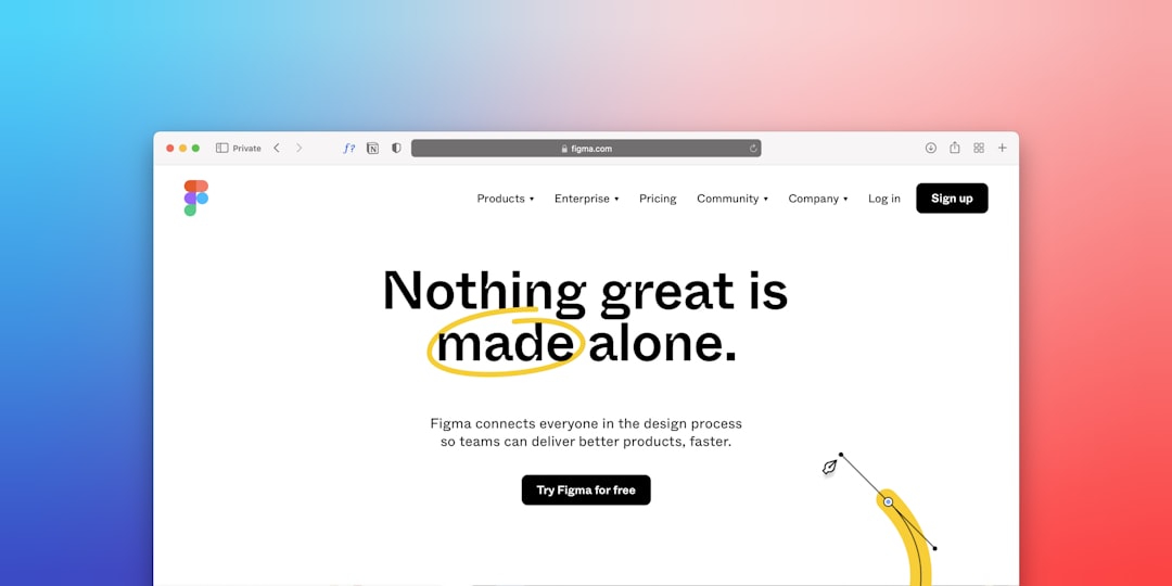
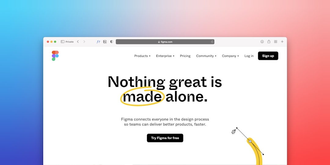
    a computer screen with the words nothing great is made alone
    Photo by Team Nocoloco on Unsplash

    Example 1 — The Minimal Grid Shop

    This layout uses a three-column product grid at desktop, two columns at tablet, and a single column on mobile. Each product card contains a 16:9 preview image using Bootstrap’s ratio component, a title, a category badge, a price, and a single CTA button. There are no sidebars. Navigation is a slim top bar with a search input and a cart icon.

    The card markup is straightforward and fully copy-pasteable:

    <div class="col-lg-4 col-md-6">
      <div class="card border-0 shadow-sm h-100">
        <div class="ratio ratio-16x9">
          <img src="preview.jpg" alt="Figma UI Kit Preview" class="card-img-top object-fit-cover">
        </div>
        <div class="card-body d-flex flex-column">
          <span class="badge bg-primary mb-2 align-self-start">UI Kit</span>
          <h5 class="card-title">SaaS Dashboard UI Kit</h5>
          <p class="card-text text-muted small">42 components, auto-layout, variables ready</p>
          <div class="mt-auto d-flex justify-content-between align-items-center">
            <strong class="fs-5">$29</strong>
            <a href="#" class="btn btn-primary btn-sm">Buy Now</a>
          </div>
        </div>
      </div>
    </div>

    The h-100 class on the card ensures every card in a row stretches to the same height even when titles or descriptions differ in length — a small detail that makes the grid feel polished and intentional.

    Example 2 — The Filter Sidebar Shop

    Shops with more than 30 products benefit from a persistent filter panel. This layout uses a two-column Bootstrap grid: a col-lg-3 sidebar containing filter checkboxes (category, price range, licence type) and a col-lg-9 product grid. On mobile the sidebar collapses into an offcanvas panel triggered by a “Filter” button pinned above the grid.

    The offcanvas filter trigger requires just a data attribute — no custom JavaScript:

    <button class="btn btn-outline-secondary d-lg-none mb-3" 
            type="button" 
            data-bs-toggle="offcanvas" 
            data-bs-target="#filterPanel">
      Filter Results
    </button>
    
    <div class="offcanvas offcanvas-start" tabindex="-1" id="filterPanel">
      <div class="offcanvas-header">
        <h5 class="offcanvas-title">Filter</h5>
        <button type="button" class="btn-close" data-bs-dismiss="offcanvas"></button>
      </div>
      <div class="offcanvas-body">
        <!-- Filter checkboxes here -->
      </div>
    </div>

    Category filters like “Mobile UI”, “Web App”, “Presentation”, and “Icon Set” map directly to what Figma template buyers search for. Keeping the filter labels concise and the checkbox hit areas large enough for mobile interaction reduces friction significantly.

    This layout leads with a full-width hero section spotlighting a single featured product — typically the newest release or a bundle deal. Below the hero, a horizontal scroll of “Popular This Week” cards gives returning visitors fast access to trending products, followed by the main grid. The Bootstrap 5 utility classes covered elsewhere on this blog handle the horizontal scroll track without a single line of custom CSS:

    <div class="d-flex gap-3 overflow-auto pb-2 flex-nowrap">
      <div class="card flex-shrink-0" style="width: 240px;">
        <img src="thumb1.jpg" class="card-img-top" alt="Template Thumb">
        <div class="card-body">
          <p class="card-text fw-semibold mb-1">Landing Page Kit</p>
          <small class="text-muted">$19</small>
        </div>
      </div>
      <!-- Repeat cards -->
    </div>

    The hero section itself works best with a dark overlay on a high-resolution product screenshot, a one-line value proposition, a price callout, and a single “Buy This Template” button. Resist the urge to add secondary CTAs in the hero — the goal is one action.

    Example 4 — The Bundle Pricing Shop

    Many successful Figma template shops generate the majority of revenue from bundles rather than individual products. This layout puts a three-tier pricing table in the hero area — “Single Template”, “5-Pack Bundle”, “Full Library Access” — using Bootstrap’s column grid and a highlighted “Most Popular” middle column achieved with a simple CSS custom property override:

    :root {
      --shop-accent: #5c6ef8;
      --shop-accent-light: #eef0ff;
    }
    
    .pricing-card.featured {
      border: 2px solid var(--shop-accent);
      background-color: var(--shop-accent-light);
    }
    
    .pricing-card .btn-primary {
      background-color: var(--shop-accent);
      border-color: var(--shop-accent);
    }

    Pricing tables work particularly well when they include a feature comparison row — tick marks for what is included at each tier communicate value faster than bullet-point descriptions. If you are using the Canvas HTML Template, the built-in pricing table components are already structured for this pattern and use –cnvs-themecolor for accent colour, making brand customisation a single variable change.

    Example 5 — The Dark Mode Premium Shop

    Dark-themed storefronts signal premium positioning and help product preview screenshots stand out with maximum contrast. This layout uses Bootstrap 5’s data-bs-theme="dark" attribute on the <html> element, supplemented by a dark header and footer, off-white body text, and vivid accent colours for CTA buttons. Product cards use a slightly lighter dark background than the page surface to create visual separation without borders:

    <html lang="en" data-bs-theme="dark">
    <body>
      <div class="container py-5">
        <div class="row g-4">
          <div class="col-lg-4 col-md-6">
            <div class="card bg-body-secondary border-0 h-100">
              <img src="preview-dark.jpg" class="card-img-top" alt="Dark UI Kit">
              <div class="card-body">
                <h5 class="card-title">Dark Analytics Dashboard</h5>
                <p class="card-text text-body-secondary">Figma + variables + dark/light modes</p>
                <a href="#" class="btn btn-warning w-100 mt-2">Buy for $39</a>
              </div>
            </div>
          </div>
        </div>
      </div>
    </body>

    Using bg-body-secondary and text-body-secondary rather than hardcoded colour values means the layout adapts automatically if a user toggles between dark and light mode — a detail that matters for accessibility compliance in 2025. For more dark layout guidance, the post on Canvas dark mode page design covers contrast ratios, typography choices, and component-level colour decisions in depth.

    Shared Patterns Across All Five Shop Layouts

    Looking across all five examples, several structural decisions appear in every successful Figma template shop built with Bootstrap 5:

    • Sticky navigation with a persistent cart icon and product count badge — buyers should never lose context while browsing.
    • Product preview modals using Bootstrap’s built-in modal component to show larger screenshots without navigating away from the listing page.
    • Social proof elements — star ratings, buyer counts, or “Downloaded 1,200 times” labels — placed directly on product cards rather than only on product detail pages.
    • Fast checkout entry — the “Buy Now” button should link to a minimal two-step checkout, not a full multi-page funnel. Digital product buyers expect Gumroad-style instant access.
    • Licence badge visibility — clearly labelling “Personal”, “Commercial”, or “Extended” licence on every card eliminates the most common pre-sale support question.

    Generating these layouts from scratch in Canvas Builder takes minutes rather than hours. Describe the shop type, product category, and colour scheme in a prompt, and the tool produces a production-ready HTML layout using Canvas components aligned to Bootstrap 5’s grid and utility system.

    Frequently Asked Questions

    Do I need a backend to sell Figma templates from a Bootstrap 5 storefront?

    No. Most Figma template sellers use third-party platforms like Gumroad, Lemon Squeezy, or Paddle to handle payments and file delivery. Your Bootstrap 5 storefront is the marketing and browsing layer — the checkout and delivery happen on the payment platform. Your “Buy Now” buttons simply link to the relevant product page on your chosen platform.

    How many products should a Figma template shop list before launching?

    A minimum of eight to twelve products is generally enough for a launch. Fewer than eight makes the shop feel sparse and reduces the chance a visitor finds something relevant to their specific need. Grouping products into two or three clear categories — such as UI Kits, Landing Pages, and Icon Sets — makes even a small catalogue feel well-organised.

    What image dimensions work best for Figma template product preview thumbnails?

    A 16:9 ratio at 1200 x 675 pixels works well across all five layout examples above. This ratio is consistent with how most design tools export component previews, renders sharply at retina resolution without excessive file size, and fits Bootstrap’s ratio ratio-16x9 component without any cropping configuration.

    Can I use the Canvas HTML Template to build a Figma template shop?

    Yes. Canvas includes pre-built shop, portfolio, and landing page section blocks that map directly onto the patterns described above. Because Canvas is built on Bootstrap 5, all the grid structures, utility classes, and component behaviours shown in the code examples in this post work inside Canvas layouts without modification. You would replace the default –cnvs-themecolor value with your brand accent colour and the shop is branded in one step.

    How do I handle search and filtering without a server-side backend?

    For shops with fewer than 100 products, client-side filtering using plain JavaScript or a lightweight library like Isotope or Filterizr is entirely sufficient. Each product card receives data-category and data-price attributes, and the filter buttons read those attributes to show or hide cards. This approach requires no server, no database query, and loads instantly. For larger catalogues, a static site generator with a built-in search index is the next step up.

    If you’re working with the Canvas HTML Template and want to generate production-ready layouts faster, try Canvas Builder free and see how much time you save on every project.
  • 7 Bootstrap 5 Utilities That Will Transform Your Layout Design

    7 Bootstrap 5 Utilities That Will Transform Your Layout Design

    Most developers use Bootstrap 5 for its grid system and then stop there — leaving a toolbox full of utilities untouched that could cut their CSS file in half and make every layout more consistent. If you are building on the Canvas HTML Template or any Bootstrap 5 project in 2025, these seven utilities are the ones that will change how you approach every layout decision.

    Key Takeaways

    • Bootstrap 5 utilities go far beyond spacing — gap, position, and object-fit classes solve layout problems that used to require custom CSS.
    • The CSS Grid utilities introduced in Bootstrap 5.1+ let you combine grid flexibility with Bootstrap’s responsive breakpoint system.
    • Combining multiple utility classes in a single element is faster and more maintainable than writing one-off CSS rules.
    • Understanding the utilities covered here will make your Canvas template work more reliably across screen sizes without touching style.css.

    1. Gap Utilities for Flexbox and Grid Spacing

    Before Bootstrap 5.1, spacing between flex children required margin hacks or a custom wrapper class. The gap utility solves this cleanly. Classes like gap-3, gap-x-4, and gap-y-2 map directly to Bootstrap’s spacing scale (0.25rem increments) and work on any flex or grid container. You no longer need to add me-3 to every child element and then remove it from the last one.

    <div class="d-flex flex-wrap gap-3">
      <div class="card p-3">Item One</div>
      <div class="card p-3">Item Two</div>
      <div class="card p-3">Item Three</div>
    </div>

    This is particularly useful in Canvas section layouts where you are stacking feature cards, icon blocks, or team member tiles inside a flex container. The gap is consistent, responsive-override-friendly, and requires zero custom CSS.

    text
    Photo by Markus Spiske on Unsplash

    2. Object-Fit Utilities for Image Control

    Inconsistent image aspect ratios are one of the most common layout problems on content-heavy pages. Bootstrap 5’s object-fit utilitiesobject-fit-cover, object-fit-contain, and object-fit-fill — let you control how an image fills its container without cropping the element itself. Pair them with a fixed-height wrapper and your images will always look intentional.

    <div style="height: 240px; overflow: hidden;">
      <img
        src="team-photo.jpg"
        alt="Team member"
        class="w-100 h-100 object-fit-cover rounded"
      />
    </div>

    This approach is essential for blog post thumbnails, team cards, and portfolio grids. If you have been setting background-image on a div just to get cover behaviour on an img tag, this utility eliminates that workaround entirely.

    3. Position and Placement Utilities

    Bootstrap 5 ships with a full set of position utilities that cover more than just position-relative and position-absolute. The placement helpers — top-0, bottom-50, start-100, translate-middle — let you pin and centre elements without writing a single line of custom CSS. This is how you centre an absolutely positioned badge on a card corner in seconds.

    <div class="position-relative d-inline-block">
      <img src="product.jpg" alt="Product" class="img-fluid rounded" />
      <span class="position-absolute top-0 start-100 translate-middle badge rounded-pill bg-danger">
        New
      </span>
    </div>

    For Canvas layouts that include notification badges, overlay labels, or floating call-to-action buttons, mastering these placement classes removes a large amount of repetitive positioning CSS. You can read more about building layout structure efficiently in our Bootstrap 5 Complete Guide for Web Designers.

    a computer screen with a woman looking at a laptop
    Photo by Team Nocoloco on Unsplash

    4. Bootstrap 5 CSS Grid Utilities

    Since Bootstrap 5.1, the framework has included opt-in CSS Grid utilities that operate separately from the traditional column system. By adding the class grid to a container, you get access to g-col-* classes that use CSS Grid’s native layout engine — with Bootstrap’s responsive breakpoints still applied. This means subgrid-style spanning is now achievable without any custom properties.

    <div class="grid gap-3">
      <div class="g-col-12 g-col-md-8">Main content area</div>
      <div class="g-col-12 g-col-md-4">Sidebar</div>
    </div>

    This is a meaningful upgrade over the traditional row/col pattern for layouts where you need precise control over column spanning without nesting rows. If you want a deeper comparison of the two approaches, our post on CSS Grid vs Bootstrap Grid walks through the trade-offs in practical detail.

    5. Overflow Utilities for Scroll and Clipping

    The overflow utilities in Bootstrap 5 — overflow-auto, overflow-hidden, overflow-scroll, and the axis-specific variants overflow-x-auto and overflow-y-hidden — are some of the most practical utilities for building modern UI components. A horizontally scrollable card row, a clipped hero image, or a fixed-height content panel all become single-class solutions.

    <div class="d-flex gap-3 overflow-x-auto pb-2">
      <div class="card flex-shrink-0" style="width: 280px;">Card One</div>
      <div class="card flex-shrink-0" style="width: 280px;">Card Two</div>
      <div class="card flex-shrink-0" style="width: 280px;">Card Three</div>
      <div class="card flex-shrink-0" style="width: 280px;">Card Four</div>
    </div>

    Note the flex-shrink-0 class on each card — without it, flex items will compress rather than trigger the scroll. This combination of overflow and flex utilities is particularly useful for mobile-first sections in Canvas where you want a horizontal swipe interface without any JavaScript plugin.

    6. Text and Display Utilities for Responsive Visibility

    Bootstrap 5’s display utilities follow the pattern d-{value} and d-{breakpoint}-{value}, giving you complete control over element visibility at every viewport size. Combined with text utilities like text-truncate, text-nowrap, and lh-sm, you can handle almost all typographic layout problems without custom CSS. For a full breakdown of text sizing and weight classes, see our guide on Bootstrap 5 Typography.

    <p class="text-truncate d-none d-md-block" style="max-width: 320px;">
      This long description text will be truncated with an ellipsis on desktop
      but hidden entirely on mobile viewports.
    </p>
    <p class="d-md-none">Short mobile label</p>

    The key here is text-truncate requires a max-width or a constrained container to trigger the ellipsis — it will not truncate inside a flex child that is free to expand. Always pair it with an explicit width constraint for reliable behaviour across browsers.

    7. Z-Index and Stack Utilities for Layered Layouts

    Layered UI elements — modals, sticky headers, dropdown menus, tooltips — all depend on a predictable z-index system. Bootstrap 5 introduced z-index utilities in the form of z-0, z-1, z-2, z-3, and z-n1 (negative one), which map to defined z-index values in Bootstrap’s design token layer. Using these instead of inline styles keeps your layering logic consistent and overrideable through the Sass variable system.

    <div class="position-relative">
      <div class="position-absolute top-0 start-0 w-100 h-100 bg-dark opacity-50 z-1 rounded"></div>
      <img src="hero-bg.jpg" alt="" class="w-100 rounded z-0" />
      <div class="position-absolute top-50 start-50 translate-middle z-2 text-white text-center">
        <h2 class="fw-bold">Overlay Heading</h2>
        <p>Stacked above the overlay layer</p>
      </div>
    </div>

    This pattern — background image at z-0, dark overlay at z-1, content at z-2 — is a repeatable recipe for hero sections and card overlays in Canvas layouts. It eliminates the need for ad hoc z-index: 9999 values scattered across your stylesheet and makes the stacking order immediately readable from the markup alone.

    Frequently Asked Questions

    Do Bootstrap 5 utilities work inside the Canvas HTML Template without modification?

    Yes. Canvas is built on Bootstrap 5, which means all Bootstrap 5 utility classes are available out of the box. You do not need to load any additional stylesheets or CDN links — Bootstrap is bundled within Canvas’s style.css and plugin files.

    Can I use gap utilities with Bootstrap’s traditional row and col classes?

    Gap utilities apply to flex and CSS Grid containers. The traditional row/col system uses negative margin gutters controlled by the gx and gy classes instead. If you add a gap class to a standard Bootstrap row, it may conflict with the gutter system. Use gap utilities on your own flex containers or on the new CSS Grid containers with the grid class.

    How do I override Bootstrap 5 utilities in Canvas without breaking the template?

    The safest approach is to add your overrides after Canvas’s style.css in the document head, using specific selectors rather than targeting utility classes directly. Alternatively, use Canvas’s CSS custom properties such as –cnvs-themecolor to restyle components at the variable level, which avoids specificity conflicts with Bootstrap utilities.

    Are Bootstrap 5 utility classes purgeable with a CSS build tool?

    Yes. Bootstrap 5 utilities are compatible with PurgeCSS and similar tools. If you are building a production Canvas project with a custom build step, configure your content paths to scan all HTML files so utility classes used dynamically are not removed. This is especially important for classes applied via JavaScript or AI-generated layouts.

    What is the difference between d-none and visibility-hidden in Bootstrap 5?

    The class d-none sets display: none, which removes the element from the document flow entirely — it takes up no space. The class invisible (Bootstrap’s visibility utility) sets visibility: hidden, which hides the element visually but keeps its space in the layout. Use d-none when you want the element fully removed; use invisible when you need to preserve the layout footprint.

    If you’re working with the Canvas HTML Template and want to generate production-ready layouts faster, try Canvas Builder free and see how much time you save on every project.
  • Connect Claude, ChatGPT, or Any AI Agent to Canvas Builder: The Agent API

    Connect Claude, ChatGPT, or Any AI Agent to Canvas Builder: The Agent API

    Most website builders are built for humans clicking buttons. Canvas Builder now works just as well when the builder is an AI agent.

    The Canvas Builder Agent API lets Claude, ChatGPT, or any custom AI assistant build, refine, publish, and download real multi-page websites on your behalf — using the same production build engine that powers the Canvas Builder chat. No browser automation, no screen-scraping, no shared passwords.

    Why an Agent API?

    AI assistants are becoming the way people get work done. You tell your assistant “I need a landing page for my coffee subscription startup” — and today, the assistant’s options are bad: it can write you raw HTML you have to host yourself, or walk you through using some website builder’s UI step by step.

    With the Agent API, the assistant just does it:

    • It requests access once. You approve it from your Canvas Builder account — scanning a QR code or clicking a link — and choose exactly what it’s allowed to do.
    • It describes the site in plain language. Our build engine generates a complete, multi-page, responsive website — the same quality you’d get building in the chat yourself.
    • It refines on feedback. “Make the hero darker, add a pricing section” — one sentence per change.
    • It publishes to a live URL on your account, connects your custom domain, or downloads the ZIP — whatever you’ve permitted.

    Security model: scoped, revocable, approved by you

    We designed the access flow so you never paste a password into a chatbot:

    • One-time consent. The agent requests a link code; you open the link signed into your own account and approve the exact scopes requested. Nothing happens without that approval.
    • Scoped tokens. Build-only by default. Publishing and domain management are separate permissions the agent must explicitly request — and you can decline.
    • Revocable anytime. Every connected agent is listed on your Account page with a one-click revoke. Tokens expire automatically after 90 days.
    • Your credits, your limits. Agent builds use your normal credit balance with the same per-build pricing — plus rate limits that stop a runaway agent from draining it.

    How it works (for the technically curious)

    The flow is deliberately simple — four REST calls:

    1. Link: the agent calls POST /api/v1/agents/link/start and shows you a QR code. You approve. The agent polls and receives a bearer token.
    2. Build: POST /api/v1/agents/sites with a plain-language description. Builds run asynchronously; the agent polls for completion.
    3. Refine: POST /api/v1/agents/sites/{id}/changes with the change described in a sentence.
    4. Ship: publish to a live subdomain, attach a custom domain, or download the full ZIP.

    Everything an agent needs to integrate is at agents.canvasbuilder.co — a single page written to be read by AI agents themselves, plus an OpenAPI 3.1 spec for tooling that consumes structured definitions.

    What can you build with it?

    Everything the Canvas Builder chat can build: complete multi-page websites with real navigation, responsive layouts, conversion-focused sections, contact forms, and consistent design systems. Landing pages, portfolios, restaurant sites, SaaS marketing sites, local business sites — described in a sentence, delivered as production-ready HTML/CSS.

    Try it

    If you use Claude, ChatGPT with actions, or build your own agents: point them at agents.canvasbuilder.co. The page contains the full integration guide. Approve the connection from your account, and your assistant can start shipping websites for you today.

    New to Canvas Builder? Sign up free — you get free credits to try your first build, whether you build it yourself or let your agent do it.

  • 7 Micro-SaaS Website Design Mistakes to Avoid

    7 Micro-SaaS Website Design Mistakes to Avoid

    Most micro-SaaS products fail to convert not because the software is bad, but because the website signals the wrong things at exactly the wrong moment. If your micro-SaaS website design contains even three of the mistakes below, you are quietly haemorrhaging trial sign-ups every single day.

    Key Takeaways

    • A cluttered hero section kills conversions faster than slow page speed — clarity beats cleverness every time on a developer tool landing page.
    • Weak or missing social proof is one of the most common SaaS website mistakes — even early-stage products can fix this with targeted testimonials and usage numbers.
    • Pricing page friction (hidden tiers, unclear feature comparisons) is a silent revenue killer for micro-SaaS founders.
    • Bootstrap 5 layout patterns and the Canvas HTML Template give you a fast, reliable structural foundation — but design decisions still determine whether visitors stay or leave.

    Mistake 1: A Vague Hero Headline That Explains Nothing

    The single most damaging pattern in micro-SaaS website design is a hero headline that sounds impressive but communicates nothing specific. Phrases like “Supercharge Your Workflow” or “The Future of Productivity” tell a visitor nothing about what the product does, who it is for, or why they should care. Visitors decide within seconds whether to stay, and a generic headline gives them no reason to.

    Your headline needs to answer three questions immediately: what the product does, who it helps, and what outcome it delivers. A formula that works reliably in 2025 is: [Outcome] for [Audience] without [Pain Point]. For example: “Automated invoice reconciliation for freelance developers — no spreadsheets required.”

    On a Bootstrap 5 layout, the hero structure should keep the headline prominent and the sub-copy concise. Here is a clean, copy-pasteable example using Bootstrap utility classes:

    <section class="py-5 bg-light">
      <div class="container">
        <div class="row align-items-center">
          <div class="col-lg-6">
            <h1 class="display-5 fw-bold mb-3">
              Automated invoice reconciliation for freelance developers
            </h1>
            <p class="lead text-muted mb-4">
              Connect your bank, sync your invoices, and close your books in under 5 minutes. No spreadsheets required.
            </p>
            <a href="/signup" class="btn btn-primary btn-lg me-2">Start free trial</a>
            <a href="#demo" class="btn btn-outline-secondary btn-lg">Watch demo</a>
          </div>
          <div class="col-lg-6">
            <img src="assets/hero-screenshot.png" alt="App dashboard preview" class="img-fluid rounded shadow">
          </div>
        </div>
      </div>
    </section>

    For a deeper look at how Bootstrap 5 layout patterns support this kind of structure, the Bootstrap 5 Complete Guide for Web Designers covers the grid and component system in full.

    a laptop computer sitting on top of a desk
    Photo by Rolf van Root on Unsplash

    Mistake 2: Missing or Misplaced Social Proof

    One of the most consistent SaaS website mistakes is treating social proof as an afterthought — burying testimonials at the bottom of the page or skipping them entirely because the product is early-stage. Both approaches lose trust at the moment visitors need it most.

    Social proof belongs directly below the hero on a developer tool landing page. Even if you only have five users, a quote from one satisfied customer alongside the number of active accounts creates a measurable lift in sign-up rate. Use a logo bar for recognisable company names, star ratings for credibility, and specific outcome-driven quotes rather than generic praise.

    Canvas HTML Template includes pre-built testimonial and logo grid components that slot cleanly into a block_section layout. Pair them with Bootstrap’s grid to keep the proof section visually tight and responsive.

    Mistake 3: Feature Sections That List Instead of Persuade

    A wall of feature bullet points is not a value proposition — it is a specification sheet. Visitors do not care what your product has; they care what it does for them. Converting a feature list into a benefit-led section is one of the highest-leverage changes you can make to a micro-SaaS website design.

    Structure each feature block around a single outcome. Lead with the benefit in bold, follow with one sentence of explanation, and support it with a small screenshot or icon. Three columns of three is a reliable grid pattern for this:

    <section class="py-5">
      <div class="container">
        <div class="row g-4">
          <div class="col-md-4">
            <div class="p-4 border rounded h-100">
              <h3 class="h5 fw-bold">Close your books in 5 minutes</h3>
              <p class="text-muted">Automatic bank sync matches transactions to invoices the moment they land.</p>
            </div>
          </div>
          <div class="col-md-4">
            <div class="p-4 border rounded h-100">
              <h3 class="h5 fw-bold">Never chase a late payment again</h3>
              <p class="text-muted">Smart reminders send at the right time without you lifting a finger.</p>
            </div>
          </div>
          <div class="col-md-4">
            <div class="p-4 border rounded h-100">
              <h3 class="h5 fw-bold">Tax-ready reports on demand</h3>
              <p class="text-muted">Export categorised summaries your accountant can use immediately.</p>
            </div>
          </div>
        </div>
      </div>
    </section>
    a close up of a computer screen with words on it
    Photo by Jason Leung on Unsplash

    Mistake 4: Pricing Page Friction That Kills Decisions

    Micro-SaaS pricing pages fail in predictable ways: too many tiers, hidden feature comparisons, no indication of which plan fits which user type, and CTAs that say “Contact us” when visitors expect “Start free.” Each of these introduces friction at the moment a visitor is closest to converting.

    For most micro-SaaS products, two to three pricing tiers with a clear recommended option is the optimum structure. Use a visual highlight (a border, a badge, a background colour change using --cnvs-themecolor) to draw attention to your most popular plan. The Canvas Pricing Tables post covers specific design patterns that improve conversion on this exact page type.

    Apply the Canvas theme colour variable to your highlighted plan card so it stays consistent across the entire site:

    .pricing-card--featured {
      border: 2px solid var(--cnvs-themecolor);
      box-shadow: 0 4px 24px rgba(var(--cnvs-themecolor-rgb), 0.15);
    }

    Mistake 5: Weak CTA Design and Placement

    A surprising number of developer tool landing pages bury their primary call to action, use low-contrast button colours, or rely on passive copy like “Learn more” when the intent should be “Start free trial.” CTA design is not decoration — it is the moment your page either earns a user or loses one.

    Every major section of a micro-SaaS page should contain a contextually relevant CTA. The hero gets the primary sign-up. The features section gets a secondary “See how it works.” The pricing section gets a tier-specific “Get started.” Place CTAs where the visitor’s decision momentum is highest — immediately after a persuasive claim, not after a long block of text.

    For a thorough breakdown of what makes buttons perform, the CTA Button Design: Science-Backed Tips That Drive Clicks post covers contrast ratios, copy patterns, and placement strategy in depth.

    Mistake 6: Ignoring Visual Hierarchy in Typography

    Developers building their own micro-SaaS sites often underestimate how much typographic hierarchy affects perceived quality and readability. When every text element is the same size and weight, the eye has nowhere to go. This creates cognitive friction that makes visitors feel the product is unpolished — regardless of how good the software actually is.

    On a Canvas-based layout, use Bootstrap 5’s display classes (display-4, display-5) for hero headlines, h2 or h3 for section titles, and text-muted for supporting copy. Control the primary and secondary typefaces through Canvas’s CSS variables:

    :root {
      --cnvs-primary-font: 'Inter', sans-serif;
      --cnvs-secondary-font: 'JetBrains Mono', monospace;
    }

    This keeps your developer-oriented audience engaged with a clean, technical aesthetic while maintaining the readability hierarchy that guides visitors toward conversion. The Canvas pricing tables guide also demonstrates how typography hierarchy applies directly to high-stakes conversion sections.

    Mistake 7: No Product Screenshot or Interactive Demo

    Telling visitors what your micro-SaaS does is not the same as showing them. A page with no screenshots, no video demo, and no interactive preview forces the visitor to take your word for it — and most will not. This is especially damaging for developer tool landing pages, where the target audience tends to be sceptical and evidence-driven.

    At minimum, include a single high-resolution product screenshot above the fold. A short screen recording (under 90 seconds) embedded with a native <video> element or a lightweight iframe performs significantly better than a text-only page. If your product has a meaningful interactive element, consider a sandboxed demo that visitors can explore without signing up — this removes the largest objection to trial sign-up entirely.

    For ideas on how visual-first layouts are evolving in 2025 and 2026, the post on Top 10 Web Design Trends for HTML Templates in 2026 outlines the patterns shaping product site expectations right now.

    Frequently Asked Questions

    What is the most important page on a micro-SaaS website?

    The landing page — specifically the hero section — has the greatest impact on whether a visitor converts or leaves. It is the first impression, the value proposition delivery, and the primary CTA placement all in one. Getting this page right before optimising anything else will produce the largest return.

    How many pricing tiers should a micro-SaaS website show?

    Two to three tiers is the optimal range for most micro-SaaS products. More than three creates decision paralysis. If you have a free plan, count it as one tier and highlight the paid tier that delivers the most value to your target user. Always make the recommended plan visually distinct.

    Do I need social proof if my SaaS product is brand new?

    Yes — but it looks different at early stage. If you have no customers yet, use beta tester feedback, founder credibility signals, or a “used by X developers in private beta” counter. Even one genuine, outcome-specific quote from a real user is more persuasive than a blank section.

    Is Bootstrap 5 a good choice for a developer tool landing page?

    Bootstrap 5 is an excellent foundation for a developer tool landing page in 2025. It is well-documented, widely understood, and produces responsive layouts quickly. The Canvas HTML Template builds on Bootstrap 5 and adds a library of pre-built components — pricing tables, feature grids, testimonials — that are specifically suited to SaaS site structures.

    How do Canvas CSS variables help with micro-SaaS website design consistency?

    Canvas CSS variables like --cnvs-themecolor, --cnvs-primary-font, and --cnvs-header-bg let you define your brand’s visual identity in one place and have it propagate across every component automatically. This means your pricing card highlight, your CTA button colour, and your header background all stay in sync without overriding individual component styles manually.

    If you’re working with the Canvas HTML Template and want to generate production-ready layouts faster, try Canvas Builder free and see how much time you save on every project.
  • Bootstrap 5 Complete Guide for Web Designers: From Grid to Components

    Bootstrap 5 Complete Guide for Web Designers: From Grid to Components

    Bootstrap 5 has become the default starting point for web designers who need responsive, well-structured layouts without writing every line of CSS from scratch — but the framework is far deeper than most tutorials let on. This guide covers everything from the grid system to interactive components, with real code you can use immediately.

    Key Takeaways

    • Bootstrap 5’s 12-column grid uses five responsive breakpoints (xs, sm, md, lg, xl) plus an xxl tier, giving you precise control over layouts at every screen size.
    • Utility classes replace most custom CSS — spacing, colour, flexbox alignment, and typography are all achievable without a separate stylesheet.
    • Bootstrap 5 dropped jQuery entirely, making it lighter and faster than Bootstrap 4 on modern projects.
    • When used inside the Canvas HTML Template, Bootstrap 5 is bundled — never load it separately from a CDN.

    What Bootstrap 5 Actually Is (and Why It Matters in 2025)

    Bootstrap 5 is an open-source front-end framework that packages a responsive grid, a comprehensive component library, and a utility-first CSS layer into a single, well-documented toolkit. Released in May 2021, its most significant shift from Bootstrap 4 was removing the jQuery dependency, rewriting all interactive components in vanilla JavaScript. That decision alone cut bundle weight and improved compatibility with modern build tools.

    For web designers, Bootstrap 5 solves the most time-consuming parts of a project: column-based layout, consistent spacing, accessible form controls, and interactive UI patterns like modals, dropdowns, and carousels. Rather than reinventing these on every project, you assemble them from tested building blocks and spend your time on design decisions that actually differentiate your work.

    If you want a deeper look at how the grid compares to native CSS Grid, the post CSS Grid vs Bootstrap Grid: A Practical Comparison for Web Designers is worth reading alongside this guide.

    a colorful cube with a red circle
    Photo by Ubaid E. Alyafizi on Unsplash

    The Grid System: Columns, Breakpoints, and Containers

    Bootstrap 5’s grid is built on flexbox and divides the available width into 12 equal columns. You nest columns inside a row, and rows inside a container. Three container variants are available: .container (fixed max-widths at each breakpoint), .container-fluid (full width at all times), and .container-{breakpoint} (fluid until a specified breakpoint, then fixed).

    The six responsive tiers are:

    • xs — below 576 px (no infix: .col-*)
    • sm — 576 px and above (.col-sm-*)
    • md — 768 px and above (.col-md-*)
    • lg — 992 px and above (.col-lg-*)
    • xl — 1200 px and above (.col-xl-*)
    • xxl — 1400 px and above (.col-xxl-*)

    A typical three-column layout that stacks on mobile looks like this:

    <div class="container">
      <div class="row g-4">
        <div class="col-12 col-md-4">
          <div class="p-4 border rounded">Column 1</div>
        </div>
        <div class="col-12 col-md-4">
          <div class="p-4 border rounded">Column 2</div>
        </div>
        <div class="col-12 col-md-4">
          <div class="p-4 border rounded">Column 3</div>
        </div>
      </div>
    </div>

    The g-4 class on the row applies a consistent gutter (1.5 rem) between columns both horizontally and vertically without any custom CSS. For a visual reference on how grid systems create layout hierarchy, see Grid Systems Explained: How to Create Visual Order in Web Layouts. You can also fine-tune your column layouts interactively using the Bootstrap Grid Calculator.

    Utility Classes: The Fastest Way to Style Without Custom CSS

    Bootstrap 5 ships with an extensive set of utility classes that cover the most common styling needs. Understanding these is the difference between writing clean, maintainable markup and accumulating a sprawling custom CSS file.

    Spacing utilities follow the pattern {property}{side}-{size}, where property is m (margin) or p (padding), side is t, b, s, e, x, y, or blank (all sides), and size runs from 0 to 5 (plus auto for margins).

    Display utilities (d-none, d-md-block, etc.) let you show and hide elements at specific breakpoints without media queries in your stylesheet. Flexbox utilities (d-flex, justify-content-between, align-items-center) handle alignment tasks that previously required custom rules. For a tool that generates flexbox CSS visually, the CSS Flexbox Generator can save time when you need precise alignment values.

    <div class="d-flex justify-content-between align-items-center p-3 bg-light rounded">
      <span class="fw-bold text-dark">Section Title</span>
      <a href="#" class="btn btn-sm btn-primary">Learn More</a>
    </div>

    Text utilities cover alignment (text-start, text-center, text-end), weight (fw-bold, fw-light), and size (fs-1 through fs-6). For a full breakdown of Bootstrap 5 typographic classes, the dedicated post on Bootstrap 5 Typography: Font Sizes, Weights, and Display Classes covers every option with examples.

    a computer screen with a lot of data on it
    Photo by Lukas on Unsplash

    Core Components Every Designer Should Know

    Bootstrap 5 includes over a dozen ready-to-use components. These are the ones that appear on almost every project:

    • Navbar — responsive navigation with built-in collapse behaviour for mobile, support for dropdowns, and brand logo placement.
    • Card — a flexible content container with optional header, body, footer, image, and list group variants.
    • Modal — an accessible overlay dialog triggered by a button, with configurable backdrop, keyboard dismissal, and scroll locking.
    • Accordion — collapsible content panels, useful for FAQs, feature lists, and settings panels.
    • Carousel — a slideshow component supporting images, captions, and autoplay with CSS transitions.
    • Toast — non-blocking notification messages that auto-dismiss after a configurable delay.
    • Offcanvas — a sidebar panel that slides in from any edge, ideal for mobile navigation and filter drawers.

    Each component works without any custom JavaScript — you wire them up using data-bs-* attributes directly in your HTML:

    <button type="button" class="btn btn-primary" data-bs-toggle="modal" data-bs-target="#demoModal">
      Open Modal
    </button>
    
    <div class="modal fade" id="demoModal" tabindex="-1" aria-labelledby="demoModalLabel" aria-hidden="true">
      <div class="modal-dialog">
        <div class="modal-content">
          <div class="modal-header">
            <h5 class="modal-title" id="demoModalLabel">Modal Heading</h5>
            <button type="button" class="btn-close" data-bs-dismiss="modal" aria-label="Close"></button>
          </div>
          <div class="modal-body">
            <p>Your modal content goes here.</p>
          </div>
          <div class="modal-footer">
            <button type="button" class="btn btn-secondary" data-bs-dismiss="modal">Close</button>
            <button type="button" class="btn btn-primary">Save changes</button>
          </div>
        </div>
      </div>
    </div>

    Forms, Inputs, and Client-Side Validation

    Bootstrap 5 redesigned its form controls to be fully consistent across browsers without relying on browser-native styling. Every input, select, textarea, checkbox, and radio button is styled through the .form-control, .form-select, and .form-check classes.

    Client-side validation uses the HTML5 constraint validation API combined with Bootstrap’s .was-validated class, which reveals .valid-feedback and .invalid-feedback elements after the user attempts to submit:

    <form class="needs-validation" novalidate>
      <div class="mb-3">
        <label for="emailInput" class="form-label">Email address</label>
        <input type="email" class="form-control" id="emailInput" required>
        <div class="invalid-feedback">Please enter a valid email address.</div>
      </div>
      <button class="btn btn-primary" type="submit">Submit</button>
    </form>
    
    <script>
      (() => {
        'use strict';
        const forms = document.querySelectorAll('.needs-validation');
        Array.from(forms).forEach(form => {
          form.addEventListener('submit', event => {
            if (!form.checkValidity()) {
              event.preventDefault();
              event.stopPropagation();
            }
            form.classList.add('was-validated');
          }, false);
        });
      })();
    </script>

    Customising Bootstrap 5 with CSS Variables and Sass

    Bootstrap 5 exposes CSS custom properties at the :root level, which means you can override theme colours, font stacks, and border radii without recompiling Sass. For quick colour changes, this approach works well:

    :root {
      --bs-primary: #e63946;
      --bs-primary-rgb: 230, 57, 70;
      --bs-border-radius: 0.5rem;
      --bs-font-sans-serif: 'Inter', system-ui, sans-serif;
    }

    For deeper customisation — changing the number of grid columns, gutter widths, or generating a reduced component set — you compile Bootstrap from its Sass source. Override variables in a _custom.scss file before importing Bootstrap’s own variables file.

    One important note for Canvas users: when building on the Canvas Builder platform or working inside Canvas HTML Template files, Bootstrap 5 is already bundled. You should not load Bootstrap from a CDN separately, as this causes duplicate styles and JavaScript conflicts. Canvas also uses its own CSS variables such as –cnvs-themecolor, –cnvs-primary-font, and –cnvs-header-bg — these sit alongside Bootstrap’s variables and control Canvas-specific elements.

    Practical Responsive Design Patterns

    Knowing the grid API is only part of building responsive layouts. These patterns solve the most common real-world problems:

    1. Stack on mobile, side-by-side on desktop — use .col-12 .col-md-6 or .col-12 .col-lg-4 as shown in the grid section above.
    2. Order reversal at breakpoints.order-last .order-md-first lets you place a content block before an image on desktop while showing the image first on mobile.
    3. Auto-width columns.col (without a number) divides available space equally between siblings, useful for button groups and icon rows.
    4. Offset columns.offset-md-2 pushes a column right by two column-widths, creating centred or asymmetric layouts.
    5. Vertical alignment.align-items-stretch on a row makes all child columns match the tallest column’s height, preventing uneven card bottoms.

    Using Bootstrap 5 Inside the Canvas HTML Template

    Canvas is built on Bootstrap 5, which means every Bootstrap class you already know works directly inside Canvas layouts. The template adds its own layer of components — sliders, icon boxes, pricing tables, portfolio grids — on top of Bootstrap’s foundation.

    When working in Canvas, load only the two required CSS files (style.css and css/font-icons.css) and the two JS files (js/plugins.min.js and js/functions.bundle.js). Bootstrap is included inside these bundles. Adding a CDN link for Bootstrap on top of this will break interactive components.

    Canvas customisation lives in CSS variables. To change the primary theme colour across buttons, links, and accents, you override --cnvs-themecolor and its RGB companion --cnvs-themecolor-rgb in a custom stylesheet:

    :root {
      --cnvs-themecolor: #2563eb;
      --cnvs-themecolor-rgb: 37, 99, 235;
      --cnvs-primary-font: 'Inter', sans-serif;
      --cnvs-logo-height: 40px;
      --cnvs-logo-height-sticky: 32px;
    }

    For a guided walkthrough of building a complete site within Canvas using Bootstrap’s grid, the Restaurant Website Design with Bootstrap 5 tutorial applies these principles to a real project from scratch.

    Performance Considerations for Bootstrap 5 Projects

    Bootstrap 5’s full CSS bundle is approximately 190 KB minified (around 25 KB gzipped). For most projects this is acceptable, but there are straightforward ways to reduce it:

    • Import only the components you use from Bootstrap’s Sass source rather than compiling the full bundle.
    • Use PurgeCSS or a PostCSS plugin to remove unused utility classes at build time — this can reduce your final CSS to under 10 KB on simple projects.
    • Defer non-critical JavaScript — Bootstrap’s JS bundle can be loaded with defer since components initialise after the DOM is ready.
    • Avoid redundant resets — Bootstrap includes Reboot (a normalisation layer). Do not add a separate CSS reset on top of it.

    Frequently Asked Questions

    Is Bootstrap 5 still relevant for web design in 2025?

    Yes. Bootstrap 5 remains the most widely used CSS framework by adoption, and its combination of a mature grid system, accessible components, and extensive documentation makes it a reliable choice for both solo designers and agency teams. Its vanilla JavaScript implementation and CSS variable support keep it compatible with modern front-end workflows.

    Do I need to know Sass to use Bootstrap 5?

    No. You can use Bootstrap 5 effectively with plain CSS by overriding its exposed CSS custom properties at :root. Sass is only necessary if you want to change fundamental values like the number of grid columns, generate a reduced component set, or integrate Bootstrap into a Node-based build pipeline.

    What is the difference between .container and .container-fluid in Bootstrap 5?

    .container has a fixed maximum width that steps up at each breakpoint, keeping content from stretching too wide on large screens. .container-fluid spans the full viewport width at all times. A third option, .container-{breakpoint}, behaves like .container-fluid below the named breakpoint and switches to a fixed max-width at and above it.

    Can I use Bootstrap 5 with the Canvas HTML Template?

    Canvas HTML Template is built on Bootstrap 5, so all Bootstrap classes are available by default. You should never load Bootstrap from a CDN alongside Canvas, as it is already bundled inside js/plugins.min.js and js/functions.bundle.js. Duplicating the Bootstrap load causes style conflicts and breaks Canvas’s interactive components.

    How do Bootstrap 5 utility classes differ from writing custom CSS?

    Bootstrap utility classes are single-purpose, predefined classes that apply one style rule each — for example, mt-3 applies margin-top: 1rem. They eliminate the need to write and name custom selectors for common styling tasks, reduce CSS file size, and keep styles co-located with markup for easier maintenance. Custom CSS is still appropriate for unique design decisions, animations, or overrides not covered by utilities.

    If you’re working with the Canvas HTML Template and want to generate production-ready layouts faster, try Canvas Builder free and see how much time you save on every project.

  • Building a Fitness Studio Website: Design Tips and Template Structure

    Building a Fitness Studio Website: Design Tips and Template Structure

    A fitness studio website has roughly eight seconds to communicate energy, credibility, and a clear next step before a prospective member clicks away — and the underlying HTML structure is what makes or breaks that first impression at every screen size.

    Key Takeaways

    • A well-structured fitness studio website HTML layout combines a bold hero, social proof sections, class schedules, and a pricing table — all within a consistent Bootstrap 5 grid.
    • The Canvas HTML Template provides a production-ready foundation that eliminates hours of boilerplate work for fitness brands.
    • CSS custom properties like –cnvs-themecolor let you apply a consistent brand colour across every component without touching multiple stylesheets.
    • Section hierarchy — hero, features, schedule, testimonials, pricing, CTA — maps directly to the decision journey of a gym prospect and should be reflected in your page’s HTML order.

    Why Page Structure Matters More Than Aesthetics for Fitness Sites

    Most gym website template projects stall because designers prioritise visual style before defining the conversion flow. A fitness prospect typically follows a predictable path: they want to see what the studio offers, understand the atmosphere, check class times, review pricing, and then act. Your HTML structure should mirror that sequence precisely, because search engines and screen readers both interpret page order as a signal of content priority.

    In practical terms, this means your hero section must appear first in the DOM, followed by a brief feature strip, then social proof, then schedule or programme details, then pricing, and finally a high-visibility call to action. Decorative elements that load before critical content inflate perceived load time and hurt both SEO and conversions.

    If you want a deeper understanding of how grid-based thinking underpins this kind of layout, the post on grid systems and visual order in web layouts is worth reading alongside this one.

    A large gym with a lot of machines
    Photo by Abdul Raheem Kannath on Unsplash

    Building a High-Impact Hero Section in HTML

    The hero is the single most important component of a fitness HTML template. It needs a full-viewport background (video or high-contrast image), a punchy headline, a sub-headline, and a primary CTA button — all above the fold on desktop and mobile.

    Using Canvas’s Bootstrap 5 grid, a minimal but effective hero structure looks like this:

    <section id="hero" class="section py-0 min-vh-100 d-flex align-items-center dark"
      style="background: url('images/gym-hero.jpg') center/cover no-repeat;">
      <div class="container">
        <div class="row justify-content-start">
          <div class="col-lg-6">
            <h1 class="display-3 fw-bold text-white ls-0 mb-3">
              Train Harder. Live Better.
            </h1>
            <p class="lead text-white op-08 mb-4">
              Group classes, personal training, and nutrition coaching
              under one roof — all in central Manchester.
            </p>
            <a href="#pricing" class="button button-large button-rounded"
              style="background-color: var(--cnvs-themecolor);">
              Start Your Free Trial
            </a>
          </div>
        </div>
      </div>
    </section>

    Note that the CTA button uses var(–cnvs-themecolor) for its background — this ensures any global brand colour change you make propagates automatically. Never hardcode a hex value on interactive elements when a CSS variable is available.

    Structuring the Class Schedule Component

    An interactive timetable is one of the most expected features on a gym website, and it is also one of the most commonly over-engineered. For most boutique fitness studios, a clean HTML table or a tabbed card layout outperforms complex JavaScript calendars in both performance and usability.

    Here is a Bootstrap 5 tab-based schedule pattern that works within Canvas without any additional plugins:

    <section id="schedule" class="section bg-transparent">
      <div class="container">
        <div class="heading-block text-center mb-5">
          <h2>Weekly Class Schedule</h2>
          <span>Book your spot in advance — classes fill fast.</span>
        </div>
        <ul class="nav nav-tabs justify-content-center mb-4" role="tablist">
          <li class="nav-item">
            <button class="nav-link active" data-bs-toggle="tab"
              data-bs-target="#monday">Monday</button>
          </li>
          <li class="nav-item">
            <button class="nav-link" data-bs-toggle="tab"
              data-bs-target="#tuesday">Tuesday</button>
          </li>
        </ul>
        <div class="tab-content">
          <div class="tab-pane fade show active" id="monday">
            <table class="table table-bordered text-center">
              <thead class="table-dark">
                <tr><th>Time</th><th>Class</th><th>Trainer</th><th>Spaces</th></tr>
              </thead>
              <tbody>
                <tr><td>07:00</td><td>HIIT Circuit</td><td>Sara K.</td><td>4 left</td></tr>
                <tr><td>09:30</td><td>Yoga Flow</td><td>James T.</td><td>8 left</td></tr>
              </tbody>
            </table>
          </div>
        </div>
      </div>
    </section>

    Because Canvas bundles Bootstrap 5 — including its JavaScript — you do not need to load any additional scripts for the tab functionality. The data-bs-toggle=”tab” attributes work out of the box with Canvas’s js/functions.bundle.js.

    A couple of men working out in a gym
    Photo by Kobe Kian Clata on Unsplash

    Pricing Section Design for Fitness Memberships

    Membership pricing is a high-stakes section on any gym website template. Prospects compare tiers carefully, so clarity beats cleverness here. Use a three-column layout with a visually distinct “recommended” card. The post on Canvas pricing tables and design options covers the full range of structural approaches — the key principle for fitness sites is to lead with outcome language (“Unlimited Classes”, “Priority Booking”) rather than listing features abstractly.

    Apply a coloured top border to the featured tier using –cnvs-themecolor rather than a separate CSS class, so the highlight stays in sync with your brand colour:

    .pricing-card-featured {
      border-top: 4px solid var(--cnvs-themecolor);
      transform: translateY(-8px);
      box-shadow: 0 16px 40px rgba(var(--cnvs-themecolor-rgb), 0.18);
    }

    For CTA button strategy within pricing cards, the post on CTA button design science is a practical companion read — particularly the guidance on label text and button sizing relative to card width.

    Using Dark Sections to Convey Energy and Urgency

    Fitness brands often benefit from alternating dark and light sections — the contrast creates visual rhythm and allows bold photography or video to breathe without competing with text-heavy backgrounds. In Canvas, dark sections are enabled with the dark class on a <section> element, which automatically adjusts child element colours without requiring individual overrides.

    A “before/after” or transformation gallery section is a natural candidate for a dark treatment. Pair it with a short-form testimonial strip directly below to transfer the emotional momentum. Typography in dark sections should use display-weight fonts for headlines — Bootstrap 5’s display-4 or display-5 classes work well here. For a full breakdown of responsive type scaling in Canvas, the post on Bootstrap 5 typography and display classes covers the system in detail.

    You can also explore a fully dark aesthetic for the entire fitness site — the guide to Canvas dark mode page design walks through the variables and section configurations needed to pull that off consistently.

    Using Canvas Builder to Generate a Fitness Layout Faster

    Building a fitness studio page from scratch — even with a solid template — involves assembling a hero, features grid, schedule, testimonials, pricing, and footer in sequence. Canvas Builder accelerates that process by letting you describe the layout in plain language and receive production-ready Canvas-compatible HTML in return.

    For a fitness studio, a prompt like “Create a single-page fitness studio website with a full-viewport video hero, a three-column class-types section, a tabbed schedule, a three-tier pricing table with a featured card, and a footer with opening hours” produces a structured output that uses correct Canvas classes, Bootstrap 5 grid columns, and –cnvs-themecolor variables throughout — rather than hardcoded hex values that break on theme changes.

    The 2025 and 2026 landscape for HTML template development increasingly favours this AI-assisted workflow for single-niche builds like fitness, hospitality, and health — not because it replaces design judgement, but because it eliminates the boilerplate that consumes hours before any real creative decisions are made.

    Frequently Asked Questions

    What HTML structure does a fitness studio website need?

    At minimum: a full-viewport hero with a CTA, a features or class-types section, a class schedule, social proof (testimonials or member counts), a pricing section, and a footer with contact and opening hours. The order should match the prospect’s decision journey rather than the designer’s aesthetic preference.

    Can I use the Canvas HTML Template for a gym or fitness site without coding experience?

    Yes. Canvas includes pre-built section components that cover most fitness site needs. Try Canvas Builder free to generate a ready-to-customise layout using plain-language prompts, which reduces the amount of raw HTML editing required significantly.

    How do I apply a custom brand colour across a Canvas fitness site?

    Set your brand colour on the :root element using –cnvs-themecolor and the corresponding –cnvs-themecolor-rgb for opacity-based usage. Any Canvas button, highlight, or accent that references this variable will update automatically, keeping your entire site consistent with a single change.

    Should a fitness website use a dark or light theme?

    Most high-energy fitness brands benefit from dark hero sections paired with lighter content sections — the contrast creates urgency near the top of the page and readability lower down. Full dark-mode sites work well for premium or boutique studios targeting a performance-focused audience. Canvas makes it straightforward to implement either approach using section-level dark class attributes.

    How do I add a class schedule without a JavaScript plugin?

    Bootstrap 5’s native tab component, which is bundled with Canvas, handles tabbed schedules without any extra dependencies. Use data-bs-toggle=”tab” on navigation items and corresponding tab-pane divs for each day’s timetable. The code example in this post shows the complete pattern ready to copy.

    If you’re working with the Canvas HTML Template and want to generate production-ready layouts faster, try Canvas Builder free and see how much time you save on every project.
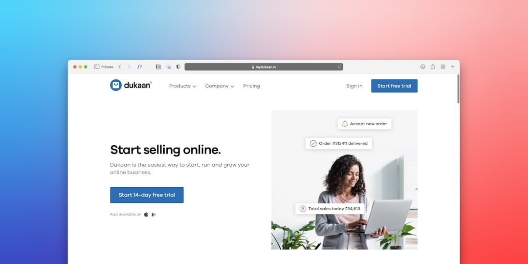
  • Canvas Dark Mode Pages: How to Design Stunning Dark Layouts

    Canvas Dark Mode Pages: How to Design Stunning Dark Layouts

    Dark layouts are no longer a niche aesthetic choice — they have become one of the most searched-for design deliverables in 2025, and clients building SaaS platforms, portfolios, and tech products expect agencies to deliver them with confidence. If you are working with the Canvas HTML Template, building a compelling dark mode page is entirely achievable with the right approach to CSS variables, section classes, and contrast management.

    Why Dark Mode Matters for Modern Web Projects

    Dark web design is not purely about aesthetics. Research consistently shows that dark interfaces reduce eye strain in low-light environments, and operating system-level dark mode adoption means a significant portion of your visitors already prefer it. For product landing pages, developer tools, creative portfolios, and SaaS dashboards, a dark HTML template signals sophistication and aligns the site’s visual identity with the product’s positioning.

    From a practical standpoint, Canvas dark mode pages also tend to make hero sections with video backgrounds, gradient text effects, and glowing CTA buttons look far more impactful than the same elements on a white background. The contrast differential does the heavy lifting.

    According to web design trend data for 2026, dark layouts combined with subtle grain textures and neon accent colours are among the most requested deliverables from freelancers and agencies using HTML templates. Building this capability into your Canvas workflow now is a sound investment.

    blue and white knit textile
    Photo by Francesco Ungaro on Unsplash

    The CSS Foundation for Canvas Dark Mode

    Canvas is built on Bootstrap 5, which means you have access to its colour utilities, but the theme’s own customisation layer sits on top of those using Canvas-specific CSS variables. To build a dark layout correctly, you need to work with those variables rather than fight against them.

    The most important variables to override for a dark page are the background colours, text colours, and the primary theme colour accent. Here is a minimal dark mode override block you would place in a custom.css file or a <style> tag in the <head>:

    :root {
      --cnvs-themecolor: #7c5cfc;
      --cnvs-themecolor-rgb: 124, 92, 252;
      --cnvs-header-bg: #0d0d0d;
      --cnvs-header-sticky-bg: #111111;
      --cnvs-primary-menu-color: #e0e0e0;
      --cnvs-primary-menu-hover-color: #7c5cfc;
      --cnvs-primary-font: 'Inter', sans-serif;
    }
    
    body {
      background-color: #0d0d0d;
      color: #e0e0e0;
    }
    

    This block sets a deep near-black background, a purple accent as the theme colour, and light grey as the default body text. The header and sticky header both receive matching dark backgrounds so the navigation integrates cleanly. Notice that –cnvs-themecolor is used — not Bootstrap’s --bs-primary, which Canvas does not rely on for its own components.

    Applying Dark Backgrounds at the Section Level

    Not every project calls for a fully dark site. Many of the most effective dark HTML template designs use a hybrid approach — a dark hero, dark footer, and specific feature sections with dark backgrounds, while content sections retain a lighter tone for readability. Canvas makes this straightforward through its section utility classes.

    Bootstrap 5’s bg-dark class applies a dark background to any section, and you can extend this with Canvas-compatible inline styles or custom classes for precise colour control:

    <section class="py-6" style="background-color: #111111;">
      <div class="container">
        <div class="row align-items-center">
          <div class="col-lg-6">
            <h2 class="text-white">Built for Performance</h2>
            <p class="text-white-50">Deploy faster with a stack designed around your workflow.</p>
            <a href="#" class="btn btn-light mt-3">Get Started</a>
          </div>
          <div class="col-lg-6">
            <img src="images/feature-dark.png" alt="Feature" class="img-fluid">
          </div>
        </div>
      </div>
    </section>
    

    Using text-white and text-white-50 from Bootstrap 5 keeps your typography legible without needing custom CSS for every element. For headings, you may want to increase weight — refer to Bootstrap 5 typography classes to pick the right display and weight combinations that hold up against dark backgrounds.

    programming codes
    Photo by Branko Stancevic on Unsplash

    Contrast, Colour Selection, and Accessibility

    The most common mistake in dark web design is choosing background and text colours that fail WCAG 2.1 contrast ratio requirements. A ratio of at least 4.5:1 for normal text and 3:1 for large text is the minimum for AA compliance. Dark grey text on a dark background — a frequent shortcut — almost always fails this threshold.

    When selecting your dark palette for a Canvas project, apply this hierarchy:

    1. Base background: #0d0d0d to #1a1a1a — deep but not pure black, which reduces harsh contrast glare.
    2. Surface background: #222222 to #2a2a2a — for cards, panels, and section alternates.
    3. Primary text: #e8e8e8 — slightly off-white to soften the reading experience.
    4. Secondary text: #9a9a9a — for supporting copy, captions, and metadata.
    5. Accent colour (–cnvs-themecolor): A saturated mid-range colour — purple, teal, or electric blue — that passes contrast checks against both the dark background and white text.

    Run your chosen combinations through a contrast checker before finalising. The CSS box shadow generator is also useful here — subtle dark-mode-appropriate shadows (using rgba values with low opacity) add depth to cards and buttons without introducing harsh light-on-dark artefacts.

    Hero Sections and CTAs in Dark Layouts

    The hero section carries the most weight in a dark layout. A well-executed dark hero with a strong headline, a glowing or outlined CTA button, and a carefully chosen background treatment will set the tone for the entire page. Canvas supports full-width sections with background images, gradients, and video — all of which benefit from a dark context.

    For CTA buttons on dark backgrounds, outlined buttons with a coloured border and transparent fill are a popular pattern that avoids visual heaviness. Here is a practical example:

    <section class="py-7 text-center" style="background: linear-gradient(135deg, #0d0d0d 0%, #1a0a2e 100%);">
      <div class="container">
        <h1 class="display-4 fw-bold text-white mb-3">Ship Faster. Scale Smarter.</h1>
        <p class="lead text-white-50 mb-5">The platform built for modern product teams.</p>
        <a href="#" class="btn btn-outline-light btn-lg me-3">Start Free Trial</a>
        <a href="#" class="btn btn-lg" style="background-color: var(--cnvs-themecolor); color: #fff;">See Demo</a>
      </div>
    </section>
    

    The gradient uses two dark tones to create depth without a full image. The primary CTA uses –cnvs-themecolor as its background, maintaining visual consistency with the rest of the theme. For deeper CTA strategy on dark pages, science-backed CTA button design principles apply regardless of background colour — contrast, whitespace, and action-oriented copy remain the key drivers.

    Header, Logo, and Navigation for Dark Pages

    One detail that frequently breaks an otherwise polished dark layout is the navigation — either the logo disappears against the dark background, or the menu links retain their default light-mode colour. Canvas handles both through its CSS variables.

    Logo sizing in Canvas is always controlled via –cnvs-logo-height and –cnvs-logo-height-sticky — not by targeting #logo img directly. Use a light or white version of your logo asset and ensure the variable is set:

    :root {
      --cnvs-logo-height: 40px;
      --cnvs-logo-height-sticky: 32px;
      --cnvs-header-bg: #0d0d0d;
      --cnvs-header-sticky-bg: rgba(13, 13, 13, 0.95);
      --cnvs-primary-menu-color: #cccccc;
      --cnvs-primary-menu-hover-color: var(--cnvs-themecolor);
    }
    

    The sticky header uses a slightly transparent version of the dark background to give a frosted or blended effect as the user scrolls — a detail that elevates the overall finish of the dark HTML template without any JavaScript.

    Frequently Asked Questions

    Can I apply Canvas dark mode to only specific pages rather than the whole site?

    Yes. Place your dark mode CSS variable overrides inside a <style> block scoped to the specific page, or add a page-level class to the <body> tag and scope your CSS rules under that class. This lets you maintain a light default and opt specific pages into the dark treatment without affecting the rest of the project.

    Does Canvas include pre-built dark demo pages I can start from?

    Canvas includes a wide range of demo layouts across its fullpagelayout and block_section types, several of which use dark hero sections and dark full-page treatments. These give you a working structural starting point, though you will still need to apply your own colour variable overrides to match your brand palette.

    Should I load a separate Bootstrap dark mode stylesheet for Canvas?

    No. Canvas bundles Bootstrap 5 internally — you should never load Bootstrap separately via CDN. The dark styling is handled through Canvas’s own CSS variables and Bootstrap 5’s utility classes, which are already available in the bundled stylesheet.

    How do I handle images and icons that look wrong on dark backgrounds?

    Use PNG or SVG assets with transparent backgrounds so they blend correctly against dark sections. For icons from Canvas’s bundled icon font (loaded via css/font-icons.css), apply text-white or a custom colour class. For photography, consider adding a dark overlay using a semi-transparent pseudo-element rather than editing the image itself.

    What is the best accent colour to use with a dark Canvas layout?

    Saturated mid-range colours work best — purple (#7c5cfc), electric blue (#3d9eff), teal (#00c8aa), and lime green (#a3e635) are all common choices. Avoid very dark accent colours, which will not stand out, and very bright neons, which can cause eye strain. Always verify your chosen accent passes a 4.5:1 contrast ratio against the dark background when used for text or icon elements.

    If you’re working with the Canvas HTML Template and want to generate production-ready layouts faster, try Canvas Builder free and see how much time you save on every project.

  • Design a High-Converting Digital Download Page with Canvas

    Design a High-Converting Digital Download Page with Canvas

    Selling digital products online is as much a design problem as it is a marketing problem — a cluttered, unpersuasive download page loses sales even when the product itself is excellent. Building a high-converting digital download page with the Canvas HTML Template gives you a production-ready Bootstrap 5 foundation with the flexibility to craft every trust signal, benefit block, and purchase CTA exactly as conversion best practices demand.

    Key Takeaways

    • A focused single-page layout with a clear hero, benefit blocks, and a prominent CTA is the fastest path to higher conversion rates for digital products.
    • Canvas’s Bootstrap 5 grid and utility classes let you build responsive, visually structured download pages without writing CSS from scratch.
    • Trust signals — money-back guarantees, file format badges, and social proof — should appear above the fold and adjacent to every purchase button.
    • Canvas CSS variables like –cnvs-themecolor make it straightforward to keep your brand colour consistent across every interactive element on the page.

    Why Layout Determines Whether Visitors Buy

    A digital download page has one job: move a visitor from curious to converted before they navigate away. Unlike a multi-page site, every persuasive element — the headline, the product preview, the price, and the download button — must coexist on a single viewport-efficient layout. Research consistently shows that reducing visual noise and shortening the path to the CTA increases purchase rates, which is why a disciplined grid structure is non-negotiable. If you want a deeper grounding in layout logic, the post on grid systems and visual order in web layouts is worth reading before you start building.

    Canvas’s single_page section type is ideal here. It scaffolds a header, hero, content sections, and footer into a single HTML file, keeping load times low and the user journey linear.

    A close up of a cell phone on a table
    Photo by Egor Komarov on Unsplash

    Structuring a Hero Section That Captures Intent

    The hero must communicate the product’s core value proposition, show a visual of the deliverable (mockup, preview, or cover image), and present the primary CTA — all within the first screenful. Use Canvas’s col-lg-6 / col-lg-6 split layout to place copy on the left and the product visual on the right on desktop, stacking vertically on mobile automatically.

    <section id="hero" class="py-6 bg-light">
      <div class="container">
        <div class="row align-items-center gy-4">
          <div class="col-lg-6">
            <span class="badge bg-color-themecolor text-white rounded-pill mb-3">Instant Download</span>
            <h1 class="display-4 fw-bold lh-sm mb-3">The Complete SEO Audit Toolkit</h1>
            <p class="lead text-muted mb-4">35 templates, checklists, and spreadsheets used by 2,000+ freelancers to deliver faster, more profitable SEO audits.</p>
            <a href="#purchase" class="button button-large button-rounded button-themecolor">Get Instant Access — $29</a>
            <p class="text-muted small mt-2">30-day money-back guarantee. PDF + XLSX formats.</p>
          </div>
          <div class="col-lg-6 text-center">
            <img src="images/product-mockup.png" alt="SEO Audit Toolkit Preview" class="img-fluid rounded shadow-lg">
          </div>
        </div>
      </div>
    </section>

    Note that the CTA uses Canvas’s own button classes (button-themecolor, button-rounded) rather than raw Bootstrap button styles. This ensures the button inherits your –cnvs-themecolor value automatically, keeping the design consistent if you later change your brand colour in a single variable.

    Benefit Blocks and the “What’s Included” Section

    After the hero, visitors need to understand exactly what they are buying. A three- or four-column feature grid works well here. Use col-md-6 col-lg-3 for four items or col-md-4 for three. Each card should contain an icon, a short heading, and no more than two lines of descriptive copy. Verbosity at this stage kills momentum.

    <section id="whats-included" class="py-6">
      <div class="container">
        <div class="row text-center mb-5">
          <div class="col">
            <h2 class="fw-bold">Everything Inside the Toolkit</h2>
            <p class="text-muted">Organised, ready-to-use files in formats your clients already know.</p>
          </div>
        </div>
        <div class="row g-4">
          <div class="col-md-6 col-lg-3">
            <div class="card border-0 shadow-sm h-100 text-center p-4">
              <i class="bi bi-file-earmark-spreadsheet fs-2 text-themecolor mb-3"></i>
              <h5 class="fw-semibold">12 Audit Spreadsheets</h5>
              <p class="text-muted small">Pre-built XLSX files covering technical, on-page, and link audits.</p>
            </div>
          </div>
          <div class="col-md-6 col-lg-3">
            <div class="card border-0 shadow-sm h-100 text-center p-4">
              <i class="bi bi-card-checklist fs-2 text-themecolor mb-3"></i>
              <h5 class="fw-semibold">15 Process Checklists</h5>
              <p class="text-muted small">Printable PDF checklists for each audit phase.</p>
            </div>
          </div>
          <div class="col-md-6 col-lg-3">
            <div class="card border-0 shadow-sm h-100 text-center p-4">
              <i class="bi bi-layout-text-window-reverse fs-2 text-themecolor mb-3"></i>
              <h5 class="fw-semibold">8 Client Report Templates</h5>
              <p class="text-muted small">Professional DOCX templates branded and ready to customise.</p>
            </div>
          </div>
          <div class="col-md-6 col-lg-3">
            <div class="card border-0 shadow-sm h-100 text-center p-4">
              <i class="bi bi-camera-video fs-2 text-themecolor mb-3"></i>
              <h5 class="fw-semibold">Walkthrough Videos</h5>
              <p class="text-muted small">Five short screen-recorded guides showing each template in use.</p>
            </div>
          </div>
        </div>
      </div>
    </section>

    For deeper reading on persuasive CTA placement and button hierarchy, the post on CTA button design covers the science behind colour, copy, and position choices that apply directly to this type of page.

    black and silver laptop computer
    Photo by Cartoons Plural on Unsplash

    Social Proof, Trust Signals, and Risk Reversal

    For a digital download page design to convert at its peak, visitors need reassurance at multiple points — not just near the buy button. Place a short testimonial strip immediately below the benefit grid. Three testimonials displayed as a horizontal row on desktop (stacking to one column on mobile with col-md-4) is sufficient. Avoid carousels here; they hide social proof that should be always visible.

    Below or adjacent to the purchase section, include a trust bar with small icons representing: secure payment, instant delivery, file format compatibility, and your refund policy. These micro-signals remove purchase friction without requiring the visitor to read additional copy.

    :root {
      --cnvs-themecolor: #4f46e5;
    }
    
    .trust-bar {
      display: flex;
      flex-wrap: wrap;
      gap: 1.5rem;
      justify-content: center;
      padding: 1.5rem 0;
      border-top: 1px solid #e5e7eb;
      border-bottom: 1px solid #e5e7eb;
    }
    
    .trust-bar-item {
      display: flex;
      align-items: center;
      gap: 0.5rem;
      font-size: 0.875rem;
      color: #6b7280;
    }
    
    .trust-bar-item i {
      color: var(--cnvs-themecolor);
      font-size: 1.1rem;
    }

    The Purchase Section and Pricing Block

    The purchase section is where your canvas html digital products layout either earns or loses the sale. Keep it uncluttered: a centred price, a short summary of what is included (three bullet points maximum), the main CTA button, and the trust signals immediately below. If you offer multiple tiers — for example, a basic file bundle versus a bundle with video training — Canvas’s card components handle side-by-side pricing cleanly. The post on Canvas pricing tables covers exactly how to configure tiered pricing layouts with minimal custom CSS.

    For a single-product page, a centred single-price block is almost always more effective than a comparison table, because it eliminates decision paralysis. Use generous vertical padding (py-6 or py-7 in Bootstrap 5 utility scale) to give the block visual breathing room and signal importance.

    Page Speed, Delivery Flow, and Post-Download UX

    A fast page is a converting page. Canvas loads js/plugins.min.js and js/functions.bundle.js — keep those as your only JavaScript files and avoid adding third-party scripts unless they are essential. For a digital download page, the only scripts you genuinely need are a payment provider embed and optionally an analytics tag.

    After payment, the post-download confirmation screen is a second conversion opportunity. Use it to offer an upsell, collect an email for your list, or direct buyers to a community. Design this screen with the same care as the landing page itself — a plain “thank you” message with no next step is a missed opportunity worth fixing.

    If you want to generate the initial page scaffold quickly rather than building from scratch, Canvas Builder can produce a production-ready single-page layout from a plain-English prompt, which you can then customise with the code patterns shown in this post. The complete Canvas Builder user guide walks through the full prompt-to-download workflow if you are new to the tool.

    Frequently Asked Questions

    What makes a digital download page different from a standard landing page?

    A digital download page is a specific type of landing page where the primary conversion action is a file purchase or gated download rather than a form submission or phone call. The design priorities shift toward communicating file format, instant delivery, and value density, since there is no physical product to inspect. Trust signals such as money-back guarantees and secure payment badges carry more weight than they would on a service enquiry page.

    Can I use the Canvas HTML Template for a page that sells multiple digital products?

    Yes. Canvas’s Bootstrap 5 grid system makes it straightforward to build a product catalogue grid alongside individual product detail sections within the same file. For a catalogue of more than six or seven products, consider using Canvas’s fullpagelayout section type to separate product listing and detail views into individual linked pages while keeping a consistent header and footer.

    How do I change the button and accent colour to match my brand on a Canvas download page?

    Set the –cnvs-themecolor CSS variable in your stylesheet’s :root block. All Canvas button classes, icon colour helpers, and interactive elements that reference this variable will update automatically. For example: :root { --cnvs-themecolor: #e63946; }. You do not need to hunt for individual selectors.

    Should I include a video on a digital download page?

    A short product walkthrough video (60 to 90 seconds) can meaningfully increase conversions for complex products like template bundles, courses, or software tools, because it removes uncertainty about what the buyer will receive. For simpler single-file products, a high-quality static mockup image often performs just as well and keeps page load times lower. Test both if traffic volume allows.

    How many CTAs should appear on a high-converting download page?

    At minimum, place a CTA in the hero section and a second CTA in the dedicated purchase block near the bottom of the page. For longer pages, a third CTA mid-page after the benefit or testimonial section is appropriate. All CTAs should use identical button styling and copy to reinforce a single conversion goal — avoid mixing “Buy Now” and “Learn More” button styles at the same hierarchy level.

    If you’re working with the Canvas HTML Template and want to generate production-ready layouts faster, try Canvas Builder free and see how much time you save on every project.