Category: Niche Tutorials

  • Real Estate Website Design: Sections Every Property Site Needs

    Real Estate Website Design: Sections Every Property Site Needs

    A property site that fails to communicate trust, location, and availability within the first few seconds will lose the lead to a competitor who does. Whether you are building from scratch or adapting a Canvas HTML Template, knowing exactly which sections belong on a real estate website — and how to structure them — is what separates a high-converting property site from one that just looks like one.

    Key Takeaways

    • Every effective real estate website needs six core sections: hero with search, featured listings, property detail, agent profiles, neighbourhood context, and a lead capture form.
    • Bootstrap 5’s grid system, bundled inside Canvas, makes it straightforward to build responsive property card layouts without any additional CSS frameworks.
    • Using Canvas CSS variables such as –cnvs-themecolor keeps your brand colour consistent across every section without hunting through stylesheet files.
    • A well-structured property detail page — with image gallery, specs, map, and CTA — dramatically reduces the number of off-site enquiries buyers make before converting.

    The hero is where a visitor decides whether your site is worth two more seconds of their time. For real estate, that decision depends entirely on whether they can immediately search for what they want. A generic headline with a background image is not enough — you need a search bar embedded directly in the hero, accepting inputs for location, property type, and price range.

    Using Canvas’s full-height section classes alongside Bootstrap 5’s grid, you can build a functional hero search bar that works on every screen size. The pattern below uses Bootstrap utility classes to centre the form and Canvas’s theme colour variable for the submit button:

    <section class="min-vh-100 d-flex align-items-center" style="background: url('images/hero-property.jpg') center/cover no-repeat;">
      <div class="container text-center text-white">
        <h2 class="display-4 fw-bold mb-3">Find Your Perfect Property</h2>
        <p class="lead mb-5">Search over 4,000 listings across the country</p>
        <form class="row g-2 justify-content-center">
          <div class="col-md-4">
            <input type="text" class="form-control form-control-lg" placeholder="City or postcode">
          </div>
          <div class="col-md-3">
            <select class="form-select form-select-lg">
              <option>Property type</option>
              <option>House</option>
              <option>Apartment</option>
              <option>Commercial</option>
            </select>
          </div>
          <div class="col-md-2">
            <button class="btn btn-lg w-100" style="background-color: var(--cnvs-themecolor); color: #fff;">Search</button>
          </div>
        </form>
      </div>
    </section>

    For hero image carousels or slider backgrounds, Canvas includes dedicated slider components that outperform generic solutions — the Canvas Slider and Carousel Components guide explains which component suits which use case.

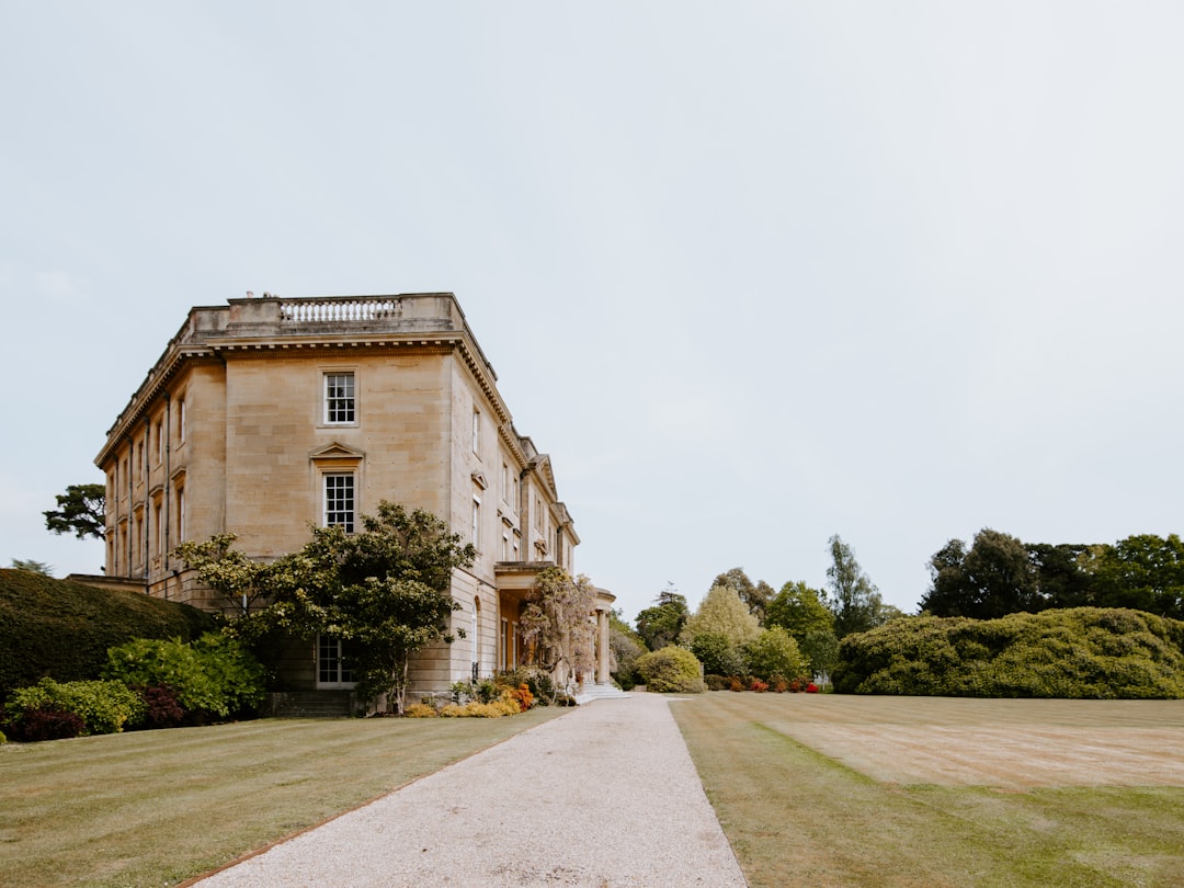
    a street lined with tall buildings next to each other
    Photo by Maz on Unsplash

    Below the hero, visitors expect to see properties immediately. A featured listings grid showcasing four to six properties with photos, price, bedrooms, and a short location tag gives browsers an instant sense of your inventory quality and price range. Each card should link through to a full property detail page.

    Bootstrap 5’s grid makes equal-height cards trivial. The key is combining col-md-6 col-lg-4 columns with h-100 on the card element so every card stretches uniformly regardless of content length:

    <section class="py-6">
      <div class="container">
        <h2 class="text-center mb-5">Featured Properties</h2>
        <div class="row g-4">
    
          <div class="col-md-6 col-lg-4">
            <div class="card h-100 border-0 shadow-sm">
              <img src="images/property-01.jpg" class="card-img-top" alt="3-bed semi in Manchester">
              <div class="card-body">
                <span class="badge mb-2" style="background-color: var(--cnvs-themecolor);">For Sale</span>
                <h5 class="card-title">3-Bed Semi, Manchester</h5>
                <p class="card-text text-muted">Beechwood Road, M14 &bull; 3 bed &bull; 2 bath</p>
                <p class="fs-5 fw-bold">&pound;325,000</p>
                <a href="property-detail.html" class="btn btn-outline-secondary btn-sm">View Property</a>
              </div>
            </div>
          </div>
    
        </div>
      </div>
    </section>

    If you want to understand how Bootstrap 5 utility classes accelerate this kind of layout work, the Bootstrap 5 Utility Classes guide covers the full toolkit available to you inside Canvas.

    Property Detail Page Structure

    This is the most conversion-critical page on the entire site. A buyer who reaches a property detail page is already motivated — the page just needs to not let them down. Structure it in this order:

    1. Full-width image gallery — minimum five photos, with a lightbox or thumbnail strip
    2. Property headline and price — prominently positioned, never buried below the fold
    3. Key specs row — bedrooms, bathrooms, floor area, parking, in an icon-and-label row
    4. Full description — written, specific, and honest about condition and location
    5. Embedded map — iframe from Google Maps or OpenStreetMap centred on the property address
    6. Agent contact form — sticky sidebar on desktop, stacked below content on mobile

    The specs row is worth marking up carefully for accessibility and scannability. Using Bootstrap’s d-flex gap-4 pattern gives you a clean, flexible row that wraps gracefully on smaller screens:

    <div class="d-flex flex-wrap gap-4 my-4 py-4 border-top border-bottom">
      <div class="text-center">
        <i class="bi bi-house-door fs-4 d-block mb-1" style="color: var(--cnvs-themecolor);"></i>
        <small class="text-muted d-block">Type</small>
        <strong>Semi-Detached</strong>
      </div>
      <div class="text-center">
        <i class="bi bi-door-open fs-4 d-block mb-1" style="color: var(--cnvs-themecolor);"></i>
        <small class="text-muted d-block">Bedrooms</small>
        <strong>3</strong>
      </div>
      <div class="text-center">
        <i class="bi bi-water fs-4 d-block mb-1" style="color: var(--cnvs-themecolor);"></i>
        <small class="text-muted d-block">Bathrooms</small>
        <strong>2</strong>
      </div>
      <div class="text-center">
        <i class="bi bi-arrows-angle-expand fs-4 d-block mb-1" style="color: var(--cnvs-themecolor);"></i>
        <small class="text-muted d-block">Floor Area</small>
        <strong>112 m&sup2;</strong>
      </div>
    </div>
    white and brown concrete building under blue sky during daytime
    Photo by Simon Peter on Unsplash

    Agent Profiles Section

    Buyers do not just buy properties — they buy the people they trust to guide them through the process. An agent profiles section with a photo, name, specialisation, years of experience, and a direct contact link builds credibility that no amount of stock photography can replace.

    Keep the layout honest. Use real photos, real names, and real contact details. A four-column grid on desktop that stacks to two columns on tablet and single column on mobile works well for teams of four to eight agents. Each card should end with a telephone number or WhatsApp link as the primary CTA — not a generic “get in touch” button that goes to a general contact form.

    Neighbourhood and Location Context

    One of the most underused sections on property websites is a neighbourhood overview. Buyers searching in an unfamiliar area want to know about schools, transport links, local amenities, and average sale prices before they commit to a viewing. Providing this information on your site keeps them engaged longer and positions your agency as a genuine local authority.

    A two-column layout works well here: a written overview on the left, and an embedded map or infographic panel on the right. If you are building multiple neighbourhood pages, this pattern scales cleanly into a template you can replicate across dozens of areas — a real advantage if you are using Canvas Builder to generate the layout scaffolding quickly.

    This approach is very similar to the location-context thinking discussed in the Wedding Venue Website Design guide, where local context is equally critical for converting site visitors into serious enquiries.

    Lead Capture and Property Valuation CTA

    Every real estate website needs at least one dedicated lead capture section that is not buried in the footer. The most effective format for 2025 is a property valuation offer: “What is your home worth? Get a free valuation in 48 hours.” This converts both buyers and sellers, two audiences a single form can rarely serve at once.

    Place this section between your listings grid and your agent profiles. Use a high-contrast background — your Canvas theme colour pulled from –cnvs-themecolor works perfectly — to visually separate it from the surrounding white sections. Keep the form short: name, email, phone, and property address. Every additional field reduces conversion rate.

    .valuation-section {
      background-color: var(--cnvs-themecolor);
      padding: 80px 0;
      color: #fff;
    }
    
    .valuation-section .form-control {
      border: none;
      border-radius: 4px;
    }
    
    .valuation-section .btn-submit {
      background-color: #fff;
      color: var(--cnvs-themecolor);
      font-weight: 600;
      border: none;
      padding: 12px 32px;
      border-radius: 4px;
    }

    Frequently Asked Questions

    What sections are essential for a real estate website HTML template?

    At minimum, you need a hero section with search functionality, a featured listings grid, individual property detail pages, an agent profiles section, a neighbourhood overview, and a lead capture or valuation CTA section. These six sections cover the full buyer and seller journey from awareness to enquiry.

    Can I use the Canvas HTML Template for a property website?

    Yes. Canvas is a multi-purpose HTML template built on Bootstrap 5, which makes it well suited for real estate layouts. Its section-based structure, CSS variables for theming, and pre-built components such as sliders, cards, and forms give you everything needed to build a professional property site without writing everything from scratch.

    How do I keep the theme colour consistent across a real estate HTML template?

    Use the Canvas CSS variable –cnvs-themecolor throughout your stylesheet instead of hardcoding hex values. Set it once in your root styles and every element referencing that variable will update automatically if you ever change brand colour.

    Should property listing cards link to a separate detail page or use a modal?

    For SEO purposes, a dedicated detail page is strongly preferred. Each property page can be indexed individually by search engines, allowing you to rank for long-tail searches like “3-bed house for sale in [area]”. Modals are fine for quick previews but should never be the only way to access full property information.

    What is the best Bootstrap 5 layout for a property card grid?

    Use col-12 col-md-6 col-lg-4 column classes inside a row g-4 container. Add h-100 to the card element to equalise card heights. This gives you a three-column grid on desktop, two on tablet, and a single column on mobile — the standard pattern for property listing pages in 2025.

    If you’re working with the Canvas HTML Template and want to generate production-ready layouts faster, try Canvas Builder free and see how much time you save on every project.

  • Wedding Venue Website Design: What to Include & How to Build It

    Wedding Venue Website Design: What to Include & How to Build It

    A wedding venue’s website is often the first — and most decisive — touchpoint for couples comparing their shortlist of venues, which means a poorly structured site doesn’t just lose a lead; it hands that booking directly to a competitor. Getting the design right requires more than beautiful photography: it demands a clear information architecture, persuasive calls to action, and a layout that performs just as well on mobile as it does on a large display.

    Why Most Wedding Venue Websites Fail to Convert

    The most common failure is prioritising aesthetics over function. A venue site might have stunning drone footage and elegant serif fonts, yet still convert poorly because couples cannot find basic information: how many guests the venue holds, whether catering is in-house or third-party, and what the enquiry process looks like. Conversion-focused design means anticipating every question a couple has and answering it before they have to ask.

    Secondary failures include slow image loading (uncompressed gallery photos are the usual culprit), no mobile-optimised navigation, and a contact form buried three scrolls below the fold. Each of these issues compounds the other. If you are building a venue site for a client, auditing against these failure points before launch will save significant revision time.

    wedded couple photo
    Photo by Eugenia Pan’kiv on Unsplash

    Essential Sections Every Wedding Venue Website Must Include

    Think of your page structure as a conversation that mirrors how couples actually make decisions. They start with emotion, then move to logistics, then seek social proof, and finally commit to an enquiry. Your section order should reflect that journey.

    1. Hero Section: Full-width image or video of the venue at its best — ceremony space, reception hall, or outdoor grounds. Include a single headline and one CTA button linking to the enquiry form.
    2. Venue Overview: A brief narrative (two to three paragraphs) covering the venue’s character, location, and unique selling point. Pair it with a secondary image or short feature list.
    3. Spaces and Capacity: A grid or tab layout showing each distinct space (ceremony room, cocktail terrace, bridal suite) with headshots, capacity figures, and a one-line description.
    4. Packages and Pricing: Even if full pricing is “available on request”, a packages section showing what is included builds confidence. Use a three-column Bootstrap card layout for easy comparison.
    5. Photo Gallery: A filterable or masonry gallery. Keep images compressed to WebP at no wider than 1,400px to maintain page speed.
    6. Testimonials: Rotating quotes from real couples with a name, wedding date, and if possible a small portrait photo.
    7. FAQ: Answer the ten questions your venue receives most often by email — this alone reduces pre-enquiry back-and-forth and builds trust.
    8. Contact and Enquiry Form: Name, email, preferred date, estimated guest count, and a message field. Keep it simple. Fewer fields equal higher submission rates.

    Building the Layout with Canvas and Bootstrap 5

    Canvas is built on Bootstrap 5, which means you have access to a full 12-column grid, flexbox utilities, and a component library out of the box. For a venue packages section, a three-column card layout is the most effective pattern. Here is a working snippet you can drop directly into a Canvas page section:

    <section class="py-6">
      <div class="container">
        <div class="row justify-content-center mb-5">
          <div class="col-lg-7 text-center">
            <h2 class="display-5 fw-bold">Our Wedding Packages</h2>
            <p class="lead text-muted">Choose the package that suits your vision and guest list.</p>
          </div>
        </div>
        <div class="row g-4">
          <div class="col-md-4">
            <div class="card h-100 border-0 shadow-sm">
              <div class="card-body p-4">
                <h5 class="card-title fw-semibold">Intimate</h5>
                <p class="text-muted">Up to 50 guests</p>
                <ul class="list-unstyled mt-3">
                  <li class="mb-2">Garden ceremony space</li>
                  <li class="mb-2">3-course dinner</li>
                  <li class="mb-2">Bridal suite access</li>
                </ul>
              </div>
            </div>
          </div>
          <div class="col-md-4">
            <div class="card h-100 border-0 shadow-sm border-top border-3" style="border-color: var(--cnvs-themecolor) !important;">
              <div class="card-body p-4">
                <h5 class="card-title fw-semibold">Classic</h5>
                <p class="text-muted">Up to 150 guests</p>
                <ul class="list-unstyled mt-3">
                  <li class="mb-2">Grand hall & garden</li>
                  <li class="mb-2">5-course dinner</li>
                  <li class="mb-2">Evening entertainment</li>
                </ul>
              </div>
            </div>
          </div>
          <div class="col-md-4">
            <div class="card h-100 border-0 shadow-sm">
              <div class="card-body p-4">
                <h5 class="card-title fw-semibold">Grand</h5>
                <p class="text-muted">Up to 300 guests</p>
                <ul class="list-unstyled mt-3">
                  <li class="mb-2">Full venue exclusive hire</li>
                  <li class="mb-2">Bespoke catering menu</li>
                  <li class="mb-2">On-site coordinator</li>
                </ul>
              </div>
            </div>
          </div>
        </div>
      </div>
    </section>

    Notice the use of var(--cnvs-themecolor) to apply the venue’s brand colour as a top border accent on the featured card — this is the correct Canvas variable, not --bs-primary. For more detail on aligning and spacing elements within these grid layouts, the guide on Bootstrap 5 Flexbox alignment and spacing covers the utilities you will use most frequently.

    brown concrete house under white sky
    Photo by Annie Spratt on Unsplash

    Typography and Colour Choices for Wedding Venues

    Wedding venues typically fall into one of three visual tones: rustic-romantic (warm neutrals, serif fonts), modern-luxury (deep charcoals, gold accents, clean sans-serif), or garden-fresh (soft greens, dusty rose, light airy typography). Your font and colour choices must reinforce whichever tone the venue has already established in its branding.

    In Canvas, set fonts via the --cnvs-primary-font and --cnvs-secondary-font CSS variables in your stylesheet. For a luxury venue pairing a display serif heading font with a neutral body font:

    :root {
      --cnvs-primary-font: 'Cormorant Garamond', Georgia, serif;
      --cnvs-secondary-font: 'Inter', sans-serif;
      --cnvs-themecolor: #b08d6a;
      --cnvs-themecolor-rgb: 176, 141, 106;
    }

    Import your chosen Google Fonts in the <head> before style.css. Never load Bootstrap separately — Canvas bundles Bootstrap 5 already, and a duplicate load will cause styling conflicts.

    Social Sharing, Open Graph, and Local SEO

    Couples routinely share venue websites with family and partners via social media links and messaging apps. If your Open Graph tags are missing or incorrect, those shared links will render as bare URLs with no image preview — a missed opportunity every time. Implement complete Open Graph meta tags in the <head> of every key page. For a comprehensive walkthrough of how to structure these correctly, see the Open Graph tags complete guide.

    For local SEO, every wedding venue website in 2025 should include structured data markup (schema.org EventVenue type), a Google Maps embed, consistent NAP (Name, Address, Phone) data in the footer, and a page title pattern that includes the venue name and location — for example: “Meadowbrook Manor Wedding Venue | Oxfordshire”.

    Accelerating the Build Process with an AI Wedding Venue Website Builder

    Building a venue site manually — even with Canvas’s component library — still involves significant layout assembly, placeholder copy decisions, and repeated tweaking of grid breakpoints. An AI-powered wedding venue website builder approach changes the workflow entirely: you describe the site’s tone, sections, and content structure in a prompt, and receive a complete Canvas-compatible HTML layout ready to customise.

    This is particularly valuable when working on client projects where initial concepts need to be presented quickly. Rather than spending several hours assembling a first draft, you can generate multiple layout variations, compare them with the client, and refine the chosen direction. The post on speeding up client approvals with AI-generated design concepts explores this workflow in more detail. If you are curious about what other venue-adjacent niche sites can be built with the same approach, 12 niche website ideas you can build with Canvas HTML is worth a read.

    The key advantage is consistency: AI-generated Canvas layouts use the correct file structure (style.css, css/font-icons.css, js/plugins.min.js, js/functions.bundle.js), the correct Canvas CSS variables, and Bootstrap 5 classes — so the output is production-ready rather than requiring a structural overhaul before it can be used.

    Frequently Asked Questions

    What pages should a wedding venue website have?

    At minimum: a home page, a venue spaces page, a packages and pricing page, a gallery, a testimonials or reviews page, an FAQ page, and a contact/enquiry page. Larger venues with multiple sites or accommodation on-site may add further section-specific pages.

    How do I make a wedding venue website mobile-friendly?

    Use Bootstrap 5’s responsive grid (which Canvas includes by default), ensure touch-friendly tap targets for all buttons and form fields, compress all gallery images to WebP format, and test on real devices rather than only browser emulators. Avoid fixed-width elements and always use percentage or viewport-relative widths for hero sections.

    Should a wedding venue website show prices?

    Transparency on pricing — even if only indicative package ranges — reduces the friction couples feel before making an enquiry. Venues that display “prices from £X” consistently report higher enquiry quality because couples have pre-qualified themselves before contacting. Full bespoke pricing can still be confirmed after enquiry.

    What is the best colour scheme for a wedding venue website?

    There is no single best scheme — it should reflect the venue’s existing brand and physical aesthetic. Luxury estates typically use deep navy, champagne gold, or charcoal with white space. Rustic barns suit warm terracotta, sage green, and cream. Garden venues work well with dusty rose, sage, and soft white. Always derive the palette from the venue’s strongest photography.

    Can I use Canvas HTML Template to build a wedding venue website?

    Yes. Canvas’s multi-purpose section library, Bootstrap 5 grid, and full CSS variable system make it an excellent base for venue websites. You can customise fonts via --cnvs-primary-font, brand colour via --cnvs-themecolor, and header behaviour via --cnvs-header-bg and --cnvs-header-sticky-bg — all without modifying core template files.

    If you’re working with the Canvas HTML Template and want to generate production-ready layouts faster, try Canvas Builder free and see how much time you save on every project.
  • 7 Online Bootcamp Website Designs That Convert Visitors to Students

    7 Online Bootcamp Website Designs That Convert Visitors to Students

    A bootcamp website that looks credible but fails to convert is costing you enrollments every single day — and in most cases, the gap between a visitor bouncing and a student enrolling comes down to a handful of deliberate design decisions, not budget.

    Key Takeaways

    • High-converting bootcamp websites lead with a specific outcome promise, not a generic headline about “learning to code.”
    • Social proof placement, urgency signals, and a frictionless CTA above the fold are the three design levers with the most impact on enrollment rates.
    • Bootstrap 5 and the Canvas HTML Template give you a production-ready foundation for every pattern shown in this post.
    • Structured layout sections — outcomes, curriculum, instructors, pricing, and FAQ — follow a proven psychological sequence that mirrors how prospective students make decisions.

    What Separates Bootcamp Sites That Convert From Those That Don’t

    Most online bootcamp landing pages repeat the same mistake: they describe the course before they sell the transformation. A visitor arriving on your page has one question — “will this change my situation?” — and every design element either answers that question or gets in the way of it. The seven design patterns below are drawn from consistently high-performing bootcamp and online education sites. Each one can be assembled using Bootstrap 5 utility classes and Canvas layout sections without writing complex custom CSS.

    If you want a broader grounding in Bootstrap utility patterns before diving into the specifics, the post on 7 Bootstrap 5 utilities that will transform your layout design is a useful companion read.

    black flat screen computer monitor
    Photo by Tobias Rademacher on Unsplash

    1. The Outcome-First Hero Section

    The single most impactful change you can make to a coding bootcamp landing page is replacing a course-description headline with an outcome headline. “Become a Full-Stack Developer in 12 Weeks” outperforms “Our Full-Stack Web Development Bootcamp” every time, because it speaks to the result the visitor wants, not the product you are selling.

    Pair that headline with a single sub-line that names the target student, states the timeline, and removes the biggest objection. Below the headline, place one primary CTA button and one secondary “See the curriculum” link. Nothing else. The Canvas sectiontype: singlepage hero block with a full-width dark overlay image handles this layout cleanly.

    <section class="py-6 dark" style="background: linear-gradient(rgba(0,0,0,.65), rgba(0,0,0,.65)), url('hero-bg.jpg') center/cover no-repeat;">
      <div class="container text-center text-white">
        <h1 class="display-4 fw-bold mb-3">Become a Full-Stack Developer in 12 Weeks</h1>
        <p class="lead mb-4">Designed for career-changers with zero coding experience.</p>
        <a href="#apply" class="btn btn-lg me-2" style="background-color: var(--cnvs-themecolor); color: #fff;">Apply Now</a>
        <a href="#curriculum" class="btn btn-lg btn-outline-light">See the Curriculum</a>
      </div>
    </section>

    2. The Trust Strip and Inline Social Proof

    Place a trust strip immediately below the hero — a single full-width row containing four to six logos of hiring partners, featured publications, or graduate employers. This is the fastest way to establish legitimacy before a visitor reads a single word of body copy. Logos should be greyscale by default and colour on hover, which keeps the strip visually clean without hiding the social signal.

    Deeper social proof — graduate testimonials with job title and salary change — belongs in two places: directly after the curriculum section, and again just above the pricing section. Repeating social proof at decision points reduces drop-off at each stage of the page.

    <div class="py-4 border-bottom">
      <div class="container">
        <div class="row align-items-center justify-content-center g-4">
          <div class="col-auto"><img src="logo-google.svg" alt="Google" class="opacity-50" style="height:28px;"></div>
          <div class="col-auto"><img src="logo-amazon.svg" alt="Amazon" class="opacity-50" style="height:28px;"></div>
          <div class="col-auto"><img src="logo-stripe.svg" alt="Stripe" class="opacity-50" style="height:28px;"></div>
          <div class="col-auto"><img src="logo-shopify.svg" alt="Shopify" class="opacity-50" style="height:28px;"></div>
        </div>
      </div>
    </div>
    Laptop with code, headphones, phone, and mouse on desk.
    Photo by Daniil Komov on Unsplash

    3. Curriculum and Outcomes in a Scannable Grid

    Prospective students want to know exactly what they will learn and in what order. A two-column Bootstrap grid works well here: the left column lists the weekly curriculum as a numbered timeline; the right column lists the tools and technologies covered as badge-style chips. This layout answers the “what will I actually be able to do?” question without forcing the visitor to read a wall of prose.

    Each curriculum milestone should name a concrete deliverable — “Build and deploy a REST API with Node.js and PostgreSQL” — rather than a vague topic like “Backend development.” Deliverable-based copy is significantly more persuasive because it lets the visitor mentally rehearse the outcome.

    For the badge chips, Bootstrap 5’s badge component styled with your Canvas theme colour keeps things consistent:

    <span class="badge rounded-pill px-3 py-2 me-2 mb-2" style="background-color: var(--cnvs-themecolor);">React</span>
    <span class="badge rounded-pill px-3 py-2 me-2 mb-2" style="background-color: var(--cnvs-themecolor);">Node.js</span>
    <span class="badge rounded-pill px-3 py-2 me-2 mb-2" style="background-color: var(--cnvs-themecolor);">PostgreSQL</span>
    <span class="badge rounded-pill px-3 py-2 me-2 mb-2" style="background-color: var(--cnvs-themecolor);">AWS Deployment</span>

    4. Instructor Credibility Section

    Instructor profiles are one of the most underrated conversion elements on bootcamp websites. A photo, a two-line bio that leads with a recognisable company name, and a LinkedIn-style credential strip (years of experience, previous employer, notable project) gives the visitor a person to trust rather than an abstract institution. Keep the layout to a three-column card grid on desktop and a single-column stack on mobile.

    Avoid the common mistake of writing instructor bios in third-person corporate language. First-person or conversational third-person reads as more authentic, which matters enormously for a high-consideration purchase like a bootcamp enrollment. This principle applies equally to other education-adjacent niches — the fitness studio website design post covers similar credibility patterns for instructor-led services.

    5. Pricing Section With Urgency Signals and a Clear CTA

    Bootcamp pricing pages frequently bury the number after paragraphs of value justification. State the price early, then justify it. A three-tier pricing card layout works well: a self-paced option, a live cohort option, and an income-share or financing option. Use Canvas’s pricing table component and set the recommended tier’s card border to var(--cnvs-themecolor) to draw the eye.

    Urgency signals that convert without feeling manipulative include cohort seat counts (“4 seats remaining in the March cohort”), application deadlines, and early-bird pricing with a visible expiry date. Countdown timers work, but only if the deadline is real — sophisticated visitors recognise fake timers and they destroy trust instantly.

    For more on pricing table design patterns that increase conversion, the post on Canvas pricing tables: design options that convert visitors covers the topic in depth.

    6. The Low-Friction Application Form

    The biggest conversion killer on online bootcamp websites is an application form that asks for too much too soon. A first-step form should collect name, email address, and one qualifying question — nothing else. Use a multi-step form pattern where subsequent questions appear only after the visitor has committed to step one. This dramatically reduces abandonment because of the psychological sunk-cost effect: once someone has typed their name and clicked “Next,” they are far more likely to complete the rest.

    On the layout side, the form should occupy its own full-width section with a contrasting background — a dark section using Canvas’s dark section class works well — so the eye is drawn to it as a distinct destination on the page rather than an afterthought appended to the pricing block.

    7. Mobile Performance and Canvas Technical Setup

    Over 60 percent of initial research visits to bootcamp pages happen on mobile, but most bootcamp sites are designed desktop-first and then awkwardly scaled down. Build every section mobile-first using Bootstrap 5’s responsive grid classes, and test the hero CTA button size — it must be at least 44px tall on touch devices to meet usability standards.

    For Canvas-specific implementation, load only the required CSS and JS files. The correct file references are style.css and css/font-icons.css for styles, and js/plugins.min.js followed by js/functions.bundle.js for scripts. Never load a separate Bootstrap CDN link alongside Canvas, since Bootstrap 5 is already bundled. Keeping the asset payload lean is the single most controllable factor in page load speed for high-traffic landing pages.

    If you are generating your bootcamp layout with AI assistance, Canvas Builder can produce a complete Canvas-compatible page layout from a single structured prompt, which significantly reduces the time between design concept and a browser-ready file.

    Frequently Asked Questions

    What is the most important element on a coding bootcamp landing page?

    The hero section headline is the highest-leverage element. It must state a specific, desirable outcome rather than describing the course format. Visitors decide within seconds whether the page is relevant to them, and an outcome-focused headline is what keeps them reading.

    How long should a bootcamp landing page be?

    Long-form pages consistently outperform short pages for high-consideration purchases like bootcamp enrollment, because visitors need to answer multiple objections before committing. A well-structured page covering hero, trust strip, outcomes, curriculum, instructors, pricing, and application form will typically run 1,500 to 2,500 words of visible copy — but every section must earn its place. Padding for length reduces conversions.

    Should a bootcamp website use a single-page layout or a multi-page structure?

    For the primary conversion goal — enrollment — a single long-form landing page outperforms multi-page navigation. Multi-page structures suit institutional sites that serve multiple audiences (prospective students, hiring partners, alumni). If you are building with the Canvas HTML Template, the single_page section type handles the long-form layout pattern cleanly.

    How do I apply Canvas CSS variables to a bootcamp site’s theme colour?

    Set your brand colour by overriding –cnvs-themecolor in your custom CSS file. For example: :root { --cnvs-themecolor: #e63946; --cnvs-themecolor-rgb: 230, 57, 70; }. Every Canvas component that references the theme colour — buttons, badges, active states, accent borders — will update automatically without touching individual component styles.

    What social proof works best for online bootcamp conversion?

    Graduate outcomes data — specifically job placement rate, average salary increase, and time-to-hire — outperforms star ratings and generic testimonials. Pair a headline statistic (“94% of graduates land a developer role within 90 days”) with two or three named testimonials that include the graduate’s previous role, new role, and employer name. Specificity is what makes social proof credible.

    If you’re working with the Canvas HTML Template and want to generate production-ready layouts faster, try Canvas Builder free and see how much time you save on every project.

  • 7 Micro-SaaS Website Design Mistakes to Avoid

    7 Micro-SaaS Website Design Mistakes to Avoid

    Most micro-SaaS products fail to convert not because the software is bad, but because the website signals the wrong things at exactly the wrong moment. If your micro-SaaS website design contains even three of the mistakes below, you are quietly haemorrhaging trial sign-ups every single day.

    Key Takeaways

    • A cluttered hero section kills conversions faster than slow page speed — clarity beats cleverness every time on a developer tool landing page.
    • Weak or missing social proof is one of the most common SaaS website mistakes — even early-stage products can fix this with targeted testimonials and usage numbers.
    • Pricing page friction (hidden tiers, unclear feature comparisons) is a silent revenue killer for micro-SaaS founders.
    • Bootstrap 5 layout patterns and the Canvas HTML Template give you a fast, reliable structural foundation — but design decisions still determine whether visitors stay or leave.

    Mistake 1: A Vague Hero Headline That Explains Nothing

    The single most damaging pattern in micro-SaaS website design is a hero headline that sounds impressive but communicates nothing specific. Phrases like “Supercharge Your Workflow” or “The Future of Productivity” tell a visitor nothing about what the product does, who it is for, or why they should care. Visitors decide within seconds whether to stay, and a generic headline gives them no reason to.

    Your headline needs to answer three questions immediately: what the product does, who it helps, and what outcome it delivers. A formula that works reliably in 2025 is: [Outcome] for [Audience] without [Pain Point]. For example: “Automated invoice reconciliation for freelance developers — no spreadsheets required.”

    On a Bootstrap 5 layout, the hero structure should keep the headline prominent and the sub-copy concise. Here is a clean, copy-pasteable example using Bootstrap utility classes:

    <section class="py-5 bg-light">
      <div class="container">
        <div class="row align-items-center">
          <div class="col-lg-6">
            <h1 class="display-5 fw-bold mb-3">
              Automated invoice reconciliation for freelance developers
            </h1>
            <p class="lead text-muted mb-4">
              Connect your bank, sync your invoices, and close your books in under 5 minutes. No spreadsheets required.
            </p>
            <a href="/signup" class="btn btn-primary btn-lg me-2">Start free trial</a>
            <a href="#demo" class="btn btn-outline-secondary btn-lg">Watch demo</a>
          </div>
          <div class="col-lg-6">
            <img src="assets/hero-screenshot.png" alt="App dashboard preview" class="img-fluid rounded shadow">
          </div>
        </div>
      </div>
    </section>

    For a deeper look at how Bootstrap 5 layout patterns support this kind of structure, the Bootstrap 5 Complete Guide for Web Designers covers the grid and component system in full.

    a laptop computer sitting on top of a desk
    Photo by Rolf van Root on Unsplash

    Mistake 2: Missing or Misplaced Social Proof

    One of the most consistent SaaS website mistakes is treating social proof as an afterthought — burying testimonials at the bottom of the page or skipping them entirely because the product is early-stage. Both approaches lose trust at the moment visitors need it most.

    Social proof belongs directly below the hero on a developer tool landing page. Even if you only have five users, a quote from one satisfied customer alongside the number of active accounts creates a measurable lift in sign-up rate. Use a logo bar for recognisable company names, star ratings for credibility, and specific outcome-driven quotes rather than generic praise.

    Canvas HTML Template includes pre-built testimonial and logo grid components that slot cleanly into a block_section layout. Pair them with Bootstrap’s grid to keep the proof section visually tight and responsive.

    Mistake 3: Feature Sections That List Instead of Persuade

    A wall of feature bullet points is not a value proposition — it is a specification sheet. Visitors do not care what your product has; they care what it does for them. Converting a feature list into a benefit-led section is one of the highest-leverage changes you can make to a micro-SaaS website design.

    Structure each feature block around a single outcome. Lead with the benefit in bold, follow with one sentence of explanation, and support it with a small screenshot or icon. Three columns of three is a reliable grid pattern for this:

    <section class="py-5">
      <div class="container">
        <div class="row g-4">
          <div class="col-md-4">
            <div class="p-4 border rounded h-100">
              <h3 class="h5 fw-bold">Close your books in 5 minutes</h3>
              <p class="text-muted">Automatic bank sync matches transactions to invoices the moment they land.</p>
            </div>
          </div>
          <div class="col-md-4">
            <div class="p-4 border rounded h-100">
              <h3 class="h5 fw-bold">Never chase a late payment again</h3>
              <p class="text-muted">Smart reminders send at the right time without you lifting a finger.</p>
            </div>
          </div>
          <div class="col-md-4">
            <div class="p-4 border rounded h-100">
              <h3 class="h5 fw-bold">Tax-ready reports on demand</h3>
              <p class="text-muted">Export categorised summaries your accountant can use immediately.</p>
            </div>
          </div>
        </div>
      </div>
    </section>
    a close up of a computer screen with words on it
    Photo by Jason Leung on Unsplash

    Mistake 4: Pricing Page Friction That Kills Decisions

    Micro-SaaS pricing pages fail in predictable ways: too many tiers, hidden feature comparisons, no indication of which plan fits which user type, and CTAs that say “Contact us” when visitors expect “Start free.” Each of these introduces friction at the moment a visitor is closest to converting.

    For most micro-SaaS products, two to three pricing tiers with a clear recommended option is the optimum structure. Use a visual highlight (a border, a badge, a background colour change using --cnvs-themecolor) to draw attention to your most popular plan. The Canvas Pricing Tables post covers specific design patterns that improve conversion on this exact page type.

    Apply the Canvas theme colour variable to your highlighted plan card so it stays consistent across the entire site:

    .pricing-card--featured {
      border: 2px solid var(--cnvs-themecolor);
      box-shadow: 0 4px 24px rgba(var(--cnvs-themecolor-rgb), 0.15);
    }

    Mistake 5: Weak CTA Design and Placement

    A surprising number of developer tool landing pages bury their primary call to action, use low-contrast button colours, or rely on passive copy like “Learn more” when the intent should be “Start free trial.” CTA design is not decoration — it is the moment your page either earns a user or loses one.

    Every major section of a micro-SaaS page should contain a contextually relevant CTA. The hero gets the primary sign-up. The features section gets a secondary “See how it works.” The pricing section gets a tier-specific “Get started.” Place CTAs where the visitor’s decision momentum is highest — immediately after a persuasive claim, not after a long block of text.

    For a thorough breakdown of what makes buttons perform, the CTA Button Design: Science-Backed Tips That Drive Clicks post covers contrast ratios, copy patterns, and placement strategy in depth.

    Mistake 6: Ignoring Visual Hierarchy in Typography

    Developers building their own micro-SaaS sites often underestimate how much typographic hierarchy affects perceived quality and readability. When every text element is the same size and weight, the eye has nowhere to go. This creates cognitive friction that makes visitors feel the product is unpolished — regardless of how good the software actually is.

    On a Canvas-based layout, use Bootstrap 5’s display classes (display-4, display-5) for hero headlines, h2 or h3 for section titles, and text-muted for supporting copy. Control the primary and secondary typefaces through Canvas’s CSS variables:

    :root {
      --cnvs-primary-font: 'Inter', sans-serif;
      --cnvs-secondary-font: 'JetBrains Mono', monospace;
    }

    This keeps your developer-oriented audience engaged with a clean, technical aesthetic while maintaining the readability hierarchy that guides visitors toward conversion. The Canvas pricing tables guide also demonstrates how typography hierarchy applies directly to high-stakes conversion sections.

    Mistake 7: No Product Screenshot or Interactive Demo

    Telling visitors what your micro-SaaS does is not the same as showing them. A page with no screenshots, no video demo, and no interactive preview forces the visitor to take your word for it — and most will not. This is especially damaging for developer tool landing pages, where the target audience tends to be sceptical and evidence-driven.

    At minimum, include a single high-resolution product screenshot above the fold. A short screen recording (under 90 seconds) embedded with a native <video> element or a lightweight iframe performs significantly better than a text-only page. If your product has a meaningful interactive element, consider a sandboxed demo that visitors can explore without signing up — this removes the largest objection to trial sign-up entirely.

    For ideas on how visual-first layouts are evolving in 2025 and 2026, the post on Top 10 Web Design Trends for HTML Templates in 2026 outlines the patterns shaping product site expectations right now.

    Frequently Asked Questions

    What is the most important page on a micro-SaaS website?

    The landing page — specifically the hero section — has the greatest impact on whether a visitor converts or leaves. It is the first impression, the value proposition delivery, and the primary CTA placement all in one. Getting this page right before optimising anything else will produce the largest return.

    How many pricing tiers should a micro-SaaS website show?

    Two to three tiers is the optimal range for most micro-SaaS products. More than three creates decision paralysis. If you have a free plan, count it as one tier and highlight the paid tier that delivers the most value to your target user. Always make the recommended plan visually distinct.

    Do I need social proof if my SaaS product is brand new?

    Yes — but it looks different at early stage. If you have no customers yet, use beta tester feedback, founder credibility signals, or a “used by X developers in private beta” counter. Even one genuine, outcome-specific quote from a real user is more persuasive than a blank section.

    Is Bootstrap 5 a good choice for a developer tool landing page?

    Bootstrap 5 is an excellent foundation for a developer tool landing page in 2025. It is well-documented, widely understood, and produces responsive layouts quickly. The Canvas HTML Template builds on Bootstrap 5 and adds a library of pre-built components — pricing tables, feature grids, testimonials — that are specifically suited to SaaS site structures.

    How do Canvas CSS variables help with micro-SaaS website design consistency?

    Canvas CSS variables like --cnvs-themecolor, --cnvs-primary-font, and --cnvs-header-bg let you define your brand’s visual identity in one place and have it propagate across every component automatically. This means your pricing card highlight, your CTA button colour, and your header background all stay in sync without overriding individual component styles manually.

    If you’re working with the Canvas HTML Template and want to generate production-ready layouts faster, try Canvas Builder free and see how much time you save on every project.

  • Building a Fitness Studio Website: Design Tips and Template Structure

    Building a Fitness Studio Website: Design Tips and Template Structure

    A fitness studio website has roughly eight seconds to communicate energy, credibility, and a clear next step before a prospective member clicks away — and the underlying HTML structure is what makes or breaks that first impression at every screen size.

    Key Takeaways

    • A well-structured fitness studio website HTML layout combines a bold hero, social proof sections, class schedules, and a pricing table — all within a consistent Bootstrap 5 grid.
    • The Canvas HTML Template provides a production-ready foundation that eliminates hours of boilerplate work for fitness brands.
    • CSS custom properties like –cnvs-themecolor let you apply a consistent brand colour across every component without touching multiple stylesheets.
    • Section hierarchy — hero, features, schedule, testimonials, pricing, CTA — maps directly to the decision journey of a gym prospect and should be reflected in your page’s HTML order.

    Why Page Structure Matters More Than Aesthetics for Fitness Sites

    Most gym website template projects stall because designers prioritise visual style before defining the conversion flow. A fitness prospect typically follows a predictable path: they want to see what the studio offers, understand the atmosphere, check class times, review pricing, and then act. Your HTML structure should mirror that sequence precisely, because search engines and screen readers both interpret page order as a signal of content priority.

    In practical terms, this means your hero section must appear first in the DOM, followed by a brief feature strip, then social proof, then schedule or programme details, then pricing, and finally a high-visibility call to action. Decorative elements that load before critical content inflate perceived load time and hurt both SEO and conversions.

    If you want a deeper understanding of how grid-based thinking underpins this kind of layout, the post on grid systems and visual order in web layouts is worth reading alongside this one.

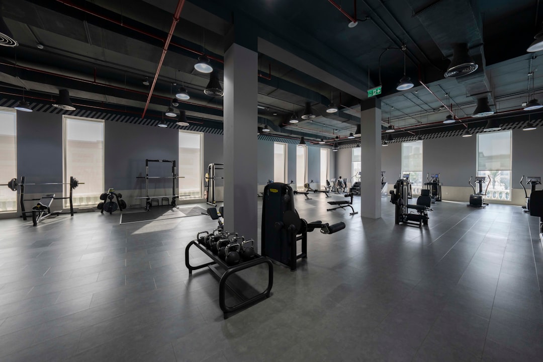
    A large gym with a lot of machines
    Photo by Abdul Raheem Kannath on Unsplash

    Building a High-Impact Hero Section in HTML

    The hero is the single most important component of a fitness HTML template. It needs a full-viewport background (video or high-contrast image), a punchy headline, a sub-headline, and a primary CTA button — all above the fold on desktop and mobile.

    Using Canvas’s Bootstrap 5 grid, a minimal but effective hero structure looks like this:

    <section id="hero" class="section py-0 min-vh-100 d-flex align-items-center dark"
      style="background: url('images/gym-hero.jpg') center/cover no-repeat;">
      <div class="container">
        <div class="row justify-content-start">
          <div class="col-lg-6">
            <h1 class="display-3 fw-bold text-white ls-0 mb-3">
              Train Harder. Live Better.
            </h1>
            <p class="lead text-white op-08 mb-4">
              Group classes, personal training, and nutrition coaching
              under one roof — all in central Manchester.
            </p>
            <a href="#pricing" class="button button-large button-rounded"
              style="background-color: var(--cnvs-themecolor);">
              Start Your Free Trial
            </a>
          </div>
        </div>
      </div>
    </section>

    Note that the CTA button uses var(–cnvs-themecolor) for its background — this ensures any global brand colour change you make propagates automatically. Never hardcode a hex value on interactive elements when a CSS variable is available.

    Structuring the Class Schedule Component

    An interactive timetable is one of the most expected features on a gym website, and it is also one of the most commonly over-engineered. For most boutique fitness studios, a clean HTML table or a tabbed card layout outperforms complex JavaScript calendars in both performance and usability.

    Here is a Bootstrap 5 tab-based schedule pattern that works within Canvas without any additional plugins:

    <section id="schedule" class="section bg-transparent">
      <div class="container">
        <div class="heading-block text-center mb-5">
          <h2>Weekly Class Schedule</h2>
          <span>Book your spot in advance — classes fill fast.</span>
        </div>
        <ul class="nav nav-tabs justify-content-center mb-4" role="tablist">
          <li class="nav-item">
            <button class="nav-link active" data-bs-toggle="tab"
              data-bs-target="#monday">Monday</button>
          </li>
          <li class="nav-item">
            <button class="nav-link" data-bs-toggle="tab"
              data-bs-target="#tuesday">Tuesday</button>
          </li>
        </ul>
        <div class="tab-content">
          <div class="tab-pane fade show active" id="monday">
            <table class="table table-bordered text-center">
              <thead class="table-dark">
                <tr><th>Time</th><th>Class</th><th>Trainer</th><th>Spaces</th></tr>
              </thead>
              <tbody>
                <tr><td>07:00</td><td>HIIT Circuit</td><td>Sara K.</td><td>4 left</td></tr>
                <tr><td>09:30</td><td>Yoga Flow</td><td>James T.</td><td>8 left</td></tr>
              </tbody>
            </table>
          </div>
        </div>
      </div>
    </section>

    Because Canvas bundles Bootstrap 5 — including its JavaScript — you do not need to load any additional scripts for the tab functionality. The data-bs-toggle=”tab” attributes work out of the box with Canvas’s js/functions.bundle.js.

    A couple of men working out in a gym
    Photo by Kobe Kian Clata on Unsplash

    Pricing Section Design for Fitness Memberships

    Membership pricing is a high-stakes section on any gym website template. Prospects compare tiers carefully, so clarity beats cleverness here. Use a three-column layout with a visually distinct “recommended” card. The post on Canvas pricing tables and design options covers the full range of structural approaches — the key principle for fitness sites is to lead with outcome language (“Unlimited Classes”, “Priority Booking”) rather than listing features abstractly.

    Apply a coloured top border to the featured tier using –cnvs-themecolor rather than a separate CSS class, so the highlight stays in sync with your brand colour:

    .pricing-card-featured {
      border-top: 4px solid var(--cnvs-themecolor);
      transform: translateY(-8px);
      box-shadow: 0 16px 40px rgba(var(--cnvs-themecolor-rgb), 0.18);
    }

    For CTA button strategy within pricing cards, the post on CTA button design science is a practical companion read — particularly the guidance on label text and button sizing relative to card width.

    Using Dark Sections to Convey Energy and Urgency

    Fitness brands often benefit from alternating dark and light sections — the contrast creates visual rhythm and allows bold photography or video to breathe without competing with text-heavy backgrounds. In Canvas, dark sections are enabled with the dark class on a <section> element, which automatically adjusts child element colours without requiring individual overrides.

    A “before/after” or transformation gallery section is a natural candidate for a dark treatment. Pair it with a short-form testimonial strip directly below to transfer the emotional momentum. Typography in dark sections should use display-weight fonts for headlines — Bootstrap 5’s display-4 or display-5 classes work well here. For a full breakdown of responsive type scaling in Canvas, the post on Bootstrap 5 typography and display classes covers the system in detail.

    You can also explore a fully dark aesthetic for the entire fitness site — the guide to Canvas dark mode page design walks through the variables and section configurations needed to pull that off consistently.

    Using Canvas Builder to Generate a Fitness Layout Faster

    Building a fitness studio page from scratch — even with a solid template — involves assembling a hero, features grid, schedule, testimonials, pricing, and footer in sequence. Canvas Builder accelerates that process by letting you describe the layout in plain language and receive production-ready Canvas-compatible HTML in return.

    For a fitness studio, a prompt like “Create a single-page fitness studio website with a full-viewport video hero, a three-column class-types section, a tabbed schedule, a three-tier pricing table with a featured card, and a footer with opening hours” produces a structured output that uses correct Canvas classes, Bootstrap 5 grid columns, and –cnvs-themecolor variables throughout — rather than hardcoded hex values that break on theme changes.

    The 2025 and 2026 landscape for HTML template development increasingly favours this AI-assisted workflow for single-niche builds like fitness, hospitality, and health — not because it replaces design judgement, but because it eliminates the boilerplate that consumes hours before any real creative decisions are made.

    Frequently Asked Questions

    What HTML structure does a fitness studio website need?

    At minimum: a full-viewport hero with a CTA, a features or class-types section, a class schedule, social proof (testimonials or member counts), a pricing section, and a footer with contact and opening hours. The order should match the prospect’s decision journey rather than the designer’s aesthetic preference.

    Can I use the Canvas HTML Template for a gym or fitness site without coding experience?

    Yes. Canvas includes pre-built section components that cover most fitness site needs. Try Canvas Builder free to generate a ready-to-customise layout using plain-language prompts, which reduces the amount of raw HTML editing required significantly.

    How do I apply a custom brand colour across a Canvas fitness site?

    Set your brand colour on the :root element using –cnvs-themecolor and the corresponding –cnvs-themecolor-rgb for opacity-based usage. Any Canvas button, highlight, or accent that references this variable will update automatically, keeping your entire site consistent with a single change.

    Should a fitness website use a dark or light theme?

    Most high-energy fitness brands benefit from dark hero sections paired with lighter content sections — the contrast creates urgency near the top of the page and readability lower down. Full dark-mode sites work well for premium or boutique studios targeting a performance-focused audience. Canvas makes it straightforward to implement either approach using section-level dark class attributes.

    How do I add a class schedule without a JavaScript plugin?

    Bootstrap 5’s native tab component, which is bundled with Canvas, handles tabbed schedules without any extra dependencies. Use data-bs-toggle=”tab” on navigation items and corresponding tab-pane divs for each day’s timetable. The code example in this post shows the complete pattern ready to copy.

    If you’re working with the Canvas HTML Template and want to generate production-ready layouts faster, try Canvas Builder free and see how much time you save on every project.

  • Medical Practice Website: Design Principles for Trust and Compliance

    Medical Practice Website: Design Principles for Trust and Compliance

    Patients searching for a doctor online make trust judgements within seconds — and a poorly structured medical website can cost a practice both credibility and new appointments before a single word is read. Getting the design right means balancing clinical authority, accessibility, and regulatory awareness in a way that most generic templates never attempt.

    Key Takeaways

    • Medical website HTML must prioritise trust signals — credentials, certifications, and clear contact details — above visual flair.
    • Accessibility compliance (WCAG 2.1 AA) is not optional for healthcare sites; it protects patients and reduces legal exposure.
    • A structured appointment booking section and compliant footer are two of the highest-impact elements on any doctor website design.
    • The Canvas HTML Template provides a production-ready Bootstrap 5 foundation that can be adapted for medical practices without rebuilding from scratch.

    Why Trust Signals Come First in Healthcare Design

    A medical practice website is not an e-commerce store. Visitors are often anxious, vulnerable, or making decisions that affect their health. Trust signals — professional credentials, association logos, practitioner photos, and verifiable contact details — must appear above the fold and repeat consistently throughout the page.

    The most effective trust architecture for a doctor website design follows a clear hierarchy:

    1. Practitioner name, qualifications, and GMC or state licence number visible in the header or hero section
    2. Association membership badges (e.g. BMA, AMA, royal colleges) placed immediately below the hero
    3. Patient testimonials with first name and treatment type — never anonymous
    4. A physical address and telephone number in the header, not hidden in the footer

    Studies from the Baymard Institute consistently show that unfamiliar organisations earn trust fastest through specificity. Vague claims like “experienced team” are ignored; a named consultant with twenty years of cardiology practice at a named hospital is convincing. Write every credential string into the HTML directly — do not hide it inside lazy-loaded JavaScript components that search engines and screen readers miss.

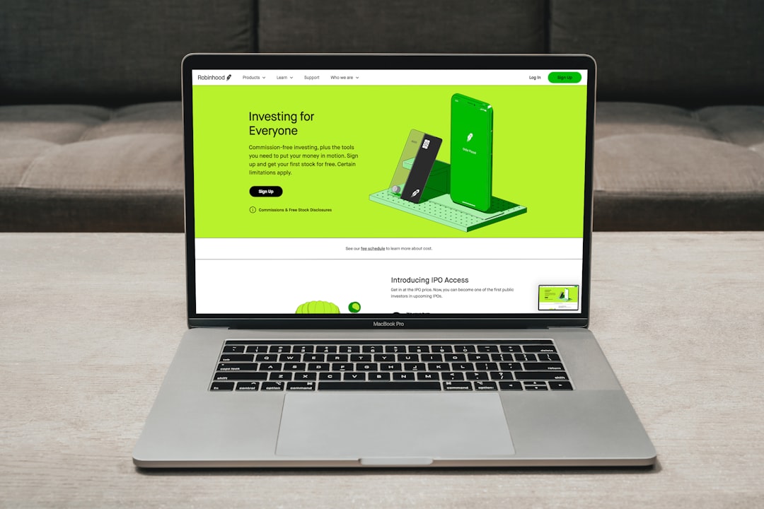
    graphical user interface, website
    Photo by PiggyBank on Unsplash

    Accessibility and WCAG 2.1 AA Compliance

    Healthcare websites serving the public in the UK, US, EU, and most other jurisdictions are expected — and in many cases legally required — to meet WCAG 2.1 Level AA. For a medical website HTML build, this means colour contrast ratios of at least 4.5:1 for body text, keyboard-navigable interactive elements, and meaningful alt text on every clinical image.

    Bootstrap 5, which Canvas bundles natively, gives you a compliant grid and utility classes out of the box. What it does not give you automatically is sufficient colour contrast when you apply a custom brand palette. Always verify your chosen theme colour against Canvas’s --cnvs-themecolor variable with a contrast checker before going live.

    A practical pattern for an accessible appointment button in Canvas:

    <a href="booking.html"
       class="button button-large button-rounded"
       style="--cnvs-themecolor: #005A8E; background-color: var(--cnvs-themecolor);"
       aria-label="Book an appointment with Dr. Singh">
      Book an Appointment
    </a>

    The aria-label attribute gives screen reader users context that the visual text alone does not always provide. Use it on every CTA that could refer to multiple practitioners or service types. For deeper guidance on button patterns, the post on CTA button design covers contrast and sizing considerations in detail.

    The footer of a medical practice website carries a disproportionate legal and regulatory load. At minimum, a UK-registered medical site must include the practice’s registered address, CQC registration number (where applicable), and a link to the privacy policy that references UK GDPR or relevant local law. US practices serving Medicare/Medicaid patients face additional non-discrimination notice requirements.

    A well-structured medical footer typically contains:

    • Registered practice name, address, and company/charity number
    • Regulatory body registration references with links to public registers
    • Links to Privacy Policy, Cookie Policy, and Accessibility Statement
    • Out-of-hours and emergency care signposting (critical for patient safety)
    • Copyright line with the current year

    The post on footer design best practices gives a framework for deciding what belongs in each footer column — apply those principles alongside the compliance requirements specific to healthcare.

    person sitting while using laptop computer and green stethoscope near
    Photo by National Cancer Institute on Unsplash

    Structuring the Appointment Booking Section

    The appointment booking flow is the primary conversion goal for most doctor websites. It should be treated with the same rigour as a landing page — a single focused objective, minimal distractions, and clear microcopy that reduces form-abandonment anxiety. For context on conversion-focused page structure, the guide on what is a landing page explains the principles that apply directly here.

    A minimal, accessible booking form built on Bootstrap 5’s grid (included in Canvas) looks like this:

    <section class="section bg-light">
      <div class="container">
        <div class="row justify-content-center">
          <div class="col-lg-8">
            <h2 class="mb-4">Request an Appointment</h2>
            <form action="booking-handler.php" method="post" novalidate>
              <div class="row g-3">
                <div class="col-md-6">
                  <label for="patient-name" class="form-label">Full Name <span aria-hidden="true">*</span></label>
                  <input type="text" class="form-control" id="patient-name" name="name" required autocomplete="name">
                </div>
                <div class="col-md-6">
                  <label for="patient-phone" class="form-label">Phone Number <span aria-hidden="true">*</span></label>
                  <input type="tel" class="form-control" id="patient-phone" name="phone" required autocomplete="tel">
                </div>
                <div class="col-12">
                  <label for="appointment-type" class="form-label">Appointment Type</label>
                  <select class="form-select" id="appointment-type" name="type">
                    <option value="">Select a service</option>
                    <option value="gp-consultation">GP Consultation</option>
                    <option value="follow-up">Follow-Up Visit</option>
                    <option value="vaccination">Vaccination</option>
                  </select>
                </div>
                <div class="col-12">
                  <button type="submit" class="button button-large button-rounded"
                    style="background-color: var(--cnvs-themecolor);">
                    Request Appointment
                  </button>
                </div>
              </div>
            </form>
          </div>
        </div>
      </div>
    </section>

    Note the use of autocomplete attributes — these are required for WCAG 1.3.5 compliance and significantly reduce friction for returning patients completing forms on mobile devices.

    Typography and Colour for Clinical Credibility

    Medical practices should avoid the oversaturated brand palettes common in e-commerce. Muted blues, teals, and greens consistently outperform high-energy reds and oranges in healthcare user testing because they signal calm, competence, and hygiene. Set your Canvas theme colour accordingly:

    :root {
      --cnvs-themecolor: #006D77;
      --cnvs-themecolor-rgb: 0, 109, 119;
      --cnvs-primary-font: 'Inter', sans-serif;
      --cnvs-secondary-font: 'Lora', serif;
    }

    Using a serif secondary font for practitioner bios and long-form clinical content improves readability and signals editorial seriousness — a quality patients associate with established medical institutions. Set body text no smaller than 16px (1rem); use the px to rem converter to keep your sizing consistent across the stylesheet.

    SEO and Schema Markup for Healthcare Practices

    Medical website HTML benefits enormously from structured data. Google’s MedicalOrganization and Physician schema types help search engines surface your practice in local knowledge panels, map packs, and rich results — particularly relevant for “doctor near me” searches that have grown sharply through 2024 and into 2025.

    A basic JSON-LD block for a GP practice:

    <script type="application/ld+json">
    {
      "@context": "https://schema.org",
      "@type": "MedicalOrganization",
      "name": "Greenfield Medical Practice",
      "url": "https://www.greenfieldmedical.co.uk",
      "logo": "https://www.greenfieldmedical.co.uk/images/logo.png",
      "telephone": "+44-20-7946-0000",
      "address": {
        "@type": "PostalAddress",
        "streetAddress": "14 Harley Street",
        "addressLocality": "London",
        "postalCode": "W1G 9PH",
        "addressCountry": "GB"
      },
      "medicalSpecialty": "GeneralPractice",
      "openingHours": "Mo-Fr 08:00-18:00"
    }
    </script>

    Place this block in the <head> of your Canvas template. It does not affect visual rendering but significantly improves how search engines index and display the practice.

    Frequently Asked Questions

    What makes a healthcare website template different from a general business template?

    A healthcare website template needs to accommodate regulatory footer content, accessibility compliance to WCAG 2.1 AA, trust-signal architecture around practitioner credentials, and patient-safe colour palettes. General business templates rarely address these requirements out of the box, which is why customisation choices matter so much in medical projects.

    Is Canvas HTML Template suitable for building a medical practice website?

    Yes. Canvas provides a Bootstrap 5 foundation with flexible section types and full CSS variable control, making it straightforward to implement accessible layouts, compliant footers, and schema markup generator. The existing healthcare demo in Canvas offers a starting point that you can adapt to match a specific practice’s brand and services.

    What GDPR considerations apply to doctor website design in the UK?

    Any form that collects patient data — including appointment requests — processes special category data under UK GDPR. You must have a lawful basis for processing, display a clear privacy notice at the point of data collection, and ensure data is stored securely. A cookie consent banner covering analytics and tracking scripts is also required.

    How do I set the Canvas theme colour for a medical brand without affecting Bootstrap utilities?

    Set --cnvs-themecolor and --cnvs-themecolor-rgb in your :root CSS block within style.css. Canvas components reference these variables natively. You do not need to modify Bootstrap’s source variables or load an additional Bootstrap CDN stylesheet — Canvas bundles Bootstrap 5 internally and its own variable layer sits on top.

    Should a medical practice use a single-page layout or a multi-page website?

    Most practices benefit from a multi-page structure — separate pages for each service, individual practitioner profiles, a dedicated booking page, and a patient information section. A single-page layout can work for solo practitioners with a narrow service range, but it limits SEO targeting and makes regulatory content harder to structure without overwhelming the user.

    If you’re working with the Canvas HTML Template and want to generate production-ready layouts faster, try Canvas Builder free and see how much time you save on every project.
  • Building a Solar Energy Website with Canvas HTML Template

    Building a Solar Energy Website with Canvas HTML Template

    Solar energy companies are competing hard for attention online, and a poorly structured website costs you leads before a visitor ever reads your pitch. The good news is that the Canvas HTML Template gives you a production-ready foundation for building a credible, high-converting solar energy website without starting from scratch.

    Key Takeaways

    • Canvas’s Bootstrap 5 grid and section system makes it straightforward to build a structured solar energy website with stats, services, testimonials, and a lead form.
    • Customising –cnvs-themecolor to a solar-appropriate amber or green immediately aligns the visual identity with renewable energy branding.
    • A single-page layout works well for solar lead generation, while a multi-page structure suits companies offering installation, maintenance, and commercial services separately.
    • Real conversion gains come from combining a strong above-the-fold hero, a savings calculator section, and a clear CTA — all achievable with Canvas components.

    Why Canvas Is Well-Suited for a Renewable Energy Website

    A solar energy website needs to do several things simultaneously: build trust with homeowners or businesses, communicate technical credibility, show social proof, and drive enquiries or quote requests. Canvas handles all of these through its modular section system. Because it is built on Bootstrap 5, the grid is responsive by default, which matters enormously when roughly half of all solar research now happens on mobile devices.

    Canvas also ships with pre-built components — counters, icon boxes, testimonial sliders, and pricing tables — that map directly onto the content types a renewable energy website needs. Rather than building a stats section from scratch, you adapt an existing one. This is the same efficiency argument made in the post on how to build a complete business website with Canvas HTML Template, and it applies equally well here.

    white and blue solar panels
    Photo by Anders J on Unsplash

    Structuring Your Solar Website Layout

    Before writing a single line of HTML, map out the sections your solar energy website needs. A typical structure for a residential solar installer looks like this:

    1. Hero — headline, subheadline, and a primary CTA (“Get a Free Quote”)
    2. Social proof bar — logos of accreditations (MCS, Which? Trusted Trader, etc.) or a stat strip
    3. Services — solar panels, battery storage, EV charging, maintenance
    4. How it works — three-step process with icons
    5. Savings counter — animated numbers showing CO2 saved, kWh generated, installs completed
    6. Testimonials — carousel of homeowner reviews
    7. Lead capture form — a short quote request form
    8. Footer — contact details, certifications, links

    If you are building a larger commercial solar company site with separate pages for residential, commercial, and agricultural solutions, a fullpagelayout structure makes more sense. For most local installers, a single_page layout with anchor navigation is faster to build and easier to maintain. See the comparison in Canvas One Page Demo vs Multi-Page: When to Use Each Format for a detailed breakdown.

    Applying Solar Branding with Canvas CSS Variables

    The fastest way to give your solar energy website a coherent visual identity is to override Canvas’s theme colour variable. Solar brands typically use amber-yellow, orange, or deep green depending on whether they want to emphasise energy output or environmental credentials. Set this in a custom stylesheet loaded after style.css:

    :root {
      --cnvs-themecolor: #f5a623;
      --cnvs-themecolor-rgb: 245, 166, 35;
      --cnvs-primary-font: 'Inter', sans-serif;
      --cnvs-secondary-font: 'Merriweather', serif;
      --cnvs-logo-height: 48px;
      --cnvs-logo-height-sticky: 36px;
    }

    Using –cnvs-themecolor (not Bootstrap’s –bs-primary) ensures the colour cascades correctly through Canvas buttons, links, icon highlights, and active navigation states. The –cnvs-logo-height and –cnvs-logo-height-sticky variables control your logo size in both the default and sticky header states — never target #logo img directly, as this bypasses Canvas’s built-in sticky header logic.

    windmill on mountain
    Photo by Vista Wei on Unsplash

    Building the Hero and Stats Counter Sections

    The hero section is where a solar energy website either earns or loses a visitor’s trust within the first few seconds. Canvas’s section system makes it simple to combine a full-width background image with an overlay, a headline, and a CTA button. Here is a working hero structure using Canvas and Bootstrap 5 classes:

    MCS Certified Installer

    Clean Energy for Your Home or Business

    Lower your bills, reduce your carbon footprint, and protect against rising energy costs with a tailored solar installation.

    Get a Free Quote

    Below the hero, a stats counter strip adds immediate credibility. Canvas includes a counter component that animates numbers when scrolled into view. A three-column strip showing installs completed, tonnes of CO2 saved, and average annual savings gives visitors quantified proof before they read anything else.

    Installations Completed

    Tonnes of CO2 Saved

    £

    Average Annual Saving Per Household

    Testimonials and Social Proof for Solar Leads

    Homeowners making a decision that involves a £6,000–£12,000 investment need strong social proof. Canvas’s testimonial carousel is one of its most versatile components, and pairing it with star ratings and installer photos significantly increases conversion. If you need guidance on choosing the right Canvas slider component for this section, the post on Canvas Slider and Carousel Components covers the options and their trade-offs in detail.

    Beyond testimonials, include a certifications row below the testimonial section. Displaying MCS, Which? Trusted Trader, RECC, or local council partnership logos in a greyscale logo strip (Canvas’s clients section pattern) reinforces legitimacy without visual clutter. Keep the section background light grey (bg-light) to separate it from surrounding content sections.

    Building the Lead Capture and Quote Form

    The quote request form is the primary conversion point on a solar energy website. Keep it short — property type, roof type, monthly electricity bill, and a contact field is enough to qualify a lead. Canvas’s Bootstrap 5 form components handle layout, validation states, and responsive stacking automatically:

    Get Your Free Solar Quote

    Takes less than 60 seconds. No obligation.

    Detached House Semi-Detached Terraced Commercial
    Under £100 £100 – £200 £200 – £400 Over £400

    Position this form at both the bottom of the page and accessible via the hero CTA anchor link. Reducing scroll distance to the form consistently improves submission rates on service-based websites. The same principle is discussed in the context of B2B pages in the post on SaaS website design and B2B homepages that convert.

    Frequently Asked Questions

    Can I use Canvas HTML Template for a solar energy company website without design experience?

    Yes. Canvas ships with pre-built sections for heroes, icon boxes, counters, testimonials, and forms. With basic HTML and CSS knowledge you can assemble a professional solar energy website by adapting existing components rather than building from scratch. Tools like Canvas Builder can accelerate this further by generating layout code from a prompt.

    Which Canvas layout type should I choose for a solar installer website?

    For most local or regional solar installers, a singlepage layout with anchor navigation is the most effective choice. It keeps visitors focused on a single conversion path. Larger companies offering multiple service lines — residential, commercial, agricultural — benefit from a fullpage_layout structure with separate pages per service.

    How do I change the theme colour in Canvas to match solar branding?

    Override the –cnvs-themecolor CSS variables generator in a custom stylesheet loaded after Canvas’s style.css. Set the value to your chosen amber, orange, or green hex code, and also update –cnvs-themecolor-rgb to the matching RGB values so opacity-dependent styles render correctly.

    Does Canvas include a counter or stats section I can use for solar metrics?

    Yes. Canvas includes an animated counter component that triggers on scroll. You use data-from, data-to, data-refresh-interval, and data-speed attributes on a span element inside a .counter div. This is ideal for displaying installs completed, CO2 saved, or average savings figures.

    What JavaScript files does Canvas require for components like counters and sliders to work?

    Canvas requires js/plugins.min.js and js/functions.bundle.js. Both must be loaded in the correct order — plugins first, then functions. Do not load Bootstrap’s CDN JavaScript separately, as Bootstrap 5 is already bundled within Canvas’s plugin file.

    If you’re working with the Canvas HTML Template and want to generate production-ready layouts faster, try Canvas Builder free and see how much time you save on every project.

  • EdTech Website Design: Driving Enrollment with Better UX

    EdTech Website Design: Driving Enrollment with Better UX

    Most prospective students decide within seconds whether a learning platform is worth their time — and a confusing layout, buried enrollment button, or slow-loading hero section will cost you that conversion before a single course description is read. EdTech website design is not just about looking credible; it is about removing every possible obstacle between a visitor and the moment they click “Enroll Now.”

    Key Takeaways

    • Course enrollment websites must prioritise clear hierarchy, fast load times, and frictionless CTAs to convert browsers into paying students.
    • Social proof, structured course cards, and progress indicators are the highest-impact UX elements for online learning platforms in 2025.
    • Bootstrap 5-based templates like the Canvas HTML Template give you a reliable, responsive foundation that accelerates EdTech builds without sacrificing flexibility.
    • Small structural decisions — card layout, sticky enrollment bars, and trust signals — directly affect how many visitors complete registration.

    Why UX Is the Real Enrollment Engine

    Conversion rate optimisation in EdTech is not a marketing problem — it is a design problem. A prospective learner visiting your platform is already motivated. They searched for a course, clicked your link, and landed on your page. What kills enrollment at this stage is cognitive friction: too many choices, unclear pricing, no visible social proof, or a registration form that feels like applying for a mortgage.

    Research consistently shows that reducing the number of steps to purchase — or in this case, enrollment — increases completion rates significantly. Every extra click, every ambiguous label, every paragraph the user has to scroll past to find the “Start Learning” button is a leak in your funnel. Good online learning website UX means designing with the learner’s anxiety in mind: Will this course actually help me? Is it the right level? How long will it take? Can I trust this platform? Your layout needs to answer those questions before the user has to ask them.

    a laptop computer sitting on top of a desk
    Photo by Vy Tran on Unsplash

    Structuring the Hero Section for Immediate Clarity

    The hero section of a course enrollment website carries more conversion weight than any other part of the page. It needs to communicate who the course is for, what they will achieve, and how to get started — all above the fold. Avoid vague taglines like “Learn Anything, Anytime.” Replace them with outcome-focused headlines: “Become a Certified Data Analyst in 12 Weeks.”

    Pair your headline with a single primary CTA button using a high-contrast colour drawn from your Canvas theme variable, and a subheadline that handles the most common objection (cost, time commitment, or prerequisites). The following is a working Canvas-compatible hero structure using Bootstrap 5 utility classes:

    <section class="py-6 bg-light">
      <div class="container">
        <div class="row align-items-center g-5">
          <div class="col-lg-6">
            <span class="badge bg-color text-white mb-3">New Cohort — January 2026</span>
            <h1 class="display-5 fw-bold mb-3">Become a Certified Data Analyst in 12 Weeks</h1>
            <p class="lead text-muted mb-4">Live sessions, real projects, and a job placement guarantee. No prior experience needed.</p>
            <a href="#enroll" class="button button-large button-rounded button-fill"
               style="background-color: var(--cnvs-themecolor); border-color: var(--cnvs-themecolor);">
              Enroll Now — Free First Week
            </a>
            <p class="mt-3 small text-muted">4.9 stars from 2,400+ graduates · Cancel anytime</p>
          </div>
          <div class="col-lg-6">
            <img src="demos/images/edtech-hero.jpg" alt="Students learning online" class="img-fluid rounded-4 shadow">
          </div>
        </div>
      </div>
    </section>

    Notice that the CTA references –cnvs-themecolor directly — this keeps your button colour in sync with whatever theme colour you have set globally, so you never end up with mismatched brand colours across sections.

    Course Card Design That Sells Without Pressure

    Course cards are the workhorse of any EdTech catalogue page. A poorly designed card forces the user to click through just to find basic information. A well-designed card answers the four questions every learner asks at a glance: What will I learn? How long does it take? What does it cost? Is it credible?

    Structure each card to include a course thumbnail, title, instructor name, duration, difficulty badge, star rating, and price. Keep the card height consistent across the grid so the page feels orderly rather than chaotic. The following Bootstrap 5 card component works cleanly inside Canvas’s grid system:

    <div class="col-md-6 col-lg-4">
      <div class="card h-100 border-0 shadow-sm rounded-4">
        <img src="demos/images/course-thumb.jpg" class="card-img-top rounded-top-4" alt="Course thumbnail">
        <div class="card-body d-flex flex-column p-4">
          <span class="badge bg-success mb-2 align-self-start">Beginner</span>
          <h5 class="card-title fw-semibold mb-1">Python for Data Science</h5>
          <p class="small text-muted mb-2">by Dr. Sarah Kim · 18 hours</p>
          <div class="d-flex align-items-center gap-1 mb-3">
            <span class="text-warning">★★★★★</span>
            <span class="small text-muted">(1,280 reviews)</span>
          </div>
          <div class="mt-auto d-flex justify-content-between align-items-center">
            <strong class="fs-5">$149</strong>
            <a href="course-detail.html" class="btn btn-sm btn-dark rounded-pill">View Course</a>
          </div>
        </div>
      </div>
    </div>

    If you are building a multi-course catalogue, consider pairing this grid with a sticky filter bar (category, level, price range) so users can self-segment without leaving the page. For layout inspiration on structuring multi-section pages, the post on 10 Canvas HTML Template sections every landing page needs covers the supporting sections that complement your course grid.

    a computer screen with a woman looking at a laptop
    Photo by Team Nocoloco on Unsplash

    Embedding Social Proof at Every Decision Point

    EdTech faces a unique trust challenge: learners are committing time as well as money, and they cannot easily evaluate course quality before purchasing. This makes social proof disproportionately powerful on an edtech website design. Place trust signals not just on the homepage but at the exact moments in the funnel where hesitation peaks.

    Key positions for social proof include directly below the hero CTA (star rating + number of students enrolled), within course cards (instructor credentials), on the checkout or enrollment form page (a single strong testimonials quote from a graduate with a photo and measurable outcome), and in a dedicated alumni section. Outcome-based testimonials perform far better than generic praise. “I got a job at a fintech startup three weeks after finishing” is 10 times more persuasive than “Great course, highly recommend.”

    You can also use a sticky enrollment bar that appears when the user scrolls past the hero — keeping the CTA visible without interrupting the reading flow. This pattern is common in high-converting SaaS pages too; the same principles apply, as covered in the SaaS website design guide for B2B homepages.

    Reducing Friction on the Enrollment Form

    The enrollment or registration form is where the most avoidable drop-off happens. Long forms, mandatory fields for information you do not actually need, and no progress indication are conversion killers. For most EdTech platforms, the initial signup should collect a maximum of three fields: name, email, and password — or ideally offer OAuth with Google or LinkedIn to reduce that to a single click.

    If your course requires payment at enrollment, separate the account creation step from the payment step. A two-step checkout feels faster even when the total number of fields is identical to a single-step form. Below is a minimal, accessible enrollment form pattern:

    <section id="enroll" class="py-6">
      <div class="container">
        <div class="row justify-content-center">
          <div class="col-lg-5">
            <div class="p-5 rounded-4 shadow border">
              <h3 class="fw-bold mb-1">Start Your Free Week</h3>
              <p class="text-muted mb-4">No credit card required. Cancel anytime.</p>
              <form>
                <div class="mb-3">
                  <label for="fullName" class="form-label fw-medium">Full Name</label>
                  <input type="text" class="form-control form-control-lg rounded-3" id="fullName" placeholder="Jane Smith" required>
                </div>
                <div class="mb-3">
                  <label for="emailAddr" class="form-label fw-medium">Email Address</label>
                  <input type="email" class="form-control form-control-lg rounded-3" id="emailAddr" placeholder="[email protected]" required>
                </div>
                <div class="d-grid">
                  <button type="submit" class="btn btn-lg rounded-3 text-white fw-semibold"
                    style="background-color: var(--cnvs-themecolor);">
                    Create My Account
                  </button>
                </div>
                <p class="mt-3 text-center small text-muted">
                  By signing up you agree to our <a href="terms.html">Terms of Service</a>.
                </p>
              </form>
            </div>
          </div>
        </div>
      </div>
    </section>

    Keep the submit button label action-oriented and benefit-led — “Create My Account” or “Start Learning Free” outperform generic labels like “Submit” in every A/B test on record.

    Building an EdTech Site Faster with Canvas and Canvas Builder

    Building a full EdTech platform from scratch is time-consuming — but you do not need to start from a blank file. The Canvas HTML Template ships with pre-built section patterns for features, testimonials, pricing tables, and FAQ accordions that map directly onto the components an online learning site needs. You can customise the visual identity using CSS variables generator like –cnvs-themecolor, –cnvs-primary-font, and –cnvs-secondary-font without touching the core stylesheet.

    If you want to move even faster, Canvas Builder generates complete, production-ready HTML layouts for Canvas using AI — so you can describe your EdTech page structure and get back a working layout with the right sections already assembled. For teams building multiple course landing pages or niche learning portals, this significantly reduces the repetitive layout work. The post on 12 niche website ideas you can build with Canvas HTML today includes EdTech among the verticals with the strongest use case for a templated HTML approach.

    Frequently Asked Questions

    What makes an EdTech website design different from a standard business website?

    EdTech sites need to handle a unique combination of catalogue browsing, trust-building, and low-friction enrollment — all in a single session. Unlike a standard business website where the goal is to generate a lead, a course enrollment website often needs to complete a transaction. This means the UX must address credibility, course discoverability, and checkout flow simultaneously, rather than simply guiding users to a contact form.

    How many CTAs should an online learning landing page have?

    A focused course landing page should have one primary CTA repeated at logical intervals — typically in the hero, after the curriculum section, after testimonials, and immediately above the footer. Avoid introducing secondary CTAs that compete with enrollment, such as newsletter signups or demo requests, on the same page as a paid course offer.

    Should I use a one-page or multi-page layout for a course enrollment website?

    For a single flagship course, a long-form one-page layout performs well because it guides the user through a persuasive sequence without navigation distractions. For a multi-course catalogue or learning platform with distinct topic areas, a multi-page structure with a searchable catalogue is more appropriate. The decision ultimately depends on whether you are selling one course or many.

    Can the Canvas HTML Template handle EdTech-specific features like course cards and pricing tables?

    Yes. Canvas includes pre-built card components, pricing tables, testimonial blocks, FAQ accordions, and feature grids that cover the core layout needs of an EdTech site. You will likely need to customise the styling and content, but the structural scaffolding is already there, built on Bootstrap 5, which means all components are fully responsive by default.

    What is the most important UX fix for an underperforming course enrollment website?

    If your enrollment rate is low, the most common culprit is a weak or buried CTA combined with insufficient social proof near the point of decision. Audit your page by asking: is the “Enroll” button visible without scrolling? Does the user see a compelling reason to trust the course before they reach the form? Fixing those two issues alone — CTA visibility and outcome-based testimonials — typically produces the largest uplift in enrollment rates.

    If you’re working with the Canvas HTML Template and want to generate production-ready layouts faster, try Canvas Builder free and see how much time you save on every project.

  • SaaS Website Design: Building a B2B Homepage That Converts

    SaaS Website Design: Building a B2B Homepage That Converts

    Most B2B SaaS homepages fail at the same point: they describe the product instead of communicating the outcome. If your above-the-fold section reads like a feature list rather than a value proposition, you are losing qualified leads before they ever scroll.

    Why Your Hero Section Is Your Entire Pitch

    In B2B SaaS, the average decision-maker spends fewer than eight seconds deciding whether to keep reading. Your hero section is not a design exercise — it is a conversion mechanism. It needs to answer three questions immediately: what does this do, who is it for, and why should I care right now.

    A strong SaaS hero uses a single declarative headline (the outcome), one supporting line (who benefits and how), and a primary CTA that reduces commitment friction. “Start Free Trial” outperforms “Learn More” in nearly every B2B context because it signals immediate value. Pair that with a product screenshot or dashboard preview — not an abstract illustration — and you give technical buyers something concrete to evaluate.

    The Bootstrap 5 structure below demonstrates a clean, semantic hero layout that works directly inside Canvas’s single_page section format:

    <section id="hero" class="py-6 bg-light">
      <div class="container">
        <div class="row align-items-center g-5">
          <div class="col-lg-6">
            <p class="text-uppercase fw-semibold ls-2 color-theme mb-3">B2B Analytics Platform</p>
            <h2 class="display-4 fw-bold mb-3">Turn Raw Pipeline Data Into Closed Revenue</h2>
            <p class="lead text-muted mb-4">Canvas CRM gives revenue teams a single source of truth — from first touch to signed contract.</p>
            <a href="/trial" class="button button-rounded button-large">Start Free Trial</a>
            <a href="/demo" class="button button-rounded button-large button-border ms-2">Book a Demo</a>
          </div>
          <div class="col-lg-6">
            <img src="images/dashboard-preview.png" alt="Revenue dashboard preview" class="img-fluid rounded-4 shadow-lg">
          </div>
        </div>
      </div>
    </section>
    black flat screen computer monitor
    Photo by Markus Spiske on Unsplash

    Placing Social Proof Where It Actually Works

    Social proof is most powerful when placed at moments of hesitation, not at the bottom of the page where most visitors never arrive. For a B2B homepage, the most effective positions are immediately below the hero (logo bar), after the features section (testimonials quotes with job titles and company names), and directly above the primary CTA (a quantified result — “used by 1,200 revenue teams across 40 countries”).

    Logo bars need real brand names. If your customer list includes recognisable companies, display their logos. If it does not, use industry categories instead (“Trusted by logistics teams at Fortune 500 companies”) rather than showing obscure logos that create uncertainty. Testimonials must include a full name, job title, and company — anything less reads as fabricated to a B2B buyer.

    For the logo strip, Canvas’s built-in clients section renders cleanly with a simple flex row:

    <div class="section bg-white py-4 border-bottom">
      <div class="container">
        <p class="text-center text-muted small mb-4 fw-semibold ls-1 text-uppercase">Trusted by teams at</p>
        <div class="d-flex flex-wrap justify-content-center align-items-center gap-5 opacity-75">
          <img src="images/logo-acme.svg" alt="Acme Corp" style="height:28px;">
          <img src="images/logo-meridian.svg" alt="Meridian" style="height:28px;">
          <img src="images/logo-vortex.svg" alt="Vortex" style="height:28px;">
          <img src="images/logo-stackline.svg" alt="Stackline" style="height:28px;">
        </div>
      </div>
    </div>

    Structuring Features as Outcomes, Not Capabilities

    The single biggest copy mistake in B2B homepage design is listing features (“automated reporting”, “API integrations”, “role-based permissions”) without translating them into buyer outcomes. Every feature on your homepage should be reframed around what the buyer gains, not what the product does.

    A three-column feature grid works well for SaaS homepages when each card follows this structure: an icon, a benefit headline (verb-first), a single supporting sentence, and an optional link to a feature detail page. Limit the grid to six items maximum — anything beyond that dilutes attention and reads as a spec sheet.

    If you want to understand which sections perform best across different page types, the post on 10 Canvas HTML Template sections every landing page needs breaks down the structural building blocks that consistently drive engagement.

    a picture of a person on a cell phone
    Photo by Markus Spiske on Unsplash

    Pricing Section Architecture for B2B Conversion

    The pricing table is where SaaS homepages either close intent or lose it permanently. For B2B, three-tier pricing tables outperform two-tier and four-tier layouts consistently — the middle tier becomes the anchored recommendation, and buyers self-select around it. Visually elevate the recommended plan using a contrasting background (set with –cnvs-themecolor in Canvas) and a “Most Popular” badge.

    Keep pricing tier names outcome-oriented (“Growth”, “Scale”, “Enterprise”) rather than generic (“Basic”, “Pro”, “Business”). Each tier should list the three to five outcomes that justify the price increase — not a raw feature diff. And always include a visible “Talk to Sales” path for enterprise buyers who will never self-serve.

    :root {
      --cnvs-themecolor: #4f46e5;
      --cnvs-themecolor-rgb: 79, 70, 229;
    }
    
    .pricing-featured {
      background-color: var(--cnvs-themecolor);
      color: #ffffff;
      border-radius: 1rem;
      transform: scale(1.04);
      box-shadow: 0 16px 48px rgba(var(--cnvs-themecolor-rgb), 0.3);
    }

    For a deeper look at how whitespace and visual hierarchy interact on conversion pages, the article on whitespace in web design is a practical companion read alongside this section.

    CTA Hierarchy and Page-Level Conversion Flow

    A well-structured B2B homepage has a primary CTA (free trial or demo), a secondary CTA (watch a demo video or read a case study), and a tertiary CTA (contact sales). These should not compete — they should guide buyers at different levels of intent toward the next appropriate step.

    Avoid placing two equal-weight CTAs side by side. One must be visually dominant. Use a filled button for the primary action and a ghost/border button for the secondary. Repeat the primary CTA at least three times across the page: hero, mid-page after features, and above the footer. Studies on B2B landing pages consistently show that each additional CTA placement increases conversion rate up to the point of three appearances — after which the effect plateaus.

    If you are building this from scratch using an AI-generated layout, the post on Canvas HTML Template for agencies: workflows, prompts, and best practices covers how to structure your prompts to generate conversion-focused SaaS sections efficiently.

    Technical Foundation: SaaS Website HTML Done Right

    A performant SaaS website HTML build requires clean asset loading, semantic structure, and accessibility from the start. In Canvas, your core CSS files are style.css and css/font-icons.css — do not import Bootstrap from a CDN separately, since Canvas bundles Bootstrap 5 and additional imports will create version conflicts. Your JavaScript files are js/plugins.min.js and js/functions.bundle.js — load them in that order before the closing body tag.

    For SaaS projects specifically, semantic HTML matters more than many developers assume. Screen readers, procurement teams’ accessibility audits, and Google’s Core Web Vitals all respond to proper heading hierarchy, descriptive alt text on product screenshots, and ARIA labels on interactive dashboard previews. These are table-stakes requirements for enterprise buyers in 2025, not optional refinements.

    <!DOCTYPE html>
    <html lang="en">
    <head>
      <meta charset="UTF-8">
      <meta name="viewport" content="width=device-width, initial-scale=1">
      <title>YourSaaS — Outcome-Driven Headline</title>
      <link rel="stylesheet" href="css/style.css">
      <link rel="stylesheet" href="css/font-icons.css">
    </head>
    <body>
    
      <!-- Header, Hero, Features, Social Proof, Pricing, CTA, Footer -->
    
      <script src="js/plugins.min.js"></script>
      <script src="js/functions.bundle.js"></script>
    </body>
    </html>

    Frequently Asked Questions

    What makes a B2B SaaS homepage different from a standard business homepage?

    A B2B SaaS homepage needs to address multiple stakeholders simultaneously — technical evaluators, budget holders, and end users — while moving each toward a trial or demo. Standard business homepages typically have a single audience and a lower-stakes conversion goal. SaaS pages also need to handle objections around security, integration complexity, and onboarding time, which standard service pages rarely need to address.

    How many sections should a B2B SaaS homepage have?

    Seven to nine sections is the practical range for most B2B SaaS homepages: hero, logo bar, problem statement, features/outcomes, social proof (testimonials), pricing, secondary CTA, and footer. Adding a FAQ section above the footer can reduce pre-trial objections significantly, particularly for products with a longer evaluation cycle.

    Can I build a SaaS homepage with the Canvas HTML Template without custom coding?

    Yes. Canvas includes pre-built section components — hero layouts, pricing tables, testimonial grids, feature blocks — that you can assemble and customise through CSS variables like –cnvs-themecolor and –cnvs-primary-font without writing JavaScript or custom component logic. For a non-coding customisation approach, see the guide on 6 ways to customise Canvas HTML Template without coding.

    Where should I place the pricing section on a SaaS homepage?

    Pricing should appear after you have established value — typically after the features/outcomes section and a testimonial or social proof block. Placing pricing too early, before you have communicated the product’s outcome, increases price sensitivity. Placing it too late means high-intent buyers abandon the page before finding it. Mid-page, after two to three value-building sections, is the optimal position for most B2B SaaS products.

    What is the best way to generate SaaS homepage layouts quickly using Canvas?

    Using an AI layout generator purpose-built for Canvas — like Canvas Builder — lets you describe the section type (hero with split layout, three-column feature grid, highlighted pricing tier) and receive production-ready HTML that uses correct Canvas classes and CSS variables. This is significantly faster than adapting generic Bootstrap templates that lack Canvas-specific class names and component patterns.

    If you’re working with the Canvas HTML Template and want to generate production-ready layouts faster, try Canvas Builder free and see how much time you save on every project.
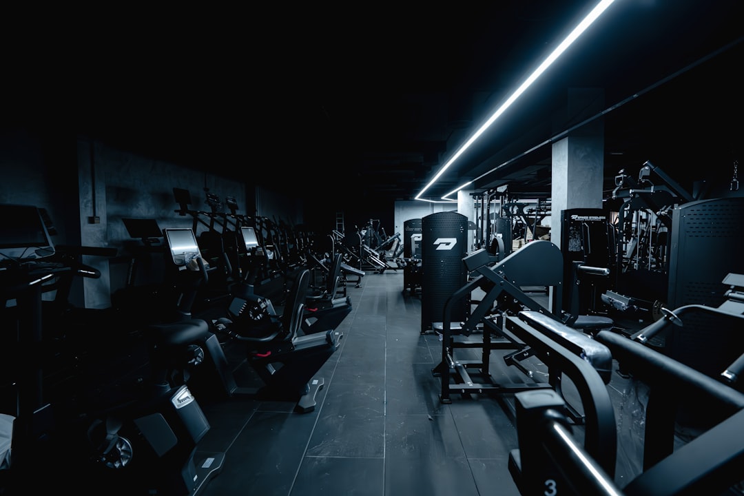
  • How to Design a Meal Kit Subscription Website with Canvas

    How to Design a Meal Kit Subscription Website with Canvas

    Meal kit subscription services live or die on their first impression online — a cluttered, slow, or unconvincing website sends potential subscribers straight to a competitor. The Canvas HTML Template gives you a production-ready foundation to build a high-converting food subscription website without starting from scratch.

    Key Takeaways

    • A meal kit subscription website needs a clear hero, a visible subscription CTA, and a trust-building section — Canvas provides all the layout components to assemble these quickly.
    • Canvas’s Bootstrap 5 grid and pre-built section components make it straightforward to build responsive meal plan cards, pricing tables, and ingredient showcase sections.
    • Use –cnvs-themecolor to apply your brand’s food-focused colour palette consistently across all components without overriding individual selectors.
    • Choosing between a single-page and multi-page structure depends on the complexity of your offering — simpler subscription tiers suit a focused one-page layout.

    Planning Your Layout Structure Before You Write a Line of Code

    Before touching any HTML, map out the customer journey. A visitor landing on a meal kit website typically needs to understand three things within the first few seconds: what the service delivers, how much it costs, and why they should trust you. Every layout decision should serve those three goals.

    For most meal kit brands launching in 2025, a single-page layout is the right starting point. It keeps the subscriber funnel tight, reduces bounce opportunities between pages, and performs well for paid traffic campaigns. If your product has multiple meal plan tiers, a family range, or a corporate catering offering, a multi-page structure makes more sense. The post on one-page vs multi-page websites covers this decision in detail. In Canvas terms, this maps directly to either the singlepage section type or a fullpage_layout depending on your scope.

    turned-on MacBook Pro on table
    Photo by Annie Spratt on Unsplash

    Building the Hero Section That Converts Visitors Immediately

    Your hero is doing the heaviest lifting on the entire page. For a food subscription website, it must communicate appetite appeal and a clear call to action — typically “Start Your First Box” or “Choose Your Plan.” Canvas gives you full-width section components with overlay support, so you can place a high-quality food photograph as the background with a legible headline on top.

    Here is a practical Canvas-compatible hero structure using Bootstrap 5 grid and Canvas section markup:

    <section id="slider" class="slider-element min-vh-60 include-header" style="background: url('images/meal-hero.jpg') center/cover no-repeat;">
      <div class="slider-inner">
        <div class="vertical-middle">
          <div class="container">
            <div class="row justify-content-center text-center">
              <div class="col-xl-7 col-lg-9">
                <h2 class="display-3 fw-bold text-white ls-n-1 mb-3">Fresh Ingredients. Zero Effort.</h2>
                <p class="lead text-white op-08 mb-4">Chef-designed meal kits delivered to your door every week.</p>
                <a href="#plans" class="button button-large button-rounded m-0" style="background-color: var(--cnvs-themecolor);">See This Week's Menu</a>
              </div>
            </div>
          </div>
        </div>
      </div>
    </section>

    Keep the overlay semi-transparent rather than fully opaque. The food photograph should remain visible — it is doing persuasive work even beneath the text. Applying –cnvs-themecolor to the CTA button ensures your brand colour carries through without scattered inline colour values.

    Designing Meal Plan Cards and Pricing Sections

    Subscription tiers need to feel easy to compare. Canvas’s Bootstrap 5 grid lets you build a clean three-column card layout for plans like “Solo Chef,” “Couple’s Kitchen,” and “Family Feast.” Pair this with Canvas’s built-in pricing table components to show per-serving costs, weekly totals, and a highlighted recommended plan.

    Here is a minimal meal plan card example using Bootstrap 5 columns inside a Canvas content section:

    <section id="plans" class="section mb-0 py-6 bg-light">
      <div class="container">
        <div class="row justify-content-center text-center mb-5">
          <div class="col-lg-6">
            <h2 class="fw-bold">Choose Your Plan</h2>
            <p class="text-muted">All plans include free delivery and flexible pause options.</p>
          </div>
        </div>
        <div class="row g-4">
          <div class="col-md-4">
            <div class="card h-100 border-0 shadow-sm rounded-4 p-4 text-center">
              <h4 class="fw-bold">Solo Chef</h4>
              <p class="text-muted">2 meals per week for 1 person</p>
              <div class="display-5 fw-bold mb-3" style="color: var(--cnvs-themecolor);">$8.99 <small class="fs-6 text-muted fw-normal">/ serving</small></div>
              <a href="#signup" class="button button-rounded button-border w-100">Get Started</a>
            </div>
          </div>
          <div class="col-md-4">
            <div class="card h-100 border-0 shadow-sm rounded-4 p-4 text-center" style="border-top: 4px solid var(--cnvs-themecolor) !important;">
              <span class="badge mb-2" style="background-color: var(--cnvs-themecolor);">Most Popular</span>
              <h4 class="fw-bold">Couple's Kitchen</h4>
              <p class="text-muted">3 meals per week for 2 people</p>
              <div class="display-5 fw-bold mb-3" style="color: var(--cnvs-themecolor);">$7.49 <small class="fs-6 text-muted fw-normal">/ serving</small></div>
              <a href="#signup" class="button button-rounded w-100">Get Started</a>
            </div>
          </div>
          <div class="col-md-4">
            <div class="card h-100 border-0 shadow-sm rounded-4 p-4 text-center">
              <h4 class="fw-bold">Family Feast</h4>
              <p class="text-muted">4 meals per week for 4 people</p>
              <div class="display-5 fw-bold mb-3" style="color: var(--cnvs-themecolor);">$6.25 <small class="fs-6 text-muted fw-normal">/ serving</small></div>
              <a href="#signup" class="button button-rounded button-border w-100">Get Started</a>
            </div>
          </div>
        </div>
      </div>
    </section>

    For more advanced Canvas pricing table patterns that drive conversions, the post on Canvas pricing tables: design options that convert visitors walks through additional layout variations worth considering.

    a bowl of food
    Photo by Hey Beauti Magazine on Unsplash

    Using Food Photography and Whitespace to Build Appetite Appeal

    Food subscription websites depend on visual hunger — the design must make the food look irresistible. Resist the temptation to fill every section with text. Generous whitespace around ingredient photography signals quality and premium positioning, which directly supports higher average subscription values.

    Canvas’s section padding utilities make this straightforward. Use py-6 or py-7 on content sections to create breathing room, and let a full-bleed image section separate your pricing area from the testimonials block. The post on whitespace in web design explains why restraint consistently outperforms density for premium brands.

    For the ingredient showcase, a block_section with an alternating two-column layout — image left, text right, then text left, image right — works well and is a pattern Canvas supports natively through Bootstrap’s order utility classes.

    Adding Trust Signals That Reduce Subscription Hesitation

    Subscription hesitation is real: visitors worry about being locked in, about food quality, about cancellation. Your design needs to proactively answer those objections. Canvas gives you icon feature blocks, testimonials sliders, and logo strips — all of which are useful here.

    A four-column icon block beneath the hero covering “Free Delivery,” “Skip Any Week,” “Fresh Guaranteed,” and “Cancel Anytime” removes the four most common objections before visitors even reach the pricing section. Below that, a testimonial section with real subscriber photos builds credibility. For food-specific design decisions around trust, the post on food tech website design trends for 2026 covers current patterns in detail.

    Apply the following CSS in your style.css to keep your brand colour consistent across icon elements:

    :root {
      --cnvs-themecolor: #e8563a;
      --cnvs-themecolor-rgb: 232, 86, 58;
    }
    
    .feature-icon i {
      color: var(--cnvs-themecolor);
    }
    
    .button:not(.button-border) {
      background-color: var(--cnvs-themecolor);
      border-color: var(--cnvs-themecolor);
    }

    Speeding Up Production with Canvas Builder

    Assembling all these sections manually — hero, features, meal cards, testimonials, FAQ, footer — is time-consuming even with Canvas’s component library. Canvas Builder accelerates this by generating complete, Canvas-compatible HTML layouts from a structured prompt. You describe the page type, section order, colour variables, and content requirements, and it outputs production-ready markup that uses the correct Canvas classes, Bootstrap 5 grid, and CSS variables rather than generic boilerplate.

    For a meal kit project, that means you can generate the full single-page layout in one pass, then refine individual sections rather than building from an empty file. When you load the output into your Canvas project, the JS files — js/plugins.min.js and js/functions.bundle.js — handle animations, sticky headers, and smooth scroll without any additional configuration.

    Frequently Asked Questions

    Should a meal kit website use a single-page or multi-page layout?

    For a straightforward subscription offering with two to four plan tiers, a single-page layout keeps the funnel focused and reduces drop-off points. If you have separate meal ranges, a blog, or a corporate offering, a multi-page structure built with Canvas’s fullpagelayout approach gives you the space to present each without crowding.

    Which Canvas CSS variable controls the brand colour for buttons and icons?

    The correct variable is –cnvs-themecolor. Set it once in your style.css root block and it cascades through buttons, icon colours, and any element you reference with var(–cnvs-themecolor). Do not use –bs-primary or –color-primary, which are not Canvas variables.

    How do I make the meal plan cards responsive on mobile?

    Use Bootstrap 5’s column classes — col-md-4 for the three-column desktop layout automatically collapses to a stacked single column on smaller screens. Canvas bundles Bootstrap 5 natively, so there is no need to load the Bootstrap CDN separately.

    What food photography size works best for Canvas hero sections?

    A minimum of 1920 x 900 pixels at 72 DPI works well for full-width hero backgrounds in Canvas. Optimise the file to under 200KB using WebP format to maintain fast load times, which directly affects both user experience and search ranking.

    Can Canvas Builder generate a full meal kit page layout automatically?

    Yes. Canvas Builder accepts structured prompts that describe your section order, colour variables, plan names, and content blocks, and outputs complete Canvas-compatible HTML. This is especially useful for agency workflows where multiple similar subscription landing pages need to be produced quickly across different food brands.

    If you’re working with the Canvas HTML Template and want to generate production-ready layouts faster, try Canvas Builder free and see how much time you save on every project.