Category: Niche Tutorials

  • Building a Vet Tech Platform Landing Page with Canvas HTML Template

    Building a Vet Tech Platform Landing Page with Canvas HTML Template

    Pet owners increasingly expect their vet practice or animal health platform to feel as polished and trustworthy as any human healthcare website — and in 2025, a generic template simply will not cut it. Building a dedicated vet tech platform landing page requires careful attention to trust signals, clean information hierarchy, and a design language that communicates care without feeling clinical or cold.

    Key Takeaways

    • The Canvas HTML Template provides the Bootstrap 5 grid, icon library, and shortcode system needed to build a professional vet tech landing page without starting from scratch.
    • A clear above-the-fold hero, a feature grid, a social proof section, and a single strong CTA are the four structural pillars every pet health platform page needs.
    • Canvas CSS variables like –cnvs-themecolor and –cnvs-primary-font let you restyle the entire page to match a warm, pet-friendly colour palette in minutes.
    • Combining Canvas’s built-in components with clean, semantic HTML keeps load times fast and the codebase maintainable for long-term client projects.

    Why Vet Tech Platforms Need Purpose-Built Design

    A vet tech platform is not simply a veterinary clinic website. It might offer appointment booking, telemedicine consultations, pet health records, prescription management, or a subscription wellness plan — sometimes all of the above. Each of those features needs to be communicated quickly to a time-pressed pet owner who landed on your page from a search result or social ad.

    This is fundamentally a conversion design problem. The page must establish trust, demonstrate the product’s value, and reduce friction on the way to a sign-up or demo request. The same UX principles that apply to a teletherapy landing page — clarity, empathy, and a confident CTA — translate directly to the pet health space, with an audience that is just as emotionally invested in outcomes.

    Canvas’s section-based architecture is well suited to this. You compose the page from discrete blocks: hero, features, testimonials, pricing, footer. Each block is independently editable, and the Bootstrap 5 grid underneath means the layout is responsive without additional effort.

    a man sitting at a desk using a cell phone
    Photo by DaryaDarya LiveJournal on Unsplash

    Recommended Page Structure for a Vet Tech Landing Page

    Before writing a line of HTML, map out the page structure. For a vet tech platform, the following section order consistently performs well:

    1. Hero: headline, subheadline, primary CTA button, supporting image or illustration of a pet or veterinary interaction
    2. Social proof bar: logos of partner clinics, accreditation badges, or a stat like “Trusted by 2,400 practices”
    3. Feature grid: three or four key platform benefits presented as icon + heading + short paragraph
    4. How it works: a numbered three-step process that reduces perceived complexity
    5. Testimonials: quotes from veterinarians or pet owners, ideally with a photo and name
    6. Pricing or demo CTA: a final conversion section with a clear, low-friction action

    This structure mirrors proven above-the-fold-to-conversion patterns. If you want a deeper look at how the first visible screen affects conversion, the guide on above the fold design is worth reading before you finalise the hero.

    Building the Hero Section in Canvas

    The hero for a vet tech platform should combine a warm headline with a concrete benefit statement and a single CTA. Canvas’s section element with a dark or coloured overlay on a photography background works particularly well here. Below is a working Canvas-compatible hero block using Bootstrap 5 utilities:

    <section id="home" class="section bg-color dark">
      <div class="container">
        <div class="row align-items-center min-vh-75">
          <div class="col-lg-6">
            <div class="heading-block">
              <h2>Your Pet's Health, Managed in One Place</h2>
              <span>Book appointments, access health records, and connect with licensed vets — all from a single dashboard designed for modern pet owners.</span>
            </div>
            <a href="#signup" class="button button-xlarge button-rounded button-light">Start Free Today</a>
          </div>
          <div class="col-lg-6 d-none d-lg-flex justify-content-center">
            <img src="images/vet-hero.png" alt="Veterinarian with pet owner reviewing health records on tablet" class="img-fluid">
          </div>
        </div>
      </div>
    </section>

    Note that bg-color dark applies Canvas’s built-in dark section treatment. You do not need custom CSS for the overlay — Canvas handles the contrast and text colour automatically based on the dark modifier class.

    A dog standing on a wooden dock at sunset
    Photo by Artem Kniaz on Unsplash

    Theming Canvas for a Pet Health Colour Palette

    Most vet tech brands use a palette built around trustworthy blues, warm greens, or soft teals — colours that read as caring and professional without the stark white-and-blue of a hospital UI. Canvas makes palette changes straightforward through its CSS variable system. Add the following to your custom stylesheet after style.css loads:

    :root {
      --cnvs-themecolor: #2b9e84;          / warm teal as the primary accent /
      --cnvs-themecolor-rgb: 43, 158, 132;
      --cnvs-primary-font: 'Inter', sans-serif;
      --cnvs-secondary-font: 'Playfair Display', serif;
      --cnvs-header-bg: #ffffff;
      --cnvs-header-sticky-bg: #ffffff;
      --cnvs-primary-menu-color: #2d3748;
      --cnvs-primary-menu-hover-color: #2b9e84;
      --cnvs-logo-height: 44px;
      --cnvs-logo-height-sticky: 36px;
    }

    This single block changes the primary accent across buttons, links, active states, and hover effects throughout the entire Canvas page. No hunting through multiple SASS files or overriding component-level styles — the variable cascade handles it. If you are comfortable going deeper, the guide on customising Bootstrap 5 with SASS explains how to layer SASS variable overrides on top of this for a fully compiled custom build.

    Building the Feature Grid with Canvas Icons

    The feature grid is where you translate your platform’s functionality into scannable, benefit-led copy. Canvas includes css/font-icons.css, which gives you access to a wide icon set without any additional CDN calls. A three-column feature grid using Canvas’s process and icon classes looks like this:

    <section id="features" class="section bg-transparent">
      <div class="container">
        <div class="row justify-content-center mb-5">
          <div class="col-lg-6 text-center">
            <h3 class="h2">Everything Your Practice Needs</h3>
            <p class="lead">Built for veterinarians and pet owners who expect more from their health platform.</p>
          </div>
        </div>
        <div class="row row-cols-1 row-cols-md-3 g-4">
          <div class="col">
            <div class="feature-box fbox-center fbox-light rounded-3 p-4">
              <div class="fbox-icon mb-3">
                <i class="icon-calendar2 color"></i>
              </div>
              <h3>Smart Scheduling</h3>
              <p>Let pet owners book, reschedule, and receive automated reminders without a single phone call.</p>
            </div>
          </div>
          <div class="col">
            <div class="feature-box fbox-center fbox-light rounded-3 p-4">
              <div class="fbox-icon mb-3">
                <i class="icon-file-medical color"></i>
              </div>
              <h3>Digital Health Records</h3>
              <p>Centralise vaccination history, prescriptions, and lab results in a secure, shareable profile.</p>
            </div>
          </div>
          <div class="col">
            <div class="feature-box fbox-center fbox-light rounded-3 p-4">
              <div class="fbox-icon mb-3">
                <i class="icon-video color"></i>
              </div>
              <h3>Telehealth Consultations</h3>
              <p>Connect pet owners with licensed vets via video for triage, follow-ups, and prescription renewals.</p>
            </div>
          </div>
        </div>
      </div>
    </section>

    The color class applied to each icon element will automatically inherit the –cnvs-themecolor value you set earlier, keeping the icon accent colour consistent with the rest of the theme.

    Adding Trust Signals and the Final CTA

    Pet owners making decisions about their animal’s healthcare need reassurance before they convert. Trust signals for a vet tech platform should include: regulatory or accreditation logos, a veterinarian testimonial with a headshot and credentials, a data privacy statement near the sign-up form, and a visible support contact. These are not optional extras — they are conversion-critical on a pet health website design.

    For the closing CTA section, keep it focused. One action, one supporting line, and one button. Canvas’s call-to-action section component with a contrasting background colour works well here. Use Bootstrap’s utility classes to add padding and centre the content, and make sure the button label is specific: “Start Your Free 14-Day Trial” outperforms “Get Started” for health-adjacent SaaS products because it reduces the perceived risk.

    If you are building this page as part of a client deliverable, the freelancer’s guide to delivering HTML templates covers how to package and hand off a Canvas project so the client can make content updates without breaking the layout.

    For teams looking to move faster across multiple niche landing pages like this one, Canvas Builder generates production-ready Canvas HTML layouts from a prompt, so you can have the structural scaffolding ready before you begin customising.

    Frequently Asked Questions

    Can I use the Canvas HTML Template for a commercial vet tech SaaS product?

    Yes. A regular ThemeForest licence covers use in a single end product, whether that is a client website or your own platform. If you plan to build a multi-tenant SaaS where different practices each get their own branded instance, you would need an extended licence. Check the Envato licence terms for your specific use case.

    Does Canvas HTML Template include Bootstrap 5 or do I need to load it separately?

    Canvas bundles Bootstrap 5 — you should never load Bootstrap from a CDN separately, as this will cause conflicts. All Bootstrap 5 classes, grid utilities, and components are available immediately from the files included in the Canvas download.

    How do I change the primary colour across the entire Canvas page for a vet brand palette?

    Override the –cnvs-themecolor and –cnvs-themecolor-rgb CSS variables in your custom stylesheet after style.css loads. This cascades through all buttons, active states, icon colours, and link highlights without requiring component-level overrides.

    What Canvas JS files are required for the vet tech landing page to function correctly?

    You need js/plugins.min.js and js/functions.bundle.js, in that order. These power Canvas’s scroll animations, sticky header behaviour, slider components, and all interactive elements. No other JS paths are needed for a standard single-page landing layout.

    How do I control the logo size in the Canvas header?

    Logo sizing is controlled by the CSS variables –cnvs-logo-height (for the standard header state) and –cnvs-logo-height-sticky (for the sticky/scrolled header state). Set these in your :root block — do not target #logo img directly, as this bypasses Canvas’s built-in responsive logo scaling.

    If you’re working with the Canvas HTML Template and want to generate production-ready layouts faster, try Canvas Builder free and see how much time you save on every project.

  • How to Design an Eco-Brand Website That Communicates Impact

    How to Design an Eco-Brand Website That Communicates Impact

    Visitors to an eco-brand website make a trust judgement in under three seconds — and a generic green palette with stock leaf imagery will not survive that test. Designing a sustainable brand website that genuinely communicates impact requires intentional structure, credible content, and a visual language that earns rather than assumes authority.

    Key Takeaways

    • Eco-brand credibility is built through specific impact data and honest messaging, not decorative green aesthetics alone.
    • Typography hierarchy and colour choices signal seriousness — earthy, muted tones outperform saturated greens for premium sustainable brands in 2025.
    • Bootstrap 5’s grid system and Canvas’s CSS custom properties let you build clean, lightweight eco-brand layouts without bloated frameworks.
    • Every section — hero, impact stats, certifications, and CTA — should serve a distinct persuasive function on a sustainable brand site.

    What Makes Eco-Brand Website Design Different

    A conventional product site needs to answer “what is this and why should I buy it?” An eco-brand website design must answer a harder question: “why should I trust that your environmental claims are real?” Greenwashing is the defining threat. Visitors in 2025 are more sceptical than ever, and a site that leans on vague language like “we care about the planet” without evidence will convert nobody.

    The design implication is significant. Every visual and structural decision — from the hero headline to the footer certifications block — either builds or erodes credibility. This means the layout itself must be purposeful: impact statistics need prominence, third-party certifications need visibility, and the supply chain story needs its own dedicated section rather than a buried paragraph.

    Strong green website design also demands restraint. Overloading a page with eco iconography, leaf patterns, and recycling symbols reads as performative. The brands that communicate impact most effectively use clean white space, grounded typography, and precise data to do the heavy lifting.

    Colour and Typography for Sustainable Brands

    The instinct to reach for bright green (#00FF00 territory) is understandable but counterproductive. Saturated greens feel synthetic — the opposite of the earthy authenticity most eco-brands want to project. Instead, consider a palette anchored in muted, natural tones: deep forest greens, warm off-whites, warm ochres, and charcoal for body text. These colours feel considered and premium without screaming.

    When building with the Canvas HTML Template, you control the site-wide accent colour through the --cnvs-themecolor CSS custom property. Swapping this to a muted sage or deep forest green instantly aligns every button, link highlight, and interactive element with your brand palette:

    :root {
      --cnvs-themecolor: #3a5a40;          / deep forest green /
      --cnvs-themecolor-rgb: 58, 90, 64;
      --cnvs-primary-font: 'DM Sans', sans-serif;
      --cnvs-secondary-font: 'Playfair Display', serif;
    }
    

    Typography hierarchy is equally important. A humanist sans-serif for body copy paired with a refined serif for headings creates a sense of craft and thoughtfulness — qualities eco-brands want to embody. For a deeper look at how heading structure shapes perceived credibility, the post on typography hierarchy in HTML templates covers the principles in detail.

    Building a Hero Section That Leads With Impact

    The hero is where most eco-brand sites lose the plot. A beautiful landscape photograph with the tagline “Building a better future” communicates nothing measurable. Lead instead with a specific claim: tonnes of CO₂ offset, percentage of recycled materials, number of trees planted. Specificity signals accountability.

    Structure the hero with a full-width background, a short headline, a one-sentence proof statement, and a single CTA. Using Bootstrap 5’s utility classes — which Canvas bundles natively — keeps the layout clean without custom CSS bloat:

    <section class="section bg-color" style="background-color: #f5f0e8;">
      <div class="container">
        <div class="row align-items-center min-vh-75">
          <div class="col-lg-6">
            <span class="ls-1 text-uppercase fw-semibold" style="color: #3a5a40; font-size: 0.8rem;">Certified B Corporation</span>
            <h2 class="display-4 fw-bold mt-2 mb-3">42,000 tonnes of CO₂ avoided since 2019</h2>
            <p class="lead mb-4">Every product we ship is carbon-negative. Here is how we measure it.</p>
            <a href="#impact" class="button button-large button-rounded" style="background-color: #3a5a40; color: #fff;">See Our Impact Report</a>
          </div>
          <div class="col-lg-6 mt-5 mt-lg-0">
            <img src="images/product-hero.jpg" class="img-fluid rounded-4" alt="Sustainable product packaging">
          </div>
        </div>
      </div>
    </section>
    

    Structuring the Impact Metrics and Certifications Section

    After the hero, the most important section on any eco-brand site is the impact block. This is where numbers, certifications, and third-party validation live. Lay it out as a grid of stat cards — each with a large number, a one-line label, and a brief context note. Four cards in a row on desktop, two on tablet, one on mobile is the standard pattern.

    <section id="impact" class="section">
      <div class="container">
        <div class="row text-center g-4">
    
          <div class="col-12 col-sm-6 col-lg-3">
            <div class="border rounded-4 p-4 h-100">
              <h3 class="display-5 fw-bold" style="color: #3a5a40;">42k</h3>
              <p class="fw-semibold mb-1">Tonnes CO₂ Avoided</p>
              <p class="small text-muted">Verified by Carbon Trust, 2019–2024</p>
            </div>
          </div>
    
          <div class="col-12 col-sm-6 col-lg-3">
            <div class="border rounded-4 p-4 h-100">
              <h3 class="display-5 fw-bold" style="color: #3a5a40;">98%</h3>
              <p class="fw-semibold mb-1">Recycled Packaging</p>
              <p class="small text-muted">Across all product lines since 2022</p>
            </div>
          </div>
    
          <div class="col-12 col-sm-6 col-lg-3">
            <div class="border rounded-4 p-4 h-100">
              <h3 class="display-5 fw-bold" style="color: #3a5a40;">1.2M</h3>
              <p class="fw-semibold mb-1">Trees Planted</p>
              <p class="small text-muted">Via One Tree Planted partnership</p>
            </div>
          </div>
    
          <div class="col-12 col-sm-6 col-lg-3">
            <div class="border rounded-4 p-4 h-100">
              <h3 class="display-5 fw-bold" style="color: #3a5a40;">B Corp</h3>
              <p class="fw-semibold mb-1">Certified Since 2021</p>
              <p class="small text-muted">Re-certified with a score of 112.4</p>
            </div>
          </div>
    
        </div>
      </div>
    </section>
    

    Note that each stat includes its verification source and date range. This is the single most effective anti-greenwashing move you can make in a layout. Unverified round numbers are a red flag; sourced figures are proof. For guidance on laying out multi-column stat sections responsively, the Bootstrap 5 grid system beginner’s guide covers the column mechanics in depth.

    Supply Chain Transparency and Brand Story Sections

    Eco-brand websites that convert go beyond metrics. They show the human and process side of sustainability through a supply chain section and a brand origin story. These sections do not need to be long — two to three paragraphs with a supporting image or timeline element are sufficient.

    The supply chain section should answer: where are materials sourced, how are workers treated, and what happens at end of life? A simple alternating-image-and-text layout (image left, copy right on one row; reversed on the next) is a proven pattern. Canvas’s section utility classes handle the spacing; Bootstrap’s flex-row-reverse utility handles the alternating column order without extra CSS.

    The brand story section benefits from a different visual treatment — a full-width background colour change, a serif headline, and a more editorial tone. This is where the founder’s conviction can show through. The same principle applies here as in the hero: specificity over sentiment. “Founded in 2018 after our CEO spent three months mapping illegal dumping sites in Southeast Asia” is more persuasive than “we decided to do things differently.”

    Performance and Technical Choices That Reflect Brand Values

    A slow, bloated eco-brand site carries an implicit contradiction — digital carbon footprint matters, and performance is part of the sustainability story. Aim for a Lighthouse performance score above 90. The technical choices that support this align naturally with good development practice.

    • Use system fonts or variable fonts with subset loading — avoid loading four separate font weight files when a variable font handles the full range in one request.
    • Compress and serve next-gen image formats — WebP or AVIF for all photography, with appropriate width and height attributes to eliminate layout shift.
    • Do not load Bootstrap from a CDN separately — Canvas already bundles Bootstrap 5, so adding a CDN link duplicates the framework and inflates page weight unnecessarily.
    • Load only the Canvas JS files you needjs/plugins.min.js and js/functions.bundle.js cover the full component library; no additional script tags are required for standard layouts.

    Canvas Builder generates production-ready Canvas HTML layouts that follow these performance conventions by default, which is particularly useful when you are building eco-brand demos to a deadline. For a practical look at customising the Canvas template to fit a specific brand identity, the HTML template customisation definitive guide walks through the process end to end.

    Frequently Asked Questions

    What colours work best for eco-brand website design?

    Muted, natural tones — deep forest greens, warm off-whites, clay, and charcoal — outperform bright greens for premium eco-brands. Saturated greens can feel synthetic and undermine the natural authenticity the brand is trying to project. Pair your primary colour with generous white space to keep the layout feeling clean and honest rather than visually overloaded.

    How do I avoid greenwashing in my website design?

    Greenwashing is primarily a language and evidence problem, not a visual one. Every environmental claim on the site should include a verification source, a date range, and a specific number. Replace vague phrases like “environmentally friendly” with audited data: certification body names, methodology links, and third-party reports. Design-wise, give impact data sections prominent placement rather than burying them in an About page.

    Can I build a sustainable brand website with the Canvas HTML Template?

    Yes. Canvas provides the structural components — grid layouts, stat cards, alternating content rows, hero sections — needed for an eco-brand site. Customise the brand palette through --cnvs-themecolor in your CSS, select appropriate Google Fonts via --cnvs-primary-font and --cnvs-secondary-font, and populate the sections with specific impact content. The result is a fully custom site without building from scratch.

    What sections should every eco-brand website include?

    At minimum: a hero with a specific impact headline, an impact metrics block with verified statistics, a certifications and partnerships section, a supply chain transparency section, a brand story section, and a footer with sustainability policy links. Product pages should also include per-product sustainability information — material sourcing, carbon footprint, end-of-life instructions.

    Does website performance affect eco-brand credibility?

    Increasingly yes. Digital carbon footprint is a growing consideration, and a slow, heavy website is at odds with a sustainability message. Aim for Lighthouse performance scores above 90 by optimising images to WebP or AVIF, using variable fonts, avoiding duplicate framework loading, and minimising render-blocking scripts. Some eco-brands now display their website carbon score (via tools like Website Carbon Calculator) in the footer as an additional proof point.

    If you’re working with the Canvas HTML Template and want to generate production-ready layouts faster, try Canvas Builder free and see how much time you save on every project.

  • How to Build a Teletherapy Landing Page with Canvas

    How to Build a Teletherapy Landing Page with Canvas

    Mental health services have moved decisively online, and a poorly designed website is now one of the biggest barriers between a therapist and the clients who need them most. Building a teletherapy landing page that communicates trust, professionalism, and ease of access requires more than a generic template — it requires structure, intentional typography, and a layout that guides anxious visitors toward booking a session.

    Key Takeaways

    • The Canvas HTML Template provides the Bootstrap 5 foundation, pre-built components, and Canvas CSS variables needed to build a conversion-focused teletherapy page without starting from scratch.
    • Trust signals — credentials, client testimonials, a clear privacy statement — are not optional on a therapy website; they directly influence whether a visitor books or bounces.
    • Calm colour palettes paired with strong typographic hierarchy reduce visitor anxiety and increase session bookings.
    • A single, prominent call-to-action (book a free consultation) should appear above the fold, mid-page, and in the footer — repetition drives conversions on mental health sites.

    Planning the Page Structure

    A teletherapy landing page has one measurable goal: convert a visitor into a booked consultation. Every section should serve that goal or be cut. The recommended section order for 2025 teletherapy pages is:

    1. Sticky header with logo, navigation, and a prominent “Book a Session” button
    2. Hero section — empathetic headline, one-sentence value proposition, CTA button
    3. How it works — three steps, icon-driven, removes friction
    4. About the therapist — credentials, photo, licensing information
    5. Services offered — individual therapy, couples, CBT, anxiety, depression, etc.
    6. Client testimonials — anonymised or first-name only, HIPAA-aware
    7. Pricing or insurance — transparency reduces drop-off
    8. FAQ — addresses objections before they become reasons to leave
    9. Footer CTA — final booking push with contact details

    Canvas uses the single_page section type for layouts like this — one HTML file containing a header, sequential content sections, and a footer. Before writing a single line of code, map each section to a Canvas component (Section, Row, Column, Icon Box, Testimonial Slider) so you know exactly which shortcodes or HTML structures you need.

    a person using a laptop on a bed
    Photo by Sincerely Media on Unsplash

    Building the Hero Section

    The hero is the highest-value real estate on your teletherapy page. Visitors arrive in a vulnerable state; the headline must immediately reassure them they are in the right place. Avoid clinical jargon — phrases like “evidence-based interventions” belong in the about section, not the hero.

    The following snippet uses Canvas’s built-in section markup with Bootstrap 5 utility classes to create a full-width hero with a soft background colour override using –cnvs-themecolor:

    <section id="hero" class="page-section bg-light py-6">
      <div class="container">
        <div class="row align-items-center gy-5">
          <div class="col-lg-6">
            <h1 class="display-4 fw-bold lh-sm mb-4">
              Therapy That Fits Around Your Life
            </h1>
            <p class="lead mb-4">
              Confidential, licensed online therapy sessions — available
              from home, on your schedule.
            </p>
            <a href="#booking" class="button button-large button-rounded button-fill"
               style="background-color: var(--cnvs-themecolor);">
              Book a Free Consultation
            </a>
          </div>
          <div class="col-lg-6 text-center">
            <img src="images/therapist-hero.jpg"
                 alt="Online therapist smiling during video session"
                 class="img-fluid rounded-4 shadow">
          </div>
        </div>
      </div>
    </section>

    Notice the CTA button uses Canvas’s own button classes (button-fill, button-rounded) rather than Bootstrap’s btn-primary, ensuring it inherits Canvas theme styling correctly. For typographic hierarchy decisions across the rest of the page, the principles covered in Typography Hierarchy in HTML Templates: A Designer’s Playbook are directly applicable here.

    Adding Trust Signals and Credentials

    Trust is the single biggest conversion factor for an online therapy website. Visitors need to know the therapist is licensed, the platform is secure, and their personal information is protected. Build a dedicated credentials strip below the hero:

    <section id="trust" class="page-section py-4 border-top border-bottom">
      <div class="container">
        <div class="row text-center gy-4">
          <div class="col-6 col-md-3">
            <i class="bi bi-shield-check fs-2" style="color: var(--cnvs-themecolor);"></i>
            <p class="small fw-semibold mt-2 mb-0">HIPAA Compliant</p>
          </div>
          <div class="col-6 col-md-3">
            <i class="bi bi-patch-check fs-2" style="color: var(--cnvs-themecolor);"></i>
            <p class="small fw-semibold mt-2 mb-0">Licensed Psychologist</p>
          </div>
          <div class="col-6 col-md-3">
            <i class="bi bi-camera-video fs-2" style="color: var(--cnvs-themecolor);"></i>
            <p class="small fw-semibold mt-2 mb-0">Secure Video Sessions</p>
          </div>
          <div class="col-6 col-md-3">
            <i class="bi bi-clock fs-2" style="color: var(--cnvs-themecolor);"></i>
            <p class="small fw-semibold mt-2 mb-0">Flexible Scheduling</p>
          </div>
        </div>
      </div>
    </section>

    Place licensing board numbers, professional association memberships (APA, BACP, UKCP), and a short privacy policy link in the footer. Anonymised testimonials with a first name and condition (e.g., “Sarah, anxiety”) convert better than no-name quotes for mental health audiences. The approach mirrors what works on high-trust professional sites — the same principles outlined in Law Firm Website Design: Authority, Trust, and Professionalism translate well to therapy pages.

    Choosing Colours and Typography for Mental Health

    Colour psychology matters more on a teletherapy page than almost any other niche. Avoid high-contrast red-and-black schemes or aggressive neon palettes. Research consistently points toward soft teals, sage greens, warm off-whites, and muted blues as colours that lower perceived stress. Set your Canvas theme colour and font stack in a :root override in your custom CSS file:

    :root {
      --cnvs-themecolor: #4a8b8c;          / calm teal /
      --cnvs-themecolor-rgb: 74, 139, 140;
      --cnvs-primary-font: 'Nunito', sans-serif;
      --cnvs-secondary-font: 'Merriweather', serif;
      --cnvs-header-bg: #ffffff;
      --cnvs-header-sticky-bg: rgba(255, 255, 255, 0.97);
      --cnvs-primary-menu-color: #3a3a3a;
      --cnvs-primary-menu-hover-color: #4a8b8c;
    }

    Nunito is approachable and rounded — it reads as friendly without being unprofessional. Merriweather as a secondary font gives quotes and testimonials a warm, authoritative feel. Load both from Google Fonts in your <head> before Canvas’s style.css. For a deeper look at how Bootstrap’s grid underpins the column layouts used throughout this page, Bootstrap 5 Grid System: The Complete Beginner’s Guide is worth reviewing before you begin.

    Integrating a Booking Form

    The booking form is where the conversion either happens or fails. Keep it short: name, email, phone (optional), preferred session time, and a brief “What brings you here?” text field. Never ask for diagnosis, insurance details, or payment information on the landing page — that friction kills conversions.

    <section id="booking" class="page-section bg-light py-6">
      <div class="container">
        <div class="row justify-content-center">
          <div class="col-lg-7">
            <h2 class="text-center mb-2">Book Your Free 15-Minute Consultation</h2>
            <p class="text-center text-muted mb-5">
              No commitment. Completely confidential.
            </p>
            <form action="/contact" method="POST" class="row g-3">
              <div class="col-md-6">
                <label for="fname" class="form-label">First Name</label>
                <input type="text" id="fname" name="first_name"
                       class="form-control form-control-lg" required>
              </div>
              <div class="col-md-6">
                <label for="email" class="form-label">Email Address</label>
                <input type="email" id="email" name="email"
                       class="form-control form-control-lg" required>
              </div>
              <div class="col-12">
                <label for="reason" class="form-label">
                  What brings you here? (optional)
                </label>
                <textarea id="reason" name="reason" rows="4"
                          class="form-control"></textarea>
              </div>
              <div class="col-12 text-center mt-2">
                <button type="submit"
                        class="button button-large button-rounded button-fill"
                        style="background-color: var(--cnvs-themecolor);">
                  Request My Free Consultation
                </button>
              </div>
            </form>
          </div>
        </div>
      </div>
    </section>

    Bootstrap 5’s form-control and form-label classes are bundled with Canvas — you do not need to load Bootstrap CDN separately. The form-control-lg modifier increases tap target size, which matters for mobile users who represent a significant share of mental health service visitors.

    Speeding Up the Build with Canvas Builder

    Assembling all of these sections manually is manageable for an experienced developer, but time-consuming for freelancers or therapists building their own sites. Canvas Builder lets you describe the sections you need in plain language and generates production-ready Canvas HTML layout code instantly — hero, trust bar, services grid, testimonials, and booking form — without touching a single line of boilerplate.

    You can use the AI Prompt Helper at canvasbuilder.co/tools/ai-prompt-helper to craft precise prompts for mental health page layouts, specifying tone, colour variables, and section order before generating the output. This is particularly useful when building multiple therapy pages for different specialisms (anxiety, depression, couples counselling) where the layout skeleton stays the same but the copy and imagery change.

    Frequently Asked Questions

    Do I need to know how to code to build a teletherapy landing page with Canvas?

    Basic HTML and CSS knowledge helps, especially when overriding Canvas CSS variables for colour and typography. However, tools like Canvas Builder can generate the core layout code from a plain-language description, significantly reducing the amount of hand-coding required for standard sections like heroes, testimonials, and contact forms.

    Which Canvas section type should I use for a single teletherapy landing page?

    Use the singlepage section type. This produces one HTML file containing a header, sequential content sections, and a footer — exactly the structure a standalone landing page requires. The blocksection type is better suited to reusable components you intend to drop into multiple pages.

    How do I change the theme colour for a therapy website using Canvas?

    Override the –cnvs-themecolor CSS variable in your custom stylesheet within a :root selector. For example, --cnvs-themecolor: #4a8b8c; sets the entire template’s accent colour to a calm teal. Do not modify style.css directly — always use a separate custom CSS file to preserve upgrade compatibility.

    What HIPAA considerations affect the design of a teletherapy landing page?

    The landing page itself is primarily a marketing asset and does not typically store protected health information (PHI). However, any contact form that collects session-related information should submit to a HIPAA-compliant backend or third-party scheduling tool (such as SimplePractice or TherapyNotes). Display a brief privacy policy link and avoid asking for diagnosis or insurance details on the public-facing page.

    Should I use Canvas’s built-in Bootstrap 5 or load Bootstrap from a CDN?

    Always use the Bootstrap 5 that is bundled with Canvas. Loading Bootstrap from an third-party CDN will cause style conflicts, duplicate CSS, and unpredictable component behaviour. Canvas’s style.css and component markup are built against its specific Bootstrap 5 integration — adding a separate CDN version breaks that dependency chain.

    If you’re working with the Canvas HTML Template and want to generate production-ready layouts faster, try Canvas Builder free and see how much time you save on every project.

  • Building a Micro-SaaS Landing Page with Bootstrap 5 and Canvas

    Building a Micro-SaaS Landing Page with Bootstrap 5 and Canvas

    Most micro-SaaS products solve a narrow problem exceptionally well — but their landing pages often fail to communicate that clarity, costing real trial signups before a single line of product code ever runs. Building your landing page with Bootstrap 5 and the Canvas HTML Template gives you a production-quality foundation without the overhead of a full framework or a bloated page builder.

    Key Takeaways

    • A micro-SaaS landing page needs five core sections: hero, problem/solution, features, social proof, and a single CTA — Canvas shortcodes speed up building every one of them.
    • Bootstrap 5’s grid and utility classes handle responsive layout without writing custom media queries, and Canvas bundles Bootstrap 5 natively so you never load it separately.
    • Canvas CSS variables (–cnvs-themecolor, –cnvs-primary-font) let you apply brand colours and typography globally in minutes.
    • Conversion-focused structure matters as much as visual design — leading with the exact outcome your product delivers is the single highest-impact change you can make.

    Why Canvas and Bootstrap 5 Are a Strong Fit for Micro-SaaS

    Micro-SaaS founders typically work with limited time and budget. The goal is to validate fast, look credible, and convert visitors into trial users. Canvas is built on Bootstrap 5, which means the grid system, flexbox utilities, and responsive breakpoints are all available immediately — no CDN link needed, no version conflicts. You get a polished UI component library layered on top of a mature CSS framework.

    Canvas also ships with pre-built section types (including block_section components) that map directly to the sections a SaaS landing page needs: hero blocks, pricing tables, testimonial carousels, and feature grids. Rather than building from scratch, you’re selecting and customising. For a deeper look at how Canvas’s shortcode system accelerates this kind of work, the post on Using Canvas Shortcodes to Build Feature-Rich Pages Faster covers the mechanics in detail.

    The practical advantage in 2025: you can ship a conversion-optimised page in a single focused session rather than across multiple days of layout troubleshooting.

    a computer screen with the words nothing great is made alone
    Photo by Team Nocoloco on Unsplash

    Planning the Section Structure Before You Touch Code

    Before opening any file, map your five mandatory sections. Every micro-SaaS landing page that converts follows a consistent information hierarchy:

    1. Hero — one sentence outcome statement, one sub-headline clarifying who it’s for, and a single primary CTA button
    2. Problem/Solution — acknowledge the pain, position your product as the specific fix
    3. Features — three to five capabilities shown as icon + headline + short description
    4. Social Proof — two or three testimonials, or a simple logo bar if you have recognisable customers
    5. Pricing / CTA — one plan or a minimal two-tier table, closing with the trial signup

    This structure is deliberate. Visitors arriving from a paid ad or a Product Hunt listing are scanning quickly. Every section earns the scroll to the next one. For more on conversion-led page architecture, the SaaS Landing Page Design: The Blueprint That Converts Trials to Customers post goes deep on copy and hierarchy decisions.

    Building the Hero Section with Bootstrap 5 Grid

    The hero section uses a two-column Bootstrap grid: left column for the headline and CTA, right column for a product screenshot or illustration. Canvas’s section wrapper and spacing utilities handle the vertical rhythm without custom CSS.

    <section id="hero" class="py-6 py-md-7">
      <div class="container">
        <div class="row align-items-center g-5">
          <div class="col-lg-6">
            <span class="badge bg-color-themecolor text-white text-uppercase fw-semibold ls-1 mb-3 d-inline-block">Now in Beta</span>
            <h1 class="display-4 fw-bold lh-sm mb-3">
              Stop chasing invoice approvals. Get paid on time, automatically.
            </h1>
            <p class="lead text-muted mb-4">
              InvoicePilot syncs with your accounting tool, sends smart payment nudges, and flags at-risk invoices before they go overdue — so you spend less time chasing and more time closing.
            </p>
            <a href="#pricing" class="button button-xlarge button-rounded button-fill"
               style="background-color: var(--cnvs-themecolor); border-color: var(--cnvs-themecolor);">
              Start Free Trial
            </a>
            <p class="small text-muted mt-2">No credit card required. 14-day free trial.</p>
          </div>
          <div class="col-lg-6">
            <img src="images/product-screenshot.png" alt="InvoicePilot dashboard" class="img-fluid rounded-4 shadow-lg">
          </div>
        </div>
      </div>
    </section>

    Notice the CTA button uses var(–cnvs-themecolor) for background and border — this ensures it inherits whatever brand colour you have set globally, rather than hardcoding a hex value that breaks when you update your palette. The button-rounded and button-fill classes are Canvas-native button modifiers that apply the correct padding and border-radius without extra CSS.

    Feature Grid and Canvas Icon Integration

    A three-column feature grid is the most common micro-SaaS layout pattern. Bootstrap’s col-md-4 handles the responsive collapse automatically. Canvas ships with an icon font set loaded via css/font-icons.css — reference these icons with the i- prefix classes rather than importing a separate icon library.

    <section id="features" class="py-6 bg-color-light">
      <div class="container">
        <div class="row text-center mb-5">
          <div class="col-md-8 offset-md-2">
            <h2 class="fw-bold">Everything you need. Nothing you don't.</h2>
            <p class="text-muted">Built for solo founders and small finance teams who bill monthly retainers or project milestones.</p>
          </div>
        </div>
        <div class="row g-4">
          <div class="col-md-4">
            <div class="feature-box p-4 rounded-3 bg-white h-100">
              <i class="i-plain i-medium bi-clock-history color-themecolor mb-3 d-block"></i>
              <h5 class="fw-semibold">Automated Follow-Ups</h5>
              <p class="text-muted mb-0">Send personalised payment reminders on a schedule you control — no manual chasing required.</p>
            </div>
          </div>
          <div class="col-md-4">
            <div class="feature-box p-4 rounded-3 bg-white h-100">
              <i class="i-plain i-medium bi-graph-up-arrow color-themecolor mb-3 d-block"></i>
              <h5 class="fw-semibold">At-Risk Invoice Alerts</h5>
              <p class="text-muted mb-0">Our model flags invoices likely to go overdue based on client payment history, giving you time to act.</p>
            </div>
          </div>
          <div class="col-md-4">
            <div class="feature-box p-4 rounded-3 bg-white h-100">
              <i class="i-plain i-medium bi-plug color-themecolor mb-3 d-block"></i>
              <h5 class="fw-semibold">One-Click Integrations</h5>
              <p class="text-muted mb-0">Connects to QuickBooks, Xero, and FreshBooks in under two minutes — no developer needed.</p>
            </div>
          </div>
        </div>
      </div>
    </section>

    The h-100 utility ensures all three cards stretch to equal height regardless of content length — a small detail that significantly improves visual consistency across screen sizes. If you want to explore Bootstrap 5’s alignment and spacing utilities in more depth, Bootstrap 5 Utility Classes: Every Designer Should Know These is a solid reference.

    Applying Your Brand Colour Globally with Canvas CSS Variables

    One of the most time-saving aspects of Canvas is its CSS variable system. You define your brand colour once, and every Canvas component that references –cnvs-themecolor inherits it automatically — buttons, icon colours, active nav states, and accent lines all update in a single change.

    :root {
      --cnvs-themecolor: #5B4CF5;
      --cnvs-themecolor-rgb: 91, 76, 245;
      --cnvs-primary-font: 'Inter', sans-serif;
      --cnvs-secondary-font: 'Inter', sans-serif;
      --cnvs-logo-height: 36px;
      --cnvs-logo-height-sticky: 28px;
      --cnvs-header-bg: #ffffff;
      --cnvs-header-sticky-bg: rgba(255, 255, 255, 0.97);
      --cnvs-primary-menu-color: #1a1a2e;
      --cnvs-primary-menu-hover-color: #5B4CF5;
    }

    Place this block in a custom.css file loaded after style.css in your document head. The –cnvs-themecolor-rgb value is required separately because Canvas uses it in rgba() calculations for backgrounds and shadows — if you only update the hex variable, some tinted elements will not update correctly. For a complete walkthrough of customising Canvas at this level, the HTML Template Customisation: The Definitive Guide for Designers covers every layer of the override system.

    Correct File Setup and JS Loading Order

    A common mistake when adapting Canvas for a new project is loading Bootstrap from a CDN alongside Canvas’s bundled version, which causes JavaScript conflicts. Canvas includes Bootstrap 5 — you do not add it separately. Your script loading order at the bottom of body must follow this pattern:

    <!-- Canvas JS — load in this order only -->
    <script src="js/plugins.min.js"></script>
    <script src="js/functions.bundle.js"></script>

    Your CSS references in head follow an equally strict order:

    <link rel="stylesheet" href="style.css">
    <link rel="stylesheet" href="css/font-icons.css">
    <link rel="stylesheet" href="css/custom.css">

    The custom.css file must always load last so your variable overrides and component tweaks take precedence over Canvas defaults. This setup keeps your micro-SaaS page lightweight — typically under 200 KB of CSS before images — which directly supports Core Web Vitals scores that affect paid acquisition costs in 2025 and beyond.

    If you want to accelerate the entire layout generation process — producing the hero, feature grid, and pricing sections with correct Canvas markup — Canvas Builder lets you describe your page sections and outputs production-ready Canvas HTML you can drop directly into your project.

    Frequently Asked Questions

    Do I need to know Bootstrap 5 deeply to build a micro-SaaS landing page with Canvas?

    A working knowledge of Bootstrap’s grid (rows, columns, breakpoints) is enough to get started. Canvas layers its own component classes on top, so many layout decisions are handled by Canvas shortcode classes like button-rounded or feature-box. You rarely need to write custom media queries.

    Can I use a Canvas blocksection as a standalone landing page without a full site?

    Yes. A blocksection in Canvas is a self-contained HTML file with its own header reference and section markup. For a micro-SaaS validation page you could use a single-page layout type instead, which gives you the full header, hero, sections, and footer in one file — ideal for a product launch or waitlist page.

    How do I change the primary brand colour across the entire Canvas page?

    Set –cnvs-themecolor and –cnvs-themecolor-rgb in your :root block inside a custom CSS file loaded after style.css. Every Canvas button, icon accent, and active state reads from these variables, so a single change propagates globally without hunting through component-level CSS.

    Should I add Bootstrap from a CDN in addition to Canvas’s bundled files?

    No — this is a critical mistake. Canvas bundles Bootstrap 5 inside js/plugins.min.js. Loading Bootstrap separately from a CDN creates duplicate instances that break Canvas’s JavaScript components, including sticky headers, carousels, and modal triggers.

    What is the minimum number of sections a micro-SaaS landing page needs to convert visitors?

    Five focused sections consistently outperform longer pages for micro-SaaS products: a clear hero with one CTA, a problem/solution block, a three-feature grid, two or three testimonials, and a pricing or trial CTA section. Adding more sections without a clear conversion reason typically increases bounce rate rather than improving it.

    If you’re working with the Canvas HTML Template and want to generate production-ready layouts faster, try Canvas Builder free and see how much time you save on every project.

  • Law Firm Website Design: Authority, Trust, and Professionalism

    Law Firm Website Design: Authority, Trust, and Professionalism

    Potential clients searching for legal representation make trust decisions within seconds of landing on a law firm’s website — and a poorly structured, visually cluttered page can cost you a consultation before a single word is read. Building a law firm website that projects authority, earns trust, and converts visitors into enquiries requires deliberate design choices, the right technical foundation, and copy that speaks directly to client concerns.

    Key Takeaways

    • Law firm websites must prioritise credibility signals — credentials, case results, and professional photography — above decorative design elements.
    • The Canvas HTML Template provides a production-ready Bootstrap 5 foundation that can be customised into a polished legal website template without building from scratch.
    • Section structure matters as much as styling — attorneys, practice areas, social proof, and a clear contact mechanism should each occupy a dedicated section.
    • CSS variable overrides and Bootstrap 5 utility classes keep customisation clean and maintainable without touching core template files.

    Most industries tolerate some design experimentation. Legal websites do not. Visitors arrive with high-stakes concerns — a pending divorce, a business dispute, a personal injury claim — and they are evaluating your firm’s competence before they even read your practice areas. Law firm web design must therefore lead with authority signals rather than creativity for its own sake.

    Key differences that separate a legal site from a generic corporate template include:

    • A restrained, dark-navy or charcoal colour palette paired with white space — never bright, playful hues
    • Attorney headshots that are professionally photographed, not stock imagery
    • Credentials, bar admissions, and recognitions displayed prominently in the header or above the fold
    • A single, frictionless primary CTA — typically “Book a Free Consultation” or “Call Us Now”
    • Mobile-first layout, because over 60% of legal searches in 2025 originate on mobile devices

    If you are delivering this project to a client, the post on The Freelancer’s Guide to Delivering HTML Templates to Clients covers expectation-setting and handoff structure that applies directly to professional service site builds.

    silver imac on brown wooden desk
    Photo by Andy Holmes on Unsplash

    Choosing the Right Template Foundation for a Law Firm HTML Site

    Starting from a blank file is inefficient when a well-structured law firm website HTML project can be scaffolded from an existing multi-purpose template. Canvas is built on Bootstrap 5 and ships with the grid, utility classes, and component library already integrated — meaning you are customising, not constructing.

    When selecting a starting layout within Canvas, prefer a fullpagelayout or a single_page demo that already includes a sticky header, hero section with a dark overlay, and a multi-column content area. From there, you are replacing content and overriding CSS variables rather than rebuilding structure.

    To set the law firm’s brand colour across the entire Canvas template, add a single block to your custom stylesheet:

    :root {
      --cnvs-themecolor: #1a2c4e;
      --cnvs-themecolor-rgb: 26, 44, 78;
      --cnvs-primary-font: 'EB Garamond', serif;
      --cnvs-secondary-font: 'Inter', sans-serif;
      --cnvs-logo-height: 52px;
      --cnvs-logo-height-sticky: 40px;
      --cnvs-header-bg: #ffffff;
      --cnvs-header-sticky-bg: #ffffff;
      --cnvs-primary-menu-color: #1a2c4e;
      --cnvs-primary-menu-hover-color: #c9a84c;
    }

    This single override propagates your chosen navy and gold brand identity throughout headers, buttons, and interactive states without modifying any core Canvas files — keeping updates straightforward. For a deeper walkthrough of the customisation process, the HTML Template Customisation: The Definitive Guide for Designers covers variable overrides, file structure, and component editing in full.

    Essential Sections Every Law Firm Website Needs

    Structure your page in the order that mirrors how a prospective client evaluates a firm. Each section should answer a specific question the visitor is silently asking.

    1. Hero section — “Can this firm handle my type of case?” — Practice area headline, background image of a courtroom or office, single CTA button.
    2. Practice areas grid — “Do they specialise in what I need?” — Icon cards or bordered columns listing each service.
    3. Attorney profiles — “Who will actually represent me?” — Headshot, name, title, bar admissions, and a short biography per attorney.
    4. Results and credentials — “Have they won cases like mine?” — Numbered counters (cases handled, verdicts won, years combined experience), awards, and bar recognitions.
    5. Client testimonials — “Do other clients trust them?” — 3–5 verified reviews with full name and case type where permissible.
    6. Contact and consultation form — “How do I reach them right now?” — Phone number in large type, embedded form, office address and map.

    Here is a Bootstrap 5 practice areas grid built with Canvas-compatible markup:

    <section id="practice-areas" class="section py-6 bg-light">
      <div class="container">
        <div class="row justify-content-center mb-5">
          <div class="col-lg-6 text-center">
            <h2 class="fw-bold">Our Practice Areas</h2>
            <p class="text-muted">Specialist legal counsel across the areas that matter most.</p>
          </div>
        </div>
        <div class="row g-4">
          <div class="col-sm-6 col-lg-4">
            <div class="card h-100 border-0 shadow-sm p-4">
              <i class="bi bi-briefcase-fill fs-2 mb-3" style="color: var(--cnvs-themecolor);"></i>
              <h5 class="fw-semibold">Corporate Law</h5>
              <p class="text-muted small">Mergers, acquisitions, compliance, and commercial contracts for businesses of all sizes.</p>
            </div>
          </div>
          <div class="col-sm-6 col-lg-4">
            <div class="card h-100 border-0 shadow-sm p-4">
              <i class="bi bi-person-fill fs-2 mb-3" style="color: var(--cnvs-themecolor);"></i>
              <h5 class="fw-semibold">Family Law</h5>
              <p class="text-muted small">Divorce, child custody, adoption, and property settlements handled with discretion.</p>
            </div>
          </div>
          <div class="col-sm-6 col-lg-4">
            <div class="card h-100 border-0 shadow-sm p-4">
              <i class="bi bi-shield-fill fs-2 mb-3" style="color: var(--cnvs-themecolor);"></i>
              <h5 class="fw-semibold">Criminal Defence</h5>
              <p class="text-muted small">Vigorous representation from investigation through trial and appeal.</p>
            </div>
          </div>
        </div>
      </div>
    </section>

    Typography, Colour, and Trust Signals That Convert

    The visual language of a legal website should communicate permanence and competence. Dark navy, deep charcoal, or forest green paired with gold or warm grey accents are established conventions for a reason — they trigger the same associations clients bring from courtrooms and traditional offices.

    Typography should pair a classic serif for headings (EB Garamond, Playfair Display, or Cormorant Garamond) with a clean sans-serif for body text (Inter, DM Sans). Avoid rounded or script fonts entirely.

    Trust signals to include above the fold or within the first two scrollable sections:

    • Bar association membership logos and recognised legal directories (Chambers, Legal 500, Martindale-Hubbell)
    • Years in practice as a bold counter statistic
    • A brief SSL/privacy notice near the contact form — clients are sharing sensitive information
    • Named attorney with photo on the homepage, not a generic “our team” link

    For spacing and alignment of these trust elements, Bootstrap 5 flex utilities handle positioning without custom CSS. The guide on Bootstrap 5 Utility Classes: Every Designer Should Know These is a practical reference for applying spacing, display, and flex classes correctly.

    Building the Consultation Form and Contact Section

    The consultation form is the highest-converting element on a law firm site — and the most commonly under-designed. Keep the form short: name, phone number, email, and a brief description of the matter. Every additional field reduces submission rates.

    <section id="contact" class="section py-6">
      <div class="container">
        <div class="row align-items-center g-5">
          <div class="col-lg-5">
            <h2 class="fw-bold mb-3">Book a Free Consultation</h2>
            <p class="text-muted">Speak with a qualified attorney today. All enquiries are confidential.</p>
            <p class="fs-4 fw-semibold mt-4" style="color: var(--cnvs-themecolor);">+1 (800) 555-0199</p>
          </div>
          <div class="col-lg-7">
            <form class="row g-3">
              <div class="col-sm-6">
                <label class="form-label fw-medium">Full Name</label>
                <input type="text" class="form-control form-control-lg" placeholder="Jane Smith">
              </div>
              <div class="col-sm-6">
                <label class="form-label fw-medium">Phone Number</label>
                <input type="tel" class="form-control form-control-lg" placeholder="+1 (555) 000-0000">
              </div>
              <div class="col-12">
                <label class="form-label fw-medium">Email Address</label>
                <input type="email" class="form-control form-control-lg" placeholder="[email protected]">
              </div>
              <div class="col-12">
                <label class="form-label fw-medium">Briefly describe your matter</label>
                <textarea class="form-control" rows="4" placeholder="e.g. I need advice regarding a commercial lease dispute..."></textarea>
              </div>
              <div class="col-12">
                <button type="submit" class="btn btn-lg text-white w-100 py-3" style="background-color: var(--cnvs-themecolor);">Request Consultation</button>
              </div>
            </form>
          </div>
        </div>
      </div>
    </section>

    Place a short confidentiality note (“All information shared is protected by attorney-client privilege”) directly below the submit button. This single line measurably reduces form abandonment on legal sites.

    Building and Deploying Your Law Firm Site with Canvas Builder

    Canvas Builder accelerates the layout generation phase by letting you describe your law firm’s sections in plain language and receive production-ready Canvas HTML output. Instead of manually assembling hero sections, practice area grids, and attorney profile layouts, you generate a structured starting point and spend your time on content and brand customisation rather than markup.

    When deploying, ensure your Canvas JS files — js/plugins.min.js and js/functions.bundle.js — are loaded in the correct order. Canvas bundles Bootstrap 5 internally, so never add a Bootstrap CDN link separately, as it will create version conflicts and override your variable customisations.

    For performance, compress all attorney headshots to WebP format and defer non-critical scripts. Law firm clients frequently mention page speed as a deciding factor when comparing firms online, and Google’s Core Web Vitals directly affect local search ranking — where most legal enquiries originate.

    Frequently Asked Questions

    What is the best colour scheme for a law firm website?

    Dark navy, charcoal, or deep forest green paired with white space and a gold or warm-grey accent colour are the most trusted conventions in law firm web design. These palettes trigger associations with authority, stability, and professionalism. Avoid bright primaries, pastels, or high-saturation colour combinations.

    Can I build a law firm website using a general-purpose HTML template?

    Yes, and it is often the most efficient approach. A multi-purpose template like Canvas provides a Bootstrap 5 grid, pre-built components, and a flexible section system that you customise into a polished legal website template — without the constraints of a niche theme or the overhead of building from scratch.

    How many pages does a law firm website need?

    At minimum: a homepage, individual practice area pages, attorney profile pages, a blog or resources section for SEO, a contact page, and a privacy policy. For solo practitioners, a single-page layout covering hero, practice areas, attorney bio, testimonials, and contact can be highly effective.

    How do I customise the Canvas template colour for a law firm brand?

    Override the –cnvs-themecolor CSS variable in your custom stylesheet. Set it to your firm’s primary brand colour (e.g. a dark navy hex value) and it will propagate through buttons, links, and interactive states across the entire template without touching core Canvas files.

    What should the hero section of a law firm website include?

    The hero section should include a headline that names your primary practice area and location, a short credibility sub-headline (years in practice, notable result, or bar recognition), a high-quality background image, and a single CTA button linking to your consultation form or phone number. Avoid sliders or auto-playing video in the hero — they dilute focus and slow load times.

    If you’re working with the Canvas HTML Template and want to generate production-ready layouts faster, try Canvas Builder free and see how much time you save on every project.

  • How to Build an Online Course Platform Landing Page with Canvas

    How to Build an Online Course Platform Landing Page with Canvas

    Most online course landing pages underperform not because the offer is weak, but because the page structure fails to guide visitors from curiosity to enrolment. If you are building an edtech product in 2025, your landing page needs more than a headline and a button — it needs a conversion architecture that works at every scroll depth.

    Planning the Right Page Structure for an Online Course

    Before writing a single line of HTML, map out the sections your visitors need to see. A high-converting online course landing page follows a predictable persuasion sequence. Prospective students arrive with a specific problem — they want to learn a skill, advance a career, or earn a certification. Every section should answer a question they are already asking.

    A practical section order for a course platform page looks like this:

    1. Hero — headline, subheadline, primary CTA, optional course preview image or video thumbnail
    2. Social proof bar — student count, ratings, logos of featured companies
    3. What you will learn — four to six key outcomes in an icon grid
    4. Curriculum — module list with lesson counts and durations
    5. Instructor bio — credentials, photo, authority signals
    6. Pricing — one or two tiers, clearly differentiated
    7. FAQ — address objections that kill conversions
    8. Final CTA — repeat the enrolment call to action

    This structure maps directly onto Canvas’s section-based layout system and pairs well with the advice in the post on free trial landing page copy and design that reduces friction.

    MacBook Pro on top of brown wooden table during daytime
    Photo by Le Buzz Studio on Unsplash

    Setting Up Your Canvas Page File

    Canvas is built on Bootstrap 5 — do not load Bootstrap from a CDN separately, as it is already bundled. Your page file needs only two CSS references and two JS files.

    <!-- Canvas CSS -->
    <link rel="stylesheet" href="css/font-icons.css" />
    <link rel="stylesheet" href="style.css" />
    
    <!-- Canvas JS (before closing body tag) -->
    <script src="js/plugins.min.js"></script>
    <script src="js/functions.bundle.js"></script>

    Set your brand colours and typography by overriding Canvas CSS variables in a <style> block in the <head>. For an edtech brand with a deep blue primary colour:

    :root {
      --cnvs-themecolor: #1a3e6f;
      --cnvs-themecolor-rgb: 26, 62, 111;
      --cnvs-primary-font: 'Inter', sans-serif;
      --cnvs-secondary-font: 'Merriweather', serif;
      --cnvs-logo-height: 48px;
      --cnvs-logo-height-sticky: 36px;
    }

    These six variables handle the vast majority of global visual changes. If you need to go further with SASS-level customisation, the post on customising Bootstrap 5 with SASS covers that workflow in detail.

    Building the Hero Section

    The hero section carries the heaviest conversion burden on any edtech website design. It needs a strong outcome-focused headline, a concise subheadline, a primary enrolment CTA, and a visual that signals the learning experience. Canvas’s section and row utilities handle the layout; you write the copy and drop in your image.

    <section id="content">
      <div class="content-wrap pt-0">
    
        <!-- Hero -->
        <div class="section py-6" style="background-color: var(--cnvs-themecolor);">
          <div class="container">
            <div class="row align-items-center g-5">
              <div class="col-lg-6 text-white">
                <span class="badge bg-white text-dark mb-3 fw-semibold">New for 2025</span>
                <h1 class="display-5 fw-bold mb-3">Master UX Design in 12 Weeks</h1>
                <p class="lead mb-4 opacity-75">
                  A project-based curriculum taught by industry practitioners.
                  Build a portfolio. Land interviews. No prior experience needed.
                </p>
                <a href="#pricing" class="button button-large button-light">
                  Enrol Now — $297
                </a>
                <p class="small mt-3 opacity-50">30-day money-back guarantee. No questions asked.</p>
              </div>
              <div class="col-lg-6">
                <img src="images/course-preview.jpg" alt="Course preview" class="img-fluid rounded-4 shadow-lg" />
              </div>
            </div>
          </div>
        </div>
    
      </div>
    </section>

    Notice the use of Bootstrap 5 utility classes like align-items-center, g-5, and opacity-75 — these are all available in Canvas without any additional setup. For a broader reference on what is available, the guide to Bootstrap 5 utility classes every designer should know is worth bookmarking.

    a computer screen with a cell phone on it
    Photo by Team Nocoloco on Unsplash

    Curriculum and Outcomes Sections

    The curriculum section is where prospective students decide whether the course is worth their time. Use a two-column grid: learning outcomes on one side as an icon list, and a module accordion or table on the other. Canvas includes icon fonts out of the box, so you can use them without any additional imports.

    <div class="section bg-transparent py-6">
      <div class="container">
        <div class="row justify-content-center mb-5">
          <div class="col-lg-7 text-center">
            <h2 class="fw-bold">What You Will Learn</h2>
            <p class="text-muted">Practical skills you can apply from day one of the course.</p>
          </div>
        </div>
        <div class="row g-4">
    
          <div class="col-md-6 col-lg-4">
            <div class="d-flex gap-3 align-items-start">
              <i class="bi bi-check-circle-fill fs-4" style="color: var(--cnvs-themecolor);"></i>
              <div>
                <h5 class="mb-1 fw-semibold">User Research Methods</h5>
                <p class="text-muted small mb-0">Interviews, surveys, and usability testing frameworks.</p>
              </div>
            </div>
          </div>
    
          <div class="col-md-6 col-lg-4">
            <div class="d-flex gap-3 align-items-start">
              <i class="bi bi-check-circle-fill fs-4" style="color: var(--cnvs-themecolor);"></i>
              <div>
                <h5 class="mb-1 fw-semibold">Figma Prototyping</h5>
                <p class="text-muted small mb-0">Build interactive prototypes from wireframe to high-fidelity.</p>
              </div>
            </div>
          </div>
    
          <div class="col-md-6 col-lg-4">
            <div class="d-flex gap-3 align-items-start">
              <i class="bi bi-check-circle-fill fs-4" style="color: var(--cnvs-themecolor);"></i>
              <div>
                <h5 class="mb-1 fw-semibold">Portfolio Projects</h5>
                <p class="text-muted small mb-0">Three end-to-end case studies you own and can present.</p>
              </div>
            </div>
          </div>
    
        </div>
      </div>
    </div>

    For richer interactive elements like tabbed module lists or animated counters showing student numbers, Canvas shortcodes can speed this up considerably. The post on using Canvas shortcodes to build feature-rich pages faster has a full walkthrough of the available components.

    Pricing and Social Proof

    Pricing sections for course platforms should present one to three tiers, with clear visual hierarchy between them. Use a featured state on the recommended tier — a subtle border or background using –cnvs-themecolor achieves this without custom classes. Below the pricing grid, a row of student avatars with a star rating and total enrolment count reinforces the decision.

    <div id="pricing" class="section py-6 bg-light">
      <div class="container">
        <div class="row justify-content-center mb-5">
          <div class="col-lg-6 text-center">
            <h2 class="fw-bold">Simple, Transparent Pricing</h2>
          </div>
        </div>
        <div class="row g-4 justify-content-center">
    
          <div class="col-md-5">
            <div class="card border-0 shadow-sm h-100 p-4">
              <h4 class="fw-bold">Self-Paced</h4>
              <p class="display-6 fw-bold my-3">$197</p>
              <ul class="list-unstyled text-muted small">
                <li class="mb-2">Lifetime access to all lessons</li>
                <li class="mb-2">Downloadable resources</li>
                <li class="mb-2">Community forum access</li>
              </ul>
              <a href="#" class="button button-border button-dark mt-auto">Get Started</a>
            </div>
          </div>
    
          <div class="col-md-5">
            <div class="card border-0 h-100 p-4" style="background-color: var(--cnvs-themecolor); color: #fff;">
              <span class="badge bg-warning text-dark mb-2">Most Popular</span>
              <h4 class="fw-bold">Mentored</h4>
              <p class="display-6 fw-bold my-3">$297</p>
              <ul class="list-unstyled opacity-75 small">
                <li class="mb-2">Everything in Self-Paced</li>
                <li class="mb-2">Weekly live Q&amp;A sessions</li>
                <li class="mb-2">Portfolio review and feedback</li>
              </ul>
              <a href="#" class="button button-light mt-auto">Enrol Now</a>
            </div>
          </div>
    
        </div>
      </div>
    </div>

    Performance, Hosting, and Delivery Considerations

    A static HTML course landing page built on Canvas loads extremely fast compared to WordPress or LMS-heavy alternatives. To keep it production-ready, compress all hero and instructor images to WebP format, lazy-load below-the-fold images with the loading=”lazy” attribute, and ensure your meta tags are complete for social sharing. If you are handing this page off to a client, setting correct Open Graph tags is essential — the complete guide to Open Graph tags for social media previews covers every required property.

    For the Bootstrap grid layout underlying your sections, the Bootstrap Grid Calculator tool can help you verify column spans and gutters before you commit to a layout, saving time during review cycles. Similarly, if you are adjusting spacing values from pixel comps, the px to rem converter ensures your type scale stays accessible.

    Frequently Asked Questions

    Can I use Canvas HTML Template to build a multi-course platform, not just a single landing page?

    Yes. Canvas supports multi-page fullpagelayout builds, so you can create separate pages for individual courses, a course catalogue index, an instructor profile section, and a checkout flow — all sharing the same header, footer, and CSS variable theme.

    Do I need to load Bootstrap separately when building with Canvas?

    No. Canvas bundles Bootstrap 5 within its compiled files. Loading Bootstrap from a CDN alongside Canvas will cause conflicts and duplicate styles. Use only Canvas’s own style.css and css/font-icons.css files, plus js/plugins.min.js and js/functions.bundle.js.

    How do I change the primary brand colour across the entire Canvas course page?

    Override the –cnvs-themecolor CSS variable in a :root block in your page’s <head>. Set the matching –cnvs-themecolor-rgb value for components that use alpha transparency. This single change propagates to buttons, accents, and interactive elements site-wide.

    What is the best Canvas section type to use for a standalone course landing page?

    Use the single_page section type, which provides a complete document structure including header, hero, content sections, and footer in one file. This is the correct type for a self-contained landing page rather than a reusable component or a multi-page demo build.

    How can Canvas Builder help speed up building an online course landing page?

    Canvas Builder generates section-by-section HTML layouts based on a prompt describing your page goal, audience, and content. Instead of manually scaffolding each Bootstrap grid row and Canvas component, you get production-ready markup that you can drop directly into your Canvas page file and customise from there.

    If you’re working with the Canvas HTML Template and want to generate production-ready layouts faster, try Canvas Builder free and see how much time you save on every project.

  • How to Build a Law Firm Website with Bootstrap 5

    How to Build a Law Firm Website with Bootstrap 5

    Most law firm websites look like they were built in 2009 — dense text, no visual hierarchy, and zero trust signals above the fold. Bootstrap 5 paired with the Canvas HTML Template gives you the tools to build something far more authoritative — fast, responsive, and structured to convert visitors into consultations.

    Key Takeaways

    • A law firm website needs specific trust-building sections: hero with a clear value proposition, practice areas, attorney bios, and social proof — all above the scroll line.
    • Bootstrap 5’s grid system and utility classes make it straightforward to create professional, responsive layouts without writing excessive custom CSS.
    • Canvas HTML Template’s CSS variables (including –cnvs-themecolor) let you align the design to a firm’s brand without touching the core framework files.
    • A well-structured contact section with a consultation form is the single most important conversion element on a legal website.

    Why Bootstrap 5 Suits Law Firm Websites

    Law firms need websites that communicate reliability, structure, and expertise — qualities that map directly onto the way Bootstrap 5 is architected. The framework ships with a 12-column responsive grid, a comprehensive set of utility classes, and semantic HTML conventions that make it straightforward to produce clean, professional layouts.

    Bootstrap 5 also dropped jQuery as a dependency, which means faster page load times — a genuine ranking factor in 2025, and a signal of professionalism to clients arriving from Google. If you want a deeper grounding in the framework before building, the Bootstrap 5 Complete Guide for Web Designers is worth reading first.

    When you build on top of Canvas HTML Template, Bootstrap 5 is already bundled — never load Bootstrap from a CDN separately, as it creates version conflicts with Canvas’s own styles.

    Essential Sections Every Law Firm Site Needs

    Before writing a single line of code, map out the content architecture. A converting law firm website requires these sections in roughly this order:

    1. Hero — a clear headline, a one-line value proposition, and a primary CTA (“Book a Free Consultation”)
    2. Practice Areas — icon cards or a grid showing each area of law the firm covers
    3. Attorney Profiles — headshots, credentials, and bar admission details
    4. Why Choose Us — trust metrics: years in practice, cases won, client ratings
    5. Testimonials / Case Results — specific, credible social proof
    6. Contact / Consultation Form — the primary conversion point

    This mirrors the content logic covered in the Real Estate Website Design: Sections Every Property Site Needs post — high-trust service businesses share a common structural playbook.

    Building the Hero Section

    The hero must communicate authority immediately. Use a full-width dark overlay over a professional image, a strong headline, a single-sentence subhead, and one action button. Here is a production-ready Bootstrap 5 hero structure for a law firm:

    <section class="py-5 text-white d-flex align-items-center" style="min-height:90vh; background: linear-gradient(rgba(0,0,0,0.65),rgba(0,0,0,0.65)), url('images/law-office.jpg') center/cover no-repeat;">
      <div class="container">
        <div class="row justify-content-start">
          <div class="col-lg-7">
            <p class="text-uppercase fw-semibold ls-2 mb-3" style="color: var(--cnvs-themecolor);">Trusted Legal Counsel Since 1998</p>
            <h1 class="display-4 fw-bold mb-4">Protecting Your Rights,<br>Securing Your Future</h1>
            <p class="lead mb-5 opacity-75">From personal injury to corporate litigation, our attorneys fight for outcomes that matter.</p>
            <a href="#contact" class="btn btn-lg px-5 py-3 fw-semibold" style="background-color: var(--cnvs-themecolor); color:#fff; border-radius:4px;">Book a Free Consultation</a>
          </div>
        </div>
      </div>
    </section>

    Note the use of –cnvs-themecolor for the accent colour and button background — this ensures your brand colour propagates consistently from the single Canvas variable rather than being hardcoded across multiple selectors.

    Practice Areas Grid with Bootstrap

    Practice area cards need to be scannable and visually consistent. A three-column grid using Bootstrap’s g-4 gutter and card component works well across devices:

    <section id="practice-areas" class="py-6 bg-light">
      <div class="container">
        <div class="text-center mb-5">
          <h2 class="fw-bold">Our Practice Areas</h2>
          <p class="text-muted">Comprehensive legal services for individuals and businesses.</p>
        </div>
        <div class="row g-4">
          <div class="col-md-6 col-lg-4">
            <div class="card h-100 border-0 shadow-sm p-4">
              <div class="mb-3" style="color: var(--cnvs-themecolor); font-size:2rem;">&#9878;</div>
              <h5 class="fw-bold">Personal Injury</h5>
              <p class="text-muted small">We recover compensation for accident victims with a proven track record of seven-figure verdicts.</p>
            </div>
          </div>
          <div class="col-md-6 col-lg-4">
            <div class="card h-100 border-0 shadow-sm p-4">
              <div class="mb-3" style="color: var(--cnvs-themecolor); font-size:2rem;">&#9878;</div>
              <h5 class="fw-bold">Corporate Law</h5>
              <p class="text-muted small">Entity formation, M&A advisory, and contract negotiation for growth-stage and established companies.</p>
            </div>
          </div>
          <div class="col-md-6 col-lg-4">
            <div class="card h-100 border-0 shadow-sm p-4">
              <div class="mb-3" style="color: var(--cnvs-themecolor); font-size:2rem;">&#9878;</div>
              <h5 class="fw-bold">Family Law</h5>
              <p class="text-muted small">Divorce, custody, and adoption proceedings handled with discretion and strategic focus.</p>
            </div>
          </div>
        </div>
      </div>
    </section>

    If you want to explore how Bootstrap 5 utility classes like shadow-sm, h-100, and g-4 interact under the hood, the Bootstrap 5 Utility Classes guide covers every class worth knowing.

    Branding: Canvas Variables for Law Firms

    Law firms typically operate in a narrow palette — navy, charcoal, gold, or deep green. Canvas HTML Template’s CSS variable system makes it trivial to apply a firm’s brand in one place and have it propagate across every component. Add a <style> block in your page <head> or in a custom stylesheet:

    :root {
      --cnvs-themecolor: #1B3A5C;          / deep navy — firm primary /
      --cnvs-themecolor-rgb: 27, 58, 92;
      --cnvs-primary-font: 'Cormorant Garamond', Georgia, serif;
      --cnvs-secondary-font: 'Inter', sans-serif;
      --cnvs-header-bg: #ffffff;
      --cnvs-header-sticky-bg: #ffffff;
      --cnvs-primary-menu-color: #1B3A5C;
      --cnvs-primary-menu-hover-color: #C5A028;  / gold accent on hover /
      --cnvs-logo-height: 48px;
      --cnvs-logo-height-sticky: 36px;
    }

    A serif primary font like Cormorant Garamond immediately signals heritage and authority. Never target #logo img directly for logo sizing — always use –cnvs-logo-height and –cnvs-logo-height-sticky as shown above. For deeper customisation patterns, see the post on Customising Bootstrap 5 With SASS.

    Consultation Form and Contact Section

    The contact section is the primary conversion point — it must be low-friction and positioned prominently. Use Bootstrap’s form grid to create a clean, two-column layout on desktop that stacks to single-column on mobile:

    <section id="contact" class="py-6">
      <div class="container">
        <div class="row justify-content-center">
          <div class="col-lg-8">
            <h2 class="fw-bold text-center mb-2">Book a Free Consultation</h2>
            <p class="text-center text-muted mb-5">Speak with an attorney within 24 hours — no obligation.</p>
            <form>
              <div class="row g-3">
                <div class="col-md-6">
                  <label class="form-label fw-semibold">First Name</label>
                  <input type="text" class="form-control form-control-lg" placeholder="Jane">
                </div>
                <div class="col-md-6">
                  <label class="form-label fw-semibold">Last Name</label>
                  <input type="text" class="form-control form-control-lg" placeholder="Smith">
                </div>
                <div class="col-md-6">
                  <label class="form-label fw-semibold">Email Address</label>
                  <input type="email" class="form-control form-control-lg" placeholder="[email protected]">
                </div>
                <div class="col-md-6">
                  <label class="form-label fw-semibold">Phone Number</label>
                  <input type="tel" class="form-control form-control-lg" placeholder="+1 (555) 000-0000">
                </div>
                <div class="col-12">
                  <label class="form-label fw-semibold">Practice Area</label>
                  <select class="form-select form-select-lg">
                    <option selected>Select area of law</option>
                    <option>Personal Injury</option>
                    <option>Corporate Law</option>
                    <option>Family Law</option>
                    <option>Criminal Defence</option>
                  </select>
                </div>
                <div class="col-12">
                  <label class="form-label fw-semibold">Brief Description</label>
                  <textarea class="form-control" rows="4" placeholder="Briefly describe your situation..."></textarea>
                </div>
                <div class="col-12 text-center mt-2">
                  <button type="submit" class="btn btn-lg px-5 py-3 fw-semibold text-white" style="background-color: var(--cnvs-themecolor);">Request Consultation</button>
                </div>
              </div>
            </form>
          </div>
        </div>
      </div>
    </section>

    Keep the form to the essential fields shown above. Every additional field reduces submission rates — legal enquiry forms that ask for case details upfront consistently outperform those requesting lengthy descriptions. The practice area dropdown also helps with internal routing if the firm uses a CRM integration.

    Frequently Asked Questions

    Can I use Bootstrap 5 with the Canvas HTML Template for a law firm site?

    Yes. Canvas HTML Template is built on Bootstrap 5 — it includes the full framework bundled within its asset files. You should never load Bootstrap from a CDN separately, as this will create CSS and JS conflicts. All Bootstrap 5 grid classes, utility classes, and components work natively within any Canvas layout.

    What Canvas CSS variable controls the firm’s brand colour?

    The primary brand colour is set using –cnvs-themecolor. Define it in a :root block within your custom stylesheet or a <style> tag in the page head. This variable cascades through buttons, accents, and any component that references it, so a single change updates the entire page.

    Which Canvas section type should I use for a law firm website?

    For a full law firm website with header, hero, multiple content sections, and footer, use the singlepage section type. If you are building an individual reusable component — such as a standalone testimonials block or a practice area card grid — use the blocksection type.

    How should I handle attorney profile photos for consistent layout?

    Use Bootstrap’s ratio utility or set a fixed aspect ratio with CSS on the image wrapper to ensure all headshots display at identical proportions regardless of the original file dimensions. A 3:4 portrait ratio works well for professional headshots in card-based layouts.

    Is a law firm website built with Bootstrap 5 good for SEO in 2025?

    Bootstrap 5 itself has no negative SEO impact — it is clean, semantic HTML. What matters is page speed, structured data (LocalBusiness and LegalService schema), mobile responsiveness, and content quality. Canvas HTML Template produces lightweight, standards-compliant markup that satisfies Core Web Vitals requirements when images are optimised and JS is loaded correctly via js/plugins.min.js and js/functions.bundle.js.

    If you’re working with the Canvas HTML Template and want to generate production-ready layouts faster, try Canvas Builder free and see how much time you save on every project.
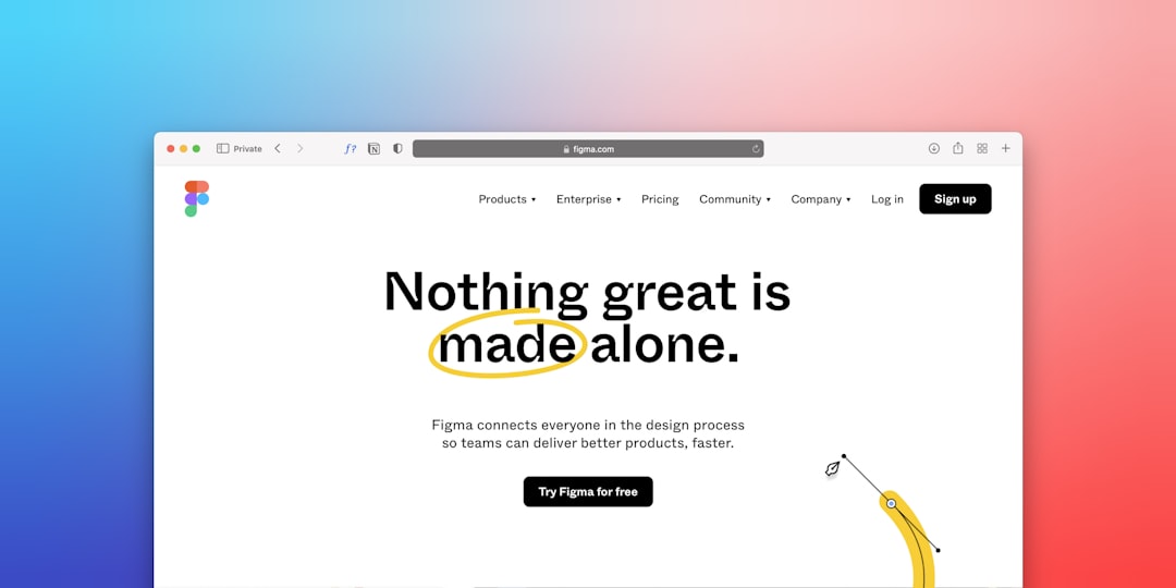
  • Real Estate Website Design: Sections Every Property Site Needs

    Real Estate Website Design: Sections Every Property Site Needs

    A property site that fails to communicate trust, location, and availability within the first few seconds will lose the lead to a competitor who does. Whether you are building from scratch or adapting a Canvas HTML Template, knowing exactly which sections belong on a real estate website — and how to structure them — is what separates a high-converting property site from one that just looks like one.

    Key Takeaways

    • Every effective real estate website needs six core sections: hero with search, featured listings, property detail, agent profiles, neighbourhood context, and a lead capture form.
    • Bootstrap 5’s grid system, bundled inside Canvas, makes it straightforward to build responsive property card layouts without any additional CSS frameworks.
    • Using Canvas CSS variables such as –cnvs-themecolor keeps your brand colour consistent across every section without hunting through stylesheet files.
    • A well-structured property detail page — with image gallery, specs, map, and CTA — dramatically reduces the number of off-site enquiries buyers make before converting.

    The hero is where a visitor decides whether your site is worth two more seconds of their time. For real estate, that decision depends entirely on whether they can immediately search for what they want. A generic headline with a background image is not enough — you need a search bar embedded directly in the hero, accepting inputs for location, property type, and price range.

    Using Canvas’s full-height section classes alongside Bootstrap 5’s grid, you can build a functional hero search bar that works on every screen size. The pattern below uses Bootstrap utility classes to centre the form and Canvas’s theme colour variable for the submit button:

    <section class="min-vh-100 d-flex align-items-center" style="background: url('images/hero-property.jpg') center/cover no-repeat;">
      <div class="container text-center text-white">
        <h2 class="display-4 fw-bold mb-3">Find Your Perfect Property</h2>
        <p class="lead mb-5">Search over 4,000 listings across the country</p>
        <form class="row g-2 justify-content-center">
          <div class="col-md-4">
            <input type="text" class="form-control form-control-lg" placeholder="City or postcode">
          </div>
          <div class="col-md-3">
            <select class="form-select form-select-lg">
              <option>Property type</option>
              <option>House</option>
              <option>Apartment</option>
              <option>Commercial</option>
            </select>
          </div>
          <div class="col-md-2">
            <button class="btn btn-lg w-100" style="background-color: var(--cnvs-themecolor); color: #fff;">Search</button>
          </div>
        </form>
      </div>
    </section>

    For hero image carousels or slider backgrounds, Canvas includes dedicated slider components that outperform generic solutions — the Canvas Slider and Carousel Components guide explains which component suits which use case.

    a street lined with tall buildings next to each other
    Photo by Maz on Unsplash

    Below the hero, visitors expect to see properties immediately. A featured listings grid showcasing four to six properties with photos, price, bedrooms, and a short location tag gives browsers an instant sense of your inventory quality and price range. Each card should link through to a full property detail page.

    Bootstrap 5’s grid makes equal-height cards trivial. The key is combining col-md-6 col-lg-4 columns with h-100 on the card element so every card stretches uniformly regardless of content length:

    <section class="py-6">
      <div class="container">
        <h2 class="text-center mb-5">Featured Properties</h2>
        <div class="row g-4">
    
          <div class="col-md-6 col-lg-4">
            <div class="card h-100 border-0 shadow-sm">
              <img src="images/property-01.jpg" class="card-img-top" alt="3-bed semi in Manchester">
              <div class="card-body">
                <span class="badge mb-2" style="background-color: var(--cnvs-themecolor);">For Sale</span>
                <h5 class="card-title">3-Bed Semi, Manchester</h5>
                <p class="card-text text-muted">Beechwood Road, M14 &bull; 3 bed &bull; 2 bath</p>
                <p class="fs-5 fw-bold">&pound;325,000</p>
                <a href="property-detail.html" class="btn btn-outline-secondary btn-sm">View Property</a>
              </div>
            </div>
          </div>
    
        </div>
      </div>
    </section>

    If you want to understand how Bootstrap 5 utility classes accelerate this kind of layout work, the Bootstrap 5 Utility Classes guide covers the full toolkit available to you inside Canvas.

    Property Detail Page Structure

    This is the most conversion-critical page on the entire site. A buyer who reaches a property detail page is already motivated — the page just needs to not let them down. Structure it in this order:

    1. Full-width image gallery — minimum five photos, with a lightbox or thumbnail strip
    2. Property headline and price — prominently positioned, never buried below the fold
    3. Key specs row — bedrooms, bathrooms, floor area, parking, in an icon-and-label row
    4. Full description — written, specific, and honest about condition and location
    5. Embedded map — iframe from Google Maps or OpenStreetMap centred on the property address
    6. Agent contact form — sticky sidebar on desktop, stacked below content on mobile

    The specs row is worth marking up carefully for accessibility and scannability. Using Bootstrap’s d-flex gap-4 pattern gives you a clean, flexible row that wraps gracefully on smaller screens:

    <div class="d-flex flex-wrap gap-4 my-4 py-4 border-top border-bottom">
      <div class="text-center">
        <i class="bi bi-house-door fs-4 d-block mb-1" style="color: var(--cnvs-themecolor);"></i>
        <small class="text-muted d-block">Type</small>
        <strong>Semi-Detached</strong>
      </div>
      <div class="text-center">
        <i class="bi bi-door-open fs-4 d-block mb-1" style="color: var(--cnvs-themecolor);"></i>
        <small class="text-muted d-block">Bedrooms</small>
        <strong>3</strong>
      </div>
      <div class="text-center">
        <i class="bi bi-water fs-4 d-block mb-1" style="color: var(--cnvs-themecolor);"></i>
        <small class="text-muted d-block">Bathrooms</small>
        <strong>2</strong>
      </div>
      <div class="text-center">
        <i class="bi bi-arrows-angle-expand fs-4 d-block mb-1" style="color: var(--cnvs-themecolor);"></i>
        <small class="text-muted d-block">Floor Area</small>
        <strong>112 m&sup2;</strong>
      </div>
    </div>
    white and brown concrete building under blue sky during daytime
    Photo by Simon Peter on Unsplash

    Agent Profiles Section

    Buyers do not just buy properties — they buy the people they trust to guide them through the process. An agent profiles section with a photo, name, specialisation, years of experience, and a direct contact link builds credibility that no amount of stock photography can replace.

    Keep the layout honest. Use real photos, real names, and real contact details. A four-column grid on desktop that stacks to two columns on tablet and single column on mobile works well for teams of four to eight agents. Each card should end with a telephone number or WhatsApp link as the primary CTA — not a generic “get in touch” button that goes to a general contact form.

    Neighbourhood and Location Context

    One of the most underused sections on property websites is a neighbourhood overview. Buyers searching in an unfamiliar area want to know about schools, transport links, local amenities, and average sale prices before they commit to a viewing. Providing this information on your site keeps them engaged longer and positions your agency as a genuine local authority.

    A two-column layout works well here: a written overview on the left, and an embedded map or infographic panel on the right. If you are building multiple neighbourhood pages, this pattern scales cleanly into a template you can replicate across dozens of areas — a real advantage if you are using Canvas Builder to generate the layout scaffolding quickly.

    This approach is very similar to the location-context thinking discussed in the Wedding Venue Website Design guide, where local context is equally critical for converting site visitors into serious enquiries.

    Lead Capture and Property Valuation CTA

    Every real estate website needs at least one dedicated lead capture section that is not buried in the footer. The most effective format for 2025 is a property valuation offer: “What is your home worth? Get a free valuation in 48 hours.” This converts both buyers and sellers, two audiences a single form can rarely serve at once.

    Place this section between your listings grid and your agent profiles. Use a high-contrast background — your Canvas theme colour pulled from –cnvs-themecolor works perfectly — to visually separate it from the surrounding white sections. Keep the form short: name, email, phone, and property address. Every additional field reduces conversion rate.

    .valuation-section {
      background-color: var(--cnvs-themecolor);
      padding: 80px 0;
      color: #fff;
    }
    
    .valuation-section .form-control {
      border: none;
      border-radius: 4px;
    }
    
    .valuation-section .btn-submit {
      background-color: #fff;
      color: var(--cnvs-themecolor);
      font-weight: 600;
      border: none;
      padding: 12px 32px;
      border-radius: 4px;
    }

    Frequently Asked Questions

    What sections are essential for a real estate website HTML template?

    At minimum, you need a hero section with search functionality, a featured listings grid, individual property detail pages, an agent profiles section, a neighbourhood overview, and a lead capture or valuation CTA section. These six sections cover the full buyer and seller journey from awareness to enquiry.

    Can I use the Canvas HTML Template for a property website?

    Yes. Canvas is a multi-purpose HTML template built on Bootstrap 5, which makes it well suited for real estate layouts. Its section-based structure, CSS variables for theming, and pre-built components such as sliders, cards, and forms give you everything needed to build a professional property site without writing everything from scratch.

    How do I keep the theme colour consistent across a real estate HTML template?

    Use the Canvas CSS variable –cnvs-themecolor throughout your stylesheet instead of hardcoding hex values. Set it once in your root styles and every element referencing that variable will update automatically if you ever change brand colour.

    Should property listing cards link to a separate detail page or use a modal?

    For SEO purposes, a dedicated detail page is strongly preferred. Each property page can be indexed individually by search engines, allowing you to rank for long-tail searches like “3-bed house for sale in [area]”. Modals are fine for quick previews but should never be the only way to access full property information.

    What is the best Bootstrap 5 layout for a property card grid?

    Use col-12 col-md-6 col-lg-4 column classes inside a row g-4 container. Add h-100 to the card element to equalise card heights. This gives you a three-column grid on desktop, two on tablet, and a single column on mobile — the standard pattern for property listing pages in 2025.

    If you’re working with the Canvas HTML Template and want to generate production-ready layouts faster, try Canvas Builder free and see how much time you save on every project.

  • Wedding Venue Website Design: What to Include & How to Build It

    Wedding Venue Website Design: What to Include & How to Build It

    A wedding venue’s website is often the first — and most decisive — touchpoint for couples comparing their shortlist of venues, which means a poorly structured site doesn’t just lose a lead; it hands that booking directly to a competitor. Getting the design right requires more than beautiful photography: it demands a clear information architecture, persuasive calls to action, and a layout that performs just as well on mobile as it does on a large display.

    Why Most Wedding Venue Websites Fail to Convert

    The most common failure is prioritising aesthetics over function. A venue site might have stunning drone footage and elegant serif fonts, yet still convert poorly because couples cannot find basic information: how many guests the venue holds, whether catering is in-house or third-party, and what the enquiry process looks like. Conversion-focused design means anticipating every question a couple has and answering it before they have to ask.

    Secondary failures include slow image loading (uncompressed gallery photos are the usual culprit), no mobile-optimised navigation, and a contact form buried three scrolls below the fold. Each of these issues compounds the other. If you are building a venue site for a client, auditing against these failure points before launch will save significant revision time.

    wedded couple photo
    Photo by Eugenia Pan’kiv on Unsplash

    Essential Sections Every Wedding Venue Website Must Include

    Think of your page structure as a conversation that mirrors how couples actually make decisions. They start with emotion, then move to logistics, then seek social proof, and finally commit to an enquiry. Your section order should reflect that journey.

    1. Hero Section: Full-width image or video of the venue at its best — ceremony space, reception hall, or outdoor grounds. Include a single headline and one CTA button linking to the enquiry form.
    2. Venue Overview: A brief narrative (two to three paragraphs) covering the venue’s character, location, and unique selling point. Pair it with a secondary image or short feature list.
    3. Spaces and Capacity: A grid or tab layout showing each distinct space (ceremony room, cocktail terrace, bridal suite) with headshots, capacity figures, and a one-line description.
    4. Packages and Pricing: Even if full pricing is “available on request”, a packages section showing what is included builds confidence. Use a three-column Bootstrap card layout for easy comparison.
    5. Photo Gallery: A filterable or masonry gallery. Keep images compressed to WebP at no wider than 1,400px to maintain page speed.
    6. Testimonials: Rotating quotes from real couples with a name, wedding date, and if possible a small portrait photo.
    7. FAQ: Answer the ten questions your venue receives most often by email — this alone reduces pre-enquiry back-and-forth and builds trust.
    8. Contact and Enquiry Form: Name, email, preferred date, estimated guest count, and a message field. Keep it simple. Fewer fields equal higher submission rates.

    Building the Layout with Canvas and Bootstrap 5

    Canvas is built on Bootstrap 5, which means you have access to a full 12-column grid, flexbox utilities, and a component library out of the box. For a venue packages section, a three-column card layout is the most effective pattern. Here is a working snippet you can drop directly into a Canvas page section:

    <section class="py-6">
      <div class="container">
        <div class="row justify-content-center mb-5">
          <div class="col-lg-7 text-center">
            <h2 class="display-5 fw-bold">Our Wedding Packages</h2>
            <p class="lead text-muted">Choose the package that suits your vision and guest list.</p>
          </div>
        </div>
        <div class="row g-4">
          <div class="col-md-4">
            <div class="card h-100 border-0 shadow-sm">
              <div class="card-body p-4">
                <h5 class="card-title fw-semibold">Intimate</h5>
                <p class="text-muted">Up to 50 guests</p>
                <ul class="list-unstyled mt-3">
                  <li class="mb-2">Garden ceremony space</li>
                  <li class="mb-2">3-course dinner</li>
                  <li class="mb-2">Bridal suite access</li>
                </ul>
              </div>
            </div>
          </div>
          <div class="col-md-4">
            <div class="card h-100 border-0 shadow-sm border-top border-3" style="border-color: var(--cnvs-themecolor) !important;">
              <div class="card-body p-4">
                <h5 class="card-title fw-semibold">Classic</h5>
                <p class="text-muted">Up to 150 guests</p>
                <ul class="list-unstyled mt-3">
                  <li class="mb-2">Grand hall & garden</li>
                  <li class="mb-2">5-course dinner</li>
                  <li class="mb-2">Evening entertainment</li>
                </ul>
              </div>
            </div>
          </div>
          <div class="col-md-4">
            <div class="card h-100 border-0 shadow-sm">
              <div class="card-body p-4">
                <h5 class="card-title fw-semibold">Grand</h5>
                <p class="text-muted">Up to 300 guests</p>
                <ul class="list-unstyled mt-3">
                  <li class="mb-2">Full venue exclusive hire</li>
                  <li class="mb-2">Bespoke catering menu</li>
                  <li class="mb-2">On-site coordinator</li>
                </ul>
              </div>
            </div>
          </div>
        </div>
      </div>
    </section>

    Notice the use of var(--cnvs-themecolor) to apply the venue’s brand colour as a top border accent on the featured card — this is the correct Canvas variable, not --bs-primary. For more detail on aligning and spacing elements within these grid layouts, the guide on Bootstrap 5 Flexbox alignment and spacing covers the utilities you will use most frequently.

    brown concrete house under white sky
    Photo by Annie Spratt on Unsplash

    Typography and Colour Choices for Wedding Venues

    Wedding venues typically fall into one of three visual tones: rustic-romantic (warm neutrals, serif fonts), modern-luxury (deep charcoals, gold accents, clean sans-serif), or garden-fresh (soft greens, dusty rose, light airy typography). Your font and colour choices must reinforce whichever tone the venue has already established in its branding.

    In Canvas, set fonts via the --cnvs-primary-font and --cnvs-secondary-font CSS variables in your stylesheet. For a luxury venue pairing a display serif heading font with a neutral body font:

    :root {
      --cnvs-primary-font: 'Cormorant Garamond', Georgia, serif;
      --cnvs-secondary-font: 'Inter', sans-serif;
      --cnvs-themecolor: #b08d6a;
      --cnvs-themecolor-rgb: 176, 141, 106;
    }

    Import your chosen Google Fonts in the <head> before style.css. Never load Bootstrap separately — Canvas bundles Bootstrap 5 already, and a duplicate load will cause styling conflicts.

    Social Sharing, Open Graph, and Local SEO

    Couples routinely share venue websites with family and partners via social media links and messaging apps. If your Open Graph tags are missing or incorrect, those shared links will render as bare URLs with no image preview — a missed opportunity every time. Implement complete Open Graph meta tags in the <head> of every key page. For a comprehensive walkthrough of how to structure these correctly, see the Open Graph tags complete guide.

    For local SEO, every wedding venue website in 2025 should include structured data markup (schema.org EventVenue type), a Google Maps embed, consistent NAP (Name, Address, Phone) data in the footer, and a page title pattern that includes the venue name and location — for example: “Meadowbrook Manor Wedding Venue | Oxfordshire”.

    Accelerating the Build Process with an AI Wedding Venue Website Builder

    Building a venue site manually — even with Canvas’s component library — still involves significant layout assembly, placeholder copy decisions, and repeated tweaking of grid breakpoints. An AI-powered wedding venue website builder approach changes the workflow entirely: you describe the site’s tone, sections, and content structure in a prompt, and receive a complete Canvas-compatible HTML layout ready to customise.

    This is particularly valuable when working on client projects where initial concepts need to be presented quickly. Rather than spending several hours assembling a first draft, you can generate multiple layout variations, compare them with the client, and refine the chosen direction. The post on speeding up client approvals with AI-generated design concepts explores this workflow in more detail. If you are curious about what other venue-adjacent niche sites can be built with the same approach, 12 niche website ideas you can build with Canvas HTML is worth a read.

    The key advantage is consistency: AI-generated Canvas layouts use the correct file structure (style.css, css/font-icons.css, js/plugins.min.js, js/functions.bundle.js), the correct Canvas CSS variables, and Bootstrap 5 classes — so the output is production-ready rather than requiring a structural overhaul before it can be used.

    Frequently Asked Questions

    What pages should a wedding venue website have?

    At minimum: a home page, a venue spaces page, a packages and pricing page, a gallery, a testimonials or reviews page, an FAQ page, and a contact/enquiry page. Larger venues with multiple sites or accommodation on-site may add further section-specific pages.

    How do I make a wedding venue website mobile-friendly?

    Use Bootstrap 5’s responsive grid (which Canvas includes by default), ensure touch-friendly tap targets for all buttons and form fields, compress all gallery images to WebP format, and test on real devices rather than only browser emulators. Avoid fixed-width elements and always use percentage or viewport-relative widths for hero sections.

    Should a wedding venue website show prices?

    Transparency on pricing — even if only indicative package ranges — reduces the friction couples feel before making an enquiry. Venues that display “prices from £X” consistently report higher enquiry quality because couples have pre-qualified themselves before contacting. Full bespoke pricing can still be confirmed after enquiry.

    What is the best colour scheme for a wedding venue website?

    There is no single best scheme — it should reflect the venue’s existing brand and physical aesthetic. Luxury estates typically use deep navy, champagne gold, or charcoal with white space. Rustic barns suit warm terracotta, sage green, and cream. Garden venues work well with dusty rose, sage, and soft white. Always derive the palette from the venue’s strongest photography.

    Can I use Canvas HTML Template to build a wedding venue website?

    Yes. Canvas’s multi-purpose section library, Bootstrap 5 grid, and full CSS variable system make it an excellent base for venue websites. You can customise fonts via --cnvs-primary-font, brand colour via --cnvs-themecolor, and header behaviour via --cnvs-header-bg and --cnvs-header-sticky-bg — all without modifying core template files.

    If you’re working with the Canvas HTML Template and want to generate production-ready layouts faster, try Canvas Builder free and see how much time you save on every project.