Blog

  • Canvas One Page Demo vs Multi-Page: When to Use Each Format

    Canvas One Page Demo vs Multi-Page: When to Use Each Format

    Choosing the wrong site structure before you write a single line of code wastes hours — and occasionally loses clients. The Canvas HTML Template ships with both one-page and multi-page formats, and knowing which to reach for — and why — is one of the most practical decisions you will make on any project.

    Key Takeaways

    • Canvas one page demos are ideal for campaigns, product launches, and focused lead-generation with a single conversion goal.
    • Multi-page layouts suit content-rich sites, SEO-driven projects, and clients who need room to grow over time.
    • Canvas’s singlepage section type bundles header, hero, and footer in one file; fullpage_layout spans multiple linked pages.
    • Your choice directly affects performance, SEO strategy, and how much scaffolding you need to build before delivery.

    What Layout Formats Canvas Actually Offers

    Canvas organises its demo content into three distinct section types. A blocksection is a single reusable component — a hero, a pricing table, a testimonials strip — that you assemble into a larger page. A singlepage demo is a complete self-contained file: one HTML document containing a header, a hero, multiple content sections, and a footer, all designed to scroll top to bottom. A fullpagelayout demo is a multi-page niche build — think a SaaS product site or a digital agency — where separate HTML files are linked together through navigation.

    Understanding this distinction matters because people frequently conflate “one-page layout” with “simple site” and “multi-page layout” with “complex site.” Neither assumption is reliable. A well-constructed Canvas one page demo can be technically sophisticated; a shallow multi-page site can be thin on substance. The format should follow the project brief, not habit.
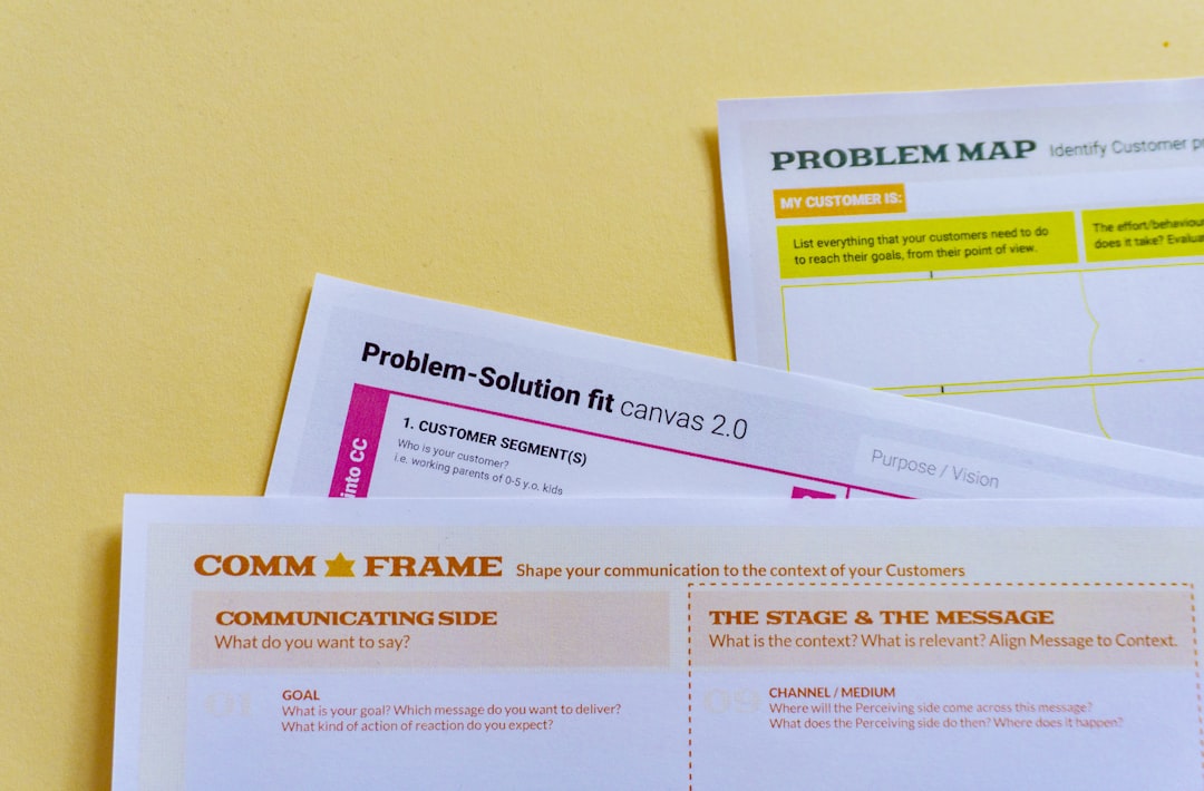
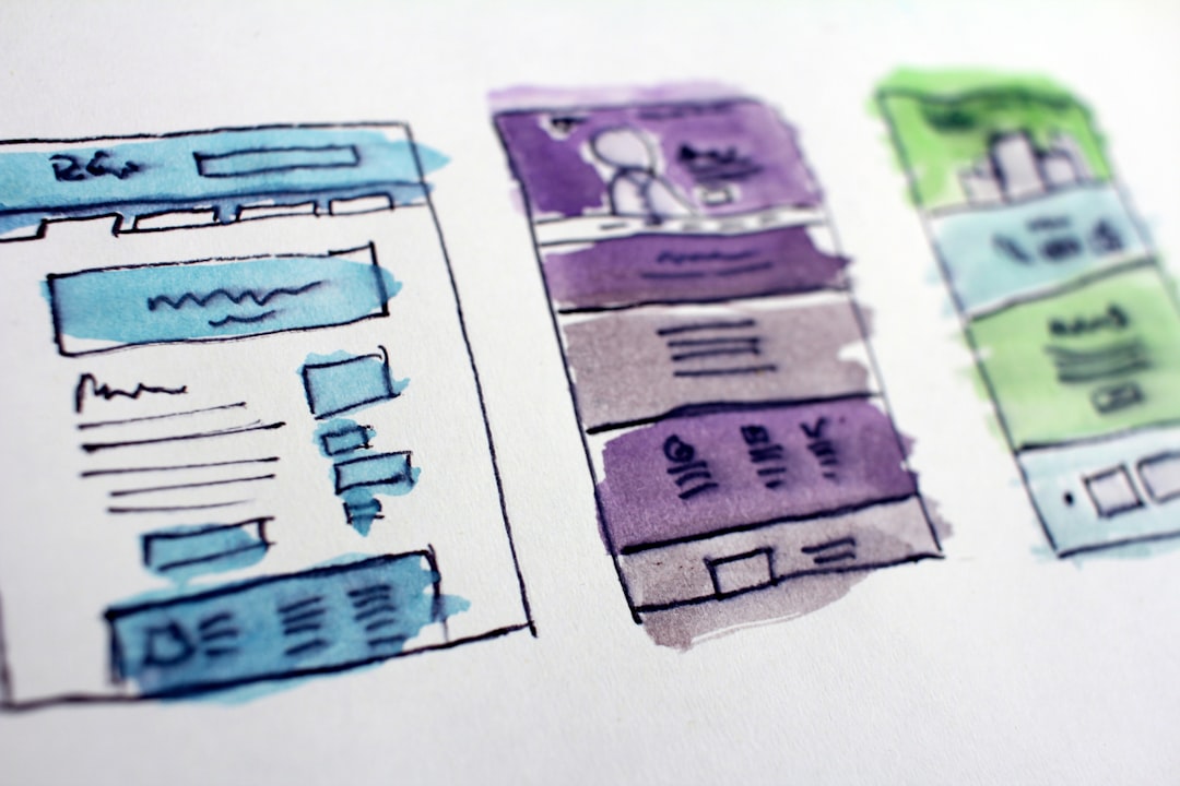
    white printer paper on white table
    Photo by Daria Nepriakhina 🇺🇦 on Unsplash

    When a Canvas One Page Demo Is the Right Choice

    One-page layouts perform best when the entire user journey can be completed — or initiated — without the visitor needing to navigate away. Classic use cases include:

    • Product launch pages where you want a visitor to scroll through benefits, social proof, and a single call to action without distraction.
    • Event and conference sites with a fixed schedule, speaker list, and registration form — all content is time-bounded and self-contained.
    • Portfolio microsites for freelancers or creative professionals who want a focused, narrative-driven presentation of their work.
    • App landing pages where the download or sign-up button is the sole conversion goal, as demonstrated in the AI SaaS landing page guide.
    • Campaign-specific pages running alongside a main brand site, often used in paid advertising where message match is critical.

    From a technical perspective, single_page layouts in Canvas keep all CSS and JS references consolidated in one document. You load style.css, css/font-icons.css, js/plugins.min.js, and js/functions.bundle.js once, and every section benefits. There is no inter-page navigation to architect, no active state management across files. The structural HTML pattern looks like this:

    <!DOCTYPE html>
    <html lang="en">
    <head>
      <link rel="stylesheet" href="css/style.css">
      <link rel="stylesheet" href="css/font-icons.css">
    </head>
    <body>
      <header id="header"><!-- Canvas header --></header>
    
      <section id="hero"><!-- Hero section --></section>
      <section id="features"><!-- Features section --></section>
      <section id="pricing"><!-- Pricing section --></section>
      <section id="contact"><!-- Contact section --></section>
    
      <footer id="footer"><!-- Canvas footer --></footer>
    
      <script src="js/plugins.min.js"></script>
      <script src="js/functions.bundle.js"></script>
    </body>
    </html>

    Smooth-scroll navigation using anchor IDs handles the entire menu structure. Canvas’s built-in one-page menu behaviour activates automatically through functions.bundle.js — no additional configuration is required.

    When a Multi-Page Layout Is the Stronger Option

    Multi-page fullpagelayout builds are the correct choice whenever the project involves substantial content depth, distinct audience segments, or long-term SEO objectives. Specific scenarios where multi-page wins include:

    • Service businesses with multiple distinct offerings that each warrant a dedicated page, unique meta descriptions, and targeted keyword optimisation.
    • E-commerce or product catalogue sites where categories, individual product pages, and checkout flows each need their own URL.
    • B2B SaaS platforms with documentation, pricing, case studies, and an about section — content that cannot be compressed into a single scroll without becoming unusable.
    • Content-heavy editorial or blog sites where individual articles need canonical URLs and independent shareability.
    • Agency or studio sites where separate case study pages carry unique assets and narrative structures.

    Multi-page Canvas builds also give you granular control over per-page CSS. You can apply page-specific overrides by targeting the <body> class that Canvas adds to each template, keeping customisation scoped without polluting a shared stylesheet. If you are evaluating whether static HTML is the right delivery format for your client in the first place, the WordPress vs static HTML comparison covers that decision in detail.
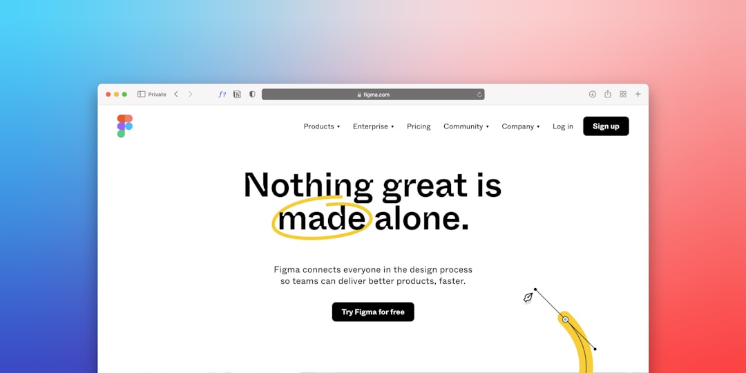
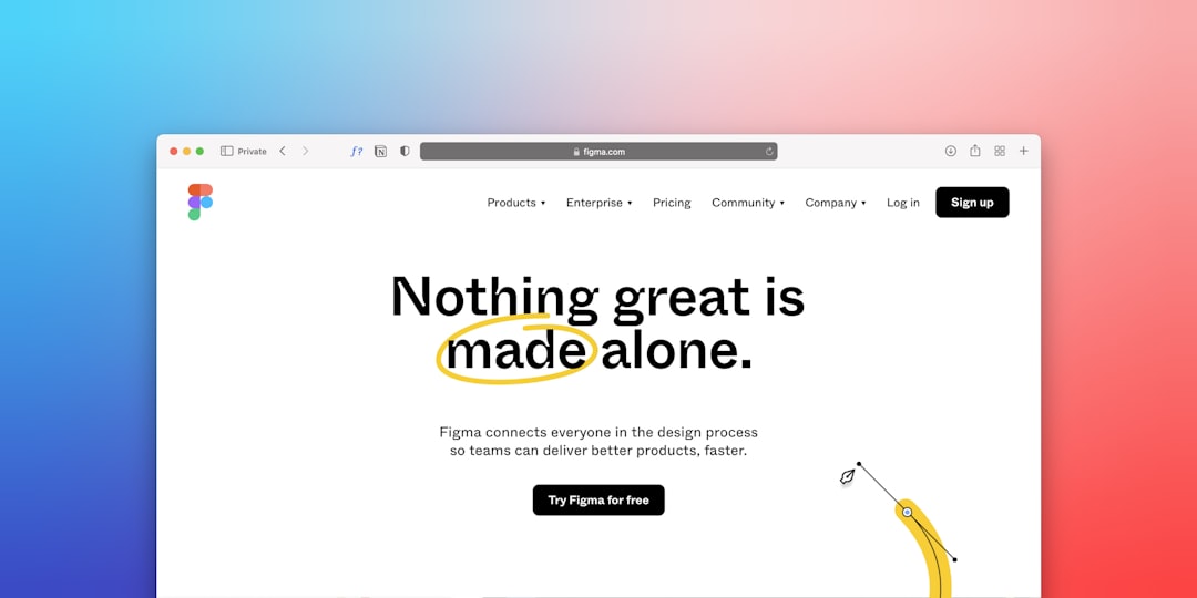
    a computer screen with the words nothing great is made alone
    Photo by Team Nocoloco on Unsplash

    SEO and Performance Implications of Each Format

    The SEO calculus here is straightforward. A Canvas one page demo has one URL, one title tag, and one meta description. That concentrates all link equity and makes on-page optimisation simple, but it caps your keyword targeting to a single document. If organic search traffic across multiple queries matters to your client, a multi-page layout is non-negotiable.

    page speed is where one-page builds often have an edge. A single HTML file with one CSS bundle and one JS bundle is trivially cacheable. There are no additional HTTP requests for navigation between pages, and with Canvas built on Bootstrap 5 — included in the template, never loaded from a CDN — you avoid the latency of third-party requests entirely.

    Multi-page layouts introduce per-page load events, but also give you the ability to defer non-critical assets on pages where they are not needed. A contact page, for instance, does not need the same image assets as a portfolio showcase page. Thoughtful asset loading across pages can actually deliver better perceived performance than a single large page that loads all section assets upfront.

    The Hybrid Approach: Combining Both in One Project

    Many production Canvas projects use both formats simultaneously, and this is often the most commercially sensible approach. A typical structure might be:

    1. A one-page marketing site at the root domain — sharp, conversion-focused, fast to load.
    2. A separate multi-page section (e.g., /docs/, /blog/, or /case-studies/) linked from the main navigation for users who want depth.

    Canvas makes this straightforward because its header and footer components are modular. You can maintain a single navigation include — either through a build process or server-side includes — and apply it across both the single-page root and the multi-page sub-sections. Theming remains consistent because all pages share the same CSS variables generator. Updating --cnvs-themecolor once propagates across every page in the project:

    :root {
      --cnvs-themecolor: #e8452c;
      --cnvs-themecolor-rgb: 232, 69, 44;
      --cnvs-primary-font: 'Inter', sans-serif;
      --cnvs-logo-height: 42px;
      --cnvs-logo-height-sticky: 34px;
    }

    This kind of scalable theming is particularly useful on agency projects where multiple deliverables share a design system. For teams managing Canvas builds at volume, the Canvas HTML Template agency workflows guide covers how to systematise this efficiently.

    Making the Decision: A Practical Framework

    When a new brief lands, run through these questions before choosing a format:

    1. How many distinct conversion goals exist? One goal favours a one-page build. Multiple goals — each with different audiences — favour multi-page.
    2. What is the SEO ambition? If the client expects organic traffic from ten different keyword clusters, plan for ten pages minimum.
    3. How much content will exist at launch versus six months out? One-page sites are harder to scale. If the content roadmap shows growth, start with a multi-page structure.
    4. Is the site a campaign asset or a long-term brand presence? Campaign assets benefit from one-page focus; brand presences need room to expand.
    5. What is the handoff expectation? Non-technical clients are often more comfortable managing a clearly structured multi-page site than a single file where all content is stacked vertically. The freelancer’s guide to delivering HTML templates addresses client handoff considerations in full.

    Neither format is universally superior. The Canvas one page demo format is a precision tool for focused objectives. The multi-page fullpagelayout is a structural foundation for sites with breadth and longevity. Using Canvas Builder to generate the initial layout accelerates both approaches, since the AI understands Canvas section types and generates production-ready code that fits either structure without requiring you to strip out boilerplate manually.

    Frequently Asked Questions

    Can I convert a Canvas one page demo into a multi-page site later?

    Yes, but it requires deliberate restructuring. You will need to split the single HTML file into separate pages, extract shared header and footer markup, update all navigation links to use file paths rather than anchor IDs, and review your CSS for any selectors that assumed a single-page context. Planning for multi-page from the start is faster than retrofitting.

    Does Canvas include ready-made examples of both formats?

    Yes. Canvas ships with an extensive library of both singlepage demos — self-contained one-page layouts — and fullpage_layout demos that span multiple linked HTML files. The naming convention in the Canvas demo folder makes the format clear for each demo.

    Does the one-page format hurt SEO?

    Not necessarily, but it limits your keyword targeting to a single URL. For local businesses, event pages, or product launches where one primary keyword cluster matters, a one-page build can rank well. For sites targeting multiple distinct search queries across different topics, a multi-page structure is required.

    How does Canvas handle smooth scrolling on one-page layouts?

    Canvas’s js/functions.bundle.js handles smooth-scroll behaviour automatically when navigation links use anchor IDs (e.g., href="#features"). No additional JavaScript configuration is needed. The active menu state updates as the user scrolls through each section.

    Can I use the same Canvas header across both a one-page and multi-page section of the same project?

    Yes. The Canvas header markup is self-contained and portable. You can copy the same header block across all pages in your project and use the shared CSS variables — such as --cnvs-header-bg and --cnvs-primary-menu-color — to maintain visual consistency without duplicating style rules.

    If you’re working with the Canvas HTML Template and want to generate production-ready layouts faster, try Canvas Builder free and see how much time you save on every project.

    Where the Alternatives Win

    Multi-page layouts genuinely outperform one-page demos in any project where SEO across multiple keywords matters, since a single URL with one title tag and one meta description cannot compete for distinct search queries the way separate, individually optimised pages can. Service businesses, B2B SaaS platforms, and content-heavy editorial sites all require the dedicated URLs, unique meta descriptions, and canonical structures that only a multi-page build provides. If a client expects the site to grow — adding case studies, product pages, or documentation over time — the one-page format will become a structural liability rather than an asset.

    The Verdict: Who Should Choose What

    Choose the Canvas one-page demo for campaign pages, product launches, app landing pages, and portfolio microsites where there is a single conversion goal and all content fits a linear scroll — the consolidated asset loading and built-in smooth-scroll navigation make setup genuinely faster. Choose the multi-page layout for service businesses, SaaS platforms, e-commerce catalogues, and any client who needs long-term SEO growth across multiple queries or content that cannot be compressed into one document without becoming unusable. The format should follow the project brief; defaulting to one-page because it feels simpler, or multi-page because it feels more professional, will produce the wrong result in either direction.


  • WordPress vs Static HTML: Which Is Right for Your Client Project?

    WordPress vs Static HTML: Which Is Right for Your Client Project?

    Choosing between WordPress and a static HTML site is one of the most consequential decisions you will make at the start of a client project — and the wrong call can cost both of you time, money, and frustration down the line.

    Key Takeaways

    • Static HTML sites consistently outperform WordPress on speed, security, and hosting simplicity — but lack built-in content management for clients who need to self-edit.
    • WordPress is the right fit when a client requires frequent content updates, a blog, or plugin-driven functionality like WooCommerce or membership systems.
    • An HTML template built on a solid framework like the Canvas HTML Template can deliver production-quality results faster than a WordPress build when the client does not need a CMS.
    • The decision should be driven by the client’s ongoing content behaviour, not by your personal tooling preference.

    The Core Difference Between WordPress and Static HTML

    WordPress is a database-driven CMS. Every page request triggers a server-side process: PHP queries a MySQL database, assembles the page, and serves it to the browser. That dynamic architecture makes it extremely flexible, but it introduces moving parts — hosting requirements, plugin compatibility, security patches, and performance overhead.

    A static HTML site is pre-built. The browser receives plain HTML, CSS, and JavaScript files with no server-side assembly required. There is no database, no login portal to brute-force, and no plugin update to miss. The trade-off is that any content change typically requires a developer or, at minimum, a working knowledge of HTML.

    Neither approach is universally superior. The correct answer depends on what the client will actually do with the site after handover.

    computer program screengrab
    Photo by apoorv mittal on Unsplash

    When WordPress Is the Right Choice

    WordPress makes clear sense in the following scenarios:

    • The client publishes content frequently. A blog, news section, or resource library that is updated weekly or more requires a CMS. Asking a client to edit raw HTML every time they want to publish an article is impractical and creates support overhead for you.
    • E-commerce is a core requirement. WooCommerce remains the most accessible route to a managed online store for small businesses. If the client is selling products and needs inventory management, order tracking, and payment gateways, WordPress plus WooCommerce is a proven stack.
    • The client needs a membership or community area. Plugin ecosystems for gating content, managing subscriptions, and running forums are mature on WordPress in a way that static HTML simply cannot replicate without significant custom development.
    • Non-technical staff will manage the site independently. The Gutenberg editor is approachable for people with no coding background. If the client’s marketing coordinator needs to update a landing page without raising a support ticket, WordPress gives them that capability.

    When Static HTML Is the Right Choice

    Static HTML is frequently the better choice for agency and freelance projects, and it tends to be underused relative to its strengths:

    • Performance is a differentiator. Static files served from a CDN routinely achieve sub-second load times. For landing pages, portfolios, product launches, and campaign microsites, that speed advantage directly supports conversion rates and Core Web Vitals scores.
    • Security posture is significantly stronger. No database, no PHP execution, no plugin surface area. The attack vectors that compromise most WordPress sites simply do not exist on a static site.
    • Hosting is simpler and cheaper. A static site can run on Netlify, GitHub Pages, Cloudflare Pages, or basic shared hosting at minimal cost. There is no PHP version to maintain or MySQL connection to configure.
    • The client has a fixed or rarely updated site. A brochure site for a law firm, a portfolio for a photographer, or a single-page product landing page may not change more than once a quarter. There is no practical reason to introduce a CMS for that use case.
    • Delivery timelines are tight. Working with a high-quality HTML template and a layout generation tool like Canvas Builder can produce a fully designed, responsive, production-ready site in a fraction of the time a custom WordPress theme build requires.

    If your agency regularly delivers HTML template projects, the workflow advantages compound significantly over time. The post on Canvas HTML Template for Agencies: Workflows, Prompts, and Best Practices covers this in detail.

    text
    Photo by Ferenc Almasi on Unsplash

    Performance and SEO: How the Two Stacks Compare

    Page speed is no longer just a user experience metric — it is a direct Google ranking signal through Core Web Vitals. On this dimension, static HTML has a structural advantage that WordPress can close but rarely eliminate without significant engineering effort.

    A well-configured WordPress site with aggressive caching, a CDN, and a lightweight theme can achieve good performance scores. But that configuration takes time to implement correctly, and it introduces ongoing maintenance. A static HTML site starts fast by default.

    For SEO beyond speed — structured markup, meta tags, Open Graph generator data — both approaches are fully capable. The difference is that on a static site, you control the markup directly. On WordPress, you are often relying on plugins like Yoast or Rank Math to inject the right output, and that output can conflict with theme code in ways that are difficult to diagnose.

    For technically demanding builds where the HTML output needs to be precise — such as an AI SaaS landing page with specific structured data requirements — working directly in HTML gives you full control. The guide on how to build an AI SaaS landing page with Canvas HTML Template shows what that level of control looks like in practice.

    Client Handover and Long-Term Maintenance

    One of the most overlooked dimensions of this decision is what happens after you hand the project over. Consider the following questions before committing to a platform:

    1. Will the client update the site themselves? If yes, how technical are they? WordPress is more accessible for non-developers, but it also means they can accidentally break things.
    2. Who handles ongoing updates? WordPress requires plugin updates, core updates, and occasionally theme updates — all of which can introduce conflicts. Static HTML sites require virtually no ongoing maintenance.
    3. What is the client’s hosting situation? Some clients have existing WordPress hosting and expect you to work within it. Others are starting fresh and will appreciate a simpler, cheaper static hosting recommendation.
    4. Is there a retainer in place? If you have an ongoing maintenance retainer with the client, a WordPress site generates more recurring work. If the engagement is project-based with a clean handover, a static site reduces your long-term liability.

    For a structured approach to client handover on HTML template projects, the Freelancer’s Guide to Delivering HTML Templates to Clients is a practical reference worth bookmarking.

    A Practical Framework for Making the Decision

    Rather than defaulting to a platform out of habit, run through this short assessment at the start of every project:

    • Content update frequency: More than once a month with non-technical staff editing? WordPress. Quarterly or less, or developer-managed? Static HTML.
    • Functionality requirements: Complex e-commerce, memberships, or booking plugins? WordPress. Marketing site, portfolio, landing page, or campaign microsite? Static HTML.
    • Performance requirements: If sub-second load times and top Core Web Vitals scores are part of the brief, static HTML gets you there with less effort.
    • Budget and timeline: Static HTML projects with a premium template are faster to build and cheaper to host. WordPress builds carry higher setup time and ongoing hosting costs.
    • Security sensitivity: Healthcare, finance, legal — any sector where a breach is particularly damaging benefits from the reduced attack surface of a static site.

    The decision is rarely black and white, but asking these questions at discovery stage will consistently point you toward the right answer. In 2025 and beyond, the default assumption that WordPress is always the professional choice is increasingly being challenged by the quality and speed achievable with modern HTML templates and AI-assisted layout tools.

    Frequently Asked Questions

    Can a static HTML site rank well on Google?

    Yes. Google indexes static HTML just as effectively as WordPress pages. In many cases, static sites rank better because their faster load times and cleaner markup contribute positively to Core Web Vitals scores, which are a confirmed ranking factor.

    Is it possible to add a blog to a static HTML site?

    It is possible, but it requires either a static site generator like Jekyll or Hugo, a headless CMS connected via API, or manually creating new HTML pages for each post. For clients who want a regularly updated blog, WordPress remains the more practical solution unless you are comfortable configuring a more complex static stack.

    What is the main security advantage of static HTML over WordPress?

    Static HTML sites have no database, no PHP execution layer, and no plugin code running on the server. The vast majority of WordPress vulnerabilities — including SQL injection, brute-force login attacks, and plugin exploits — simply cannot occur on a static site because the attack surface does not exist.

    How does using an HTML template like Canvas compare to building a WordPress theme?

    An HTML template gives you direct control over every line of markup, no theme framework overhead, and no dependency on a CMS. With a tool like Canvas Builder generating production-ready layouts, the build time is significantly shorter than developing a custom WordPress theme while the output quality is equal or better for static use cases.

    Can I convert a static HTML site to WordPress later if the client’s needs change?

    Yes, but it is not a trivial process — it requires converting HTML templates into PHP-based WordPress theme files. It is generally more practical to build correctly for the client’s current and anticipated needs from the start, rather than planning for a future migration that may introduce significant rework.

    If you’re working with the Canvas HTML Template and want to generate production-ready layouts faster, try Canvas Builder free and see how much time you save on every project.

    Where the Alternatives Win

    WordPress genuinely beats static HTML — and Canvas Builder — when clients need to publish content independently and frequently, such as weekly blog posts, news updates, or resource libraries that non-technical staff must manage without developer involvement. For e-commerce with inventory management, order tracking, and payment gateways, WooCommerce on WordPress is a proven, mature stack that static HTML cannot match without substantial custom development. Membership systems, subscription gating, and community features are also areas where WordPress’s plugin ecosystem has no realistic static equivalent.

    The Verdict: Who Should Choose What

    Canvas Builder and static HTML are the right choice for agencies delivering brochure sites, portfolios, campaign landing pages, and other projects where the client rarely self-edits content and performance, security, and delivery speed are priorities. WordPress is genuinely the better fit when the client’s marketing team needs to publish independently, when e-commerce functionality is central, or when a membership or subscription system is required — scenarios where introducing a CMS is justified by real client behaviour rather than tooling habit.

  • Food Tech Website Design Trends and Best Practices for 2026

    Food Tech Website Design Trends and Best Practices for 2026

    Food technology is one of the fastest-growing verticals in digital product design, and the websites representing these brands in 2026 face a unique challenge: they need to communicate scientific credibility, consumer trust, and appetising visual appeal — all at once. Whether you are building for a restaurant tech startup, a meal-kit platform, or an alternative protein company, the design decisions you make now will determine how quickly visitors convert.

    Key Takeaways

    • Food tech websites in 2026 must balance scientific authority with warm, appetite-driven visual language — neither alone is sufficient.
    • Performance and mobile-first layout are non-negotiable, especially for restaurant tech platforms where users arrive mid-decision on a phone.
    • Interactive elements such as modals, tabs, and animated data visualisations are now expected in the food tech space, not optional extras.
    • Using a production-ready HTML framework like the Canvas HTML Template with an AI layout tool significantly reduces the time from wireframe to live site.

    Why Food Tech Website Design Is a Different Discipline

    A standard SaaS landing page can afford to be minimal and text-heavy because the product is abstract. Food tech cannot. Visitors to a restaurant tech website or a food delivery platform carry immediate sensory expectations — they expect colour, warmth, and imagery that triggers an appetite response within two seconds of landing. At the same time, investors, retail buyers, and B2B clients visiting the same URL expect charts, certifications, and case study evidence. That dual audience is what makes food tech website design genuinely difficult to execute well.

    The solution in 2026 is modular page architecture: hero sections and above-the-fold content serve the consumer eye with rich visuals, while scrolling reveals structured data, testimonials, and proof-point sections aimed at decision-makers. This is not a new idea, but the execution bar has risen considerably.

    a person using a cell phone and a laptop on a table
    Photo by Marielle Ursua on Unsplash

    The Visual Language Dominating Food Tech in 2026

    Several distinct visual directions have emerged across leading food tech brands this year.

    1. Bioluminescent colour palettes — deep teals, electric greens, and warm ambers that reference both organic ingredients and laboratory innovation simultaneously.
    2. Macro food photography combined with data overlays — a close-up of a grain or protein cell with nutritional or sustainability data superimposed in a clean sans-serif typeface.
    3. Dark backgrounds with warm accent tones — a pattern that, as explored in dark mode fitness dashboard and website design trends for 2026, has crossed from fitness into food tech as a signal of premium positioning.
    4. Illustrated iconography replacing stock photography for feature sections, giving brands a proprietary visual identity that stock libraries cannot replicate.

    When implementing these palettes in Canvas, always define your brand colour through the correct CSS variables generator. Do not target Bootstrap variables directly.

    :root {
      --cnvs-themecolor: #2D8A5F;
      --cnvs-themecolor-rgb: 45, 138, 95;
      --cnvs-primary-font: 'DM Sans', sans-serif;
      --cnvs-secondary-font: 'Fraunces', serif;
    }

    Using –cnvs-themecolor ensures your brand colour propagates through buttons, links, and interactive states across the entire Canvas component library without needing to override individual selectors.

    Restaurant Tech Website Layout Patterns That Convert

    Restaurant tech platforms — think reservation systems, kitchen management software, or ghost kitchen operators — need layouts that communicate speed and reliability above all else. The following Bootstrap 5 grid pattern, available inside Canvas, works particularly well for a three-value-proposition row above a demo CTA:

    Order in 60 Seconds

    Streamlined checkout reduces abandonment by 34% on average.

    Allergy-Safe Filtering

    Real-time menu filtering across 14 dietary categories.

    Live Kitchen Analytics

    Monitor throughput, waste, and margin in a single dashboard.

    Notice the use of Bootstrap 5’s g-4 gutter class and col-lg-4 columns — Canvas ships with Bootstrap 5 bundled, so there is no need to load any third-party Bootstrap CDN stylesheet alongside it.

    fried potato with yellow and red dips
    Photo by Jonathan Tsoi on Unsplash

    Interactive Elements That Food Tech Sites Need in 2026

    Static pages no longer communicate the complexity of a modern food tech product effectively. The interactive elements that perform best in this niche in 2026 are:

    • Ingredient or process explainer modals — triggered by clicking a product ingredient or a supply chain node, revealing detailed sourcing or nutritional information without navigating away. The Bootstrap 5 modal implementation covered in Bootstrap 5 modal components and popup dialogues is directly applicable here.
    • Tabbed comparison sections — particularly for platforms offering tiered plans or comparing their product against conventional alternatives (e.g. plant-based vs animal protein nutrition panels).
    • Animated SVG data visualisations — calorie breakdowns, carbon footprint comparisons, or supply chain maps that animate on scroll using Canvas’s built-in scroll reveal utilities.
    • Sticky “Book a Demo” bars — fixed to the bottom of the viewport on mobile, ensuring the primary B2B conversion action is always accessible regardless of scroll depth.

    For a sticky CTA bar in Canvas, a minimal implementation looks like this:

    The d-block d-lg-none classes ensure this bar appears only on mobile, where screen real estate is limited and a persistent CTA adds the most conversion value.

    Performance, Accessibility, and Trust Signals

    Food tech companies handling dietary data, payment processing, or health claims face heightened scrutiny from regulators and cautious consumers alike. Your website design must make trust visible, not just implied.

    In practice, this means:

    • Displaying certification badges (organic, B Corp, ISO, FDA compliance) in a dedicated trust bar immediately below the hero — not buried in the footer.
    • Using WCAG 2.2 AA colour contrast ratios throughout, especially for any nutritional or allergen information. The px to rem converter is useful for ensuring font sizes remain accessible and scalable across devices.
    • Core Web Vitals scores above 90 on mobile. This means lazy-loading all food photography, serving next-gen image formats (WebP/AVIF), and deferring non-critical scripts. Canvas’s js/plugins.min.js and js/functions.bundle.js are already minified and bundled — avoid adding unoptimised third-party scripts that undermine this.
    • A clear, prominent privacy policy link near any form, particularly for platforms collecting dietary preferences or health data.

    Building Food Tech Sites Faster with Canvas and AI

    The complexity of food tech website design — dual audiences, rich media, interactive components, trust requirements — makes it one of the most time-intensive niches to build from scratch. Using Canvas Builder to generate production-ready Canvas HTML layouts via AI prompts dramatically compresses the prototyping phase.

    A well-structured AI prompt for a food tech hero section might specify: dark background, a macro food image on the right, a headline in Fraunces serif, a subheadline in DM Sans, one primary CTA button in the brand green, and a trust badge row below. Canvas Builder outputs correctly structured Canvas HTML using the right classes, variables, and JS file references — not a generic Bootstrap scaffold that requires extensive rework.

    For agencies managing multiple food and hospitality clients, the workflow efficiencies compound. The approach mirrors patterns described in the Canvas HTML Template for agencies: workflows, prompts, and best practices guide, which covers how to structure repeatable client delivery systems around a single HTML template.

    The food website trends 2026 landscape rewards speed of iteration. Brands that can test three different hero layouts in the time it used to take to build one will outpace slower-moving competitors on conversion optimisation alone.

    Frequently Asked Questions

    What makes food tech website design different from a standard restaurant website?

    A traditional restaurant website primarily serves local discovery — menus, opening hours, reservation links. A food tech website must simultaneously address consumer appeal, investor credibility, B2B sales, and often regulatory compliance. The information architecture, visual hierarchy, and interactive elements required are considerably more complex.

    Which colour palettes work best for food tech websites in 2026?

    The dominant directions in 2026 are bioluminescent greens and teals paired with warm amber accents for brands emphasising sustainability and natural ingredients, and dark charcoal or near-black backgrounds with high-contrast warm tones for premium or enterprise-positioned products. Avoid the overly saturated fast-food palette — it signals low price point rather than innovation.

    How should I handle the dual audience problem — consumers and B2B buyers?

    Structure your page vertically: lead with visually rich, emotionally engaging content above the fold for consumer appeal, then transition to proof-point sections — case studies, ROI statistics, compliance certifications — as the user scrolls. A clear navigation split between “For Consumers” and “For Business” or “For Partners” also helps route different visitors efficiently.

    Is Bootstrap 5 suitable for food tech websites or should I use a different framework?

    Bootstrap 5 is an excellent foundation for food tech websites, particularly when paired with a feature-rich template like Canvas. It provides a reliable responsive grid, accessible components, and wide browser support. The key is extending it with custom CSS variables and component-level customisation rather than fighting its defaults.

    How do I optimise a food tech website for Core Web Vitals given the heavy use of food photography?

    Serve all images in WebP or AVIF format, use the loading=”lazy” attribute on all below-fold images, and define explicit width and height attributes to prevent layout shift. Use a CDN for image delivery, compress files to under 150KB where possible, and avoid loading multiple large hero images — use a single hero image with CSS for any overlay effects.

    If you’re working with the Canvas HTML Template and want to generate production-ready layouts faster, try Canvas Builder free and see how much time you save on every project.

  • Bootstrap 5 Modal Components: Building Popup Dialogues

    Bootstrap 5 Modal Components: Building Popup Dialogues

    Popup dialogues are one of the most versatile UI patterns on the web — used for confirmations, forms, image previews, and notifications — yet many developers implement them poorly, either blocking the page incorrectly or relying on outdated JavaScript libraries. Bootstrap 5 solves this cleanly with its built-in Bootstrap modal component, requiring no third-party dependencies and giving you full control over structure, behaviour, and accessibility.

    Key Takeaways

    • Bootstrap 5 modals are fully self-contained — no jQuery or third-party plugins required, just the bundled Bootstrap JS.
    • Modal size, scrolling behaviour, and backdrop options are all controlled through data attributes and CSS utility classes.
    • Stacking multiple modals or nesting a form inside a modal are common patterns that require specific structural decisions to work correctly.
    • When using the Canvas HTML Template, Bootstrap 5 is already bundled — never load the Bootstrap CDN separately alongside it.

    How the Bootstrap 5 Modal Component Works

    The Bootstrap 5 modal is a layered dialog system that consists of three structural parts: the modal wrapper (.modal), the dialog container (.modal-dialog), and the content box (.modal-content). When triggered, Bootstrap adds a backdrop overlay, applies overflow: hidden to the body to prevent scroll, and shifts focus to the modal for accessibility compliance.

    Triggering a modal requires either a data attribute on a button or programmatic invocation via JavaScript. The data attribute approach is the most common and requires zero custom JS:

    <button type="button" class="btn btn-primary" data-bs-toggle="modal" data-bs-target="#exampleModal">
      Open Modal
    </button>
    
    <div class="modal fade" id="exampleModal" tabindex="-1" aria-labelledby="exampleModalLabel" aria-hidden="true">
      <div class="modal-dialog">
        <div class="modal-content">
          <div class="modal-header">
            <h5 class="modal-title" id="exampleModalLabel">Modal Title</h5>
            <button type="button" class="btn-close" data-bs-dismiss="modal" aria-label="Close"></button>
          </div>
          <div class="modal-body">
            <p>Your modal content goes here.</p>
          </div>
          <div class="modal-footer">
            <button type="button" class="btn btn-secondary" data-bs-dismiss="modal">Close</button>
            <button type="button" class="btn btn-primary">Save Changes</button>
          </div>
        </div>
      </div>
    </div>

    The tabindex="-1" attribute on the outer .modal div ensures the element receives focus when opened without being part of the natural tab order when closed. This is a required accessibility detail, not optional.

    a computer screen with the words the easy way to build marketplaces
    Photo by Team Nocoloco on Unsplash

    Bootstrap 5 provides five size modifier classes applied to the .modal-dialog element. Choosing the right size prevents the common mistake of cramming too much content into a default-width modal or leaving a simple confirmation dialogue feeling oversized.

    • .modal-sm — 300px max-width, ideal for simple confirmations or alerts
    • .modal-lg — 800px max-width, suitable for forms or preview panels
    • .modal-xl — 1140px max-width, for data tables or detailed content
    • .modal-fullscreen — occupies the entire viewport
    • .modal-fullscreen-{breakpoint}-down — fullscreen below a specific breakpoint, useful for mobile UX

    A common pattern for mobile-first projects is the responsive fullscreen variant, which keeps the modal at a fixed size on desktop while expanding to fullscreen on smaller screens:

    <div class="modal-dialog modal-lg modal-fullscreen-md-down">
      <!-- modal-content here -->
    </div>

    If you are working on responsive layout decisions more broadly, the principles covered in Bootstrap 5 Breakpoints: How to Build Truly Responsive Layouts apply directly to modal sizing choices at different viewports.

    Scrollable and Vertically Centred Modals

    By default, a modal that exceeds the viewport height will scroll the entire page. Adding .modal-dialog-scrollable changes this behaviour so that the .modal-body scrolls internally while the header and footer remain fixed — essential for forms with many fields or long terms-and-conditions text.

    Vertical centring is handled by .modal-dialog-centered, which positions the dialogue in the middle of the viewport rather than near the top. These two modifier classes can be combined:

    <div class="modal-dialog modal-dialog-centered modal-dialog-scrollable modal-lg">
      <div class="modal-content">
        <div class="modal-header">
          <h5 class="modal-title">Terms and Conditions</h5>
          <button type="button" class="btn-close" data-bs-dismiss="modal" aria-label="Close"></button>
        </div>
        <div class="modal-body">
          <p>Long scrollable content here...</p>
        </div>
        <div class="modal-footer">
          <button type="button" class="btn btn-success" data-bs-dismiss="modal">I Agree</button>
        </div>
      </div>
    </div>
    a window with a sign that says we're setting up a new show
    Photo by Rapha Wilde on Unsplash

    One of the most practical uses of a Bootstrap popup is a contact or lead-capture form that appears without navigating away from the current page. The key structural rule is to place the <form> tag inside .modal-content but wrapping both .modal-body and .modal-footer, so the submit button in the footer remains part of the form:

    <div class="modal fade" id="contactModal" tabindex="-1" aria-labelledby="contactModalLabel" aria-hidden="true">
      <div class="modal-dialog modal-dialog-centered">
        <div class="modal-content">
          <form action="/submit" method="POST">
            <div class="modal-header">
              <h5 class="modal-title" id="contactModalLabel">Get in Touch</h5>
              <button type="button" class="btn-close" data-bs-dismiss="modal" aria-label="Close"></button>
            </div>
            <div class="modal-body">
              <div class="mb-3">
                <label for="nameInput" class="form-label">Full Name</label>
                <input type="text" class="form-control" id="nameInput" name="name" required>
              </div>
              <div class="mb-3">
                <label for="emailInput" class="form-label">Email Address</label>
                <input type="email" class="form-control" id="emailInput" name="email" required>
              </div>
            </div>
            <div class="modal-footer">
              <button type="button" class="btn btn-secondary" data-bs-dismiss="modal">Cancel</button>
              <button type="submit" class="btn btn-primary">Send Message</button>
            </div>
          </form>
        </div>
      </div>
    </div>

    This pattern is frequently used on landing pages and SaaS product sites — if you are building that type of page, the post on How to Build an AI SaaS Landing Page with Canvas HTML Template shows how these components fit into a complete page structure.

    Controlling Modals Programmatically with JavaScript

    Data attributes handle most use cases, but there are situations — such as showing a modal after an AJAX call completes or dismissing it after successful form validation — where you need programmatic control via the Bootstrap Modal JavaScript API.

    Bootstrap 5 exposes a clean API through bootstrap.Modal. The three most used methods are show(), hide(), and toggle():

    const modalElement = document.getElementById('contactModal');
    const modal = new bootstrap.Modal(modalElement, {
      backdrop: 'static',
      keyboard: false
    });
    
    modal.show();
    
    modalElement.addEventListener('hidden.bs.modal', () => {
      console.log('Modal has been fully hidden');
    });
    

    The backdrop: 'static' option prevents the modal from closing when the user clicks outside it — a necessary UX decision for critical confirmations or multi-step forms where accidental dismissal would cause data loss. The keyboard: false option disables the Escape key dismissal for the same reason.

    Bootstrap 5 also fires lifecycle events — show.bs.modal, shown.bs.modal, hide.bs.modal, and hidden.bs.modal — that let you hook into the open and close transitions to reset form state, load content dynamically, or trigger analytics events.

    Using Bootstrap Modals Inside the Canvas HTML Template

    Because the Canvas HTML Template is built on Bootstrap 5 with its own bundled JS files (js/plugins.min.js and js/functions.bundle.js), Bootstrap modal functionality is available on every Canvas page without any additional setup. You must not load the Bootstrap CDN separately — doing so will cause script conflicts and modal failures.

    To style a modal to match Canvas theme colours, target the .modal-content element using the Canvas CSS variables generator --cnvs-themecolor rather than Bootstrap’s utility colours:

    .modal-content {
      border-top: 3px solid var(--cnvs-themecolor);
    }
    
    .modal .btn-primary {
      background-color: var(--cnvs-themecolor);
      border-color: var(--cnvs-themecolor);
    }

    This approach keeps your modal styling consistent with the rest of the Canvas theme and ensures it updates automatically whenever you change --cnvs-themecolor globally. For a broader look at how Bootstrap components and Canvas work together in team environments, the post on Canvas HTML Template for Agencies: Workflows, Prompts, and Best Practices is worth reading alongside this one.

    If you want to compare how Bootstrap 5 components like modals fit into the wider landscape of CSS frameworks, the detailed breakdown in Bootstrap 5 vs Tailwind CSS: Which Should You Use for HTML Templates? covers the trade-offs well.

    Frequently Asked Questions

    Can I have multiple modals open at the same time in Bootstrap 5?

    Bootstrap 5 does not support multiple simultaneously open modals by default. You can open a second modal after closing the first, but stacking two modals on screen at the same time requires custom CSS and JavaScript to manage z-index and backdrop layering manually. For most projects, chaining modals sequentially is the cleaner approach.

    Why is my Bootstrap modal not working when I include it in a Canvas HTML Template page?

    The most common cause is loading Bootstrap JS from a CDN in addition to Canvas’s bundled scripts. Canvas includes Bootstrap 5 inside js/plugins.min.js — adding a second copy of Bootstrap creates conflicts that break modal initialisation. Remove any separate Bootstrap CDN script tags and rely solely on Canvas’s own JS files.

    How do I prevent a Bootstrap modal from closing when clicking the backdrop?

    Pass backdrop: 'static' as an option when initialising the modal via JavaScript: new bootstrap.Modal(el, { backdrop: 'static' }). You can also use the data attribute approach: add data-bs-backdrop="static" to the outer .modal element.

    Is the Bootstrap 5 modal component accessible?

    Yes, when implemented correctly. The component manages focus trapping automatically, moves focus into the modal on open, returns focus to the trigger element on close, and respects the aria-hidden attribute on the backdrop. You must include tabindex="-1" on the outer .modal div, aria-labelledby pointing to the modal title, and a proper close button with an aria-label to meet WCAG 2.1 AA requirements.

    Can I load content into a Bootstrap modal dynamically via AJAX?

    Yes. Listen for the show.bs.modal event, make your AJAX request inside the handler, and inject the response HTML into the .modal-body element before the modal finishes opening. Use the shown.bs.modal event if you need the modal fully visible before injecting content, such as when initialising a chart or map inside the dialogue.

    If you’re working with the Canvas HTML Template and want to generate production-ready layouts faster, try Canvas Builder free and see how much time you save on every project.

  • Canvas HTML Template for Agencies: Workflows & Prompts

    Canvas HTML Template for Agencies: Workflows & Prompts


    Canvas HTML Template for Agencies: Workflows, Prompts, and Best Practices

    Running a web agency means juggling client expectations, tight deadlines, and the eternal pressure to ship work that looks expensive even when the budget isn’t. The right canvas html template agency workflow can be the difference between a project that runs smoothly and one that bleeds hours on things that should have been templated from the start.

    This guide covers exactly that: how agencies can structure their workflows around Canvas HTML templates, which prompts get the best results from AI-assisted generation, and the best practices that separate agencies that scale from those that reinvent the wheel on every project.


    Key Takeaways

    • Agencies that standardize around a single web agency html template foundation ship faster and onboard developers more easily.
    • AI-assisted prompting cuts initial build time significantly — but only with structured, specific prompts.
    • A repeatable agency website workflow includes discovery, component mapping, prompt generation, and structured client handoff.
    • Canvas HTML templates support Bootstrap 5 natively, giving agencies a production-ready, responsive baseline.
    • Code review checklists and delivery templates prevent scope creep and client confusion.

    a group of white letters on a wooden surface
    Photo by sarah b on Unsplash

    Why Agencies Need a Template Foundation

    Most agency inefficiency isn’t creative — it’s structural. Designers rebuild nav patterns from scratch. Developers re-implement the same card layouts across different projects. Junior staff spend hours figuring out how things “used to be done” on the last project.

    A canvas html template agency setup solves this by giving your team a shared language. When everyone starts from the same structural foundation — a consistent grid, established component library, predictable file organization — the cognitive overhead drops dramatically.

    Canvas HTML templates are particularly well-suited to agency use because they’re component-based and Bootstrap 5-native. Every element is modular. Need a hero section for a fintech client? Pull it. Need a testimonial Bootstrap carousel for a healthcare brand? It’s already built. The value isn’t just speed — it’s consistency across every deliverable that leaves your studio.

    This is especially relevant if your agency is also watching the AI web design space. As outlined in AI Web Design in 2026: The Complete Guide for Freelancers and Agencies, the agencies that win aren’t necessarily using AI to replace design judgment — they’re using it to eliminate the repetitive structural work so designers can focus on differentiation.


    Building Your Agency Website Workflow

    A repeatable agency website workflow has four stages. Every project, regardless of size, should move through these phases:

    1. Discovery & Component Mapping
    Before writing a line of code, map the client’s required sections to existing Canvas components. Build a spreadsheet: page → section → Canvas component name. This prevents over-engineering and makes it immediately clear what’s custom work versus template work.

    2. Prompt Generation
    Use structured AI prompts to scaffold the initial HTML. The more specific the prompt, the less revision you’ll need. (More on this below.)

    3. Component Assembly & Customization
    Drop in generated or template components, apply brand tokens (colors, fonts, spacing), and wire up interactivity.

    4. QA & Client Handoff
    Run through a structured checklist before delivery. The 11 Things to Check Before Delivering an HTML Template to a Client covers this thoroughly — make it part of your standard SOW.

    The point of this workflow isn’t rigidity. It’s repeatability. A project manager should be able to look at any active project and immediately know what stage it’s in.


    assorted-color abstract painting
    Photo by Hal Gatewood on Unsplash

    Structuring AI Prompts for Canvas Templates

    AI-assisted HTML generation is only as good as your prompts. Vague prompts produce vague output. Here’s the formula that works for agency use:

    Prompt structure:
    [Page type] + [industry/niche] + [Bootstrap 5 components] + [color/style] + [must-include elements]

    Example prompt for an agency landing page hero:
    > “Generate a Bootstrap 5 hero section for a digital marketing agency website. Include a headline, subheadline, two CTA buttons (primary and outline), and a hero image on the right. Use a dark navy background (#0f172a) with white text and an accent color of #6366f1. Make it fully responsive with a stacked layout on mobile.”

    Example prompt for a services section:
    > “Create a Bootstrap 5 services grid with 6 cards, each containing an SVG icon, a title, and a two-sentence description. Use a light grey background, rounded card corners, and a hover shadow effect. Follow Canvas HTML template conventions.”

    Specificity matters at every level. Name the components. Name the colors. Name the responsive behavior. The more constraints you give, the more usable the output.

    For a deeper comparison of AI generation approaches, AI HTML Generators Compared: Canvas Builder vs Manual Coding breaks down where AI-generated code saves time versus where a human hand is still faster.


    Core HTML Patterns Every Agency Should Template

    These are the five patterns that appear in almost every agency project. Standardize these first.

    1. Agency Hero Section

    <section class="py-5 py-lg-7 bg-dark text-white">
      <div class="container">
        <div class="row align-items-center g-5">
          <div class="col-lg-6">
            <span class="badge bg-primary mb-3">Digital Agency</span>
            <h1 class="display-4 fw-bold lh-sm mb-4">
              We Build Brands That<br>Actually Convert
            </h1>
            <p class="lead text-white-50 mb-5">
              Strategy-led design and development for companies that want results, not just a pretty site.
            </p>
            <div class="d-flex gap-3 flex-wrap">
              <a href="#work" class="btn btn-primary btn-lg px-4">See Our Work</a>
              <a href="#contact" class="btn btn-outline-light btn-lg px-4">Get a Quote</a>
            </div>
          </div>
          <div class="col-lg-6">
            <img src="agency-hero.jpg" alt="Agency hero" class="img-fluid rounded-4 shadow-lg">
          </div>
        </div>
      </div>
    </section>

    2. Services Grid

    <section class="py-5 py-lg-7 bg-light">
      <div class="container">
        <div class="row g-4">
          <div class="col-md-6 col-lg-4">
            <div class="card h-100 border-0 shadow-sm rounded-4 p-4 transition-hover">
              <div class="mb-3">
                <svg width="40" height="40" fill="none" viewBox="0 0 24 24" stroke="#6366f1" stroke-width="1.5">
                  <path stroke-linecap="round" stroke-linejoin="round" d="M12 3v1m0 16v1M4.22 4.22l.707.707m12.02 12.02.708.707M3 12h1m16 0h1M4.927 19.073l.707-.707M18.364 5.636l.708-.708" />
                </svg>
              </div>
              <h5 class="fw-semibold mb-2">Brand Strategy</h5>
              <p class="text-muted mb-0">
                From positioning to visual identity, we craft brands that resonate with the right audience.
              </p>
            </div>
          </div>
          <!-- Repeat for additional services -->
        </div>
      </div>
    </section>

    3. Hover Transition CSS (add to your base stylesheet)

    <style>
      .transition-hover {
        transition: transform 0.2s ease, box-shadow 0.2s ease;
      }
      .transition-hover:hover {
        transform: translateY(-4px);
        box-shadow: 0 12px 32px rgba(0, 0, 0, 0.1) !important;
      }
    </style>

    These patterns form the backbone of most agency client sites. Save them as Canvas component presets so any developer on your team can drop them in without thinking.


    Brand Token System for Multi-Client Agencies

    The biggest drag on agency efficiency isn’t building pages — it’s re-theming the same components for every client. A CSS custom property (token) system solves this cleanly.

    <!-- In your client's root CSS file -->
    <style>
      :root {
        / Brand tokens — edit these per client /
        --brand-primary:    #6366f1;
        --brand-secondary:  #0f172a;
        --brand-accent:     #f59e0b;
        --brand-text:       #1e293b;
        --brand-surface:    #f8fafc;
        --brand-radius:     0.75rem;
        --brand-font:       'Inter', sans-serif;
      }
    
      / Map to Bootstrap overrides /
      body {
        font-family: var(--brand-font);
        color: var(--brand-text);
        background-color: var(--brand-surface);
      }
      .btn-primary {
        background-color: var(--brand-primary);
        border-color: var(--brand-primary);
      }
      .card {
        border-radius: var(--brand-radius);
      }
    </style>

    With this setup, re-theming a site for a new client takes minutes, not hours. Change the seven token values at the top, and your entire component library reflects the new brand. This is especially useful when you’re building multiple sites in parallel or managing a client who goes through a rebrand mid-project.


    Client Communication Templates for Agency Projects

    Technical quality is only half the battle. Agencies lose hours — and clients — to poor communication. These templates belong in every project folder.

    Discovery kickoff email structure:
    1. Project goals (in plain language)
    2. What you need from the client (assets, copy, logins)
    3. What they’ll receive (deliverables, formats)
    4. Timeline with milestones
    5. Revision policy

    Feedback request framing:
    Rather than “What do you think?”, use: “Please review these three specific items: (1) hero headline, (2) color palette, (3) navigation structure. For each, mark as Approved, Minor Revision, or Major Revision.”

    Structured feedback requests cut revision cycles dramatically. Clients who receive open-ended feedback prompts tend to give open-ended, unfocused feedback. Constrain the question, and you constrain the scope of change.

    The Freelancer’s Guide to Delivering HTML Templates to Clients covers client handoff documentation in detail — worth reading even if you’re agency-side, since many of the same principles apply.


    Performance and Accessibility Standards for Agency Deliverables

    Clients don’t always ask for performance budgets or accessibility compliance upfront — but they will when their site underperforms in search or they receive a complaint. Get ahead of it.

    Agency minimum standards:

    • Lighthouse Performance score: ≥ 85
    • First Contentful Paint: < 2.5s
    • WCAG 2.1 AA color contrast on all text
    • All images with alt attributes
    • Keyboard-navigable navigation and modals
    • Meta description and OG tags on every page

    Enforce these as part of your pre-delivery QA checklist, not as an afterthought. Canvas HTML templates have a solid accessibility baseline out of the box, but custom components — especially carousels, Bootstrap modal, and dropdowns — need manual checking.

    For teams working on Bootstrap 5-based layouts, correct breakpoint usage is foundational to responsive performance. Bootstrap 5 Breakpoints: How to Build Truly Responsive Layouts is a useful reference to keep bookmarked for your dev team.


    Scaling Your Template Library Over Time

    The agencies that compound value fastest are the ones that treat every project as an investment in their template library, not just a deliverable for one client.

    After each project, run a 30-minute retrospective:

    • Which components did we build from scratch?
    • Which of those are reusable?
    • Are they documented clearly enough for another developer to use?

    Over 10 projects, this compounds. You build a private component library that’s faster than anything you could buy, because it reflects exactly how your team works and exactly the kinds of clients you serve.

    Store components as annotated HTML snippets with their required CSS and JS dependencies documented. Use a simple naming convention: [category]-[variant]-[state].html — e.g., hero-split-dark.html, testimonials-carousel-light.html, pricing-three-col-annual.html.

    This library becomes your real competitive advantage — not the tools you use, but the accumulated work product that no competitor can replicate overnight.


    Frequently Asked Questions

    Q: Can Canvas HTML templates be used for white-label agency projects?
    Yes. Canvas HTML templates are clean, standards-based HTML/CSS/Bootstrap 5 — there’s no platform branding baked in. You can fully white-label deliverables, and clients receive code they own outright. There are no SaaS dependencies or vendor lock-in.

    Q: How do we handle client-requested design changes without breaking the template structure?
    Use CSS custom properties (brand tokens) for all client-specific values — colors, fonts, border radii. Keep structural Bootstrap classes untouched where possible and override via a separate client theme file. This way, structural updates to the base template don’t conflict with client customizations.

    Q: What’s the best way to onboard a new developer to a Canvas-based agency project?
    Three documents: the component map (which sections use which components), the brand token file, and the delivery checklist. A developer who has those three things can pick up a project mid-stream without a lengthy handover call.

    Q: Should agencies use Bootstrap 5 or Tailwind CSS with Canvas templates?
    Canvas HTML templates are Bootstrap 5-native, which is the better choice for most agency contexts — it has broader developer familiarity, a more complete component library, and more predictable behavior across browsers. For a detailed breakdown of the tradeoffs, see Bootstrap 5 vs Tailwind CSS: Which Should You Use for HTML Templates?

    Q: How do we manage multiple client sites built on the same Canvas template without conflicts?
    Keep each client in a fully isolated project directory. Never share CSS files between clients — each client gets their own theme file that imports shared utilities. Use a prefix or CSS scope (e.g., .client-acme) if you’re ever serving components from a shared CDN.


    Final Thoughts

    The agencies that run lean and ship fast aren’t doing anything magic. They’ve just made good decisions about standardization: one template foundation, one workflow, one way of handling client communication. A canvas html template agency setup isn’t about locking your team into rigidity — it’s about freeing up creative energy by eliminating the decisions that don’t need to be made fresh every time.

    Build the system once. Improve it project by project. Let the compound interest work in your favor.


    Start Building Faster

    Ready to put this into practice? Explore Canvas HTML templates at CanvasBuilder.co and start building your agency’s reusable component library today. Your future self — on deadline, at 9pm — will thank you.

  • Web3 Website Design: What Separates Good from Great in 2026

    Web3 Website Design: What Separates Good from Great in 2026


    Web3 Website Design: What Separates Good from Great in 2026

    The bar for web3 website design has never been higher — and the gap between projects that convert and projects that confuse has never been wider. In 2026, a slick gradient and an animated logo aren’t enough. Users have been burned by rug pulls, drained by scammy UIs, and exhausted by onboarding flows that require a PhD in crypto.

    Great blockchain website design earns trust in the first five seconds, then keeps earning it. This post breaks down exactly what that looks like — with real code you can use today.


    Key Takeaways

    • Trust signals come first. Web3 users are skeptical by default. Design that earns credibility outperforms design that just looks cool.
    • Wallet connection UX is a make-or-break moment. Friction here costs you users, not just conversions.
    • Dark mode is expected, not optional — but it needs to be done properly.
    • Glassmorphism and neon are still relevant in 2026, but only when they serve hierarchy, not distraction.
    • Performance beats visual complexity. A 3-second load on a crypto landing page is a death sentence.
    • Accessible, copy-ready HTML components — not custom frameworks — are the fastest path to a production-ready crypto website.

    logo
    Photo by Mariia Shalabaieva on Unsplash

    Trust-First Design: Why Credibility Is Your #1 Asset

    Web3 users arrive pre-skeptical. They’ve seen the exit scams, the anonymous teams, the tokenomics designed to enrich founders. Your design has to counter that instinct immediately.

    What trust-first design actually looks like in 2026:

    • Doxxed team sections with real LinkedIn profiles and photos — not cartoon avatars
    • Audit badges (Certik, Hacken, OpenZeppelin) displayed prominently above the fold, not buried in the footer
    • Token distribution charts rendered cleanly and accessibly
    • GitHub links next to your smart contract addresses

    Here’s a clean Bootstrap 5 trust-badge row you can drop directly into your hero or above-fold section:

    <!-- Trust Badge Row: Bootstrap 5 -->
    <div class="d-flex flex-wrap gap-3 align-items-center justify-content-center my-4">
      <a href="https://certik.com" target="_blank" rel="noopener" 
         class="badge bg-dark border border-success text-success px-3 py-2 fs-6 text-decoration-none">
        ✅ Audited by CertiK
      </a>
      <a href="https://github.com/yourproject" target="_blank" rel="noopener"
         class="badge bg-dark border border-info text-info px-3 py-2 fs-6 text-decoration-none">
        <svg xmlns="http://www.w3.org/2000/svg" width="16" height="16" fill="currentColor" 
             class="bi bi-github me-1" viewBox="0 0 16 16">
          <path d="M8 0C3.58 0 0 3.58 0 8c0 3.54 2.29 6.53 5.47 7.59.4.07.55-.17.55-.38
                   0-.19-.01-.82-.01-1.49-2.01.37-2.53-.49-2.69-.94-.09-.23-.48-.94-.82-1.13
                   -.28-.15-.68-.52-.01-.53.63-.01 1.08.58 1.23.82.72 1.21 1.87.87 2.33.66
                   .07-.52.28-.87.51-1.07-1.78-.2-3.64-.89-3.64-3.95 0-.87.31-1.59.82-2.15
                   -.08-.2-.36-1.02.08-2.12 0 0 .67-.21 2.2.82.64-.18 1.32-.27 2-.27
                   .68 0 1.36.09 2 .27 1.53-1.04 2.2-.82 2.2-.82.44 1.1.16 1.92.08 2.12
                   .51.56.82 1.27.82 2.15 0 3.07-1.87 3.75-3.65 3.95.29.25.54.73.54 1.48
                   0 1.07-.01 1.93-.01 2.2 0 .21.15.46.55.38A8.012 8.012 0 0 0 16 8c0-4.42-3.58-8-8-8z"/>
        </svg>
        Open Source
      </a>
      <span class="badge bg-dark border border-warning text-warning px-3 py-2 fs-6">
        🔒 Non-Custodial
      </span>
    </div>
    

    Wallet Connection UX: Get This Wrong and You Lose Everyone

    The wallet connection moment is the single highest-friction point in any crypto website 2026 experience. Most projects treat it like an afterthought. Great ones design it like a product.

    The pattern that works:

    1. Explain before you ask. A one-liner about what connecting your wallet does (and doesn’t do) reduces bounce.
    2. Support multiple providers. MetaMask, WalletConnect, Coinbase Wallet — show them all.
    3. Show wallet state clearly. Connected address, network, and balance in the nav — not hidden in a dropdown.

    <!-- Wallet Connect CTA: Bootstrap 5 Dark Theme -->
    <div class="card bg-dark border border-secondary rounded-4 p-4 text-center" 
         style="max-width: 400px; margin: 0 auto;">
      <div class="mb-3">
        <span class="fs-1">🔐</span>
      </div>
      <h5 class="text-white mb-1">Connect Your Wallet</h5>
      <p class="text-secondary small mb-4">
        Read-only access. We never store your keys or request signing 
        unless you initiate a transaction.
      </p>
      <div class="d-grid gap-2">
        <button class="btn btn-outline-warning rounded-3 py-2 fw-semibold">
          🦊 MetaMask
        </button>
        <button class="btn btn-outline-primary rounded-3 py-2 fw-semibold">
          🔗 WalletConnect
        </button>
        <button class="btn btn-outline-info rounded-3 py-2 fw-semibold">
          💙 Coinbase Wallet
        </button>
      </div>
      <p class="text-muted mt-3" style="font-size: 0.7rem;">
        By connecting, you agree to our 
        <a href="/terms" class="text-muted">Terms of Service</a>
      </p>
    </div>
    

    gold round coin on black surface
    Photo by Kanchanara on Unsplash

    Dark Mode & Glassmorphism Done Right

    In 2026, dark mode is a baseline expectation for blockchain website design. What separates average from excellent is how it’s executed. Pure black (#000000) backgrounds create eye strain and make glassmorphism elements look muddy. The sweet spot is a deep navy or near-black with blue undertones — typically #0a0f1e or #080d1a.

    Glassmorphism still works when used with restraint: cards, Bootstrap modal, and stats panels. Not the entire page.

    <!-- Glassmorphism Stats Card: Works on gradient/image backgrounds -->
    <style>
      .glass-card {
        background: rgba(255, 255, 255, 0.05);
        backdrop-filter: blur(12px);
        -webkit-backdrop-filter: blur(12px);
        border: 1px solid rgba(255, 255, 255, 0.1);
        border-radius: 1rem;
        padding: 1.5rem;
        color: #fff;
        transition: transform 0.2s ease, box-shadow 0.2s ease;
      }
      .glass-card:hover {
        transform: translateY(-4px);
        box-shadow: 0 8px 32px rgba(99, 102, 241, 0.25);
      }
      .stat-value {
        font-size: 2rem;
        font-weight: 700;
        background: linear-gradient(135deg, #818cf8, #38bdf8);
        -webkit-background-clip: text;
        -webkit-text-fill-color: transparent;
        background-clip: text;
      }
    </style>
    
    <div class="row g-3">
      <div class="col-md-4">
        <div class="glass-card">
          <div class="stat-value">$2.4B</div>
          <div class="text-secondary small mt-1">Total Value Locked</div>
        </div>
      </div>
      <div class="col-md-4">
        <div class="glass-card">
          <div class="stat-value">148K</div>
          <div class="text-secondary small mt-1">Active Wallets</div>
        </div>
      </div>
      <div class="col-md-4">
        <div class="glass-card">
          <div class="stat-value">99.9%</div>
          <div class="text-secondary small mt-1">Uptime (365d)</div>
        </div>
      </div>
    </div>
    

    For a deeper dive into how CSS frameworks affect component decisions like this, the Bootstrap 5 vs Tailwind CSS comparison is worth reading — the tradeoffs apply directly to Web3 UI work.


    Tokenomics & Roadmap: Structure Over Decoration

    These two sections are where most Web3 projects lose trust through poor design. Tokenomics buried in a wall of text, or a roadmap that’s just floating circles connected by dotted lines — these patterns signal amateur hour.

    What works in 2026:

    Tokenomics: Use a horizontal progress-bar layout that doubles as a visual distribution chart. Clean, readable, no chart.js dependency required.

    <!-- Token Distribution: Bootstrap 5 Progress Bars -->
    <div class="p-4 rounded-4 bg-dark border border-secondary">
      <h5 class="text-white mb-4">Token Distribution</h5>
    
      <div class="mb-3">
        <div class="d-flex justify-content-between text-secondary small mb-1">
          <span>Community Rewards</span>
          <span>40%</span>
        </div>
        <div class="progress" style="height: 10px; border-radius: 99px;">
          <div class="progress-bar bg-info" style="width: 40%;"></div>
        </div>
      </div>
    
      <div class="mb-3">
        <div class="d-flex justify-content-between text-secondary small mb-1">
          <span>Ecosystem & Development</span>
          <span>25%</span>
        </div>
        <div class="progress" style="height: 10px; border-radius: 99px;">
          <div class="progress-bar" style="width: 25%; background: #818cf8;"></div>
        </div>
      </div>
    
      <div class="mb-3">
        <div class="d-flex justify-content-between text-secondary small mb-1">
          <span>Team & Advisors <span class="text-warning">(2yr vest)</span></span>
          <span>15%</span>
        </div>
        <div class="progress" style="height: 10px; border-radius: 99px;">
          <div class="progress-bar bg-warning" style="width: 15%;"></div>
        </div>
      </div>
    
      <div class="mb-0">
        <div class="d-flex justify-content-between text-secondary small mb-1">
          <span>Treasury Reserve</span>
          <span>20%</span>
        </div>
        <div class="progress" style="height: 10px; border-radius: 99px;">
          <div class="progress-bar bg-success" style="width: 20%;"></div>
        </div>
      </div>
    </div>
    

    Roadmap tip: Use a timeline that shows what’s shipped versus what’s planned with visual differentiation — completed items in solid color, upcoming items in a muted/dashed style. Vague “Q3 2026: Major Features” entries destroy credibility faster than having no roadmap.


    Performance: The Most Underrated Web3 Design Decision

    Heavy three.js backgrounds, animated particle fields, and looping WebGL effects are everywhere in web3 website design. They’re also frequently responsible for 8-second time-to-interactive scores and 40% bounce rates on mobile.

    The 2026 standard: design intent first, animations second.

    Rules that actually ship fast, production-ready sites:

    • Defer all animation libraries. Load them after the core content is interactive.
    • Use CSS animations over JavaScript for hero effects wherever possible.
    • Lazy-load video backgrounds. The loading="lazy" attribute on <video> isn’t supported everywhere — use Intersection Observer instead.
    • Audit your wallet SDK bundle size. Some Web3 connection libraries add 300–500KB. Use tree-shaking.

    A CSS-only animated gradient hero that loads instantly and doesn’t require any JS:

    <style>
      @keyframes gradientShift {
        0%   { background-position: 0% 50%; }
        50%  { background-position: 100% 50%; }
        100% { background-position: 0% 50%; }
      }
    
      .web3-hero {
        min-height: 100vh;
        display: flex;
        align-items: center;
        justify-content: center;
        background: linear-gradient(-45deg, #0a0f1e, #0d1f4e, #1a0a3e, #0a1a2e);
        background-size: 400% 400%;
        animation: gradientShift 12s ease infinite;
        text-align: center;
        padding: 2rem;
      }
    
      .web3-hero h1 {
        font-size: clamp(2rem, 6vw, 4.5rem);
        font-weight: 800;
        color: #fff;
        letter-spacing: -0.02em;
        line-height: 1.1;
      }
    
      .web3-hero .gradient-text {
        background: linear-gradient(135deg, #818cf8 0%, #38bdf8 50%, #34d399 100%);
        -webkit-background-clip: text;
        -webkit-text-fill-color: transparent;
        background-clip: text;
      }
    </style>
    
    <section class="web3-hero">
      <div>
        <h1>The Future of<br>
          <span class="gradient-text">Decentralized Finance</span>
        </h1>
        <p class="text-secondary mt-3 mb-4" 
           style="font-size: 1.15rem; max-width: 520px; margin-inline: auto;">
          Permissionless. Non-custodial. Live on mainnet.
        </p>
        <a href="#connect" class="btn btn-lg px-5 py-3 fw-semibold rounded-pill"
           style="background: linear-gradient(135deg, #818cf8, #38bdf8); 
                  color: #fff; border: none;">
          Launch App →
        </a>
      </div>
    </section>
    

    If you’re scaffolding a full Web3 landing page and want a head start, Canvas Builder’s AI HTML generator can produce the base structure in minutes — you’d spend your time on the Web3-specific trust and UX layers, not boilerplate.


    Copy & CTAs: The Undervalued Half of Great Design

    Design carries the eye. Copy closes the deal. The two most common failures in Web3 CTAs in 2026:

    1. “Connect Wallet” as the primary above-fold CTA — before explaining what the product does
    2. Jargon overload — AMM, zkEVM, LSD, LST in the hero headline without context

    What actually converts:

    • Lead with the outcome, not the mechanism. “Earn 12% on your idle USDC” beats “Provide liquidity to our AMM pools.”
    • Use progressive disclosure. Casual users in the hero, technical details in docs/FAQ.
    • CTAs should state what happens next: “Launch App” > “Enter” > “Get Started”

    For projects building out a full pricing or staking tier structure, see how Canvas pricing table components handle tiered CTAs — the same conversion logic applies to Web3 staking tiers and membership levels.


    Frequently Asked Questions

    1. What makes a Web3 website different from a regular website to design?

    The core difference is trust architecture. Web3 users are inherently more skeptical — they need to see audits, open-source code, clear team information, and transparent tokenomics before they’ll engage. The wallet connection flow also introduces a unique UX challenge with no direct equivalent in traditional web design.

    2. Should a crypto website in 2026 use dark mode by default?

    Yes, overwhelmingly. Dark mode is the community standard in crypto and Web3. That said, provide a light mode toggle for accessibility — some users genuinely need it. Build your design system dark-first, then adapt.

    3. Do I need a custom framework or can I use Bootstrap for blockchain website design?

    Bootstrap 5 works exceptionally well for Web3 projects. The component system is mature, the dark utilities are solid, and glassmorphism effects layer cleanly on top. Custom frameworks add build complexity without meaningful design advantages unless you have a very large team.

    4. How important is mobile performance for a crypto website in 2026?

    Critical. A significant share of Web3 users access DeFi and NFT platforms on mobile. Heavy animations, large WebGL canvases, and unoptimized wallet SDKs destroy mobile performance. Design and test mobile-first; treat desktop as the enhancement.

    5. What’s the biggest mistake Web3 projects make with their website design?

    Prioritizing visual spectacle over trust signals. A project can have stunning 3D animations and still convert nobody if it doesn’t clearly communicate who built it, whether the code is audited, and what the actual product does. Trust earns conversions — aesthetics just get visitors through the door.


    Ready to Build Your Web3 Site?

    The gap between a Web3 website that looks cool and one that actually converts comes down to trust architecture, performance discipline, and UX clarity at the wallet connection moment. None of it requires exotic tools — it requires intent.

    Explore Canvas HTML Templates → — production-ready components built for exactly this kind of work. Dark mode first. Bootstrap 5 powered. Copy, customize, ship.


    Published 2026 · Tags: web3 website design, crypto website 2026, blockchain website design

    If you’re working with the Canvas HTML Template and want to generate production-ready layouts faster, try Canvas Builder free and see how much time you save on every project.

  • Bootstrap 5 vs Tailwind CSS: Which for HTML Templates?

    Bootstrap 5 vs Tailwind CSS: Which for HTML Templates?


    Bootstrap 5 vs Tailwind CSS: Which Should You Use for HTML Templates?

    Choosing the right CSS framework shapes how fast you build, how clean your code stays, and how easily clients can take a project and run with it. In 2026, the bootstrap 5 vs tailwind css debate is still very much alive — and the right answer genuinely depends on your workflow, your project type, and who is going to maintain the result.

    This post breaks down both frameworks honestly, so you can make the call with confidence rather than follow the hype in either direction.


    What Each Framework Actually Is

    Bootstrap 5 is a component-first framework. You get a full design system out of the box: buttons, cards, navbars, Bootstrap modal, accordions, and grids — all pre-styled, documented, and ready to drop into a page. It ships with opinionated defaults and a 12-column responsive grid that handles most layout challenges without custom CSS.

    Tailwind CSS is a utility-first framework. Instead of pre-built components, you get hundreds of atomic classes (flex, mt-4, text-gray-700) and compose your UI from scratch. There are no default component styles — a <button> looks like a plain browser button until you style it yourself.

    Neither approach is wrong. They solve the same problem from opposite ends of the spectrum.


    a computer screen with a bunch of text on it
    Photo by Peter Masełkowski on Unsplash

    Speed of Development: When You Need to Ship Fast

    For rapid prototyping and client delivery, Bootstrap 5 has a clear advantage. You can build a polished, responsive multi-section page in an afternoon using existing components. Drop in a Bootstrap navbar, a hero with grid columns, a card row, a pricing table, and a footer — and the layout is done. Pre-written JavaScript handles interactivity (modals, dropdowns, tabs) with zero custom code.

    If you’re building Bootstrap 5 accordion and tab components for client projects, Bootstrap’s built-in interactive elements save hours compared to wiring up equivalent Tailwind solutions.

    Tailwind is faster once your team has established a design system and you’re working inside a build pipeline with PostCSS and purging configured. In a mature setup with component libraries (shadcn, Headless UI, etc.), Tailwind can match or beat Bootstrap’s pace. But there’s real setup cost upfront — especially for solo developers or small agencies without a custom component library.

    Verdict: Bootstrap wins for speed at project start. Tailwind wins for long-term scalability in product teams.


    File Size and Performance in 2026

    This used to be Bootstrap’s biggest weakness. Its full CSS bundle historically ran 150–200 KB before customisation. Tailwind’s JIT (Just-In-Time) compiler changed the conversation: a production Tailwind build only includes the classes you actually used, often landing under 10 KB.

    Bootstrap 5 addressed this too. With custom Sass imports, you can include only the modules you need, and unused component styles can be stripped at build time. A lean Bootstrap build for a landing page easily stays under 50 KB. It’s not as surgical as Tailwind’s JIT, but for most template use cases the performance gap is negligible.

    Where Tailwind genuinely wins is in large applications where you’d otherwise accumulate CSS debt — overrides on top of overrides. Utility classes don’t cascade in the same way, so specificity wars are far less common.


    a couple of bikes parked next to a building
    Photo by Haberdoedas II on Unsplash

    HTML Templates and Client Handoff

    This is where the bootstrap tailwind comparison gets practical freelancers and agencies.

    Bootstrap HTML templates are universally understood. A client’s developer, a CMS integrator, or a new hire can open a Bootstrap template and immediately read the structure. Class names like col-md-6, btn-primary, and card-body are self-documenting. Bootstrap’s documentation is thorough and stable — it’s been the industry reference for over a decade.

    Tailwind templates, by contrast, can look intimidating to anyone not already fluent in it:

    <div class="flex flex-col gap-4 p-6 bg-white rounded-2xl shadow-md md:flex-row md:items-center">

    That’s valid, readable Tailwind — but a client handing that to their in-house developer who learned CSS the traditional way will hit friction. For client-facing deliverables specifically, Bootstrap templates tend to produce cleaner, more maintainable handoffs.

    If you’re working through the freelancer’s guide to delivering HTML templates, Bootstrap’s familiarity reduces the support questions you’ll field after delivery.


    Customisation and Design Flexibility

    Tailwind’s utility approach gives designers pixel-level control without ever writing custom CSS. You’re not working around Bootstrap’s opinionated component styles — you’re building exactly what the design requires. For teams with a strong designer and a well-defined design system, Tailwind removes the friction of overriding defaults.

    Bootstrap is customisable too, but it takes more deliberate effort. The recommended approach is to override Sass variables before compiling, which gives you a fully custom-branded build. However, many developers skip this and just write override CSS — which leads to specificity bloat over time.

    For working with pre-built professional templates like Canvas, Bootstrap’s customisation model is very well documented. Knowing how Bootstrap 5 typography and font classes work, for example, makes it straightforward to retheme a full template consistently — no Sass expertise required to tweak font sizes, weights, and headings globally.

    Tailwind shines brightest when you’re starting from a Figma design and want your HTML to match it precisely without fighting against a framework’s default aesthetic.


    Which CSS Framework to Choose in 2026

    Here’s an honest, direct breakdown for the main use cases:

    Choose Bootstrap 5 if:

    • You’re building HTML templates for client delivery
    • Your team or clients are familiar with Bootstrap
    • You want fast development with minimal setup
    • You need a rich library of interactive components (modals, dropdowns, carousels)
    • You’re working with a premium template like Canvas that leverages Bootstrap’s ecosystem

    Choose Tailwind CSS if:

    • You’re building a product UI or web app with a dedicated design system
    • Your team uses a modern JS framework (React, Vue, Next.js)
    • You want granular design control and zero inherited component opinions
    • Your build pipeline already includes PostCSS and a component library

    For the css framework 2026 landscape, the trend is clear: Tailwind dominates new product development in React/Next.js stacks, while Bootstrap holds strong for template-based work, agency projects, and multi-page marketing sites. The two frameworks have settled into distinct niches rather than directly competing.

    If you’re building landing pages, marketing sites, SaaS sites, or client templates — Bootstrap 5, especially paired with a well-structured template, remains the most practical and productive choice. If you want to see how that plays out in practice, the Canvas HTML template vs ThemeForest competitors comparison is worth a read.


    ✅ Key Takeaways

    • Bootstrap 5 is component-first: fast, documented, and ideal for client templates and agency work
    • Tailwind CSS is utility-first: flexible, lean output, best for product teams with design systems
    • Bootstrap wins on speed-to-delivery and client handoff readability
    • Tailwind wins on design freedom and long-term CSS maintainability in large apps
    • For HTML templates in 2026, Bootstrap remains the dominant practical choice
    • Both frameworks can be performant — the file-size gap has narrowed significantly
    • Choose based on your workflow and who maintains the code, not on framework popularity

    Frequently Asked Questions

    Q: Is Bootstrap 5 still relevant in 2026?
    Absolutely. Bootstrap 5 remains one of the most downloaded frontend frameworks in the world. Its stability, documentation, and component library make it the default choice for template-based and agency web development. Its relevance hasn’t declined — it’s settled into a mature, reliable position in the ecosystem.

    Q: Is Tailwind CSS harder to learn than Bootstrap?
    For developers new to CSS frameworks, Bootstrap has a gentler learning curve because its class names map to familiar concepts (containers, rows, columns, buttons). Tailwind requires understanding atomic utility naming conventions and how they compose — which is faster once learned, but has a steeper initial ramp-up.

    Q: Can you use Bootstrap and Tailwind together?
    Technically yes, but it’s not recommended. Conflicting utility classes and specificity issues create maintenance headaches. Pick one framework per project. If you’re extending an existing Bootstrap template, stick with Bootstrap’s utilities and Sass overrides.

    Q: Which framework produces smaller CSS files?
    Tailwind’s JIT compiler produces smaller production builds by default, since only used classes are included. Bootstrap can be made lean with Sass partial imports, but requires more manual configuration to match Tailwind’s output efficiency.

    Q: Which framework is better for SEO?
    Neither framework directly affects SEO in a meaningful way. Performance (file size, render time) has marginal SEO impact, and both frameworks can be optimised for fast loading. Focus on semantic HTML, content quality, and page speed — not which framework you used.


    Ready to Build Faster With Bootstrap 5?

    If you’ve decided Bootstrap 5 is the right fit for your next project, there’s no need to build from scratch. Canvas is a premium Bootstrap 5 HTML template with 40+ pre-built pages, professionally designed components, and a clean, well-documented codebase that makes client delivery fast and confident.

    👉 Explore Canvas HTML Templates — build better, ship faster.

    If you’re working with the Canvas HTML Template and want to generate production-ready layouts faster, try Canvas Builder free and see how much time you save on every project.

  • AI HTML Generators Compared: Canvas Builder vs Manual Coding

    AI HTML Generators Compared: Canvas Builder vs Manual Coding

    ⚡ Key Takeaways

    • AI HTML generators dramatically cut development time — from days to hours — without sacrificing code quality.
    • Manual coding still wins on ultra-custom, performance-critical projects, but carries a steep time cost.
    • Canvas Builder combines AI-assisted scaffolding with clean, hand-editable HTML — giving you the best of both worlds.
    • For most freelancers and agencies, an ai html generator paired with a solid template library is the fastest path to a polished deliverable.
    • The right choice depends on project complexity, client budget, and how much control you need over the final output.

    Every developer has been there: a client needs a polished website in two weeks, the budget is tight, and the brief covers a dozen feature requests. You open your code editor, stare at a blank file, and wonder whether to start from scratch or reach for a tool that can do the heavy lifting.

    That tension is exactly what the rise of AI HTML generators and modern AI web design tools is meant to resolve. But “AI-assisted” covers a huge spectrum — from one-click page exporters to intelligent template builders that still respect your markup. In this comparison, we stack Canvas Builder’s approach against traditional manual coding so you can decide which workflow actually fits the way you work.

    What Is an AI HTML Generator — and Why Does It Matter?

    An ai html generator uses machine learning or intelligent automation to produce structured, styled HTML from a set of inputs — a prompt, a wireframe, a content brief, or a template selection. The output ranges from bare-bones markup to fully responsive, component-rich pages ready for a browser.

    The “why it matters” part is simple: developer time is expensive and client timelines are short. According to multiple agency surveys, building a typical marketing website from scratch consumes 40–80 hours of billable work. An intelligent generator can compress that to under 10 hours for comparable complexity — not by cutting corners, but by automating the repetitive scaffolding work that doesn’t require human creativity.

    That said, not all generators produce the same quality of code. Some output bloated, inline-heavy markup that’s painful to maintain. Others lean on JavaScript-heavy frameworks when plain HTML would serve better. Understanding the tradeoffs is what separates a good html generator comparison from a marketing brochure.

    text
    Photo by Ferenc Almasi on Unsplash

    Manual Coding: Real Strengths, Real Limits

    Manual coding isn’t dead — far from it. When you write every line yourself, you control everything: file size, dependency count, semantic structure, and accessibility. For performance-obsessed projects (think: sub-second load times on 3G), a hand-crafted page often outperforms any generated alternative.

    Manual coding also shines when a project has genuinely unique interaction requirements — custom WebGL scenes, complex data visualizations, or tightly integrated back-end logic. No generator anticipates every edge case.

    The limits, though, are real. Manual work scales poorly. A solo freelancer can’t hand-code twelve landing page variants for an A/B test in the same sprint. Junior developers make inconsistent decisions across components. And without a shared system, maintenance becomes archaeology — digging through files to figure out why a button is styled the way it is.

    If you’re regularly delivering HTML templates to clients, you’ve probably already built mental shortcuts — snippets, starter files, preferred component patterns. That instinct toward systematization is exactly what a good AI tool formalizes. For a deeper look at that delivery workflow, The Freelancer’s Guide to Delivering HTML Templates to Clients covers it thoroughly.

    How Canvas Builder Approaches AI HTML Generation

    Canvas Builder isn’t a “describe your site and click generate” tool. Its philosophy is more deliberate: provide a rich, professionally designed HTML template library and layer AI-assisted tooling on top — so the output is always clean, maintainable, and genuinely yours to edit.

    The core workflow looks like this: you pick a starting template that matches your project’s category (SaaS, e-commerce, portfolio, service business), swap content blocks using a visual interface, and export production-ready HTML. AI assistance surfaces in smart defaults — typography pairings, spacing scales, color contrast checkers — rather than in opaque black-box generation.

    The result is code you can actually read. No mystery classes, no runtime dependencies to untangle. If you’ve ever tried to build an AI SaaS landing page with Canvas HTML Template, you’ll recognize this pattern: the scaffold is done for you, but every element is transparent and editable.

    This approach also means Canvas works well at scale. Agencies running multiple client projects simultaneously can maintain brand consistency without duplicating effort — each project starts from the same quality baseline.

    grey flat screen computer monitor
    Photo by Eftakher Alam on Unsplash

    Side-by-Side Feature Comparison

    Here’s how the two approaches stack up across the criteria that actually matter for professional web projects:

    Criteria Manual Coding Canvas Builder (AI-Assisted)
    Time to first draft 8–20+ hours 1–3 hours
    Code quality Depends entirely on developer skill Consistent, semantic, Bootstrap 5-based
    Customization ceiling Unlimited (you write everything) Very high (full HTML/CSS access)
    Maintenance ease Low without a style guide High — structured, documented components
    Learning curve High — requires deep HTML/CSS/JS knowledge Low to moderate — template-based entry point
    Scalability across projects Poor without a shared component system Strong — reuse components across clients
    Cost efficiency High hourly cost, low tool cost Low tool cost, dramatically lower hourly cost
    Dependency risk None (you own everything) Low — exports static HTML, no platform lock-in

    The dependency risk row deserves a closer look. Many AI web design tools generate output tied to a proprietary platform — if the service shuts down or raises prices, you’re stuck. Canvas Builder’s export model avoids this: you get static HTML files you own outright. That’s a significant advantage compared to some alternatives, as explored in the Canvas Builder vs Webflow HTML Template Advantage breakdown.

    When to Choose Each Approach

    Neither tool is universally superior. The honest answer depends on your situation:

    Choose manual coding when:

    • The project has highly custom interaction design that no template anticipates
    • Performance requirements demand every kilobyte be justified
    • You’re building a long-lived internal application where you control the full stack
    • You have dedicated development time and an experienced team

    Choose an AI HTML generator (like Canvas Builder) when:

    • You’re building marketing sites, landing pages, or client-facing front-ends
    • Timelines are tight and the client cares about the result, not the process
    • You’re a freelancer or small agency managing multiple concurrent projects
    • You want professional design quality without a dedicated designer on staff
    • You need to hand off clean, editable files — not a locked CMS export

    For most modern freelance and agency workflows, the AI-assisted path is the practical default. Manual coding then becomes a targeted intervention for the 20% of projects that genuinely need it — not the starting point for everything. This mirrors the broader shift described in AI Web Design in 2026: The Complete Guide for Freelancers and Agencies.

    Getting the Most From Your AI HTML Tool

    Switching to an AI-assisted workflow doesn’t mean surrendering craft — it means redirecting your craft toward higher-value decisions. Here are practices that consistently improve outcomes:

    • Start with the right template category. Picking a template designed for your use case (SaaS vs. portfolio vs. e-commerce) cuts customization time in half. The structural decisions are already made correctly.
    • Edit the HTML directly, not just through the visual UI. AI web design tools are fastest when you trust them for structure and override them in code for edge cases. Don’t fight the tool — complement it.
    • Audit before delivery. AI-generated output still needs a human pass for accessibility, semantic correctness, and client-specific needs. Build this into your process — a structured pre-delivery checklist saves painful revisions.
    • Keep a component library. As you customize templates, save your best variations. Over time, you’ll build a personal component system that makes each new project faster than the last.
    • Don’t over-engineer the stack. If static HTML meets the client’s needs, ship static HTML. Resist the urge to add complexity just because you can.

    Frequently Asked Questions

    What is an AI HTML generator?

    An AI HTML generator is a tool that uses automation or machine learning to produce HTML markup — sometimes from a text prompt, sometimes from a template selection or visual interface. The goal is to reduce the time spent on repetitive scaffolding so developers and designers can focus on decisions that require genuine judgment.

    Is AI-generated HTML good enough for client projects?

    It depends on the tool. Low-quality generators produce bloated or poorly structured markup. Canvas Builder, by contrast, generates clean Bootstrap 5-based HTML with semantic structure — the same quality you’d expect from an experienced front-end developer. Always review output before delivery, but for the majority of client projects, AI-assisted HTML is entirely production-ready.

    Can I edit the HTML after generating it?

    Yes — and you should. Canvas Builder exports standard HTML and CSS files that you own completely. There’s no proprietary runtime or platform dependency. Open them in any editor, modify freely, and deploy anywhere. This is one of the key differentiators from SaaS website builders that lock you into their ecosystem.

    How does Canvas Builder compare to other AI web design tools?

    Most AI web design tools fall into two camps: fully automated generators (fast but inflexible) and visual website builders (flexible but platform-locked). Canvas Builder occupies a middle ground — it uses template-based AI assistance to give you a high-quality starting point while preserving full code ownership and customization freedom. It’s designed for professionals who need both speed and control.

    Do I need to know how to code to use an AI HTML generator?

    Not necessarily, but some HTML/CSS literacy will help you get better results. Canvas Builder is approachable for designers with basic markup knowledge, and more powerful for developers who want to dig into the code. You don’t need to be an expert to get started — but the more you understand the output, the more you can shape it to your exact needs.

    If you’re working with the Canvas HTML Template and want to generate production-ready layouts faster, try Canvas Builder free and see how much time you save on every project.

    Where the Alternatives Win

    Manual coding genuinely beats Canvas Builder on projects demanding sub-second load times, custom WebGL scenes, complex data visualizations, or tightly integrated back-end logic — situations where no template library can anticipate every requirement. Manual coding also carries zero tool dependency and no platform risk whatsoever, since every line is yours from the start. If a project budget is too constrained for any tooling cost, or if a developer needs unlimited structural control over semantic markup and dependency count, hand-writing the code remains the stronger choice.

    The Verdict: Who Should Choose What

    Canvas Builder is the right fit for freelancers and agencies regularly delivering marketing sites, landing pages, or SaaS templates under tight timelines — especially when consistency across multiple client projects matters more than pixel-level custom architecture. Manual coding is genuinely the better option for performance-critical builds, unique interaction requirements like custom visualizations or complex back-end integration, or any project where the developer’s deep expertise is the actual deliverable and scaffolding automation adds no real value.

  • Pet Subscription Box Website Design: What Works in 2026

    Pet Subscription Box Website Design: What Works in 2026

    The pet e-commerce market is booming — and your pet subscription box website has about four seconds to convince a visitor they’ve found something worth paying for every month. Here’s how to design one that actually converts.

    ⚡ Key Takeaways

    • Your hero section must answer what it is, what’s inside, and how much within the first viewport.
    • Social proof (photos of real pets + unboxing clips) outperforms studio photography for conversion.
    • Tiered pricing cards with a highlighted “Best Value” plan are the single highest-ROI layout change you can make.
    • A subscription pet website in 2026 must be mobile-first — over 68% of pet product traffic arrives via phone.
    • FAQ sections reduce pre-checkout anxiety and cut support tickets simultaneously.
    • Bootstrap 5 components let you ship a polished pet box landing page fast, without writing everything from scratch.

    Designing a pet subscription box website isn’t the same as building a standard e-commerce storefront. You’re not selling a one-time product — you’re selling a recurring relationship. Visitors need to trust you before they hand over their card details, and that trust has to be established through layout, copy, social proof, and frictionless UX — all working in concert.

    In 2026, the bar is higher than ever. Competitors have polished animations, unboxing reels embedded directly in hero sections, and quiz-style personalisation flows that feel closer to an app than a website. This guide breaks down what’s actually working on the best pet box landing pages right now, with real code you can drop straight into your project.

    woman in white t-shirt and blue denim jeans sitting beside brown dog
    Photo by Nicole Calmet on Unsplash

    Hero Section Design That Hooks Pet Parents Immediately

    Your hero is doing heavy lifting. It has to communicate your brand personality, show the physical product, plant a price anchor, and push toward a CTA — all above the fold.

    The pattern that wins in 2026: a split layout with a product photo or short looping video on one side, and a tight value proposition + primary CTA on the other. Keep the copy scannable. “Monthly boxes tailored to your dog’s size, breed, and quirks. From $29/month.” That’s it.

    <!-- Bootstrap 5 split hero for a pet subscription box website -->
    <section class="hero-split py-6 bg-soft-cream">
      <div class="container">
        <div class="row align-items-center g-5">
    
          <!-- Copy column -->
          <div class="col-lg-6">
            <span class="badge bg-warning text-dark mb-3">🐾 New boxes ship every 1st</span>
            <h1 class="display-4 fw-bold lh-sm">
              Surprise Your Dog. Every. Single. Month.
            </h1>
            <p class="lead mt-3 text-muted">
              Curated treats, toys, and gear — personalised to your pup's breed and size.
              From <strong>$29/month</strong>. Cancel anytime.
            </p>
            <a href="#pricing" class="btn btn-primary btn-lg mt-4 px-5 rounded-pill">
              Start My Box →
            </a>
            <p class="text-muted small mt-2">⭐ 4.9/5 from 12,400+ subscribers</p>
          </div>
    
          <!-- Image column -->
          <div class="col-lg-6 text-center">
            <img
              src="assets/img/hero-box-open.webp"
              alt="Open pet subscription box with treats and toys"
              class="img-fluid rounded-4 shadow-lg"
              width="560"
              height="420"
              loading="eager"
            />
          </div>
    
        </div>
      </div>
    </section>

    Note the loading="eager" on the hero image — LCP (Largest Contentful Paint) matters for SEO, and lazy-loading your above-the-fold image is a common mistake that tanks Core Web Vitals scores.

    Social Proof That Actually Converts Pet Box Shoppers

    Studio photography looks beautiful in mockups. Real dogs tearing into boxes converts. The most effective social proof on a subscription pet website in 2026 combines three elements:

    • UGC photo grid — pull from Instagram or TikTok, display in a masonry layout
    • Star rating + review count — pinned near the CTA, not buried in a reviews tab
    • Short video testimonial — 15–30 seconds, autoplay muted, shows the unboxing moment

    For the review strip, a horizontally scrolling card row works well on mobile and keeps the section compact on desktop:

    <!-- Horizontal scrolling review strip -->
    <section class="reviews-strip py-5 bg-white">
      <div class="container">
        <h2 class="text-center fw-semibold mb-4">What Pet Parents Are Saying</h2>
        <div class="d-flex gap-3 overflow-auto pb-2" style="scroll-snap-type: x mandatory;">
    
          <!-- Review card -->
          <div class="card border-0 bg-light rounded-4 p-4 flex-shrink-0"
               style="width: 300px; scroll-snap-align: start;">
            <div class="d-flex align-items-center mb-3">
              <img src="assets/img/reviewer-1.webp" class="rounded-circle me-2"
                   width="44" height="44" alt="Reviewer photo">
              <div>
                <p class="fw-bold mb-0 small">Sarah M.</p>
                <p class="text-warning mb-0 small">★★★★★</p>
              </div>
            </div>
            <p class="text-muted small mb-0">
              "Biscuit literally sprints to the door on delivery day now. 
              Best $39 I spend all month."
            </p>
          </div>
    
          <!-- Repeat card for each review... -->
    
        </div>
      </div>
    </section>

    This pattern pairs naturally with Bootstrap 5’s card system — if you want to explore more card layout options, 8 Bootstrap 5 Card Components You Should Be Using Right Now is worth a read.

    Pricing Section: The Make-or-Break Moment on a Pet Box Landing Page

    Subscription pricing is inherently more complex than a one-off purchase. Visitors need to understand billing cycles, commitment length, and cancellation policy — and they need to understand all of it before clicking Buy.

    The layout that consistently outperforms in 2026: three-tier cards with a visually differentiated “Best Value” plan. A billing toggle (monthly vs. annual) adds perceived flexibility without cluttering the UI.

    <!-- Pricing toggle + three-tier cards -->
    <section id="pricing" class="pricing-section py-6 bg-soft-cream">
      <div class="container text-center">
        <h2 class="fw-bold mb-2">Pick Your Perfect Plan</h2>
        <p class="text-muted mb-4">Pause or cancel anytime. No tricks.</p>
    
        <!-- Billing toggle -->
        <div class="d-inline-flex align-items-center gap-3 mb-5 bg-white rounded-pill px-4 py-2 shadow-sm">
          <span class="small fw-semibold">Monthly</span>
          <div class="form-check form-switch mb-0">
            <input class="form-check-input" type="checkbox" id="billingToggle">
          </div>
          <span class="small fw-semibold">Annual <span class="badge bg-success">Save 20%</span></span>
        </div>
    
        <div class="row g-4 justify-content-center">
    
          <!-- Pup Plan -->
          <div class="col-md-4">
            <div class="card border-0 rounded-4 p-4 h-100 shadow-sm">
              <h3 class="h5 fw-bold">🐶 Pup Plan</h3>
              <p class="display-6 fw-bold my-3">$29<span class="fs-6 text-muted">/mo</span></p>
              <ul class="list-unstyled text-start text-muted small">
                <li class="mb-2">✅ 4–5 items per box</li>
                <li class="mb-2">✅ Breed-matched treats</li>
                <li class="mb-2">✅ Free shipping</li>
              </ul>
              <a href="/subscribe/pup" class="btn btn-outline-primary w-100 mt-auto rounded-pill">Start Pup Plan</a>
            </div>
          </div>
    
          <!-- Alpha Plan (Best Value - highlighted) -->
          <div class="col-md-4">
            <div class="card border-0 rounded-4 p-4 h-100 shadow-lg bg-primary text-white">
              <span class="badge bg-warning text-dark mb-2 align-self-start">⭐ Best Value</span>
              <h3 class="h5 fw-bold">🦴 Alpha Plan</h3>
              <p class="display-6 fw-bold my-3">$49<span class="fs-6 opacity-75">/mo</span></p>
              <ul class="list-unstyled text-start small">
                <li class="mb-2">✅ 7–9 items per box</li>
                <li class="mb-2">✅ Personalised toy selection</li>
                <li class="mb-2">✅ Member-only discounts</li>
              </ul>
              <a href="/subscribe/alpha" class="btn btn-light text-primary w-100 mt-auto rounded-pill fw-bold">Start Alpha Plan</a>
            </div>
          </div>
    
          <!-- Pack Plan -->
          <div class="col-md-4">
            <div class="card border-0 rounded-4 p-4 h-100 shadow-sm">
              <h3 class="h5 fw-bold">🐾 Pack Plan</h3>
              <p class="display-6 fw-bold my-3">$79<span class="fs-6 text-muted">/mo</span></p>
              <ul class="list-unstyled text-start text-muted small">
                <li class="mb-2">✅ 12+ premium items</li>
                <li class="mb-2">✅ Multi-pet customisation</li>
                <li class="mb-2">✅ Priority support</li>
              </ul>
              <a href="/subscribe/pack" class="btn btn-outline-primary w-100 mt-auto rounded-pill">Start Pack Plan</a>
            </div>
          </div>
    
        </div>
      </div>
    </section>

    For a deeper look at pricing table patterns that lift conversions, see Canvas Pricing Tables: Design Options That Convert Visitors.

    Personalisation Quiz Flow: The 2026 Retention Weapon

    The biggest shift in subscription pet website design between 2024 and 2026 is the rise of the onboarding quiz as a primary CTA. Instead of sending users straight to a checkout form, the best brands route visitors through a 3–5 step pet profile quiz first.

    Why it works: it creates investment before purchase. By the time someone has answered “What’s your dog’s breed?”, “How playful is she?” and “Any allergies?”, they feel like the box is already theirs. Conversion rates on quiz-gated flows consistently outperform direct CTAs by 20–35% in A/B tests.

    The quiz itself doesn’t need complex JavaScript. A simple multi-step form with hidden sections works fine for most setups:

    <!-- Multi-step pet quiz (CSS-driven, no JS framework needed) -->
    <style>
      .quiz-step { display: none; }
      .quiz-step.active { display: block; }
    </style>
    
    <div class="quiz-container card border-0 rounded-4 shadow p-5 mx-auto" style="max-width: 560px;">
    
      <!-- Step 1 -->
      <div class="quiz-step active" id="step-1">
        <p class="text-muted small mb-2">Step 1 of 3</p>
        <h3 class="fw-bold">What kind of pet are you shopping for?</h3>
        <div class="d-flex gap-3 mt-4">
          <button class="btn btn-outline-primary flex-fill py-3 rounded-4"
                  onclick="goToStep(2)">🐶 Dog</button>
          <button class="btn btn-outline-primary flex-fill py-3 rounded-4"
                  onclick="goToStep(2)">🐱 Cat</button>
        </div>
      </div>
    
      <!-- Step 2 -->
      <div class="quiz-step" id="step-2">
        <p class="text-muted small mb-2">Step 2 of 3</p>
        <h3 class="fw-bold">How big is your dog?</h3>
        <div class="d-flex flex-column gap-2 mt-4">
          <button class="btn btn-outline-secondary py-3 rounded-4" onclick="goToStep(3)">Small (under 20 lbs)</button>
          <button class="btn btn-outline-secondary py-3 rounded-4" onclick="goToStep(3)">Medium (20–50 lbs)</button>
          <button class="btn btn-outline-secondary py-3 rounded-4" onclick="goToStep(3)">Large (50+ lbs)</button>
        </div>
      </div>
    
      <!-- Step 3: Email capture -->
      <div class="quiz-step" id="step-3">
        <p class="text-muted small mb-2">Step 3 of 3</p>
        <h3 class="fw-bold">Where should we send your box details?</h3>
        <input type="email" class="form-control form-control-lg mt-4 mb-3" placeholder="Your email address">
        <button class="btn btn-primary btn-lg w-100 rounded-pill">See My Personalised Box →</button>
        <p class="text-muted small text-center mt-2">No spam. Just your box.</p>
      </div>
    
    </div>
    
    <script>
      function goToStep(n) {
        document.querySelectorAll('.quiz-step').forEach(el => el.classList.remove('active'));
        document.getElementById('step-' + n).classList.add('active');
      }
    </script>

    Mobile-First Layout: Non-Negotiable for a Subscription Pet Website in 2026

    Over 68% of pet product e-commerce traffic is mobile. Your pet box landing page must be designed phone-first, then scaled up to desktop — not the other way around.

    Key mobile considerations for subscription sites:

    • Sticky bottom CTA bar — keeps “Subscribe Now” visible while users scroll through content
    • Touch-friendly tap targets — minimum 48×48px for all buttons and interactive elements
    • Compressed image delivery — use .webp with srcset for hero and product images
    • Single-column pricing — stack your three pricing tiers vertically on mobile, with the best-value plan first
    <!-- Sticky mobile CTA bar -->
    <div class="d-lg-none fixed-bottom bg-white border-top px-4 py-3 shadow-lg">
      <div class="d-flex align-items-center justify-content-between gap-3">
        <div>
          <p class="fw-bold mb-0 small">Alpha Plan — $49/month</p>
          <p class="text-muted mb-0 small">Cancel anytime</p>
        </div>
        <a href="#pricing" class="btn btn-primary rounded-pill px-4 flex-shrink-0">
          Subscribe
        </a>
      </div>
    </div>

    For a thorough guide on Bootstrap 5 responsive layout mechanics, Bootstrap 5 Breakpoints: How to Build Truly Responsive Layouts covers the exact breakpoint logic you’ll need.

    Trust Signals and Conversion Details That Separate Winners from the Rest

    The final 20% of conversion rate optimisation on a pet subscription box website comes from a collection of small trust signals that collectively eliminate the last objections before checkout:

    • Cancellation guarantee — make it prominent, not buried in footer fine print (“Cancel in one click. No phone calls.”)
    • Shipping timeline — “Ships on the 1st of every month” reduces “when will I get it?” anxiety
    • Pet guarantee — “Your pet doesn’t love a product? We’ll replace it.” This is a high-trust differentiator
    • Payment security badges — Stripe, PayPal, and SSL badges near the checkout button
    • As seen in press strip — even small press mentions (blogs, podcasts) add legitimacy

    A well-designed FAQ section handles objections at scale. Use Bootstrap’s accordion component to keep it compact — and consider it a conversion tool, not just a support page. For interactive component patterns without heavy JavaScript, Bootstrap 5 Accordion and Tabs: Interactive Content Without JavaScript is exactly what you need.

    <!-- Trust badge strip -->
    <section class="trust-strip py-4 border-top border-bottom">
      <div class="container">
        <div class="row g-3 text-center">
          <div class="col-6 col-md-3">
            <p class="mb-0 small fw-semibold">🔒 Secure Checkout</p>
            <p class="text-muted small mb-0">SSL encrypted</p>
          </div>
          <div class="col-6 col-md-3">
            <p class="mb-0 small fw-semibold">📦 Ships Every Month</p>
            <p class="text-muted small mb-0">On the 1st, always</p>
          </div>
          <div class="col-6 col-md-3">
            <p class="mb-0 small fw-semibold">❌ Cancel Anytime</p>
            <p class="text-muted small mb-0">One click, no calls</p>
          </div>
          <div class="col-6 col-md-3">
            <p class="mb-0 small fw-semibold">🐾 Happiness Guarantee</p>
            <p class="text-muted small mb-0">Or we replace it</p>
          </div>
        </div>
      </div>
    </section>

    Frequently Asked Questions


    The key difference is trust and commitment. A regular e-commerce site needs to win a one-time purchase. A subscription site needs to win a recurring billing relationship. That means more emphasis on social proof, cancellation guarantees, personalisation, and transparent pricing — and less emphasis on a large product catalogue.


    Three tiers is the sweet spot. One tier feels limiting, two tiers force a binary choice, and four or more tiers create decision paralysis. Always highlight your middle or best-value tier visually — it anchors visitors and drives them toward your most profitable subscription level.


    Absolutely. Bootstrap 5 gives you a reliable, well-documented component system with zero JavaScript framework lock-in. For subscription box sites — which need carousels, accordions, modals, and responsive grids — it’s an excellent foundation. Pair it with a quality HTML template and you can have a production-ready site in a fraction of the time it would take to build from scratch.


    Test both, but quiz-gated flows typically outperform direct CTAs by 20–35% for subscription products because they create psychological investment before the purchase decision. The quiz also captures segmentation data that helps you personalise follow-up emails, which further improves lifetime value.


    Critical. Google’s Core Web Vitals directly influence your organic rankings, and slow pages kill conversion rates — especially on mobile. Use .webp images, lazy-load everything below the fold, and keep your initial JavaScript bundle lean. A good HTML template with optimised assets can get you to a 90+ Lighthouse score out of the box.

    If you’re working with the Canvas HTML Template and want to generate production-ready layouts faster, try Canvas Builder free and see how much time you save on every project.

  • How to Build an AI SaaS Landing Page with Canvas HTML Template

    How to Build an AI SaaS Landing Page with Canvas HTML Template

    The AI software market is growing faster than any niche in tech, and the landing pages selling those tools need to keep pace. A great AI SaaS landing page doesn’t just describe a product — it immediately signals intelligence, speed, and trust. The problem? Most teams reach for no-code builders and end up with something that looks like every other SaaS site on the internet.

    Canvas HTML Template gives you a different starting point. You get clean, production-ready Bootstrap 5 markup, deep customisation control, and a component library that maps almost perfectly onto what an AI product page actually needs: a punchy hero, a features grid, social proof, a pricing table, and a friction-free CTA. This guide walks you through the whole build, section by section, with real code you can copy straight into your project.

    ⚡ Key Takeaways

    • Canvas’s pre-built sections map directly onto a proven AI SaaS page structure.
    • Bootstrap 5 utility classes let you establish a dark, gradient-heavy AI aesthetic in minutes.
    • A minimal hero, feature grid, social proof strip, pricing table, and FAQ block are the five non-negotiable sections.
    • Gradient text, glassmorphism cards, and animated counters are easy wins for the “AI tool” look without third-party plugins.
    • Canvas’s pricing components handle the upgrade conversation so you don’t have to hard-code it.

    Why Canvas HTML Template Is a Smart Fit for AI Tool Website Design

    A lot of ai tool website design fails because the template wasn’t built with conversion in mind — it was built to look pretty in a Dribbble screenshot. Canvas is different. It ships with dozens of complete page demos (including SaaS and startup variants), a component hierarchy that follows real information architecture best practices, and Bootstrap 5 as its foundation, which means you already know the grid.

    Compared to subscription-based website builders, Canvas gives you file-level ownership. You export once, host anywhere, and every byte is yours. If you’re weighing that trade-off in detail, the comparison in Canvas Builder vs Webflow: The HTML Template Advantage is worth reading before you commit to a platform.

    For AI SaaS specifically, the practical benefits are:

    • Dark mode sections built in — no extra CSS gymnastics required.
    • Gradient utility classes for that signature “AI glow” look.
    • SVG icon packs and Lottie integration points for animated feature illustrations.
    • Flexible pricing table components that handle monthly/annual toggles natively.
    black flat screen computer monitor
    Photo by David Pupăză on Unsplash

    Building the Hero Section: The First 3 Seconds

    Your hero has one job: make someone who has never heard of your product understand exactly what it does and feel compelled to keep reading. For an AI SaaS product, that means a tight headline, a sub-headline that handles the “so what”, a primary CTA, and a visual that screams “this is software, not a brochure”.

    Here’s a Canvas-based hero you can drop straight in. It uses the dark section background, Bootstrap’s display heading classes, a gradient badge, and the two-column grid pattern Canvas uses across its SaaS demos:

    <!-- AI SaaS Hero Section -->
    <section class="bg-dark text-white py-6">
      <div class="container">
        <div class="row align-items-center gy-5">
    
          <!-- Left: Headline + CTA -->
          <div class="col-lg-6">
            <span class="badge rounded-pill px-3 py-2 mb-3"
                  style="background:linear-gradient(135deg,#6366f1,#8b5cf6);font-size:.75rem;">
              ✦ Now powered by GPT-4o
            </span>
            <h1 class="display-4 fw-extrabold lh-sm mb-3">
              Write better content<br>
              <span style="background:linear-gradient(90deg,#818cf8,#c084fc);
                           -webkit-background-clip:text;
                           -webkit-text-fill-color:transparent;">
                10× faster with AI
              </span>
            </h1>
            <p class="lead text-white-50 mb-4">
              Superscribe uses your brand voice to generate blog posts,
              ad copy, and emails — ready to publish in seconds.
            </p>
            <div class="d-flex flex-wrap gap-2">
              <a href="#pricing" class="btn btn-lg px-5"
                 style="background:linear-gradient(135deg,#6366f1,#8b5cf6);color:#fff;border:none;">
                Start Free Trial
              </a>
              <a href="#demo" class="btn btn-lg btn-outline-light px-4">
                Watch Demo ▶
              </a>
            </div>
            <p class="text-white-50 small mt-3">No credit card required · 14-day free trial</p>
          </div>
    
          <!-- Right: Product screenshot / illustration -->
          <div class="col-lg-6 text-center">
            <img src="img/ai-dashboard-mockup.png"
                 alt="AI content dashboard screenshot"
                 class="img-fluid rounded-4 shadow-lg">
          </div>
    
        </div>
      </div>
    </section>
    

    The gradient text trick (lines 14–19) is pure CSS — no plugin, no JavaScript. It works in every modern browser and is the single quickest way to give a heading that unmistakable AI-product energy.

    Structuring the Features Grid with Canvas Cards

    After the hero, visitors want proof. A well-structured features section answers “what does it actually do?” without reading like a spec sheet. Canvas’s card components make this fast — pick a card style, drop in an icon, write three lines of copy, repeat six times.

    For an AI SaaS landing page, glassmorphism-style cards on a dark background work beautifully. Here’s the pattern:

    <!-- Features Grid -->
    <section class="py-6 bg-dark text-white" id="features">
      <div class="container">
        <div class="text-center mb-5">
          <h2 class="display-6 fw-bold">Everything your content team needs</h2>
          <p class="text-white-50 lead">One platform. Infinite output.</p>
        </div>
    
        <div class="row g-4">
          <!-- Feature Card -->
          <div class="col-md-6 col-lg-4">
            <div class="h-100 p-4 rounded-4"
                 style="background:rgba(255,255,255,.06);
                        border:1px solid rgba(255,255,255,.1);
                        backdrop-filter:blur(12px);">
              <div class="mb-3 fs-2">⚡</div>
              <h5 class="fw-bold mb-2">Instant Drafts</h5>
              <p class="text-white-50 small mb-0">
                Generate a full 1,500-word blog post from a title
                in under 10 seconds. Seriously.
              </p>
            </div>
          </div>
          <!-- Repeat for additional features -->
        </div>
      </div>
    </section>
    

    The glassmorphism effect (the rgba background + backdrop-filter on lines 14–17) pairs well with Canvas’s existing dark section utilities. Keep your icon set consistent — either all emojis, all SVGs, or all from an icon font. Mixing them looks amateur.

    If you want to go deeper on Bootstrap 5 card patterns, the round-up in 8 Bootstrap 5 Card Components You Should Be Using Right Now covers the variants Canvas ships with and when to reach for each one.

    Adding Social Proof: Logos, Metrics, and Testimonials

    Nothing kills conversion on an AI SaaS landing page faster than looking unproven. Even if you’re pre-launch, you can use animated stat counters and a logo strip to manufacture authority fast. Canvas ships with both.

    A minimal stats strip between your features section and pricing table works as a trust anchor:

    <!-- Social Proof Stats Strip -->
    <section class="py-5" style="background:#0f0f1a;">
      <div class="container">
        <div class="row text-center text-white gy-4">
    
          <div class="col-6 col-md-3">
            <div class="display-5 fw-extrabold"
                 style="background:linear-gradient(135deg,#818cf8,#c084fc);
                        -webkit-background-clip:text;
                        -webkit-text-fill-color:transparent;">
              50K+
            </div>
            <p class="text-white-50 small mt-1 mb-0">Active users</p>
          </div>
    
          <div class="col-6 col-md-3">
            <div class="display-5 fw-extrabold"
                 style="background:linear-gradient(135deg,#818cf8,#c084fc);
                        -webkit-background-clip:text;
                        -webkit-text-fill-color:transparent;">
              2M+
            </div>
            <p class="text-white-50 small mt-1 mb-0">Documents generated</p>
          </div>
    
          <div class="col-6 col-md-3">
            <div class="display-5 fw-extrabold"
                 style="background:linear-gradient(135deg,#818cf8,#c084fc);
                        -webkit-background-clip:text;
                        -webkit-text-fill-color:transparent;">
              4.9★
            </div>
            <p class="text-white-50 small mt-1 mb-0">Average rating</p>
          </div>
    
          <div class="col-6 col-md-3">
            <div class="display-5 fw-extrabold"
                 style="background:linear-gradient(135deg,#818cf8,#c084fc);
                        -webkit-background-clip:text;
                        -webkit-text-fill-color:transparent;">
              99.9%
            </div>
            <p class="text-white-50 small mt-1 mb-0">Uptime SLA</p>
          </div>
    
        </div>
      </div>
    </section>
    

    For testimonials, Canvas’s card-with-quote variant slots in cleanly below the stats strip. Use real quotes — even a single genuine sentence from a beta user outperforms five manufactured blurbs.

    Pricing Table: Convert Visitors into Paying Users

    The pricing section is where all the earlier trust-building pays off. For an AI SaaS landing page, the standard three-tier structure (Free → Pro → Enterprise) still converts best because it anchors the middle tier as the obvious choice. Canvas’s pricing components handle this pattern with toggle switches, highlighted “popular” badges, and icon-prefixed feature lists — all without a single line of JavaScript for the layout.

    Here’s a trimmed but functional pricing card structure using Canvas conventions:

    <!-- Pricing Cards -->
    <section class="py-6 bg-dark text-white" id="pricing">
      <div class="container">
        <div class="text-center mb-5">
          <h2 class="display-6 fw-bold">Simple, transparent pricing</h2>
        </div>
    
        <div class="row justify-content-center g-4">
    
          <!-- Free Tier -->
          <div class="col-md-6 col-lg-4">
            <div class="p-4 rounded-4 h-100"
                 style="background:rgba(255,255,255,.05);border:1px solid rgba(255,255,255,.1);">
              <h5 class="fw-bold">Free</h5>
              <div class="display-5 fw-extrabold my-3">$0</div>
              <ul class="list-unstyled text-white-50 small mb-4">
                <li class="mb-2">✓ 5,000 words / month</li>
                <li class="mb-2">✓ 10 templates</li>
                <li class="mb-2">✗ API access</li>
              </ul>
              <a href="#" class="btn btn-outline-light w-100">Get started free</a>
            </div>
          </div>
    
          <!-- Pro Tier (highlighted) -->
          <div class="col-md-6 col-lg-4">
            <div class="p-4 rounded-4 h-100 position-relative"
                 style="background:linear-gradient(135deg,#4f46e5,#7c3aed);border:1px solid #818cf8;">
              <span class="badge bg-warning text-dark position-absolute top-0 end-0 m-3">
                Most Popular
              </span>
              <h5 class="fw-bold">Pro</h5>
              <div class="display-5 fw-extrabold my-3">$29<span class="fs-6 fw-normal">/mo</span></div>
              <ul class="list-unstyled small mb-4">
                <li class="mb-2">✓ Unlimited words</li>
                <li class="mb-2">✓ 50+ templates</li>
                <li class="mb-2">✓ API access</li>
                <li class="mb-2">✓ Priority support</li>
              </ul>
              <a href="#" class="btn btn-light w-100 fw-bold">Start 14-day trial</a>
            </div>
          </div>
    
        </div>
      </div>
    </section>
    

    If you want to see how Canvas handles the full range of pricing table variations — including comparison grids and feature matrices — the post on Canvas Pricing Tables: Design Options That Convert Visitors goes deep on each pattern and when to use it.

    FAQ Section and Final CTA: Closing the Loop

    The bottom of your ai saas landing page has two jobs: answer the last objections (FAQ) and make one more ask (CTA). Canvas’s Bootstrap accordion component handles the FAQ without any custom JavaScript — it ships as a pure Bootstrap 5 component. For the CTA, a full-width dark gradient band with a single button outperforms busy footer CTAs every time.

    Bootstrap 5 accordion for your FAQ:

    <!-- FAQ Accordion -->
    <section class="py-6 bg-dark text-white" id="faq">
      <div class="container">
        <div class="row justify-content-center">
          <div class="col-lg-8">
            <h2 class="display-6 fw-bold text-center mb-5">Frequently asked questions</h2>
    
            <div class="accordion accordion-flush" id="faqAccordion">
    
              <div class="accordion-item bg-transparent border-bottom border-white-10">
                <h3 class="accordion-header">
                  <button class="accordion-button collapsed bg-transparent text-white fw-semibold"
                          type="button" data-bs-toggle="collapse"
                          data-bs-target="#faq1">
                    Is there a free plan?
                  </button>
                </h3>
                <div id="faq1" class="accordion-collapse collapse" data-bs-parent="#faqAccordion">
                  <div class="accordion-body text-white-50">
                    Yes — our Free plan gives you 5,000 words per month and access to 10 templates,
                    no credit card required.
                  </div>
                </div>
              </div>
    
              <!-- Repeat pattern for additional FAQ items -->
    
            </div>
          </div>
        </div>
      </div>
    </section>
    
    <!-- Final CTA Band -->
    <section class="py-6 text-white text-center"
             style="background:linear-gradient(135deg,#4f46e5 0%,#7c3aed 50%,#a21caf 100%);">
      <div class="container">
        <h2 class="display-6 fw-bold mb-3">Ready to write faster with AI?</h2>
        <p class="lead text-white opacity-75 mb-4">
          Join 50,000+ teams already saving hours every week.
        </p>
        <a href="#" class="btn btn-light btn-lg fw-bold px-5">
          Start Your Free Trial — No Card Needed
        </a>
      </div>
    </section>
    

    Notice the accordion uses data-bs-toggle and data-bs-target — that’s native Bootstrap 5, no extra plugins. If you want to see more interactive patterns built this way, Bootstrap 5 Accordion and Tabs: Interactive Content Without JavaScript covers the full set of patterns Canvas supports out of the box.

    For the CTA copy specifically, the framing matters. “Start Your Free Trial — No Card Needed” works better than “Sign Up” because it pre-empts the two biggest objections (cost and commitment) in six words. If you’re building a dedicated free trial landing experience, the guide on Free Trial Landing Page: Copy and Design That Reduce Friction is a practical companion to this post.


    FAQ: Building an AI SaaS Landing Page with Canvas

    1. Do I need to know Bootstrap 5 to use Canvas for an AI SaaS page?

    A working knowledge of Bootstrap’s grid (rows, columns, utility classes) is helpful, but Canvas’s pre-built demos mean you can start by editing placeholder text and swapping images before touching any CSS. The code examples in this post are self-contained and copy-paste ready.

    2. Can Canvas HTML Template handle a monthly/annual pricing toggle?

    Yes. Canvas ships with a pricing toggle component that uses Bootstrap’s tab/pill pattern to switch between billing periods. You wire up two sets of price values in HTML and the toggle handles the show/hide logic without custom JavaScript.

    3. How do I make my AI SaaS landing page look different from generic SaaS templates?

    Three moves: use a dark background as your base (not white), apply gradient text to your primary headline, and invest in a custom product screenshot or animated demo GIF. These three choices visually separate your page from 90% of the SaaS template defaults.

    4. Is the glassmorphism card effect safe to use in production?

    backdrop-filter: blur() is supported in all modern browsers including Safari 9+. If you need to support older browsers, simply fall back to a solid semi-transparent background using a feature query: @supports not (backdrop-filter: blur(1px)) { .card { background: rgba(30,30,50,.9); } }.

    5. How many sections should an AI SaaS landing page have?

    For a cold-traffic landing page (ads, SEO), five focused sections — Hero, Features, Social Proof, Pricing, FAQ + CTA — convert better than longer pages with eight or more sections. Add sections like an integration grid or “How it works” only when your analytics show visitors are dropping off due to lack of information, not because you want to fill space.


    What’s included & where everything lands

    If you’re working with the Canvas HTML Template and want to generate production-ready layouts faster, try Canvas Builder free and see how much time you save on every project.