Blog

  • Canvas Builder vs Webflow: The HTML Template Advantage

    Canvas Builder vs Webflow: The HTML Template Advantage

    <h2 id="what-webflow-does-well”>What Webflow Does Well

    Before making the case for HTML templates, it’s worth being honest: Webflow genuinely excels in specific scenarios.

    Its visual editor is among the best in the industry. Designers who think in terms of layouts, not code, can build sophisticated interactions without writing a line of JavaScript. The built-in CMS handles content-driven sites elegantly, and the hosting infrastructure is fast and reliable.

    For solo founders building their own product marketing site, or small teams that want to ship fast and never touch code, Webflow is a defensible choice. The problem isn’t that Webflow is bad. The problem is that it carries hidden costs and constraints that become painful the moment you scale — or the moment a client asks for something that lives outside Webflow’s sandbox.
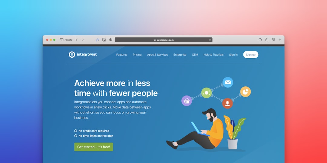

    a person sitting on the floor using a laptop
    Photo by Team Nocoloco on Unsplash

    The Lock-In Problem With Webflow

    This is the conversation no Webflow sales page leads with.

    Every site you build in Webflow is, at its core, a Webflow asset. The visual editor produces clean-ish HTML when exported, but the export is incomplete — it strips out CMS content, dynamic bindings, and interactions. A client who wants to move their site to a different host or CMS faces a near-total rebuild.

    That’s a dependency that affects real business decisions. Webflow’s pricing tiers have changed multiple times, and clients who signed up at one price point have found themselves grandfathered out and pushed toward higher plans. When your client’s website budget is tied to a subscription you don’t control, you’re exposed.

    With an HTML template like Canvas, the deliverable is yours. You own the files. Your client owns the files. There’s no subscription, no platform permission required to deploy, and no third party between the finished product and the web server it runs on. For agencies concerned about long-term client relationships, that independence is not a minor footnote — it’s a core value proposition. You can read more about how this plays out in practice in Canvas HTML Template vs ThemeForest Competitors: A Detailed Comparison.


    Cost Comparison: Real Numbers Over Time

    Let’s talk money directly.

    Webflow’s plans for client sites start around $14–$23/month per site on the Basic or CMS plan. A CMS plan — which most real sites need — runs closer to $23/month. That’s roughly $276/year per client site, just for hosting and CMS access. For an agency managing 20 client sites, that’s $5,500/year in platform fees alone, for sites you’ve already been paid to build.

    Canvas HTML templates are a one-time purchase. The developer license covers unlimited client projects. You pay once; you deploy as many times as the license allows. Hosting is handled wherever the client prefers — a $5/month VPS, a shared cPanel host, Netlify’s free tier, or a managed WordPress environment if you’re pairing with a PHP backend.

    The math compounds fast. Over three years, a 20-site agency running on Webflow pays north of $16,000 in platform fees. Running on self-hosted HTML templates, that same agency pays a one-time template license — often under $100.

    This is why the webflow alternative conversation matters. It’s not about ideological preferences for code over no-code. It’s about margin.
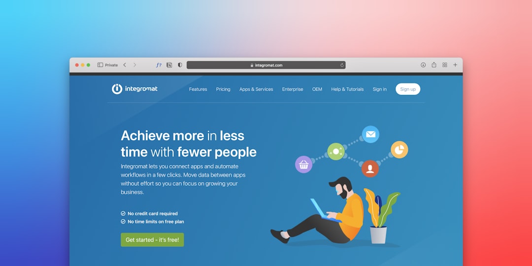

    a person sitting on the floor using a laptop
    Photo by Team Nocoloco on Unsplash

    Developer Control and Customisation Depth

    Webflow’s visual editor is powerful within its constraints. Step outside them, and you’re fighting the platform.

    Custom JavaScript interactions require embedding <script> tags and hoping nothing conflicts with Webflow’s own JS runtime. Complex animations beyond Webflow Interactions often need Lottie or GSAP brought in from the outside, with workarounds to prevent flashes of unstyled content. Anything involving server-side logic — user authentication, dynamic pricing, form processing beyond the basics — requires external services stitched together via Zapier or Make.

    With Canvas, you’re writing against Bootstrap 5 and a clean, documented component library. Every component is editable at the source level. Want to rework the navigation entirely? Open the file. Need a custom animation sequence? Write it. Need to wire up a backend endpoint? There’s nothing in the way.

    For developers building sites that need real interactivity — booking flows, filterable portfolios, multi-step forms, conditional content — the HTML template route isn’t a compromise. It’s the faster path. The Bootstrap 5 Accordion and Tabs: Interactive Content Without JavaScript approach alone covers a huge range of UI patterns with zero runtime overhead.


    When Webflow Still Makes Sense

    Being fair means acknowledging the genuine use cases where Webflow wins.

    Non-technical founders building their own marketing site and managing their own content — Webflow’s CMS editor is genuinely easier than handing someone a code editor or even a WordPress backend. If the person who’ll maintain the site isn’t technical, Webflow’s content management layer is a real advantage.

    Design-heavy agencies where the visual editor maps naturally to the team’s workflow, and where clients are happy to remain on Webflow’s ecosystem long-term, can make it work economically. If you’re billing retainers and the hosting cost is built into the engagement, the math changes.

    Rapid prototyping — when a client needs something live in 48 hours and visual speed matters more than long-term flexibility, Webflow’s layout system is genuinely fast.

    But for the majority of professional web projects — where a freelancer or agency is building something, handing it off, and moving on — an HTML template wins on cost, flexibility, and client ownership.


    Making the Switch: Practical Starting Points

    If you’ve been defaulting to Webflow and want to evaluate Canvas seriously, the learning curve is shallower than you might expect.

    Canvas ships with hundreds of pre-built pages and section patterns. The Canvas Template Section Patterns: Building Pages Like a Pro approach means you’re assembling pages from a well-documented library, not starting from scratch every time. The workflow feels closer to Webflow than you’d think — except the output is clean, portable HTML that you fully own.

    The key mental shift is from “I’m configuring a platform” to “I’m writing a product.” That shift pays off every time a client asks you to do something unusual — because with an HTML template, unusual is just another few lines of code.

    For agencies thinking about delivery workflows, the Freelancer’s Guide to Delivering HTML Templates to Clients covers exactly how to hand off clean, maintainable code in a way that sets clients up for success — without platform dependency.


    Key Takeaways

    • Webflow is a platform; Canvas is a product. One charges ongoing fees and owns the infrastructure; the other is a one-time purchase you deploy anywhere.
    • Lock-in is real. Webflow’s CMS and interactions don’t export cleanly — migrating a Webflow site is a near-rebuild. HTML templates are inherently portable.
    • The cost gap compounds. At scale, the difference between a one-time template license and per-site SaaS fees is significant enough to reshape agency margins.
    • Developer control is the key differentiator. Anything outside Webflow’s sandbox requires workarounds. HTML templates have no sandbox.
    • Webflow still wins for non-technical owners who will self-manage content and prefer the visual CMS. For professional build-and-deliver workflows, HTML templates win.

    FAQ

    Q: Can I replicate Webflow’s visual editing experience with an HTML template?
    Not identically — Webflow’s drag-and-drop editor is genuinely excellent for visual designers. With Canvas, you’re working in code and a browser. However, Canvas’s section-based structure means assembly is fast, and the output is cleaner and more portable than Webflow’s generated code.

    Q: How does client content management work if there’s no built-in CMS?
    HTML templates can be paired with any CMS — WordPress (as a theme), a headless CMS like Contentful or Sanity, or a simple flat-file system. This flexibility is an advantage: clients aren’t locked into one content platform.

    Q: Is Canvas Builder a Webflow alternative for enterprise projects?
    Yes, with the right setup. Large-scale projects often need custom backend integrations, specific hosting environments, or compliance requirements that Webflow’s infrastructure can’t accommodate. HTML templates integrate with any stack.

    Q: What about SEO? Doesn’t Webflow handle that automatically?
    Webflow has solid built-in SEO tooling — meta tags, sitemaps, clean URLs. But the same is achievable with HTML templates and standard SEO practices. The performance advantage often goes to self-hosted HTML, which can be optimised at the server level in ways Webflow’s shared infrastructure doesn’t allow.

    Q: How hard is it to switch from Webflow to an HTML template workflow?
    The conceptual shift takes a project or two. The tooling (VS Code, a local server, Git) is standard for any developer. Canvas’s documentation and pre-built components reduce the ramp-up significantly — most experienced developers are productive within a day.


    Ready to Own Your Work?

    If you’re building sites professionally, the question isn’t whether HTML templates can match Webflow’s features — it’s whether you want to keep paying monthly for something you’ve already built.

    Canvas gives you a complete, production-ready HTML framework with hundreds of components, full Bootstrap 5 integration, and a one-time license that covers every project you’ll ever build with it.

    Explore Canvas and see what you’ve been missing →


    Comparison details reflect platform pricing and features as of mid-2025. Webflow pricing tiers are subject to change.

    If you’re working with the Canvas HTML Template and want to generate production-ready layouts faster, try Canvas Builder free and see how much time you save on every project.

    Where the Alternatives Win

    Webflow genuinely beats Canvas Builder for non-technical founders and content editors who need to manage their own site — Webflow’s CMS editor requires no code knowledge, while Canvas delivers raw HTML files that most clients cannot update without developer help. For design-heavy teams whose entire workflow is visual, Webflow’s layout system also enables faster prototyping, with the article specifically citing 48-hour turnarounds as a realistic advantage. If an agency is billing ongoing retainers and can fold hosting costs into those engagements, Webflow’s per-site subscription fees become far less painful than the article’s standalone math suggests.

    The Verdict: Who Should Choose What

    Canvas Builder is the stronger choice for freelancers and agencies building sites they hand off to clients — the one-time license, full file ownership, and absence of recurring platform fees make a compelling financial case at any meaningful volume. Webflow, however, is genuinely better suited to non-technical founders managing their own content, or to agencies running long-term retainer relationships where the CMS editor’s ease of use is a service differentiator and hosting costs are built into the billing.


  • 6 Best Dark Mode Fitness App Designs to Copy (2026)

    6 Best Dark Mode Fitness App Designs to Copy (2026)


    The fitness industry has always moved fast — and in 2026, its websites are keeping pace. Members no longer just want a place to find class schedules; they expect an experience that motivates them before they even step through the door. Whether you’re building a boutique gym site, an online workout platform, or a personal trainer’s digital home, the stakes for great design have never been higher.

    Looking for the best dark mode fitness app and dashboard designs for 2026? This guide breaks down the UI patterns behind today’s highest-converting fitness products — dark-mode dashboards, mobile app screens, and gym websites — with the exact color systems, typography, and layout ideas you can copy. Every section pairs a design principle with practical, copy-paste code so you can ship the look, not just admire it.

    What Makes a Great Dark Mode Fitness Dashboard Design in 2026

    The strongest dark mode fitness dashboards in 2026 share four traits: a near-black (not pure black) base like #0B0B0F to reduce eye strain, a single high-energy accent (electric lime, neon orange, or cyan) reserved for progress and CTAs, oversized numeric typography for live stats (heart rate, reps, calories), and generous spacing so workout data never feels cramped. The patterns below show how to apply each one.

    This guide breaks down the most important fitness website design trends shaping 2026 — with practical code you can use today. From bold typography to AI-powered personalisation, here’s what’s winning in the gym space right now.


    ⚡ Key Takeaways

    • Bold, kinetic typography is replacing static hero images as the primary attention hook on gym websites.
    • Dark-mode-first layouts project energy and reduce eye strain during evening browsing sessions.
    • Micro-interactions and progress animations drive higher engagement on workout platform dashboards.
    • AI-powered personalisation (content, class recommendations, pricing) is becoming table-stakes for fitness platforms.
    • Mobile-first, thumb-friendly navigation is non-negotiable — most fitness traffic arrives via smartphone.
    • Social proof sections (live class counts, member stats, real-time activity feeds) significantly increase trust and conversion.

    1. Bold, Kinetic Typography Takes Centre Stage

    Gone are the days of a hero image with a modest subtitle. In 2026, the best gym website designs lead with oversized, expressive type — words that practically vibrate with energy before a single photo loads. Think full-viewport headings at 96px–120px, variable-weight fonts that shift on scroll, and text animations that feel athletic, not gimmicky.

    The reasoning is simple: bold type loads faster than video backgrounds, works perfectly on mobile, and sets tone in milliseconds. Brands like Barry’s and Mirror have already proved that words are the visual.

    Here’s a minimal Bootstrap 5 hero using a display utility class and a CSS animation to give text that kinetic feel:

    <!-- Kinetic Typography Hero -->
    <section class="d-flex align-items-center justify-content-center text-center
                    bg-dark text-white" style="min-height:100vh;">
      <div class="container">
        <h1 class="display-1 fw-black text-uppercase lh-1 hero-pulse">
          Train Harder.<br>
          <span class="text-warning">Live Stronger.</span>
        </h1>
        <p class="lead mt-4 text-white-50">Join 12,000 members crushing goals every day.</p>
        <a href="#plans" class="btn btn-warning btn-lg mt-3 px-5">Start Free Trial</a>
      </div>
    </section>
    
    <style>
      @import url('https://fonts.googleapis.com/css2?family=Inter:wght@900&display=swap');
    
      .hero-pulse {
        font-family: 'Inter', sans-serif;
        animation: pulse 3s ease-in-out infinite;
      }
    
      @keyframes pulse {
        0%, 100% { letter-spacing: -0.02em; }
        50%       { letter-spacing:  0.04em; }
      }
    </style>

    Pair this pattern with Bootstrap 5 Typography: Font Sizes, Weights, and Display Classes for a deeper look at how to control hierarchy across the whole page.


    topless man holding black dumbbell
    Photo by LOGAN WEAVER | @LGNWVR on Unsplash

    2. Dark-Mode-First Layouts That Radiate Energy

    Light websites feel clinical. Dark websites feel powerful — and that psychological contrast is exactly why dark-mode-first is one of the defining fitness website design trends of 2026. Deep charcoal backgrounds (#111, #1a1a1a) paired with electric accent colours (neon green, amber yellow, hot coral) give workout platforms a visual identity that screams intensity.

    Dark mode also has practical benefits: it reduces eye strain for users browsing late at night after a session, and OLED screens render true blacks at lower battery cost — a real win given how much fitness traffic comes from mobile.

    Implementing a dark base with Bootstrap is straightforward using data-bs-theme:

    <!-- Bootstrap 5.3+ dark theme wrapper -->
    <html lang="en" data-bs-theme="dark">
    <head>
      <meta charset="UTF-8">
      <link rel="stylesheet"
        href="https://cdn.jsdelivr.net/npm/[email protected]/dist/css/bootstrap.min.css">
      <style>
        :root[data-bs-theme="dark"] {
          --bs-body-bg:    #111111;
          --bs-body-color: #f0f0f0;
          --accent:        #c8ff00; / neon lime — swap for your brand /
        }
    
        .btn-accent {
          background-color: var(--accent);
          color: #111;
          font-weight: 700;
          border: none;
        }
    
        .btn-accent:hover {
          background-color: #aadd00;
          color: #111;
        }
      </style>
    </head>
    <body>
      <!-- All Bootstrap components automatically adopt dark palette -->
      <div class="container py-5">
        <h2>Today's Classes</h2>
        <p class="text-body-secondary">Pick your session and book in seconds.</p>
        <a href="#book" class="btn btn-accent px-4">Book Now</a>
      </div>
    </body>
    </html>

    3. Micro-Interactions and Progress Animations

    On a workout platform design, every small animation is a motivational cue. A progress bar that fills when a user completes a module, a button that “bounces” on hover, a counter that increments when a milestone is hit — these micro-interactions make digital fitness feel alive.

    Research consistently shows that animated feedback increases task completion rates. Apply this to onboarding flows, challenge trackers, and class booking confirmation screens. The goal is to mirror the dopamine hit of finishing a set — right in the browser.

    Here’s a CSS-and-JS animated stat counter card using Bootstrap utilities:

    <!-- Animated Stat Card -->
    <div class="card bg-dark text-white border-0 text-center p-4" style="max-width:220px;">
      <div class="display-4 fw-bold text-warning counter" data-target="12847">0</div>
      <p class="mb-0 text-white-50 small text-uppercase">Active Members</p>
    </div>
    
    <script>
      document.querySelectorAll('.counter').forEach(counter => {
        const target = +counter.dataset.target;
        const step   = Math.ceil(target / 80);
        const tick   = () => {
          const current = +counter.innerText.replace(/,/g, '');
          if (current < target) {
            counter.innerText = Math.min(current + step, target).toLocaleString();
            requestAnimationFrame(tick);
          }
        };
        new IntersectionObserver(([entry]) => {
          if (entry.isIntersecting) tick();
        }).observe(counter);
      });
    </script>

    Stack several of these cards in a Bootstrap grid row to create a live social-proof section — member counts, classes booked this week, calories tracked. Numbers in motion tell a story that static copy never can.


    green and black barbell on black steel stand
    Photo by Andrew Valdivia on Unsplash

    4. AI Personalisation Is Reshaping Workout Platform Design

    In 2026, static class timetables feel like fax machines. The best fitness platforms now surface personalised content: “You haven’t done a leg day in 8 days” or “Your favourite instructor just dropped a new HIIT session.” This is powered by lightweight AI layers that track behaviour and adjust the UI accordingly.

    From a design perspective, this means your gym website 2026 needs to be built with dynamic content slots — sections that swap based on user state (logged in vs. new visitor, beginner vs. advanced). The layout itself doesn’t change; the content inside it does.

    This ties closely into the broader shift documented in AI Web Design in 2026: The Complete Guide for Freelancers and Agencies — worth reading for the full picture of how AI is changing front-end delivery.

    Architecturally, build your hero, feature, and CTA sections as component shells that accept data attributes:

    <!-- Personalised Welcome Banner -->
    <div class="alert alert-dark border-start border-warning border-4 rounded-0 mb-0"
         id="personal-banner"
         data-member-name="Alex"
         data-last-class="HIIT Power"
         data-days-since="3">
      <strong id="banner-greeting"></strong>
      <span id="banner-message"></span>
    </div>
    
    <script>
      const banner = document.getElementById('personal-banner');
      const name   = banner.dataset.memberName;
      const last   = banner.dataset.lastClass;
      const days   = +banner.dataset.daysSince;
    
      document.getElementById('banner-greeting').textContent = Hey ${name}! ;
      document.getElementById('banner-message').textContent  =
        days >= 3
          ? It's been ${days} days since your last session (${last}). Ready to go again?
          : Great work keeping your streak alive. Your next ${last} class starts in 2 hours.;
    </script>

    5. Mobile-First, Thumb-Friendly Navigation

    More than 70% of fitness website traffic arrives on mobile — often in the gym, between sets, with one thumb. In 2026, top workout platform designs are rethinking navigation entirely for this use case: bottom navigation bars instead of hamburger menus, large tap targets (minimum 48×48px), and swipe-gesture carousels for class browsing.

    The standard hamburger menu at the top left is the worst position for a right-handed thumb on a 6″ screen. Bottom-anchored nav — popularised by iOS apps — is making its way into mobile web. Here’s a Bootstrap-compatible bottom nav bar:

    <!-- Bottom Nav Bar (mobile only) -->
    <nav class="d-flex d-md-none fixed-bottom bg-dark border-top border-secondary
                justify-content-around align-items-center py-2"
         style="z-index:1040;">
      <a href="/" class="text-center text-white-50 text-decoration-none small">
        <div style="font-size:1.4rem;">🏠</div> Home
      </a>
      <a href="/classes" class="text-center text-white text-decoration-none small">
        <div style="font-size:1.4rem;">📅</div> Classes
      </a>
      <a href="/workouts" class="text-center text-white-50 text-decoration-none small">
        <div style="font-size:1.4rem;">🏋️</div> Workouts
      </a>
      <a href="/profile" class="text-center text-white-50 text-decoration-none small">
        <div style="font-size:1.4rem;">👤</div> Profile
      </a>
    </nav>
    
    <style>
      @media (max-width: 767.98px) {
        body { padding-bottom: 72px; }
      }
    </style>

    For responsive layout techniques underpinning this, check out Bootstrap 5 Breakpoints: How to Build Truly Responsive Layouts — it covers the exact breakpoint logic you need to show/hide components like this nav bar cleanly.


    6. Conversion-Focused Pricing and CTA Design

    All the aesthetic wins in the world mean nothing if visitors don’t convert. In 2026, the smartest gym websites combine transparent pricing with friction-reducing CTAs — free trials, no-credit-card offers, and one-click class bookings front and centre.

    Pricing tables for fitness memberships benefit from a tiered “good / better / best” layout, with the middle tier visually elevated (highlighted border, “Most Popular” badge) to anchor decision-making. Keep plans scannable: 3–4 bullet points max per tier, price prominent, CTA unmissable.

    If you’re building out the pricing section, Canvas Pricing Tables: Design Options That Convert Visitors is an excellent companion resource — it covers layout patterns proven to move visitors from browsing to buying.

    <!-- Fitness Pricing Card - "Popular" Tier -->
    <div class="card border-warning border-2 text-center shadow-lg"
         style="max-width:320px; margin:auto;">
      <div class="card-header bg-warning text-dark fw-bold text-uppercase small">
        ⚡ Most Popular
      </div>
      <div class="card-body py-4">
        <h3 class="fw-black">Pro Membership</h3>
        <div class="display-5 fw-bold my-3">
          $49<span class="fs-6 text-muted fw-normal">/mo</span>
        </div>
        <ul class="list-unstyled text-start mb-4">
          <li class="mb-2">✅ Unlimited gym access</li>
          <li class="mb-2">✅ 20+ live classes/week</li>
          <li class="mb-2">✅ Personal progress dashboard</li>
          <li class="mb-2">✅ Nutrition tracking included</li>
        </ul>
        <a href="/signup" class="btn btn-warning w-100 fw-bold">
          Start 7-Day Free Trial
        </a>
        <p class="text-muted small mt-2 mb-0">No credit card required</p>
      </div>
    </div>

    Frequently Asked Questions

    What makes a fitness website design effective in 2026?
    Effective fitness websites in 2026 combine fast-loading performance, bold visual identity (often dark-mode-first with strong accent colours), mobile-first navigation, and conversion-focused CTAs like free trial offers. The best sites also incorporate dynamic or personalised content — surfacing the right classes or programmes for each user rather than showing everyone the same homepage.

    Should a gym website use dark mode?
    Dark mode is a strong default choice for gym and fitness brands because it conveys energy, intensity, and modernity — values that align with most fitness brand identities. It also performs better on OLED screens common in newer smartphones. That said, it must be executed with high contrast; dark mode done poorly can hurt readability. Always test contrast ratios against WCAG AA standards.

    How important is mobile design for a workout platform?
    Critically important. Industry data consistently shows 65–75% of fitness website traffic arriving on mobile, and users are often on their phones in the gym — mid-session, checking schedules or logging workouts. This means large tap targets, bottom navigation patterns, minimal form fields, and fast page loads (under 2 seconds on 4G) are non-negotiable for any serious workout platform design.

    What are the best fonts for a gym website in 2026?
    Strong sans-serif and display fonts dominate the gym website space. Popular choices include Inter (variable weight, excellent for large headings), Barlow Condensed (compact and powerful), and Oswald (classic fitness feel). The key is high weight contrast — pair an ultra-bold heading font (900 weight) with a regular-weight body font for maximum hierarchy. Variable fonts are increasingly preferred because they let you control weight dynamically via CSS animations.

    How do I add AI personalisation to a fitness website without a big budget?
    Start small and client-side. Use browser localStorage to track which classes or pages a user has viewed, then show relevant “Continue where you left off” or “You might also like” sections dynamically with vanilla JavaScript. For more sophisticated personalisation, headless CMS platforms with personalisation plugins (like Contentful + Ninetailed, or Builder.io) offer affordable tiers. Full server-side AI personalisation can be layered in as the platform grows.


    The gap between a good fitness website and a great one in 2026 comes down to intention. Every font choice, every animation, every navigation decision either reinforces your brand’s energy or dilutes it. Start with the trends above, validate them against your specific audience, and iterate. The best gym websites aren’t designed once — they’re trained, just like the members who use them.


    📋 Post summary & checklist:

    If you’re working with the Canvas HTML Template and want to generate production-ready layouts faster, try Canvas Builder free and see how much time you save on every project.

  • Canvas Pricing Tables: Design Options That Convert Visitors

    Canvas Pricing Tables: Design Options That Convert Visitors


    Canvas Pricing Tables: Design Options That Convert Visitors

    Your pricing table is doing one of two things right now: closing deals or leaking revenue. There’s rarely a middle ground. Visitors land there already interested — they’ve scrolled your homepage, maybe poked around your features page, and now they’re asking the real question: Is this worth my money?

    A well-crafted Canvas pricing table answers that question instantly. A poorly designed one makes people second-guess themselves until they quietly close the tab.

    This guide walks through the design options available inside the Canvas HTML template, the psychology behind high-converting pricing layouts, and the practical choices you can make today to stop losing visitors at the moment they’re closest to converting.


    Why Pricing Tables Are Conversion-Critical (Not Just Pretty)

    Most teams treat their pricing page as an afterthought — something to bolt on after the hero section and the features grid are polished. That’s backwards. Your pricing table is where intent becomes action.

    Conversion research consistently shows that pricing pages rank among the highest-intent pages on any SaaS or service website. A visitor there already believes your product might be right for them. Your job isn’t to sell at that point — it’s to remove friction and guide a decision.

    That’s why your pricing HTML template structure matters as much as the copy on it. Cognitive load, visual hierarchy, the placement of a “Most Popular” badge — these micro-decisions have macro effects on whether someone clicks “Get Started” or bounces.

    Canvas gives you the building blocks to get this right. The question is knowing which ones to reach for and when.


    Art supplies on an easel with blank canvas
    Photo by Ati Nabaut on Unsplash

    Canvas Pricing Table Layout Options: Cards, Columns, and Toggles

    Canvas ships with several distinct pricing table patterns. Understanding what each one communicates to visitors helps you pick the right structure for your offering.

    The 3-Column Card Layout is the most common — and for good reason. It creates immediate visual comparison between tiers (typically Free/Starter, Pro, and Enterprise), lets you highlight a middle option as the “recommended” choice, and works naturally at most screen sizes. Canvas’s card components make this effortless to implement, and the Bootstrap grid underneath ensures it collapses gracefully on mobile.

    The Toggle (Monthly/Annual) Pattern adds an interactive layer that serves two purposes: it gives users agency, and it surfaces the annual discount in a compelling way. Canvas’s built-in toggle components handle this cleanly without requiring custom JavaScript. If you’re building a SaaS pricing page, this is close to non-negotiable — annual plans dramatically improve LTV, and making the discount visible at the toggle level increases uptake. (For more on interactive UI patterns without heavy JS, the guide on Bootstrap 5 Accordion and Tabs covers how Canvas handles these elegantly.)

    The Feature Comparison Table works best when you have more than three tiers or a sophisticated buyer who needs to evaluate specific features before committing. Canvas allows you to combine a card header row with a detailed feature matrix below — giving you a hybrid layout that leads with price and follows with specifics.

    The Horizontal Single-Tier Layout suits one-product businesses or usage-based pricing. Instead of comparing plans, you’re presenting a single value with supporting proof around it. Canvas’s full-width section containers work well here paired with a strong testimonials or stat alongside the CTA.


    Here’s something every high-converting pricing page does: it makes one choice feel inevitable.

    The “recommended” or “most popular” plan technique works because it offloads decision-making from the visitor. People are loss-averse and choice-paralyzed by nature. When one option is visually elevated — a contrasting background color, a badge, slightly larger card, a subtle shadow — it signals that other smart people already chose this. That social proof built into the design itself.

    In Canvas, you can implement this several ways:

    • Background contrast: Use Canvas’s color utility classes to give the featured card a dark or brand-colored background while keeping adjacent cards neutral
    • Scale and shadow: A subtle scale(1.04) transform or elevated shadow class makes the card appear to float forward
    • Badge placement: Canvas’s badge component dropped into the card header (“Most Popular” or “Best Value”) adds anchoring without needing custom styling
    • CTA button contrast: Use a filled primary button on the recommended plan, and outlined/ghost buttons on the others — this alone creates strong visual hierarchy

    The goal is to guide, not manipulate. If your Pro plan genuinely is the right fit for most customers, making it the visual anchor is honest design. If you’re trying to push people toward a tier that isn’t right for them, no design trick fixes that long-term.


    a computer with a keyboard
    Photo by Shutter Speed on Unsplash

    Conversion Design Principles Every Pricing Section Needs

    Good conversion design on a pricing page comes down to a handful of principles that Canvas makes practical to execute:

    Lead with value, not features. Beneath each plan name, don’t list “10 projects” as the first line — lead with what that unlocks (“For growing teams ready to scale”). Feature lists follow.

    Keep the feature list scannable. Canvas’s list components with check icons work perfectly here. Aim for 5–7 items per plan. More than that and visitors stop reading; fewer and the tier feels underspecified.

    Anchor the price clearly. Price should be the largest number on the card. Supporting text (per user/month, billed annually) should be noticeably smaller. Canvas’s typography scale makes this hierarchy natural — but don’t fight it by keeping everything the same size.

    Reduce friction at the CTA. “Start Free Trial” or “Get Started Free” outperforms “Buy Now” because it implies lower commitment. Pair it with a one-line reassurance beneath the button: “No credit card required” or “Cancel anytime.” These microcopy lines are conversion design in miniature. For a deeper look at friction-reduction on action pages, Free Trial Landing Page: Copy and Design That Reduce Friction covers this in detail.

    Include an Enterprise or custom option. Even if you don’t expect many Enterprise deals, having “Contact us” as a fourth tier sets a ceiling that makes the Pro plan feel more accessible by comparison.


    Responsive Pricing Tables That Work on Every Device

    Pricing tables are notoriously difficult on mobile. Three columns at 360px wide is a layout failure in progress.

    Canvas’s Bootstrap 5 foundation handles this with column stacking — your three-column pricing grid becomes a single-column scroll on small screens. But stacking alone isn’t enough. You need to think about how the visual hierarchy translates:

    • The recommended card should still stand out when stacked. Make sure the background contrast or border color is strong enough to read without the comparative context of adjacent cards.
    • Feature lists should remain collapsed or abbreviated on mobile unless the user taps to expand. Long feature lists on mobile pricing pages create scroll fatigue.
    • Sticky CTAs at the bottom of a stacked pricing card can significantly improve mobile conversion — Canvas’s sticky utility classes make this achievable without custom CSS.
    • Toggle switches need to be thumb-friendly. The default Canvas toggle sizing works on desktop but consider increasing the tap target on mobile breakpoints. The Bootstrap 5 Breakpoints guide has practical techniques for targeting specific viewport ranges inside Canvas.

    Test your pricing table on real devices before shipping. Emulators lie. Actual thumbs tell the truth.


    Common Pricing Table Mistakes (And How Canvas Helps You Fix Them)

    Even with a solid template, teams consistently make the same errors:

    Too many tiers. Four or more plans with similar pricing creates analysis paralysis. If you find yourself with four tiers, ask whether two of them can merge.

    Inconsistent feature lists. If Plan A has “Unlimited projects” and Plan B just says “Projects,” visitors assume the worst. Be specific and parallel across all tiers.

    Missing social proof near the CTA. A small “Trusted by 4,000+ teams” line or a five-star review snippet directly beneath the pricing block can lift conversions meaningfully. Canvas’s testimonial and badge components slot in cleanly.

    No FAQ section. Pricing objections are predictable. Can I change plans later? Is there a free trial? What happens if I go over my limit? Answering these immediately below the pricing table reduces support load and removes purchase blockers. Canvas’s Bootstrap accordion component is purpose-built for this.

    Burying the pricing page in navigation. If visitors can’t find your pricing page in two clicks, you’re losing revenue. Canvas’s mega menu and header navigation patterns make prominent pricing links easy to implement — worth reviewing if your current nav buries it.


    Key Takeaways

    • Your Canvas pricing table layout choice signals as much as your copy does — pick the structure that matches your product’s complexity and your buyer’s decision style.
    • The “recommended plan” visual effect is one of the highest-ROI design decisions you can make on a pricing page — use Canvas’s contrast, badge, and shadow utilities to implement it cleanly.
    • Conversion design on pricing pages lives in the details: CTA copy, microcopy under buttons, feature list formatting, and mobile behavior.
    • Responsive pricing tables need deliberate attention — stacking isn’t enough; hierarchy must survive the mobile layout shift.
    • An FAQ section directly below your pricing block removes objections at the exact moment they form.
    • Canvas’s built-in toggle, card, accordion, and badge components give you everything you need for a high-performing pricing HTML template without writing custom UI from scratch.

    FAQ

    Q: How many pricing tiers should I include in my Canvas pricing table?
    Three tiers (Starter, Pro, Enterprise or similar) is the proven sweet spot for most SaaS and service products. It’s enough to segment buyers without triggering choice paralysis. If your product genuinely requires more tiers, consider a detailed comparison table format rather than a card grid — Canvas supports both layouts.

    Q: Can I add a monthly/annual billing toggle to a Canvas pricing table without custom JavaScript?
    Yes. Canvas includes toggle and switch components that handle state visually, and combined with Bootstrap’s utility classes you can show/hide monthly vs. annual pricing blocks. For more complex interactivity, Canvas’s built-in interactive components cover most pricing toggle patterns — no custom JS required for the core behavior.

    Q: What’s the best way to highlight a “Most Popular” plan in Canvas?
    Use a combination of background color contrast checker (dark card vs. neutral cards), Canvas’s badge component in the card header, and a filled primary CTA button while keeping other plan CTAs outlined. This three-layer visual signal is consistent with how high-converting SaaS pricing pages handle plan emphasis.

    Q: How do I make my Canvas pricing table look good on mobile?
    Bootstrap’s grid handles column stacking automatically, but you should also: ensure the featured plan retains strong visual distinction when stacked, keep feature lists concise (or use an accordion to collapse them), and make sure toggle controls and CTAs have adequate tap targets. Test on real devices — emulator behavior often doesn’t match actual mobile rendering.

    Q: Should I show prices on my pricing page or gate them behind a “Contact us” form?
    Show prices whenever possible. Gating pricing creates friction and signals a lack of transparency — both of which hurt conversion. The only reasonable exception is a true enterprise or custom-quote tier where pricing genuinely varies. Even then, give a starting anchor (“From $X/month”) so visitors can self-qualify before they contact sales.


    Ready to Build a Pricing Page That Actually Converts?

    Canvas gives you every component you need to build a pricing table that earns its place on your site — cards, toggles, badges, accordions, responsive grids, and clean typography utilities, all in one cohesive pricing HTML template system.

    Stop leaving conversions on the table. Open your Canvas project, pick the pricing pattern that fits your product, and apply the hierarchy principles in this guide. Your next customer is already on that page — make sure the design closes them.

    Explore Canvas HTML Template →

    If you’re working with the Canvas HTML Template and want to generate production-ready layouts faster, try Canvas Builder free and see how much time you save on every project.

  • How to Design a Premium Pet Brand Website

    How to Design a Premium Pet Brand Website

    The pet industry crossed $150 billion globally in 2023 — and it’s still
    climbing. Owners don’t just buy food and toys; they buy into a brand that
    feels worthy of their companion. That means your pet brand website
    design
    has to do more than list products. It has to communicate
    quality, warmth, and trust within the first five seconds.

    Whether you’re building from scratch or refreshing an existing
    pet product website, this guide walks you through every
    layer — visual identity, layout, copy, code — so your site sits comfortably
    in the premium tier alongside the brands your customers already love.

    🐾 Key Takeaways

    • Premium pet websites lead with emotion, not spec sheets.
    • A tight colour palette (2–3 tones) and one strong typeface pair signal confidence.
    • Full-width hero sections, generous white space, and large product imagery drive perceived value.
    • Interactive UI — tabbed ingredient panels, accordions for FAQs — reduces bounce without page bloat.
    • Mobile-first layout with Bootstrap 5 breakpoints is non-negotiable; the majority of pet-purchase traffic is mobile.
    • A clear conversion path (Shop → Learn → Trust → Buy) needs to be visible on every scroll depth.

    Start With Brand Identity, Not Templates

    Before you touch a single line of HTML, lock down three brand fundamentals: your colour palette (pick two or three tones maximum — anything more signals indecision, not richness), your typographic pairing (one display weight for headlines, one readable text face for body copy), and your photography direction (lifestyle shots of pets in natural settings, not sterile studio white-background product images). These three decisions are the DNA of every subsequent layout, spacing, and component choice on the site.

    Pet brands that skip this step end up with generic sites that could belong to any e-commerce store. A tight palette of oat, charcoal, and warm amber — for example — immediately signals “premium and natural” before the visitor reads a single word of copy. By contrast, a rainbow of accent colours and three competing typefaces reads as amateur, regardless of how polished the code is behind the scenes.

    Once those three are fixed, template selection becomes easy. A Canvas HTML
    template, for instance, ships with enough pre-built section patterns that you
    can map your palette and fonts in minutes — see
    Canvas Template Section Patterns: Building Pages Like a Pro
    for how to think about that mapping process.

    a small black and brown dog sitting on top of a bed
    Photo by Alexey Demidov on Unsplash

    Craft a Hero Section That Converts Emotion Into Clicks

    The hero on a pet product website is prime real estate. Owners need to feel
    something — affection, reassurance, aspiration — before they read a single word.
    That means a full-bleed lifestyle photograph (not a white-background product
    shot) and a headline that speaks to the pet, not the SKU.

    Structure-wise, keep it simple: one headline, one sub-line, one CTA button. Here
    is a Bootstrap 5 snippet you can drop straight into your template:

    <!-- Premium Pet Hero Section -->
    <section
      class="min-vh-100 d-flex align-items-center text-white"
      style="
        background: url('assets/img/hero-dog.jpg') center/cover no-repeat;
      "
    >
      <div class="container">
        <div class="row">
          <div class="col-lg-6">
            <span class="badge bg-warning text-dark mb-3 px-3 py-2 rounded-pill">
              New — Grain-Free Range
            </span>
            <h1 class="display-4 fw-bold lh-sm mb-4">
              Food as good as the&nbsp;love you give.
            </h1>
            <p class="lead mb-4 opacity-75">
              Vet-formulated, cold-pressed nutrition for dogs who deserve better.
            </p>
            <a href="/shop" class="btn btn-light btn-lg rounded-pill px-5">
              Shop the Range
            </a>
          </div>
        </div>
      </div>
    </section>

    Note the min-vh-100 utility — it ensures the hero fills the
    viewport on every device without a fixed pixel height that breaks on mobile.
    For a deeper dive on responsive sizing,
    Bootstrap 5 Breakpoints: How to Build Truly Responsive Layouts
    covers the logic in full.

    Design Product Cards That Feel Luxurious, Not Cluttered

    On a premium pet brand website, product cards carry the same
    weight as editorial photography. A cluttered card destroys the illusion of
    quality. The rule: one image, one name, one price, one action — nothing else
    above the fold of the card.

    <!-- Premium Pet Product Card -->
    <div class="col-md-4 mb-4">
      <div class="card border-0 shadow-sm rounded-4 overflow-hidden h-100">
    
        <!-- Product image with hover zoom -->
        <div class="overflow-hidden" style="height: 280px;">
          <img
            src="assets/img/product-kibble.jpg"
            alt="Grain-Free Adult Kibble"
            class="w-100 h-100 object-fit-cover"
            style="transition: transform .4s ease;"
            onmouseover="this.style.transform='scale(1.06)'"
            onmouseout="this.style.transform='scale(1)'"
          />
        </div>
    
        <div class="card-body p-4">
          <span class="text-muted small text-uppercase ls-2">Adult Dog</span>
          <h3 class="h5 fw-semibold mt-1 mb-2">Grain-Free Duck &amp; Sweet Potato</h3>
          <p class="text-muted small mb-3">Cold-pressed. No fillers. 28% protein.</p>
          <div class="d-flex align-items-center justify-content-between">
            <span class="fw-bold fs-5">£34.99 <small class="text-muted fw-normal fs-6">/ 5kg</small></span>
            <a href="/product/grain-free-duck" class="btn btn-dark rounded-pill px-4">
              Add to Bag
            </a>
          </div>
        </div>
    
      </div>
    </div>

    The object-fit-cover utility keeps imagery proportional regardless
    of upload dimensions — a practical necessity when clients upload their own
    product photos. If you need more card patterns for your pet product website,
    8 Bootstrap 5 Card Components You Should Be Using Right Now
    is worth bookmarking.

    Build Credibility With Smart Trust Signals

    Premium pet brands compete on trust as much as taste. Your website needs to
    surface proof points without screaming “look how legit we are.” Three areas
    that reliably move conversion rates:

    1. Vet endorsements: A short quote with a headshot and credentials
      (“Dr. Sarah Kim, BVetMed, MRCVS”) outperforms five-star review counts.
    2. Ingredient transparency: Use a tabbed panel to show
      ingredients, nutritional analysis, and sourcing stories side by side. Bootstrap
      5 tabs handle this natively with zero JavaScript — see the implementation guide
      at Bootstrap 5 Accordion and Tabs: Interactive Content Without JavaScript.
    3. Certifications row: FEDIAF compliance, organic certification
      logos, and manufacturing country flags displayed in a clean icon row beneath
      the hero.

    Here’s a minimal certification strip you can adapt:

    <!-- Trust / Certification Strip -->
    <section class="py-4 border-top border-bottom bg-light">
      <div class="container">
        <div class="row align-items-center justify-content-center g-4 text-center">
    
          <div class="col-6 col-md-2">
            <img src="assets/img/cert-organic.svg" alt="Certified Organic" height="48">
            <p class="small text-muted mt-2 mb-0">Certified Organic</p>
          </div>
    
          <div class="col-6 col-md-2">
            <img src="assets/img/cert-vet.svg" alt="Vet Approved" height="48">
            <p class="small text-muted mt-2 mb-0">Vet Approved</p>
          </div>
    
          <div class="col-6 col-md-2">
            <img src="assets/img/cert-fediaf.svg" alt="FEDIAF Compliant" height="48">
            <p class="small text-muted mt-2 mb-0">FEDIAF Compliant</p>
          </div>
    
          <div class="col-6 col-md-2">
            <img src="assets/img/cert-uk.svg" alt="Made in the UK" height="48">
            <p class="small text-muted mt-2 mb-0">Made in the UK</p>
          </div>
    
        </div>
      </div>
    </section>

    Optimise for Mobile-First Performance

    More than 65% of pet-related purchases start on mobile. A premium pet website
    that stutters on a phone loses customers to a cheaper brand that loads in two
    seconds. The baseline checklist:

    • Images: Serve WebP with <picture> fallbacks. Lazy-load anything below the fold.
    • Fonts: Self-host your chosen pair with font-display: swap — Google Fonts adds a round-trip latency hit.
    • Hero video: If you use a background video, provide a poster image and pause on mobile via a matchMedia check.
    • Touch targets: Buttons should be at least 44 × 44 px. The Bootstrap btn-lg class hits this by default.
    <!-- Responsive lazy-loaded product image -->
    <picture>
      <source
        srcset="assets/img/product-kibble.webp"
        type="image/webp"
      />
      <img
        src="assets/img/product-kibble.jpg"
        alt="Grain-Free Duck & Sweet Potato kibble bag"
        class="img-fluid rounded-4"
        loading="lazy"
        width="600"
        height="600"
      />
    </picture>

    Write Copy That Speaks to the Owner — and the Pet

    Pet owners anthropomorphise. They don’t buy food; they cook for their dog. Your
    copy has to honour that emotional reality. A few principles that consistently
    outperform generic e-commerce copy on premium pet product websites:

    • Lead with outcome, not ingredient: “Shinier coat in 30 days”
      beats “Contains omega-3 fatty acids.”
    • Use the pet’s name slot: “Made for dogs like [NAME]” in a
      personalisation field is a lightweight engagement driver with outsized results.
    • Avoid clinical detachment: “Scientifically formulated” reads
      cold. “Developed with vets who own dogs” reads warm and credible.
    • CTA language: “Add to Bag” outperforms “Buy Now” in premium
      segments because it implies leisure, not urgency.

    The same principle applies to your subscription or free-trial offers.
    If your pet brand runs a starter box or trial programme, reducing friction in the
    sign-up flow is critical — the guidance at
    Free Trial Landing Page: Copy and Design That Reduce Friction
    translates cleanly to the pet subscription model.

    Design a Subscription Experience That Drives Repeat Purchases

    Premium pet brands increasingly rely on subscription revenue — auto-ship kibble, monthly treat boxes, seasonal grooming kits. The subscription sign-up flow is where most pet websites lose the most qualified traffic. A visitor who has already decided they like your product should not face a five-step checkout to start a recurring order.

    The design principles that work here mirror the broader premium positioning: simplicity, transparency, and perceived effort. Present three plan tiers (not seven — analysis paralysis kills conversion on mobile). Show the per-day or per-meal cost next to the monthly total (“£1.16/day” beside “£34.99/month”) to reframe the price as trivial rather than significant. Include a one-line cancellation promise (“Cancel or pause anytime — no phone call required”) directly under the CTA button, not buried in a footnote.

    On the technical side, use a Bootstrap 5 stepper component inside a card to walk the user through plan → dog profile → delivery schedule → payment. Each step should feel like a continuation, not a new page load — this is where single-page interactivity (tab or accordion navigation) dramatically reduces drop-off compared to multi-page funnels. The Canvas template includes stepper patterns that handle this cleanly, or you can use a simple card-with-tabs approach as shown in the Bootstrap 5 Card Components guide.

    Post-purchase, surface the subscription management panel prominently in the customer dashboard. Let owners swap recipes, adjust delivery frequency, or skip a month with a single click. The easier it is to modify, the less likely they are to cancel outright — and that reduction in churn is worth more than any amount of new-customer acquisition spend.

    Frequently Asked Questions


    Premium pet websites combine three things: restraint (white space, a
    tight palette, one hero typeface), emotional photography that centres
    the pet, and copy that respects the owner’s intelligence. Anything that
    feels rushed — inconsistent spacing, mixed fonts, stock photography —
    signals mass-market.


    Earthy, muted palettes — oat, stone, sage, terracotta — consistently
    outperform bright primaries in user testing for premium pet brands.
    They read as natural, artisan, and trustworthy. Reserve one accent
    colour (warm amber or deep teal) for CTAs only.


    Three to six is the sweet spot. Fewer than three looks like a start-up
    with limited range; more than six starts to resemble a supermarket aisle.
    Curate ruthlessly — show your hero products, then link to the full
    catalogue. Scarcity of choice signals confidence.


    For the hero section and product close-ups, custom photography is
    practically mandatory at the premium tier — stock pet images are
    immediately recognisable and undermine brand authenticity. Stock is
    acceptable for supporting editorial sections or blog imagery, but
    invest in a one-day shoot for your core assets.


    Absolutely. A well-structured template like Canvas gives you a
    production-ready component library — carousels, product cards,
    testimonial sections, and more — that you customise with your brand
    palette and typography. The key is discipline: strip out any
    components that don’t serve your brand story, and the result is
    indistinguishable from a fully bespoke build at a fraction of the cost.


    If you’re working with the Canvas HTML Template and want to generate production-ready layouts faster, try Canvas Builder free and see how much time you save on every project.

  • Bootstrap 5 Accordion & Tabs: Copy-Paste Examples (2026)

    Bootstrap 5 Accordion & Tabs: Copy-Paste Examples (2026)

    How the Bootstrap 5 Accordion Works

    The Bootstrap 5 Bootstrap accordion is built on the Collapse plugin. Each panel is controlled by a data-bs-toggle="collapse" attribute pointing to a target element. The accordion wrapper ensures only one panel is open at a time by default.

    Here’s a working three-panel accordion:

    <div class="accordion" id="faqAccordion">
    
      <div class="accordion-item">
        <h2 class="accordion-header" id="headingOne">
          <button class="accordion-button" type="button" data-bs-toggle="collapse" data-bs-target="#collapseOne" aria-expanded="true" aria-controls="collapseOne">
            What is included in the starter plan?
          </button>
        </h2>
        <div id="collapseOne" class="accordion-collapse collapse show" aria-labelledby="headingOne" data-bs-parent="#faqAccordion">
          <div class="accordion-body">
            The starter plan includes up to 5 projects, basic analytics, and email support.
          </div>
        </div>
      </div>
    
      <div class="accordion-item">
        <h2 class="accordion-header" id="headingTwo">
          <button class="accordion-button collapsed" type="button" data-bs-toggle="collapse" data-bs-target="#collapseTwo" aria-expanded="false" aria-controls="collapseTwo">
            Can I upgrade my plan later?
          </button>
        </h2>
        <div id="collapseTwo" class="accordion-collapse collapse" aria-labelledby="headingTwo" data-bs-parent="#faqAccordion">
          <div class="accordion-body">
            Yes. You can upgrade or downgrade at any time from your account dashboard.
          </div>
        </div>
      </div>
    
      <div class="accordion-item">
        <h2 class="accordion-header" id="headingThree">
          <button class="accordion-button collapsed" type="button" data-bs-toggle="collapse" data-bs-target="#collapseThree" aria-expanded="false" aria-controls="collapseThree">
            Is there a free trial available?
          </button>
        </h2>
        <div id="collapseThree" class="accordion-collapse collapse" aria-labelledby="headingThree" data-bs-parent="#faqAccordion">
          <div class="accordion-body">
            We offer a 14-day free trial with no credit card required.
          </div>
        </div>
      </div>
    
    </div>

    The key mechanics: data-bs-parent="#faqAccordion" links all panels to the wrapper so only one expands at a time. Remove that attribute if you want multiple panels open simultaneously. The collapse show class on the first item marks it as open on load.


    How Bootstrap 5 Tabs Work

    Tabs use the nav-tabs (or nav-pills) component paired with a tab-content container. The connection between tab triggers and panes is made through data-bs-toggle="tab" and matching id / aria-controls values.

    <ul class="nav nav-tabs" id="featureTabs" role="tablist">
      <li class="nav-item" role="presentation">
        <button class="nav-link active" id="design-tab"
          data-bs-toggle="tab"
          data-bs-target="#design"
          type="button" role="tab"
          aria-controls="design"
          aria-selected="true">Design</button>
      </li>
      <li class="nav-item" role="presentation">
        <button class="nav-link" id="development-tab"
          data-bs-toggle="tab"
          data-bs-target="#development"
          type="button" role="tab"
          aria-controls="development"
          aria-selected="false">Development</button>
      </li>
      <li class="nav-item" role="presentation">
        <button class="nav-link" id="deployment-tab"
          data-bs-toggle="tab"
          data-bs-target="#deployment"
          type="button" role="tab"
          aria-controls="deployment"
          aria-selected="false">Deployment</button>
      </li>
    </ul>
    
    
    <div class="tab-content" id="featureTabsContent">
      <div class="tab-pane fade show active" id="design"
        role="tabpanel" aria-labelledby="design-tab">
        <p class="mt-3">Pixel-perfect components built for flexibility across every viewport.</p>
      </div>
      <div class="tab-pane fade" id="development"
        role="tabpanel" aria-labelledby="development-tab">
        <p class="mt-3">Clean, semantic HTML with full Bootstrap 5 utility class support.</p>
      </div>
      <div class="tab-pane fade" id="deployment"
        role="tabpanel" aria-labelledby="deployment-tab">
        <p class="mt-3">One-click deploy to any static host — no build tools required.</p>
      </div>
    </div>

    Swap nav-tabs for nav-pills if you want a rounded button style instead of the underlined tab look. Both work identically under the hood.


    Accordion vs. Tabs: When to Use Each

    They both hide and reveal content, but they serve different UX purposes.

    Use accordions when:

    • Content items are independent of each other (FAQs, feature descriptions, terms)
    • Users may need to compare multiple open panels side by side (disable data-bs-parent)
    • You’re working in a narrow column or sidebar layout
    • Mobile is the primary context — vertical collapse works better on small screens

    Use tabs when:

    • Content represents distinct categories or steps (Pricing tiers, Before/After, Step 1/2/3)
    • Only one view makes sense at a time
    • You want a horizontal layout that mirrors familiar UI patterns (like browser tabs or dashboards)
    • Labeling is short and scannable (one to three words per tab works best)

    A pricing table comparing plans? Tabs. A help center FAQ section? Accordion. A product feature overview with long descriptions? Either works — but accordion handles unequal content lengths more gracefully.

    For a deeper look at how these components fit into full page layouts, the guide on Canvas Template Section Patterns: Building Pages Like a Pro covers practical structure decisions across common page types.


    Customizing Accordion and Tab Styles

    Bootstrap’s defaults are functional but generic. A few CSS overrides go a long way.

    Removing the accordion border and background:

    .accordion-item {
      border: none;
      border-bottom: 1px solid #e5e7eb;
      border-radius: 0 !important;
    }
    
    .accordion-button {
      background-color: transparent;
      font-weight: 600;
      color: #1a1a2e;
      box-shadow: none;
    }
    
    .accordion-button:not(.collapsed) {
      background-color: transparent;
      color: #5c6bc0;
      box-shadow: none;
    }

    Styled pill tabs with custom active state:

    .nav-pills .nav-link {
      border-radius: 50px;
      padding: 0.5rem 1.25rem;
      color: #555;
      font-weight: 500;
      transition: all 0.2s ease;
    }
    
    .nav-pills .nav-link.active {
      background-color: #5c6bc0;
      color: #fff;
    }

    Flush accordion variant (built into Bootstrap — no CSS needed):

    <div class="accordion accordion-flush" id="flushExample">
      
    </div>

    The accordion-flush class removes the outer border and rounded corners, giving you a clean list-style collapse that works well inside cards or sidebars.

    If you’re building out full typography and spacing for these components, Bootstrap 5 Typography: Font Sizes, Weights, and Display Classes is worth a read alongside this — heading weights inside accordion buttons matter more than most people think.


    Accessibility and ARIA Best Practices

    Bootstrap builds accessibility in, but you need to follow the markup conventions correctly for it to hold up.

    For accordions:

    • Always use <button> elements as the toggle — not <a> tags
    • Set aria-expanded="true" on the open panel’s button and "false" on closed ones
    • Link the button to its panel with aria-controls matching the panel’s id
    • Wrap each header in an <h2> (or appropriate heading level for your document outline)

    For tabs:

    • Use role="tablist" on the <ul>, role="tab" on each button, and role="tabpanel" on each pane
    • Set aria-selected="true" on the active tab
    • Link each tab button to its panel via aria-controls and the panel’s aria-labelledby

    Bootstrap’s JavaScript handles keyboard navigation automatically — arrow keys move between tabs, Enter/Space toggles accordions. As long as your markup matches the documented pattern, screen readers and keyboard users get a fully functional experience.

    This matters especially in contexts like healthcare or financial platforms where accessibility compliance isn’t optional. The principles covered in Mental Health Platform Website Design Best Practices go into further depth on building inclusive interactive interfaces.


    Real-World Use Cases and Patterns

    Here’s how these components map to common page sections:

    FAQ page → Accordion with accordion-flush, grouped by topic. Open the most common question by default using collapse show.

    Pricing page → Tabs for plan tiers (Starter / Pro / Enterprise), each pane containing a feature list and CTA button.

    Product features → Nav pills in a horizontal row above a tab content area. Each pane holds a screenshot or short description.

    Onboarding steps → Tabs labeled “Step 1”, “Step 2”, “Step 3” — use JavaScript to programmatically advance tabs as the user completes each step (one line of Bootstrap’s Tab API: bootstrap.Tab.getOrCreateInstance(el).show()).

    Settings panel → Vertical tabs (flex-column nav-pills with col-3 / col-9 grid layout) — Bootstrap supports this with minor layout adjustments.

    <div class="d-flex">
      <div class="nav flex-column nav-pills me-3" id="v-pills-tab" role="tablist">
        <button class="nav-link active" data-bs-toggle="pill"
          data-bs-target="#v-pills-account" type="button" role="tab">Account</button>
        <button class="nav-link" data-bs-toggle="pill"
          data-bs-target="#v-pills-billing" type="button" role="tab">Billing</button>
        <button class="nav-link" data-bs-toggle="pill"
          data-bs-target="#v-pills-notifications" type="button" role="tab">Notifications</button>
      </div>
      <div class="tab-content" id="v-pills-tabContent">
        <div class="tab-pane fade show active" id="v-pills-account" role="tabpanel">Account settings go here.</div>
        <div class="tab-pane fade" id="v-pills-billing" role="tabpanel">Billing details go here.</div>
        <div class="tab-pane fade" id="v-pills-notifications" role="tabpanel">Notification preferences go here.</div>
      </div>
    </div>

    For a broader look at how these components integrate into complete template systems, 8 Bootstrap 5 Card Components You Should Be Using Right Now covers complementary UI building blocks that pair well with tabs and accordions.


    ✅ Key Takeaways

    • Bootstrap 5 accordions use data-bs-toggle="collapse" and data-bs-parent to create mutually exclusive panels — no custom JavaScript needed
    • Bootstrap tabs use data-bs-toggle="tab" with matching id / aria-controls pairs to link triggers and content panes
    • Accordions suit FAQs and vertical layouts; tabs suit parallel categories and horizontal navigation
    • Accessibility is built in — but only if you follow the correct markup structure with proper role and aria-* attributes
    • accordion-flush and nav-pills give you quick style variations without extra CSS
    • Both components are fully customizable with CSS overrides targeting Bootstrap’s modifier classes

    ❓ FAQ

    Q: Do I need to write any JavaScript to use Bootstrap accordions or tabs?
    No. Both components are powered by Bootstrap’s bundled JavaScript plugin. Include bootstrap.bundle.min.js (which includes Popper) in your page and the data-bs-* attributes handle everything. No custom scripts required.

    Q: Can I have multiple accordion panels open at the same time?
    Yes. Remove the data-bs-parent attribute from each .accordion-collapse element. Without it, panels collapse and expand independently — clicking one won’t close the others.

    Q: How do I open a specific tab or accordion panel on page load?
    Add collapse show to the accordion panel’s classes (and set aria-expanded="true" on its button). For tabs, add active to the tab button and show active to the corresponding tab pane.

    Q: Can I link directly to a specific tab using a URL hash?
    Bootstrap doesn’t do this automatically, but it’s achievable with a small snippet that reads window.location.hash on load and triggers the matching tab using bootstrap.Tab.getOrCreateInstance(el).show().

    Q: What’s the difference between nav-tabs and nav-pills?
    Purely visual. nav-tabs gives you the classic underlined tab style. nav-pills gives you filled rounded buttons. Both use the same data-bs-toggle="tab" mechanism and work identically for content switching.


    🚀 Build Faster With Components That Already Work

    Bootstrap 5’s accordion and tab components are powerful — but building an entire project from scratch still takes time. Canvas is a premium HTML template that ships with pre-built accordion and tab sections, dozens of layout patterns, and clean component code ready to drop into any project.

    Explore Canvas and see what’s included →

    If you’re working with the Canvas HTML Template and want to generate production-ready layouts faster, try Canvas Builder free and see how much time you save on every project.

  • Mental Health Platform Website Design Best Practices

    Mental Health Platform Website Design Best Practices

    Key Takeaways

    • Calm, high-contrast color palettes build trust before a user reads a single word.
    • WCAG 2.1 AA accessibility is non-negotiable for mental health audiences.
    • Mobile-first layouts ensure care-seekers can reach you from any device, anywhere.
    • Privacy-first CTAs reduce friction and increase booking conversions.
    • Structured content hierarchy guides emotionally vulnerable users without overwhelming them.

    People searching for mental health support are often in a vulnerable moment. They may be anxious, overwhelmed, or uncertain. When they land on your therapy platform website, the design itself communicates safety, trust, and competence before any words are read. That’s a heavy responsibility — and a meaningful opportunity.

    Whether you’re building a teletherapy marketplace, a private practice site, or a corporate wellness portal, these mental health website design best practices will help you create an experience that actually helps people take the next step.

    Color and Typography That Signal Safety

    Mental health website design leans on psychology from the first pixel. Cool blues, soft greens, warm off-whites, and muted earth tones consistently outperform bold primaries in user trust studies for wellness contexts. Avoid high-energy palettes — red urgency cues or aggressive oranges can heighten anxiety rather than soothe it.

    Practical color palette approach:

    
    <section class="py-5" style="background-color: #f0f4f8;">
      <div class="container">
        
        <p class="lead mt-3" style="color: #5a7a8a;">
          Book a confidential session with a licensed therapist — 
          available today.
        </p>
        <a href="#book" class="btn btn-lg mt-3 px-5 py-3"
           style="background-color: #4a8b7f; color: #fff; border-radius: 50px;">
          Find My Therapist
        </a>
      </div>
    </section>

    For typography, prioritize legibility over personality. A clean sans-serif like Inter or Nunito at 17–18px body size, with generous line-height (1.7–1.8), reduces cognitive load. Avoid decorative scripts — they read as frivolous in a clinical wellness context. For a deeper dive into font hierarchy, see our guide on Bootstrap 5 Typography: Font Sizes, Weights, and Display Classes.


    text
    Photo by Matthew Ball on Unsplash

    Accessibility and WCAG Compliance Are Mandatory

    Mental health audiences skew toward users with anxiety disorders, ADHD, depression, and other conditions that affect how people interact with screens. Accessibility on a therapy platform website isn’t a checkbox — it’s the ethical floor.

    WCAG 2.1 AA minimums for mental health platforms:

    • Color contrast ratio: 4.5:1 for body text, 3:1 for large text
    • Focus indicators: Visible keyboard focus on all interactive elements
    • Alt text: Every image must be descriptively labeled
    • ARIA labels: Forms, modals, and navigation need meaningful labels
    • No auto-playing media: Sound or motion can be deeply triggering
    
    <form aria-label="Book a therapy session">
      <div class="mb-3">
        <label for="therapyType" class="form-label fw-medium">
          What brings you here today?
        </label>
        <select id="therapyType" class="form-select" 
                aria-describedby="therapyTypeHelp" required>
          <option value="">Select a focus area</option>
          <option value="anxiety">Anxiety &amp; Stress</option>
          <option value="depression">Depression</option>
          <option value="relationships">Relationships</option>
          <option value="trauma">Trauma &amp; PTSD</option>
        </select>
        <div id="therapyTypeHelp" class="form-text text-muted">
          Your answer is private and only shared with your matched therapist.
        </div>
      </div>
    
      <div class="mb-3">
        <label for="userEmail" class="form-label fw-medium">Email address</label>
        <input type="email" id="userEmail" class="form-control"
               placeholder="[email protected]" 
               aria-required="true" autocomplete="email">
      </div>
    
      <button type="submit" class="btn btn-success px-4">
        Book My Session
      </button>
    </form>

    Run your finished pages through the WAVE browser extension and axe DevTools before launch. No exceptions.

    Mobile-First Design for On-the-Go Care Seekers

    More than 60% of health-related searches happen on mobile. Someone experiencing a panic attack at 11 PM is reaching for their phone, not their laptop. Your wellness website best practices must include a rigorously tested mobile layout.

    Bootstrap 5’s responsive grid gives you a solid foundation. Stack content vertically on small screens, keep tap targets at least 44×44px, and move your primary CTA above the fold on every Bootstrap breakpoint tester.

    
    <div class="container py-5">
      <div class="row g-4">
        
        <div class="col-12 col-md-6 col-lg-4">
          <div class="card h-100 border-0 shadow-sm rounded-4 p-3">
            <img src="therapist-sarah.jpg" 
                 class="rounded-circle mx-auto d-block mt-2"
                 style="width: 80px; height: 80px; object-fit: cover;"
                 alt="Sarah K., Licensed Clinical Psychologist">
            <div class="card-body text-center">
              <h3 class="h5 fw-semibold mb-1">Sarah K., LCP</h3>
              <p class="text-muted small mb-2">Anxiety · Depression · CBT</p>
              <span class="badge bg-success-subtle text-success mb-3">
                Available Today
              </span>
              <a href="#book-sarah" 
                 class="btn btn-outline-primary w-100 rounded-pill">
                View Profile
              </a>
            </div>
          </div>
        </div>
        
      </div>
    </div>

    For a complete breakdown of responsive grid patterns, our Bootstrap 5 Breakpoints guide covers exactly how to handle every viewport edge case.


    an open laptop computer sitting on top of a bed
    Photo by Aleksander Vlad on Unsplash

    Trust Signals and Privacy-First Messaging

    Therapy seekers have one immediate fear: Will this be confidential? Your mental health website design must proactively answer that question. Trust signals aren’t decorative — they’re conversion architecture.

    High-impact trust elements:

    • HIPAA compliance badge (if US-based) in the header or near every form
    • SSL/secure connection indicator — visually called out, not assumed
    • Real therapist credentials — full license numbers, state boards, and specialties
    • Transparent pricing — hidden costs destroy trust in sensitive contexts
    • Patient testimonials with photo and first name + last initial — avoid anonymous quotes
    • Crisis line mention — showing the 988 Lifeline link signals genuine care over profit
    
    <div class="bg-light border-bottom py-2">
      <div class="container d-flex flex-wrap gap-3 align-items-center 
                  justify-content-center small text-muted">
        <span>
          <i class="bi bi-shield-lock-fill text-success me-1"></i>
          HIPAA Compliant
        </span>
        <span>
          <i class="bi bi-lock-fill text-success me-1"></i>
          256-bit SSL Encrypted
        </span>
        <span>
          <i class="bi bi-patch-check-fill text-success me-1"></i>
          Licensed Therapists Only
        </span>
        <span>
          <i class="bi bi-telephone-fill text-danger me-1"></i>
          Crisis line: <a href="tel:988" class="text-danger fw-bold">988</a>
        </span>
      </div>
    </div>

    Content Hierarchy and Navigation Patterns

    Cognitively overwhelmed users don’t scroll — they bounce. Your wellness website best practices must include ruthless content prioritization. Every page needs one clear job.

    Recommended page hierarchy for therapy platform websites:

    1. Hero: Empathetic headline + single CTA (not two, not three — one)
    2. Social proof: testimonials or therapist count / sessions delivered
    3. How it works: 3-step process, icon-driven, zero jargon
    4. Therapist profiles: Filtered by specialty, availability, insurance
    5. FAQ: Pre-answer the anxiety-causing questions before users ask
    6. Footer CTA: Reinforce the main conversion action

    Navigation should be minimal. A sticky top nav with 4–5 items max keeps cognitive load low. Avoid mega menus that feel corporate — unless your platform has genuinely complex service tiers. (When complex nav is warranted, see our Canvas Mega Menu Setup guide for patterns that stay usable.)

    
    <nav class="navbar navbar-expand-md navbar-light bg-white shadow-sm sticky-top">
      <div class="container">
        <a class="navbar-brand fw-bold" href="/" 
           style="color: #2d4a5e;">MindSpace</a>
    
        <button class="navbar-toggler border-0" type="button" 
                data-bs-toggle="collapse" data-bs-target="#mainNav"
                aria-controls="mainNav" aria-expanded="false"
                aria-label="Toggle navigation">
          <span class="navbar-toggler-icon"></span>
        </button>
    
        <div class="collapse navbar-collapse" id="mainNav">
          <ul class="navbar-nav ms-auto align-items-md-center gap-md-2">
            <li class="nav-item">
              <a class="nav-link" href="/how-it-works">How It Works</a>
            </li>
            <li class="nav-item">
              <a class="nav-link" href="/therapists">Find a Therapist</a>
            </li>
            <li class="nav-item">
              <a class="nav-link" href="/pricing">Pricing</a>
            </li>
            <li class="nav-item ms-md-2">
              <a class="btn btn-sm px-4 py-2 rounded-pill text-white"
                 style="background-color: #4a8b7f;" href="/start">
                Get Started
              </a>
            </li>
          </ul>
        </div>
      </div>
    </nav>

    CTA Design That Converts Without Pressure

    Standard SaaS CTA language (“Start Free Trial,” “Sign Up Now”) can feel transactional — even threatening — to someone seeking mental health support. Your CTAs need warmth, agency, and zero pressure.

    High-converting CTA language for mental health:

    | ❌ Avoid | ✅ Use Instead |
    |———-|—————|
    | “Sign Up Now” | “Find My Therapist” |
    | “Buy a Plan” | “See What’s Covered” |
    | “Start Today” | “Take the First Step” |
    | “Submit” | “Send My Message” |
    | “Try for Free” | “Start at No Cost” |

    
    <section class="py-5 text-center" style="background-color: #e8f4f1;">
      <div class="container" style="max-width: 640px;">
        <h2 class="fw-bold mb-3" style="color: #2d4a5e;">
          Ready when you are.
        </h2>
        <p class="text-muted mb-4">
          There's no commitment, no pressure, and no judgment. 
          Tell us a little about yourself and we'll match you 
          with the right therapist.
        </p>
        <div class="d-flex flex-column flex-sm-row gap-3 
                    justify-content-center">
          <a href="/match" class="btn btn-lg px-5 py-3 rounded-pill text-white"
             style="background-color: #4a8b7f;">
            Find My Therapist
          </a>
          <a href="/how-it-works" 
             class="btn btn-lg btn-outline-secondary px-5 py-3 rounded-pill">
            Learn How It Works
          </a>
        </div>
        <p class="mt-3 small text-muted">
          Your information is always private. Cancel anytime.
        </p>
      </div>
    </section>

    If you’re working from a pre-built HTML template for a mental health or wellness client, these patterns drop cleanly into most Bootstrap-based frameworks. For guidance on presenting finished work to clients — including accessibility sign-off and design rationale — see The Freelancer’s Guide to Delivering HTML Templates to Clients.

    FAQ

    1. What colors work best for mental health website design?
    Soft blues, muted greens, warm off-whites, and sage tones are the most effective. These palettes lower arousal and signal calm and safety. Avoid high-saturation reds, oranges, and electric blues — they increase perceived urgency, which is counterproductive for anxious users.

    2. Do therapy platform websites need to be HIPAA compliant?
    If you’re collecting patient health information (PHI) in the United States — including appointment bookings, session notes, or any identifiable health data — yes. HIPAA compliance requires encrypted data transmission, access controls, and a signed BAA with any third-party processors. Display your HIPAA compliance badge visibly near forms.

    3. How many CTAs should appear on a mental health homepage?
    One primary CTA per section, maximum. The homepage should funnel toward a single action (e.g., “Find My Therapist”). Secondary CTAs like “Learn More” should be visually subordinate — outline buttons rather than filled. Too many competing calls to action overwhelm vulnerable users.

    4. Is mobile-first design really necessary for wellness websites?
    Absolutely. Over 60% of mental health-related searches occur on mobile devices. More critically, acute emotional moments — when someone most needs help — often happen away from a desk. Your mobile experience must be fast, frictionless, and fully functional. Test on real devices, not just browser simulators.

    5. How do I write copy that doesn’t feel salesy on a therapy website?
    Lead with empathy, not features. Instead of “Our platform connects you with 500+ therapists,” try “You deserve support from someone who actually gets it.” Avoid pressure language, countdown timers, and scarcity tactics entirely. Use second person (“you,” “your”) consistently, and always acknowledge the courage it takes to seek help.

    Build With Confidence

    Mental health website design demands more than good aesthetics — it demands genuine respect for the people you’re designing for. Every color choice, heading hierarchy, form label, and CTA word is a design decision that either builds or erodes trust.

    Use the code snippets in this guide as your starting foundation. Prioritize accessibility from day one, write copy that leads with empathy, and never make a user feel pressured. When the design is right, the next step feels natural — not forced.

    Ready to build your therapy platform website? The Canvas HTML Template gives you a production-ready Bootstrap 5 framework with clean component architecture, accessible markup, and the flexibility to implement every pattern in this guide without starting from scratch.

    Explore Canvas HTML Template →


    Related reading: Bootstrap 5 Typography: Font Sizes, Weights, and Display Classes · Bootstrap 5 Breakpoints: How to Build Truly Responsive Layouts · The Freelancer’s Guide to Delivering HTML Templates to Clients

    If you’re working with the Canvas HTML Template and want to generate production-ready layouts faster, try Canvas Builder free and see how much time you save on every project.

  • Canvas HTML Template vs ThemeForest: Detailed Comparison

    Canvas HTML Template vs ThemeForest: Detailed Comparison

    If you’ve spent any time browsing ThemeForest’s site templates category, you’ve almost certainly encountered Canvas by SemiColonWeb. With over 75,000 sales and a near-perfect rating, it has held the top spot among Bootstrap HTML templates for years. But is it actually the best choice for your next project, or are its competitors closing the gap?

    In this updated, in-depth comparison, we put the Canvas HTML template head-to-head against its strongest pure-HTML ThemeForest rivals — BigBoss, Mr. Jax, Norden, and Flavor. We cover component depth, code quality, pricing, support responsiveness, update frequency, and the AI-powered workflow now available through Canvas Builder that none of these competitors can match.

    Whether you’re a freelance developer picking a foundation for client work, an agency standardising its toolkit, or a startup that needs production-ready HTML fast — this breakdown will save you hours of evaluation.

    Important Distinction: Pure HTML vs. WordPress Templates

    Before we dive in, a critical filter: many “top ThemeForest templates” — Avada, Enfold, BeTheme — are WordPress themes, not standalone HTML templates. They require WordPress, come with plugin dependencies, and lock you into a CMS ecosystem. That’s an entirely different product category.

    Canvas is a pure HTML/CSS/JS template. No WordPress, no CMS dependency, no plugin bloat. The competitors in this comparison are all pure HTML templates competing in the same category. This distinction matters enormously for developers who need code ownership, custom backends, or static site deployments.

    What Makes the Canvas HTML Template Stand Apart

    Canvas isn’t just another Bootstrap template with a handful of colour skins. It’s closer to a component operating system for the web — a massive, well-organised library you assemble real websites from. Here’s what separates it from the competition:

    1,658+ Pre-Built UI Components

    This is the headline figure, and it’s not inflated. Canvas ships with over 1,658 individual elements: hero sections, pricing tables, team grids, portfolio layouts, testimonials carousels, contact forms, counters, icon boxes, call-to-action blocks, and niche-specific sections for restaurants, medical practices, real estate, SaaS, fitness, education, and dozens more verticals.

    Why does this matter? Because component depth determines how many projects you can tackle without writing custom code from scratch. A template with 150 elements covers three or four project types before you’re hand-coding layouts. Canvas covers virtually any industry or layout requirement you’ll encounter in agency work — translating directly into faster delivery and higher profit margins.

    65+ Complete Demo Websites

    Many templates claim “multipurpose” with five homepage variations and call it done. Canvas includes 65+ fully designed, multi-page demo websites spanning corporate, creative, e-commerce, blog, magazine, one-page, landing page, and vertical-specific layouts for niches like construction, hosting, wedding, photography, and nonprofit. Each demo is a complete site with inner pages — not a colour swap of the same hero section.

    Clean, Maintainable Code

    Canvas is built on Bootstrap 5 with well-structured SCSS, modular JavaScript, and semantic HTML5. The source follows logical naming conventions and avoids the deeply nested CSS specificity nightmares that plague many ThemeForest templates. If you’ve ever tried to override a template style only to fight 14 levels of selector specificity — you’ll appreciate Canvas’s architecture. It’s genuinely readable and maintainable by developers who didn’t write the original code.

    10+ Years of Active Maintenance

    SemiColonWeb has maintained Canvas continuously for over a decade. It has tracked every major Bootstrap release, added hundreds of new components, and maintained backward compatibility throughout. The changelog is public and substantial. This matters because template abandonment is the silent killer on ThemeForest — you buy a template, the developer vanishes after six months, and you’re stuck maintaining someone else’s stale code forever.

    AI Integration via Canvas Builder

    This is the differentiator no competitor has matched. Canvas Builder is an AI-powered website generator that creates complete, production-ready websites using Canvas’s component library. Describe what you need in plain language, and the AI assembles pages from the 1,658+ elements — in minutes instead of hours. More on this below. For a deeper look at how AI fits into HTML development workflows, see our comparison of AI HTML generators vs. manual coding.

    The Top 4 Pure-HTML ThemeForest Competitors

    These are the HTML templates that genuinely compete with Canvas for the same buyer: developers and agencies who need a robust, multipurpose Bootstrap foundation without CMS lock-in. We’ve evaluated each on component count, code quality, design range, documentation, support, and update history.

    1. BigBoss – Multi-Purpose HTML Template

    BigBoss is among the higher-selling pure-HTML multipurpose templates on ThemeForest. It positions itself as a comprehensive solution with broad industry coverage and a solid Bootstrap foundation.

    • Components: ~150-200 UI elements — decent for a single-project deployment, but noticeably thinner than Canvas
    • Demo sites: 20+ pre-built website layouts across multiple industries
    • Code quality: Good. Follows Bootstrap conventions with reasonable SCSS organisation
    • Update frequency: Every 3-4 months on average
    • Price: $17-22 (regular license)
    • Strength: Clean, business-oriented designs that work well for corporate and professional services sites

    Verdict vs. Canvas: BigBoss handles mainstream business and corporate projects competently. However, its component count — roughly 10-12% of Canvas’s library — means you’ll hit its limits fast on diverse or niche projects. If you exclusively build corporate sites and want a lighter starting point, it’s a reasonable choice. For broader agency work spanning multiple industries, Canvas’s depth advantage is decisive.

    2. Mr. Jax – Creative Multi-Purpose HTML5 Template

    Mr. Jax positions itself as the creative choice on ThemeForest’s HTML template shelf. It emphasises portfolio layouts, agency sites, and visually distinctive design patterns — popular among freelance designers and boutique creative agencies.

    • Components: ~120-180 elements, with a strong bias toward creative and visual blocks
    • Demo sites: 15-20 pre-built websites, skewing creative, portfolio, and agency
    • Code quality: Decent. Heavier use of custom CSS animations and effects alongside Bootstrap, adding visual polish but complicating customisation
    • Update frequency: Every 4-6 months
    • Price: $19-24 (regular license)
    • Strength: Strong visual design language for creative portfolios and agency showcases

    Verdict vs. Canvas: If your work is exclusively creative — portfolios, design agencies, photography showcases — Mr. Jax’s opinionated design language might save initial styling time. But for anything outside the creative vertical (corporate, medical, SaaS, e-commerce), Canvas’s broader component library is substantially more useful. Canvas also includes extensive creative demos, making it the more versatile long-term investment even for creative-leaning studios.

    3. Norden – Responsive Bootstrap HTML Template

    Norden competes on visual polish and modern aesthetics. It targets the “premium feel” segment with attention to typography, spacing, and micro-interactions that create a more refined out-of-the-box appearance.

    • Components: ~100-150 elements — focused rather than exhaustive
    • Demo sites: 10-15 pre-built websites, primarily business and creative
    • Code quality: Good. Clean Bootstrap 5 integration, though less modular than Canvas
    • Update frequency: Sporadic — some gaps between updates, which raises long-term maintenance concerns
    • Price: $14-19 (regular license)
    • Strength: Polished default designs that look premium without much customisation

    Verdict vs. Canvas: Norden is a solid choice for a single project where you need something that looks refined out of the box with minimal tweaking. However, at ~100-150 elements vs. Canvas’s 1,658+, you’re trading depth for immediate polish. For agency workflows where you need to tackle a new industry every other week, Canvas’s library depth and broader demo coverage make it the practical winner.

    4. Flavor – Business & Startup HTML Template

    Flavor is a newer contender built specifically for the SaaS, startup, and modern business niche. It’s a more focused template that appeals to developers who want a curated starting point rather than a massive component library.

    • Components: ~80-120 elements — intentionally minimal
    • Demo sites: 8-12 pre-built websites, all in the SaaS/startup/business space
    • Code quality: Very clean. Modern SCSS, good use of CSS custom properties, well-documented
    • Update frequency: Every 1-2 months — the most actively updated competitor
    • Price: $14-17 (regular license)
    • Strength: Modern design patterns specifically tuned for SaaS and startup landing pages

    Verdict vs. Canvas: If you’re building exclusively SaaS landing pages and startup sites, Flavor’s focused approach might feel cleaner and less overwhelming. But at ~100 elements vs. 1,658+, you’ll exhaust its library after a few projects. For anyone who builds across more than one or two verticals, Canvas’s breadth and 10-year component accumulation is functionally irreplaceable.

    Side-by-Side Comparison Table

    Feature Canvas BigBoss Mr. Jax Norden Flavor
    UI Components 1,658+ ~150-200 ~120-180 ~100-150 ~80-120
    Demo Websites 65+ 20+ 15-20 10-15 8-12
    Bootstrap Version 5.x 5.x 5.x 5.x 5.x
    Code Quality Excellent Good Decent Good Very Good
    Update Frequency ~Monthly 3-4 months 4-6 months Sporadic 1-2 months
    Years Active 10+ 4+ 5+ 3+ 2+
    AI Website Builder ✅ Canvas Builder
    Pure HTML (No CMS)
    Price (Regular) $19 $17-22 $19-24 $14-19 $14-17

    When Canvas Is the Right Choice

    Canvas is the strongest pick when:

    • You build websites across multiple industries. The 1,658+ component library means you’re rarely starting from scratch, regardless of the client’s niche — restaurant, medical practice, SaaS startup, law firm, Canvas has dedicated sections for all of them.
    • You’re an agency standardising on one template. Having every developer on your team learn one component system and apply it everywhere reduces onboarding time and improves code consistency across projects. Our guide on Canvas for agency workflows covers this in detail.
    • You want AI-assisted development. Canvas Builder is the only AI tool that assembles websites from a professional, battle-tested component library rather than generating code from scratch. The output is production-ready by default.
    • Long-term maintainability matters. Canvas’s 10+ year track record and monthly update cadence mean you’re not betting on a template that gets abandoned next year.
    • You need maximum project flexibility. With 65+ demo websites and the deepest component coverage on ThemeForest, Canvas adapts to virtually any client brief.

    When a Competitor Might Be the Better Fit

    Being genuinely fair — Canvas isn’t always the optimal answer:

    • Exclusively creative work: If you only build portfolios and design agency sites, a creative-focused template with opinionated animations and visual effects might save styling time upfront.
    • Single niche, single project: If you’re building one SaaS landing page and want the lightest possible starting point, a focused template avoids decision paralysis from Canvas’s massive library.
    • Non-Bootstrap tech stack: If you’re committed to Tailwind CSS, Foundation, or another framework, none of these templates (Canvas included) are the right fit. That’s an entirely different product category.
    • Maximum visual polish, minimum customisation: Some competitors ship with more opinionated, “ready to deploy” designs that look polished with zero tweaking. Canvas’s design language is intentionally neutral for flexibility — which means you may spend more time on visual refinement for a single project.

    For most professional developers and agencies, however, Canvas’s combination of component depth, code quality, proven maintenance history, and AI integration makes it the strongest long-term investment in the ThemeForest HTML template ecosystem.

    Canvas Builder: The AI Layer No Competitor Can Match

    Here’s what truly puts Canvas in a competitive category of one: Canvas Builder.

    No other HTML template on ThemeForest — or anywhere else — has an AI-powered website generator built on top of its component library. Canvas Builder takes all 1,658+ components and makes them accessible through natural language. Instead of manually browsing dozens of demos, copying HTML sections, and customising code block by block, you describe what you need — and the AI assembles a complete, multi-section website in minutes.

    How Canvas Builder Works

    1. Describe your project — “Build a modern SaaS landing page with a gradient hero section, three-column features grid, tiered pricing table, customer testimonials carousel, and a contact form”
    2. AI selects optimal components — Canvas Builder identifies the best-matching Canvas elements for each section, considering design coherence and semantic structure
    3. Get production-ready HTML — The output is clean, semantic, Bootstrap 5 HTML built entirely from real Canvas components. No AI-hallucinated markup, no invented CSS classes, no broken layouts
    4. Customise and deploy — Download the complete code, make any final adjustments, and ship to your client

    This is fundamentally different from generic AI code generators. Tools like ChatGPT or GitHub Copilot generate HTML from scratch — which means inconsistent quality, no design system, and code that frequently needs heavy reworking before it’s client-presentable. Canvas Builder generates from a proven, professionally designed component library, so the output follows established design patterns and is inherently production-grade.

    For agencies, this means the gap between client brief and first working deliverable shrinks from days to hours. For freelancers, it means taking on more projects without proportionally increasing development time. For a deeper comparison of AI-powered vs. traditional approaches, see our analysis of Canvas Builder vs. Webflow.

    Pricing and Value Analysis

    All templates in this comparison fall in the $14-24 range for a regular ThemeForest license. At these price points, the template cost is negligible compared to the development hours it saves. The real question is value delivered per dollar spent:

    • Canvas at $19: 1,658+ components, 65+ demo websites, 10+ years of continuous updates, AI website builder access via Canvas Builder. Effective cost per component: ~$0.01.
    • Top competitor at $17-22: ~150-200 components, 20+ demos, shorter track record, no AI tooling. Cost per component: ~$0.10-0.15.
    • Budget competitor at $14: ~80-120 components, 8-12 demos, 2 years active, no AI tooling. Cost per component: ~$0.12-0.18.

    On a pure components-per-dollar basis, Canvas delivers approximately 10-15× the value of its closest competitors. Factor in Canvas Builder’s AI capabilities — which don’t require any additional purchase — and the value gap becomes even more dramatic.

    web agencies purchasing multiple licenses for client work, the calculus is even more decisive. A $5 difference in template cost is meaningless when the resulting deliverable is a $3,000-15,000 website project. The template that gets you to “shipped” fastest with the cleanest code is the one that actually saves — and makes — money.

    The Verdict

    Canvas is the clear winner for professional web developers and agencies building across multiple industries.

    Its component library is unmatched in depth and breadth — at 1,658+ elements, it has roughly 8-20× more components than any competing pure-HTML template on ThemeForest. Its code quality ranks among the best available. Its 10+ year maintenance track record eliminates the abandonment risk that haunts many template purchases. And the addition of Canvas Builder as an AI-powered generation layer puts it in a competitive category of one.

    Competitors serve valid niches: creative-focused templates for pure portfolio work, focused startup templates for single-project deployments, and polished options for developers who want minimal scope. These are legitimate use cases where a more focused template can work.

    But for the broadest range of projects, the most maintainable codebase, the deepest component coverage, and the fastest path from brief to deliverable, Canvas remains the HTML template to beat on ThemeForest — and with Canvas Builder’s AI capabilities, that lead is accelerating rather than narrowing.

    Key Takeaways

    • Canvas leads decisively on component depth — 1,658+ elements vs. 80-200 from pure-HTML competitors, covering virtually every industry and layout type
    • Most “ThemeForest competitors” are WordPress themes — when you filter for pure HTML templates only, Canvas’s competitive advantage is even larger than headline numbers suggest
    • Code quality and 10+ years of maintenance are Canvas’s hidden moat — consistent monthly updates on clean, modular Bootstrap 5 code that any developer can work with confidently
    • Canvas Builder is the unique differentiator — no other HTML template has an AI-powered website generator, making Canvas the only template that gets faster and more productive to use over time
    • Competitors serve specific niches — creative-focused, startup-focused, or minimal templates work for narrow, predictable use cases where Canvas’s scale isn’t needed
    • At $19, Canvas’s value-per-component is unmatched — delivering 10-15× the elements of its competitors at a near-identical price point

    Frequently Asked Questions

    Is Canvas the best-selling HTML template on ThemeForest?

    Yes. With over 75,000 sales, Canvas by SemiColonWeb is the #1 Bootstrap HTML template on ThemeForest. It has maintained this position for several years due to its unmatched component depth, consistent update cadence, and high buyer ratings. No competing pure-HTML template has come close to matching its sales volume.

    How does Canvas compare to WordPress themes like Avada or Enfold?

    Canvas is a static HTML/CSS/JS template, not a WordPress theme. Templates like Avada and Enfold require WordPress and come with CMS dependencies, plugin requirements, and platform lock-in. Canvas gives you clean, lightweight code with full ownership — no CMS overhead, no plugin compatibility issues, no forced platform choices. For developers who need control over their technology stack, these are fundamentally different product categories.

    What is Canvas Builder and how does it relate to the Canvas template?

    Canvas Builder is an AI-powered website generator built specifically on Canvas’s component library. Unlike generic AI code generators that produce HTML from scratch (often with inconsistent quality), Canvas Builder assembles websites from Canvas’s 1,658+ professionally designed elements. The result is production-ready HTML that follows an established design system — ready for client delivery with minimal customisation needed.

    Can I use Canvas for commercial client projects?

    Yes, with the appropriate ThemeForest license. A regular license covers a single end product — your own website or one client project. For multiple client projects, you’ll need separate regular licenses for each. Canvas Builder helps maximise each license’s value by generating unique website variations quickly, reducing development time per project significantly.

    Are ThemeForest HTML templates still relevant in 2026 with page builders and AI tools available?

    Absolutely — for professional developers and agencies, HTML templates remain highly relevant. Page builders like Webflow and Wix trade code control for convenience, which doesn’t work when clients need custom functionality, specific hosting requirements, or code ownership. Professional HTML templates like Canvas give you a massive head start on design and components while preserving full control. And with AI tools like Canvas Builder now bridging the speed gap, the “convenience vs. control” trade-off increasingly favours code-based workflows.

    Start Building with Canvas Today

    Stop spending hours comparing templates and start shipping websites. Canvas Builder lets you describe your project in plain language and generates a complete, production-ready website from Canvas’s 1,658+ components — in minutes. It’s the fastest path from client brief to working prototype in the entire Bootstrap ecosystem.

    → Try Canvas Builder free at canvasbuilder.co

    Where the Alternatives Win

    BigBoss, Mr. Jax, Norden, and Flavor all carry lower price points ($17–22 on regular license) compared to Canvas, making them genuinely more cost-effective for developers who build exclusively in one niche — such as corporate sites or a single industry vertical — and will never need Canvas’s full component breadth. A lighter template also means less initial complexity to navigate: if you only need 20 demo layouts and 150–200 components, loading a 1,658-component library adds overhead with no practical benefit. For solo freelancers with a narrow, predictable project scope, these competitors deliver a faster ramp-up and a smaller footprint without the features they’d never use.

    The Verdict: Who Should Choose What

    Canvas and Canvas Builder are the clear choice for agencies, freelancers handling diverse client work across multiple industries, and developers who need a decade-backed, actively maintained component library they won’t outgrow — especially if the AI-powered page generation is a workflow priority. Developers building a single-niche site on a tight budget, or those who find a large component library more distracting than useful, are genuinely better served by one of the leaner ThemeForest alternatives like BigBoss or Norden, where the lower price and reduced scope can actually be an advantage.

  • AI Web Design in 2026: Complete Guide for Freelancers

    AI Web Design in 2026: Complete Guide for Freelancers

    <!– BLOG POST: AI Web Design in 2026: The Complete Guide for Freelancers and Agencies –>


    Published: 2026 | Reading time: 9 min | Tags: AI Web Design, HTML Generator, Website Builder


    > Key Takeaways
    > – AI web design tools in 2026 can cut initial build time by 60–80%, but human expertise still determines quality outcomes.
    > – The best freelancers and agencies use AI as a force multiplier, not a replacement — handling the tedious scaffold so they can focus on strategy and customisation.
    > – An ai html generator produces cleaner, more semantic markup than it did even two years ago, but still requires review for accessibility and performance.
    > – Choosing the right ai website builder depends on your output format: SaaS platforms vs. raw HTML/CSS/Bootstrap exports are very different workflows.
    > – Client delivery, QA, and post-launch maintenance remain human responsibilities — and that’s where your premium billing lives.


    Why AI Web Design Matters in 2026

    The conversation has shifted. A year ago, freelancers were asking “will AI replace me?” In 2026, the professionals winning the most work are asking “how fast can I ship with AI, and how good can I make it?”

    This is the ai web design guide for that second group.

    AI tools have matured from novelty prompt toys into production-grade assistants. They generate usable HTML scaffolds, suggest responsive layouts, write CSS utility overrides, and even produce interactive Bootstrap components — all from a plain-English brief. That’s a genuine workflow shift, not hype.

    But here’s what hasn’t changed: clients still need someone to own the project. They need someone who asks the right questions, handles the edge cases, understands brand systems, and makes sure the thing actually works before it goes live. That’s you. The AI is your very fast intern.


    computer screen displaying website home page
    Photo by Pankaj Patel on Unsplash

    The AI Web Design Stack in 2026

    The modern AI-augmented design workflow typically layers three categories of tool:

    1. AI Design Ideation (Wireframe & Concept Layer)
    Tools like Figma AI, Uizard, and Relume generate wireframes and site maps from briefs. You describe the client’s goal, and you get a clickable prototype in minutes — not hours.

    2. AI HTML/CSS Code Generators
    This is where the real time savings live. An ai html generator like GitHub Copilot, Cursor, or purpose-built web builders accepts your wireframe or description and outputs structured HTML with Bootstrap 5 classes, semantic tags, and ARIA attributes baked in.

    3. AI Content & Copy Assistants
    Integrated writing tools fill placeholder copy with on-brand text, generate alt attributes for images, and write meta descriptions — killing the “Lorem Ipsum” stage entirely.

    Used together, these three layers take a typical five-day solo build down to a one- or two-day sprint. The remaining time goes into what actually earns your rate: bespoke interaction design, client feedback loops, and QA.


    What a Real AI-Generated HTML Scaffold Looks Like

    Let’s be concrete. Here’s a typical hero section output from a modern ai html generator prompt like “Bootstrap 5 hero section for a SaaS startup, headline + sub-copy + two CTA buttons, dark background”:

    
    <!-- AI-Generated Hero Section — Bootstrap 5 -->
    <section class="hero bg-dark text-white py-6">
      <div class="container">
        <div class="row align-items-center min-vh-75">
          <div class="col-lg-7">
            <span class="badge bg-primary mb-3 text-uppercase ls-2">New in 2026</span>
            <h1 class="display-4 fw-bold lh-sm mb-4">
              Build Faster.<br>Ship Smarter.
            </h1>
            <p class="lead text-white-50 mb-5">
              The AI-powered platform that turns your brief into a live site
              — without sacrificing design quality.
            </p>
            <div class="d-flex flex-wrap gap-3">
              <a href="#get-started" class="btn btn-primary btn-lg px-5">
                Start Free Trial
              </a>
              <a href="#demo" class="btn btn-outline-light btn-lg px-5">
                Watch Demo
              </a>
            </div>
          </div>
          <div class="col-lg-5 d-none d-lg-block">
            <img src="assets/img/hero-illustration.svg"
                 alt="Dashboard preview of the AI web builder"
                 class="img-fluid"
                 width="560" height="480">
          </div>
        </div>
      </div>
    </section>
    

    Notice what’s already right: semantic <section>, proper alt text, responsive column classes, accessible button contrast. Notice what needs a human eye: the custom py-6 and min-vh-75 utilities won’t exist in a vanilla Bootstrap install — you need to define them or swap them. That’s the review step no AI skips for you.

    For a deep-dive on how responsive column decisions work, see our guide on Bootstrap 5 Breakpoints: How to Build Truly Responsive Layouts.


    Computer screen displaying code with a context menu.
    Photo by Daniil Komov on Unsplash

    AI Website Builder vs. AI HTML Generator: Know the Difference

    These two terms get used interchangeably, but they describe very different tools — and choosing wrong will cost you time.

    | | AI Website Builder | AI HTML Generator |
    |—|—|—|
    | Output | Hosted platform (Wix, Squarespace AI, etc.) | Raw HTML/CSS/JS files you own |
    | Best for | Small business clients who self-manage | Agencies and freelancers who deliver code |
    | Customisation | Limited to platform constraints | Unlimited — it’s just code |
    | Portability | Locked to platform | Host anywhere |
    | Price model | Subscription per client site | One-time or per-export |

    For freelancers delivering HTML templates or agency builds, an ai html generator that exports clean Bootstrap-based code is almost always the better choice. You stay in control of the output, you can hand off clean files to the client, and you’re not locking them into a SaaS subscription they’ll later resent.

    If portability and client ownership matter to your pitch, our Freelancer’s Guide to Delivering HTML Templates to Clients covers exactly how to structure that handoff.


    Prompting AI for Better Web Design Output

    The quality of your AI output is almost entirely determined by the quality of your prompt. Vague in, vague out.

    Weak prompt:
    > “Make a pricing table.”

    Strong prompt:
    > “Bootstrap 5 pricing section, three tiers (Starter / Pro / Enterprise), monthly/annual toggle using a Bootstrap switch, recommended plan highlighted with a primary colour card border and a ‘Most Popular’ badge, mobile-first layout that stacks to a single column below 768px, ARIA labels on toggle.”

    That second prompt gets you 80% of the way to production-ready. Here’s a snippet of the card markup a strong prompt typically returns:

    
    <!-- Pricing Card — "Most Popular" tier -->
    <div class="col-md-4">
      <div class="card border-primary shadow-lg h-100 position-relative">
        <span class="badge bg-primary position-absolute top-0 start-50 translate-middle px-3 py-2">
          Most Popular
        </span>
        <div class="card-body text-center pt-5 pb-4">
          <h3 class="card-title fw-bold">Pro</h3>
          <div class="display-5 fw-bold my-3">
            $49<small class="fs-6 text-muted fw-normal">/mo</small>
          </div>
          <ul class="list-unstyled text-start mb-4">
            <li class="mb-2">
              <i class="bi bi-check-circle-fill text-primary me-2" aria-hidden="true"></i>
              Unlimited projects
            </li>
            <li class="mb-2">
              <i class="bi bi-check-circle-fill text-primary me-2" aria-hidden="true"></i>
              AI HTML export
            </li>
            <li class="mb-2">
              <i class="bi bi-check-circle-fill text-primary me-2" aria-hidden="true"></i>
              Priority support
            </li>
          </ul>
          <a href="#" class="btn btn-primary w-100 py-3">Get Started</a>
        </div>
      </div>
    </div>
    

    The position-absolute / translate-middle badge trick is a Bootstrap 5 classic — and AI tools in 2026 reliably generate it correctly when you specify “badge overlapping top edge of card.”


    Quality Control: What AI Still Gets Wrong

    This is the section most AI-hype articles skip. Here’s your honest checklist of what to audit in every AI-generated page before it goes to a client:

    Accessibility gaps:

    • Missing aria-label on icon-only buttons
    • Form inputs without associated <label> elements
    • Images with generic or empty alt attributes
    • Insufficient colour contrast on AI-chosen palettes

    Performance issues:

    • Inline style attributes that should be classes
    • Duplicate CSS declarations across sections
    • Missing loading="lazy" on below-fold images
    • Oversized placeholder images left in the output

    Semantic structure:

    • Multiple <h1> tags on a single page
    • <div> soup where <nav>, <main>, <article>, <aside> belong
    • Missing <lang> attribute on <html>

    Bootstrap-specific:

    • Using deprecated Bootstrap 4 classes (AI sometimes regresses)
    • Missing data-bs-* attributes on interactive components
    • Forgetting to include Bootstrap JS bundle for dropdowns/modals

    Run your AI output through the 11 Things to Check Before Delivering an HTML Template to a Client checklist before every delivery. It was written for hand-coded templates, but every point applies equally to AI-generated ones.


    Pricing Your Work in an AI-Assisted World

    This is the elephant in the room for freelancers. If AI cuts your build time in half, do you halve your prices?

    No. Here’s why.

    Your client is paying for the outcome — a working, on-brand, performant website — not for the hours you log. AI reduces your cost of production; it doesn’t reduce the value you deliver. In fact, it arguably increases it: you can now offer faster turnaround, iterate more freely during the discovery phase, and take on more concurrent projects.

    Restructure how you quote:

    • Value-based pricing: Anchor to the client’s business outcome, not your hours. A site that converts leads is worth the same whether it took 10 hours or 40.
    • Retainers for AI-augmented iteration: Position monthly retainers as “continuous improvement” — AI makes it easy to test and ship small changes, and clients pay for that responsiveness.
    • Tiered deliverables: Offer a faster/cheaper “AI-scaffolded” tier and a premium “fully bespoke” tier. Let clients self-select.

    What AI can’t commoditise: discovery conversations, brand strategy, stakeholder management, and the judgment call that saves a project from going sideways. Sell those explicitly.


    The AI Web Design Workflow: End-to-End

    Here’s how a high-performing freelancer or small agency runs a project in 2026:

    Phase 1 — Discovery (Human-led, 2–4 hrs)
    Intake call, brand questionnaire, competitor review. No AI shortcuts here. This is where you earn the brief.

    Phase 2 — Wireframe & Architecture (AI-assisted, 1–2 hrs)
    Feed your brief into an AI wireframing tool. Get a site map and rough layout. Review and adjust before any code is written.

    Phase 3 — HTML Scaffold (AI-generated, 1–3 hrs)
    Use your AI HTML generator to produce section-by-section markup. Work page by page. Keep prompts specific (see above).

    Phase 4 — Design & Customisation (Human + AI, 3–6 hrs)
    Apply the brand system: typography scale, colour tokens, spacing. Fine-tune what AI couldn’t know — the client’s personality, their audience’s expectations.

    Phase 5 — QA & Accessibility Audit (Human, 2–3 hrs)
    Run the checklist. Test on real devices. Validate HTML. Check Lighthouse scores.

    Phase 6 — Client Review & Handoff (Human-led, 2–4 hrs)
    Walkthrough, revisions, final delivery. Document what you built and how to maintain it.

    Total: 11–22 hours for a multi-page site. Pre-AI, that same scope ran 30–50 hours. The savings are real — and they’re yours to reinvest.


    Future-Proofing Your Skills as AI Gets Smarter

    The freelancers who will be irrelevant in five years are the ones who only do things AI already does well: pixel-pushing, boilerplate coding, stock-layout assembly.

    The ones who’ll thrive are investing in:

    • Systems thinking — designing scalable component libraries, not one-off pages
    • Performance & Core Web Vitals — understanding what AI generates but can’t optimise autonomously
    • Client communication & strategy — the higher-margin work AI can’t touch
    • Niche domain expertise — knowing how to build for SaaS, real estate, or e-commerce better than a generalist tool ever will

    AI is a floor, not a ceiling. It raises the minimum quality bar for everyone. Your job is to build so far above that bar that the comparison isn’t even interesting.


    Frequently Asked Questions

    1. Can an AI website builder fully replace a freelance web designer in 2026?
    Not meaningfully. AI tools excel at generating structural scaffolds and boilerplate code, but they lack the brand intuition, client relationship skills, and strategic thinking that define quality web design. The best outcomes in 2026 come from humans directing AI tools — not AI working autonomously.

    2. What’s the best AI HTML generator for Bootstrap 5 projects?
    It depends on your workflow. GitHub Copilot and Cursor are excellent if you’re writing code in an IDE. Purpose-built platforms like Canvas offer pre-tested Bootstrap component libraries with AI-assisted customisation, which can be faster for template-based delivery workflows.

    3. Will clients pay less because AI made my work faster?
    Only if you let them. Clients pay for outcomes, not hours. The key is to reframe your value proposition around delivery speed, strategic input, and post-launch support — not raw build time. Many freelancers have increased their rates in the AI era by taking on more projects simultaneously.

    4. How do I make sure AI-generated code is accessible?
    Treat every AI output as a first draft. Run it through axe DevTools or WAVE, check colour contrast manually, and audit heading hierarchy and ARIA labels. Accessibility review is a non-negotiable human step — AI improves here every year, but it still misses context-dependent decisions.

    5. Should I tell clients I used AI to build their site?
    This is a business judgment call, but transparency is generally the right move. Framing it as “I use industry-leading AI tools to deliver faster and more cost-effectively” positions it as a professional advantage, not a shortcut. Most clients care about the quality of the result, not the tools in your toolkit.


    Ready to Build Smarter?

    The AI web design shift isn’t coming — it’s here. Freelancers and agencies who build an intentional AI workflow in 2026 will deliver better work, faster, at higher margins.

    Canvas is built for exactly this workflow: a premium Bootstrap 5 HTML template with a component library deep enough to serve as the foundation for any AI-assisted build. Start from a production-ready base, customise with AI, and deliver work that genuinely stands out.

    👉 Explore Canvas and start your next project →


    Found this guide useful? Share it with a fellow freelancer who’s still on the fence about AI tools. The gap between early adopters and late movers is only going to grow.

    If you’re working with the Canvas HTML Template and want to generate production-ready layouts faster, try Canvas Builder free and see how much time you save on every project.

  • Bootstrap 5 Breakpoints: xs, sm, md, lg, xl, xxl (Pixel Values)

    Bootstrap 5 Breakpoints: xs, sm, md, lg, xl, xxl (Pixel Values)

    Responsive design isn’t optional anymore — it’s table stakes. But knowing how Bootstrap 5 handles responsiveness under the hood is what separates a layout that merely looks okay from one that feels intentional on every screen. This guide breaks down Bootstrap 5 breakpoints from first principles, shows you the utility classes that actually matter, and gives you copy-paste snippets you can drop into your next project right now.

    Key Takeaways

    • Bootstrap 5 ships with six named breakpoints: xs, sm, md, lg, xl, and xxl.
    • All breakpoints are mobile-first — styles apply from the given width upward.
    • Grid columns, display utilities, spacing, and typography all accept breakpoint infixes.
    • You can customise breakpoint values in Sass without touching Bootstrap’s source files.
    • Combining breakpoint-aware utilities eliminates the need for most custom media queries.

    What Are Bootstrap 5 Breakpoints?

    A breakpoint is a pixel threshold at which your layout is allowed to reflow. Bootstrap 5 defines six of them, each backed by a Sass variable and an auto-generated set of utility classes:

    Name Infix Min-width Typical target
    Extra small (none) 0px Portrait phones
    Small sm 576px Landscape phones
    Medium md 768px Tablets
    Large lg 992px Laptops
    Extra large xl 1200px Desktops
    Extra extra large xxl 1400px Wide monitors

    The xs tier has no infix — it is the default, unprefixed class. So col-12 means “full-width on all screens”, while col-md-6 means “half-width from 768 px upward, full-width below”.

    This mobile-first philosophy is the most important mental model to internalise. You write the small-screen rule first, then override it as the viewport grows.

    a black and white photo of a pair of shoes
    Photo by Emiliano Vittoriosi on Unsplash

    Grid Columns at Every Breakpoint

    The 12-column grid is Bootstrap’s backbone, and every column class accepts a breakpoint infix. Stack multiple infixes on one element to describe how a column behaves across the full range of devices:

    <div class="container">
      <div class="row g-4">
    
        <!-- Full-width on phones, half on tablets, one-third on desktops -->
        <div class="col-12 col-md-6 col-lg-4">
          <div class="card p-3">Feature A</div>
        </div>
    
        <div class="col-12 col-md-6 col-lg-4">
          <div class="card p-3">Feature B</div>
        </div>
    
        <!-- Sidebar: full-width on phones, full on tablet, one-third on desktop -->
        <div class="col-12 col-lg-4">
          <div class="card p-3">Sidebar</div>
        </div>
    
      </div>
    </div>

    Reading left to right: col-12 covers xs through sm. col-md-6 kicks in at 768 px and overrides the twelve-column rule. col-lg-4 takes over at 992 px. Bootstrap uses a cascade of min-width media queries, so each infix simply overrides the one before it at the appropriate threshold.

    For masonry-style cards and feature grids, 8 Bootstrap 5 Card Components You Should Be Using Right Now pairs well with this technique — it shows how card variants interact with responsive column stacking.

    Display and Visibility Utilities

    Sometimes you don’t want to reflow content — you want to hide it entirely on certain screens. Bootstrap’s responsive display utilities make this clean:

    <!-- Visible only on mobile (xs/sm) -->
    <div class="d-block d-md-none">
      <p>📱 Mobile nav placeholder</p>
    </div>
    
    <!-- Visible only on md and above -->
    <div class="d-none d-md-block">
      <nav class="navbar">Full desktop nav</nav>
    </div>
    
    <!-- Flex layout that becomes a column on small screens -->
    <div class="d-flex flex-column flex-md-row gap-3">
      <div class="p-3 bg-light">Column / Row item 1</div>
      <div class="p-3 bg-light">Column / Row item 2</div>
      <div class="p-3 bg-light">Column / Row item 3</div>
    </div>

    The pattern is always d-{breakpoint}-{value}. Values include none, block, inline, flex, grid, and more. Combining d-none with a breakpoint-specific d-{bp}-block lets you toggle entire sections without a single line of custom CSS.

    The same breakpoint logic governs text alignment, spacing, and type scale. If you’re fine-tuning font sizes across screen sizes, the companion guide Bootstrap 5 Typography: Font Sizes, Weights, and Display Classes covers every responsive typography utility in detail.

    graphical user interface, website
    Photo by PiggyBank on Unsplash

    Responsive Spacing and Sizing

    Padding and margin utilities also accept breakpoint infixes, which is enormously useful for hero sections and call-to-action banners that need generous breathing room on desktop but compact padding on mobile:

    <!-- Hero section: tight on mobile, spacious on desktop -->
    <section class="py-5 py-lg-7 px-3 px-md-5 text-center bg-primary text-white">
      <h1 class="display-4 display-md-2 fw-bold">Build Faster, Launch Smarter</h1>
      <p class="lead mt-3 mb-4">Everything you need, none of what you don't.</p>
      <a href="#" class="btn btn-light btn-lg">Get Started Free</a>
    </section>

    Note the py-5 py-lg-7 pattern: 3 rem of vertical padding on all screens, bumping to a larger custom value at the lg breakpoint. If you’re using the Canvas HTML template, utility spacing up to *-9 is available out of the box — pairing nicely with Bootstrap’s native scale.

    Width and height sizing utilities (w-25, w-50, w-100, etc.) can also be scoped to breakpoints using the same infix pattern, giving you precise control over image and container sizing at every tier.

    Customising Breakpoints with Sass

    The default thresholds won’t fit every project. Bootstrap 5 is built on Sass, so you can override any breakpoint before the framework compiles. The key is to update the $grid-breakpoints and (if you use containers) $container-max-widths maps in your own stylesheet — never in Bootstrap’s source files:

    <!-- In your custom _variables.scss (import BEFORE bootstrap) -->
    
    /*
      Override Bootstrap 5 breakpoints
      Always import this file before @use 'bootstrap'
    */
    
    $grid-breakpoints: (
      xs:   0,
      sm:   480px,   // was 576px — better for modern phones
      md:   768px,
      lg:   1024px,  // was 992px
      xl:   1280px,  // was 1200px
      xxl:  1536px   // was 1400px
    );
    
    $container-max-widths: (
      sm:   460px,
      md:   740px,
      lg:   980px,
      xl:   1240px,
      xxl:  1496px
    );

    After recompiling, every breakpoint-aware utility class in Bootstrap — grids, displays, spacing, flex, order — automatically reflects your new values. You get the full utility API without duplicating a single media query.

    If you’re shipping customised layouts to clients, documenting these overrides is essential. The 11 Things to Check Before Delivering an HTML Template to a Client checklist includes a prompt specifically for flagging Sass customisations so handoffs don’t turn into support tickets.

    Practical Responsive Layout Patterns

    Putting it all together, here are two production-ready patterns that combine breakpoints, grid, flex, and spacing utilities into real-world components:

    Pattern 1 — Responsive pricing row (stacked on mobile, inline on desktop):

    <div class="container py-5">
      <div class="row row-cols-1 row-cols-md-3 g-4 justify-content-center">
    
        <div class="col">
          <div class="card h-100 text-center p-4 border-0 shadow-sm">
            <h3 class="h5 fw-semibold">Starter</h3>
            <p class="display-5 fw-bold my-3">$9</p>
            <a href="#" class="btn btn-outline-primary">Choose Plan</a>
          </div>
        </div>
    
        <div class="col">
          <div class="card h-100 text-center p-4 border-primary shadow">
            <span class="badge bg-primary mb-2">Most Popular</span>
            <h3 class="h5 fw-semibold">Pro</h3>
            <p class="display-5 fw-bold my-3">$29</p>
            <a href="#" class="btn btn-primary">Choose Plan</a>
          </div>
        </div>
    
        <div class="col">
          <div class="card h-100 text-center p-4 border-0 shadow-sm">
            <h3 class="h5 fw-semibold">Enterprise</h3>
            <p class="display-5 fw-bold my-3">$79</p>
            <a href="#" class="btn btn-outline-primary">Choose Plan</a>
          </div>
        </div>
    
      </div>
    </div>

    row-cols-1 stacks all three cards on mobile. row-cols-md-3 switches to a three-column inline layout at the md breakpoint. Zero custom CSS required.

    Pattern 2 — Sidebar layout (content-first on mobile, side-by-side on desktop):

    <div class="container py-5">
      <div class="row g-5">
    
        <!-- Main content: 8/12 cols on lg, full-width below -->
        <main class="col-12 col-lg-8 order-2 order-lg-1">
          <h2>Article Title</h2>
          <p>Your main content goes here...</p>
        </main>
    
        <!-- Sidebar: 4/12 cols on lg, full-width + reordered below -->
        <aside class="col-12 col-lg-4 order-1 order-lg-2">
          <div class="bg-light p-4 rounded">
            <h5>Related Posts</h5>
            <ul class="list-unstyled">
              <li><a href="#">Link one</a></li>
              <li><a href="#">Link two</a></li>
            </ul>
          </div>
        </aside>
    
      </div>
    </div>

    The order-* utilities reorder elements visually without touching the DOM — meaning the main article appears first in source order (better for SEO and screen readers) while the sidebar renders below it on mobile and beside it on desktop.

    Frequently Asked Questions

    What is the default breakpoint in Bootstrap 5?

    The default (unprefixed) tier is xs, which starts at 0 px. Any class without a breakpoint infix — such as col-6 or d-flex — applies from the smallest possible screen size upward. This is the foundation of Bootstrap’s mobile-first approach.

    Can I add a custom breakpoint to Bootstrap 5?

    Yes. Add a new key-value pair to the $grid-breakpoints Sass map before importing Bootstrap, then recompile. Bootstrap will auto-generate all utility classes (grid columns, display, spacing, flex, etc.) for your new breakpoint. Just ensure the map stays in ascending order by pixel value.

    What is the difference between col-md-6 and col-lg-6?

    col-md-6 applies a 6-column (50%) width from 768 px and wider. col-lg-6 does the same but only from 992 px and wider. Below those thresholds, the element falls back to whichever smaller-breakpoint class is also applied — or to full-width (col-12) if none is specified.

    Does Bootstrap 5 still use jQuery for its responsive components?

    No. Bootstrap 5 dropped the jQuery dependency entirely. All interactive components — including the responsive Bootstrap navbar collapse — are powered by vanilla JavaScript bundled with Bootstrap. This reduces page weight and removes a legacy dependency.

    How do I debug which breakpoint is active on my page?

    A simple debugging trick is to add a fixed badge in the corner of your layout that shows the active tier. Add this snippet during development and remove it before going live:

    <div class="position-fixed bottom-0 end-0 p-2 bg-dark text-white small z-3">
      <span class="d-inline d-sm-none">XS</span>
      <span class="d-none d-sm-inline d-md-none">SM</span>
      <span class="d-none d-md-inline d-lg-none">MD</span>
      <span class="d-none d-lg-inline d-xl-none">LG</span>
      <span class="d-none d-xl-inline d-xxl-none">XL</span>
      <span class="d-none d-xxl-inline">XXL</span>
    </div>

    If you’re working with the Canvas HTML Template and want to generate production-ready layouts faster, try Canvas Builder free and see how much time you save on every project.

  • Delivering HTML Templates to Clients: Freelancer Guide

    Delivering HTML Templates to Clients: Freelancer Guide

    Handing over a finished HTML template without a clear delivery process is one of the fastest ways to erode client trust — even when the design itself is flawless. A structured, professional delivery workflow separates the freelancers who get referrals from those who get revision emails at midnight.

    Key Takeaways

    • A repeatable delivery checklist reduces revision requests and protects your professional reputation on every freelance web design HTML project.
    • Organising your file structure, stripping unused assets, and validating your code before handoff signals quality and saves clients hours of confusion.
    • Clear documentation — even a simple README — dramatically reduces post-delivery support tickets.
    • Using a tool like Canvas Builder to generate layouts speeds up production without sacrificing the clean code clients expect.

    Why Your Delivery Process Is Part of the Product

    Most freelancers treat the handoff as an afterthought — a zip file dropped into an email with “Let me know if you have questions.” But for clients who are not developers, receiving a folder of HTML, CSS, and JavaScript files with no guidance is overwhelming. The delivery experience shapes how they perceive the entire project. A messy, undocumented handoff makes even beautiful work feel unfinished. A clean, well-documented delivery makes workmanlike code feel premium.

    In 2025, clients are more design-literate than ever, but rarely more code-literate. That gap is your opportunity. Build a repeatable html template client delivery process once, and every subsequent project benefits from it with almost no extra effort.

    a bottle of hand sanitizer next to a computer screen
    Photo by Budka Damdinsuren on Unsplash

    Organise Your Files Before You Touch the Zip Button

    The first thing a client or their in-house developer will do after receiving your files is open the folder and try to make sense of it. A logical, predictable file structure signals professionalism before a single line of code is read.

    A sensible baseline structure for any freelancer html templates project looks like this:

    project-name/
    ├── index.html
    ├── about.html
    ├── contact.html
    ├── assets/
    │   ├── css/
    │   │   ├── style.css
    │   │   └── custom.css
    │   ├── js/
    │   │   └── main.js
    │   ├── images/
    │   │   ├── hero-banner.webp
    │   │   └── logo.svg
    │   └── fonts/
    │       └── inter-variable.woff2
    ├── README.md
    └── CHANGELOG.md

    Keep the root clean. Every HTML page lives at the top level; all supporting assets live inside a clearly named assets/ directory. Separate CSS from JavaScript from images. If you’re using a framework like Bootstrap, keep vendor files in a vendor/ subfolder inside assets/ so your client’s team can distinguish your code from third-party libraries instantly.

    Delete anything that isn’t in the final deliverable. Unused page templates, placeholder images named image1_FINAL_v3.jpg, and commented-out test scripts all undermine confidence.

    Write Clean, Valid HTML the Client Can Actually Maintain

    Valid HTML isn’t just a pedantic checkbox — it directly affects how easily a client or their developer can make changes after handoff. Run your files through the W3C Markup Validator before delivery and fix all errors. Warnings about missing lang attributes or unlabelled form elements are worth addressing too: they affect accessibility compliance, which is increasingly a legal concern for businesses.

    A well-formed HTML5 page skeleton looks like this:

    <!DOCTYPE html>
    <html lang="en">
    <head>
      <meta charset="UTF-8">
      <meta name="viewport" content="width=device-width, initial-scale=1.0">
      <meta name="description" content="A brief, accurate page description for SEO.">
      <title>Page Title — Client Brand Name</title>
      <link rel="stylesheet" href="assets/css/style.css">
    </head>
    <body>
    
      <!-- Page content here -->
    
      <script src="assets/js/main.js" defer></script>
    </body>
    </html>

    Note the defer attribute on the script tag: scripts load after HTML parsing is complete, which improves perceived load speed and avoids rendering blocks. Small details like this demonstrate expertise. For deeper guidance on typography and visual hierarchy within your templates, the post on Bootstrap 5 Typography: Font Sizes, Weights, and Display Classes covers the specifics of Bootstrap’s type system in detail.

    graphical user interface, website
    Photo by 2H Media on Unsplash

    Test Responsiveness and Cross-Browser Compatibility

    A template that breaks on a client’s phone — or in their preferred browser — is a failed delivery, regardless of how it looks in your development environment. Before handoff, run through this minimum testing matrix:

    1. Mobile breakpoints: 375px (iPhone SE), 390px (iPhone 14), 414px (Android large)
    2. Tablet: 768px (iPad portrait), 1024px (iPad landscape)
    3. Desktop: 1280px, 1440px, 1920px
    4. Browsers: Chrome, Firefox, Safari (macOS/iOS), Edge

    If you’re building on Bootstrap 5, the grid system handles most responsiveness automatically — but custom CSS, absolute positioning, and fixed pixel values frequently break at unexpected viewport widths. Use browser DevTools to simulate devices, and pay special attention to navigation menus, hero sections, and any CSS Grid or Flexbox layouts you’ve hand-coded.

    For complex responsive layouts, the Flexbox Generator and the Bootstrap Grid Calculator can help you verify your column logic before locking in the final code.

    Optimise for Performance Before Handoff

    page speed is no longer a “nice to have” — it affects search rankings, conversion rates, and client satisfaction. A slow template reflects on you even after you’ve been paid. Run Lighthouse in Chrome DevTools on at least the homepage and one inner page. Target a performance score above 85 before delivering.

    The most impactful quick wins:

    • Images: Convert all images to WebP format. Use the loading="lazy" attribute on any image below the fold.
    • CSS: Remove unused styles. If you used a full Bootstrap CDN build, switch to a custom Sass build that only compiles the components you actually used.
    • JavaScript: Minify scripts. Use defer or async on non-critical scripts.
    • Fonts: Self-host variable fonts where possible. Use font-display: swap to prevent invisible text during font load.
    /* Recommended font-face setup for self-hosted variable fonts */
    @font-face {
      font-family: 'Inter';
      src: url('../fonts/inter-variable.woff2') format('woff2-variations');
      font-weight: 100 900;
      font-style: normal;
      font-display: swap;
    }

    If the template is built on the Canvas HTML Template, many of these optimisations are already baked into the base theme — but custom sections and images you’ve added still need checking.

    Write a README That Makes You Look Like a Pro

    Documentation is the single most underused tool in a freelancer’s delivery kit. A clear README takes 30 minutes to write and eliminates hours of support questions. At minimum, your README should cover:

    • Project overview: What was built, which pages are included, and which template or framework was used.
    • Setup instructions: How to open the project locally — even if it’s as simple as “open index.html in a browser”.
    • Editing guide: Where to change colours, fonts, and content. Reference your CSS custom properties or Sass variable file specifically.
    • Dependencies: List every plugin, library, and icon set used, with version numbers and licence notes.
    • Deployment notes: Any server requirements, redirect rules, or hosting considerations.
    <!-- In your README.md, reference where colours are defined like this: -->
    <!-- 
      CUSTOMISATION GUIDE
      ===================
      Brand colours are defined as CSS custom properties in assets/css/style.css
      
      :root {
        --color-primary:   #0d6efd;
        --color-secondary: #6c757d;
        --color-accent:    #f97316;
        --font-base:       'Inter', sans-serif;
      }
      
      Change these values to update colours site-wide without hunting through individual components.
    -->

    Including this level of detail in your documentation also protects you. When a client makes edits six months later and breaks something, a clear README means they can check their own changes before assuming it’s your fault. Before sending anything, run through the checklist at 11 Things to Check Before Delivering an HTML Template to a Client — it’s a concise pre-flight list that pairs directly with this workflow.

    Run a Walkthrough Call — Even a Short One

    Sending files without a walkthrough is a missed opportunity. A 20-minute screen-share call where you open the template and explain what was built, how it’s structured, and how to make basic edits does several things at once: it confirms the client understands what they’ve received, it surfaces any misalignments before they become complaints, and it positions you as a consultant rather than a vendor.

    During the call, cover:

    1. The folder structure and where each page lives
    2. How to update text, images, and contact form destinations
    3. Where CSS custom properties or variables are declared
    4. Any third-party services connected (analytics, form handlers, maps APIs)
    5. What falls inside scope if they need post-launch changes

    Record the call and share the recording. Clients often forget details, and a reference video saves you both time. It also demonstrates a level of care that most freelancers skip, which directly feeds word-of-mouth referrals.

    Define Post-Delivery Support Scope in Writing

    Scope creep doesn’t end at delivery — it continues as “quick questions” that consume hours of unpaid time. Before handing over files, define in writing exactly what post-delivery support you’re offering, for how long, and what constitutes a new paid request.

    A clear post-delivery clause in your project agreement might read:

    “This project includes 14 days of bug-fix support following delivery, covering issues directly attributable to the delivered code. Content changes, new sections, and integration of additional third-party services are scoped separately.”

    Send a follow-up email 48 hours after delivery that reiterates this scope, links to the README and walkthrough recording, and confirms the project is complete. This paper trail protects you and signals closure to the client — making it easier for both parties to move on, or to re-engage on paid next steps.

    Using Canvas Builder to Accelerate Delivery Without Cutting Corners

    The biggest bottleneck in most freelance HTML projects isn’t the design — it’s the production work of translating a design into clean, structured, cross-browser HTML. Canvas Builder accelerates this by generating layout structures based on Canvas Template components, so you spend more time on the parts clients actually value: customisation, content, and communication.

    By starting from a generated layout rather than a blank file, you inherit a consistent component architecture — clean IDs, sensible class naming, and Bootstrap grid compliance — that makes your final deliverable easier to document and easier for clients or their future developers to maintain. Combined with the section patterns and layout conventions covered in Canvas Template Section Patterns: Building Pages Like a Pro, this approach significantly compresses the time between brief and delivery without sacrificing quality.

    Frequently Asked Questions

    How should I deliver HTML template files to a client — as a zip, via GitHub, or another method?

    For most small clients, a well-organised zip file is the simplest and most accessible option. For clients with an in-house developer or ongoing maintenance needs, a private GitHub or GitLab repository is preferable — it gives them version history and makes future edits trackable. Whichever method you use, include a README so the file structure is self-explanatory on arrival.

    What should I include in a freelance HTML project README?

    At minimum: a project overview, setup instructions, an editing guide covering where colours and fonts are controlled, a list of all dependencies with version numbers, and any deployment notes. The goal is for a non-developer client or an unfamiliar developer to understand the project without needing to contact you.

    How many revisions should I include in a freelance HTML template project?

    Industry standard is two to three rounds of revisions, clearly defined in your contract before work begins. Specify what counts as a revision (e.g., changes to existing content or layout) versus a new scope item (e.g., adding a new page or section). This prevents revision creep and ensures your delivery timeline stays predictable.

    Should I validate HTML before delivering to a client?

    Yes, always. Run every page through the W3C Markup Validator and fix errors before handoff. Valid HTML improves browser compatibility, accessibility, and SEO — all things clients care about even if they can’t articulate why. It also removes any grounds for a client to question the quality of your code after delivery.

    How do I handle ongoing maintenance after delivering an HTML template?

    Define a clear post-delivery support window in your contract — typically 14 to 30 days covering bugs in the delivered code. After that window, offer a separate maintenance retainer or hourly rate for changes. Document this scope in your delivery email and point clients to the README for common self-service edits. Clear boundaries protect your time and train clients to respect it.

    A professional delivery process is as much a part of your service as the template itself. If you’re building on the Canvas HTML Template and want to generate clean, structured layouts faster, try Canvas Builder free and see how much time you can reclaim on the production side of every project.